


Icon Tutorial #3 (Colouring): Rukia Blue Moon [Beginners; Photoshop/GIMP]
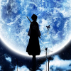 ===>
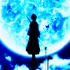
===> 
Program: GIMP 2
Steps: 16 (though some can be omitted)
Difficulty: Uber easy. Like, seriously. 8D
The final icon is a bit brighter than the one made with Photoshop. That's basically because GIMP doesn't have Exclusion layers to mute the colours, but it still works all the same, so. x3
( For GIMP users.)


