10 multifandom icons for icons10in20
Jun. 9th, 2022 11:09 pm![[personal profile]](https://www.dreamwidth.org/img/silk/identity/user.png) tinny
tinnyAfter a longer break, there was another ![[community profile]](https://www.dreamwidth.org/img/silk/identity/community.png) icons10in20 round, and I jumped on the chance to participate immediately. I was stuck on most of the themes at first, but then the table filled quickly after all. It was fun!
icons10in20 round, and I jumped on the chance to participate immediately. I was stuck on most of the themes at first, but then the table filled quickly after all. It was fun!
Teasers:


hover for fandom
ALTS:

I love all comments, and concrit, too. <3 Take and use as many icons as you like, credit is appreciated. Texture and brushes makers: listed in my resource post.
Previous icon posts:

icons10in20 round, and I jumped on the chance to participate immediately. I was stuck on most of the themes at first, but then the table filled quickly after all. It was fun!Teasers:
hover for fandom
| Angle | Dust | Far Crop | Four | Green+Pink |
 |
 |
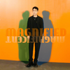 |
 |
 |
| High Contrast | Outdoors | Stock | Transportation | Vanilla |
|
|
 |
|
 |
ALTS:
I love all comments, and concrit, too. <3 Take and use as many icons as you like, credit is appreciated. Texture and brushes makers: listed in my resource post.
no subject
on 2022-06-09 10:23 pm (UTC)no subject
on 2022-06-10 08:32 am (UTC)Thank you! <3
no subject
on 2022-06-09 10:47 pm (UTC)no subject
on 2022-06-10 08:34 am (UTC)no subject
on 2022-06-10 06:00 pm (UTC)no subject
on 2022-06-16 08:12 am (UTC)Thank you! I immediately thought of characters with motorbikes for that theme. I'm really not quite sure anymore where the idea for the green background came from. :DD
Coloring/style of Green+Pink is great.
Green+pink stumped me for a long time, I redid that one at least three times. /o\ Glad the end result works!
I also really like the coloring of Outdoors :)
Thanks! I really like the fire, too - I'm not quite as sure about how purple his (actually mostly dark blue/black) suit came out. ;)
no subject
on 2022-06-10 09:15 pm (UTC)no subject
on 2022-06-16 08:13 am (UTC)no subject
on 2022-06-11 11:08 pm (UTC)no subject
on 2022-06-16 08:14 am (UTC)no subject
on 2022-06-12 02:22 am (UTC)no subject
on 2022-06-16 08:15 am (UTC)no subject
on 2022-06-12 01:25 pm (UTC)no subject
on 2022-06-16 08:15 am (UTC)no subject
on 2022-06-12 05:05 pm (UTC)The green and pink icon is soooo good!I love it!Vanilla is nice,very ice-creamy. :D
I like the four icon. The angle one is a great choice of image!
That text work and colours in the far crop-looks like a movie poster and I'm loving it!
no subject
on 2022-06-16 08:22 am (UTC)Heee. Dreamlike life takes some... dedication. It's still my fave show of his in terms of character cuteness and romance, because Luo Fusheng is so incredibly adorable. (He always tries to be cool and he's supposed to be this ruthless mafia enforcer, but in fact he's such a cinnamon roll.) But everything else apart from him and the female lead is just... terrible. Absolutely hilariously dramatically terrible. (And it has one of my favorite tv weddings ever, lol.)
The green and pink icon is soooo good!
Thank you! I was very unsure about green and pink and redid it a few times. I'm glad the end result works now!
Vanilla is nice,very ice-creamy. :D
Z1l and vanilla just go together. :D
I like the four icon.
That was probably the toughest theme of all of them. I was thinking I'd go with the "usual" split the icon into four parts method for the longest time, and then I thought it was too much work, and I couldn't think of a good combination of caps I hadn't used before. I feel like I've done them all. :D And then I went looking for tv show ensembles with four characters on them... years later... . In the end I just went with the KinnPorsche one, and I had to manip it into shape to get the text to fit in the middle, and I think it was more work than the split thing would have been in the end. :D
That text work and colours in the far crop-looks like a movie poster and I'm loving it!
Thank you! I wasn't sure whether it worked at all. <3