![[personal profile]](https://www.dreamwidth.org/img/silk/identity/user.png) tinny
tinnyAs usual, ![[livejournal.com profile]](https://www.dreamwidth.org/img/external/lj-userinfo.gif) jsfunction came up with a very interesting challenge format for
jsfunction came up with a very interesting challenge format for this last month's round at ![[livejournal.com profile]](https://www.dreamwidth.org/img/external/lj-community.gif) somein30: you had to define axes in a number of dimensions (1, 2, or even more), and fill the resulting line/matrix with icons. I chose tough ones that forced me to make clean and muted icons, which was really challenging - but a lot of fun! tinebrella had the brilliant idea to put two different gradients on the same axis. Thank you for that!
somein30: you had to define axes in a number of dimensions (1, 2, or even more), and fill the resulting line/matrix with icons. I chose tough ones that forced me to make clean and muted icons, which was really challenging - but a lot of fun! tinebrella had the brilliant idea to put two different gradients on the same axis. Thank you for that!
Enjoy!
Teasers:
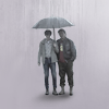
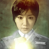
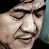
Depending on lj style vagaries, you might not be able to see the axes. They are:
Top to bottom: Vibrant->Muted->B/W
Top to bottom: Texturized->Clean
Left to right: Negative Space->No Negative Space
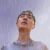
ALTS (all the vibrant ones :D ) :




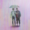
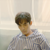
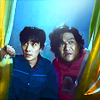

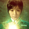
I love comments, concrit is welcome. <3 Take and use if you want, and please credit me. Texture and brush makers are listed in my resource post.
Previous icon posts:



jsfunction came up with a very interesting challenge format for somein30: you had to define axes in a number of dimensions (1, 2, or even more), and fill the resulting line/matrix with icons. I chose tough ones that forced me to make clean and muted icons, which was really challenging - but a lot of fun! tinebrella had the brilliant idea to put two different gradients on the same axis. Thank you for that!Enjoy!
Teasers:
Depending on lj style vagaries, you might not be able to see the axes. They are:
Top to bottom: Vibrant->Muted->B/W
Top to bottom: Texturized->Clean
Left to right: Negative Space->No Negative Space
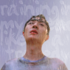
| texturized - - - - - clean | vibrant - - - - - muted - - - - - b/w |  |
 |
 |
 |
|
 |
 |
|
 |
|||
 |
 |
 |
|
|||
|
 |
 |
 |
|||
| negative space - - - - - - - no negative space | ||||||
ALTS (all the vibrant ones :D ) :
I love comments, concrit is welcome. <3 Take and use if you want, and please credit me. Texture and brush makers are listed in my resource post.
![[identity profile]](https://www.dreamwidth.org/img/silk/identity/openid.png)
no subject
on 2021-06-04 04:20 pm (UTC)no subject
on 2021-06-20 07:28 pm (UTC)Dirtied Z1L is just... a reason unto itself. :D
no subject
on 2021-06-02 06:16 pm (UTC)Really like how it turned out, the neg space axis is really interesting!
My favs are: 1 (great composition and coloring!), 10 (love the subtle text and the soft tones), 13 (this is my fav of favs, perfect muted coloring and neg space!), alt2 (wow, the crop is perfect and the b/w is gorgeous, amazing contrast!).
no subject
on 2021-06-03 07:07 pm (UTC)Yes I did! I couldn't decide on fewer than three. :DD It was a great idea that I wouldn't have thought of.
Really like how it turned out, the neg space axis is really interesting!
Thank you! <3 I ended up also going from far crop to close crop (mostly). I'm sure I could have done that differently, but I just thought the set would look more balanced if the crops also went in one direction. :)
1 (great composition and coloring!), 10 (love the subtle text and the soft tones)
Heee! Those are the first and last icons I did for the set, respectively. :D
13 (this is my fav of favs, perfect muted coloring and neg space!)
Wooot! I always had to be extra careful not to make them all too vibrant. Choosing vibrance as an axis was really hard for me.
alt2 (wow, the crop is perfect and the b/w is gorgeous, amazing contrast!).
Oooh, thank you for picking that one! I only didn't put it into the set because it overpowered it.
no subject
on 2021-06-02 06:17 pm (UTC)no subject
on 2021-06-03 07:08 pm (UTC)I fiddled with the last one for so long! (Which is why I have three alts for that spot...) But in the end it clicked after all. :D
no subject
on 2021-06-02 07:42 pm (UTC)I love how cohesive it looks. The effects of 2 and 4 look really good. The text placement in 1, 5 and is perfect! The crops for the second column are my faves. I also really like how you made the b/w icons, they still have great contrast, especially 16!
no subject
on 2021-06-03 07:12 pm (UTC)I love how cohesive it looks.
I tried so hard to make that set cohesive, because I considered that to be part of the challenge to line up the icons on the gradient perfectly. (I don't think I quite managed. :D But it's already way more cohesive than my usual sets.)
The crops for the second column are my faves.
Mine, too! :D They're my standard go-to crops. The others were all much harder for me.
I also really like how you made the b/w icons, they still have great contrast, especially 16!
Thank you so much! b/w is something I rarely if ever do, and I specifically chose vibrance as a gradient to challenge myself. I am so happy to hear that they came out well! (16 fought me so hard, omg.)
no subject
on 2021-06-02 08:20 pm (UTC)no subject
on 2021-06-03 07:17 pm (UTC)Hehee, I would never have thought of that on my own. It was all tinebrella's brilliant idea.
Your clean and B&W set is so good!
Oh my those were such a challenge! I mean, I chose the gradient like that on purpose to make myself work for it. But oh my, clean *and* b/w, it was so hard! :D
<3
no subject
on 2021-06-03 01:34 pm (UTC)Your set is full of awesome, I love that you chose challenging axes (and an extra axis!) and that you combined more vibrancy with texturized and left muted ones clean (maybe this is just my personal style but I tend to combine those things the opposite way, so this seems like a fun and different way to do it).
Your versatility shows really well here cause I look at the grid and I like icons pretty evenly from all parts of the grid. In the textured, vibrant top row I'm especially into 2 - the coloring is fantastic, so saturated and eye-catching!, and I LOVE the texture use cause it's somehow shiny and gritty at the same time. 1 is incredible, the simple text adds so much and the textured background is lovely, and still looks clean.
11 is another top favorite for me, the smooth lighting combined with the peachy coloring is just so pretty! And the text is super cute, I really like the fonts and placements.
The bw row is all around great, I especially love the negative space composition in 13 (the painty pastel alt is fantastic as well!) and the crop + strong contrast + greast lighting in 16. The lighting and coloring in 6 is great too and I'm also a bg fan of the text use and muted contrast in 14.
Thanks so much for entering, I love how much thought you put into this!
no subject
on 2021-06-03 07:22 pm (UTC)Hee, yeah, I guess I'm contrary like that. When you said it wasn't possible, I immediately tried to make it work, and when I had it, I made a test post with the table style to see if it would come out on LJ as well. Which it did, but there's really no way to tell if it will work for everyone, since you have so many ways to style your journal.
Also, I didn't quite succeed in what I wanted to do. I wanted to have a border on one side of the axis, or even an arrow, but I didn't manage that. So I used a gradient instead to indicate the direction.
What I did is this:
x-axis: style="background: repeating-linear-gradient(90deg, white 0%, grey 100%);
y-axis: style="writing-mode: vertical-rl; vertical-align: center; background: repeating-linear-gradient(0deg, white 0%, grey 100%);
eta: oh yeah, and the column width was important, too. It will not make the column wide enough for the text if you don't explicitly set the width. For some reason the text size calculation doesn't work for vertical text...
no subject
on 2021-06-06 04:40 pm (UTC)no subject
on 2021-06-03 07:35 pm (UTC)OOoh, that hadn't occurred to me. I probably just thought I'd start with my favorite thing = vibrant + textured. Which of course meant that I had an incredibly hard time with the opposite side. :DD But then I think making b/w look good with a lot of textures would have been harder, since b/w depends on contrast a lot.
Your versatility shows really well here cause I look at the grid and I like icons pretty evenly from all parts of the grid.
Thank you! <3 It was such hard work! I really tried to make the gradients look good - which is also why I absolutely wanted a 4x4 grid, because it would have been "too easy" otherwise. ;D
In the textured, vibrant top row I'm especially into 2 [...] and 1
Thank you! They're two of my personal faves, too. (although I can't really say I hate any of the icons in this set. I worked hard on all of them. :))
11 is another top favorite for me
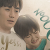
Oooh, thanks for picking that one! (Nobody else picked it.) I had such a hard time making the text look like it belongs to the right person. And I think every single "o" in that Noooo is a different font. :DD
Also, that scene is just hilarious and I love it to bits. :D
The bw row is all around great, I especially love the negative space composition in 13 (the painty pastel alt is fantastic as well!)
Thank you! The b/w row all started out as "normal" and then I took out the colors and couldn't resist posting the alts, too. :D b/w is sooo hard for me. :D
16 is the only one that really started out as b/w already, and it fought me for the longest time.
The lighting and coloring in 6 is great too and I'm also a bg fan of the text use and muted contrast in 14.
That whole column is my fave, because crops like that are my fave kind, so those were relatively easy. I knew I had to make 14 all faint and low-contrast, because the mood in this scene is so subdued. I'm happy it works!
Thanks so much for entering, I love how much thought you put into this!
Thank you for coming up with it, the challenges were all so inspiring, it's been a joy to work on them. <3
no subject
on 2021-06-03 04:34 pm (UTC)My favorites are: 1 (maybe my overall favorite, beautiful composition, negative space and lighting), 5 (nice negative space here too, and color combination, 13 (very nice and clean).
From the alts: 4 (very nice tones and lighting) :)
no subject
on 2021-06-03 07:41 pm (UTC)The double gradient on the same axis sounds difficult but you made it work very well!
I just couldn't decide on two gradients, so being able to add a third was great. I'm not sure it was harder that way. Leaving textures out was relatively easy. The vibrance gradient was extremely tough on me, otoh. :D
Thank you so much for picking faves! Especially alt 4! I wanted the text in there, but the whole mood really comes across better in the alt where I made the rain more prominent.