


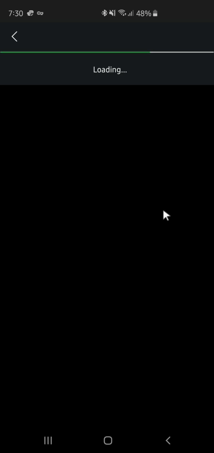

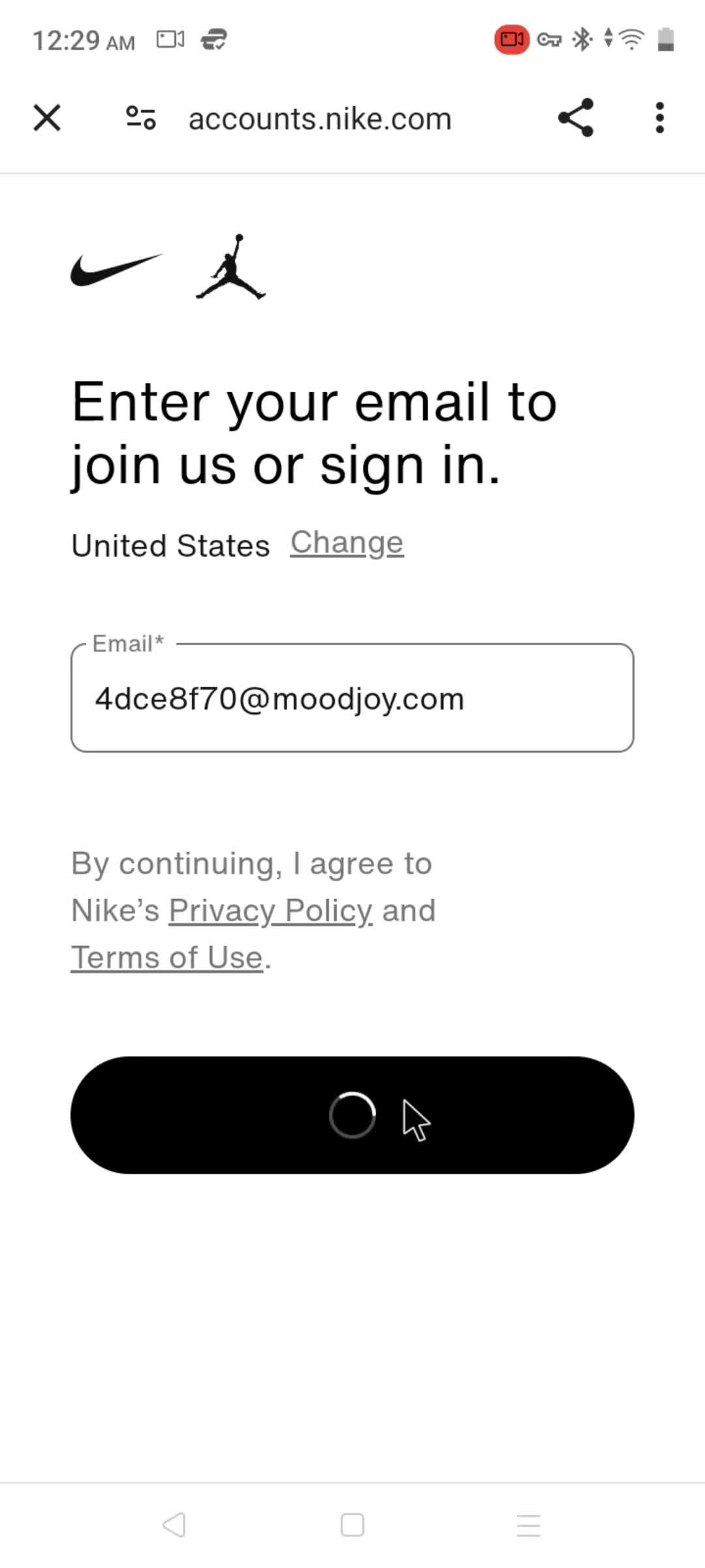

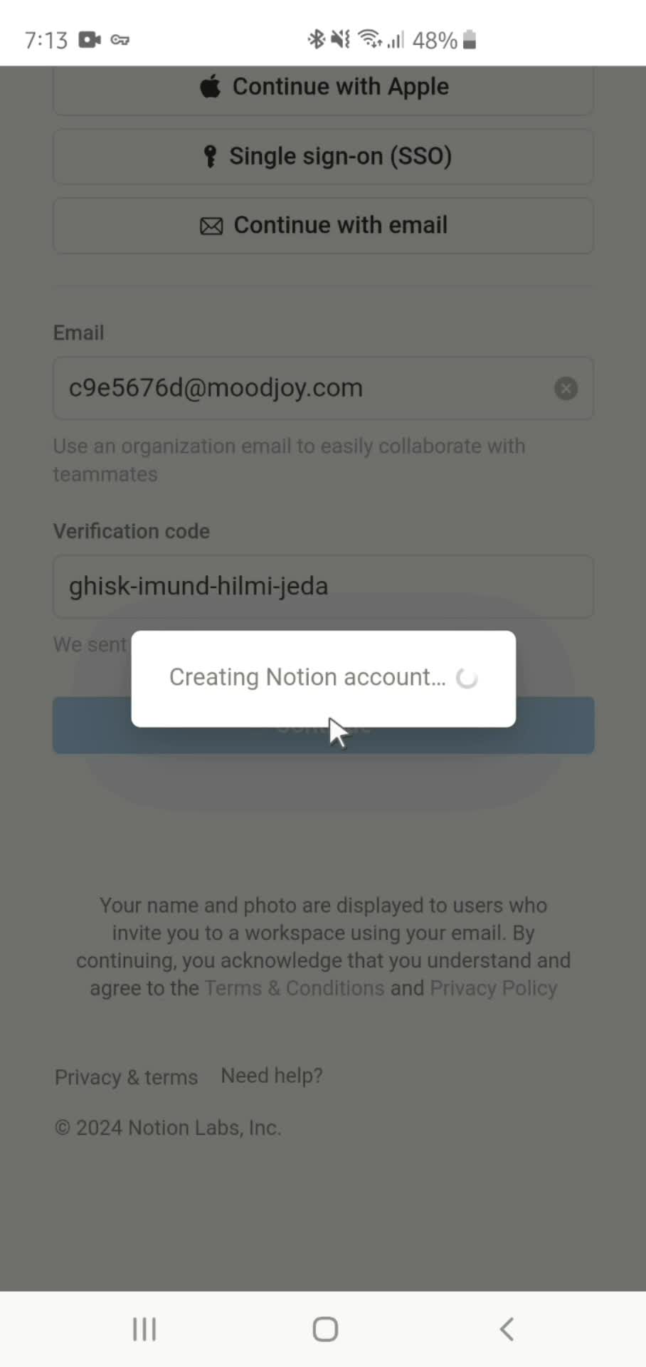
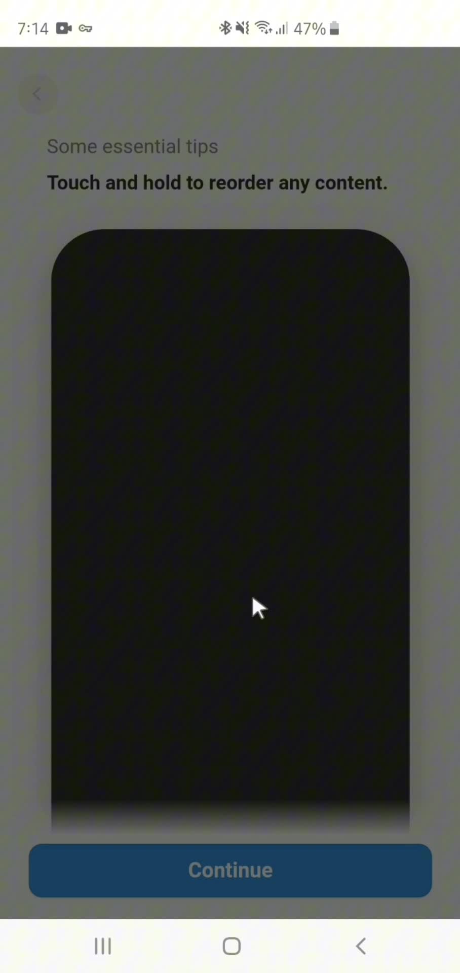
The Loading indicator Component in Android Apps
The Loading indicator is a core part of Android UI, and thoughtful implementations often define whether an app feels polished or sloppy. This page collects real Loading indicator examples from the Page Flows Android library, documented inside the user flows they appear in.
Material Design vs Custom Loading indicator Patterns
Seeing Loading indicator in context matters on Android especially, where Material Design provides guidance but leaves plenty of room for brand-specific adaptations. You'll see how apps implement Loading indicator across different app categories — some using classic Material patterns, others pushing the component in custom directions.
A Reference for Android Designers
For Android designers building a design system, evaluating a new interaction, or researching how Loading indicator behaves in practice, this library shortcuts days of manual research into a browsable, current reference.
Frequently Asked Questions
What does a Loading indicator look like in Android apps?
Implementations vary — some follow Material Design guidelines strictly, others adapt the Loading indicator for custom design systems. The library shows both approaches side by side.
Can I see Loading indicator examples across different Android app categories?
Yes. Loading indicator appears across app types, and each example is tagged by brand and category so you can compare implementations across fintech, social, productivity, and other spaces.
Are Loading indicator examples captured with Material Design 3?
Many are. As apps migrate to Material Design 3 (Material You), the library captures those updates, so you can study modern Android Loading indicator patterns.
How does the Android Loading indicator differ from iOS?
Android Loading indicator components often have Material-specific behaviors — different triggers, transitions, and visual conventions — that don't translate from iOS. Comparing them across platforms is a common research use case.