Contestant Bios
 project_icon!
( Collapse )
( Collapse )
Type username to filter posts in this community
 project_icon!
 gunshou is an American in her late twenties, teaches high school English language and literature, works evenings at a pediatric hospital, and wishes she could get a job playing video games all day. She has been making LJ icons and layouts for two years, primarily within the Final Fantasy fandom. She plays a dark elf assassin on Everquest II, which really says all you need to know about her personality. gunshou's offline interests include the martial art Shim Gum Do, in which she is a second degree black belt in sword and a first degree black belt in self-defense. Despite this, she is rather unathletic and relies strongly on the laws of inertia. A long time ago, she was a talented pianist, and regrets that higher education denied her the opportunity to practice for the past decade. She has a toy poodle named Shadow who lives with her mother several states away, and whom she misses very much. She also writes fanfic and is a (rarely commenting) member of Fandom Wank, effectively making her an evil, talentless ball of slime floating in the cesspit of the universe, according to conventional wisdom. When her army of penguins marches on the world, all shall love her and despair.
 WHAT gunshou LOOKS FOR IN AN ICON: WHAT gunshou DISLIKES IN AN ICON: SOME OF gunshou's OWN ICONS, WITH COMMENTARY: SOME OF gunshou'S FAVORITE rusalkatrix ICONS, WITH COMMENTARY:
 ---> This icon cracks me up every time. Really, that's all it takes some days, a great expression to go with some witty text.
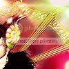 <--- I know I said I'm not a fan of cropping this "creative," but for fans of the game, Edea's hoopy thing is distinctive enough that it works as the focus of the icon. Again, the colors are gorgeous, and the light texture along the top gives the icon a touch of mysterious magic. The only distracting piece is the tiny bit of white around her fur ruff. You can find gunshou's icons at iconage. ff_eye_candy, a Final Fantasy icontest, and dothack_awards, a .hack (anime and manga) icontest.redobanners, a place to request that an ugly awards banner be fixed.rusalkatrix lives in New York, where she alternates writing YA fiction and panhandling. She started making icons in late 2005, because her favorite fandoms (old or fringe video games, Japanese cute art) weren't getting enough love, and she wanted to fill the void. Offline interests include books, comic books, good sushi, and lusting after clothes she can't afford. She is totally not down with that penguin army thing, and prefers the ill-tempered goodness of Pallas' cats.gunshou. ;) WHAT rusalkatrix LOOKS FOR IN AN ICON: WHAT rusalkatrix DISLIKES IN AN ICON: SOME OF rusalkatrix's OWN ICONS, WITH COMMENTARY:
 <--- I made this icon when I was first learning to use Photoshop. I didn't have any textures, so I filled a layer with pink and then scribbled a gold brush over it. (Why? Um, because otherwise it would have had a blank background?) I also knew I wanted text, but had no idea what to write. So since the character is an archer, I went with that. The line art looks washed out--I could have used blend layers (multiply, soft light) or a nice color overlay (or both) to bring them out more. I didn't really know what I was doing when I made this, and it shows.
 ---> A frilly dress, pretty colors (I think I used a blue and purple gradient), and a crop that draws your eye to just the right aspects: Lolita cuteness! Bondage! ♥ If I were to redo it, I'd probably omit the white swirly brush on the right side, & fix the border. (There's a pale white border inside the darker one, and it's a bit distracting.) It's a simple icon, and it doesn't really require extra adornment (i.e. brushes).
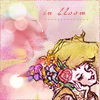 <--- This is one of my favorite icons that I've made lately. Mostly because I think it's pretty (the line art is enhanced by the delicate coloring, the lights add life to the image, the text blends well & doesn't distract), but also because I rescued it from being mediocre. It was a long & crazy process, but it showed me that, even if I'm dissatisfied with an icon I'm working on, a different approach might result in something I'll really be proud of. [ tutorial ] SOME OF rusalkatrix'S FAVORITE gunshou ICONS, WITH COMMENTARY: You can find rusalkatrix's icons at trixicons. ff_seasonal, a Final Fantasy icontest with seasonal themes.