
Rusalkatrix Bio
 rusalkatrix lives in New York, where she alternates writing YA fiction and panhandling. She started making icons in late 2005, because her favorite fandoms (old or fringe video games, Japanese cute art) weren't getting enough love, and she wanted to fill the void. Offline interests include books, comic books, good sushi, and lusting after clothes she can't afford. She is totally not down with that penguin army thing, and prefers the ill-tempered goodness of Pallas' cats.
As you can see from this bio, she is way less interesting (or far more mysterious) than her cohort
gunshou. ;) WHAT rusalkatrix LOOKS FOR IN AN ICON:
Originality. I like risk-taking (icons that aren't automatic crowd pleasers, but are beautifully done). Pretty coloring, whether it's muted or vibrant. I like clean, simple composition (I'm a big fan of white space), but I also like icons that are complicated and colorful--the important thing is balance. Nothing gratuitous.
WHAT rusalkatrix DISLIKES IN AN ICON:Oversaturated icons (bright colors are nice, but everything in moderation, okay?), text that is meant to be read but is illegible, text that doesn't mesh well/distracts from the image, radioactive neon coloring, brush abuse, black 1px borders by default (not every icon needs a black border), oversharpened anything (beware of jagged edges) . . . And this probably goes without saying, but please don't enter an icon of your baby.
SOME OF rusalkatrix's OWN ICONS, WITH COMMENTARY: <--- I made this icon when I was first learning to use Photoshop. I didn't have any textures, so I filled a layer with pink and then scribbled a gold brush over it. (Why? Um, because otherwise it would have had a blank background?) I also knew I wanted text, but had no idea what to write. So since the character is an archer, I went with that. The line art looks washed out--I could have used blend layers (multiply, soft light) or a nice color overlay (or both) to bring them out more. I didn't really know what I was doing when I made this, and it shows.
 ---> A frilly dress, pretty colors (I think I used a blue and purple gradient), and a crop that draws your eye to just the right aspects: Lolita cuteness! Bondage! ♥ If I were to redo it, I'd probably omit the white swirly brush on the right side, & fix the border. (There's a pale white border inside the darker one, and it's a bit distracting.) It's a simple icon, and it doesn't really require extra adornment (i.e. brushes).
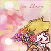 <--- This is one of my favorite icons that I've made lately. Mostly because I think it's pretty (the line art is enhanced by the delicate coloring, the lights add life to the image, the text blends well & doesn't distract), but also because I rescued it from being mediocre. It was a long & crazy process, but it showed me that, even if I'm dissatisfied with an icon I'm working on, a different approach might result in something I'll really be proud of. [ tutorial ] SOME OF rusalkatrix'S FAVORITE gunshou ICONS, WITH COMMENTARY: You can find rusalkatrix's icons at
  trixicons.
 She is the creator and moderator of
ff_seasonal, a Final Fantasy icontest with seasonal themes.