60+ CSS Galleries: Free Code Snippets & Portfolio Examples
CSS galleries organize dense photographic portfolios and product listings into highly responsive visual grids, converting flat layouts into immersive, interactive showcases. By coordinating flexible column tracks, hardware-accelerated hover zooms, and scroll-snap pagination natively, these templates display graphic assets without the lag of heavy script libraries.
- Interactive modal lightboxes and fluid grid expansions leverage the native View Transitions API to morph element coordinates off the main thread.
- Tactile horizontal swiping and pagination locks are managed natively using scroll-snap-type: x mandatory properties inside the scroll wrapper.
- To preserve critical INP (Interaction to Next Paint) performance during high-speed image filtering, dynamic grid updates run on GPU compositor layers.
Explore these responsive layout designs to master the integration of native grid systems and performance-first image galleries into your web platforms.
Table of Contents:
Examples
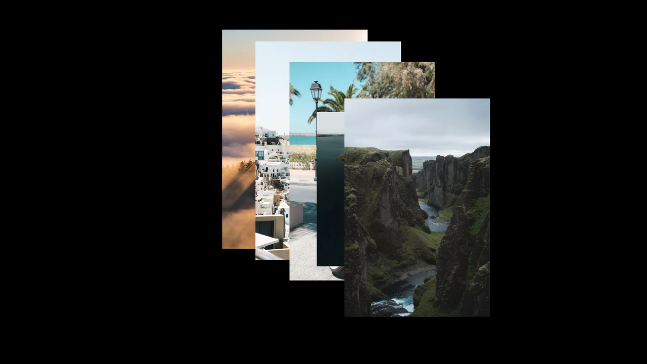
Interactive Cursor Image Trail Gallery
This creative image gallery generates a dynamic visual trail following the user’s cursor. Built with vanilla JavaScript, the script measures pointer displacement using hypotenuse mathematics. Once the cursor exceeds a relative distance threshold, the next image in the queue spawns directly under the pointer with an incrementing depth index, while older trail elements automatically deactivate.
 Chrome 36+
 Edge 12+
 Firefox 16+
 Safari 9+
See the Pen Interactive Cursor Image Trail Gallery.
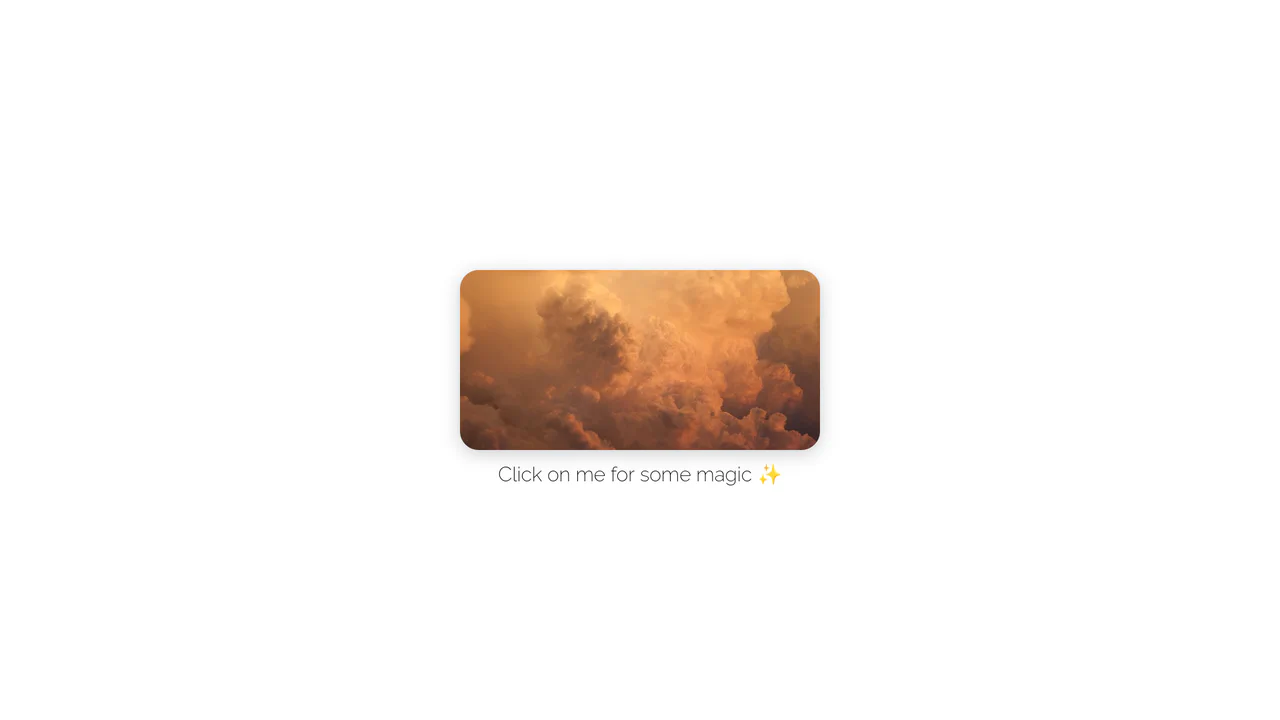
Rounded Inset Clip-Path Image Reveal
This interactive image gallery showcases an organic full-screen grid transition powered by clipping bounds. By masking a multi-column CSS grid of photographs with clip-path: inset(), the initial state reveals only a rounded, centered viewport window. A simple JavaScript click toggle expands the mask boundaries to full scale, transforming the thumbnail window into a comprehensive gallery.
Chrome 55+
Edge 79+
Firefox 54+
Safari 9.1+
See the Pen Rounded Inset Clip-Path Image Reveal.
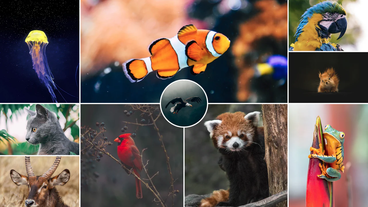
Responsive CSS Grid Mosaic Gallery
A zero-JavaScript responsive mosaic gallery built entirely on native CSS Grid. The grid system adapts dynamically through CSS Custom Variables and column-span mappings across responsive breakpoints, utilizing performance containment properties (contain: size) to prevent layout shifting. Features a centered, overlapping circular highlight portrait.
Chrome 57+
Edge 79+
Firefox 69+
Safari 15.4+
See the Pen Responsive CSS Grid Mosaic Gallery.

CSS Scroll-Driven Radial Gallery
This is a Scroll-Driven Radial Gallery. It binds a circular, rotating layout directly to the viewport’s scroll position. Its function is to transform linear page scrolling into a dynamic, spatial carousel, keeping only the active item in sharp focus while pushing others into a blurred, grayscale periphery.
Chrome 132+
Edge 132+
Safari 26.2+
See the Pen CSS Scroll-Driven Radial Gallery.
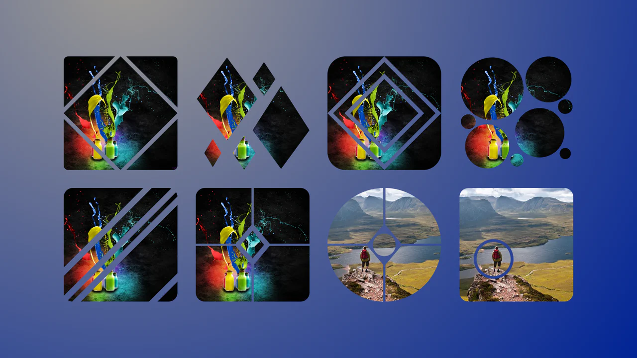
Complex Geometric Image Masks
This is a collection of Complex Geometric Image Masks. It shapes standard rectangular images into precise, multi-part vector forms using a single HTML node. Its function is to break rigid grid layouts and introduce structural visual interest without requiring external SVG assets.
Chrome 88+
Edge 88+
Firefox 71+
Safari 13.1+
See the Pen Complex Geometric Image Masks.

Responsive Fluid Photo Gallery Grid
This is a Responsive Fluid Photo Gallery Grid. It organizes varied aspect-ratio images into justified rows without cropping essential content. Its primary function is to optimize visual space, ensuring edge-to-edge alignment while deferring offscreen asset loading for strict performance control. (Requires: lazysizes, object-fit-images)
Chrome 80+
Edge 80+
Firefox 75+
Safari 13+
See the Pen Responsive Fluid Photo Gallery Grid.

CSS :has() Character Select Screen
This is a CSS :has() Character Select Screen. It replicates the classic user interface of a fighting game’s selection menu, using modern CSS to handle all state logic. Its function is to demonstrate how the :has() pseudo-class can completely replace JavaScript for managing visibility in a selection-based UI, triggering changes in the main content area based on the state of a radio button group. (Requires: Vue)
Chrome 105+
Edge 105+
Firefox 121+
Safari 15.4+
See the Pen CSS :has() Character Select Screen.

Clipping Quadrant Image Gallery
This is a Clipping Quadrant Image Gallery. It segments a full-screen display into four interactive quadrants, each housing a unique photograph. Upon clicking any segment, the component utilizes the clip-path property to instantly expand that specific quadrant to cover the entire viewport, transitioning from a mosaic-style grid into a singular, immersive view.
Chrome 55+
Edge 79+
Firefox 52+
Safari 11+
See the Pen Clipping Quadrant Image Gallery.

Interactive Radial Image Carousel
This is an Interactive Radial CSS Image Carousel. It arranges a deck of image cards into a curved, fan-like layout. Its function is to provide an engaging, space-saving gallery interface where hovering over a card gracefully shifts its neighbors away along a circular path, bringing the focused item into clear view without relying on JavaScript math.
Chrome 119+
Edge 119+
Firefox (partial)
Safari 26.2+See the Pen Interactive Radial Image Carousel.

Dynamic Circular Avatar Gallery
This is a Dynamic Circular Avatar Gallery. It arranges a series of profile images into a perfect circle that smoothly expands when interacted with. Its function is to showcase user groups or team members in a compact, engaging format, using cutting-edge CSS math instead of JavaScript to handle complex radial positioning and dynamic item counting.
Chrome 119+
Edge 119+
See the Pen Dynamic Circular Avatar Gallery.

Smooth View Transition Grid Cards
This is a Smooth View Transition Grid Cards component. It transforms a standard CSS Grid of cards into an interactive, animated gallery. Its function is to elegantly expand a selected item to full width, smoothly reflowing the remaining siblings using native browser rendering instead of complex JavaScript math.
Chrome 111+
Edge 111+
Firefox 128+
Safari 18+
See the Pen Smooth View Transition Grid Cards.

Trigonometric 3D Orbit CSS Gallery
This Trigonometric 3D Orbit Gallery is a stunning example of “Code Art,” demonstrating the raw power of modern CSS mathematics. Instead of relying on rigid keyframes for positioning, it uses parametric equations to place and animate 32 images along a complex, fluid 3D curve in real-time, creating a perpetual motion machine effect purely with stylesheets.
Chrome 111+
Edge 111+
Safari 16.4+
Firefox 113+See the Pen Trigonometric 3D Orbit CSS Gallery.
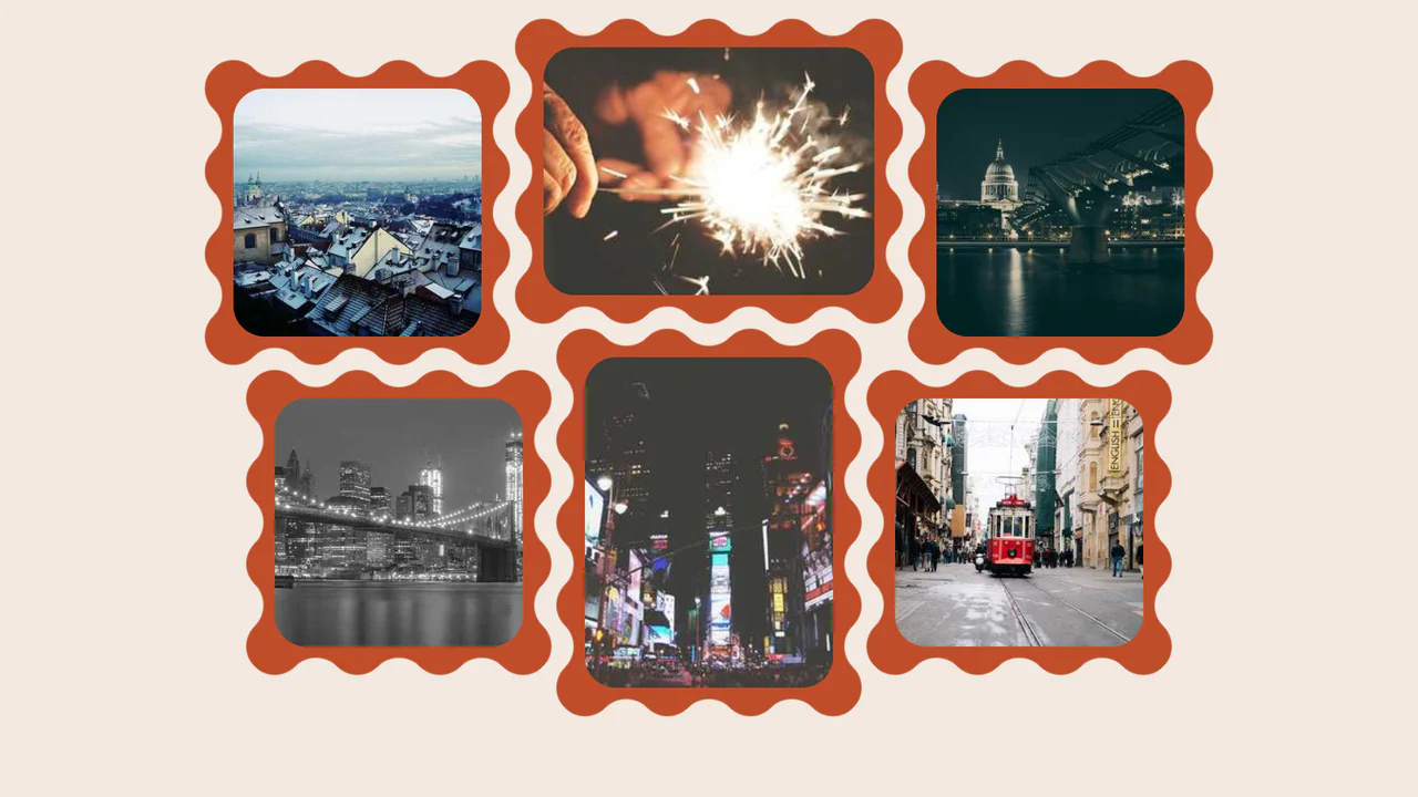
Wavy Image Gallery
Images appear as jigsaw puzzle pieces with interlocking edges that can visually fit together.
See the Pen Wavy Image Gallery.

Animated Grid Tracks with :has()
A pure CSS expanding gallery powered by the modern :has() selector. Hovering triggers a grid-template-columns transition, widening the active item while revealing content via opacity and transform animations, all styled with blend modes for a tinted monochrome aesthetic.
See the Pen Animated Grid Tracks with :has().
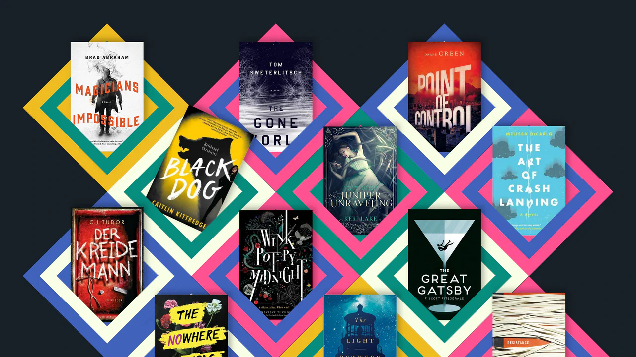
Responsive CSS Grid: Books
A unique, dynamic, and responsive collage of images that uses advanced CSS techniques to create a 3D-like geometric pattern.
See the Pen Responsive CSS Grid: Books.
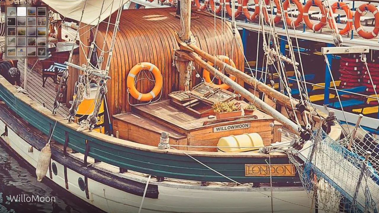
Full Viewport Gallery: Pure CSS
A pure CSS image gallery that leverages the advanced :has() pseudo-class and radio input hacks to orchestrate state changes without JavaScript. The layout utilizes CSS Grid variables to dynamically translate the viewport, creating a smooth, easing-based transition between full-screen images controlled entirely by sibling combinators and checked states.
See the Pen Full Viewport Gallery: Pure CSS.

Pure HTML/CSS Image Slideshow
A lightweight, fast gallery that operates without JS libraries, supporting keyboard navigation, mobile swipes, and deep linking to specific slides.
See the Pen Pure HTML/CSS Image Slideshow.
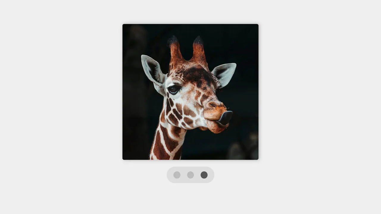
Smooth Scroll Image Gallery with Anchor Links
This component leverages the native browser feature scroll-behavior: smooth to create a fluid scrolling animation between sections. This is triggered by anchor links, providing a simple and performant way to build a slideshow without any complex JavaScript animation libraries.
See the Pen Smooth Scroll Image Gallery with Anchor Links.
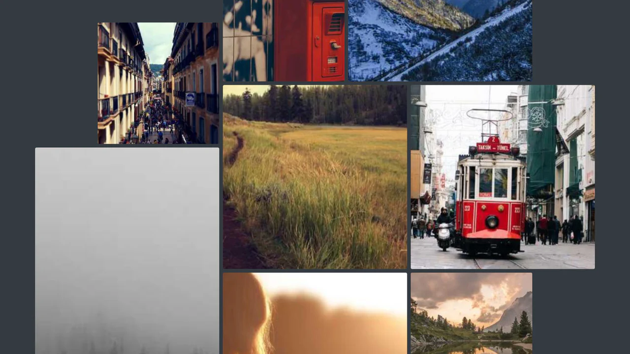
Scroll-Driven Gallery
A demonstration of the new CSS Scroll-Driven Animations (SDA) API, where the scroll position of the entire page directly drives a complex, scaling, and rotating grid of images, achieving a high-performance, engaging visual effect purely with CSS.
See the Pen Scroll-Driven Gallery.
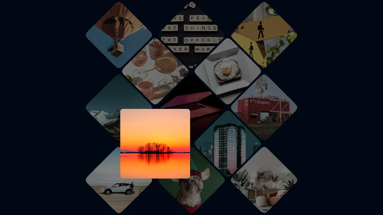
Photo Gallery Grid Animation with CSS Clip-Path
A showcase of the creative application of clip-path to create an “unfolding” image effect on hover, where the interaction not only changes the shape but also uses z-index to elevate the element and overlap neighboring tiles.
See the Pen Photo Gallery Grid Animation with CSS Clip-Path.

3D Parallax Navigation with 'Fisheye' Hover Effect (CSS-Only)
A stunning CSS-only 3D parallax navigation with a “fisheye” hover effect, achieved using transform-style: preserve-3d and a translateZ function tied to cursor position. The core mechanism is the mathematical calculation of CSS variables.

Reflection with Progressive Blur in CSS
Progressive Blur for the lower screen half is implemented to simulate fog: the effect is created by layering multiple elements with varying backdrop-filter: blur() values, precisely masked using mask: linear-gradient().
See the Pen Reflection with Progressive Blur in CSS.

Corner-shape Hexagon Avatars
This demo creates a responsive hexagonal grid using CSS Grid and the powerful, lesser-known corner-shape: bevel property. It uses negative margin-block for smooth overlaps, and a unique linear() easing function for a bouncy, fluid hover animation.
See the Pen Corner-shape Hexagon Avatars.

Coverflow 3D Effect with CSS
A truly modern image flow powered by CSS Scroll-driven Animations and view-timeline. This demo uses pure CSS to create a 3D perspective effect where images pop out and rotate as they enter the viewport, with no JavaScript required.
See the Pen Coverflow 3D Effect with CSS.
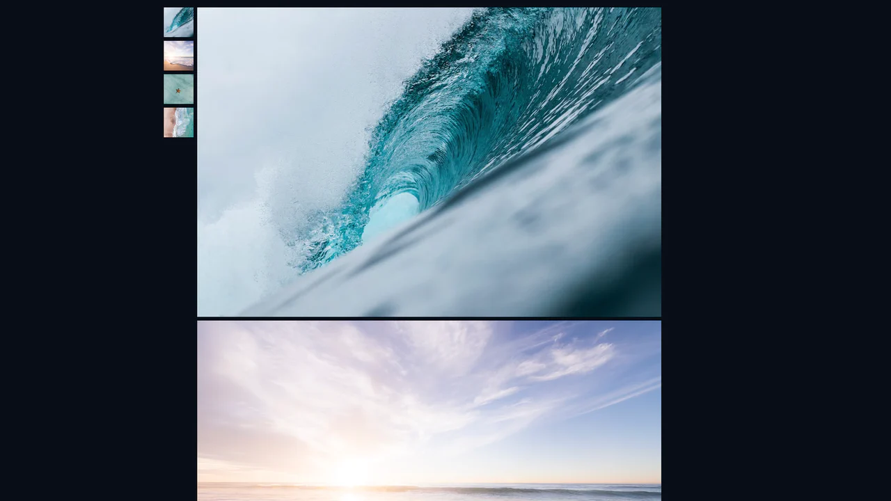
Vertical Slider with CSS Only
A simple, yet effective image gallery using CSS Grid and native browser features like scroll-snap and :target. This approach creates a smooth, fully accessible slideshow without any JavaScript, relying on pure CSS for both layout and navigation.
See the Pen Vertical Slider with CSS Only.
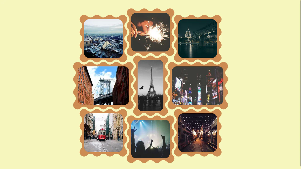
A Gallery of Squiggle Images
CSS Grid creates a 3‑column base, then each image is individually shifted with translate to break the alignment — resulting in a scattered, organic layout. The wave‑shaped border is drawn using mask with repeating radial gradients; the design is purely visual and static.
See the Pen A Gallery of Squiggle Images.
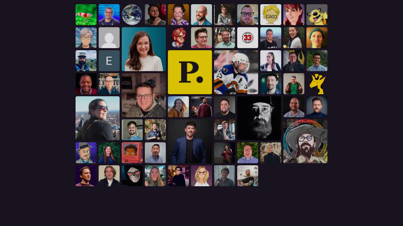
CSS Grid for Multi-Sized Avatars
A responsive mosaic grid of user avatars utilizing CSS Grid’s dense auto-flow algorithm to seamlessly pack items of varying sizes. Special ‘gold’ supporters span multiple rows and columns, creating visual hierarchy, while :has() pseudo-class selectors enable a focused hover state that subtly dims non-active elements.
See the Pen CSS Grid for Multi-Sized Avatars.
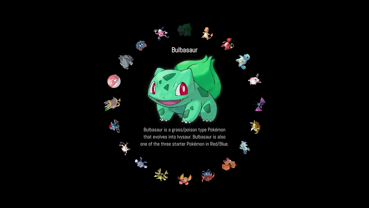
Pokémon Slide Gallery (Yet Another Circle Gallery)
Radio buttons hidden behind thumbnails control a rotating circular menu — each selection rotates the container so the chosen item aligns at the front. Custom properties handle positioning and animation delays; :has() and sibling selectors manage the interactions. The gallery is fully functional with no JavaScript.
See the Pen Pokémon Slide Gallery (Yet Another Circle Gallery).
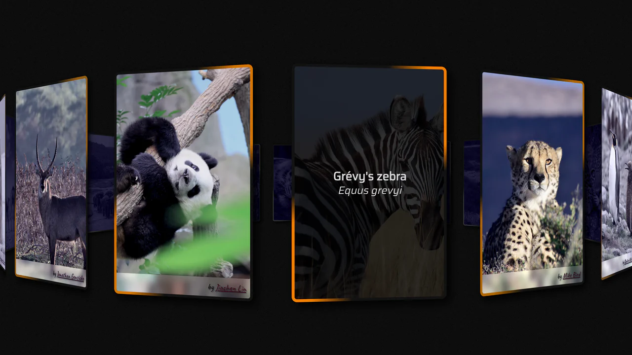
CSS Infinite Scroll Gallery
A sophisticated 3D circular gallery powered by native Scroll-Driven Animations. It calculates item positions along a cylinder using calc() and trigonometric functions, while @property variables (--k, --ang) manage layout state. A tiny JavaScript helper synchronizes the scroll position, enabling a fluid, infinite rotary motion as the user navigates the page. High-end, programmatic styling.
See the Pen CSS Infinite Scroll Gallery.
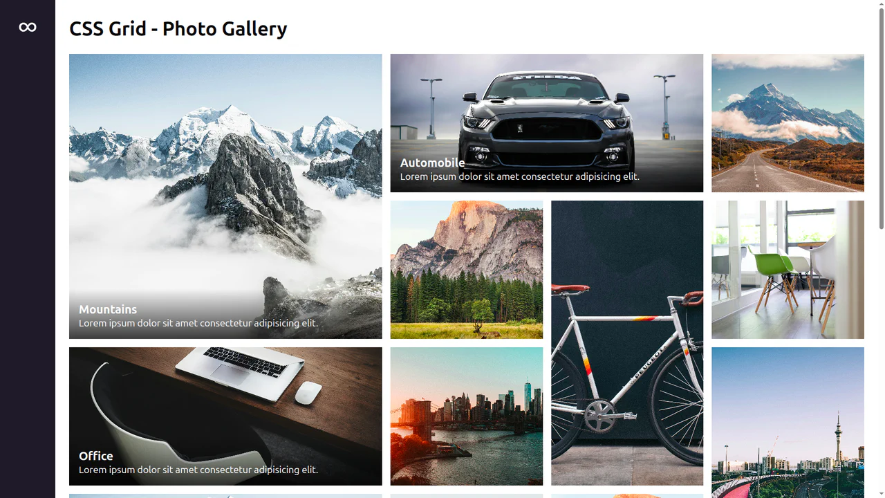
Responsive Photo Gallery with CSS Grid
A fluid masonry-style gallery engineered with CSS Grid and container queries. It dynamically toggles caption visibility based on card width (@container figure) and employs grid-auto-flow: dense for optimal space utilization. Images scale smoothly on hover, and the overall layout shifts automatically between standard and spanned grid cells depending on the viewport size. Truly robust, modular, and JS-free.
See the Pen Responsive Photo Gallery with CSS Grid.