20+ CSS Thumbnails: Free Preview Code Snippets & Examples
CSS thumbnails organize responsive photo galleries, blog feeds, and e-commerce product listings into highly structured, compact preview cards. By wrapping media elements inside ratio-locked containers and coordinating hardware-accelerated overlays natively, these templates establish clean focus paths that guide users through visual lists.
- Symmetrical boundaries and clean preview proportions are engineered natively using the aspect-ratio and object-fit: cover properties.
- Polished glassmorphic caption reveals and overlay hover scales leverage GPU-composited transform and opacity transitions.
- To preserve critical INP (Interaction to Next Paint) performance during heavy grid scrolling, active card transformations avoid triggering reflows.
Explore these responsive preview designs to master the integration of native aspect ratio metrics and highly polished thumbnail grids into your applications.
Table of Contents:
Examples

Invert Radius Shape with Cool Hover Effect
A sophisticated hover effect utilizing CSS Houdini to animate a complex image mask.
See the Pen Invert Radius Shape with Cool Hover Effect.

Animated Gallery Thumbnails
A stylish card that rests as a diagonal fragment and smoothly “straightens” into a full rectangular image on hover, shifting the text downwards.
See the Pen Animated Gallery Thumbnails.
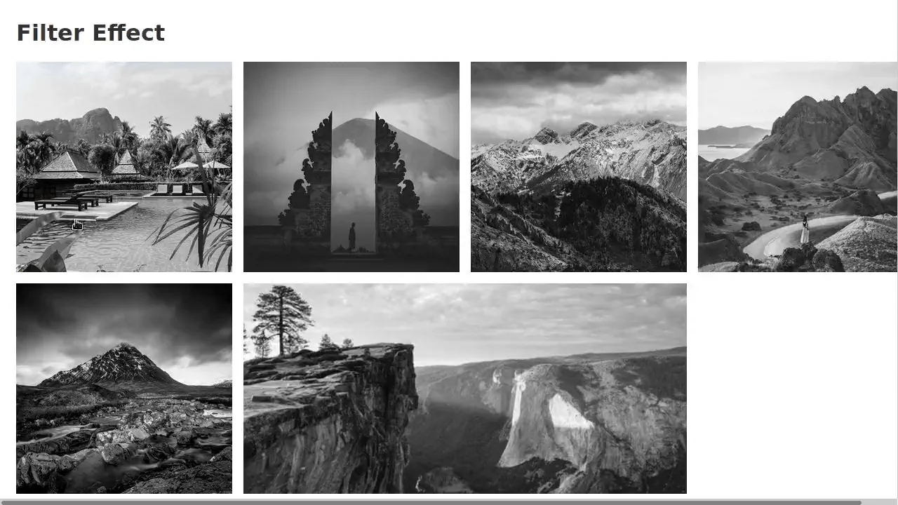
CSS Thumbnail Transition Effects
A fluid, responsive gallery that automatically adjusts to screen size and provides rich visual feedback on hover.
See the Pen CSS Thumbnail Transition Effects.
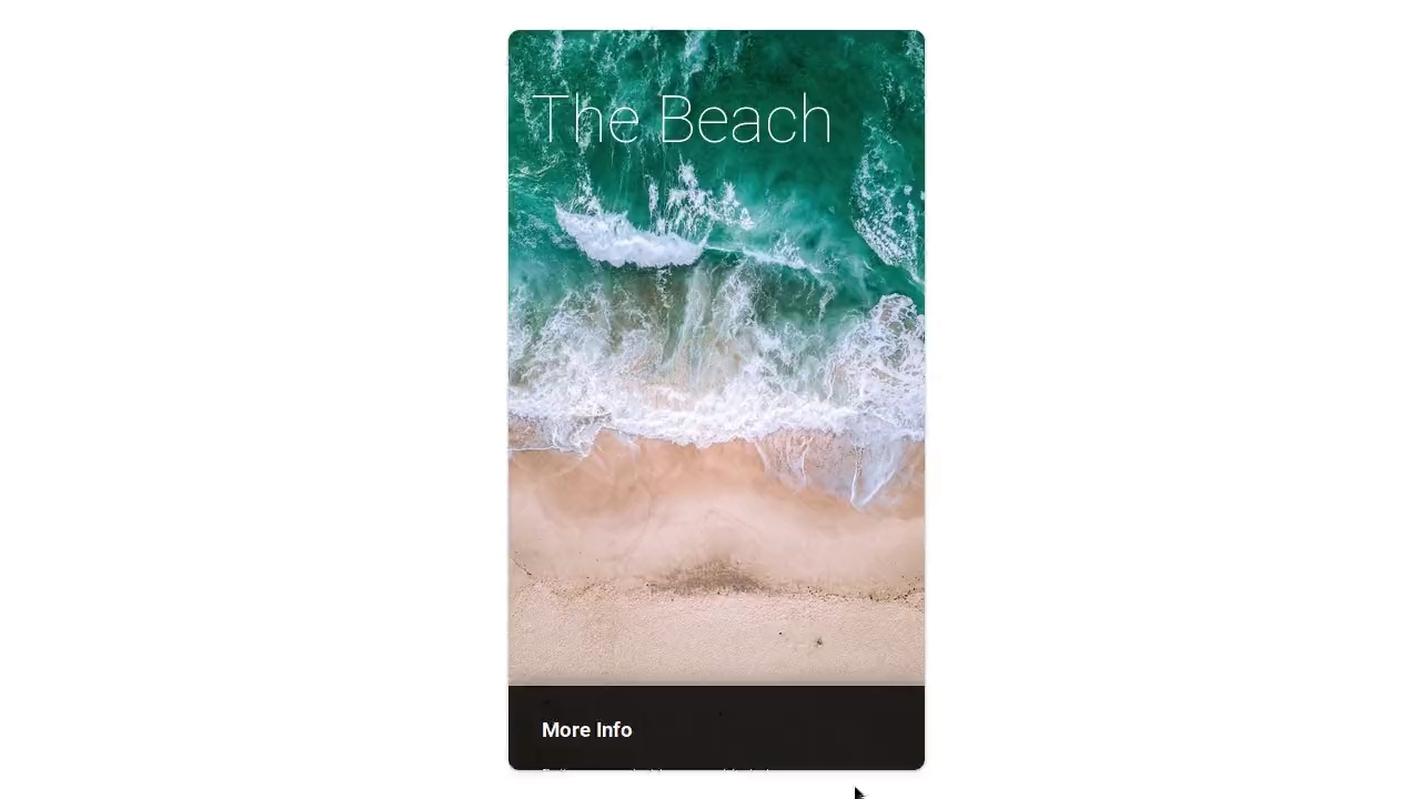
Figure & Figcaption
The SCSS organises styles with variables, nesting, and mixins. Animations and @for loops control element delays and appearance. The slide-popout mixin handles absolute positioning, though its logic is straightforward and could be inlined. Overall, the code is structured and predictable.
See the Pen Figure & Figcaption.

Thumbnail Hover Effects
A float‑based grid with widths calculated via SCSS variables. Three hover effects use a pseudo‑element :after with skew and scale transforms. Text fades in synchronised with the background animation — all controlled by CSS transitions and delays.
See the Pen Thumbnail Hover Effects.
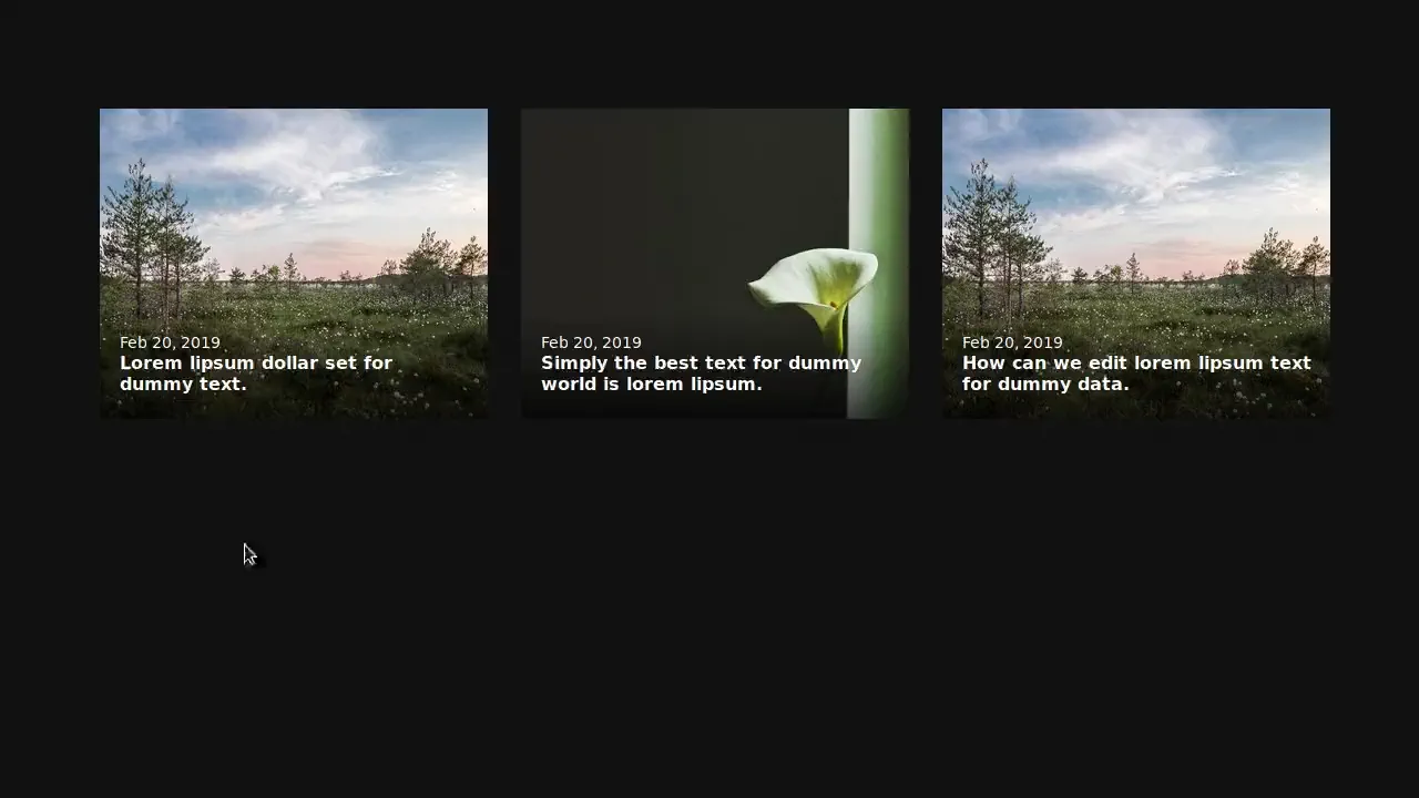
CSS Thumbnail Text Hover
Three cards aligned with flexbox, each with an image and text overlay. On hover, the description smoothly expands — max-height and opacity animate. The overlay gradient shifts to keep text readable. No JavaScript — just CSS transitions.
See the Pen CSS Thumbnail Text Hover.
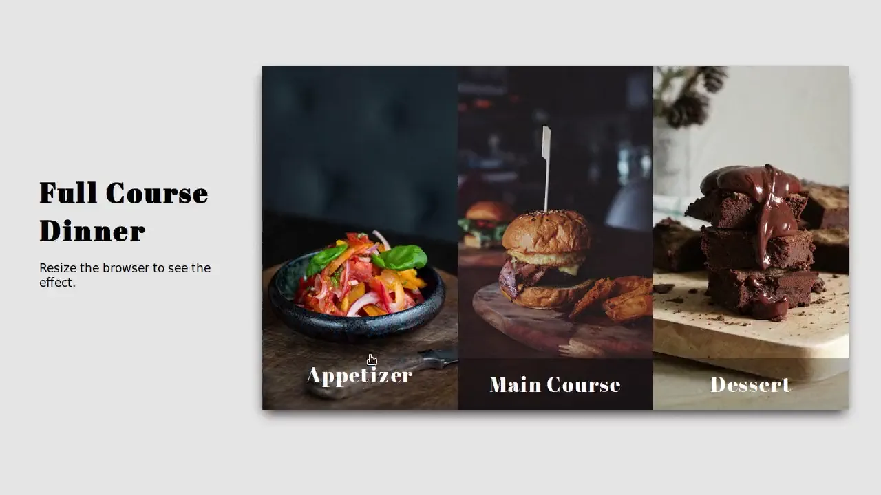
Respopnsive Images with Thumbnails
Three flex items with responsive images via <picture> — different crops per breakpoint. On hover, the overlay smoothly expands to full height, the background darkens, and the text stays visible. The grid stacks vertically on narrow screens; object‑fit and object‑position handle image cropping. Pure CSS, no scripts.
See the Pen Respopnsive Images with Thumbnails.
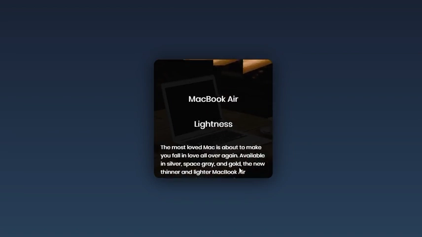
Split Image Thumbnail
A card with an image split into four vertical strips. On hover, the strips slide up with staggered delays, revealing a text block that slides in from the bottom. The animation uses CSS transitions; the split background is achieved by positioning separate spans. Simple structure: container, strips, and content.
See the Pen Split Image Thumbnail.
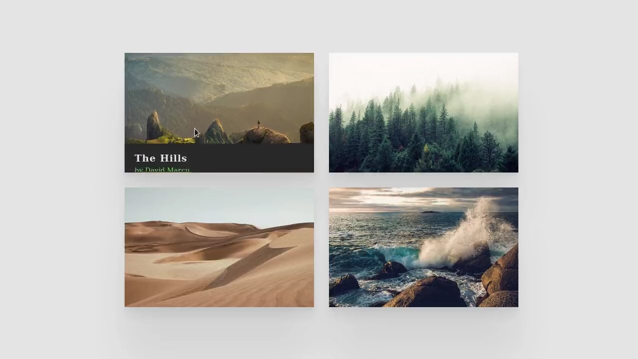
Thumbnail Hover Interaction
Four image cards with sliding info panels on hover. Each panel slides in from a different side (bottom, top, left, right) matching the card’s style. The background also shifts slightly for extra effect. Responsive grid uses CSS Grid. No JavaScript — just transitions and transforms.
See the Pen Thumbnail Hover Interaction.

Card Animation - Demon Slayer
Three character cards with diagonal colour strips built with absolute positioning and rotate transforms. On hover, the strips slide in, the card smoothly scales down, and the text fades in. All animations are pure CSS, no JavaScript. Colour schemes reinforce each character’s identity.
See the Pen Card Animation - Demon Slayer.

CSS Image Hover Effects
Four image cards showcase different hover effects: scaling, text fade‑in, background shift, and colour change. Each effect is handled by a dedicated CSS class. No JavaScript — just transitions and transforms.
See the Pen CSS Image Hover Effects.
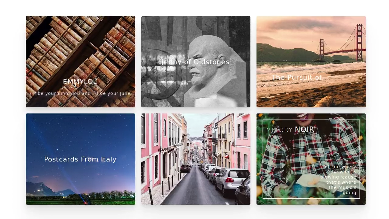
CSS Thumbnail Hover Effects
Six image cards with distinct hover effects — zoom, frame reveal, text slide, blur overlay, vintage gradient, and scale‑out. Each effect is isolated in its own modifier class; animations rely on transforms and transitions. No JavaScript — just styles and predictable behaviour.
See the Pen CSS Thumbnail Hover Effects.

Rounded Thumbnails Portfolio
An interactive CSS image cluster gallery. Each .item has a tilted, circular thumbnail image (border-radius: 50%). Hovering over a card smoothly rotates it to 0, removes the rounding to expand the image into a rectangle, and transitions open a hidden, folded side information block (.info) using rotation offsets.
See the Pen Rounded Thumbnails Portfolio.

Artist Radio Thumbnails
A clean, dark-themed music artist card design. The central round portrait is accented by a pair of concentric, semi-transparent rings (.artist__ring) styled with gradient backgrounds and left-right box shadows to simulate a glowing glass bezel. An duplicate image layer blurred using filter: blur(40px) provides an ambient backdrop.
See the Pen Artist Radio Thumbnails.

Pure CSS Perfect Square Thumbnails Gallery
A clean, responsive CSS image gallery displaying perfectly square thumbnails. Sizing uses relative width percentages and a padded padding-bottom wrapper to force a 1:1 square aspect ratio. Hovering over a card slides a translucent dark caption overlay into place and projects a deep, realistic shadow backdrop.
See the Pen Pure CSS Perfect Square Thumbnails Gallery.

Thumbnail Hover
An elegant, multi-column CSS grid portfolio card layout. Each card .item has a solid blue background and handles a dramatic hover animation. A rotated :after pseudo-element slides diagonally across the frame to cover the zooming image, while the white descriptive metadata .item-text fades and slides into place.
See the Pen Thumbnail Hover.
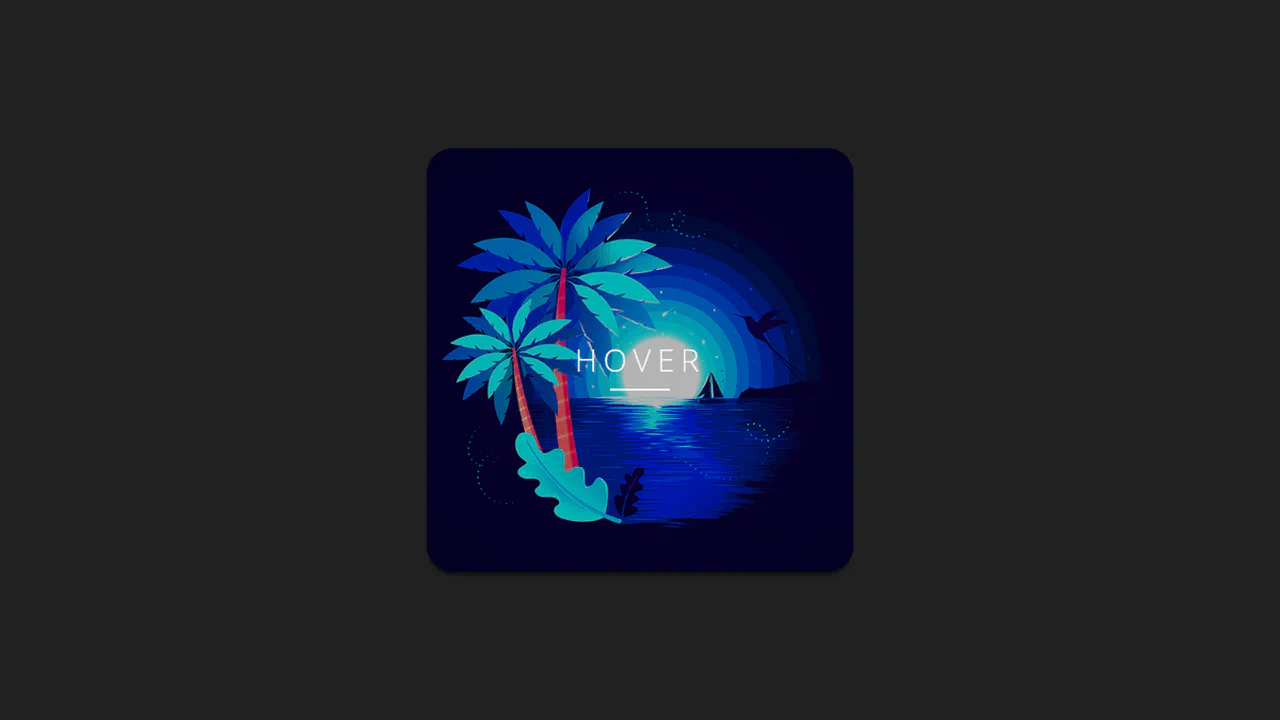
CSS Responsive Thumbnail
A clean, interactive portfolio card featuring nested CSS flexbox layouts and intricate hover transitions. On hover, the main image scales down to scale(1) from 1.2, the centered “Hover” label flies upward, and the white bottom footer panel smoothly expands (flex-grow: 1) to reveal the sliding caption.
See the Pen CSS Responsive Thumbnail.
flex- thumbnails
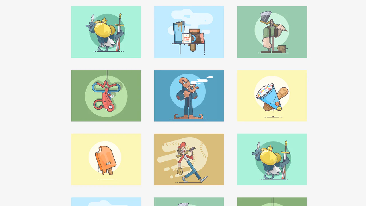
A clean, responsive thumbnail gallery built using inline-block list elements. By using relative width percentages and CSS media queries, the grid adjusts dynamically, displaying 2 columns on mobile, 3 columns on medium screens, and 4 columns on large desktop viewports. The layout utilizes text-align rules for centering.
See the Pen flex- thumbnails.
Thumbnail Hover
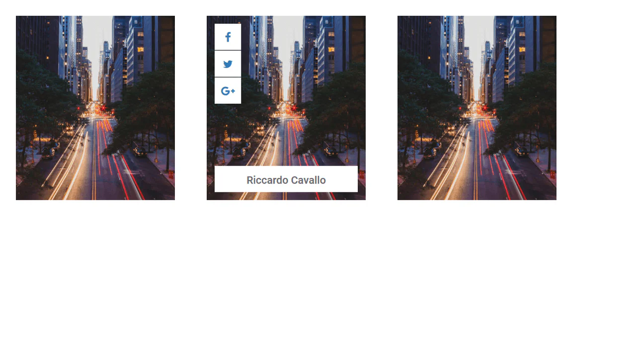
An interactive profile card layout featuring dramatic 3D swing-fold hover animations. Built with pure CSS, the cards use perspective to define 3D spaces. Sibling .SocialIcons and .profileInfo boxes use opposing axis rotations (rotateY and rotatex) to smoothly unfold like origami flaps when hovered.
See the Pen Thumbnail Hover.

Thumbnail Presentation with CSS Grid
An advanced CSS Grid editorial magazine layout. Using responsive picture elements and custom media queries, the grid adjusts dynamically across viewports. On larger screens, specific cards use absolute pseudo-elements styled with angled border limits to crop triangular corner notches, creating an interlocking geometric frame.
See the Pen Thumbnail Presentation with CSS Grid.

Document Thumbnail with CSS Custom Property
A clever pure CSS mockup displaying a folded-corner document thumbnail. It uses a single hidden <img> and inline CSS variables (--thumb-url) to draw the paper fold dynamically. The main .document background renders the top-right diagonal fold, while :before and :after map the split image segments. Hovering displays a striped outer border.
See the Pen Document Thumbnail with CSS Custom Property.
Fotobook Album Thumbnail
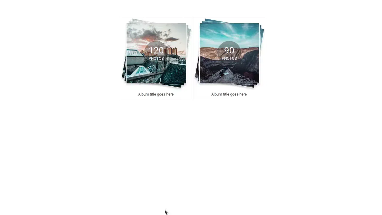
An interactive album thumbnail widget featuring a scattered-pile hover effect. In its default state, three stacked <img> elements are offset and rotated (rotateZ(10deg) and rotateZ(4deg)) to look like a loose pile of photos. Hovering over the card neatly aligns all the images back to zero degrees with smooth transitions.
See the Pen Fotobook Album Thumbnail.
Pure CSS Thumbnail Hover Effect
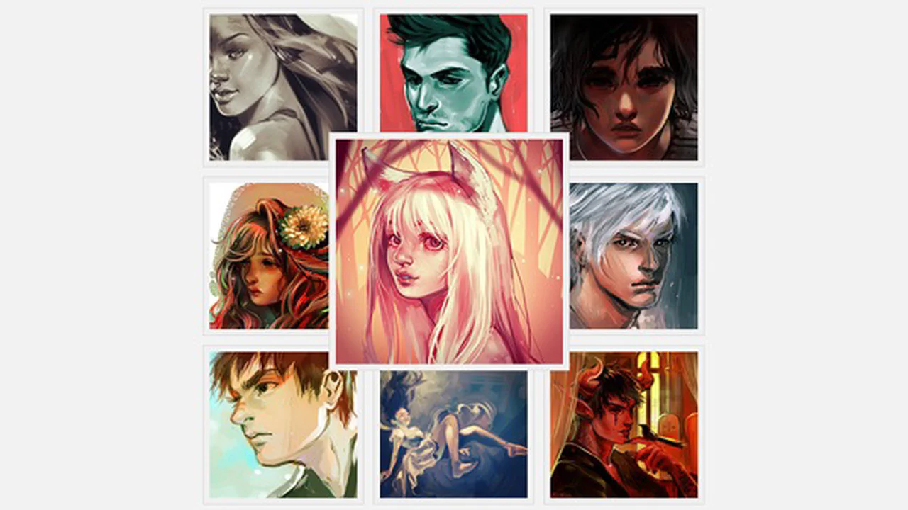
A clean, responsive grid of image thumbnails featuring an interactive pure CSS zoom-on-hover effect. When hovered, the targeted image element dynamically expands its dimensions and uses negative margins to shift its absolute offset boundaries. This smoothly pops the zoomed image over its neighbors via an increased z-index layer.
See the Pen Pure CSS Thumbnail Hover Effect.