
Misc
The Problem With Our Maps

Maps shape our understanding of the world—and in an increasingly interconnected and global economy, this geographic knowledge is more important than ever.
Unfortunately, billions of people around the world have a skewed perception of the true size of countries thanks to a cartographic technique called the Mercator projection. Used just about everywhere, from classroom wall maps to navigation apps, the Mercator projection is the way most of humanity recognizes the position and size of Earth’s continents.
The Mercator Projection
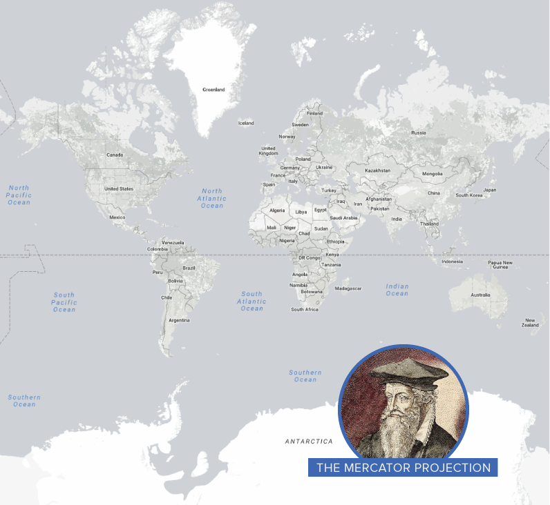
In 1569, the great cartographer, Gerardus Mercator, created a revolutionary new map based on a cylindrical projection. The new map was well-suited to nautical navigation since every line on the sphere is a constant course, or loxodrome. In modern times, this is particularly useful since the Earth can be depicted in a seamless way in online mapping applications.
That said, in this projection style, the sizes of landmasses become increasingly distorted the further away from the equator they get. One trade-off for the utility of Mercator’s map is that it pumps up the sizes of Europe and North America. Visually speaking, Canada and Russia appear to take up approximately 25% of the Earth’s landmass, when in reality they occupy a mere 5%. When Antarctica is excluded (as it often is), Canada and Russia’s visual share of landmass jumps to about 40%.
Canada is the second largest country in the world, but not by much. Here is an “at scale” look at Canada, the United States, and Mexico.
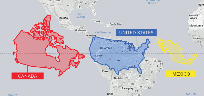
Africa, South Asia, and South America all appear much smaller in relation to countries further from the equator.
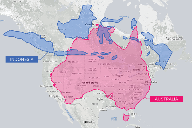
And from a North American perspective, countries such as Australia and Indonesia appear much smaller than they actually are. Comparing the landmasses on the same latitude as Canada helps put sizes into perspective.
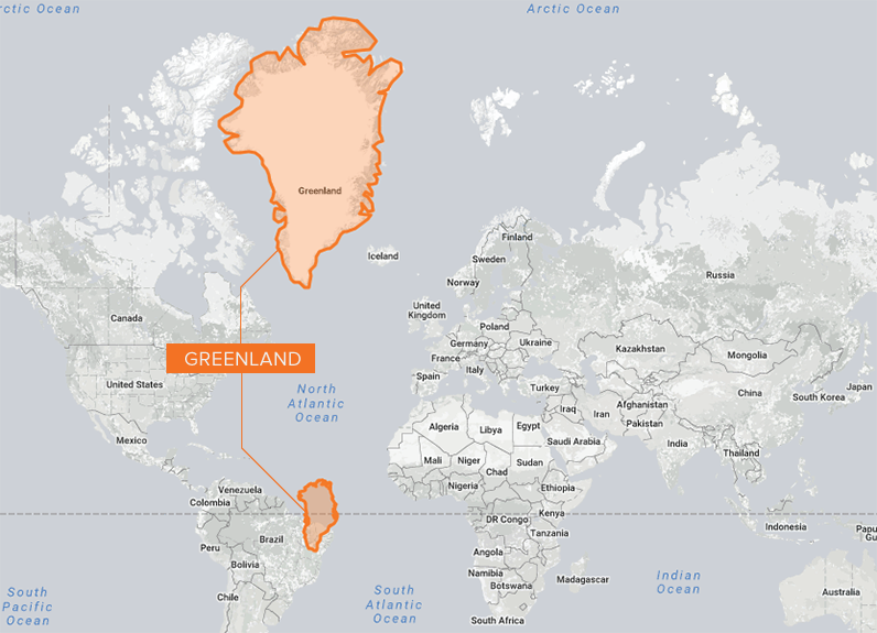
Greenland is the world’s largest island, but looking at its hyper-exaggerated depiction in the map below, you’d be forgiven for wondering why it isn’t a stand-alone continent. In reality, Greenland is about fourteen times smaller than Africa.
Is Bigger Better?
Though Mercator’s map was never intended for use as the default wall map in schools around the world, it has shaped the worldviews of billions of people. Critics of the map—and similar projections—suggest that distortion reinforces a sense of colonialist superiority. As well, the amount of territory a country occupies is often correlated with power and access to natural resources, and map distortions can have the effect of inadvertently diminishing nations closer to the equator.
In our society we unconsciously equate size with importance and even power. – Salvatore Natoli, Educational Affairs Director, AAG
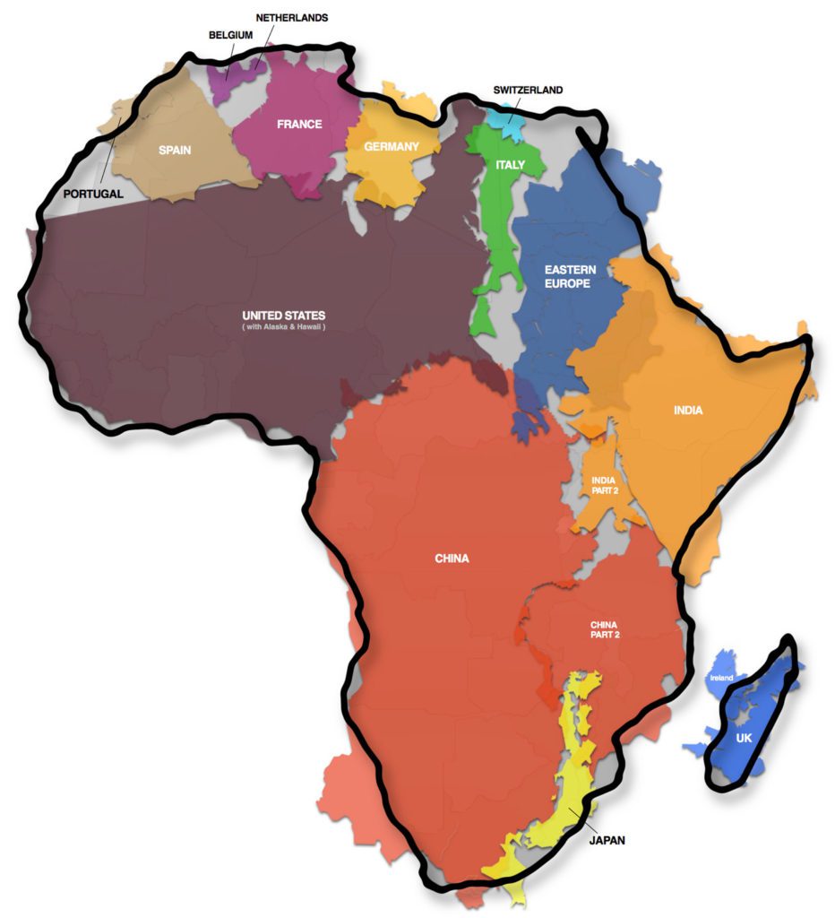
A prime example of this argument is the “True Size of Africa” graphic, which demonstrated to millions of people just how big the continent is.
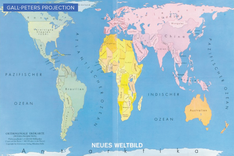
Growing awareness of map distortion is translating into concrete change. Boston public schools, for example, recently switched to the Gall-Peters projection, which more accurately depicts the true size of landmasses.
As well, Google, whose map app is used by approximately one billion people per month, took the bold step of using different projections for different purposes in 2018. The Earth is depicted as a globe at further zoom levels, sidestepping map projection issues completely and displaying the world as it actually is: round.
The Road to Equal-Area Mapping
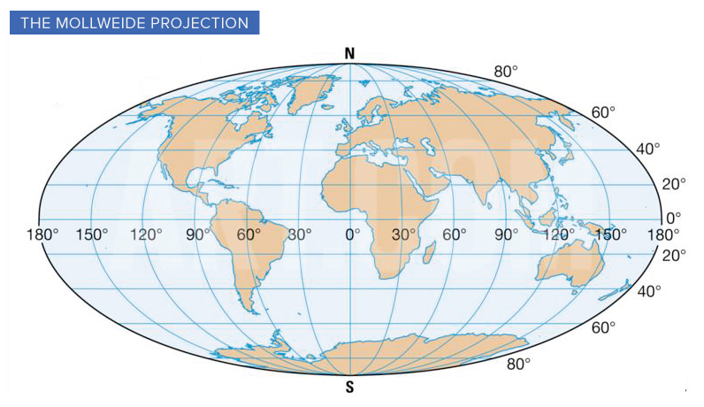
In 1805, mathematician and astronomer, Karl Mollweide, created a namesake projection that trades accuracy of angles and shape for accuracy of proportion. The Mollweide projection has inspired many other attempts at a user-friendly equal area map.
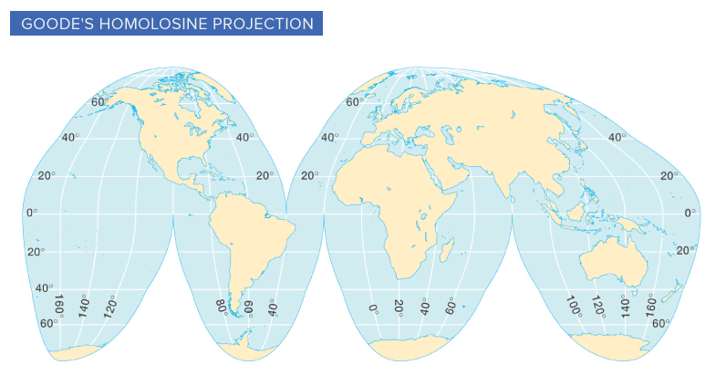
John Paul Goode’s attempt, known as the Goode Homolosine Projection, took this concept a step further by adding interruptions at strategic locations to help reduce the distortion of continents. The resulting shape is sometimes referred to as an “orange peel map”.
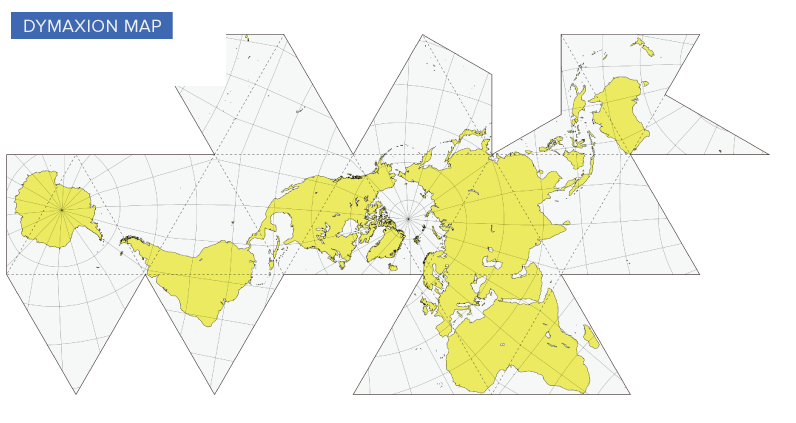
Another evolution in cartography was the Dymaxion map, invented by Buckminster Fuller and patented in 1946. In this version, the continents are no longer in their familiar positions—however, there is more spacial fidelity than in previous projection methods. We’re able to see the true proportions of Africa, Northern Canada, Antarctica, and other distortion hot spots.
The Dymaxion map wasn’t created for purely practical purposes. Fuller believed that humans would be better equipped to address global challenges if they were given a way to visualize the Earth’s continents in a contiguous manner.
The AuthaGraph Map
Using a new map-making method called AuthaGraph, Japanese architect, Hajime Narukawa, may have created the most accurate map of the world yet. AuthaGraph divides the globe into 96 triangles, transfers them to a tetrahedron and unfolds into a rectangle.
The end result? Landmasses and seas are more accurately proportioned than in traditional projections.
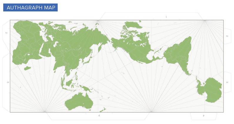
The biggest downfall of the AuthaGraph map is that longitude and latitude lines are no longer a tidy grid. As well, continents on the map are repositioned in a way that will be unfamiliar to a population that is already geographically challenged.
That said, depicting our round world on a flat surface will always come with some trade-offs. As demand grows for a true equal-area map, it will be exciting to see what the next generation of map projections have to offer.
Map It Yourself
Looking to learn more about maps and map projections? This fantastic tool, created by Florian Ledermann, allows users to take a vast selection of projection styles, and modify them in different ways. This hands-on approach is a fun way to learn how the shape of landmasses shift as the projection changes.


Misc
The Race to Build the World’s Tallest Skyscraper
The U.S. may have been the birthplace of the skyscraper, but the tallest buildings since 2000 have all been in Asia.


The Race to Build the World’s Tallest Skyscraper
See visuals like this from many other data creators on our Voronoi app. Download it for free on iOS or Android and discover incredible data-driven charts from a variety of trusted sources.
Key Takeaways
- The world’s tallest building has grown from 700 feet in 1909 to 2,717 feet today.
- New York dominated the skyscraper race for much of the 20th century.
- Since 1998, the world’s tallest building has been located in Asia.
In 1909, New York’s Metropolitan Life Tower became the tallest building in the world at 700 feet. Just over a century later, Dubai’s Burj Khalifa reached 2,717 feet, nearly four times taller.
This timeline shows every building to hold the title of world’s tallest since 1909, using the most recent data available from the Council on Vertical Urbanism (CVU).
Per CVU methodology, buildings must include floors, excluding structures such as Toronto’s CN Tower and the Stratosphere in Las Vegas. Heights are measured to the architectural top, including spires but excluding detachable antennae, flagpoles, or signs.
New York’s Skyscraper Boom
For most of the 20th century, the U.S. housed the world’s tallest building. New York in particular held the crown, with the Big Apple producing back-to-back skyscraper marvels from 1909 to 1972.
The Metropolitan Life Tower, constructed in New York’s Flatiron District, topped out at 700 feet in 1909. Within a few years, it would be surpassed by Tribeca’s Woolworth Building (792 feet), which itself lost the title by the late 1920s with the arrival of the Art Deco icon known as the Chrysler Building (1,046 feet).
The table below lists the world’s tallest buildings between 1909 and 2026.
| Year Built | Building | City | Height |
|---|---|---|---|
| 1909 | Metropolitan Life Tower | 🇺🇸 New York | 213 m / 700 ft |
| 1913 | Woolworth Building | 🇺🇸 New York | 241 m / 792 ft |
| 1930 | Chrysler Building | 🇺🇸 New York | 319 m / 1,046 ft |
| 1931 | Empire State Building | 🇺🇸 New York | 381 m / 1,250 ft |
| 1972 | One World Trade Center | 🇺🇸 New York | 417 m / 1,368 ft |
| 1974 | Willis Tower | 🇺🇸 Chicago | 442 m / 1,451 ft |
| 1998 | Petronas Towers | 🇲🇾 Kuala Lumpur | 452 m / 1,483 ft |
| 2004 | TAIPEI 101 | 🇹🇼 Taipei | 508 m / 1,667 ft |
| 2010 | Burj Khalifa | 🇦🇪 Dubai | 828 m / 2,717 ft |
The Chrysler Building, found in East Midtown, opened in 1930 as the world’s first supertall skyscraper. At the time, developers were racing to build the world’s tallest building, and the Chrysler Building famously beat rival 40 Wall Street by secretly assembling a 125-foot spire inside the tower before raising it into place after 40 Wall Street was completed.
The Chrysler Building’s victory was short-lived. In 1931, the Empire State Building (1,250 feet) opened and promptly became the world’s tallest building by a significant margin. However, Depression-era economic slowdowns caused abysmal tenancy rates in the new supertall skyscraper, which was popularly derided as the “Empty State Building” in the mid-1930s.
The Twin Towers and Chicago’s Resurgence
The Empire State Building maintained its position until the completion of the Twin Towers in New York’s Financial District in 1972. At that time, One World Trade Center, commonly known as the North Tower, took the title at over 1,368 feet, standing a few feet taller than its South Tower counterpart. The two towers would eventually be destroyed in the September 11 attacks of 2001.
Chicago, the birthplace of the modern skyscraper, reemerged as a dominant player in tall buildings with the 1974 opening of the Sears Tower (1,451 feet), named for the retailer headquartered there. The building held the title of world’s tallest for nearly a quarter-century, although it was renamed in the 2000s after British insurance broker Willis Group Holdings.
In the late 1990s, the Petronas Towers opened in the Malaysian capital of Kuala Lumpur at 1,483 feet, marking the first time in decades that the world’s tallest building was not located in the United States. Similar to the Chrysler Building nearly 70 years earlier, the Petronas Towers’ spires made the difference, much to Chicagoans’ dismay.
How Asia Took Over the Skyscraper Race
Since the Petronas Towers, the world’s tallest building has remained in Asia, albeit in different regions. TAIPEI 101, in the Taiwanese capital, held the title following its completion in 2004 at 1,667 feet. A few years later, Dubai’s Burj Khalifa opened at a staggering 2,717 feet tall.
The Burj Khalifa is over 60% taller than TAIPEI 101 and nearly four times taller than the Metropolitan Life Tower, which opened a century earlier. Its long reign as the world’s tallest building could come to an end in the coming years, however, as another Middle Eastern tower nears completion in nearby Saudi Arabia.
The Jeddah Tower, which will be the world’s first building to surpass one kilometer in height, is projected to open as early as 2028. Construction began in 2013 but has been plagued by delays and pauses, only passing the 100th floor as of April 2026. When completed, this megatall skyscraper is expected to stand at 3,300 feet, making it over 500 feet taller than the Burj Khalifa.
Learn More on the Voronoi App 
Where are the world’s tallest buildings concentrated today? Find out with The World’s Tallest Buildings in 2024 on Voronoi.Use This Visualization
Maps
Mapped: The Second Most-Spoken Language by State
Spanish is the second most-spoken language in 47 states, with Alaska, Hawaii, and Maine standing out for unique cultural histories.


Mapped: The Second Most-Spoken Language by State
See visuals like this from many other data creators on our Voronoi app. Download it for free on iOS or Android and discover data-driven charts from a variety of trusted sources.
Key Takeaways
- Spanish is the second most-spoken language in 47 states and Washington, D.C.
- Alaska, Hawaii, and Maine are the only exceptions, reflecting Indigenous, Pacific Islander, and French-speaking heritage.
- California alone has more than 10.5 million Spanish speakers, the largest total in the country.
Spanish is the second most-spoken language in nearly every U.S. state, revealing how widely the language is spoken far beyond the Southwest and border regions.
This map shows the second most-spoken language across America using U.S. Census Bureau data on people age five and older who speak a language other than English at home.
While Spanish dominates almost the entire map, Alaska, Hawaii, and Maine stand out with distinct linguistic histories shaped by Indigenous communities, Pacific migration, and French-speaking heritage.
Spanish Is the Clear No. 2 Language Nationwide
Spanish is the second most-spoken language in 47 states and Washington, D.C.
| State | #2 Language | Speakers |
|---|---|---|
| Alabama | Spanish | 187,711 |
| Alaska | Other Native (North America) | 24,996 |
| Arizona | Spanish | 1,344,168 |
| Arkansas | Spanish | 176,128 |
| California | Spanish | 10,513,931 |
| Colorado | Spanish | 613,290 |
| Connecticut | Spanish | 439,949 |
| Delaware | Spanish | 76,483 |
| District of Columbia | Spanish | 60,423 |
| Florida | Spanish | 4,801,213 |
| Georgia | Spanish | 890,264 |
| Hawaii | Ilocano/Samoan/Hawaiian & Austronesian | 117,184 |
| Idaho | Spanish | 147,208 |
| Illinois | Spanish | 1,681,635 |
| Indiana | Spanish | 353,025 |
| Iowa | Spanish | 140,635 |
| Kansas | Spanish | 223,357 |
| Kentucky | Spanish | 146,717 |
| Louisiana | Spanish | 201,847 |
| Maine | French | 30,737 |
| Maryland | Spanish | 562,050 |
| Massachusetts | Spanish | 646,141 |
| Michigan | Spanish | 298,830 |
| Minnesota | Spanish | 227,636 |
| Mississippi | Spanish | 73,687 |
| Missouri | Spanish | 169,451 |
| Montana | Spanish | 15,285 |
| Nebraska | Spanish | 156,178 |
| Nevada | Spanish | 600,083 |
| New Hampshire | Spanish | 34,831 |
| New Jersey | Spanish | 1,514,828 |
| New Mexico | Spanish | 491,462 |
| New York | Spanish | 2,772,893 |
| North Carolina | Spanish | 876,033 |
| North Dakota | Spanish | 16,618 |
| Ohio | Spanish | 294,716 |
| Oklahoma | Spanish | 305,840 |
| Oregon | Spanish | 365,276 |
| Pennsylvania | Spanish | 686,810 |
| Rhode Island | Spanish | 141,693 |
| South Carolina | Spanish | 262,999 |
| South Dakota | Spanish | 22,332 |
| Tennessee | Spanish | 348,679 |
| Texas | Spanish | 7,932,949 |
| Utah | Spanish | 345,046 |
| Vermont | Spanish | 8,063 |
| Virginia | Spanish | 649,137 |
| Washington | Spanish | 665,921 |
| West Virginia | Spanish | 19,863 |
| Wisconsin | Spanish | 276,721 |
| Wyoming | Spanish | 26,551 |
California has by far the largest Spanish-speaking population after English, with more than 10.5 million people speaking Spanish at home. Texas follows with nearly 7.9 million, while Florida has 4.8 million.
Together, California and Texas alone account for more Spanish speakers than the populations of many countries. The data highlights how Spanish has become a truly national language, spoken widely across the South, Midwest, Northeast, and West Coast.
New York, Illinois, New Jersey, and Arizona also each have more than one million Spanish speakers.
Three States Break the Pattern
Alaska, Hawaii, and Maine are the only states where Spanish is not the second most-spoken language.
In Alaska, the leading language category after English is Alaska Native Languages, with nearly 25,000 speakers.
In Hawaii, Ilocano, Samoan, Hawaiian, and other Austronesian languages lead with more than 117,000 speakers. These languages are linked to Filipino, Samoan, Native Hawaiian, and broader Pacific Islander communities.
Maine’s second language is French, with more than 30,000 speakers. This reflects French-speaking heritage along the Quebec border and the long history of Francophone communities in northern New England.
The Largest Spanish-Speaking States
The biggest Spanish-speaking populations are concentrated in large states and major migration hubs. California, Texas, and Florida alone account for more than 23 million Spanish speakers.
Other major centers include New York, with 2.8 million Spanish speakers, and Illinois, with 1.7 million. The map shows that Spanish is no longer concentrated in a handful of border states. It is now the clear second language across almost the entire U.S., with only three states reflecting different regional histories.
Learn More on the Voronoi App
If you enjoyed today’s post, check out The World’s Most Spoken Languages by Total Speakers on Voronoi.
-

 Misc3 weeks ago
Ranked: The World’s Most Powerful Passports in 2026
-

 Economy5 days ago
Ranked: The 30 Highest-Paying Jobs in America
-

 Maps1 week ago
Mapped: America’s Most-Spoken Languages After English and Spanish
-

 Green1 week ago
Ranked: Countries With the Highest Water Use Per Person
-

 Economy4 days ago
Ranked: The World’s Biggest Economies by 2031
-

 Demographics1 week ago
The Fertility Rate of Every Country in the World
-

 Politics2 days ago
Ranked: The World’s Most & Least Free Countries
-

 Education4 weeks ago
Ranked: America’s Top Non-Ivy League Universities