background cover
background cover

KendoReact

Roadmap

Coming in 2025

Here is the timeline for our upcoming major releases this year:

  • 2025 Q1 Release - Month: February
  • 2025 Q2 Release - Month: May
  • 2025 Q3 Release - Month: August
  • 2025 Q4 Release - Month: November

In addition to the major releases, we will continue to deliver incremental improvements through our 6-week release cadence.

 Our team is excited to announce the roadmap for new components and features on our list for release. Many of these items will be released as part of the Q1 February release and others will come shortly after. 

Your feedback is a huge factor in these plans. After all, our mission is to make your life easier. We encourage you to keep sharing your thoughts, plans, and ideas for what next you would like to see developed in the Kendo component library in our dedicated Feedback portal.  

The items below are what we feel comfortable announcing, but there is more on our radar. Check back periodically for updates.

KendoReact

More Grid Improvements

Improvement

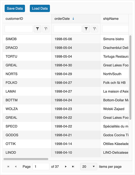
The upcoming Grid improvements on the roadmap focus on enhancing usability, performance, and data handling capabilities. Key enhancements include built-in state management and improved virtualisation, which is now turned On by default and working together with the Pagination. All these lead to boosted performance and developer experience. Other changes include column chooser for managing hidden columns, multi-column filtering for more refined data selection. Additionally, OData support and a dedicated DataSource component will enhance integration with external data sources. 


AI-Powered Grid Features

New feature

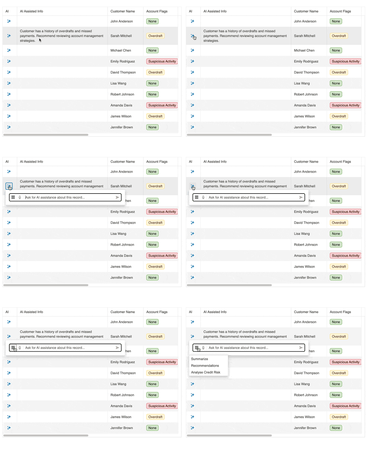
We’re introducing AI-Powered Grid Features - a suite of intelligent enhancements that transform dense data tables into intuitive, conversational experiences. Without changing your existing markup, you’ll be able to issue plain-language commands - typed or spoken - to sort, filter, or spotlight key records on the fly. 

By introducing AI-Powered Grid Features, we aim to reduce user friction when exploring large datasets, accelerate insight generation through conversational interactions, and make the Grid component a more intuitive and self-guided way to explore data - empowering both technical and non-technical users to discover value without wrestling with complex filters or manual summaries. 


Chat/AI Prompt Component Enhancements

New feature

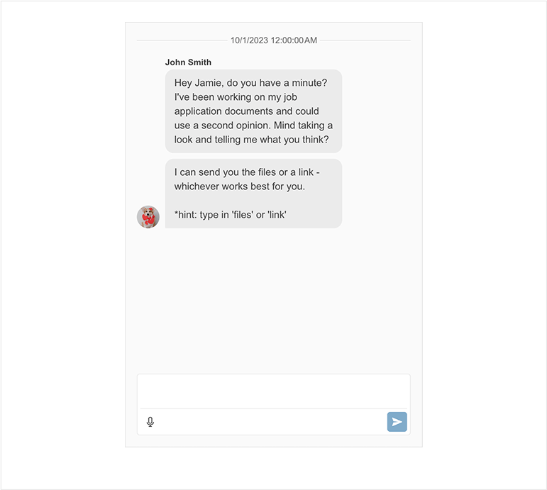
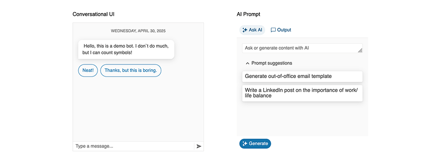
As AI-driven interactions become the norm, we’re advancing our Conversational UI Component to support the next generation of real-time, intelligent communication. This revamp introduces a modernized design and key feature upgrades that enable both human-to-human and human-to-AI interactions through a flexible and extensible chat interface. New enhancements include predefined templates for in-chat attachments, structured message and attachment actions, improved link and message styling, and a redesigned header element that centralizes chat context and navigation. The message input area now supports a more expressive TextArea with built-in action adornments like emoji or file upload. Additionally, speech-to-text integration makes the chat experience more accessible.

For AI use cases, the new AI Prompt mode optimizes LLM-based conversations, offering support for contextual memory through events, formatted AI responses (e.g., code, markdown, HTML), response interruption via a stop button, token tracking, and styled quick suggestions for AI prompts like “Summarize” or “Fix grammar.”

thumbnail

Inline AI Prompt Component

New component

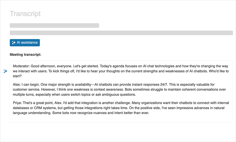
Adding a brand-new Inline AI Prompt component will enable developers to embed lightweight, context-aware AI interactions directly within forms, editors, and data grids. This component provides a seamless input experience where users can invoke AI suggestions inline—without disrupting their workflow—using predefined triggers or natural language prompts. Developers will benefit from flexible API integration with any LLM backend and customizable prompt templates. Designed for fast rendering and low memory footprint, this component helps accelerate productivity features such as smart autocompletion, contextual explanations, content rewriting, fixing grammar, translating text, polishing formatting, and much more inside any business application.


Input OTP Component for Seamless Two-Factor Authentication

New component

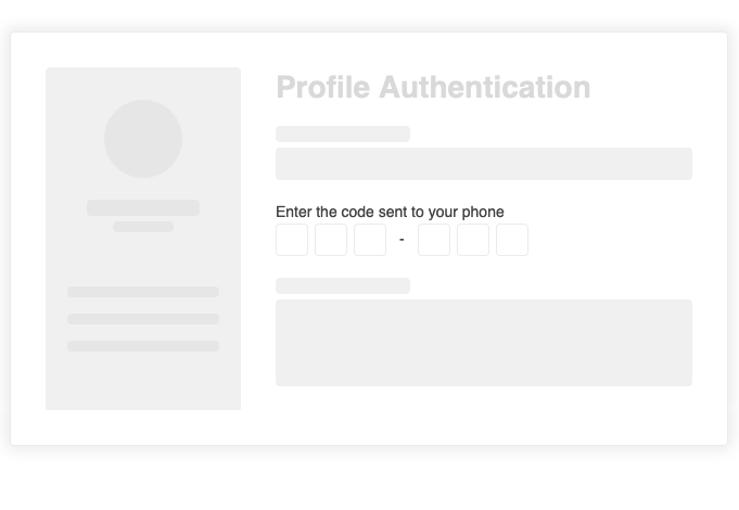
In an era where digital security is paramount, our new Input OTP component is designed to simplify and enhance two-factor authentication (2FA) workflows. This dedicated component addresses the growing need for a secure, user-friendly solution to OTP input, combining advanced customization, intuitive interactions, and rigorous security measures. With features like configurable input lengths, automatic focus shift, built-in validation, and accessibility support, the Input OTP component ensures a smooth and secure user experience. Fully customizable to fit any design system, it supports theming, localization, and integration with form validation libraries. Whether you're building login flows or verification steps, this component empowers developers to deliver robust, secure applications with ease.


thumbnail

New Speech-to-Text Button Component

New component

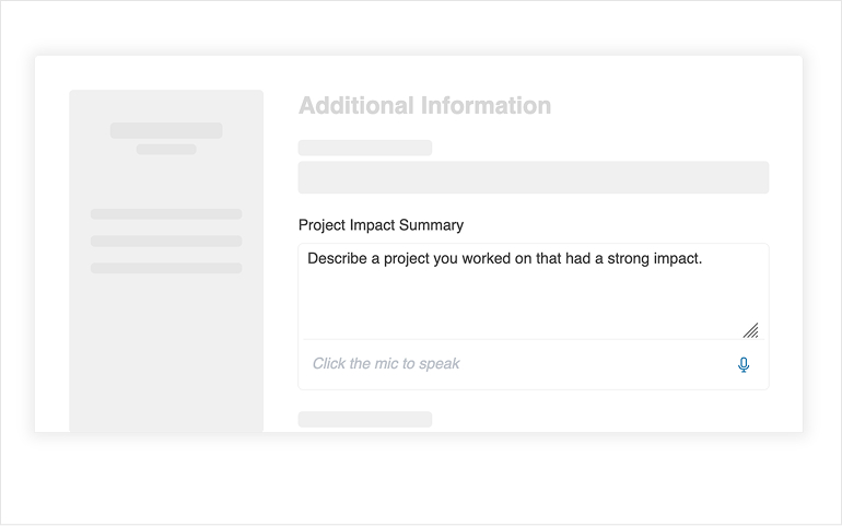
We are introducing a new Speech-to-Text Button component: a reusable UI element that integrates voice input capabilities into web applications with minimal effort. Voice input is becoming an important interaction method in modern web applications, improving accessibility, increasing productivity, and allowing hands-free workflows. Designed to fit seamlessly into forms, chat inputs, search fields, or any prompt interface, it enables users to dictate text or prompt in one click and allows developers to customize behavior, and styling as necessary. 

AI Prompt Component Improvements

Improvement

The AI Prompt component will be enhanced with new capabilities aimed at improving user interaction and output control. A new Response Formatting feature will introduce structured output handling through a set of customizable events, enabling seamless integration with third-party libraries for tailored response presentation. Additionally, the component will integrate with the upcoming  Speech-to-Text component, allowing users to input prompts via voice for a more natural and accessible experience. A Stop Response feature will also be introduced within the text area, giving users the ability to interrupt response generation in real time, offering greater control and responsiveness during AI interactions. 


thumbnail

Responsiveness and Adaptiveness for Ultimate Usability

Improvement

We’re undertaking a comprehensive initiative to establish Kendo UI as the most adaptive and responsive component libraries on the market. While our components already support responsiveness and adaptiveness, this effort is a complete reevaluation and enhancement designed to set a new standard. Over the course of 2025, we will roll out significant updates across our library, including adaptive improvements to core components like the Grid, Toolbar, and Forms.

 Highlights of the initiative include:

  • Adaptive enhancements to Toolbar, Pager, and Popup components, setting the foundation for more flexible layouts.
  • Transforming the Grid with new data presentation modes, improved mobile usability, and adaptive side panels.
  • Advancing form capabilities with multi-column layouts, input enhancements, and full responsiveness.
  • Adaptive updates for other major components

With emphasis on developer experience, and a commitment to cutting-edge standards, this initiative ensures developers can create applications that adapt seamlessly to any device or user need—delivering a best-in-class experience.


thumbnail

Codemods CLI Tool For Assisted Migration

New feature

The Codemods CLI tool is designed to streamline Kendo version migrations on breaking changes, addressing key customer pain points and enhancing overall experience. By automating code transformations, including syntax updates, CSS variable restructuring, and module adjustments, it significantly reduces manual effort and the risk of errors. A dry-run mode and detailed migration reports ensure transparency and safety, allowing developers to preview changes before applying them. Supporting multiple legacy versions, the tool provides a seamless upgrade path, encouraging faster adoption of the latest versions while reducing support costs. Additionally, this initiative reinforces technical leadership, positioning Kendo UI as a developer-friendly, future-proof solution that balances innovation with ease of migration.


thumbnail

Adopting Fluent 2

New feature

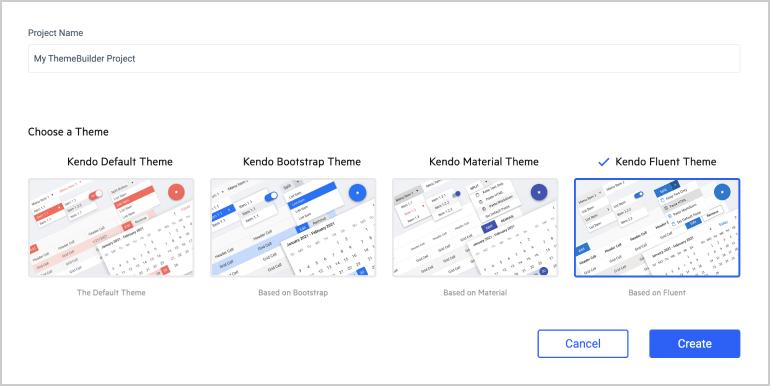
We’re excited to announce the upgrade of our Fluent theme to Fluent 2, bringing a refreshed, modern design language that aligns with Microsoft's latest Fluent design system. Fluent 2 introduces a cleaner aesthetic with softer corners, improved typography, and consistent padding, all aimed at enhancing usability and visual clarity. This update ensures better accessibility, dark mode fidelity, and seamless integration with Microsoft's ecosystem of apps. By adopting Fluent 2, our UI components now deliver a more intuitive, elegant, and future-proof user experience—empowering developers to build interfaces that feel native to Windows 11 and beyond.


thumbnail

New Demo App - Personal Finance

New feature

The new personal finance demo app showcases the capabilities of KendoReact in building modern, data-driven applications with an intuitive user experience. Designed to demonstrate real-world financial tracking and budgeting, the app features interactive charts, data grids, and form components for managing expenses, setting budgets, and visualizing financial trends. With a focus on usability and performance, it highlights responsive design, real-time data updates, and smooth interactions. This demo serves as a practical reference for developers, illustrating best practices in UI/UX design, state management, and integration with external data sources. By providing a hands-on example, the app enhances customer engagement, encourages adoption of Kendo UI components, and reinforces the library’s suitability for financial and enterprise applications.


thumbnail

Focus on Feedback from Our Feedback Portal

Improvement

We prioritize our customers' feedback and are committed to incorporating their top-rated feature requests. By actively listening to your suggestions and needs through our Feedback Portal, we aim to provide enhancements that directly address your most pressing requirements. This customer-centric approach ensures that our product evolves in ways that are most beneficial to you, enhancing your development experience and satisfaction.

thumbnail

Migrating Class Components to Embrace Modern React Features

Improvement

As part of our ongoing efforts to keep our components up-to-date with the latest React advancements, we are migrating key class components from React 16 to functional components. This migration enables us and our customers to fully leverage new React features post-React 16, while ensuring that upgrading does not break existing applications. We’ve already completed the migration of several components in 2024, including Grid, Button, Toolbar, Pager, Input, and more. This move ensures compatibility with future versions of React, enhances performance, and empowers developers to take full advantage of the latest React capabilities. We plan to continue this migration throughout 2025, further modernizing our component library.


No items found.