UI for Blazor
Blazor ValidationSummary
- The Blazor Validation Summary groups together all issues with the data in one place and serves as an error report.
- Part of the Telerik UI for Blazor library along with 120+ professionally-designed UI components.
- Includes support, documentation, demos, virtual classrooms, Visual Studio Code Extensions and more!

-
Validation Summary
The Validation Summary component groups together all issues with your form data in one place. It has the benefit of acting like a report of errors. Putting all messages in the same place makes it easy to identify that something went wrong (because the user sees a big red blob).
Telerik UI for Blazor ValidationSummary -
Templates
Control the appearance of your error messages by providing a template to the component. Modify the visual style to match the rest of the application and make sure the errors are easily noticeable and focus the user's attention.
ValidationSummary Templates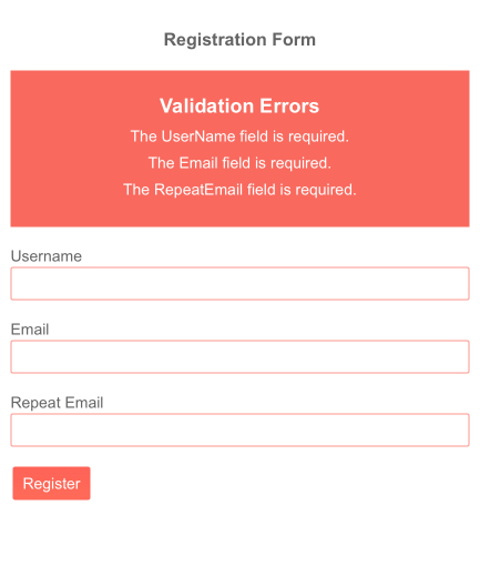
-
Localization
The Telerik ValidationSummary component can easily pick the correct error message to display depending on the active app language so your app is available to everyone in the world.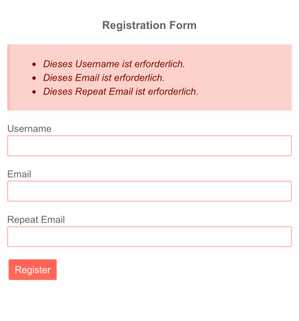
-
Full Set of Validation Tools to Use with Form Component with Blazor ValidationSummary
Telerik UI for Blazor provides a set of validation tools to use with our Form component and the standard Microsoft EditForm). The validation tools consist of 3 components, each providing a different way to report issues with user input validation. The components follow the modern Telerik UI for Blazor design principles – they deliver many features out of the box, while being flexible to be placed in a variety of situations – like the ability to completely alter their visual by specifying a template or a CSS class.
See more in the Blazor Validation Demo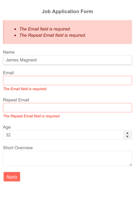
-
Right-to-Left (RTL) Support
The Telerik UI for Blazor Validation Summary component supports right-to-left configuration. The RTL functionality is supported my most of our components to accommodate users who communicate in a right-to-left language script, such as Arabic and Hebrew.
Learn more in our Blazor Right-to-Left Support documentation