This article is adapted from the introduction to A Cultural History of the Punisher: Marvel Comics and the Politics of Vengeance, by Kent Worcester, published by Intellect Books on or around December 1st, 2023.
The premise is high concept. A decorated veteran and his family are shot – gunned down by mobsters in broad daylight in Central Park. The husband survives and becomes a vigilante. Rather than merely seeking retribution against those who murdered his wife and children, he turns a blood feud against organized crime into a war on criminality. His family was ‘killed by criminals, and so I hunt criminals’ [footnote 1]. Expert in all forms of combat, he is shrewd, motivated, and impervious to pain. He operates far beyond the confines of morality and the law. Over time, he racks up a body count in the tens of thousands. His vendetta takes him across the globe and even into outer space. It pits one man’s natural law against an entire social order. But ‘the core of his mission lies in the dark, claustrophobic concrete canyons’ [2] of his place of birth, New York City.
Images from Punisher 1, 1987. Script Mike Baron, art Klaus Janson
This, in a nutshell, is the story of Frank Castle, aka the Punisher. Inducted into the Marvel Universe (MU) amidst the urban crisis of the 1970s, the contemporary avatar of vengeance started out as a bit player in an already crowded Spider-Man storyworld. Castle’s cultural stock soared during the decade that followed, which in retrospect seems inevitable, but which at the time came as a shock to many people at Marvel. Having found favor with a vocal contingent of fans, the Punisher would go on to inspire multiple series, several shelves’ worth of graphic novels, and guest appearances in Marvel and non-Marvel titles, from Batman and Beavis andButt-Head to Moon Knight and Spider-Gwen.
The character’s successes and achievements exemplified the trend toward edgier, more violent comics and expanded the Overton window of superhero discourse. A crime-fighting technique that was once unthinkable – systematic murder – was now an option, however controversial, for the characters who carry monthly titles and the companies that publish them.
The sheer volume of printed material speaks to the character’s seismic impact on comics and popular culture more generally. Between 1974 and 2023, Frank Castle was featured in close to one thousand comic books and graphic novels. He turned up in one-shots, solo titles, team-ups, and guest slots. A fair number of these stories were subsequently reprinted in hardcovers and trade paperbacks. For many retailers, the Punisher remains a proven earner. Most fans would agree that the character is part ofthe serial comic book pantheon, regardless of whether they follow his adventures or approve of his methods.
The scale of the Punisher’s campaign of anticrime violence offers another reason why the character may be considered culturally significant. Few protagonists in all of popular culture are responsible for as many murders as Frank Castle. That said, tallying the villains and henchmen that Castle has expunged in the pages of comic books and graphic novels – let alone films, streaming, and video games – is a fool’s errand.
In a 2011 conference call with reporters and bloggers, Marvel editor Stephen Wacker gravely claimed that ‘Castle has killed 48,501 people, counting back to his first appearance’ [3]. But given that the Punisher has demolished entire islands teeming with bad guys, this is a comically precise figure. In a story from 2005, an aide to the mayor of New York estimates that the Punisher executes ‘a dozen maggots a week’ [4]. Twelve murders a week yields around 30,000 murders in the half-century between 1974 and 2023. The ‘real’ number of deaths committed in diegetic space in the print medium most likely lies somewhere between these two sets of numbers: 30,000-50,000 murders, most of them premeditated and face-to-face.
The Punisher has left his mark on non-print media as well. To date, the character has featured in three studio movies, two Netflix series (his own and Daredevil), a dozen or so video games, a score of animated television programs and direct-to-video animated movies, and numerous video tributes and mashups. Jon Bernthal’s Netflix performances have been especially well-received. The character’s logo and chevron can also be found on licensed and unlicensed items – socks, hoodies, sneakers, beanies, folding knives, pinball machines, shot glasses, key chains, and practically anything else one might think of, including tattoos [5]. There is even a website devoted to images of Punisher action figures playing miniature harps. ‘Why does he do it?’, the site asks.
Frank is doing this in memory of his family whom he communes with through songs, poems, and prayers as he gracefully waves his battle-scarred arms and hands across the strings to fill his private family shrine with harp music and moves the Punisher to joyful tears [6].
The Punisher became a valuable piece of intellectual property (IP) during the closing decades of the twentieth century. He has become a global icon in the twenty-first. Along the way, control over the IP has to a significant extent slipped out of Marvel’s hands. During the 2016 presidential campaign, for example, freelance entrepreneurs combined Castle’s skull-and-bullets chevron with Donald Trump’s distinctive hairstyle to produce the ‘Trumpisher’. This is unlikely to be official merchandise almost by definition. As unlicensed takes on the skull chevron and related imagery proliferate, and not just in the United States, the company’s grip over the character’s media aesthetics seems increasingly uncertain. To a significant extent the brand’s imagery, meaning, and value have been appropriated by social actors – pro-gun groups, pro-police groups, pro-Trump groups, small business owners, eccentrics with websites, and so on – to the evident chagrin of Marvel’s editorial and marketing departments [7].
While the Punisher started out as a comic book curiosity, he has transmuted into something far more socially consequential. He is no longer a mere gimmick or brand. Instead, Frank Castle has come to embody a cause, that of murderous vigilantism. Judging by the extent to which the wider culture has warmed to Punisher-esque imagery, the banner of instant vengeance commands a powerful grip on the imagination of a great many people. At various times and places soldiers [8], criminals [9], pundits [10], politicians [11], and police associations [12] have embraced Castle’s morbid iconography, as has the so-called alt-right. Punisher pins and patches were donned by White nationalist protesters at the infamous Unite the Right rally held in August 2017 in Charlottesville, Virginian [13]. If you want to let other people know that you are prepared to dispatch your enemies, plastering a Punisher decal on your car presents the logical choice [14].
Punisher skulls can thus be spotted on autos, trucks, and sometimes police vehicles across all 50 states. In some places they are close to ubiquitous. These decals and bumper stickers are often modified to include a blue streak that conveys the idea that Blue Lives Matter – a pointed rejoinder to the Black Lives Matter movement. A police chief in Kentucky defended placing decals on patrol cars by arguing, ‘Our lives matter just as much as anybody’s. I’m not a racist or anything like that. I’m not trying to stir anything up like that. I consider it to be a warrior logo’. [15]. In a town near Syracuse, New York, the local police chief described ‘the Punisher symbol on the patrol vehicles’ as ‘our way of showing our citizens that we will stand between good and evil’ [16]
The cartoonist Nate Powell draws a provocative analogy between the contemporary uses of the Punisher logo and the Jolly Roger that pirate ships hoisted in the eighteenth century. ‘The 20th century’, Powell argues, ‘cemented the death’s head as a Western military symbol, from Nazi troops to numerous American units in World War II, Vietnam, and beyond’. In recent years, the Punisher’s version of the death’s head has been ‘adopted as an above-the-law cultural vigilantism’ by ‘aggrieved, insecure white Americans with an exaggerated sense of sovereignty’. Those who affix Confederate flags, Punisher symbols, and similar decals on their cars and trucks ‘have officially declared their existence as above the law, consistent with a long tradition of acting and living above it – propped up by apolitical consumer trends’ normalizing impact’ [17].
When asked about the character’s widespread popularity amongst soldiers and police officers, the Punisher’s chief creator, Gerry Conway, bristles. Even under ‘the most positive faming, the Punisher is a very emotionally damaged criminal’, Conway insists. ‘He’s someone who breaks the law. This is exactly what we do not need as police officers. He’s not intended as a role model’ [18] But this is not always the message that the stories themselves convey. In the tenth series (2014-15), Castle fights alongside a Special Forces soldier who proudly sports a Punisher shoulder patch. ‘We might be in different wars’, the soldier avers, ‘but we’re both in the same fight. I will always consider Frank part of my team’ [19].
-END-
A Cultural History of the Punisher: Marvel Comics and the Politics of Vengeance is published by Intellect Books on or around December 1st, 2023.
At time of writing, Amazon UK only has the hardback. I hope they will show the reasonably-priced paperback soon!
Kent Worcester’s other books include Arguing Comics (2004), A Comics Studies Reader (2008), The Superhero Reader (2013), Peter Bagge: Conversations (2015), and Peter Kuper: Conversations (2016).
Footnotes:
[1] Mike Baron and Larry Stroman, The Punisher 1.19 (New York: Marvel Comics, May 1989), 1.
[2] Steve Saffel, ‘Editorial’, Marvel Age 135 (New York: Marvel Comics, April 1994), n.p.
[9] In 2018, a Florida man was arrested ‘on charges of criminal mischief of more than $10,000 after repeatedly using a firearm to damage property’. ‘He was seen on camera wearing a Punisher t-shirt’, the report noted. A few months earlier, the FBI asked for the public’s assistance in apprehending ‘a man in his mid-to-late thirties’ who ‘wore a gray Punisher T-shirt in a December 7 robbery’. Eric Rogers, ‘Man in Punisher T-Shirt Arrested for Shooting Up FPL Property’, Florida Today, 8 March 2018, https://www.ajc.com/news/local/fbi-says-man-punisher-shirt-robbed-metro-atlantabanks/CBm6rTbG5HJCZRQkhT1QOJ/.
[10] During the first year of the COVID-19 public health crisis, Fox News broadcaster Sean Hannity sported a Blue Lives Matter/Punisher pin on his nightly cable news program.
[11] Supporters of Rodrigo Duterte, the President of the Philippines from 2016-22, sometimes refer to him as ‘The Punisher’. On the eve of his inauguration, Duterte told a crowd in Manila, ‘If you know any addicts, go ahead and kill them yourself’. The Human Rights Watch estimates that ‘more than 12,000 people have died in the drug war, many of them victims of summary execution by the police’. Felipe Villamore, ‘Duterte Says His “Only Sin” Is the Killings in a Drug War’, New York Times, 28 September 2018, A4.
[12] The St. Louis Police Officers Association encourages its members to use Punisher imagery on social media, while the Detroit police union defended the use of the Punisher insignia on police uniforms at Black Lives Matter protests in 2020. See Doyle Murphy, ‘St. Louis Police Union Loves the Punisher: But the Punisher Isn’t On Board’, Riverfront Times, 12 July 2019, and James Whitbrook, ‘As the Punisher Skull Re-Emerges on Cops in U.S. Protests, Marvel Reckons with its Imagery’, 25 June 2020, https://io9.gizmodo.com/as-the-punisher-re-emerges-on-cops-in-u-s-protes1843911179. See also Abraham Riesman, ‘Why Cops and Soldiers Love the Punisher’, http://vulture.com/2017/11/marvel-punisher-police-military-fandom-html.
[14] The iconography’s confrontational aspect cannot be easily overstated. In 2017, ‘a 29-year old smuggled four guns, throwing stars, pepper spray, and a knife into the Phoenix Comicon. Police found the man inside the convention dressed as the comic book character the Punisher in all black clothes, black face paint, body armor, and a belt with ammunition for his multiple guns strapped across his chest. He had allegedly come to kill police as well as fictional law enforcement’. Few comic book characters are capable of summoning this kind of terroristic vibe. Kelly Weill, ‘Cosplayer Set Alarm for Alleged Green Power Ranger Assassination, Bragged about Knife Collection’, http://www.thedailybeast.com/articles/2017/05/29/power-rangers-cosplayer-set-alarm-for-allegedgreen-power-ranger-assassination-bragged-about-knife-collection.
[18] John Annese and Rocco Parascandola, ‘Good for Morale or Bad Community Relations?’ New York Daily News, 4 November 2018.
[19] Nathan Edmondson, Kevin Maurer, and Carmen Carnero, The Punisher 10.8 (New York: Marvel, September 2014), n.p. This may have been the view held by the Milwaukee police officers who called themselves ‘the Punishers’ and who ‘wore black gloves and caps embossed with skull emblems while on patrol’. John Diedrich, ‘Milwaukee Police Looked into Punishers’ Group’, Milwaukee Journal Sentinel, 5 January 2011, A1.
Further homage to Mildred Marsh, Cynthia Blake and their fellow colour separators
UPDATE (July 26th, 2021): This post has been changed since it was originally put up in April of this year. It now fully takes into account Eliot R. Brown’s highly valuable post about a visit to the colour separators of the Chemical Color Plate company back in the mid-1980s. My post has illustrations recreating the colour separation process in detail. Elliot’s post was the source of two key details in particular, for which I am very grateful. I wish I’d found it sooner! Well worth a look! Guy Lawley
Larger versions of some pictures can be seen by clicking on them. Use the back arrow on your browser to return to this page. Or right click to open an image in a new tab or window.
Continued from:
Part 1 — Roy Lichtenstein—the man who didn’t paint Ben Day dots
Part 8 — 1930s to 1950s: the Golden Age of Comics, and Craftint Multicolor
Part 9a — 1950s and 60s: the Silver Age of Comics, Part 1
guy.lawley@btinternet.com
Previously on ‘The History of Ben Day Dots’:
Both sections of Part 9 are about a certain system of colour production — specifically, a system of colour separation — which was used by Marvel, DC and many other US comic book publishers from the 1950s to the 1980s, but not by all. I have called it ‘thenine acetate method‘ or more simply ‘the acetate method‘. It was used for the inside pages of the comics, printed on rough newsprint paper — and by the letterpress method, using relief printing plates, not by offset litho as you might read elsewhere. (Litho printing came to the US mainstream comic books only gradually during the 1980s.) Comic book covers were generally printed on better, whiter, glossy paper — and produced by a variety of different methods, which I’m not dealing with here.
The acetate method involved the hand-painting of up to nine acetate sheets for each four-colour page — a set of three acetates for each of the three colours (excepting black) followed by photographic combination of each set of three acetate images into one negative image which could be used to make a printing plate. (The black printing plate was separately photo-engraved as it had been from the first 1890s Sunday newspaper strips onwards.)
The acetate method was slow and highly laborious, especially compared to today’s computerised methods.
It was a continuation of the comics industry’s previous longstanding practice of addingcolour to black and white artwork during production — known as mechanical colour separation. When artists created full colour artwork, colour could be extracted from it to make separate printing plates, originally by photographing the art through three or four different colour filters, and later by scanning the art. Mainstream US comics only moved to the more expensive full colour art, and colour separation by extraction, in the 1980s (though Marvel’s Hulk magazine in 1978-1981 was a trailblazer). British and European comics had been doing it for decades (e.g. Eagle, TV Century 21, Asterix and TinTin).
Part 9a of my history looked at CMYK colour, the colour guides of Marvel, DC and other US comic books, their YRB / yellow-red-blue coding system, and the type of coloured dots seen on their pages from the mid-1950s onwards. Marvel changed to this type of dot — and the new acetate colour separation system that created it — in 1954, and DC in 1956, just in time for the so-called ‘Silver Age’ of comics. If you haven’t seen Part 9a yet, it might be worth looking back at it before reading this part.
In the late 1950s, the US comic book dots were often called ‘Ben Day dots‘ within the printing and publishing industry, even though the real Ben Day method had been largely phased out of comic books in the 1930s. When the painter Roy Lichtenstein shot to fame with his Pop Art paintings in the early 1960s, he informed the world that he was copying ‘Ben Day dots’ from the comics. No-one knows where he heard or read the name ‘Ben Day dots’, but it has continued to stick ever since, like ‘Kleenex’ for a tissue, or ‘Hoover’ for a vacuum cleaner. It is strongly associated with Lichtenstein’s paintings, but also with the comics which he copied — rather misleadingly, if we actually want to understand the new dot-making technology they used.
On the printed page, dots of the 25% tints like magenta / R2 below left, were ‘positive dots’, i.e. spots of actual ink. As seen in R3 (right) the darker 50% tints involved ‘holes’ in a grid of colour, dots created by the absence of ink — or what I call ‘negative dots‘. Printed on a white background, they were white dots, as the paper showed through the holes.
Magenta 25%, left, is R2 and 50%, right, is R3
Printing ink was semi-transparent on the comic page, so when one ink was printed on top of another, the colour below showed through and a mixed colour was created. As seen in Hulk Green below, blue dots printed over yellow became dark green dots, and the overall effect was of a yellowish green. In Thing Orange (YR3; R3 over yellow) the negative dots of R3 became yellow, while the magenta grid assumed a scarlet hue.
Hulk Green is coded YB2. Thing Orange is YR3.
This section continues with a demonstration of how the dots were actually made during the production of the comics. This has not been shown before in detail, with illustrations. Comic book production flies well below the radar of most histories of printing, and has also received little scholarly attention within the specialist comics literature. I have reconstructed the process from various sources, including material gathered for the Connecticut Historical Society’s 2003 exhibitioncelebrating the invention of the comic book. The CHS interviewed comics professionals including Dick Giordano and Will Eisner, as well as Mildred Marsh and Cynthia Blake, staffers who made colour separations at the Chemical Color Plate Corporation of Bridgeport, Connecticut in the 1950s and 1970s. Chemical Color created the printing plates for Marvel, DC, Archie, EC and other comic book publishers, and for Sunday newspaper strips.
My rediscovery of the process has not been without error and the need for correction. I believe the following material is accurate. I welcome feedback, added information and further correction.
Where 2 tints of the same colour are contiguous, they are continuous
A final point about these comic book tints before I attempt an explanation of how they were made. Given the nature of old-school comic book art, where one tint meets another there is generally a black outline between them — as seen in the detail from Strange Tales 110 below.
Doctor Strange; Steve Ditko, Strange Tales 110, 1963. Original c. 1cm tall.
Occasionally tints meet directly, including different tints of the same colour, as seen in two of these details from Fantastic Four 89.
Half-inch squares (c. 1.2 cm) from Fantastic Four 89, cover-dated August 1969.
At these junctures an interesting phenomenon can be seen. When for example B2 meets B3, or R2 meets R3, the positive dots of the light tint are always perfectly positioned to meet the negative dots of the darker tint — in fact the positive dots merge into the grid structure between the negative dots.
Likewise, the spaces between the positive dots merge exactly with the negative dots in the grid. They are not just lined up atthe same screen angle, which we would expect, but perfectly positioned as continuous rows of dots and gridlines.
This is shown more clearly below, in two examples from 1960s DC comics.
Dots from DC’s Blackhawk 88, 1963, and Justice League of America 42, 1966
In the previous system, Craftint Multicolor (as seen in Part 9a) the lines and dots were always perfectly lined up like this, because they were printed that way on the Craftint boards. Any credible explanation of exactly how the acetate method created its dots has to explain how this phenomenon continued to occur in the new system. It may not seem particularly tricky, but I believe it is. I will return to this point below.
How the ‘Silver Age’ method was done
As in previous posts, I will work through a notional example of colour separation using just one panel. The colour separator would have worked on a whole page at a time. This way is unrealistic, but easier for me to create and, I hope, for you to take in.
Below is an out-of-copyright comic book panel from Magazine Enterprises’ Dream Book of Romance 5, 1953, drawn by Frank Bolle. For the actual comic book it was colour-separated using the ‘Golden Age’ Craftint Multicolor system — you can see the characteristic lines of Craftint. It was one of those ‘non-realistically’ coloured panels that romance comics did from time to time (a way of expressing strong emotion, perhaps). This scan is taken from the Digital Comic Museum web site.
I downloaded the original B&W art from Lars Teglbjaerg’s page at Comic Art Fans and I’m using it with his kind permission. I chose the image as a nod to Roy Lichtenstein’s romance comic paintings. I’m going to simulate colour separating it using the acetate method, but choosing different colours.
As discussed in Part 9a, the first step in the acetate method was a colourist making a sketchy colour guide, with more or less thorough YRB notations. The colour guide was done on a copy of the artwork, the same size as the printed comic page — a photocopy in later years, a ‘silver print’ earlier.
My own version below is completely different from the original colouring of Bolle’s panel, and intended to show a wide range of tints and colour combinations.
As a further tribute to DC romance books, I’ve adopted a convention sometimes seen on DC covers — Julie has R2 skin with only magenta (red) dots, while her male lover is Y2R2 — using both magenta and yellow dots. Inside DC comics, every white person was R2-only until 1969, when artist Neal Adams got them to start using the yellow tints Y2 and Y3 for the first time in decades. White skin in Atlas and Marvel books was always Y2R2, so my choice here also points up that difference between the two publishers.
The black-and-white artwork and the colour guide were both sent to the engraving company — our friends at The Chemical Color Plate Corporation of Connecticut.
The original artwork — i.e. the black-and-white page, not the colour guide — went to one part of the Chemical Color building, where it was photographed in a huge specialised camera. As with all old-school analogue photography, the result was a negative image — as shown below for my single panel. The negative was not actually B&W but opaque black on clear plastic film, i.e. black and see-through. The negative was used to photoengrave the black printing plate for that page.
Colour separation in detail
The colourist’s original colour guide went to another room where the colour separations were made. Here the colour separator — let’s call her Mildred, in honour of Ms Marsh — worked directly over this colour guide. (This detail fell into place only after I read Elliot R. Brown’s post, as mentioned earlier.)
For each page of artwork, and for each tint of yellow, red and blue, Mildred carried out a separate task, laying a separate transparent acetate sheet down on top of the colour guide for that page, and painting on it — one sheet at a time. If the job called for the full gamut of colours, that meant nine separate pieces of work, on nine acetate sheets.
Here was manual or ‘mechanical’ colour separation in action. It was clearly a collaborative process between the colourist and the colour separator. The colourist decided (with more or less instruction from editor, writer, artist or simply from past practice) which of 64 (maximum) defined colours was required on each and every part of the page, and produced a diagram / plan which informed the next steps in the process. Every one of those colour decisions was implicitly or explicitly stated, visually and/or by a written label. The separator’s task was to interpret the diagram and follow the plan, converting all those decisions into a material form — painted acetate sheets — which, as we will see, would go on to determine where the defined solid colours and dot tints would appear on three colour printing plates.
Each time Mildred painted an ‘acetate’, both the paper colour guide and the acetate sheet were held firmly in place by a pair of pegs at the top of the page. Since this thin plastic sheet was close to invisible, but vital to the technique, I can neither illustrate it nor ignore it. I therefore represent it here by partly fading out the image beneath it, and with the yellow word ‘acetate’. (In later pictures, please simply assume that the acetate sheet is there, because the text would only get in the way if I left it :0)
Mildred painted on each acetate in turn where a particular tint was needed. We don’t know what order she worked in, so let’s say she started with the acetate for magenta 25%, the R2 tint. She looked for all those parts of the colour guide labelled with, or known to require, R2. If the colourist did not label every part of the guide, the separator had to rely partly on what was shown on previous pages, or on her own knowledge of the colours routinely used in that comic, or by that publisher. (See for example the page from Thor 163 in Part 9a). A good example is the caucasian skin colour mentioned above, often routinely assumed to be Y2R2 or R2, depending on publisher, so not labelled on the colour guide.
On my imagined example I have labelled every colour.
The R2 areas Mildred needed to paint included all the mixed colours of which R2 was a part: R2B2 (the wall), Y2R2 (the man’s skin), the orange YR2 shading on Julie’s hair, and the dark blue jacket, R2B. The YRB notation made finding these areas relatively simple.
Below is the result of this first step in Mildred’s work. The R2 areas have been painted on the acetate with a dark red paint.
Mildred’s interview transcript states: “…you painted solid colors used red paint, […] a paint that would stay on the solid acetate.” What she might have actually said was that this paint would “stay solid on the acetate”. At a later stage in the process, as we’ll see, it was important that the red areas were ‘solid,’ with no gaps — and that they were were opaque, letting no light through. (Later she mentions a different technique using black paint, giving no details.)
I believe that she routinely painted with a brownish red liquid called Opaque Red. Eliot’s blog confirms that Opaque Red, or something very like it, was still used for this purpose at Chemical Color in the mid-1980s. This liquid had long been used in photography and photoengraving for touching up and correcting negatives, i.e. it was formulated for painting on a smooth plastic sheet. And, importantly, it was just as ‘solid’ and opaque as the black parts of the negative itself.
Here is a jar of the stuff, still being used on photographic negatives by Craig Sheaks, who posted this photo at The Darkroom on Facebook:
It was, as we will see, adapted very well to the acetate colour separation technique. Perhaps this technique was in fact developed partly because Opaque Red was already there, ready to do the job.
Later, starting in the 1960s, a sticky-backed plastic sheet called Rubylith — stuck onto the acetate and cut to shape with a scalpel — began to replace this kind of paint throughout the graphics industries, including comics. As mentioned, Chemical Color was still using Opaque Red or a similar liquid formulation in the mid-1980s. Many published accounts of colour separation in comics mention cutting Rubylith (or the similar orange Amberlith); the 80s and post-80s generation of colourists and production people have been interviewed and have posted about their work, and that’s what they knew and used. Cutting the sheets was still a laborious job, but more precise. Rubylith users in the comics biz sometimes look back on the Chemical Color era (and Opaque Red) with a certain amount of disdain.
Back in the day, let’s take a closer look as (imaginary) Mildred painted her acetate sheet for R2. The job wasn’t as simple as it might seem — working at comic book size, she was painting at a fairly small scale, and had to work fast.
Her finished R2 sheet, still in place on the colour guide, looked something like this:
All the R2 areas had merged into one — the black outlines which divided up the picture into its constituent parts had been covered up. However, Mildred had a way of adding the black outlines back, to help her check that her painting was correct. This was the final detail added by Eliot Brown‘s account.
There was another clear acetate sheet, printed with the black artwork, held on the same pegs as the colour guide and the acetate, and ready to flip down over the painted acetate. As Eliot says, the painted layer was like the filling in a sandwich, with the colour guide as the bottom slice of bread, and the acetate with the black artwork as the top slice. Looking down at the whole ‘sandwich’ at this stage, Mildred would have seen this:
And of course she could also have flipped down the top sheet at any earlier stage if she’d wanted to check as she went along (once her paint was dry, presumably). Flipping up the painted sheet she could also check her work back against the colour guide beneath if she needed to. The pegs kept the sheets lined up with each other.
And just to be clear, in real life she would be working on a whole page at a time, not the single panel which I am showing here.
Once this stage was completed, the painted R2 acetate — taken out of the ‘sandwich’ and viewed on a white surface — would have looked something like this :
Like the colour guide, this was not intended to be a fine or attractively finished piece of work. It was a functional object, part of the industrial production line of a cheap and disposable product. (Real) Mildred’s interview states that the acetates were washed clean for re-use after a job had been completed. It would be astonishing if any worked examples have survived; certainly I have never seen one. You are probably seeing one here for the first time — or at least, the best simulation I can give you. PLMK if I’m wrong.
(Update July 30th, 2021 (and July 28th 2024): Sarah has made a mock-up of a similar acetate (for a whole page) in her new blog post here.)
Let’s assume that imaginary Mildred painted the 50% magenta R3 area on her next acetate sheet. In this case it was a simpler, faster job, involving only lover-boy’s brown hair (YR3B3) .
In the final magenta phase, imaginary Mildred looked for all the solid red areas, marked R or YR, and painted those on her third acetate sheet. These were only small, but obviously a bit fiddly. Real interviewed Mildred told us she didn’t like intricate details. They slowed her down and cost her money!
Mildred now had three acetate sheets ready for the next stage of the process, looking something like this:
In order to produce the magenta printing plate, by photoengraving (just like the black plate from the original artwork), I believe that these three images must have been combined into one negative in a camera set up specifically for this purpose. I can’t give a full account of this part of the process, as I have found no details which I can pass on.
The 2003 Connecticut Historical Society interviews don’t clear up the mystery. In an interview reduced to precis form, engraver Dan Jocis told the CHS: “Shooter used to make dot pattern for color percentages” — and nothing more. A ‘shooter’ must have been a camera operator. Dan himself, unfortunately for us, “Did every part of engraving work except camera work.” Also, we can speculate that he might have given more details which the person writing the precis didn’t fully understand, so summarized in this way. No camera operator was apparently interviewed by the CHS.
I believe that this extract from Stone and Eckstein’s book Preparing art for printing, 1965 (a book I cited in Part 9a) while not specifically referring to comics production, holds the key to understanding this procedure:
“This original Benday process is virtually obsolete and is being replaced by an in-the-camera screening method which is more efficient, less costly and easily manipulated by the cameraman. […] Today tinting is accomplished with a screen similar to the halftone screen. It is placed in the camera in front of the film and a white or black surface is photographed. The screen value, 10%, 20% , 30% , etc., is controlled by manipulation of the exposure.” (p.45) [My emphases.]
‘The screen value’ is another way of referring to the ‘tint value’ or the strength (darkness) of the dot tint.
They illustrated that paragraph with this picture of ‘line copy’ — i.e. black and white artwork — and its tinted version:
In Chemical Color’s camera, the ‘surface’ which was photographed was in each case one of Mildred’s acetate sheets with its painted-on red shapes. Opaque Red was designed to fill small ‘holes’ in a ‘B&W’ negative, just as if it had been black; it could also be photographed in B&W just like black — just as blue pencil or blue wash could be photographed as white. Thus each Opaque Red-painted acetate was the equivalent of ‘a black surface,’ effectively a piece of ‘line copy’ just like the black fishy image above. Just like the fish, it was ready to be ‘shot’ as an area of dotted tint; 25% ‘screen value’ in the case of the R2 acetate below.
The acetate for solid colour could be ‘shot’ unscreened. Then the same 60 lines-per-inch screen could be used to shoot areas of 25% and 50% tint from the other two acetates, one shot after the other, controlling the tint value by varying the exposure of the shots. The same screen, I believe, must have been left in place in the camera between these two shots. ‘A screen similar to the halftone screen’ to the best of my understanding must have been a contact halftone screen. And the same piece of film was also in the camera throughout all three shots, producing a combined single negative at the end of the process.
This is a credible explanation for the consistent precisely continuous positioning of the adjacent tint patterns which I noted above; the screen didn’t move between shooting the 25 and 50% tints. It stayed in exactly the same position. So the two sets of dots which ended up on the single screened negative lined up perfectly, as I showed above on printed examples. Every time!
Some printing experts have suggested to me that two different screens would be necessary, and obviously would have to be very precisely lined up every time a shot was taken. I believe (a) that this would not have happened in the world of fast cheap comics production, and (b) even if it could be done, slight errors in positioning would surely have crept in — errors which we just don’t see on the printed page. Only the double use of a single fixed screen fits the bill.
It also implies that slight variations in exposure time or other photographic factors might create tints of variable dot size (value) or appearance in the camera — not only during printing as previously mentioned — i.e. variations in the size of the 25% dots, and in the checkerboard or grid of the 50% tint, can also be partially accounted for at this stage of production.
Whether or not I am entirely right about the method, the end result must have been a negative which looked something like this (but with complete continuity across tint edges, unlike my primitive effort) — reversed both in B&W and right-left terms:
When this imaginary negative was etched (photoengraved) onto a printing plate, it would, if used to print a magenta image, create something like this (which in reality would never be printed on its own, but only as part of a four-colour print job):
If this looks like a hot mess — did imaginary Mildred screw up? Surely not! — here is another notional image, with the black artwork added in, representing ‘black printed on top of the magenta’:
Compared to tint-making in modern software on a PC or Mac, this acetate method may seem like madness. Perhaps now the method behind the madness is starting to come into focus…?
Back at the imaginary separator’s work-bench, Mildred now had to do the same work twice more — making the blue and yellow images. Let’s say she next painted the three acetates for the cyan printing plate, one each for 25% B2, 50% B3 and solid B:
The resulting image, if ever printed on its own, would look like this:
Finally for my simulated panel — which, unlike DC comics before 1969, contained a yellow tint, Y2 — Mildred only had to make two acetates for 25% Y2 and solid Y. For a real old-school DC book she would only have needed one, for the solid Y; for a Marvel book, generally one for Y2 as well, if only for the flesh tint. Y3 came and went at Marvel over the years.
The resulting image for my panel would look like this:
I didn’t put an outline around this yellow image because I’m now imagining it not as a standalone notional image, but as the first image ‘actually’ to be ‘printed‘, combining the colours as my panel goes through the hypothetical printing press. This ‘printed’ image will end up with its own black outlines.
After yellow the magenta image is printed, and the result is this:
Last of the YRB colour plates is the cyan/blue, giving us this image, now with clearly visible rosettes as blue tints overlie the red ones at a different ‘screen angle’:
Still something of a mess, you might think, until the black ‘key’ plate is printed over the rest to pull it all together:
To add a touch of realism, here is my final result as you probably would have seen it in a Silver Age comic… with the colours slightly misaligned or ‘off register’ :0)
The colours seen above are obviously far too bright and uniform to represent an old-school comic book panel accurately. My image-making skills are rudimentary. I am therefore very grateful to artist Nicholas Burns, who has donated this newsprint-ised version… kudos and a zillion thanks!
Concluding remarks.
I hope that Nicholas’s version of ‘my’ panel convinces you that this seemingly crazy colour separation technology really was the way it was done in all those Silver and Bronze Age Marvel, DC and most other US comics.
Not only that, but — laborious and time-consuming as it was — it remained cheaper than the alternatives (based on colour extraction from full-colour artwork) which many other periodicals used. This was vital in an industry which struggled to keep its products ‘all in color for a dime’ as long as it possibly could.
That price went up and up through the 1960s, 70s and 80s, until the struggle was abandoned, offset litho printing and better paper were brought in to replace letterpress on newsprint (along with Rubylith and Amberlith to replace Opaque Red), and in the 90s computer colouring took over, step by step.
That, however, is a whole nother story.
This concludes Part 9 of my History of ‘Ben Day dots’ — many of which, as you now know, weren’t really Ben Day dots at all. As I said before, please send comments and corrections. I’m trying to break new ground with this attempt at a thorough history of the topic. I may have got some things wrong, or made some things less than clear.
I’m not committing myself to a Part 10 at this point. Coming full circle to where I started, with the 1960s and the type of comics — and of course dots! — that Roy Lichtenstein copied, seems enough for now. I hope you’ve enjoyed discovering this stuff alongside me.
The end; кінець; fin; fim; ende; fine; סוף; slut; einde; koniec; النهاية; 終わり… et cetera.
–
Once again, thanks are due to Mildred Marsh, Cynthia Blake and all their colleagues at the Chemical Color Plate Corporation, and to Andrea Rapacz at the Connecticut Historical Society for sending me the the texts from their exhibition; to Lars Teglbjaerg for the Frank Bolle romance panel; to Dewey Cassell for the Batman page; to Craig Sheaks for the Opaque Red photo; to Craig Yoe for explaining how widespread the ‘grey paint’ method probably was — the alternative comics colour separation method (more research needed!); to Nicholas Burns for many things, and to Pascal Lise for a stimulating discussion about 50% tints. Also to Todd Klein,Anthony Tollin, José Villarrubia and Bob Rozakis for writing about comics colouring online — look for their stuff!
Also to Sarah, who alerted me to Eliot R. Brown‘s amazing account of his visit to Chemical Color in the mid-1980s, when the acetate method was still going strong.
If you haven’t already, you should also see Sarah’s own excellent post about pre-digital colour in the comics. You’ll find stuff there that you won’t find here!
I believe I am also indebted to Khouri Giordano, who I think authored a web page some years ago which I now can’t find. IIRC he gave some details about the acetate system which I found hard to believe (9 acetates for every page?!?) but which set me on the trail to confirm the facts.
Last but definitely not least, Fiona McIntosh provided research assistance, tech advice, and incalculable, invaluable support besides.
Panel from Secret Hearts 83, DC comics (November 1962), attributed to Tony Abruzzo
Larger versions of some pictures can be seen by clicking on them. Use the back arrow on your browser to return to this page. Or right click to open an image in a new tab or window.
Continued from:
Part 1—Roy Lichtenstein—the man who didn’t paint Ben Day dots
Roy Lichtenstein, Magnifying Glass (1963). Oil on canvas, c.41 x 41 cm
With this post my history of Ben Day dots cycles back to the 1960s, the decade where I began; to the comic books — and the dots — which inspired Roy Lichtenstein’s Pop Art paintings. Mainstream US comics of this period are particularly remembered for the renaissance of the superhero, beginning at DC and including Spider-Man, the Avengers and other enduring characters from the newly ascendant Marvel comics.
It was Lichtenstein who popularised the idea that those comics were printed with something called ‘Ben Day’ dots, though in fact the genuine Ben Day method (patented in 1879) had almost completely fallen out of use by that time, as cheaper faster technologies replaced it. However, in the printing and publishing industries the old name had stuck to the new types of dot, as a genericised brand name like ‘Band-aid’, ‘Kleenex’, ‘Hoover’ and ‘Diesel’ — although by the ’60s it might be spelled Benday, Ben-day or simply benday. The worldwide fame achieved by Lichtenstein and his paintings brought the name out of obscurity and into much wider usage.
This post, Chapter 9a, looks at the 1960s dots as they appeared on the page, and how their colour guides worked.
Chapter 9b has the technical details of how the dots were created during the production process.
Plenty has been written about how Roy Lichtenstein made his version of ‘Ben Day dots’ on canvas. These two posts show how the original dots were made for their original source: the printed pages of Silver Age comic books.
The key stage in comics production: Colour separation
The 1962 DC comic panel at the head of this page (magnified details shown below) was the source for Roy Lichtenstein’s painting ‘Hopeless’, and shows that era’s new variety of (so-called) ‘Ben Day dot’.
Half-inch (c. 1.25 cm) squares from the above panel in Secret Hearts 83, 1962
The dots were added during the production stage called colour separation, when a different image was made for each of the three colours Cyan (blue), Magenta (red) and Yellow used in the CMYK (or ‘four-colour’) printing of the comics. Each of the three images, having been constructed, had to be etched (or ‘engraved’) onto a metal printing plate — an additional step in the production process.
Separately from the colour work, the black and white ‘line art’, the K in CMYK — including the lettering — was photographically reproduced on a printing plate — photoengraved — in essentially the same way it had been since the first Sunday newspaper strips of the 1890s.
Photographic colour separation of fully coloured artwork (‘process colour’) did not come to mainstream US comics until the 1980s. Like the photoengraving of the black plate, 1960s comic book colour separation was in some ways also similar to 19th century methods — still largely done by hand — but using a very different technology from the genuine Ben Day dots of the 1890s to the 1930s. Technical details of the Silver Age method are given in Part 9b.
This post is about the interior pages of a wide range of US mainstream comic books — those published by Marvel, DC, Archie and others — produced in a certain standardised way, and printed on newsprint. Their covers, printed on better (usually glossy) paper, were always dealt with separately and by a range of different methods, which this post will not deal with. Not all comics publishers used the techniques I describe here for their inside pages, but the majority did.
The committed Ben Day Detective will be able to tell when a comic page (at Dell or Gold Key, for example) departs from the ‘rules’ described in my posts. Obvious exceptions like Jack Kirby’s Marvel photocollages are just the tip of the iceberg!
Magnifying glasses in hand, let us begin…
The end of Craftint Multicolor… and the beginning of a new ‘Age’
Earlier posts in this series have explained the original Ben Day dots, used in newspaper comics from the 1890s onwards, and how they were phased out of the new comic books in the 1930s. At that time National / DC’s Jack Adler and Sol Harrison pioneered two new methods, one using grey painted images photographed as halftone dots (which I haven’t yet covered in detail) — relatively expensive and, at DC, confined to covers and advertising pages. The other method was Craftint Multicolor, which dominated the pages of mainstream comics of the 1940s and earlier 1950s. The signature feature of this method, easily seen on the printed page (especially with the help of a magnifying glass) was its use of closely spaced lines for the darker tints, rather than dots.
The panel below, from another DC romance comic — a moonlit scene helpfully coloured only in blue — shows areas of solid or ‘100%’ colour, and both the pale dot and darker line tints of Craftint Multicolor. These were generally referred to in the comics business as having colour ‘values’ of 25% (or a quarter strength) and 50% (half strength) respectively. In fact on the printed page their values could vary considerably. (Full details of Craftint Multicolor are given in Part 8.)
Before the Silver Age: Craftint Multicolor in use
In comics cover-dated October and November 1954 Marvel Comics (then known as Atlas) phased out Craftint and phased in a new colour separation technique. DC followed suit, but two years later, starting with comics cover-dated October 1956. Coincidentally this is usually defined as the beginning of the so-called ‘Silver Age’ of comics — US superhero comics, anyway — with the publication of DC’s Showcase 4, the first appearance of the new Flash. The ‘first Silver Age comic’ was also one of the last to use the old ‘Golden Age’ Craftint dots — and of course lines. The images from Showcase 4 below were scanned by me from the Taschen book 75 Years of DC Comics by Paul Levitz. (The book is highly recommended; quite expensive, but a good deal cheaper than a copy of this comic!)
Origin of the Silver Age Flash. Both speed lines and Craftint lines can be seen. Art by Carmine Infantino and Joe Kubert.
The Silver Age dots, which Roy Lichtenstein copied and called ‘Ben Day’, were two generations of new technology away from the original Ben Day variety, and created in a very different way from either Ben Day or Craftint. Key to the new technique was a clear plastic sheet of the type known as ‘acetate’ — actually cellulose acetate, which had replaced the highly flammable cellulose nitrate in cinema film (‘celluloid’) in the 1930s.
Ben Day and Craftint Multicolor were both names of branded commercial products, but the post-Craftint method used in comic book colour didn’t have a catchy name. Similar acetate sheets are sometimes referred to as ‘3M’ after the main company which manufactured them. However that name does not seem to have caught on widely. History does not relate how Roy Lichtenstein picked up on the name Ben Day. If someone had told him the comic book dots were called ‘3M dots’ you would probably not be reading about the history of ‘Ben Day dots’ now. I will refer to the ‘Silver Age’ method as ‘the acetate method’.
An example of the new Silver Age DC tints is shown below, in a panel scanned from the first page of Superboy 52 — like Showcase 4, cover-dated October 1956. Lana Lang’s skin is the same tint as the old ‘25%’ Craftint dots. Her hair and the curtain behind her both show a ‘50%’ magenta (red) tint, which previously would have been made up of lines. The magnified details show that this tint was now formed by a dot pattern very close to a checkerboard in appearance, at least when printed on white paper.
Page 1, panel 3, of Superboy 52, October 1956. Below left, a one inch square (c. 2.5cm); right, a half-inch square detail.
An exact checkerboard tint — half white, half black — would of course have a precise 50% colour value (and square dots). As shown below, this is the form taken by the middle point in a black-to-white gradation put through an old-fashioned halftone screen — the kind used to break the continuous tones of a photograph into dots for printing — i.e. a halftone version of a 50% tint.
The middle part of a gradient from black to white, as represented in optical ‘halftone’.
To the left of the mid-point, where the tint becomes darker than 50%, increasingly round white dots are seen within the black. On Lana’s hair in the panel above, the same magenta tint printed over yellow seems to show this pattern — more printed colour and less ’empty space’. The printed tint, in other words, could resemble 50% or a darker value more like 60 or even 70%, varying not just from page to page but in immediately adjacent areas of a single panel. However in the production process, before printing, the tint would have been the same — or at least, intended to be the same. More on this below.
Such variations in the printing of tints show why any attempt to define their values in precise percentage terms can never be exact. Nor could it at the time the comics were published. Artists, colourists, editors, production teams, colour separators, engravers and printers must all have recognised the limitations of the fast cheap printing of the day — four-colour rotary perfecting letterpress on newsprint. I could abbreviate that to FCRPLON, but I prefer to call it ‘old-school comics printing.’
And it really was old-school. The first Sunday newspaper comics of the 1890s were printed in essentially the same way. By the 1960s and 70s, most of the publishing world had moved on to process colour production, and increasingly abandoned letterpress printing for offset litho. The comics business resolutely stuck to its old school methods until literally everyone else in the USA (with the possible exception of the Yellow Pages phone books) had given them up. Mainstream US comics very gradually introduced offset litho through the 1980s.
But I digress. Although varying somewhat on the printed page, we know that the acetate colour system in theory had only three values of each colour to work with — 25, 50 and 100% — as with Craftint before it, but unlike the original Ben Day method itself. The well-known 64 colours available on the comic book page resulted from the three-value limitation of the newer methods. This limited gamut of colours did not apply to the old Ben Day process, which was far more flexible — capable of producing a much larger range of tints, colours and patterns.
I haven’t yet discovered when other publishers made the switch to acetate, though Charlton, for example, certainly used Craftint into the 1960s. (Some others may have continued to use the alternative ‘grey paints’ method I alluded to above; more research is required on this.) As far as I can tell, DC and Marvel used the acetate method, in the form I will describe here, well into the 1980s.
Printed dots, ideal dots and… negative dots.
The aesthetic appeal of the 60s dots is easy to see in the example below, which I have shown before — half-inch squares from the Fantastic Four 89, 1969. Again, the darker tint is not a checkerboard but more like a grid of inked colour with round ‘holes’ in it. I call these dots ‘negative dots’ — as opposed to the positive dots of the 25% tint, which are clearly dots composed of coloured ink. Negative dots in the 50% tints are a signature feature of the acetate method, just as the lines were in Craftint.
As with actual holes in a solid object, like a sieve or colander, whatever is under the holes shows through them. In this case it is mostly not white but yellow, where both magenta and cyan tints have been printed over ‘solid’ 100% yellow — like Lana Lang’s hair. On the Thing’s face, the cyan tint is mostly printed on white paper (actually a 25% yellow dot tint). Unlike Lana’s curtain, it does not show a checkerboard appearance, but negative dots again.
Half-inch squares (c. 1.2 cm) from Fantastic Four 89, cover-date Aug 1969. Art: Jack Kirby and Joe Sinnott.
Below is another example, from Strange Tales 110 — not from a scan this time, but a photograph taken through a USB microscope. Here we see the light and dark tints of cyan printed on a white background, and next to each other.
Dr Strange by Steve Ditko, 1963. Original size approx 1.4 x 1cm
And again we see negative dots, not a checkerboard. In my experience looking at 1960s Marvel and DC comics, the darker tint is more likely to show the negative dots appearance. Here is an illustration of a 60% tint from the 1965 book Preparing art for printing by Stone and Eckstein (Van Nostrand Reinhold, New York) p.44. (It doesn’t mean ‘c.60%’ as in ‘approximately 60%’; in this illustration, picture ‘a.’ showed a 10% tint, picture ‘b.’ was 30%, and picture ‘c.’ followed)
So was the so-called 50% tint actually intended to be 60%, as some have suggested? Creating tints in the image-making software Clip Studio (known as Manga Studio 5 when I first used it) suggests a possible answer to this question — ‘no’. The image below was made in this programme, and the value set at 50%. The square form of this tint is obviously not a checkerboard, and the round dot version closely resembles the comic book dark tint. This certainly shows that a dot tint with 50% value does not have to be a checkerboard, but can indeed be a grid of colour containing negative dots.
Tints made of both positive and negative dots, when printed in real life on paper with liquid ink, are prone to becoming darker than intended due to dot gain, as defined here (a web page about offset litho printing, not the old school comics variety, but a clear and relevant account of dot gain). On newsprint dot gain is particularly likely, largely due to ink spreading between the coarse fibres of the paper.
On the other hand, you have probably seen parts of old school comic books where insufficient ink or low pressure in the printing press have created very light tints, or even complete gaps in the colour images. Even ‘solid colour’ tends to contain patchy white areas due to fast printing and rough paper.
I will continue to refer to 25 and 50% tints — while accepting that these are nominal, approximate figures only — and where my examples have been created in Clip Studio (or some years ago in Manga Studio 5) they will use these theoretical, ideal values.
Also, the colours of these simulated on-screen examples can only be approximations of the printed CMYK colours… which leads on to my next section…
Colour guides: CMYK meets YRB
As is well known, a colourist employed by the publisher prepared a colour guide for every page of a comic, at the reduced size of the printed page, using watercolour dyes on a photocopy of the black artwork — or earlier, on another type of printed copy; a silver print. [Update April 2022: Silver prints were made like regular photgraphic prints, from negatives, but not on glossy paper like most photos. Cartoonist Kayfabe (Ed Piskor and Jim Rugg) on YouTube report that Jim Shooter made the change to the much cheaper photcopier method when he took over at Marvel Comics (1978), although colourists disliked the cheap thin paper.]
As this colour guide system developed, the colourists used watercolour dyes matched to the colours of printing as closely as possible, i.e to the CMY colours, their 25 and 50% dilutions and mixtures thereof.
These quickly-made, often messy guides were sent to the colour separators — staff at the engraving company which made the printing plates. Unlike ‘process colour’ artwork, these were not finished images to be colour-separated photographically or on a scanner, but essentially just diagrams for the next person in the production line to work from. Each guide had to contain a clear set of instructions for the colour separator, and to that end a system was developed for adding an abbreviated form of written information to their coloured images.
Below is a Marvel colour guide for Thor 163, 1969, some detailed views of one-inch squares, and the page as printed. (You will notice that the colourist was not credited at that time.) So far I have been referring to the colours in comics by their CMYK names, including cyan and magenta. You can see that the colour guide was annotated instead using the letters Y for yellow, R for red and B for blue — as well as numbers. This YRB system is seen throughout the comics field, and very rarely (if ever) elsewhere. It’s worth pondering why this was so, and how it worked.
Thor 163, Marvel Comics, cover-dated April 1969. Colour guide from Heritage Auctions.
Like many things in comic book production, the YRB system probably started with long-term DC staffers Sol Harrison and Jack Adler, in the 1930s or 40s. In book and magazine publishing with CMYK process colour, production staff had to factor black into their colour separation processes. In old-school comic books, the black printing plate was dealt with separately, and while it might contain black dot tints on rare occasions, they were not actually made within the acetate system, but on the drawing board itself, as part of the ‘line art’.
Colour separators only had to consider the other three colours — C, M and Y. Simplifying things further by referring to cyan (a.k.a. ‘process blue’) as ‘blue’ and magenta (‘process red’) as ‘red’ must have been tempting — shorter words save time and space! — and perhaps seen as less confusing for non-specialist employees.
In CMYK, black had probably been designated as K (for the ‘key’ plate) and C for cyan / blue, partly to avoid any confusion arising from use of the letter B. If B sometimes meant ‘black’ and sometimes ‘blue,’ the potential for disastrous printing errors would have been built right into the system. YRB could afford to use B for blue without that problem.
The primary colours outside of the printing biz, of course, were usually thought of as red, yellow and blue, often abbreviated to RYB. However YRB became the preferred option in comics, probably because their yellow was always printed first, magenta second and cyan third — or Y, then R, then B — and finally black on top of the other three. (In other areas of printing, different / more flexible orders of printing might be used.) When checking progressive proofs of printed covers, production staff and editors would also have seen images in Y-R-B order (and finally K on top).
The same system can occasionally be seen in use in the newspaper strip field in the 1960s. Whether it spread there from the comic books is unknown. Dewey Cassell has a page at Comic Art Fans where you can see YRB in action on both a colour guide and a proof page (printed on better paper than the final newsprint version) of a 1967 Batman strip, as shown below. The condition of the colour guide is an indication of how little they were valued at the time (not by Dewey, I hasten to add!) — they were usually thrown away, meaning that few survive at all.
Below are my approximations of the three primary colours in the YRB system, and the colours which resulted when their semi-transparent inks were printed over one another on the page. This kind of colour mixing is known as physical blending.
On the printed page then the comics did not have only the three basic colours from which to create their full gamut, but seven (plus black, plus white). The added four were the three secondary colours, created by printing one colour over another — YR (which we might call scarlet), YB (dark green) and RB (dark blue) — and the tertiary YRB, mixing all three primaries to create a dark brown.
YRB as such was rarely used in the Silver Age — an area of ‘solid’ YRB was 3 x 100% = 300%, and most printers, inside and outside comics, encouraged publishers to avoid colour mixes over 240% (sometimes 200 was the limit). Too much ink on the paper could in theory cause a variety of problems. In 1969, artist Neal Adams started taking more chances with darker colours, including YRB, in his DC comics, reckoning that their newsprint paper would absorb the ink burden without complications. He was right. Of course he was — he was Neal Adams.
Below is page 4, panel 6 from the 1968 DC comic The Brave and the Bold no. 79. This was the first comic where Adams drew Batman on the interior pages, and this was the only panel with an area of solid YRB in the background. As you can see, some of it ends up as RB, some as YR, and a few more colour separation anomalies are visible — especially if you can click through to the large version.
ABC, YRB, 1,2,3
This post is all about the Silver Age comic book dots, i.e. the tints created from these basic colours. Without their tints, their 25 and 50% colour values, the comics would only have had those seven colours seen above to work with. Adding tints, the full gamut became the often-quoted 64 colours — or in fact 63 YRB system colours plus white for the 64, or adding both black and white, 65. A puny figure, to be sure, compared to the millions of colours available on our screens today, and in contemporary comics — digitally produced on computer then printed on glossy paper by offset litho.
But 63 is a big step up from 7, you have to admit.
Still, all those tints and mixes were of course limited to combining the seven basic colours (with or without white) in more or less complex ways. And only a fraction of that gamut of 63 would ever be used in most published comics.
Let’s look at some of the colours in Thor 163, and how they were designated in the YRB system. Here is solid cyan, or blue, labelled B on the colour guide (left), and as printed on the page (right):
And here is B3, which is 50% blue:
And R, designating solid red:
Below are two tints of orange — red printed over yellow. YR2 stands for solid yellow, Y, plus R2, the 25% red tint. YR3 is solid yellow plus R3, 50% red — though here both red tints look a good deal darker than their nominal values.
DC’s production maven Jack Adler explained in a 1975 interview (published inAmazing World of DC Comics no.10, Jan 1976) why there were R2 and R3 tints but no R1. This notation originated in their painted grey system of the late 1930s or 1940s, which I mentioned earlier:
“Well, we used a gray [paint] series put out by the Miller Brush Company. In shooting, in order to get the flesh value… the first value that picked up [photographically] as a 20% was a number 2, not number one. Number one [10%] got lost, so we actually used the grays’ numbers as the numbering system… and today the colors are R, R2 and R3 for red solid, 25% and 50%, and so on.”
I.e. their 10% grey paint, No. 1, was too pale to photograph for printing, so they had to start with no.2 as their palest tint. (I suspect that the Miller Brush grey paint No.3 might been 30% in fact, not 50% — but this kind of detail is lost to time.)
This ‘grey paint’ colouring system was completely different from the Craftint Multicolor used at the time for the inside pages of most comics. Nonetheless, since Craftint had the 25 and 50% tint limitation, that was how the standardised labelling of those tints as 2 and 3, and not 1 and 2, arose.
Here are some more examples from the Thor 163 page. Firstly, Y, the darker orange YR3 again, and RB2, a classic comic book purple or maroon, (25% cyan, B2 over solid magenta, R).
Each dot in RB2 is of course no longer cyan, but the dark blue of RB.
Next, the colour guide says YR2B3 for the wall to Thor’s right (our left). If you think the printed version looks quite different, you’d be right. It ended up as YR2B — solid blue substituted for 50% blue, creating a much darker, greener colour. (Error? Aesthetic judgement at work? We will never know.)
You will immediately have noted that this is a 225% colour mix — close to that possible 240% borderline which may or may not have applied at Marvel. In fact in this system anything above 225 would have hit 250. The dots here, magenta printed over yellow, then in turn over-printed with blue, are in theory little YRB dots. In practice, on the page, they’re not the very dark brown shown in my on-screen diagram above. Especially in old-school comics printing, practice makes imperfect.
The complex mix of tints on Thor’s hammer seems to have been labelled only ‘gray’ or ‘grey’. In my copy of the comic, an error occurred which makes it easier to see that this grey tint was Y2R2B3 — the same as the standard caucasian flesh tint with added 50% blue. Let all Midgard decree that it shall henceforth be known as Mjölnir Grey!
Something seems to have gone wrong here in the colour separation, or in the plate engraving, or at the printing stage. If any reader has this comic, perhaps you could report in the comments whether your copy has the same defect. TIA!
[Readers have let me know that other copies do have the same defect — many thanks! And Nicholas Burns spotted the small white space between Thor’s hand and his cape, seen on both colour guide and printed page (and in my ‘B’ square above). This should have been sky blue, i.e. B3 in this case. Nicholas reckons the separator was ultimately responsible for both these errors in B3, and I think he’s right — though the colourist must share the blame!]
Mjölnir grey, Y2R2B3, is 25 + 25 + 50%, a total of 100%. If it’s 100%, you might be asking, why is there still some white paper showing through? Answer: because the tints, both dots and grid, overlapped each other a lot. As a result, Mjölnir grey contained all seven of the YRB colours in a complex rosette pattern, and quite a lot of white — as seen below in a micro-photograph of Y2R2B3. A ‘100%’ colour mix doesn’t necessarily mean 100% coverage of the paper.
Buildings in the background have the same grey colour, but on the colour guide they were not labelled at all. Sometimes, it seems, shortcuts were taken, and the separator had to rely on their own knowledge of the colours routinely used in that comic or by that publisher.
With repeated elements in a story — a city background, a character’s hair or clothing — colourists routinely labelled things only once at the beginning of a page or sequence of pages. A superhero’s costume which stayed the same every month might perhaps not be labelled at all. Here Thor’s scarlet cape and armbands were not labelled YR, for example though his tights, as we saw, were noted as ‘B’.
The sky behind our hero is another example. Inker Vince Colletta is renowned for leaving out details drawn by pencillers, and this page may have suffered further at the hands of the colour separator. It looks as if the colourist intended the sky to contain stripes of B, B3 and B2 (though they didn’t label them at all). The colour separator, perhaps pushed for time, felt that a simpler transition from B to B3 would suffice. (There is one small stripe of B on the other side of Thor.)
Colour guides from the 1980s are seen much more often, and on the whole seem to have more thorough labelling.
More fun with dots: a different angle on The Hulk vs The Thing
Below are the 25 and 50% tints of cyan, henceforth known as B2 and B3, in simulated (Manga Studio 5) ‘ideal’ versions.
And the same for R2 and R3.
If these look wonky on your screen… they’re not. A fun-packed optical illusion occurs because each set of dots is inclined at an angle — a different angle for each colour, in fact. These are known as ‘screen angles,’ probably because of halftone screens (though the original Ben Day dots were also made using screens of a different kind).
The screen angles in old-school comics varied, but until the mid-1970s the colours were always kept 30 degrees apart from one another. This avoided Moiré patterns and ensured stable ‘rosette’ patterns when tints were printed over each other, keeping the colours uniform or ‘flat’, and consistent.
When Marvel and DC’s engraving company changed to a cheaper camera system sometime in the mid-1970s, all the colours were screened at the same angle. The result was similar to the situation in the Tarzan Sunday strips I looked at in Part 6.1, and there was a distinct drop-off in the quality of colour. No-one seemed to notice at the time, since the printing of the comic books was getting shoddy in a number of other ways — e.g. ever-cheaper paper, and plastic printing plates replacing metal. More recently Zoe D. Smith has taken notice of some of the hideous results, though her article mainly addresses more serious issues around the depiction of skin colour in comics.
But I digress. Here are two examples of tints over solid yellow — YB2 and YR3.
No doubt these are immediately recognisable as ‘Hulk green’ and ‘Thing orange’. (Which colour do you think would win in a fight?)
Again, as shown in my original YRB diagram above, due to physical blending on the printed page, the positive blue dots in YB2 were no longer blue, but YB, i.e. dark green (the same as Hulk’s hair). Likewise the magenta ink grid around the negative yellow dots in YR3 becomes a grid of scarlet, YR.
Of course, whereas I am demonstrating how the comic book dots worked, readers of the comics were not supposed to perceive those dots at all. The intended result was flat colours, with the dots merging into invisibility. This type of colour mixing — blue with white in B2 and B3, dark green dots with yellow in Hulk Green, etc. — is called optical blending. It occurs in your eye (or a camera) when you look at dots too small to distinguish as individual marks.
On smooth and/or glossy paper, the printing of tiny dots at 175 or 200 or more lines-per-inch is possible. These dots can effectively disappear, achieving the intended illusion. In the old-school comics, printed on newsprint with 60 lines-per-inch dots, only yellow dots could reliably do so. At a normal reading distance, old-school cyan and magenta dots often remain clearly visible…
…or sometimes only on the threshold of visibility. Thankfully magnifying glasses and microscopes are available to help Ben Day detectives overcome this annoying difficulty!
Homage to the women who made the colour separations
This post is dedicated to two colour separators at the Chemical Color Plate Corporation of Bridgeport Connecticut, Mildred Marsh and Cynthia Blake. On the whole these staffers, who were mostly women, remain completely anonymous. Mildred and Cynthia though gave interviews to the Connecticut Historical Society for a highly impressive exhibition in 2003-2004 celebrating their important local links to the comics business.
Mildred(b. 1926, d. 2016) worked during the 1950s and possibly later, with both the old Craftint and the new ‘Silver Age’ method. Cynthia was there from 1974 “for about seven years” — a later ‘Bronze Age’ period of the old school comics, of course, but using essentially the same production methods. Mildred’s interview transcript is much longer, Cynthia’s really just a brief precis, including this:
“All the color separators worked in the art dept. Lighted tables set up in rows, 2 bosses oversaw. 25-30 people, mostly women.”
There isn’t room for much discussion of the often fascinating contents of these interviews. They confirmed some of the facts about the acetate process that I had read about elsewhere, and added some details. From Mildred we learn that Chemical Color did the colour separations and plate-making for Marvel, DC, and Archie, possibly other comics publishers, and for advertising agencies. She also describes working on comics she didn’t like: “The horror ones were scary. I admit I’m glad that they took them off the stands.” Elsewhere we learn that these were the classic EC comics. Cynthia tells us they worked for newspaper strip syndicates too.
More details about Chemical Color, including photographs of the workrooms in the mid-1980s, can be found in this article by Eliot R. Brown, which I only discovered after completing my first draft of this post. Big thanks to Eliot, and to Sarah who alerted me to Eliot’s article.
The colour separators were not really ‘little old ladies’ as is often claimed; a myth which has grown up largely unchallenged. However many of them were local women, who might have described themselves as ‘housewives’, and had perhaps answered a recruitment ad in a newspaper, as Mildred did. She confirmed that they worked for non-unionised pay in her time, but believes that they were unionised shortly after she left.
“The men [e.g. the plate engravers] were unionized. They made big dollars for very little work. The girls had to constantly paint to reach the quota… you had to do so many pages… if you didn’t do 20 pages within a week — that was the limit, if you didn’t do that then you would be eliminated, out. And then from there they had maybe 25 pages then you maybe got $25/week then if you got to 30 pages then you got $30 – $35 dollars, and I was out to make the money…”
Mildred said she made made $3,000 a year — more than her husband. That would be about 60 dollars a week. Was she then separating perhaps 50 pages a week?
Unfortunately these interviews do not answer all the questions we might ask about the working conditions at Chemical Color Plate, or of the technical details of the work these women did. There remains some need for conjecture, and to reconstruct a scenario from the evidence which does exist.
As before, I worked through a notional example of colour separation using just one picture — an out-of-copyright comic book panel from Dream Book of Romance 5, drawn by Frank Bolle and taken from the original B&W art. I downloaded it from Lars Teglbjaerg‘s page at Comic Art Fans and use it with his kind permission.
After I posted my reconstruction of the colour separations, Nicholas Burns immediately sent me a version of my coloured panel as it would have looked on old-school comics newsprint… kudos and many thanks for that!
Please send me your own comments and corrections. I’m breaking new ground with this attempt at a thorough history of the topic. I may have got things wrong, or made some things less than clear.
Will there ever be a Part 10? I’m not committing myself at this point. Coming full circle to the 1960s seems enough for now.
–
Thanks are due to Mildred Marsh, Cynthia Blake and all their colleagues at the Chemical Color Plate Corporation, and to Andrea Rapacz at the Connecticut Historical Society for sending me the the texts from their exhibition; to Lars Teglbjaerg for the Frank Bolle romance panel; to Dewey Cassell for the Batman page; to Craig Yoe for explaining how widespread the ‘grey paint’ method probably was (more research needed!); to Sarah for the heads-up on Eliot Brown, and to Eliot himself; to Nicholas Burns for many things, and to Pascal Lise for a stimulating discussion about 50% tints. Also to Todd Klein,Anthony Tollin and Bob Rozakis for writing about comics colouring online.
I believe I am also indebted to Khouri Giordano, who I think authored a web page some years ago which I now can’t find. IIRC he gave some details about the acetate system which I found hard to believe (9 acetates for every page?!?) but which set me on the trail to confirm the facts. Fiona McIntosh provided research assistance, tech advice, and incalculable, invaluable support besides.
And thanks to my readers for their patience! This post has been a long time coming.
A ‘bittersweet historical drama with two comics studies angles’ — and two complete pamphlets, cartoon-packed, of British communist party propaganda from the post-WWII years.
FIGURE ONE: Derek Kartun, This is America, 1947 — a book published by the Communist Party of Great Britain’s London publishing arm.
Communism in Britain peaked in the mid-1940s. By ‘Communism’ I mean the ‘official’ Communist Party (and its periphery) that was embedded in a wider, pro-Soviet international movement. The currently unfashionable term ‘Stalinism’ also applies in this context.
In 1943 the Communist Party of Great Britain (CPGB) reported a membership of around 60,000 – the majority of whom were working class – and in the 1945 General Election the party’s candidates tallied over 100,000 votes. Two Communists were elected to the House of Commons that year, and as Frances Beckett notes in Enemy Within: The Rise and Fall of the British Communist Party (1995), about “a dozen of the 393 Labour MPs [who were elected in 1945] were either secret CP members or close to the CP, sharing its beliefs and enjoying the company of its leaders”. Party members may have been embroiled in internal debates,[1] but on the whole the future seemed bright.
Within a few years these hopes had faded. The wartime alliance that brought together Britain, the United States, and the U.S.S.R. gave way to a Cold War that placed an ‘iron curtain’ between two contending power blocs. While anti-Communism played a bigger role in the U.S. than in Britain, the CPGB faced a far less hospitable environment in the 1950s than it had in the 1930s and 1940s.
The two Communist MPs, Willie Gallacher (West Fife) and Phil Piratin (Mile End), both lost their seats in the 1950 General Election. The party had shrunk to 35,000 members or so by 1951. The party would continue to shed members throughout the postwar era, particularly in the wake of Nikita Khrushchev’s revelations about Joseph Stalin’s grotesque abuses of power and the Soviet invasion of Hungary, both of which occurred in 1956. As the writer Brian Behan admitted in the early 1960s, “Our membership never went above thirty thousand, and this was only kept up by frantic recruiting drives in which, like the runner on the escalator, we kept running like mad just to stay in the same place”.[2]
Despite these setbacks, the CPGB retained a base in certain industries and communities through the 1960s and 1970s. “If its Marxism was doctrinaire and Russified”, David Widgery wrote, “the party still provided a working-class political education and an industrial organisation for many thousands of workers”.[3] However, the Communists were outmaneuvered by its rivals on the postwar left and by the 1980s the party was riven by in-fighting. As the historian Raphael Samuel wryly noted in 1985, the “Communist Party is becoming as faction-ridden as the Liberals, as Byzantine in intrigue as the Tories, and as Aesopian in its in-fighting terminologies”.[4] Outside observers often characterized the party’s internal divisions in terms of a two-way battle between ‘Euros’ and ‘Tankies’, but as Lawrence Parker rightly points out, this was “a common misreading of the struggle inside the CPGB”.[5] The Communist Party of Great Britain was finally disbanded in 1991, which was the same year that the USSR itself fragmented into several geopolitical pieces.
There are two comics studies angles to this bittersweet historical drama.
First, the Communist movement attracted an impressive number of cartoonists and graphic designers. From its founding in 1920 onwards, the party issued a steady stream of printed materials, from leaflets, posters, and newspapers, to pamphlets, magazines, and books. During its lifetime the CPGB generated a greater volume of political material than the much larger Labour Party.[6] Drawings, cartoons, and good design enlivened Communist publications and made it easier for comrades to build an audience for the party and its program via bookshops, public meetings, street sales, and rummage sales.[7] Communist parties across the globe built on the ‘Wobbly’ tradition of using ‘silent agitators’ to convey its message to a wider audience.[8]
The aesthetic quality of British Communist literature varied widely, of course. The menacing cover to Arthur Clegg’s American Spider, a 1947 pamphlet that bitterly denounces U.S. economic imperialism, is far more representative of the party’s midcentury graphics than the handsome pamphlets that are featured below.[9]
FIGURE TWO: Arthur Clegg, American Spider — CPGB, 1947
Second, as readers of Martin Barker’s A Haunt of Fears: The Strange History of the British Horror Comics Campaign (1984) will recall, party members played a pivotal if covert role in the British anti-comics campaign of the late 1940s and early 1950s. Led by the Comics Campaign Council, the moral panic over superhero, crime, and horror four-color imports from North America culminated in the passage of the Children and Young Persons (Harmful Publications) Act in 1955. Astonishingly, this law is still on the books.
This guest blog post, along with a possible follow-up, considers the party’s investment in political cartooning and its crusade against “the great cultural machine” of Yankee imperialism. But its main goal is to place a spotlight on culturally oriented CPGB materials that have not been in general circulation since the 1950s.
– – –
To date, little has been written on the CPGB’s use of comics and cartoons. In addition, many of the artists whose work appeared in outlets like the Daily Worker, Labour Monthly, Workers’ Weekly, and other similar publications from the first half of the twentieth century have left only the faintest trace in the historical record.
William Hope, for example, was a first-rate draftsman who contributed numerous pieces to the Daily Herald and The Communist in the early 1920s. We know that he sometimes signed his work ‘Espoir’ (‘hope’ in French), and we know when he was born (1884) but not when he died. Some Internet sources say that he came from Australia, while others claim that he migrated to the U.K. from New Zealand.
Michael Boland is another talented political cartoonist who created stirring images in the 1920s and early 1930s but about whom we know almost nothing.[10] There are in fact a number of cartoonists from this early period whom we can only identify via their pen names, such as ‘J.D. Bream’, ‘Hobnob’, ‘Redcap’, and ‘Westral’. It is possible that further information about these engagé artists will turn up in research archives or security services files. But it seems unlikely that oral history can help. The number of people who are still alive and who were active in the party before, say, 1950 must be very small indeed.
Other artists who contributed to the party press but who have yet to attract much attention from art historians and cultural historians include Peggy Angus, whose cartoons appeared in the Daily Worker’s ‘women’s page’; Pearl Binder, who went onto become a successful book illustrator; Pat Carpenter, who signed his work ‘Patrick’; Tom Poulton, a prolific illustrator who briefly worked as a cartographer for the Ministry of Defense; Cliff Rowe, who designed Red Army posters when he lived in Moscow in the early 1930s; and Elisabeth Shaw, who “produced some unusual cartoon posters for the CP during the war in a rather whimsical style reminiscent of nineteenth century children’s’ books”. Shaw subsequently enjoyed “a successful career in book illustration” in the German Democratic Republic.[11]
One member of the Communist cartooning fraternity who has received considerable notice from critics and historians is James Boswell (1906-1971), who joined the party in 1932 in the depths of the Great Depression. Boswell was a founding member of the Artists’ International, which was soon renamed the Artists’ International Association, and he served as the art editor of Left Review. During the Second World War he served in Iraq as a member of the Royal Army Medical Corps, and after the war he penned a thoughtful book titled The Artist’s Dilemma (1947). A muralist for the 1951 Festival of Britain, Boswell also designed posters for the 1964 Labour Party campaign and for Ealing Studios. Over time he increasingly focused his efforts on landscape and abstract painting. In 2006 Tate Britain hosted on a centenary display of his work in tandem with the British Museum, which exhibited some of his wartime drawings. Boswell seems to have drifted away from political activity in the 1960s.
FIGURE THREE: James Boswell, The Artist’s Dilemma (1947)
Another noteworthy CPGB cartoonist was the Scottish-born James Friell (1912-1997), whose work appeared in the Daily Worker and other party outlets between 1936 and 1957. When he joined the party Friell adopted the nom de plume ‘Gabriel’ in hopes that his work could herald the end of the capitalist system. Unlike other cartoonists who were in and around the party, Friell was employed by the Daily Worker on a full-time basis. However, he resigned from the CPGB shortly after the Hungarian uprising. He later said, “I couldn’t conceive carrying on cartooning about the evils of capitalism and imperialism, and ignoring the acknowledged evils of Russian Communism.” He subsequently landed a job as a cartoonist for the Evening Standard before setting out as a freelancer. In a 1968 interview with BBC Radio Four Friell expressed a degree of ambivalence about the political cartooning profession. “You begin to wonder if you are banging your head against a foam rubber wall”, he said.[12]
The pamphlets that are reproduced at the end of this post—Uncle Sam (1947) and America – Go Home! (1951)—feature cover art by James Boswell and James Friell, respectively. In both cases the interior drawings are by Friell. Ironically, Friell’s cover has a superhero aspect in that it pits a dastardly supervillain—modelled, it would seem, on the left-leaning folk singer Burl Ives—against a noble industrial worker. Their size relative to the ground below suggests that the stakes are enormous. Both covers catch the eye and make good use of a flirty shade of red. The inside pages are black-and-white to keep production costs low.
Both pamphlets sold for threepence, or 3d.[13] This was the same price as a newsstand copy of the London Times in 1950 and slightly more expensive than a domestic postage stamp, which cost two-and-a-half-pence [old pence, that is, 240 to the pound, not 100 as now; a.k.a. tuppence ha’penny—GL]. In the same year the average weekly wage was a little over seven pounds.
The author of Uncle Sam goes uncredited. But the pamphlet was most likely penned by Derek Kartun, one of the party’s leading journalists. For one thing, the text bears many similarities to the argument advanced in America – Go Home!, which features Kartun’s name on the cover. For another, the case laid out in Uncle Sam closely aligns with the left-nationalist anti-Americanism that Kartun advances in This is America (1947) which describes the United States as
this restless, powerful and tottering juggernaut […] the latest and greatest representative of that system of society that built the technical miracles and cultural triumphs of modern industrialism and built, too, the slums, organised the economic misery and mechanised warfare and has failed in the end to solve the impossible problems it has set mankind. Here is the last of the giants, rushing to economic disaster on a scale which no one yet fully realises.[14]
It is also likely that the two pamphlets were commissioned and edited by Sam Aaronovitch (1919-1998), a working-class autodidact who became the party’s Cultural Secretary after the war. According to his son David, a prominent British journalist and broadcaster, his father had “the tricky job of herding historians, thespians and novelists in the service of Marxism and in the direction of Communism”.[15] Aaronovitch played a key role in implementing the party’s anti-America campaign in the early years of the Cold War, including its efforts in the area of comic books. As Martin Barker notes, “In the background, advising and shaping, fitting the campaign to the party’s goals and the party to the campaign, is the figure of Sam Aaronovitch, then full-time worker for the CP on cultural matters”.[16]
While Aaronovitch remained a party member until its dissolution, Derek Kartun (1919-2005) joined around 1939 and dropped out following the Soviet invasion of Hungary. He became the Daily Worker’s foreign editor after the Second World War and among other assignments covered the birth of Israel in 1948. He subsequently became the managing director of Staflex, a successful clothing business, and wrote a series of spy novels as well as radio plays for the BBC. As his obituary in the Independent notes, Kartun “was the improbable combination of leftist activist, captain of industry, DailyWorker journalist and writer of spy thrillers”.[17]
Both pamphlets are written in an accessible, colloquial manner, with more than a dash of sarcasm. “What does America stand for?” asks the author of Uncle Sam. “As a country, it has better plumbing, more ice-cream, hot dogs and night clubs than ours. It has many Universities, and Professors of Cosmetics, or Cosmetology, at some of them”. But the author’s main concern has to do with the potential impact of the Cold War on jobs and industries in the U.K.:
Harnessed to American foreign policy, we are to lose both our markets and our natural allies and friends. When the crisis comes, we should not be strong enough to hold on to our hard-won export markets. We should be entirely dependent on American charity, pensioners, doorkeepers, policemen, caretakers of a military outpost, whatever role is assigned to us.
If anything, America – Go Home! is even more scathing in its assessment of U.S. foreign policy and its impact on Britain’s economy and culture. In the section addressed to the U.S. Ambassador, Kartun writes: “Your America is the most dangerous, grasping, brutal and degrading capitalist power the world has ever seen. A country of giant profits and miserable rural poverty, or irresponsible government by bankers and financiers”. The pamphlet goes on to identify a slew of problems with the “cheap, hysterical wilderness of American life today”, including race-hatred, poverty, militarism, and rising crime rates:
We can get along in our quiet way without Coca-Cola, American admirals, and American G.I.’s. We want Britain for the British, not for the United States […] We believe in an independent Britain, not a Britain in pawn to the United States. We believe in a prosperous Britain, not a Britain ruined by crazy rearmament. We believe in an honest Britain, not a Britain dirtied by the hypocrisy of an American campaign for ‘democracy’ which is really a campaign for capitalism.
The accompanying visuals reinforce this core message. Friell’s drawings, which are scattered throughout the two pamphlets, are witty, economical, and easy to grasp. He was a skilled caricaturist and manages, for example, to capture General Eisenhower’s famous grin while still giving the future President an ominous visage. He invokes a number of well-known cartooning clichés, such as fat-cat bankers and downtrodden proletarians, but does it in a way that still seems fresh and engaging. If anything, the covers are even more successful in fostering a sense of a small island-nation under siege from a colossus that the second pamphlet characterizes as being “half-crazy with fear”.
It is worth noting that neither pamphlet references comic books. While America – Go Home! claims that American “films, books, comic strips, radio and television” are “brutalising the minds of the population”, the absence of any mention of horror or crime comics in these documents suggests that the anti-comics campaign was by no means a central preoccupation of the Communist Party in the period following World War Two. This is further underscored by the fact that the party did not publish a single anti-comics pamphlet under its own imprint. Arthur Clegg’s American Spider, for example, warns about “the 250 American corporations which already rule the United States”, and “the bullying policy of atomic bomb diplomacy”, but says nothing at all about movies let alone comic books.[18] Party propaganda focused almost entirely on industrial and economic issues rather than cultural topics – wages, housing, health and safety, and so on.[19]
It is also worth emphasizing that anti-Americanism was by no means confined to Communist Party circles in the 1940s and 1950s. As the historian Lawrence Black has argued, Labour Party members and supporters were as likely to view the United States in negative terms as Communists. “As socialists saw it”, he writes, “the USA was the provenance, the ‘American way of life’ the form, of an encroaching mass culture… Anti-Americanism was shorthand for criticism of capitalism and the general tenor of postwar social change”.[20] Or as a British contributor to the U.S. student magazine Anvil and Student Partisan observed in 1955,
In the field of foreign affairs, the dominant and most important attitude (with particular strength among the Bevanites) is that of anti-Americanism. It is an attitude which is at once tremendously important in itself, and also interesting in that it encompasses complicated motives and emotions, some progressive, some reactionary, which are elements in the pot pourri of ideas motivating the British Labor Party. There is involved in the anti-Americanism such varied elements as British chauvinism and a softness toward Stalinism, as well as a healthy hostility toward American warmongering.[21]
In a follow-up post I hope to return to the issues that Martin Barker raises concerning the party’s involvement in the post-WWII anti-comics moral panic, which I view as a minor and contingent component of its larger campaign against U.S. foreign policy and American influence in British affairs. The CPGB’s stance on cultural issues was primarily motivated by its support for the Soviet Union and its hopes that a postwar Britain could pursue friendly trading and diplomatic relations with the U.S.S.R. and its allies in Central and Eastern Europe. The party’s anti-Americanism was a byproduct of its pro-Sovietism, in other words. The ‘natural’ home of anti-comics fervor was (and remains) on the right rather than the left, which is what makes Barker’s revelations in A Haunt of Fears so intriguing.
By 1951, with the publication of The British Road to Socialism, British Communism had formally jettisoned its ‘insurrectionary’ past and was focused on promoting peaceful relations between the U.K. and its ‘socialist’ wartime ally. In the unlikely event that former Vice-President Henry Wallace had won the presidency in 1948 and pursued a policy of peaceful cooperation with the U.S.S.R., Sam Aaronovitch and other CPGB leaders would not have underwritten the type of material reproduced below.[22]
From the vantage point of 2020, the party’s anti-Americanism seems quixotic as well as stubbornly nationalistic.[23] These days the average Brit is almost as likely to watch American football as the English variety – while drinking a Budweiser, eating McDonalds takeout, and celebrating Halloween. As it happens, some contemporaneous observers also assumed that the party was playing a weak hand. A writer for Punch magazine suggested that the party’s ‘Hate America’ campaign was unduly negative and “showed up the sterility of the contemporary Communist appeal”.[24] Clever design and appealing cartooning can only take you so far.
— Kent Worcester
Kent Worcester is the author of ‘C.L.R. James: A Political Biography’ (1996), the co-editor of ‘Arguing Comics: Literary Masters on a Popular Medium’ (with Jeet Heer, 2004), ‘A Comics Studies Reader’ (2009), and ‘The Superhero Reader’ (with Charles Hatfield and Jeet Heer, 2013), and editor of ‘Peter Bagge: Conversations (Conversations with Comic Artists Series)’ (2015). A review of that last book appears here.
Below: the two pamphlets discussed in Kent’s text.
Clicking on each image should take you to a larger, fully readable version. Click on your browser’s back button to return here. A bibliography and footnotes follow.
FIGURE FOUR: Uncle Sam (1947)
Cover: James Boswell. Interior art: James Friell (‘Gabriel’)
– –
FIGURE FIVE: America – Go Home! (1951)
Cover & interior art: James Friell (‘Gabriel’)
[Editor’s note 1: please do not reply to the advertisement or recruitment form in this publication. The Communist Part of Great Britain ceased trading in 1991. :O) ]
Further Reading
David Aaronovitch, Party Animals: My Family and Other Communists. Jonathan Cape, 2015.
Jim Aulich, “Stealing the Thunder: The Soviet Union and Graphic Propaganda on the Home Front during the Second World War”, Visual Culture in Britain 13.3 (2012).
Martin Barker, A Haunt of Fears: The Strange History of the British Horror Comics Campaign. Pluto, 1984.
Francis Beckett, Enemy Within: The Rise and Fall of the British Communist Party. Merlin Press, 1995.
Lawrence Black, The Political Culture of the Left in Affluent Britain, 1951-1964. Palgrave Macmillan, 2002.
John Callaghan, Cold War, Crisis and Conflict: The CPGB 1951-68. Lawrence & Wishart, 2004.
Ben Harker, The Chronology of Revolution: Communism, Culture, and Civil Society in Twentieth Century Britain. University of Toronto Press, forthcoming.
Alan Horne, The Dictionary of Twentieth Century British Book Illustrators. Antique Collectors’ Club, 1994.
Samuel S. Hyde, “‘Please, Sir, he called me “Jimmy!”’ Political Cartooning before the Law: ‘Black Friday’, J.H. Thomas, and the Communist Libel Trial of 1921”, Contemporary British History 25.4 (2011).
_____, “‘The Vicious Circle’: Communist Cartooning, Internationalism & Print Culture, c.1917-25”. Twentieth Century Communism: A Journal of International History 12 (Spring 2017).
John A. Lent, Pulp Demons: International Dimensions of the Postwar Anti-Comics Campaign. Fairleigh Dickenson University Press, 1999.
Lawrence Parker, The Kick Inside: Revolutionary Opposition in the CPGB, 1945-1991. November Publications, 2012.
Raphael Samuel, The Lost World of British Communism. Verso, 2006.
Kent Worcester, ed. Silent Agitators: Cartoon Art from the Pages of New Politics. New Politics Associates, 2016.
– –
Footnotes
[1] As Lawrence Parker has argued, “a section of the party’s membership” were in “angry rebellion against the leadership” and were “accorded a considerable platform in the open publications of the party to make their case” in the run-up to the party’s “congress of November 1945”. The main issue, Parker suggests, had to do with the party’s de facto alliance “with British imperialism during the latter part of the war” and the party’s decision to “project the cross-class politics of ‘winning the war’ into ‘winning the peace’”. Lawrence Parker, The Kick Inside: Revolutionary Opposition in the CPGB, 1945-1991. London: November Publications, 2012: 16 and 15.
[2] Brian Behan, With Breast Expanded (1964), quoted in David Widgery, The Left in Britain: 1956-1968. London: Penguin, 1976: 73.
[6] As a party member boasted at the end of the 1930s, “There is no party which produces and sells so much literature as the Communist Party”. Party Organizer, January-February 1939, quoted in Samuel, The Lost World of British Communism, 218.
[7] The cover of the pamphlet The Inside Story of the Daily Worker: Ten Years of Working-Class Journalism (1939) includes a tagline that reads, “With many Illustrations and Cartoons.” In fact, the pamphlet only includes two cartoons, and zero illustrations, but it does feature no fewer than 18 black-and-white photographs, some of which are pretty entertaining. I hope to include some of its pages in a second post.
[8] Members of the Industrial Workers of the World (IWW), who referred to themselves as ‘Wobblies’, coined the term ‘Silent Agitators’ sometime around 1910 to describe the stickers and small posters that they affixed in large numbers to lampposts, train cars, and other objects across the United States. These printed materials typically featured cartoons or drawings as well as agitational slogans.
[9] I have been unable to determine who drew the cover to American Spider.
[10] The historian Dave Cope suggests that Boland’s cartoons “are like the early Soviet ones with strong proletarian figures sweeping away the clergy and capitalists; they are similar to Kustodiev’s stirring depiction of a worker smashing his chains on the cover of Communist International. They appear dated and stereotyped now, but they combine a vigour and even a hint of violence with a lightness of touch that also lent itself to caricature of individual politicians. They are by far the best of this style by any British artist.” See Dave Cope, “CPGB Bibliography”, http://banmarchive.org.uk/cpgb_biblio/searchfrset.htm.
[13] American readers may not be aware that there was a 3d coin in general circulation at the time and that the term is pronounced ‘thruppence’.
[14] Derek Kartun, This is America. Thames, 1947: 79. Kartun complains about “the phony culture of Hollywood and the advertising industry” (2) and the “brittle, frenzied, and faintly lunatic quality of much of this synthetic American culture which makes it quite different from and far more appalling than the machine culture of other countries” (72), but has nothing specific to say about comic strips or comic books.
[15] David Aaronovitch, Party Animals: My Family and Other Communists. Jonathan Cape, 2016: 43.
[16] Martin Barker, A Haunt of Fears: The Strange History of the British Horror Comics Campaign. Pluto, 1984: 21.
[22] This is not quite as far-fetched as it might seem. Wallace was a prominent figure in U.S. politics and had served as Vice-President under Franklin D. Roosevelt from 1941 to 1945. He was popular with many rank-and-file Democrats and had considered standing against Harry Truman in the Democratic primaries. But Wallace eventually decided to help launch a third party, the Progressive Party. As the Progressive Party’s 1948 presidential candidate, Wallace “won just 2.38 percent of the nationwide popular vote and failed to carry any state. His best performance was in New York, where he won eight percent of the vote”. (Wikipedia.)
[23] Lawrence Black reports that the party “found itself defending the monarchy at the time of the coronation [of Queen Elizabeth II in 1953]. Given the way the idea of monarchy was cultivated, it argued it was ‘small wonder if many have fallen for it’, but the CPGB also suggested part of its popular appeal was that ‘it’s British not Yankee’”. Black, The Political Culture of the Left in Affluent Britain: 90.
There’s a reason we don’t call it the megaverse, the pluriverse or superspace… because it’s Michael Moorcock’s multiverse.
CLICKING ON A PICTURE WILL OFTEN TAKE YOU TO A BIGGER VERSION. USE YOUR BROWSER’S BACK BUTTON TO GET BACK HERE. You knew that.
Introduction
[Originally posted August 15th 2019; updated August 9th 2021 and again July 31st 2022]
If you wrote an article or made a documentary about the 1967 album Sergeant Pepper’s Lonely Hearts Club Band you would almost certainly mention the Beatles at some point — probably more than once. Likewise if you submitted a book proposal or draft podcast script about the Theory of Relativity and neglected to mention Albert Einstein, you might be asked to do a rewrite.
So why do endless articles, documentaries, podcasts and books about ‘The Multiverse’ continue to appear without any mention of Michael Moorcock, the writer who came up with the concept and gave it its name?
Moorcock wasn’t the first to use the word ‘multiverse’, as he makes clear himself, but he originated the meaning of the word as it is used today in both physics and popular fiction. The word itself is generally said to have been coined by the psychologist and philosopher William James in 1895, although as I establish in Appendix 2 below, it must have appeared significantly earlier. James and others used the word multiverse to describe our own world or universe, a single and self-contained entity, but seen from as many points of view as there are minds to perceive it — and therefore not subject to any one unique or authoritative interpretation. ‘The multiverse’ was often seen as an atheistic notion and contrasted with ‘the universe’ as ruled by a divine plan. This usage did not entirely disappear as the 20th century went on, but it remained fairly obscure.
In 1963, Moorcock either re-invented the word multiverse, or it surfaced from some forgotten corner of his memory, when he used it to name a new concept in his science fiction story The Blood Red Game. The Oxford English Dictionary acknowledges Moorcock’s novel idea, and that he originated a new meaning of the word. The dictionary defines this newly conceived multiverse as “A hypothetical space or realm of being consisting of a number of universes, of which our own universe is only one.”The OED also recognises that this meaning of the word spread from Moorcock’s science fiction to a generalised scientific understanding of the basis of reality, or ‘fact’. I will come back to this in more detail below.
Moorcock’s idea went well beyond the well-established science fiction notion of parallel worlds, to imagine the complete set of all possible worlds — as a ‘scientific’ concept and as a literary device. In a July 2021 Facebook conversation, when the issue of previous parallel world stories came up again (as it often does) Moorcock himself said this:
H.G. Wells was the first writer to discuss parallel worlds in fiction. I think he got it from Frazer. Before that people went to fairyland or another missing continent for satirical and romantic purposes [e.g. Gulliver’s travels to Brobdingnag, 1726, etc.—GL]. The multiverse connects my books and is not strictly a ‘parallel world’ or ‘alternate history’ idea, though that idea can fit into the multiverse. All parallel world stories (such as Sprague de Camp’s) are a means on which to set a version of ‘fairyland’ (science fiction version) but I wrote ABOUT the multiverse itself and, for what it’s worth, that is the simple difference.
I thought of the multiverse in terms of a visible, physical entity and theorised about its composition in conjunction with eternally recurring characters, and found a logical construct when Mandelbrot published his theories.
I used the multiverse to write what I, at least, think of as one big novel, with continuing characters carrying recurring themes and narratives, from different viewpoints and across different genres or structures of my own which I made for a particular purpose. It is on one level a device which connects all my fiction, fantastic or otherwise, enabling me and the interested reader to explore a good many ideas in some depth.
And it is worth repeating: Moorcock not only wrote about the multiverse as such for the first time, but he also gave it a name. Not a trivial detail.
It’s… everywhere.
And now the multiverse is all around us. There’s no escape from it. I don’t mean that we’re all trapped in an ensemble universe made up of an infinite number of sub-universes—though many scientists now propose that we actually are. I’m talking about the word ‘multiverse’ itself.
Surely there was a time, not long ago, when it was hardly ever heard…? And now it’s everywhere.
A case in point; the Marvel Cinematic Universe (MCU) — currently the biggest single dollar-earning entertainment franchise on the planet — is metamorphosing into the Marvel Cinematic Multiverse.
[The usual online sources and a zillion others can be consulted as they monitor what some might describe as the ‘evolution’ or ‘development’ of Disney/Marvel’s Multiverse. Brief [updates] will appear below as they seem required. The latest one is from July 31st 2022.]
[In July 2022, the president of Marvel Studios, Kevin Feige, announced at the San Diego Comic Con that Phase 4 of the MCU, which was almost over, and the forthcoming Phases 5 and 6, would collectively be known as the Multiverse saga. (Phases 1-3 had been labelled ‘The Infinity Saga.’) Feige also showed this new logo:]
[This had been coming on for a while.] Three weeks ago [as I wrote the original version of this post], at the San Diego Comic Con (SDCC), July 2019, Feige [had] announced the title of the next Doctor Strange movie: Doctor Strange in the Multiverse of Madness, scheduled for 2021. [Eventually released in May 2022 after a change of director and extensive reworking of the story.]
Feige and multiverse at SDCC, July 2019
Although the Marvel comics universe has been a multiverse for many years (and as I will argue below, has in fact been part of Michael Moorcock’s multiverse since 1972; see Appendix 5) Feige and his movie-making team have been playing a long game in this regard. Perhaps, as with other aspects of the Marvel Universe—including the fundamental concept of the superhero—they have felt a need to break the movie-going public in gently. Maybe it’s more about putting their own distinctive MCU stamp on these ideas. Quite likely both.
[I would now add, in 2022, that the occasionally impressive, sometimes enjoyable, often jaw-droppingly clumsy emergence of the Marvel Cinematic Multiverse has been more than a little disappointing since 2019. There are signs of a lack of coordination in overall modelling of how this particular multiverse concept ‘works’. The multiverse is also being used as the MCU’s new Big Threat, a source of nothing but danger and angst, as Thanos and the Infinity Stones were in Phases 1 to 3. I am hoping for a twist at some point, as the multiverse’s potential for wonder and positivity is also revealed. Could happen…]
[As I updated this post in August 2021, Marvels’ Loki series had recently finished streaming on Disney+, apparently setting up the multiverse as an important part of the next phase of the whole MCU. And the launch of Marvel’s new Disney+ animated series What If…? was two days away. This was named after a comic launched in 1977 to explore alternate world concepts under titles like What if Spider-Man had joined the Fantastic Four? and What if the Hulk had Bruce Banner’s Brain? In the MCU of 2021 the What If…? series became the first fruit of the post-Loki Marvel Multiverse in full swing. ]
Marvel’s Loki and What If…? continue their appropriation of the multiverse idea
It’s arguable that the Asgardian ‘nine worlds’ cosmology, first seen in the 2011 Thormovie, was an early example of multiversality in the MCU, but Scott Derrickson’s original Doctor Strange in 2016 was the film which explicitly introduced the term ‘multiverse’ to the MCU.
Just don’t call him Bendydick Cucumberpatch.
As she sent Stephen Strange (Benedict Cumberbatch) on his first trip through other dimensions of reality, Tilda Swinton’s Ancient One asked him, “Who are you, in this vast multiverse?” Soon afterwards, she explained that magicians, in casting spells, “harness energy drawn from other dimensions of the multiverse.” After that the word itself was given a rest, although the main plot of Doctor Strange involved an alien dimension—another world of the multiverse—invading MCU reality. The announcement of Multiverse of Madness gave a new and unexpected prominence to the word and the concept, suggesting [pre-Loki] that Marvel are [were] keen to stake a strong cinematic claim on the multiverse.
In 2019, parallel realities, a key element of the many-worlds notion, had already been gradually creeping in. Dr Strange himself viewed 14,000,605 alternate futures in 2018’s Avengers: Infinity War. At San Diego Comic Con that year Feige also reminded us that ‘branch realities’ were explained in Avengers: Endgame (2019) during its time-travel storyline, and that the word ‘multiverse’ was heard again in its follow-up, the Sony/Marvel co-production Spider-Man: Far From Home. In Sony’s own (non-MCU) animated Spider-Man film, Into the Spider-verse (2018), alternate worlds were dramatically real; in the MCU-canonical Far From Home the super-villain Mysterio was lying about them. Nevertheless, the apparent revelation prompted an excited exclamation from teenage science-nerd Peter ‘Spider-Man’ Parker; “There’s a multiverse?!” The next entry in this series, Spider-Man: No Way Home is [was] currently scheduled for December 2021, and advance publicity teased a number of multiversal plot threads including Spider-verse-like multiple Spider-men. [Toby Maguire’s Spider-Man from Sam Raimi’s 2002-2007 trilogy and Andrew Garfield’s 2012-2014 version did indeed appear in No Way Home, establishing a form of multiversal canonicity for those non-MCU films.]
Spider-Men of the Multiverse
At this [that] point in Peter Parker’s fictional world, just as it is in ours, this really is [was] a word of some potency, and firmly embedded in the cultural landscape. I’m interested in how it got there.
The word multiverse may seem very new and very ‘now’ as we bandy it about today, but it has a long and—appropriately enough—multifaceted history. In this post I look at that history in some detail, but with a focus on the role of Michael Moorcock, which is so often forgotten. His phenomenally popular books of the 1960s, 70s and 80s in particular are agreed by many sources to have been the origin of the word multiverse in its current sense, yet in the media he hardly ever gets any credit for it.
Rock and role! Michael Moorcock in guitar hero days. Photo uncredited, from the Hollow Lands hb, Hart-Davis MacGibbon, 1975
Dozens of books have explored the multiverse concept, especially its emergence in science. Articles about the subject have proliferated, especially since the turn of the century, in both popular science journals and the general media. (As someone once quipped, the multiverse might not be fully embraced by scientists, but journalists love it !) But almost very time I find a new one—BBC Radio 4’s In Our Time discussion, say—I wait in vain for a mention of Moorcock.
There have been some exceptions. In Nature‘s July 2007 special issue, SF expert Gary Wolfe gave Mike some due credit.
In the world of Comics Studies, William Proctor, analysing Marvel as a transmedia quantum multiverse in editor Matt Yockey’s 2017 Make Ours Marvel says:
[T]he usage of the word as a way to describe the cosmological system of parallel worlds comes from a different source: the popular novelist Michael Moorcock.
and Andrew Friedenthal’s World Of DC Comics (2019) has a whole section on ‘Moorcock’s Multiverses’.
A notable mention in the world of science/popular science books, though not a positive one, is Dr John Gribbin’s book In search of the multiverse (2009). Dr Gribbin says this:
According to the Oxford English Dictionary, the word ‘multiverse’ was first used by the American psychologist William James (the brother of novelist Henry James) in 1895. But he was interested in mysticism and religious experiences, not the nature of the physical Universe. Similarly, although the word appears in the writings of G. K. Chesterton, John Cowper Powys and Michael Moorcock, none of this has any relevance to its use in a scientific context.
My view is that Dr Gribbin has got this wrong (and not just in accepting ‘first use’ by William James — see Appendix 2, below). I will come back to this—also to the Oxford English Dictionary, James, Chesterton, and Powys.
I will also bring to the discussion a few details which I think are genuinely new, or at least largely lost to history… particularly in the Appendices at the end of this article.
And of course, this is the multiverse… if I balls it up here, at least I know there are other planes of reality where the essay ended up elegant, concise and fun to read.
Fiction and physics
The word multiverse might seem to have two distinct meanings, both of which I’m sure most readers are familiar with. It can refer to the various fictional versions which now exist—e.g. in Marvel and DC comics, games likeMagic: The Gathering, and many more. The web site TV Tropes has a long list of these which might or might not be exhaustive, and includes a brief section called ‘Real Life’. This, of course, acknowledges the second meaning of the word; a multiverse that modern physics suggests might be the actual structure of reality. However, like two particles with quantum entanglement, these two categories of multiverse are bound up with each other in an intimately shared history.
I’m proposing that the word multiverse was originally used in this way in fiction—specifically Moorcock’s science fiction and fantasy from 1963 onwards—then migrated not only into other fictional multiverses, but also into the world of physics.
Admittedly, the multiverse might seem to have arrived in physics first, and this is an aspect which I need to deal with. Here, the multiverse concept is often dated to 1956, when Hugh Everett III wrote his original (and highly controversial) PhD thesis on quantum mechanics; or 1957, when a shortened version of the thesis was finally accepted and published. Both versions of the thesis can be read in this 2012 book by Peter Byrne and Jeffrey A. Barrett.
Challenging the accepted quantum science of the time, Everett introduced what Barrett & Byrne call “the strange, brilliant, revolutionary idea widely known as the ‘many worlds’ interpretation (MWI) of quantum mechanics.” Notably though, Everett didn’t use the word multiverse. In fact, as Barrett & Byrne have to admit, “Everett himself never mentioned many worlds or parallel universes in either version of his thesis.” His theorizing required further clarification, notably by Bryce S. DeWitt, who gave it the ‘many worlds’ name in 1970, and whose “interpretation of Everett so captured people’s imagination that it remains the most popular understanding of Everett’s theory.”
The first indication that quantum physics might imply a number of different realities in fact goes back to 1952, and a lecture given by physicist Erwin Schrödinger.
In 1935 he had proposed his famous thought experiment involving a cat in a sealed box, whose fate depended on whether a single atom underwent radioactive decay or not. Quantum mechanics said that the atomic event was only a matter of probability until it was observed, at which point the “wave form collapsed” one way or the other, and it became a yes or a no. Schrödinger didn’t accept this, and his cat scenario was actually a joke, pointing out the absurdity of the claim by scaling it up. The cat was neither dead nor alive, or else it was both dead and alive, until an observer opened the box, when it settled into one state or the other.
According to the MWI, the cat is alive in one universe and dead in another. In 1952 Schrödinger (sort of) suggested much the same thing, but he didn’t re-use his cat analogy. If he had, his assertion might have made more impact. As it was (in our universe anyway) it seems to have gone no further than the lecture hall at the time. It may just possibly have influenced Everett’s own thinking, though. I’m grateful to John Gribbin, whose In Search of the Multiverse includes this little-known twist in the cat’s tale; also to Wikipedia for the illustration below, using Schrödinger’s cat to illustrate the MWI.
PS: it’s a thought experiment. No cat has ever been harmed trying it out. Er… as far as I know.
By 1980, ‘many worlds’ remained the name associated with the Everett/DeWitt interpretation. In that year, Paul Davies, a professor of theoretical physics, published his book Other Worlds, discussing the concept in detail. Davies did not use the term multiverse. He wrote of alternate worlds and parallel universes, saying: “If we now picture all the possible worlds […] as a sort of gigantic, multi-dimensional super-world…” The word he settled on most often for this structure was ‘superspace’.
Clearly the world of physics was crying out for the word multiverse. If only more of these people had been reading Michael Moorcock. Or… perhaps some of them were…
The 1997 book The Fabric Of Realityby David Deutsch, a pioneer of quantum computing, was one of the first to set the multiverse firmly in place as a completely serious scientific notion. (The Marvel movie Avengers: Endgame explicitly uses Deutsch’s limitation on time travel, as described in this book—i.e., any changes you make in a past time cannot possibly affect the time (reality) that you came from (and might hope to return to). Instead any such change produces a new branch reality. Another very Moorcockian concept, as it happens.)
And with this book, the word multiverse itself had very much arrived. I quote just one of many, many mentions:
Most physicists prefer to carry on using the word ‘universe’ to denote the same entity that it has always denoted, even though that entity now turns out to be only a small part of physical reality. A new word, multiverse, has been coined to denote physical reality as a whole.
David Deutsch did not mention Moorcock in his account, but as I will show below, he accepts that the word multiverse very probably arrived in the world of physics from Moorcock’s books. Deutsch dates this as far back as the 1970s, even though it didn’t make it into Paul Davies’s book in 1980 (or its 1988 paperback edition).
Deutsch’s own multiverse was very much of the quantum physics variety, accepting the Everett-DeWitt Many Worlds Interpretation (MWI) and moving on from there. But, as science-historian Helge Kragh showed in his 2009survey of the field, a number of new multiple-universe theories emerged from other areas of science in the 1980s and 90s. Since his article is not widely available, I have pulled out a number of quotes below. This includes Kragh’s single brief mention of the MWI, perhaps implying that it was no longer any kind of front-runner in the multiverse-theory sweepstakes by 2009.
The inflation theory of the very early universe did much to change the situation, especially in the versions of ‘chaotic’ and ‘eternal’ inflation introduced by the Russian physicists Andrei Linde and Alexander Vilenkin in the early 1980s. […]
According to the self-reproducing or eternal inflationary scenario, pocket or bubble universes will be produced constantly from regions of false vacuum and the universe (or multiverse) as a whole will regenerate eternally. Vilenkin claims that [this] makes the multiverse ‘essentially inevitable’, a claim supported by other multiverse enthusiasts.[…]
By 1990 there existed a variety of ideas of how multiple universes might be generated. Some of them were based on inflation theory, others on hypotheses of cyclic universes, and others again on the many-worlds interpretation of quantum mechanics. […]
Since the beginning of the new century there has been a marked change in the interest for and attitude to the multiverse, with many eminent physicists having ‘converted’ from the idea of a single universe to the possibility of many universes. Part of the reason has been […] the discovery in 1998 of the accelerated expansion of the visible universe. Another important reason, apart from the inflation theory, is that advances in string theory (or Mtheory) have inspired confidence in the multiverse.
Andrei Linde himself describes the 1998 watershed moment thusly:
The situation changed dramatically only after the discovery of the cosmological constant/dark energy and the development of the string theory landscape [the calculation that there are 10500 universes in the multiverse; more than there are atoms in our universe].
Here I will leave the science of the multiverse, at least for now. Wikipedia has a current summary of this still-evolving field—one which, I’m pleased to find, credits Michael Moorcock* with the first use of the term “in fiction and in its current Physics context”. [* Not any more… not as of May 14th 2025 anyway.]
Two final points though: firstly, there has been and remains a degree of scientific doubt whether any of the various multiverse scenarios is likely to be ‘real’—or at least, can ever be scientifically proven one way or the other. As proposed by Popper, if there is no way to prove an idea false by experiment, it’s not science, but pseudo-science; not physics, but metaphysics. Everett’s ‘many worlds’ were by definition closed to us (though Deutsch interprets experimental ‘interference’ effects as actual evidence). Other types of multiverse may or may not leave traces in our universe. Paul Davies, of Other Worlds and ‘superspace’, perhaps surprisingly, wrote a famous and famously sceptical piece in the New York Times in 2003. Among other things he said:
The fashionable scientific response […is…] the so-called multiverse theory. The idea here is that what we have hitherto been calling ”the universe” is nothing of the sort. It is but a small component within a vast assemblage of other universes that together make up a ”multiverse.” […]
How seriously can we take this explanation […]? Not very, I think. For a start, how is the existence of the other universes to be tested? […] As one slips down that slope, more and more must be accepted on faith, and less and less is open to scientific verification.
Extreme multiverse explanations are therefore reminiscent of theological discussions. Indeed, invoking an infinity of unseen universes to explain the unusual features of the one we do see is just as ad hoc as invoking an unseen Creator. The multiverse theory may be dressed up in scientific language, but in essence it requires the same leap of faith. […] To a scientist, it is just as unsatisfying as simply declaring, ”God made it that way!”
Davies, BTW, was possibly the first to use the Hawking-derived title ‘A Brief History of the Multiverse’ for that article—or perhaps it was an inspired NYT sub-editor—but he certainly hasn’t been the last. I thought I’d been very clever and invented the title when I first planned this post. I soon found out differently. Not entirely dissimilar to Michael Moorcock’s use of the word multiverse itself, perhaps? As above, so below…
Secondly: writers like Helge Kragh and Andrei Linde (who both used ‘A Brief History…’!) discuss multiverse theories with admirable historical and scientific rigour, but without bringing any rigour to the question of its naming; not even to the basic question, ‘Just when did ‘many-worlds’ become ‘multiverse’ in the world of science?’
For example, in his 1982 paperNonsingular regenerating inflationary universe, Linde wrote:
In the scenario suggested above the universe contains an infinite number of mini-universes (bubbles) of different sizes […]
And his 1987 paperParticle Physics and Inflationary Cosmology was still introduced like this:
It seems likely that the universe is an eternal, self‐reproducing entity divided into many mini‐universes, with low‐energy physics and perhaps even dimensionality differing from one to the other.
It ‘seems likely’ to me that Linde would have used the word multiverse here, if it was then current in his scientific context. However he might have used it in the body of the paper itself, which I can’t read online… and this underlines the difficulty of trying to answer the question of when and how the multiverse got its name in science.
By 2012, Linde was definitely using the word, as seen below.
Andrei Linde’s inflationary bubble multiverse (2012)
Finally, in 2009 Helge Kragh said this:
In this paper I shall [consider] the class of cosmological theories which postulate the existence of many universes, often referred to as the multiverse. (Other names appear in the [scientific] literature, such as ‘megaverse’, ‘pluriverse’, and ‘parallel universes’.)
Fair enough, but there has to be a reason none of those other names was being widely used in 2009, and nor was ‘gigantic, multi-dimensional super-world’. That reason, I contend, was Michael Moorcock. Let’s see if the Oxford English Dictionary (OED) agrees.
The multiverse in the OED
When writing about the meaning or history of a word, the Oxford English Dictionary (OED) is certainly a traditional place to start. When I looked at its entry on ‘multiverse’, I was pleased to find that the OED did indeed agree with me on the Moorcock connection. (Is that a point for me or a point for the OED? :0)
On ‘multiverse’, noun, the OED lists three meanings, 1.a., 1.b. and 2..
Meaning 1.a. is where William James and John Cowper Powys come in; I’ll get to that a bit later.
Meaning 1.b., which is more recent, is the one which is most relevant to our current usage. The OED says this:
1.b. originally Science Fiction. A hypothetical space or realm of being consisting of a number of universes, of which our own universe is only one; (Physics) the large collection of universes in the many-worlds interpretation of quantum mechanics, according to which every event at the quantum level gives rise to a number of parallel universes in which each in turn of the different possible outcomes occurs.
It then goes on to quote a number of sources or examples of this usage, starting with what its compilers think is the earliest:
1963 M. Moorcock in Sci. Fiction Adventures vol. 6, no. 32. Jewelled, the multiverse spread around him, awash with life, rich with pulsating energy.
1982 Time (Nexis) 15 Mar. 92 The task of the science-fiction writer, said [Philip K.]Dick, ‘is creating multiverses, rather than a universe.’
1990 New Scientist 9 June 37/2 The wormhole picture changes our view of the ‘origin’ of the Universe in a big bang, which is now seen simply as the event corresponding to our Universe branching off from the greater ‘multiverse’, to which we must still be connected by an umbilical wormhole.
1994 Interzone Sept. 27/2 Suddenly there was insight. He could treat it as a single object existing simultaneously at all levels in a multiverse.
1997 M. Rees Before Beginning 3 What’s conventionally called ‘the universe’ could be just one member of an ensemble. Countless other universes may exist… This line of thought—the enlarged perspective of the ‘multiverse’—supplies a motive for this book.
2000 Nature20 Jan. 247/3: Twenty years ago the Multiverse concept would have seemed utterly far-fetched, but now it threatens to become conventional wisdom.
There is so much to be taken from this entry alone, and some of it might have to wait for future discussion. For now, three things immediately appear to demand attention:
First, the OED defines the ‘science fiction’ and ‘science fact’ meanings of the word together. This seems surprising—shocking, even! Surely we’d expect the two to be separated out…? Is the OED implying that Moorcock’s creation of the fictional multiverse in some way led to physicists taking another look at the factual universe, and finding in it newly evident, previously hidden layers of reality?
Well, no, it isn’t, of course; the OED’s interest, even more tightly than mine, is focussed on the word. What the dictionary is implying, which might at first seem almost as surprising, is that the word multiverse started in science fiction and spread from there to the world of science fact. That, of course, is an assertion I am completely comfortable with.
(I do speculate, however, that the two meanings might become separated in a future edition of the OED. This entry for ‘multiverse’ dates back to 2003, and it has been updated twice, having appeared originally in the 1933 Supplement, and getting updated for the 1989 edition. It would be a shame if the very close links between the SF and scientific meanings became lost or watered down in future.)
(Also, while I’m in parentheses, the 2003 date explains, I think, why the ‘physics’ meaning as defined here is confined to the field of quantum mechanics and the MWI. I imagine that the OED has already been alerted to the newer manifestations of the multiverse in the scientific realm.)
Secondly, there is a gap of 27 years between the first appearance of meaning 1.b. in a 1963 science fiction story, and the first quoted passage from a factual science magazine in 1990—albeit ‘multiverse’ appeared in New Scientist in ‘scare quotes’. This at least pushes the date of the fiction-to-physics migration back from 1997 by seven years, and David Deutsch’s book which I quoted above (and Martin Rees’s, mentioned here in the OED, which I’ve yet to read). Did it really take that long for the word multiverse to make the transition? Well, David Deutsch says not… again, more on this later.
Moorcock, of course, is the third Interesting Thing to leap out of OED: multiverse 1.b., which makes it clear that the origin of the word as we use it today is seen by the dictionary to lie in his writing. That is, in both the fiction and the physics—from the Marvel universe to the learned journals—the OED concurs that Michael Moorcock coined the term that is now more widely used than any other for Paul Davies’s ‘gigantic, multi-dimensional super-world.’
James, Chesterton, Powys & co.
William James
The OED’s meaning1.a. of multiverse is “The universe considered as lacking order or a single ruling and guiding power.” The earliest known quote using this meaning is given as:
1895 W. James in the International Journal of Ethics: “Visible nature is all plasticity and indifference, a multiverse, as one might call it, and not a universe.”
(I have found an earlier published example of this meaning; see Appendix 2 at the end.)
William James (1842-1910) was an influential American psychologist and philosopher. He was a pluralist, taking the philosophical position that rather than one consistent means of approaching truths about the world, there were many—as opposed to monism, which stresses the unity of all things. He was a co-founder of the philosophy of pragmatism, which Wikipedia tells me contends that most philosophical topics—such as the nature of knowledge, language, meaning, belief, and science—are best viewed in terms of their practical uses and successes, and focussing on a changing universe rather than an unchanging one.
James was not referring to other worlds, but characterising our own world as one in which many different points of view exist, and are often in conflict. The quote is from a talk called ‘Is Life Worth Living?’, given to the Harvard Young Men’s Christian Association. Specifically, in this passage, James was talking about the idea that nature itself might be worthy of religious reverence, and rejecting it. His audience may well have understood this to be a critique of pantheistic ideas attributed to Jean-Jaques Rousseau. To extend the OED’s quote a little:
Truly, all we know of good and duty proceeds from nature; but none the less so all we know of evil. Visible nature is all plasticity and indifference,—a moral multiverse, as one might call it, and not a moral universe. To such a harlot we owe no allegiance; with her as a whole we can establish no moral communion; […] If there be a divine Spirit of the universe, nature, such as we know her, cannot possibly be its ultimate word to man.
The OED’s quote, as you may have noticed, does not have the word ‘moral’; I’m not clear if this was in the original lecture or added to the published version for clarification. Sometimes the quote is given with brackets, like this: ‘a (moral) multiverse, as one might call it, and not a (moral) universe.’
Later, in his bookA Pluralistic Universe (1909), while still rejecting monism, James was to write:
We still have a coherent world, and not an incarnate incoherence, as is charged by so many absolutists. Our ‘multiverse’ still makes a ‘universe’; for every part, though it may not be in actual or immediate connexion, is nevertheless in some possible or mediated connexion, with every other part however remote, through the fact that each part hangs together with its very next neighbors in inextricable interfusion.
James’s use of ‘multiverse’ seems to have been quite influential, especially amongst Christian churchmen, who clearly associated it with atheism. This aspect of the word and its history has emerged from my own research. Despite the intellectual climate of the 1890s, which was highly conducive to atheism, James—like Galileo and Charles Darwin—did not explicitly reject the idea of God (in his writing, at least). Indeed, he was intrigued by religious experience and wrote about it at length. It seems clear though that the notions of pragmatism, pluralism and the Jamesian multiverse itself were potentially tools in the atheist toolbox—arguably not compatible with any monotheistic deity and his authoritative plan for the human race.
Throughout the twentieth century, I have found, Christians could be heard proclaiming that “We live in a Universe, not a Multiverse”. As my searches through old books and newspapers have shown, this became something of a catchphrase of theirs. The most recent example seems to be from 1999, in volume 3 of R.J. Rushdoony’s The Institutes of Biblical Law:
The presupposition of the university is Christian in that it is assumed that, because there is one God, there is a common universe of truth, law, and meaning. If, however, we have a multiverse, many systems separately evolving out of nothing, there is no common origin and meaning.
The implications of this, while seldom stated explicitly are revolutionary. Without the Biblical God, there is no common meaning, and truth is as diverse as the multiverse.
Let’s be clear; Rushdoony does not think this is a good thing.
The British author G.K. Chesterton (1874 – 1936) occasionally referred to the multiverse in a similar way. That isn’t him below; that’s John Cowper Powys.
Self-proclaimed tatterdemalion Taliesen, John Cowper Powys
Powys is the other writer with whom the word multiverse is often associated, including in ‘OED 1.a.’:
1957Times Lit. Suppl. 11 Oct. 602/1: It is precisely Mr Powys’s ever-present contact with the vital, or spiritual, principles within the universe which enables him to explore… the deeper problems of that comparatively small section of the universe—or as he would say multiverse—which constitutes man.
Powys was an Englishman who in later life rediscovered his Welsh roots. In his 1942 non-fiction book Mortal Strife, he explicitly adopted the William James meaning:
I keep repeating William James’s strange word ‘Multiverse’ because I feel that it is infinitely satisfactory to hold in our mind that the world we live in is not—to use another expression of William James—a ‘block-universe’ [James’s conception of the universe as seen by monism].
And later in the same book:
What wonderful, what startling possibilities are suggested by William James’s pluralistic system of things or ‘multiverse’!
In later writings, Powys’s use of the word took on a moremystical tinge, in keeping with the author’s developing spirituality, which—paradoxically, given James’s original intention—came very close to nature-worship. Powys’s multiverse became loosely associated with other worlds which he believed that the human soul, if not the mind, was in touch with. Powys did not however attempt to construct a ‘many worlds’ cosmology, though I have found this intriguing passage from his 1953 book In Spite Of: a Philosophy for Everyman:
I refer to the staggering mathematical hypothesis of a number of dimensions other than the one with which we are familiar. This is indeed a stroke for the mental liberation of individual man and woman that cannot be over-praised. But the problem for us is how an individual soul can accept what surrounds it in the enormity of such a multiverse without going mad.
Just which ‘mathematical hypothesis’ Powys was referring to here remains, for now, just one more mystery of the multiverse. If any reader can shed some light on this… please do!
Finally, OED meaning 2…
2. figurative. A sphere of very varied possibility, such as the mind or the imagination.
1987 N. Spinrad Little Heroes 96 How many times had she experienced such a magic moment of reality transformation from on high as the LSD or the mescaline or the peyote began its rush through her brain, as ordinary earth-bound reality dissolved into the multiverse of the infinite possible, taking her spirit with it?
1993 Sci. Fiction Stud. Nov. 457 Postmodernist fiction… assumes that the world is not one, that we function in an ontologically plural multiverse of experience in which the classical subject is decentered and fragmented.
Hmm… isn’t this something of a mash-up of 1.a. and 1.b.? Perhaps that’s just a reflection of how words get new meanings. Anyway, keeping this brief; Spinrad— good to see another author of literate SF in the OED… Bug Jack Barron! Last Hurrah of the Golden Horde… tasty!
And let’s not even get started on quantum physics, the multiverse, postmodernism, post-structuralism, post-truthiness, Jacques Derrida, Gilles Delueze, the rhizome etc.. That is another whole blog post, if not several, and that is someone else’s job. Reader… you write it. (And send me the link.)
You can read far more about him at the above link than I can fit in here. Recipient of the 2008 Science Fiction and Fantasy Writers of America Grand Master Award; born 1939; in 1957, teen prodigy editor of UK comic Tarzan Adventures; journalist and comics scripter, SF and fantasy author who hit big with the Elric of Melniboné stories in the magazine Science Fantasy, starting in 1961…
Elric in Science Fantasy, Multiverse in SF Adventures.
His novella in Science Fantasy‘s companion title Science Fiction Adventures no.32 (May 1963), quoted in OED:1.b., was called The Blood Red Game; the sequel to The Sundered Worlds in no. 29 (Nov 1962). The two novellas have subsequently been published together several times under one or other name (generally to some extent rewritten).
The original story, in its early pages, appears to be a homage to, or a late entry in, a genre established partly by Edgar Rice Burroughs and developed by US pulp magazine Planet Stories (1939-1955). Especially as written by Leigh Brackett, these yarns are often called ‘planetary romances’ or themselves simply ‘planet stories’. However, The Sundered Worlds enters new territory with the appearance near the edge of ‘our’ galaxy of an alien solar system, found to follow its own orbit through multiple universes, and establishing Moorcock’s fictional multiverse for the first time. The word itself did indeed first appear in his oeuvre, as the OED says, in the original publication of The Blood Red Game.
Moorcock went on to develop the idea in depth, sometimes in more serious fiction, but most notably, in terms of massive sales figures—the reason so many impressionable young minds would have been exposed to the idea of the multiverse—in his fantasy novels of the 1960s and 70s. Mass-market paperbacks of his popular series sold in their tens of thousands, were reprinted and collected and box-setted—often re-titled and re-issued—throughout the English-speaking world and in translation. This continued into the 1980s and beyond, and most of his titles are still in print today.
UK (1983 printing) and US (1967) Elrics; US Jerry Cornelius, 1968
His latest book, The Whispering Swarm, (2015), his closest yet to autobiography, still finds another new way of looking at the multiverse. It’s also a meditation, in particular, on the writer’s conflicting impulses towards escapism and political engagement.
Many of Moorcock’s earlier characters, like Elric, Prince Corum, Dorian Hawkmoon and Jerry Cornelius, were reincarnations of one being, The Eternal Champion. He, occasionally she, was doomed to take sides in the never-ending struggle between the forces of Law and Chaos, the conflict which largely displaced the more simplistic notion of Good vs. Evil in Moorcock’s fiction. The various Champions lived in different worlds within Moorcock’s multiverse; one huge—possibly infinite—series of parallel universes, ‘planes of reality’ sometimes well known to each other and accessible by means of magic or science, sometimes less so.
This is not to imply that Moorcock invented the idea of ‘parallel’ or ‘alternate’ worlds, which of course was already long-established in fantastic fiction. The Encyclopedia of Science Fictiontraces it back to 1895, in stories by H.G. Wells and Joseph-Henri Boëx. There is no doubt that Moorcock did something radically new with the concept when he developed his multiverse—websites like Wikipedia and the Encyclopaedia of Science Fiction in addition to the OED, credit Moorcock with this game-changing creation.
Whether Moorcock picked up the word itself from a book by Powys, or it came to him de novo, is lost to time and memory. For the first issue of his DC/Helix Multiverse comic in 1997 he wrote:
Whether I or the great Welsh poet and philosophical novelist John Cowper Powys invented ‘the multiverse’ some thirty-five years ago isn’t particularly important, since Powys’s mighty romantic mind had much more elevated discursive and philosophical uses for the concept.
I developed the idea from lowlier origins—from Rider Haggard and Robert E. Howard—in an effort to bring what I hoped was increased sophistication, subtler metaphor, to science fantasy storytelling.
Moorcock kept an eye on scientific advances, incorporating ideas from string theory (as well as role-playing games) into later multiverse stories. Also in 1997, in a piece for the book Tales from the Texas Woods, he wrote:
Since the advent of Mandelbrot’s extraordinary observations, the creation of Chaos Theory and Chaos Mathematics, I have been able to give further coherence to my notion, by suggesting we perceive each fresh ‘plane’ of the multiverse as a ‘scale’—that scale alone differentiates them when so close together. The greater the variance of scale, the greater the variance of history and personal lives.
A Mandelbrot set animation from Wikipedia
My own interest in the multiverse has always been more in the narrative device than the real or supposed science — though the beautiful, infinitely repeating images of Mandelbrot sets are admittedly a delightful adjunct to the Moorcockian vision. Still, whether reality might actually have a multiversal structure or not seems very remote from most people’s lives, even if quantum computers, bringing us even faster computing power, seem to work partly in other dimensions. Moorcock’s genuine innovation was to bring together a wide-ranging body of work under the umbrella title. Within the storyworld—intradiegetically—characters may (or may not) understand that they live in this multiverse, and the concept can also inject extra dramatic elements, for example various levels of difficulty crossing from one world to another when the need arises.
Outside the stories, extradiegetically, the overarching structure reflects a certain thematic unity across the many strands of Moorcock’s fiction. Perhaps it gave readers an added level of investment in Moorcock’s oeuvre, transforming some into fans with a mission to ‘collect the set’. (Hello, thirteen-year-old me! It’s a good thing I was much too old for Pokémon.) Moorcock wrote a lot of more ambitious, serious material—including a good deal of non-fiction—alongside his lighter fantasy and SF, and financially supported the ground-breaking magazine New Worlds, where others could do the same. The multiverse notion may have helped to carry some fantasy readers towards more earnest fare, though it should be stressed that even the ‘lightest’ of Moorcock’s fantasies were not written cynically, and they often embody his anti-authoritarian politics.
Plus, they are far, far better than most of the crummy rip-offs that followed, in a post-early-Moorcock (and post-Tolkien) world where publishers were very keen to get fantasy books on shelves. This is not to damn Moorcock with faint praise. I frequently re-read segments of the Eternal Champion saga to this day, and always with great pleasure.
Moorcock’s success bred both flattery and of course, imitation; the latter on a massive scale. The struggle between Law and Chaos was ‘hommaged’, borrowed, stolen and occasionally even licenced by any number of other writers and, especially, role-playing games companies.
Moorcock’s much-copied Chaos symbol
The eight-arrowed Chaos symbol in particular, Moorcock’s creation, cropped up all over the place—long before the internet made such viral spreading even easier. The multiverse concept too proliferated within the hugely widespread field of gaming.
Summing Up
From Moorcock’s massive achievement in popular culture, then, I believe that three linked but separable phenomena flowed:
Firstly, the idea of a multiverse tying together linked series of games, comics and books became increasingly common, and gradually spread into TV and movies. As outlined above, this has almost certainly been both a genuinely well-liked trope—by creators, readers, players etc.—and, in many cases, something of a marketing ploy.
Secondly, the name multiverse has stuck pretty firmly to most of these new examples. No doubt there is at least one universe, somewhere out there, in which Moorcock trademarked both the Chaos symbol and the Multiverse. On that plane of existence he lives in unbridled luxury, simultaneously funding several good causes. Unfortunately, that reality isn’t the one we’re living in. Of course, there is also at least one world where he trademarked both, but where all the rip-off Chaos symbols have six arrows, not eight, and there are lots and lots of ‘Megaverses’. On those planes, only the lawyers are making big money.
Thirdly, the name multiverse escaped from fiction into science. While many of Moorcock’s hundreds of thousands of readers in the 60s, 70s and 80s were simply digging Moorcock’s brand of ‘science fantasy’ escapism, a good proportion of them will have had some real interest in the sciences. The timing seems right for Moorcock’s original multiverse to have been the one which inspired one or more scientists to adopt the word.
I put this notion to Professor David Deutsch, aforementioned quantum champion, in 2014, when I started looking into the topic—and before I’d seen the OED entry. Wikipedia, in an earlier (and no longer current, even in 2014) article had reported that Deutsch had read some Moorcock, and therein found the word multiverse. I found this unlikely, as he didn’t mention Moorcock in The Fabric Of Reality, and I said as much in an email.
“No I hadn’t read it at that time,” he replied.
I also wrote: “Moorcock’s books were enormously successful in the 60s & 70s, and it strikes me that many young scientists or scientists-to-be would have read them. I wonder then whether the term may have originated in his fiction, and percolated into scientific circles.”
Prof Deutsch replied “I think that’s likely.”
He went on to write this neat summary:
I’m far from being an expert on the history of this term, but as far as I know, it happened like this:
First, the term was used by arty or philosophical people to mean the universe considered as a disorganised thing, not unified by underlying principles. This usage is obsolete, though I see that the OED has an example from as recently as 1985 [Oliver Sacks, The man who mistook his wife for a hat].
Second, Michael Moorcock used it in the 1960s to mean a collection of universes. I was unaware of this.
Third, it came into informal use by physicists referring to the Everett interpretation of quantum theory.
Fourth, I used it, starting in the late 70s, conforming to that existing, informal usage. (I didn’t think I was coining anything.)
Fifth, suddenly, people started using it in regard to the fine-tuning problem, and then in regard to string theory. I thought that that was regrettable and would cause confusion.
So, as I mentioned above, Prof Deutsch adds to our previous knowledge that Everett/MWI proponents were using the word multiverse by (or before) the late 1970s. This again pushes back the date well beyond New Scientist’s first recorded mention (according to the OED) of 1990.
So… next time you read an article, listen to a podcast, watch a documentary about ‘the’ multiverse, or any specific multiverse in particular, and Michael Moorcock doesn’t get any credit, please feel free to complain politely to the makers. Send them the link to this post; it might save you some time.
Clearly, though, once a word accumulates the kind of weight and reach that ‘multiverse’ has—its own payload of cultural capital—it will be used by people who genuinely don’t know that it originated with Moorcock. Many will believe that it was invented in the world of physics. We must not come down hard on these poor benighted souls, like some agents of Chaos. Gentle nudges in the right direction must be the Order of the day.
Or at the very least, grumble, swear a bit or SHOUT! at that magazine, TV, radio, laptop, iPad, phone or other communications device of choice. That’s what I’ve been doing for years. It’s working out well so far.
1969 paperback, cover by Bob Haberfield
Appendices
There are a few things which haven’t found their way into the main body of this text, but I think deserve an airing. There are a few new finds here—some more meaningful, or more serious, than others.
New Scientist Magazine
An earlier appearance of the word multiverse
An earlier SF multiverse
An etymological quantum multiverse from 1960
Moorcock’s Multiverse invades the Marvel Universe
Appendix 1.: New Scientist magazine
Since the New Scientistarchive is now searchable from 1956 to 1989 on Google Books, I can tell you that a search for ‘multiverse’ therein finds only one mention, from 1976—not actually in a scientific sense, but in a review of an exhibition of Islamic science and technology. And though the word was attributed to Robert Oppenheimer, so-called ‘father of the atomic bomb’, his usage—as explained here—was most definitely William James’s. Oppenheimer used the word while giving the William James lectures at Harvard University, quoting James himself, and expressing the hope that science would sort out the disorganised multiverse, or ‘cognitive jungle’, of knowledge which Oppenheimer deplored in his contemporary world.
Hugh Everett III also got a single mention during these years. His original 1957 publication was given a New Scientistreview in January 1958, but the ‘many worlds’ implication (always somewhat under-emphasised by Everett) doesn’t get a mention here.
The Many Worlds Interpretation got four mentions, all between 1984 and 1987—none using the word multiverse. In a December 1984 review of John Gribbin’s book In Search of Schrödinger’s Cat, the MWI was dismissed as a ‘dissident viewpoint’ and ‘metaphysical’. In March 1985 Gribbin wrotea page in favour of this “minority view”. “Science-fiction writers (and readers) love it. Most physicists abhor it […]” he noted. In September 1987, the MWI was mentioned in passing in another book review. Yale physics professor Lee Smolin’s October 1985 article ‘What is quantum mechanics really about?” said this about the MWI:
I will not attempt to convince the reader that this is reasonable, or unreasonable. Some physicists find it extremely appealing, whereas others have difficulty understanding how anyone can take it seriously. At a recent meeting in Oxford, physicists interested in quantum gravity voted on the issue, and the result was about even, for and against.
Appendix 2.: An earlier appearance of the word multiverse than 1895
On the correspondence page of Scientific American magazine, Nov 22, 1873, a letter appeared from William Denovan, scientist and author of popular science books. At some length, he argued that a previous correspondent had got it wrong about planetary motion. Denovan’s science is very convoluted and very 19th century and need not concern us here; anyway, it’s not the science of multiple worlds that he’s discussing. What’s interesting is how he signs off:
I must record my conviction that Science never can advance to a generalization of all the forces of Nature until it recognizes the fact that the substratum of mechanical power, appertaining to every unit, is as infinite and eternal as space and time in the will of God—that the Great Mechanic presides over a universe, and not merely a cohering multiverse.
Here, some 22 years before William James’s famous 1895 example, is the word multiverse… and not even in ‘scare quotes’.
The meaning is much the same as James’s, but with that Christian emphasis which I noted above—‘it’s God’s universe not a godless multiverse’. (Another scientist who believed that “God doesn’t play dice”!)
The OED has been informed.
Appendix 3: an earlier Science Fiction multiverse
Before there was science fiction, as a named category, there were ‘scientific romances.’ The Triuneverse: A Scientific Romance, by R.A. Kennedy, a self-proclaimed “metaphysician”, was published in London in 1912. As a fictional narrative, the book is perhaps best described as ‘bonkers’. Nature reviewed it; this is the entire review:
One gets rather tired of these ” Looking Backward” books, which usually follow Mr. H. G. Wells, longo intervallo [from a great distance]. The one under review begins at 1950 A.D., and opens with a description of some astronomers watching Mars split into two, then into four, and finally into about 500 bits. This cluster then proceeds to swallow Jupiter and Saturn; the sun blows up, and the earth starts off somewhere on a wild career, with a piece of sun just big enough to keep it fairly warm. Then two of our astronomers suffer a magical shrinkage in size, entering the infra-tonic (less than electronic) world. And here we may as well leave them, for Nature is a scientific journal, and this book, though a romance of science, is more of the former than the latter.
The book isn’t exactly a secret, having picked up brief mentions in SF commentaries. For example, The Encyclopedia of SF has it in its Great and Small section:
The idea that there might be worlds within worlds was popularized by the Rutherford-Bohr model of the atom as a tiny “solar system” with electrons orbiting the nucleus. The notion that all the atoms of our Universe might be solar systems in their own right, and all of our Universe’s solar systems themselves atoms in a macrocosm, was developed by several writers, appearing first in The Triuneverse (1912) by R A Kennedy.
What has escaped attention, or perhaps escaped comment because of reasons, is the multiverse angle. The first pages of its extensive contents listing is shown below:
The Triuneverse; first of four pages of contents. Value for money.
‘The multiple structure of the known universe’ in Chapter 5 is as outlined in the Encyclopedia; every atom of our universe is a tiny solar system (and its own particles, electrons, are made of even tinier ones, infratons, etc.); in turn, our solar system is an atom in a larger structure, etc. Much of this was taken straight from a 1907 book, which Kennedy plugged at the end, the supposedly serious and scientific Two New Worlds, by E. E. Fournier d’Albe. Here the tiny solar systems constitute the Infra-world, and the big stuff is the Supra-world, and at one point:
In the accompanying diagram a multi-universe is shown […] . Though this is not the plan of the infra-world or the supra-world, the diagram is useful in showing that an infinite series of similar successive universes may exist without producing a ‘blazing sky’.
The diagram, which sounds so exciting, is actually very dull. Well, this is proper science, not some coffee-table effort. :0)
Diagram from Two New Worlds, not from the Triuneverse, which has no pictures at all.
This structure clearly gave Kennedy the name ‘The Multiverse’ for his physical universe. However, he doesn’t stop there; the presence of life makes the Multiverse into an Organiverse, which due to the presence of Spirit within living things makes it into a Spirituverse. Somehow the whole thing is a Triuneverse, and God comes into it somewhere. The book’s crazed ‘plot’ is just a frame to hang all this ‘metaphysical’ stuff on. Perhaps Kennedy had aspirations to found a cult. After writing this book he seems to have disappeared from historical view. Any sightings gratefully received.
It’s tempting to construct an argument that The Triuneverse is a neglected masterpiece which must have inspired Powys, brilliantly anticipates Moorcock and Mandlebrot, etc., but life is too short, and word count too long, for satire. Equally, while it is undoubtedly an exemplar of its time, when the Edwardian public were being fed all sorts of pseudoscientific and spiritualistic mumbo-jumbo… no time for serious sociocultural analysis either.
I very much doubt if this book really fits into our narrative anywhere. It’s unreadable, but as a curio, clearly belongs on the shelf of any collector with even a passing interest in the multiverse.
Appendix 4: An etymological quantum multiverse from 1960
In John Gribbin’s book, In Search Of the Multiverse, he says that the word multiverse became associated with the 1956 Everett interpretation of quantum physics as early as 1960, some two years before Michael Moorcock wrote TheBlood Red Game, and ten years before DeWitt named the ‘Many Worlds Interpretation.’ In December of 1960, A Scottish amateur astronomer called Andy Nimmo…
was the Vice-Chairman of the Scottish branch of the British Interplanetary Society, and was preparing a talk for the branch about a relatively new version of quantum theory, which had been developed by the American Hugh Everett. […] But Nimmo objected to the idea of many universes on etymological grounds. The literal meaning of the word universe is ‘all that there is’, so, he reasoned, you can’t have more than one of them. For the purposes of his talk, delivered in Edinburgh in February 1961, he invented the word ‘multiverse’ — by which he meant one of the many worlds. In his own words, he intended it to mean ‘an apparent Universe, a multiplicity of which go to make up the whole… you may live in a Universe full of multiverses, but you may not etymologically live in a Multiverse of ‘universes’.’ Alas for etymology, the term was picked up and used from time to time in exactly the opposite way to the one Nimmo had intended.
The story of Mr Nimmo’s ‘backwards’ definition of multiverse has been picked up from Dr Gribbin’s book, and appears in various parts of the internet. I have been trying to get more detail on this, e.g. from the Interplanetary Society itself, so far without results. For example, I wonder how many people attended Nimmo’s talk, and whether it was published anywhere? We have already seen in this narrative how Schrödinger’s 1952 revelation of his own ‘many worlds’ idea went unnoticed for decades, for example.
Dr Gribbin believes that Moorcock’s multiverse, despite appearing in many bestselling SF and ‘science fantasy’ books, is irrelevant to the scientific discourse, while appearing to suggest that Andy Nimmo’s version somehow seeded its way into the scientific community. I strongly suspect that like Nimmo, he has things the wrong way round.
But part of the purpose of this article is to see if any better evidence might emerge about this process… so let’s see what, if anything, turns up.
Appendix 5: Moorcock’s Multiverse invades the Marvel Universe
The comic that ate a universe in 1972.
Again, no Time or Space for a major overview of multiverses in the comics (see here as a starting point)… but this important point must be made: in 1972 Michael Moorcock’s Multiverse annexed the Marvel comic book universe. This wasn’t a stealth move, comparable to Steve Gerber’s later kidnapping of Howard the Duck and replacing him with a clone. The Multiverse was invited in by Roy Thomas, writer of the Conan comic book, and as these semi-sentient supra-universal entities are wont to do, it waltzed in and gobbled down the lot. It’s just that no-one noticed; as I said before, affairs at multiversal level often don’t impinge on the lives of mortals much. Which means no-one officially told the legal department. Which means that if anyone in Legal noticed, they’d have kept schtum. Because those guys know which way the time-winds blow.
By now there have been so many changes in the ownership of Marvel that any claim from Mike’s side would get so tied up in red tape (and probably a lot of black tape, and also some in nameless eldritch colours) that even a seventh son of a seventh son would have little chance of seeing a dime. And the Multiverse doesn’t care about these trivia. It will just keep turning. So it goes.
Anyway, this is what happened in ’72… Roy Thomas didn’t need to carry out any complex rituals. He simply asked Michael Moorcock and his friend Jim Cawthorn — early Elric artist and co-architect of the mythos—to plot a story for Conan, in which Elric visited the Hyborian Age of Marvel. That was all it took. Any esoteric rune-casting was left up to the pale prince of Melniboné himself.
The very moment that Moorcock’s Multiverse took over the Marvel Universe… Elric appears in its pages for the first time.
Barry Smith (later Windsor-Smith) drew the two-parter. He, being a Brit and a smart cookie, might have got wind of some danger in the air, since he drew Elric in the outlandish gear seen on US paperback covers by Jack Gaughan (vide supra).
Our heroes fight at first…
This could have been a move to suggest that this wasn’t really Elric at all, seeing as how he’d never actually be seen dead in such an outfit. But informed sources suggest that Mr Smith just made a minor understandable mistake, and no-one has ever really doubted that this was a genuine Appearance by the albino Prince of Ruins.
…then they team up. Truly, this is the Marvel Universe.
And so, since Marvel at that time only claimed a Marvel universe, Elric’s visit clearly annexed said universe to the greater Multiverse that already constituted the world of Moorcock. This claim, admittedly, hinges on the comic-book Conan and his world being part of the Marvel universe; Red Sonja and King Kull’s guest-slots alongside Spider-man in Marvel Team-Up (numbers 79, 1979, and 112, 1981) seem to have established that nearer the time, and in 2019 Conan himself has been fully embraced by the rest of the Marvel comics line…
Q, as they say, ED.
Another day I might also look at how DC dodged this bullet not once but twice; in 1976 their Claw the Unconquered comic (no.7, cover-dated May-June) only shamelessly ripped off the Multiverse notion, without allowing any actual infiltration by the Real Thing.
King Occulas of the Yellow Eye plots against Conan… I mean Corum… no, it was Claw, wasn’t it?
And in the 1990s, when DC’s Helix imprint published Michael Moorcock’s Multiverse, though it was scripted by Mike, and featured most of his characters, they made sure it didn’t cross over with the DC universe at all. Same with theElric: Making of a Sorcerer comic that followed. Canny runecasters at DC in those days.
That’s enough of that. Appendix 5 was really just an excuse for some pictures.* You knew that.



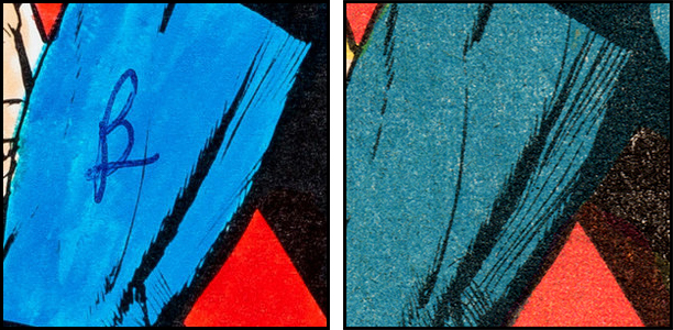


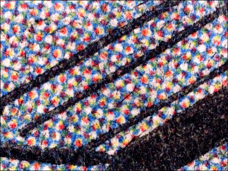


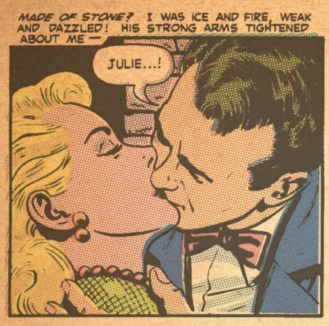


 LEGION of ANDY