Indie game storeFree gamesFun gamesHorror games
Game developmentAssetsComics
SalesBundles
Jobs
TagsGame Engines

Dragon's Isle Software

925
Posts
3
Topics
54
Followers
45
Following
A member registered Nov 29, 2021 · View creator page →

Creator of

Recent community posts

(1 edit)

Thanks for playing and the great feedback.

The post-combat inventory screen was there for the Inventory Management gameplay. I missed disabling it when Inventory Management is disabled, but it will be done in the next update. When you need to distribute your loot to each Slime for them to use it in the next combat, it made sense to have it show after each combat. It can be turned off in the settings, but should default to off when not needed.

There are currently no equipable items for the Slimes. We plan to later add special Slime helmets as their main armor, along with some accessory type items. It didn't make sense for the Slimes to be able to equip normal human body armor. We do plan to make some updated to the character stats screen that shows equipment slots to hide the ones the current character can't use to make it more clear.

Most of our current UI work is done when a new feature requires changes. There are a few more things we think will need some improvement to better fit the change to make Inventory Management off by default, but they are lower in priority at the moment.

"Fight mechanic, RPG parts of the game, UI, UX, developer of the game"
Thanks!


So, the reason for our questions is that what we have feels stuck between styles. The story feels like it deserves a full RPG game. Our movement through the world limits the feel of exploration that is needed for a good RPG, and is one of the complaints we often hear.  We've had several ideas on how to change this, but it is a lot of work, and will add a lot of time to development. Stepping back and looking at the game, the parts that are most polished are the combat and movement, which are not really RPG. The combat can work in an RPG, but it is also not a standard style for it. In order to get a game to release that is good enough, and can sustain our game dev work, we are planning to take the pieces of the game that work, and split them off into a new game that focuses less on the story and RPG elements and instead finish up a game with them.

To make a fun game out of what we have, we are thinking the best option is to go with a Roguelite style. In looking things up I found that Roguelite is the more accurate term for what we are thinking, as we are not going for the true Roguelike experience. We will keep it in the same world setting, and are currently thinking of even being in the same area. The town our demo ends at, Wildemore, will be the starting point. You will start with 1 Slime character, and a party size of 1. You can unlock additional characters, including non-Slimes, and increase the party size. At the start of each run you pick your party. There will be the typical unlocks for permanent stat boosts, and other stuff you'll be able to start with on future runs. We figure storywise we are going to center it around fighting off various generals leading groups of the invaders, rather than going for the big bad. You can keep playing and building up, fighting ever harder forces. We will have less travel along the main road and fewer towns. The player will eventually be able to pick different directions to travel from the starting town.

I'm currently doing an overhaul on our systems for handling events and placing the segments that make up the world, which has long been planned anyway. Once that is done, we just need to add in the unlocks for future runs and build out the world for this new mode. It will be far faster to complete than an overhaul to make exploration more core to the game, especially if we go with more traditional JRPG type free roaming exploration. We also hope that keeping it in the same world will allow cross promotion and help get more interest in the base game.
The biggest issue with the buttons is not enough margin/spacing at the top. You can have them shifted up a bit, just don't have them touching the edge. Even 1-2 pixels of margin can be enough to massively improve the look of text that is touching the edge/border.

Escape is often used for accessing menus, pausing, and exiting/cancelling from a screen. It was unexpected when it closed the game completely.

It would be nice if the game had an in-game option to not be in fullscreen. I used my OS controls to exit fullscreen.

I started with the tutorial. I started the game from the terminal, and when the tutorial started there were a lot of errors about tiles.

There does not seem to be a way to return to the main menu from the tutorial select screen. Once in the tutorial there doesn't seem to be a menu or other way to do so either. Pressing Escape ends the game, so I can restart, but a way to return to the menu would be nice.

I'm just starting out, so my opinions may change on things later, but there are some things about the UI that stand out to me. The button text seems positioned oddly high. It looks to be touching the top of the button with a lot of space below it. I would recommend adding a top margin or centering the text vertically. Generally it is good not to have text touching an edge.

In the top section, it feels like there is a lot of empty space. This especially stands out with the small font size for the lower row of information. Maybe more will get added later, but if not, I'd like to see the text increase in size a bit. If you want to keep the top row larger than the lower, then it feels like there is plenty of space to increase both slightly. The lower text feels too small for the UI, at least to me.

I think the tutorial instructions could use with being positioned a bit higher/further from the character. It told me to move. When I did so, some text appeared about finding someone, but I couldn't read it clearly, as it was behind the tutorial text telling me to click next turn. When the turn ended additional text showed here as well and was heard to read.

It would be nice if the tutorial had some kind of indicators when it told you to look at or interact with a UI element. This could be a glow or pulsing effect around the area, or an arrow pointing towards it. When first getting started I don't know where everything is, so an arrow from the tutorial box pointing towards the bottom right for the next turn button would help to find things faster.

After clicking next turn it tells you to hover the population resource. This is not clear. I started by looking for resources on the map, before looking around and seeing the text for it in the top bar. The small font size stood out when looking for it. Hovering the did advance the tutorial. The tutorial text change was fast and quiet, and I did not initially acknowledge it had changed as I was looking at the Population info. It might help to add something to indicate a change. After finishing with the population it does make sense to go back to the tutorial text, so this may not be needed. The tutorial text also covers up part of the popups when hovering, so maybe instead of moving it up, it should go lower down to not interfere with this part of the tutorial.

I'm at the step where the tutorial says to open the Equipment tab by having a unit and pressing the equipment. I have a unit selected and when I click on the Equipment in the bottom center box I get messages to the terminal, but nothing seems to happen in game. I clicked on the Inventory button and that advanced the tutorial.

I decided to not go back and do the next tutorial, but see what the main game was like.

The "Choose a faction!" text feels like it should be larger, bolder, underlined, or otherwise look more like a title/header. That whole left side with the equal spacing and sizing feels off. Obviously it is in an early state, but this is my first time playing, and it stood out to me. Bikers seems to have the flavor text and their special feature reversed in positioning.

Starting the game I clicked around. The Victories screen was hard to understand at first. The UI could use with some better grouping of what goes together, such as a horizontal line between the different victory conditions, or having the condition name centered on a line on its own as the separator.

I've collected several items. I have what looks like 3 pieces of clothing and a bow. When I hover over them, one of the shirts says it is a bow, while the bow says it is a sniper rifle. Both have the same stats. Equipping the clothes that say they are a bow changes the unit's Weapon line from red to green, but the text says "None".

Each unit only has 2 red icon slots below the unit for equipment, and as you choose to give them new equipment the icons update to show the 2 latest ones, rather than having dedicated slots for specific types of equipment, which is odd.

With the unit limit of 5 before new survivors found create new units, you can quickly get a lot of units to control. It would be nice if there was a quick way to see them all, along with how much movement they had left, and cycle through them.

Sometimes pressing Next Turn does not seem to end my turn but moves me to another unit. There should be more feedback on this. I thought I had gone through and made sure everyone had used all their movement, which is what I thought might have caused it before. Maybe I missed something, and the unit did still have something they could do. If that is the case, then maybe add an indicator next to the Next Turn button to show when everyone has moved/the turn is ready to be ended.

I founded a settlement/camp. Several messages all came up together at turn start and faded before I could read them. It would be nice to have a log of messages so you can go back and read any you missed.

I took a look at the tech screen and did some research. I'm going to wrap up my playthrough here.

You have a decent start. I would recommend putting some time into UI, as that was an area that lessened my enjoyment of the game. There is a lot to manage, so you need a good UI to make it not be a hassle.

I only played on the default settings with 1 faction. I saw them once early on, and did not fight them. Then I just moved around collecting things and equipping them. Eventually I built a camp. The game looks like it has potential, but as it is, did not really draw me in. I do enjoy 4x games, so will keep an eye on it in future jams to see how it progresses.

I did the auto-calibrate. Actually I played around with trying it a few times, because after I saw the second and third speeds being asked for I felt my first time through was a bit fast for the slow part, if it was going to want multiple speeds. I got very different results. I think that with a better idea of what it is for I could experiment and find a better setting.

I'd have tried more if not for the bug. That combined with the other aspects I wasn't as fond of all combined to have me decide to be done, and not really want to go back when I thought of the sensitivity, even if I had gotten past it. We also recently did another jam, and I'm a bit burned out with reviewing jams games, so didn't have as much energy to push through and keep playing. Maybe I'll try again in the future. The game had some interesting looking ideas.

(1 edit)

From the main menu the Settings screen can be a bit hard to read. It would be nice if the background was a bit more opaque. This was most notable in the Video settings where the text was over top of the main menu's button text.

On the character creation screen it would be nice if there was info on all of the Personalities.

While I was reading the update info there was some flickering of the game. It also looks like the game had already started playing as I saw someone moving down the road while typing this and it looks like there might be a day/night cycle taking place. Before I closed it I was on Day 2.

I went to the training hall and started to move around. I've played some games using this style of circle the mouse around to attack, and it is not a style I particularly like. The lack of a cursor also made it a bit harder to get a feel for where to move the mouse to get a good circle around the character. When I tried to do the special by holding the right mouse button, the target wanted to be on the right side, unless I was actively moving my mouse another direction. It would be nicer if it kept the last direction and only went back to the right when I moved that way.

I pressed Escape to pause the game while I typed this, and under what I though was the "pause" menu I got a popup about completing something and gaining fame. I only glanced at it as I typed this, and it auto-closed.

When I tried to continue the game, it would no longer recognize mouse movement to move the character or aim. I could go back to the menu and the mouse worked fine. I could right click and use the special, but not move the target cursor. The cursor was on the right side of the character, though the projectile/attack went down-left.

I quit to menu and tried to play again. When I returned to the Training Hall it popped up a message about clearing Stage 0. Pressing continue kicked me back to the overworld. I had not made my way over to speak with anyone yet, so still have a message to speak with the trainer, which I don't seem to be able to do.

I tried visiting other menu options for the town and each of them gave me the Stage 0 Cleared message, with 1 button to press that returned me to the overworld.

I decided to explore the map a bit and finally found some orcs. I entered combat, and got the same message, which also ended the combat when clicked.

I refreshed the web page and loaded from my profile, and that allowed me to take part in the fight. I was very unprepared and after a little bit of flailing about I returned to the menu.

I see that you have been adding multiplayer aspects to the game. When I first went to the Training Hall it said someone else was there and I could join them. I prefer single player games, so would be more interested in playing if there was an option to disable multiplayer interactions. Of course, the combat isn't really my thing either.

Thinking on it, maybe if I redid the mouse calibration and played with those settings I could have found something that made the swinging work a bit better for me. I was not doing well getting it to spin well. I'm adding this as an edit later, after closing the game, and don't feel like going back in to retry, but figured I'd share the thought.

The description sounded neat. I've not played Hammerfight, but did enjoy Arcanum and Magicka. Unfortunately, the combat mechanic just didn't work for me. Add to that the multiplayer, and I'm not the best reviewer for this game. Good luck with your project.

Thanks for playing and the feedback.

Resting at the inn heals your party and advances the story available from talking to NPCs.

Thanks for playing and the feedback.

There are shortcut keys you can hold while clicking an action to skip the additional selection steps. For example, if you hold Shift while clicking on an action, it will skip the Select Target step and use the currently selected one.  We are working on redoing the tutorial to just show useful tips like that, or find a better way to slip them in. We also are looking at options so you can set the default, and the key press would reverse it. We can't remove the ability to select your target manually, as it does have more value later in the game. We will look into other ways to perhaps simplify this process when you don't want to see the extra steps.

The dialog boxes being a larger size fits the style for a story heavy game like this. We do have plans to add sounds for the dialog boxes. We started to add it, but the sound we had chosen didn't work out once we tested in game, so we need to go back and find something else.

After your last reply it did not look like it had been updated, but maybe it was just cached in my browser. I've hard refreshed the page, and started the game, and it does look like there are changes. I still had a bunch of money from the last play, so I reset and started fresh.

The back button no longer locks up the game, though it does take me to the main menu, rather than back to the pause menu and being able to resume the game. It is just 1 press to continue playing from the main menu, so not a big deal, but generally I would expect a back button to take me back to the screen it came from.

I started playing through the tutorial area. I got to the block you need to switch realities to move, after using a key. I moved it part way and then switch realities and died in the night reality. This brought me back to the start point. The opening text displayed, and then the game froze. I was at 0.85% complete, 91 coins, 1 key, and one of the new gold fragments.

I refreshed the page and pressed play. It loaded me back at the start, with no progress or collected items.

I redid it and died in the day reality this time. This time I was paying attention and it was the blocks that are only safe for a short time that killed me. I think that your decision to have ending a dialog move you is problematic, especially next to these blocks. I'm not a fan of ending the dialog moving you, but if you want to keep it, then you need to design it so that it does not move you onto a danger spot. In this case you can add 1 safe space to the right of the person so ending the dialog moves you there. This will let the player see what happens and then shift to get past. Obviously the game locking after dying here is a bigger issue than the push onto the unsafe tile.

I restarted again, and got to the person who says to get the gold fragment down from them. Closing the dialog by pressing Space moves me to the right 1 tile. Moving back to the tile opens the dialog, repeating the cycle. I cannot go down to get the fragment, nor can I move back to the left to talk with anyone else.

At this point I'm guessing that this forced movement to the right is a bug, as it is interfering with completing the game.

I moved ahead and crossed a checkpoint before intentionally dying, and it did respawn me without locking up, so it may only be an issue with the initial area.

I'm going to stop my replay here, as the movement on closing dialog seems like it is going to be problematic going forward.

Thanks for playing and the feedback.

The power of an item is supposed to go up mainly in line with the level of the item, so the basic sort by level is meant to cover this. Still, I can see the use of a sort purely by the power level. We only started displaying the power to the player recently, and should update the sort to fit.

We are working on a world map. We have the base outline in place, but are still working to refine it. The game is story heavy, so we are trying to work out some story details to make the world map feel like it fits. The map will also have details about each town you know of. For the early game you really only know about the area around your hometown up to the end of the demo. The demo leads up to your party leaving their home forest, and that is where you really start to have a larger goal than just go to the next town.

We recently updated the demo to try to give a feel for the later game with the big fight in the final town. The Demo Dragon gives you a big level up to a point well beyond what the main game would have you at for the final fight, just as that fight has enemies intended to be faced much later in the game. We had hoped to show off a bit more of the later content, but it probably dumped too much on the player too quickly, and we should have given the player a few regular fights to learn about the new abilities.

Thanks!

(1 edit)

It loaded fine, and much quicker, on that system.

This jam is all about helping each other out by leaving comments with feedback. I've looked over the submissions and did not see any comments from you on other submissions. The voting period has just over a day left. Please take some time to play and leave feedback on at least one other submission.

If you have a fixed version, feel free to upload it when you are ready. We do not block uploads at any time.

Thanks for playing and the great feedback!

The only plugin we are currently using is for Git. We will be adding the SDK plugins for things like Steam, when we get to integrating them. The dialog system is custom. I've always preferred to make my own stuff when I can. It gives me more freedom to ensure it does exactly what I want.

The game started as a combat focused side-scroller, and then gained more story and RPG-like elements. As it stands it feels caught in-between them and is not working for most people. The reason we asked the questions about genres/styles is that we are planing to fork the game. The story heavy parts are intended to go more towards and RPG style with free roaming movement for exploration. We will take the current side-scroller and add some roguelite elements. We intend for both to be in a shared world, and currently, intend for them to be in the same general area, covering different events and threats in the greater conflict. This version will still have some story, but will be much more cut down.

The quests are intended to give you rewards, but they will be delivered to you by the Traders at the next town you visit. That piece has not yet been implemented. Currently, completing the initial goal unlocks the next tier of the quest. At each tier you will get more powerful rewards. Also, the demo does not go far enough for this to have an impact, but completing certain quests will have a large impact on the game. If you send items back, both for the main quest of feeding your clan, and the quests you gain at the end to supply the towns fighting back, it helps to limit how powerful the enemy can get. If you ignore the quests and keep all the loot, then the enemy grows stronger. We plan to introduce this concept to the player and give a key item, with a UI element for tracking the enemy power level.

Part of the issue right now is that the story starts off too slow. We have a lot more for the later parts that doesn't show in the demo. We may need to change the demo to start later in the game so players can see the additional elements.

The complexity of the inventory screen is for the Inventory Management mode, where you will be distributing your loot to each of the Slimes. In older versions the filters were hidden in a tab and rarely used. We wanted them to be always available for quickly managing the items when distributing them ans the filters are very helpful for that part. With the recent change to disable Inventory Management by default, the inventory screen is a bit bloated and not well designed for the simpler gameplay. The last update hid the Slimes' individual bags, making the shared party bag much bigger than it needs to be, but removed potential confusion for people of why they would need to use the individual bags. We need to take a look at the UI changes to make this mode feel more natural.

We will look into the UI scaling issues. We believe in letting players play how they want, so don't want to force anything on them. We have support for fullscreen in the game itself, and through Itch adding a button for it, and would rather leave that choice up to the player. During jams I often don't play in fullscreen as I take notes while playing and not all fullscreen games like constant switching of focus. Still, players should be able to play in a window and still read everything, so we will see if we can improve readability at smaller sizes.

Glad to help how I can. Doing game jams I've been playing a lot more styles of games than I normally would. These days I do a lot more turn-based than fast paced, but I used to do more real-time.

I'm really not sure on the boost issue. I tried to test it more, but the game was challenging and I was not able to figure out a good way to test. I tried both in the tutorial and main game. I'm not sure if the tutorial limits when it becomes enabled, as I was not able to use it at the start when I had the issue, but playing through it again I did eventually get it to work. Since I wasn't sure on the tutorial, my main testing was to start a new game and immediately try to use the boost and barrel roll. I'd press and hold for boost, but nothing happened. I was not loosing energy. I did not see any visual, or hear any audio, indication it was working. Trying the barrel roll I can acknowledge that I didn't always time things right to trigger it, but I retried it several times and similarly never saw it happen. After a restart it seemed to be working. I know this isn't that helpful, because I really don't have any key details to narrow it down. I even opened up a doc and started typing to make sure my keyboard was still working correctly. One thought I had was maybe something to do with the Caps Lock key, as I did accidentally press it at one point, but toggling it didn't seem to have any impact. The biggest issue is that I was trying to learn so much at once and my attention so spread, that when it first started to be an issue I figured I made a mistake, but didn't really pay enough attention to what was happening right away. I don't know if it was tied to boosting or doing a barrel roll when I died or perhaps activated a shop. There are many things I could see it being, but my skill was not sufficient to retest. The best I can say is that it seemed to happen at some point as I played and restarting the game seemed to fix it. When I next play I will try to pay more attention for if/when it happens and what may have happened before it.

Thanks. These are good points. We do try to  design games we enjoy, as it is easier to get a feel for if it is fun, and more enjoyable to test. Sometimes in jams we will explore new styles, but sticking with what you know helps. This started one way and grew in others, so we kind of got lost along the way. We will experiment this month with some of the changes we are thinking of and see what people think.

I know indie dev is hard, and most don't make it. We still have a bit of time left to try to make this work, so we are going to do what we can. And even if it needs to be cut back to nights and weekends, we do plan to keep working on trying to make it succeed.

First of all, thank you for such great feedback!

I will look into the potential memory leak bug. We primarily test on native Linux, and Windows in Wine. The browser tends to only get a couple of us doing a full playthrough of the game once we are finalizing a new release, so there certainly could still be some web issues we missed. We also do all our browser testing with Vivaldi, which is Chromium based. We may need to pull out Firefox, Opera, and some others for more testing.

We created this game for Godot Wild Jam # 83, which was just short of a year ago. It did not become our primary focus right away, but eventually rose to be the project we chose as what we wanted to be our first big release.

We try to be accessible in our games, and when possible develop for mobile as well as desktop. Dungeon Revolution was an outlier in not having had the time to setup the mobile controls. We have a template for them too, but it still takes a bit more work as we need extra icon art per game. It also needs a review with the recent Godot update that added in some default mobile controls.


We know the intro needs work. We are planning to break the intro up into a prologue for those who want more depth, which will start earlier in the day, and then the main game will start after you wake up at the inn, with the Leader Leo dialog happening there. We are considering adding mini-games and taking part in the festivities as part of the prologue, along with free roam and being able to play it from the perspective of each of the 4 party Slimes. Some of these are a bit feature creep and would be added later.

One of our earliest tutorials was combat focused. The big area in town with the festivities was actually designed for the combat tutorial originally, and only a recent update filled it with festival stuff. The tutorial, as we tend to do, was too long. It took you turn by turn introducing each ability the Slimes had and the combat mechanics. This was also for our old combat system, where things were pretty different. You had several basic abilities, and then 5 items from your bag that you could use. With the new abilities I would not go through and show each of them. At some point we want to create a new version of this combat tutorial, but with all the feedback that our tutorials are too long, it has been pushed to the side for now. I am considering an option where you have mini-fights started from the Training Hall, where you can do a turn or two at a time for specific things. That will take a lot more code to setup, so is far down the road.

The game does feel fairly intuitive to us, but many were confused in the past. I think a lot of our design changes have made it easier to understand, but we did not do a good job of cutting down the tutorials as we made those changes. We only recently disabled the tutorials by default. They will get a fresh review in the future, after we have got a more solid view of the path ahead.

We added the initial in development popups for Steam due to some of the initial review process, but they probably are not actually needed. We will see about dropping them, as you are right that while some people probably like the changelogs, many don't care, especially on the first play.

I'm assuming you played with the default of Inventory Management off. That was also a recent change. In the original gameplay you are supposed to distribute your loot among the personal Slime bags, rather than keep it all in a single shared bag. Each Slime can only access their bag in combat to pick items to use with their abilities. This is why the inventory screen pops up after each fight. I had meant to disable that by default when we also disabled the Inventory Management by default, and will do so in the next update. The inventory screen layout was also designed for that aspect of the game and normally the center would be split at the middle with the shared bag at the top and Slime bags at the bottom. A lot of the filtering and sorting options were designed around distributing your loot from the shared bag to the personal bags. I hid the personal bags in the last update, but the UI needs a fresh look to see how to clean it up when not playing with Inventory Management.

You mention wanting to sort/filter the food for villagers. The main quest of feeding your clan treats all items as food, since your people can eat anything. When you get the later quests to arm and feed other towns, then the Traders' Depot will automatically apply filters so only items that meet the selected quest will be shown. There is a filter for food items. It is in the last tab of the filters and uses the loaf of bread icon.

We plan to add a subset of the filter to the combat item select. We just haven't worked out how we want to do it yet. It does filter down to the items you can use for the ability, but we want players to be able to a bit more filtering if they are looking for something specific.


Art is an area we are constantly working on. The game started in the jam with a free asset pack. We then created our own art and transitioned to it. Now we are expanding it. The characters have 3 of the 4 directions done for basic animations. Once the 4th is finished we will be adding in attack/ability animations as well. We will start with some general ones, but plan to add more over time.

I don't think the story as we picture it would do well in a roguelike. There is too much to it, and it would slow the game down, especially in repeated plays. Maybe we will evolve things as we go and find a way that feels true to our goals and works in the format. This will still be in the same world, and some of the core story will be present, though we have not decided on the roguelike's story yet. The main game is intended to move beyond the forest, and the end of the demo is leaving it. We are finishing up the tilesets for the plains, which is the next area you move into. There will be plenty of additional terrains to travel through in the main game, and the roguelike.


Thanks again for your great feedback!

The core issue it money. We switched to full time game dev about a year ago, and this is our first real game that we need to release to try to sustain us as we continue. It has grown much bigger than intended, and as it is, it is not working. We are caught in between several areas and not good enough at promoting to draw enough interest in what may be too niche of a project.

Based on the feedback we have gotten, the story is too heavy and long for many who like the combat and want faster gameplay more fitting with the side-scroller style. Those who like the deep story and want to explore more of the world feel limited by the movement and ways to interact with the world and want to be more immersed in it . Switching to a full JRPG is a big undertaking, and would require a lot more time to do, but does feel like what we need to do to create the game we have in our minds with the full story. We don't have the time for that, so are looking at alternatives. Rather than picking one style, the reason for our questions is that we are thinking of forking the code and making 2 games in this world setting. We will take the side-scroller movement and combat and create an endless or roguelike. It will have much less story, but will be based somewhere in the same world, to allow some shared world building between the 2 games. This will allow us to reuse some of the art and character designs to help get both to completion without starting fresh on a new game. The main game will then advance more slowly as we build out new systems to make it feel bigger and allow more exploration and depth to the experience for the player. The current story would stay with that version. We do have a larger story planned, and that story is what drove the design to become more RPG-like and story heavy.

On the art, we are doing our own art for the game. The characters are already being designed for 4 directional movement, so it won't take much to finish them up for the free roam movement. We were already considering enabling it in the towns anyway. The big thing with art will be needing a lot more of it for the world. We will need interiors, which we don't currently have. The rest of the overworld art will need some work as well, but won't be too bad. We've done games with roaming around so have an idea of some of the issues we will need to deal with.

Thanks for taking the time to continue discussing this!

When we switched to doing game dev full time, we started by doing a bunch of game jams. The main one we did was Godot Wild Jam. One of the regulars in the jam, Maack, created a template that the jam now recommends for people starting out who want to use a template. I have not used it myself, as we created our own after our first GWJ submission and before that template was in the recommendations, and maybe before it was released. (I'm not sure on timing of when it was announced, just that we learned of it during the second or third GWJ we took part in). I did look at it when I learned of it, and if we did not already have one we probably would have used it. There are others out there, but this one is the one I recommend to people if they ask for one to use. 

Personally, the thing that is missing from yours that I most value, and the reason we created our template, is input remapping. We try to have high accessibility in our games, and input remapping to allow players to use whatever inputs methods and layouts they want was something we saw mentioned a lot. When we started out, most templates and tutorials we found with input remapping only supported a single remapped input for any action, but we wanted to support at least 3, since our defaults would include support for multiple devices. We ended up going with offering 4, but once you have it setup for multiple, the number allowed is largely a UI choice.

The other big thing for a template like this, is going to be customization. We have our own template that is designed for our use. It is not very customizable, as it serves our needs and is not being offered to others. For our stuff we want a certain overall look that ties our games together, while for a template we'd want the dev to be able to personalize the look and feel more for their projects. I admit that I did consider releasing our original template while I was making it, but when I learned of Maack's, it already had all the core things ours had, and in a much more adaptable way. Since I wasn't going to release it, I focused the future template design on our needs, and left out any of the features I'd considered that would have been for making a public one. Having gone through this process myself is why I felt it important to share my thoughts, while trying not to be too critical.

I can totally understand not wanting to lose to someone using your template. Of course, the template is really just meant to be the base allowing you to skip redoing the same things repeatedly and get into making the game. The game itself is what should win or lose the jam, unless the jam is about templates. GWJ does have a category for Accessibility, and that is an area where the template can influence score. But it is only one of many, and in that jam plenty of people will be using the same template.

Good luck with your work on this. A good template is a lot of work, but also can be valuable to many people, especially those just starting out. Having multiple options with a different feel is a good thing and offers devs more choice.

I did not download and look at the project files, so this is based solely on looking at what you have on the web.

We've done several jams now, and over time also built our own template for our use out of those projects, so I can appreciate the idea of making a reusable template.

This seems like a decent base. You've got the core elements, and even include keyboard support. You've got some music and SFX, along with some basic visual FX. There are some settings ready to go. All around it looks like something that is ready to be built upon. I did notice that the music has a fairly long delay when it loops, and personally, I'd try to reduce the delay before it loops, or try to have it fade into the next loop.

Depending on your needs this could grow to include more pieces, such as input remapping, or stay as something simple. I've seen some nice and feature rich free templates for Godot, so I do think this is a bit bare and simple to be a paid offering as it is. It seems like it should work fine for small projects, and the things we learn while creating a template are very useful. I don't want to sound dismissive of the template. I'm just not sure that it is quite ready to be a paid offering. Of course that is from my personal view, and for others it may be just what they want. I don't know the code/project design, so don't know how it compares to the others I've seen, and maybe that simplicity will be the thing most valued.

This was a neat idea, but I found it difficult to control. It felt like I needed to circle the mouse around a lot to make changes, and I had to drag it pretty low along the bottom edge if I was doing a full circle. With only the top of the wheel showing I initially figured it would only be dragging it side to side a small amount, but that did almost nothing. If you need to spin the mouse around the wheel, then more of the wheel should probably be showing, to make it easier to get under for the circling. Even with dragging all the way around it felt like by the time I saw a rock there was not enough time to avoid it. There are probably tricks to control it better, but I did not find them. Maybe add some more details on how to move quickly enough to avoid rocks. I tried a few times, but was unable to get far.

I had some additional thoughts.

First, while I played, I never felt the need for the Orbital Strike. I went back and gave it a try. It is far too small and weak to be worth using. Maybe after you add upgrades and the max energy goes up it will be better, but only being able to use it once, wait a bit, then get a second shot, limits it. The blast radius is small enough that under normal situations I was only getting 2, or maybe 3. On the later levels there may be larger clusters, but never really felt threaten enough to try it the first time. I had really expected something bigger, so maybe I was just setting my expectations too high.

As before, I did not use Walls. Towards the end I did start thinking about it, but just added an extra Tower at each spot and that worked. If difficulty continues to progress, I may start using them next time.

I think the change to having the Droids only auto-fire without being able to manually shoot works well. The long range firing really allowed the Droids to be overpowered before. The current range does feel a bit short, but still usable. I generally only had 1 Droid active at a time, but occasionally would use one as a guard when I put down a second of a different type.

I like the addition of the goals at the top guiding the player for what to do in the mission, and opening things up for additional goals later.

When I start the Music Volume is always back at 0, and I need to open the settings to raise it.

The map to select your next mission tile has an issue selecting tiles the further you go from the start. I had to click closer to the start point, often including on the next closest tile, to select the one I wanted.

I cleared 10 sectors, counting the Tutorial. I cleared 2 x 4 section, then went to the corner opposite the start. I like how things started to progress in difficulty. I did the first couple areas with the original droid, then I customized them. I primarily used dual Mining Arms with top Tower Gun. As I reached the later levels I also created one with all three mount points just using the Tower Gun.

Throughout I used a similar solution to what I have done before. I start by getting minerals and fighting off the initial waves, while placing a Root at each of the corners of the starting area, with a Tower at the corner of the area that claims. At later levels I would place a second Tower after collecting enough minerals. Once the base was secured by this, I went around collecting all the minable minerals I could. If some where near a spawn point, I might go into the next phase in that direction sooner. The next phase was to build out at an angle towards a spawn point, just placing Roots out until I got close enough and then placing 2+ Towers. On lower levels I only did 2, and then later came back to add a 3rd. By the end I placed 5 Towers at each. After one was complete I'd move on to the next. For the 30% areas I then needed to claim a bit more land somewhere. If I lost the Droid after all the mining was done, I'd use the combat unit.

The game is feeling much better now that there is difficulty progression and some challenge, even if it is still pretty easy at this point. I still lost some Droids and had to be more careful with my tactics, and felt the combat unit to be useful. I look forward to more customization and growth of the Droids. The game is progressing and feeling good.

I'm playing on Linux. I started from the terminal so I could see any errors. On startup there were several errors about failing to compile depended scripts, and being unable to load/open other scripts & resources. After pressing play and selecting a ship a lot more errors were shown. I'll save listing any specific ones for if they seem relevant to any issues I experience in game.

I want to give a warning that I can get into fine details. I'm spending a bit more time, and being a bit more detailed, with games I've been following on the Discord server. I offer my opinions and suggestions. Do with them what you will.

On the title screen, the music volume feels like it spans a wide range, from really quiet to loud enough I lowered my volume. When loud it can easily overwhelm the SFX for hovering a button, and I almost missed that it was there. Most people won't be spending a lot of time here, so it is probably not a big deal, but I had stopped to write out the notes about the startup bugs. I noticed, so I'm mentioning.

The Play button is big and obvious, but it barely reacts when you hover, especially compared to the 2 smaller buttons below it. From what I can see the hover effect makes it brighter, but the Play button is already brighter than the others, so the change is minimal. I had missed the change completely at first and had to look close to see there was an effect.

On the Select Ship screen it looks like the Tank is selected and showing its stats. When I mouse over the right half of the screen the Dart stats show up and there are some highlighting effects. The Tank stats stay showing. This looks to be because it is selected. I did not want to click on the Dart to test this, so switched to keyboard and confirmed. I'm not yet that far into the game, but am acknowledging the mouse may not be a favored input method, and this is probably why the menu Play button was already bright, as it was the selected option for keyboard/joypad. You do list keyboard/mouse combo controls, so considering mouse use on the UI is probably still good to do. I think the mouse hover effects might benefit from some review. Not vital now, but some polish for the future.

I clicked back on the game to regain focus, and ended up selecting a ship. At this point I realized that I'd probably do better with a joypad, and paused to connect one. When I went back to the game I clicked to ensure it had focus and noticed the mouse was not interacting with the game. I was able to press Start on the joypad to unpause and repause, and at that point the mouse was working on the pause screen again.

I am playing on a 4K screen, so maybe that is impacting things, but I feel like the intro text at the top is a bit small. This is still just at the start, and I can see having some text be small and out of the way of the main game can be good, but compared to the rest of the screen that feels undersized currently. The text with the controls feels similarly small compared to the vastness on the screen. I resized the window, and the text did not scale, so that lack of UI scale is probably the issue.

I moved it to a 1080p monitor and the text feels better sized, though the left side floating controls text is being cut off. For Pitch and Yaw, it cuts off between "th" in "Pitch". It is possible this is because it started in 4K and got moved to 1080p. For now I have it on the 4K screen, and have resized the window down to what I think will be a good size that should bring the top text closer to my primary field of view, while making sure everything is still visible.

I had switched to the joypad, thinking the game may have been designed for a joypad, maybe HOTAS. The controls on the screen only show for keyboard, so now I am thinking I was wrong on this. The controls for advancing the dialog especially were unknown and my first choice ended it, rather the advancing. I even restarted with the joypad plugged in, and used that to start the game, just to see if that affected what was shown. I have switched back to keyboard and mouse for now to follow along with the tutorial being shown.

The down arrow key to advance the tutorial dialog feels very out of the way. Considering that the dialog auto-advanced I didn't really use it beyond the initial bits. There were times where I was trying to read the top text and the new side controls that updated that the top text advanced a bit too quickly. When I redid the tutorial, the skipping didn't seem to be working to skip much.

I found the Inertial Damper step to be tough. I had to retry it several times before it detected and let me move on.

For the Utility and Heavy Abilities, I had missed the UI element showing them at the bottom right of the screen, so had no idea what I was doing when I first used them. I'll attribute that partly to the screen size, and the focus being on trying to read the dialog at the top and the controls to the left. It might be good to have the tutorial draw attention to the UI elements as they are relevant.

This is tough. Once you get through the gate it is just non-stop combat. I really didn't feel like I had a chance to get a feel for things. The tutorial was long and slow compared to the actual gameplay. I think you need a slower difficulty ramp so players can get used to putting the skills to use. That first area should probably have the spawn rate cut in half. It took a while before I was able to get enough of a break to see what the Black Market trader was, even though I saw it soon after entering. I largely just tried targeting whatever red thing I saw in my view and shooting while moving around in largely the same area. When I tried to get behind cover, it was always too far and I just get more enemies to deal with.

I also had an issue with Boost and Barrel-Rolls. Sometimes they worked and sometimes they did not. I was at full energy and still could not get Boost to work. I'm not sure what the issue was. Maybe there is something in game that I missed that prevents their use, beyond energy. It was problematic and made me less willing to even try Barrel Rolls. I restarted the game and they seemed to be more reliable then for a while, but still I never was fully trusting they'd work. That restart was also my last play. Perhaps it is an issue that happens over time, or something that happened while playing and affected the inputs after that.

It would be nice if the Defeat screen included some kind of score so you can compare runs. It seems like the pause and other screens, such as Defeat, hide some of the UI elements, such as currency and time, so just leaving those would be a start.

I replayed a few times and got a bit of a feel for the game. I managed to find the gate a couple times and start the charging. I also reached the Black Market and Turret Fabricator. This is not really my style of game, at least not these days, so I struggled with keeping up with the pace of the game. Still, I really think it would benefit from a slower difficulty curve to introduce players. Maybe even add a training/practice area. No tutorial popups, just an area with the basic elements of the game to learn how they work. Maybe different sections, so you go to one area and it spawns harmless drones for target practice. Another could spawn enemies that shoot back, but with a limit so that only 2 or 3 spawn in a batch, and no more spawn until those are gone and a cooldown has expired. Maybe use your logic from the tutorial so you have to go there and shoot to activate the spawn. After all are destroyed there could be a countdown and if you are still shooting after it, then it spawns more. Let the player have some currency and maybe see how some shops or other elements work. I think there is a good base here. Maybe as it progresses I'll get a better feel for it and be able to finish an area.

I think a tag of optional level/side quest will help with the Phantom level, but if possible, I'd see about adjusting the level select indicator for it as well. Giving a bit more distance, or maybe a color change to the circle. Something to stand out more right from the start so players see it as different and are more likely to pay attention to the fact that it is bonus and the story ends with the third level. The way it transitioned it felt like it could be part of the story. Possibly this new thing might be something to gain for your fight against the invading forces. Like it was a step along the way to that big fight we just saw.


For the cards, I think they need some rebalancing. The new ones could be interesting, but when evaluating things they just did not pay off for me. I am a very logical person. While I enjoy story, when I it comes to picking my party and equipment, I get into the details. I want to know everything and go with the most effective combo for my play style. One issue for me in picking some cards was the unknowns. In a future play I may experiment more, but for the first time through I wanted to win without losing any ships. That limited some experimentation. If I wasn't sure on how an ability worked, and wasn't sure I could calculate its damage/effectiveness, I skipped it. This included things like the Sniper line and Fuel Shot. How does distance get converted into damage? How much fuel does each ship have? I also had this issue with the Flower, as mentioned in my other comments. After seeing it used, I was willing to try it, as it looked really cool and powerful, but the card art and description made me think it worked differently, and I wasn't willing to risk it before seeing it in use. Self-destruct was never on my list to even consider using.

Side note here, maybe add a testing mode/shooting range for players to try out the abilities and see how they work.

I mainly focused on dealing damage. In some games I go all out on a turtle defense style, in others I like to hit hard and take the enemy out before they can hurt me, so there is no need to heal. In this game I went with win fast and limit getting hit. I also like to be prepared for everything I can. I started picking cards based on doing damage, then added some healing and support. The support ship was hard to aim, but had an extra point of energy per turn, so it got 2 abilities to pass that energy on to another ship that I could better aim. It also gave it attacks that spread out to make up for aiming issues, especially as I got more tired. While picking abilities I also wanted to have a good mix. I liked the multi-hit straight ones, especially Double Attack costing 0, and Triple Attack only costing 1. I feel like the Triple Attack costing the same as the basic Shotgun makes the Shotgun significantly less appealing. With the way aiming works, the Shotgun line is hard to use to really hit several targets, so aiming straight and guaranteeing that if you hit, all shots hit, is the better option. Only for the Support ship with its harder aiming did the Shoutgun make more sense for me, and even then, I did not use it much.

I largely broke the weapons down into lasers, which were vital for penetrating shields, basic/straight projectiles, shotguns, and other. As mentioned before, the Blast Gun was hands down my favorite weapon. It could hit multiple enemies, get around shields, and do good damage. The cost was also low enough that I could use it often. I put it on the Assassin ship, and then had the Support ship keep giving it an energy boost so I could use it more often. As much as I loved using it, I think it may be overpowered as is, and should probably have the cost increased to 3. Instead of higher cost, it could maybe get the damage amount dropped down.

Once I learned about how the Flower line worked, I also liked them. With it covering a wide area, it also worked as a good alternative to using a Shotgun. The base Flower cost more for equal projectiles in a Shotgun, but going straight meant more could hit from greater range. Once you get the second Flower, the shotgun really loses most value. The only Shotgun I gave any value to was the Bounty Shotgun. The cost of 2 with the spread giving me a better chance of hitting made it a decent choice for the Support when I needed to use it to finish an enemy. The 5 shots over the 3 of the 2 cost Tri Laser helped with the accuracy concern. If there were more options at the 2 cost tier I'd have considered them over the shotgun. I think the split Lasers suffer from the same issue as the Shotguns. The aiming can be tough, and from a distance you are not likely to hit multiple targets, or multiple times on the same enemy. This may be intended to encourage getting up close with them, but why? Why would I get close and use a Shotgun, or split Laser, when there are so many options that let me do just as much damage, for similar cost, from further away?

I think the Shotguns need an overhaul to make them feel worth getting closer to use. They need to be more powerful than the equivalent non-Shotgun options. At the low end we have the 0 cost Double Attack and 1 cost Triple Attack vs the 1 cost Shotgun. What benefit does the Shotgun offer over those? It spreads a bit, which can increase the chance of hitting if your aim is off, but aim is vital, so for most ships I think in terms of having decent accuracy. Also, if I am relying on the spread to hit, then that is accepting that I may be doing less damage for any missed shots, lessening the value equation somewhat. At 3 cost the 7 projectiles of the Shotgun over 6 of Hexa Shot does offer some boost, though at 4 cost, they are equal and straight wins for me. Back down at 3 cost we now have the Flower line. I did not use the 3 cost one, and looking at it, the 5 projectiles vs 6 or 7 alternatives just discussed doesn't seem as good. Having not used it enough, maybe the way it moves would balance out, but that would need more testing. Once we get to 4 cost the Remorse Flower with 12 projectiles dominates the Nona Shot and Destroyer alternatives with only 9. The Shotgun line also stops at 4, while the Flower line gets the 5 cost 16 projectile. Of course that is from the bonus fight, and I'm not sure the extra energy is worth the slight bump. I'll quickly bring this back to the Blast Gun, and compare the 2 cost Shotgun to it. Shotgun has 5 projectiles doing 1 point each. The Blast Gun is 4 damage per target. If hitting 1 target, the Shotgun does 1 extra. If you hit 2 or more targets, the Blast Gun totally dominates on damage. Now, the Blast Gun does require more accuracy to hit, so that can impact the equation.

Next I'll move on to Lasers. The Shotguns also need to compare to these, but they have their own pros and cons, so I'll center the focus here on them with mentions relating to Shotguns. The basic 1 cost Laser is a good low cost way to hit through shields, or when the enemies line up. I equipped the Tri laser for a while, but didn't really use it, and now consider it to be less desirable. It has the same split negatives as the Shotgun, though suffers a bit more here. The pro of the Laser line is penetration, so you often want to line things up, and may be further away from the target due to the shield. That is going to reduce the chance of multiple hitting the same target, and also trying to get all split beams to hit feels more challenging. The only one of the split Lasers that felt useful to me was the Doom Cannon, and part of that comes from it doing 2 damage per hit. Of course its high cost makes it unreasonable for general use. I viewed it as a boss fight weapon used with the Special to give full energy. The lasers costing 1 more than the equivalent number of projectiles Shotgun works well for the balance of it having penetration.

Now, once we move from the split Lasers to the multi-beam straight Lasers, things change. The Laser of Lament was nice. At 3 cost it only did 3 beams, but each was 2 damage, allowing up to 6 damage per target if all 3 hit. Going straight it was easier to hit a single target, especially from a safe distance. The 3 cost Shotgun has 7 projectiles, so slightly higher potential for a single target, but the penetration means the Laser can hit multiple enemies, and pierce shields. Also with only 3 beams and 2 damage each, each hit does more, so if you only hit once you get more, while losing some chance to hit. This cost benefit gets even more in its favor when you compare to the 3 cost split Laser which only has 5 beams/max damage. The Phantom Ray is a decent step up from this, but being at end game I did not use it.

The Assassin being in the middle also meant that I gave it the AOE heal, which otherwise would have gone to the Support. I know they can move around in combat, so debated putting the heal on Support, but where I generally placed them in combat, this felt the best. I also did not do much in combat healing, so treated it more as a backup/safety net.

I did not use any Aim cards as they did not feel worth the extra turn to use for the benefit. Partly this was a self imposed requirement that I should just get good myself, rather than using some of these as a crutch. Also, these work on an ally, when I'd be more likely to want the Support to have them to improve it own accuracy. The Sniper's Vision could have use for dealing with obstructions, but that is what Lasers are for.

Gaining and transferring Energy was useful with the Support ship having 2 energy but tough aiming. I did try to improve my aim skill with it, but transferring the energy and using higher power stuff sooner ended up working well. The 0 Energy Recharge Ally was a great opening move for me, setting up for a powerful move on the next turn, especially paired with Energy Infusion. That gave The Assassin ship its max 4 Energy on turn 2, allowing the use of most cards. This felt like a great use of the Support role for me. Even better, with the Support gaining 2 Energy per turn, and this opening only using 1, on turn 3 the Support had 3 Energy and could then do a decent attack move itself, such as Laser of Lament.

Healing I did not use much. I went with "the best defense is a good offense". I had Band Aid for occasional help, but almost never used it. The Pravarshan was a nice addition, but I never actually ended up using it. The main heal I used was Uplifting Aura. The lower cost of 3, and getting it early enough, meant it had more chance to be used. In the future I may test these out more and find a better set for me, but in general I want to get better at not getting hit instead.

I only got 2 "Other" category cards. The Plasma Shield sounded cool, and at 3 is reasonably priced. I almost used it once, but then ended up just hitting the enemy hard and never felt the need for it. The revive is nice to have, but again, with my refusal to lose a ship, and its high cost of 5, I felt it was not practical to equip. Unlocking cards to write this up I looked at some others. The Therapeutic Grapple looks nice, though the current 0 cost would be way too low and make it feel overpowered. I'm guessing that was added for testing and not meant to be in the main game.

Okay, hope that wasn't too rambly. There was more going on in my head, but I think this covers the most important, and easiest to explain, parts.

One other note, it looks like the "Assassin" ship is spelled "Assasin" (missing an "s").

(1 edit)

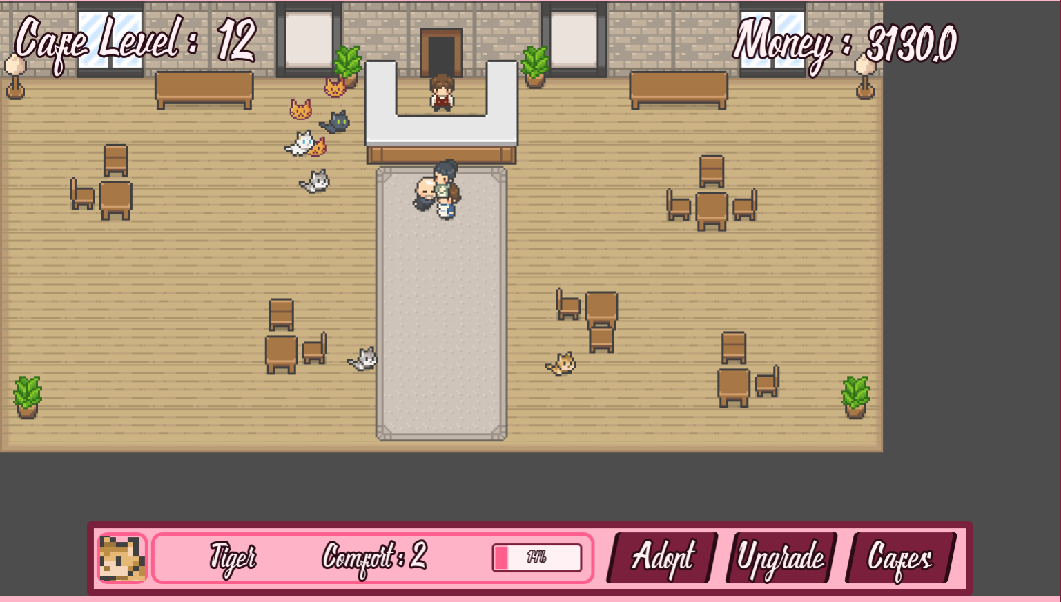
The font is nice, but can be hard to read, especially in areas where the text is small. The text at the top center really stood out right away as an example of this. Adding an option to switch back to a basic font would be good for those who have trouble reading fancy ones. I'd also recommend adding a small margin to the left side of that top area so the text is not touching the border.

Another thing that can help with readability would be to allow going into fullscreen. As long as you have your Godot project settings set to enable scaling, it can handle the scaling work for you. Then you just need to check the box on Itch for it to add the button to go into fullscreen, without any extra code to handle fullscreen in the game. The project setting is under Display → Window → Stretch. For 2D pixel art games setting Mode to "canvas_items" usually works well. For checking a couple boxes you can get a nice little improvement. I tried using the browser zoom, but the UI elements and cafe scene did not scale. They stayed in their relative positions as the game viewport expanded.

Of course, if you do offer fullscreen, you need to keep in mind that the Esc key exits fullscreen in the browser. When offering browser games with fullscreen, and in general for browser games, it is good to add an alternative pause key, often "P".

I opened the Adopt screen, and again the font really feels harder to read than I think is good. The pink text on white background doesn't help. The larger size helps make the font more readable than if it was smaller, but it feels really big for the space it is in. The single line details are fine, but the "More Info" spanning multiple lines feels like there is so little text on a line that it impacts comprehension. Sure, this is flavor text and not vital details, but it lessens the feel when you have to do extra thinking to process it in an uncommon format. There is a decent amount of space around the whole "Cat Adoption Board" that you can work with, so I would increase its width and give more width to the "Cat Info" area. I'd also suggest adding bolding to the title of each stat/detail in the "Cat Info", or do something else to help the brain quickly process the title separate from the detail it is pointing to. This area could also benefit from more left margin.

For the more info of Bandit, should "Love to explore" be "Loves"?

I adopted a cat and clicked on them to get their comfort up. The final message about customers did not wait for me to do anything and went away before I could read all of it.

I don't yet know how important time passing is. You call it an idle game, so I'm assuming that there is no time pressure, and making the customers and cats wait won't matter. If it does matter, I noticed that opening up the Adopt screen again does not pause things. I don't do many idle games, so the lack of pause had me closing it right away to check on everything, and see if I was missing an interaction I needed to deal with. Playing some more I would say time does not matter, so there is no need to pause when showing the adoption screen. If you do add elements where the player needs to react in a limited time, then you'll want to be sure the adoption screen doesn't cause them to miss it.

I do appreciate that you included a pause screen, as that allows me to not miss things while I am typing these notes.

I adopted a second cat. A new customer showed up as soon as I closed the screen. I also saw the original customer get stuck for a short time on one of the cats. They sorted it out, so it is not a big deal, but as the number of characters on screen grows, you may need to work on the navigation/path finding to reduce the chances of this.

I played a bit more and then started adoption more cats. I adopted 5, and had 3 customers when 2 customers decided to go to the counter at the same time, and got stuck on each other. Then the third customer joined in. One of the cats got stuck on the pileup for a while, but freed themselves.


I'm still making money, and there don't seem to be any significant negatives at the moment, other than not being able to interact with the customers. I went ahead and adopted the remaining cats, and got the You Win message. The game was continuing in the background. It would be nice if you added an "OK" or "Keep playing with the cats" button, for those who want to just enjoy having all the cats.

I tried clicking on the Upgrade and Cafes buttons, but they did not seem to do anything. If they are not yet implemented, I would suggest disabling them so they don't look active to players. You could also have them show a message about what they will be and that they are not ready yet, but I think the simple disable conveys that well enough.

Thanks for playing and the feedback.

We really need to work on the tutorials. Our current ones are disabled by default due to feedback that they were too much (too long, too many details all at once). There used to be a training fight in the large area in the first town that walked you through combat with your opponent being a Slime teaching you. Each turn it would unlock you next possible action and have you use it. This was with the old combat system, and was not updated for the new one. Then we added the popup based system that points to each section and explains it. As new systems were added those got a bit too wordy, and too many pop ups in a row for some people, so they were turned off by default in a recent updae. We also have the Training Hall. That used to be in the Town UI with the Inns and Taverns. We had some comments that some people felt like they had to read through all of it before leaving town, which made the intro too slow. They were in every town, but if you missed that part you may want to do everything, and that could make it feel too much, especially for a jam game. We moved it to the menu so you can access it from anywhere hoping to give players more freedom to visit it at any time to read up as they were ready. We clearly need to find a better balance. I think the popup tutorials are probably still good, but we need to cut them down. Part of the issue is that we support so many inputs and talk about them and the different ways to do things. I'm looking at changing it so that the player picks what input they are mainly using and want as the basis for their tutorials.

The main change we are talking about for making it a JRPG is the movement/how you interact with the game world. Right now we have it on rails with your characters mostly moving to the right, and interactions done through menus. Switching to be more JRPG style would involve allowing free roaming to explore the world. You'd wander around town to interact with NPCs. You'd walk outside and explore the world, fighting random encounters. Things like that. We feel we will be better able to present the story in a way that works for a larger audience, and make the world feel more alive. It will both offer a gameplay style people are more familiar with, and help to breakup the text with more player control.

We have discussed updating the travel system to allow picking what fork in the road to take, with options for more risk/reward. With our recent changes adding the AP system we still need to balance the drop rate of items, especially early game.

Thanks again for playing!

Thanks for playing and the feedback.

Thanks for playing and the feedback.

There are several options for dialog speed, including showing all the text immediately. We do not currently have anything for auto-advancing, though will think about it. The game is story rich, so we are working on trying to find the right way to present those story sequences. Part of the thoughts on going with a more standard JRPG style is to allow separating out the story a bit with more player control in between and player choice of who to talk to.

We are needing to do some rethinking on the inventory with the change to remove the inventory management on the default mode. Normally you would see the Bags for each Slime and be transferring items around in there. It also lets you see details, if you want. It does feel a bit excessive when the inventory management is off, but it seemed like the best way to do things for now until we really get a feel for what this change means and how to best update the UI for it.

We will look into the Filter UI to see about making them more clear.

The popups were longer, but then things changed so that you were getting a bunch at one time and they felt like they took too long to get through all of them. The main purpose of the popups is just to let the player know their is something new, and they can go into the Character Details to see more. We may need to rework it a bit more to find the right balance. We have already discussed adding a setting so players can adjust how longer the notifications remain, and possibly the size.

This demo was designed to give players a fast intro to the game, so it was accelerated from what the planned normal game would be. That Demo Dragon boost was especially meant to be a major jump so we could show off tougher fights and later abilities.

The main thing we are thinking about for changing to a JRPG would be the movement changing from an on rails side-scroller to the normal freedom of movement of a JRPG. This would impact not just moving around, but how the player explores, how they interact with NPCs, and how the story would unfold in scripted events.

We are looking at options for making leveling up feel better. Being able to distribute skill or stat pints are among the things being looked at.

We've had the suggestion of starting out with a single Slime and adding more over time before. The problem is that it does not fit into the story. That is one of the reasons we are looking at roguelike aspects. In that style of game with less focus on story we could have the player start with just one character and unlock more, and a larger party size, as they play.

Thanks again for the feedback!

When I came back to play again I refreshed the page. This time the first mission showed as not yet completed. So, maybe completing the tutorial marked the first mission as complete.

Having played through it already, it would be nice to be able to skip the opening sequence on subsequent plays.

It would be nice if the battle log used different color for the text to distinguish your actions vs the enemy's. It does show "ENEMY TURN", but maybe having the enemy hurting you be red, while you hurting them is orange or something else. I think more important than that, though, would be to add a message or spacer after the enemy turn, before the messages about your ships recharging before turn start.

It seems odd that you include a Basic Attack card, when every ship also gets that ability. Is there a reason to have a second copy? Or is it just because the display includes all cards perhaps.

For the 3rd fight in the first area it seemed like time was sensitive, so I tried to take the enemy out as fast as possible, while the previous fights I had done a bit more experimenting. I had not used the special abilities yet, so decided to start with them. I charged all ships to full energy. Then used the Blast Gun (I keep wanting to call it Blast Cannon) on the center enemy, hitting slightly high and hitting them and the ship above. I moved everyone where I wanted them, and then got my extra turn. I fired the Blast Gun again, destroying both the center and top enemies. I the used the Bounty Shotgun with the Support ship and did some damage to the last ship, though was not able to take it out. The next turn I finished it off quickly.

The last text was "Prepare to land on Drunghur", instead of "Dronghur".

In the text "they will take at least a week to reach." A space is missing in "at least". Unless it is intentional for the character's speech, I'd say it should have something more at the end, such as "reach us" or "reach here".

After the old man says "Follow me", it feels a bit abrupt switching to the ship loadout/cards screen.

I'm not fully sure on the ores and stones that come on the screen with asteroids. I tried to collect Godrin's Stone (I think that is what it was called), and took collision damage. Then I shot it, but it was near the top of the screen, and I could not read everything that popped up. Clicking on it said something about reviving a ship, so I had wanted to collect it. I did not have any destroyed ships, so it probably was wasteful. It seems like shooting the repair stuff heals the ship that shot it. The blue/green Military Supplies seem to heal all of your ships, while the red you were told not to shoot I'm guessing heal the enemy.

As far as I can tell the Credits are just for repairing your ship. This works well, as I'm not concerned about being able to afford repairs with nothing else to spend them on.

The Quick Repairs description could use some work. I'd start with "Finding popularity" or "Having found". There is also a period followed by a lowercase letter and no space.

The "E" in "enough from you" in the Crusher fight should be capitalized.

I did not do as well on the Crusher fight. I did not count my fights, so didn't swap out any abilities for more powerful ones. I'd planned to use the Doom Cannon on the next boss fight. I also did not jump to using the Specials right away. I tested a basic attack on the shield and found it was not damaged at all. I then moved my top ship to attack the outer target. I continued largely treating it like any other fight as I took out the top target. Then I got hit by its special. The ship with the basic targeting heal was the one that got hit, so I had to charge up to use Uplifting Aura, and even that was not really enough. I also adjusted positions so the damaged ship was behind another. The enemy's next attack destroyed a Military Supplies, which also helped heal me up a bit. I did a bit of damage control and repair, and then went back to my strategy from the last boss fight of using the specials to hit hard and fast. I was able to win without losing any ships

At the end of a level you may want to rotate the ships so they are facing the right edge of the screen before they warp out. It looks a bit odd with some of them highly rotated. The asteroids and other stuff flying with them is also a bit off, and you may want to hide the other stuff, or do something with it, while making sure not to damage the ships.

It looks like I got Pravarshan twice. I got it earlier and again from the fight I just finished.

As I am unlocking more cards, I find that I am not changing my ship loadout often. The Blast Gun is my favorite. I also like the Laser of Lamentation as a second to that for group damage.

I'm going to pause here and list my current setup. I'm not fully happy with it, but am getting tired and not processing exactly how I want to change it, just that I know I want to update it.

Spaceship: Triple Attack, Tri Laser, Laser Beam, Band Aid (Swapping to Pravarshan for next boss)

Assassin: Double Attack, Shotgun, Blast Gun, Uplifting Aura

Support: Recharge Ally, Bounty Shotgun, Energy Infusion, Laser of Lamentation

I haven't really used the Tri Laser, so I'm swapping it for the Hexa Shot I just got.

I haven't tried The Flower, as it makes me think it will do a starburst style attack from your ship going in all directions and increase chances of friendly fire. With the enemies always staying on the far right, and your ships limited in how far right you can go, that style doesn't make sense. The enemy also used the Remorse Flower on me and it looked like it may have been a homing attack. I'm swapping in the Remorse Flower to try out in the next fight, replacing Shotgun, which I rarely use. I feel like there is no need for the Shotgun when I can use Triple Attack. If my aim was better I might be able to hit multiple targets, but in most cases 3 straight shots can be used more often. If there were more slots I might add in a shotgun for alternate scenarios, but it just doesn't compare favorably. Sure, you can only use 1 of each card, so it could go to another ship, but other things win over it. Of course, once you get the higher shot count Shotguns things are different, but even there I'm only using the Bounty Shotgun on the Support, since it can use it any turn after the first. The Bounty Shotgun has a good balance for me on that ship, especially with the ship's low accuracy.

OK, I know the level said it was Difficult, so I should have expected more. I was thinking to use the first fight for my testing, but it looks like a boss on its own. We shall see how it goes.

I built up and used the Remorse Flower. I messed up my timing, but it was still very powerful, and also pretty.

After fight 2 of level 3 all the cards I got were duplicates. Since it does not seem like you can assign 2 of the same card, even when getting a duplicate, this feels off. Especially with the header text saying "You've Unlocked New Abilities".

Typo in Signal fight in the word "transmission" in "Gwen we are getting a transmission".

Typo in post-fight text "face of danger in beyond me" should probably be "is beyond me". Same conversation from Flinn "information" is misspelled.

I initially used WASD for controlling my ship movement, but found the rotation hard to get right. After a while I remembered the mouse could be used as well, and that is so nice for accurately aiming at an enemy!

More duplicate cards, at least 2 of them being the same as the previous fight. There are still a fair number of cards not yet unlocked as I go into the final level.

In The Phantom Mission Info it says "What does his objective?", which should probably be "What is his objective?".

Interesting that after the 3rd fight being listed as Difficult, the 4th fight is only listed as Medium Difficulty.

After seeing the post-fight display of enemies from level 3, I swapped the Hexa Shot out for Penta Laser, figuring if there are layers of enemies, the laser would be more useful.

And starting the final level, instead of a fleet, I am greeted with a single ship. The other may have been better here. We shall see what comes next.

I took some significant damage, and ended up hiding one of my ships behind another as it was very low on HP. My base strategy works well on the boss fights, though I should have paid a bit better attention here to healing, as there was a point I could have healed up and didn't. I really like charging everyone to full energy, and then taking another turn. I don't use the special attack that often. Actually I think I only used it once or twice, after I had drained their energy on other stuff, though as part of the opening combo it does work well for the second turn after all others have used their abilities.

When I finished there were still a number of cards locked. It would also be nice to be able to view cards without going into a fight, as I wanted to read the text on the new ones, but was not going to do another fight. From the card select screen there does not appear to be a way to get back to the menu.

I really like the power boosting mechanic when aiming straight ahead and getting the accuracy in the range. That keeps the combat feeling more active and give a nice reward not just for tactics, but skill as well.

I enjoyed playing through the game. The story was good, and I look forward to seeing the rest of it. I may have more thoughts later, but I'm tired so will end it here for now.

(1 edit)

This is the first time I'm leaving feedback on one of your games, so fair warning, I can get a bit into tiny details at times. I tend to give a lot of advice. Please take this as my personal preferences/opinions and do with it what you will to make your game.


The Settings button is a bit faint. On the web it is also covered by the "User Tools" links on Itch. I didn't see it until I hid those. Going into fullscreen would also show it, and I'm sure many people do sue fullscreen for the web games to deal with those links. I take notes while play, and not all fullscreen games play nicely with that, so I start without and test as I go.

It would be nice if there was BG music on the title screen.

When having volume controls it is good to have something playing so the player can adjust the volume and get feedback on their changes. BG music on the title screen would work for the music adjustment with your settings also being there. For SFX we play a short sound every time the volume is adjusted.

I do like the debug type unlocks you offer in the settings, and may try some later.

I started the tutorial, and it was also silent. I double checked my sound settings, then restarted and went into the main game, at which point I got sound. I then returned to the tutorial.

I like how you cover over elements during the tutorial to bring focus where you want it. Many will just highlight the key part while leaving everything else, but this does a good job of making it clear what the focus is.

When you start you see 3 ships, but when you get to the step that says to click on any of your ships, that blocking of other parts of the screen, is now covering up the top ship. I just see the bottom half of the text "( MOVE )". I can click on either of the others, but it did stand out to me that it says to click on any, but limits to 2 of 3. This is a bit nit-picky, but when giving jam feedback, I like to mention what I notice and leave it up to the dev to decide what to do with it.

After selecting the Assassin ship, it said to select the Basic Attack. While moving my mouse to it, I noticed that the Shotgun card also had a light-up/glow effect as I passed over the left edge of it. The basic attack had that effect, but the other 2 cards did not. The Shotgun also only had it on a small portion. At the vertical middle you have horizontal lines on either side. It only highlighted from the left edge up to the start of that line. I was able to right-click to get the info popup for the Shotgun card.

When you mouse over the cards it says to right-click to see more info. You may want to disable that text during this step of the tutorial. Your overlay seems to cover much of the card. I was able to close the card by clicking off to the side, but it lacked a clear way to close it.

The Aim Circle/Speed look to be using special font characters that may be OS specific. I am on Linux and see that your download is Windows, so I am guessing you are using a Windows system font for that display. I recommend including any fonts you use in your export, and not relying on system fonts. Looking at a screenshot, it looks like when Normal, there should be a green circle there.


When I clicked on Basic Attack I got some sound. It was a bit loud, so I adjusted my speakers, but then tried to click on the sound icon at the top right of the screen. That cause the ship to fire. It wasn't straight on, but I was lucky and it was close to center and still hit the enemy.

I like the way the sound changes to reflect how close it is to the center.

For the Move step, I think it would be nice if the "Click here" text had an arrow, as you aren't supposed to click on that text, but the Move text below it. You could even do away with the "Click here" text and just have an arrow, maybe pulsing, pointing at the button.

The Move text in the area that looks like a tab is thin, and the hover effect is fairly faint. You may want to add something more to the hover. The Move text under the ships have a glow to them, so maybe add that to the tab location as well.

I had chosen the bottom ship. I moved straight forward. The bottom edge of the ship, and the movement remaining indicator were cutoff by the tutorial text. The Stop button was also covered.

After moving I did the Basic Attack again. This time there was no sound as the indicator moved. There was sound when it fired.

For the message about gaining energy and fuel, I think you should add the word "is", making the end "its fuel is refilled".

Now that I can see the full card when right-clicking on it, I don't see a clear indicator of how to close the view. Clicking on the card itself does nothing. Clicking anywhere else, including on the text about the card, closes it. If there is no action for clicking on the card, then I would recommend closing it when clicking the card as well.

After our recent discussions about the Shotgun, I had to go with it for the Assassin. Since you said the spread was reduced, I moved straight ahead with full movement, and fired. It seemed like the spread was still reasonable, and all 3 hit the main target.

The description for Band Aid looks to be missing a space in "reverse damage".

I had moved the bottom ship mostly straight forward and stopped with the front just left of where the Move tab starts to angle down. When I went to click on the Move text below the ship, it did not respond initially. I was able to get it to react by moving the mouse up to the top third of the text. You have the tabbed Move button right there, so it is not a big issue blocking gameplay. Edit: After starting the next combat I retested this and found that even when starting I had the same issue. I'm guessing you have a Container extending edge to edge that is above the ships and blocking access to the Move button. If so, and you don't need it to pass things up, you may want to change the Mouse setting to Ignore.

I finished the tutorial. The targeting sound was intermittent as I played. I did not pay enough attention to figure out if there was a pattern. It may be the first ship each turn had it, but I cannot confirm that at the moment.

I gained 5000 Credits, and clicked the button for cards. Then I got a screen that had some header text saying "You've unlocked new abilities", with a large empty area and a next button. I waited a bit expecting something to show up in the middle area. Personally, if all that is meant to show up there is that text, I'd move it to be more vertically centered so the screen doesn't feel so empty and like there is something missing. When I clicked next it took me to what looked like the main game screen. I did not see anywhere to spend the credits or buy new cards. I'm guessing that may be related to it having been the end of the tutorial and not being able to buy anything going into the main game, but it could use with something more there to explain the situation.

I could now move between circles to select a mission. The first shows as completed, which is likely from my previous play. Moving between the missions, I can go from the first to the last with a single click. From the last, however, I can only click on the previous mission.

I like the intro. It is a good length, and gives a nice starting point for the game.

The music fits the game well. Combat feels much better having the music playing.

I started with the bottom ship. After clicking Move the bottom UI was hidden, and I acknowledged there was a fair amount of screen space down there. I decided to spread my ships out. I did think about how the UI might cover up a ship that went too far down, but wanted to try it anyway. I angled the ship down at a 45 degree angle and moved forward. It went a short distance in the direction I was aiming, and then started to slide to the right. I would prefer if the UI, or most of it, remained to show the limit of where you can go. I'm going to say that the bottom edge lines up with the larger line going across below the Move & End Turn tab-like buttons. Maybe just hide them, and the cards, but leave the lower UI outline to mark where the player can move.

Pressing the power icon brings up a Quit Game panel that looks a bit out of place. It is very bland an un-styled, like it is missing your main theme.


I'm going to be taking a break now. It is dark now and the loud festivities are starting. I'll play again later tonight or tomorrow and actually play through the main game.

Thanks for the additional comments. It did not seem rambling to me, but was useful feedback.

I'll start with the Next Fest detail. We had hoped that it would be better received and we could then finish fleshing out the story and art by the end of the year. With the poor reception, we are now stepping back and planning larger changes. We include all the placeholder and early dev comments in part to temper expectations, especially for Steam. Itch is a bit more forgiving, but Steam we want to be sure people know this is still a WIP.

I agree with your comments on the lead up to the camp fight. We added a new "danger approaching" track, and so thought to use it there, but you are right that from the character perspective it should be more questioning and not certain of danger.

I also agree that it would be nice to flesh out the towns a bit. We had some plans for this, including having you travel around the towns, instead of just using the menu, but even that felt a bit lacking. This is where a JRPG would allow for a better presentation.

We do plan additional animations and effects in combat, but it got delayed as we worked on other bits and tried to figure out how we could make the game work.


Now, the reason we asked about styles is that we are planning to split the game. We are currently doing some updates to the core that had already been planned. Once they are done, we will fork the code. The main project is intended to become more of a JRPG, including free roam of the world. This is going to require a lot more time to build out, and many things will need to be updated to fit. The other branch is tentatively going to be called Hungry For Loot Goes Rogue. That  will embrace the current combat and travel systems and build them out into a roguelike. We intend to base the new game in the same world setting, though have not worked out how it will relate to the core story that will be in the JRPG. This game will have much less story, though will likely retain the Bestiary and perhaps some other parts of the Compendium. The first version of the new game will be based on the current Hungry For Loot, reusing the characters and towns. Once the core gameplay is working and we see how it is received, we will flesh out where it fits and update the characters to be unique for it.

Some key things we are planning for the new game will be that you start with only 1 character, currently Phil. You will be able to unlock additional characters, at which point you can pick who to play as. After you get another character you will be able to start unlocking party slots, allowing up to 6 characters in your party. We also plan to expand it so you can have characters from other Slime clans, as well as non-Slimes in the party. The current breaking at towns will largely be replaced by resting at camps. Loot will be massively reduced, as you won't be doing the quests to feed your clan and arm the other towns. We have other ideas, but these are the biggest changes to the current core gameplay.

The core thinking behind this split is that we do not have the time to complete Hungry For Loot as a JRPG, but that is how the story will work best. We need to produce a finished game to start making money. We already have a lot of systems in place with our current code base, and the existing gameplay lends itself well to a roguelike style. Roguelikes are also very popular, and we feel like we could do a better job of presenting and marketing it. By keeping it in the same world setting it can also be used to help promote the core game as we finish building it out. We have a lot of work ahead, but plan to dedicate this month to getting the core roguelike game ready. The parent branch will likely get some releases as I finish pieces that will apply to both of them before they get split.

Thanks for the great feedback, as usual.

We wanted that final fight to be tougher for the Next Fest demo to show off more of the higher level abilities. We didn't run into the same issue with too much healing. They do have a limit on healing items, though the healer class does have their ability, and that may need to get more limits on how often it can be used. Of course, we know the game, so that likely had an impact, and this is why others playing is so helpful. We will take a look at it with an eye to balancing the healing. We also plan an overhaul of the demo when we next release one, so that whole fight will likely change. Those enemies are meant for a later fight, and you won't normally be getting the Demo Dragon upgrades.

When you select a character in combat their current and max AP is shown at the top center. You can see this in the first screenshot on the game page. It is in a more horizontal 3x3 grid layout, compared to the vertical layout of the character stats screen. We may need to do something to make it more clear what this is. If it is not showing for you, then that would be a bug.

We are thinking on ways to better handle organizing things for the non-Inventory Management mode. In the normal mode the idea had been that you'd leave all the low level or less wanted items in the Party Bag, so they would not crowd the combat screen. Now everything you don't send back for a quest is there, which can make it more crowded. We've been toying with adding a single extra bag for holding items you want to keep, but not see anywhere else. There is also the possibility we could add an attribute to items so the player could simply mark them so that it does not show in combat. Though I think that would need a good UI to not confuse players with why certain items aren't showing if they forget, or did it without realizing. The other thing I want to add is a player selectable filter for the combat item selection, but it needs to be more limited to fit the space. It also needs the right settings for what to retain between selecting items. For example, if you simply decide that you only want higher level items, should that stay for all characters and abilities, or just the current one. Some things like level work well across all abilities. Filtering by Affinity may be specific to the ability. We have not worked out how we want to handle this, so it is still on the todo list. We will be putting more focus on the combat in the near future, so hopefully we can work out a good way to do this during that review.

The basic spit does work well for cleaning up the last HP of enemies. One of the things we wanted in the combat is the decision between using items to do more powerful attacks and taking the enemy out sooner, before they use their items, or loosing the items the enemy uses. With the current version you get a fair amount of items, and the quests don't have any sense of urgency, so it is less needed to hold all items. This means using the lower level ones to finish fights when you need a bit more than item-less spit, can be useful, and not feel as wasteful.

Thanks again for your feedback. Looking forward to your thoughts on the other questions.

When I started I clicked on the top right button, chose Normal Mode, and pressed Next. The game looked like it had locked up. I was pulling up the console to look for errors when it finally loaded. I would suggest adding a loading screen to give the player feedback that something is happening.

I then got a message about completing 10% and a reward. After that I was taken to a pause like screen, and got the browser prompt for a username.

When adding things like leaderboards, it is a good idea to make them optional. Not everyone wants their score/progress publicly shown. Having a popup right as you start requiring you enter a username that cannot be changed is a potential way to lose people. Even if some may be willing to submit a final score, if they have not played and don't know if they will like the game, or how well they will do, they may be less likely to enter a name. Even if they do enter something, you are more likely to get generic names that people will use when unwilling to commit to putting their gaming name into it. Being unable to change it if they decide they do like the game, will annoy some people.

As someone who plays jam games, and especially as a jam host, I am always aware of and concerned about security. Having a game I don't know actively sending unknown data to a remote server is a serious concern these days. With this game using JS, I stopped playing and started looking at the code to see what it was sending and where. SimpleBoards seems to be a legit site and the current data sent seems fine. Still, not everyone will do that, and some may decide a game that is sending random data is not worth playing, so offering an option to disable it will help to not lose a set of players. The option to disable needs to be available before prompting for a username, or available from that prompt.

After the popup asking for a name, I was unable to proceed. I clicked on the Back button, but nothing seems to happen. I tried again and checked the consol for errors. I saw the score was regularly being saved, but that was all it was showing. I also noticed that the music sounded like there were multiple instances playing, so I think the button is loading the game, but not hiding the menu screen, and keeps loading/starting things.

I refreshed my browser. When I went to the settings from the main menu it worked fine to get back to the menu. I then pressed play and it loaded the game. I was still seeing regular console messages about score submissions.

Since you have made updates to the game, it is possible there are bugs for those who have played older versions and have the old save file/progress being loaded. When making breaking changes you need to either have the loader include logic to update/convert the old save file, or start fresh, with a message to the player about it.

As someone who only plays this once a month, among many other jam games, coming back to it and continuing in the middle, I don't remember all of the controls. I recall they weren't all that clear to start with. I would highly recommend adding a way to see all of the controls for the game while playing. That could be as simple as putting them on the game page. Adding a way to see them from the pause screen would also be an option.

I paused to check if they were there, going to the options screen, and then ran into the same issue from earlier of not being able to use the Back button to return to the game. From the initial pause screen the resume button did work.

When I got into the game it looked like I was continuing from my old game. I was not at the start area, but it also looked like all of the keys and coins had respawned.

By the time I was in game and looked at my stats, I had over 45,000 coins. I don't recall getting that many the last time. I think it may have something to do with the other bugs. As I was writing this out I saw another batch of console messages about submitting score to the database, and my coins went up by 1,000. This seems to happen every few minutes.

The new gold merchant using in-game currency is much better, and adds more to seek out.

The grey merchant that sells blocks give the message about needing a block and placing it next to them, which seems odd.

I placed a block on one of the people asking for a block, instead of next to them. I could then no longer interact with them.

Not a big deal, but in an area with 2 people asking for blocks, I did both, and after the message of the second one completed, before it faded out, the first person showed back up briefly.

It would be nice if placing blocks was done in the direction your character was facing/had just moved. Having them appear behind you can be very problematic. From what I can tell it always appears to the right side of your character.

Your supporter pack shows up in the regular coin based shop, but does not have a price showing. The devlog said it was 999 coins.

I decided to use my large supply of coins to do some testing and buy up blocks. I bought a few things, including some of the new token coins, and was at one point taken to the broken pause screen. Upon refreshing the browser and restarting, all the coins and keys were back in the world to be collected. I still had my score and collected items, just that I could not go through and collect things again as well. The 1,000 coins I get every few minutes does not alter the % complete, but recollecting things on the map does. I intentionally went to the options screen and pressed the Back button, then restarted the game, and again the collectables respawned.

While testing I got the 30% completion message, so was able to see what should have shown for the 10% message, but was hidden by the options. This brings up another thing to keep in mind. If someone should get a reward at a certain point, but the game crashed or otherwise prevents them from getting it, you should track if they got it, and make sure they are given a chance to still collect it when they restart.

At this point I figured some of the bugs may be from the old data, so I decided to Reset. After pressing Reset several times I pressed Back and was taken to the menu.

After typing here I find I need to click into the game window a couple times to get it to accept inputs again. I started a new game and things looked like it had restarted. I double clicked and got the options menu. Back took me to the menu screen. I reset again, refreshed, and tried again. When starting, with the initial message showing, if I click on the game it takes me to the menu. From some more testing, it looks like it might be time sensitive. If you click too soon after loading into the game world it seems to happen. The message had already started showing when I clicked, so it wasn't like this was a really quick thing. Retrying and waiting a few seconds after the message finished before clicking and things worked fine, at least on the last time I tried it.

At this point I could spend a bit of time restarting with the bug and get 100% completion, just from that first area. Just letting the game sit while I do something else I can come back and buy anything I want from the shops. After restarting I left the game up while I finished writing my feedback. As I am finishing up I have over 18,000 coins accumulated, and I am still standing on the starting tile.

As to your question about paying for a "DLC", no, I would not pay for this game or any expanded content for it. This game is still very buggy. The game is growing, and many things are improving, but it is not ready for a paid release. You should get all of the features in, then polish and bug fix them, before starting on paid content. With this release it feels like you threw in a bunch of changes without enough testing. It is important to keep in mind that if you want to sell a game, then stability and being as bug free as possible is important. We indie devs cannot get away with massively buggy releases the way AAA studios can. One of the kids pulled this up to play, got the initial bug preventing them from playing, and decided to move on to something else. Something to keep in mind is that while adding more features can build out a game and make it feel better and more complete, it also adds more code to debug. As a game grows in complexity it gets harder to debug, even with good clean code. If you rush to add new features without good planning and implementation, you are going to create more problems for yourself in the future. Take the time to do it right, and test your changes before releasing an update, especially if you are trying to get people to spend money. I really want to emphasize this point. There are plenty of indie devs putting up simple random projects for fun with varying levels of quality, but not charging for them. You are very focused on making money on everything you release, and that means you need to meet a much higher standard than free stuff. Your current releases are not up to that level.

(1 edit)

This game involves some puzzle elements. Certain enemies can only be defeated by the appropriate tool. If you look at the bottom of the room you will see an open door. Go through there and get the tool you need.

* Based on what you said I am assuming you were in the water dungeon, through the left side door.

The starting UI is pretty polished. I like the lights changing to red when hovering over Exit. The display of the controls is nice. There is a typo in "Controll". It should be a single "L".

I like the jump state indicator at the bottom left.

Starting out, I did not expect touching the pumpkins to kill me.

The "Dead" screen feels like it takes a bit long. I suppose that may be due to things reloading, but when trying to get through an area and messing up, I want to get back to trying quickly.

I do like that you have plenty of checkpoints. I'm not particularly good at the game, so only having to do each section on its own allows me to play further.

At the first platform you press "E" to use, on a retry I double pressed "E". It gave the sounds acknowledging the inputs and stayed down. After that it did not want to respond to pressing "E" again. I got off an back on and jumped. Finally I ran back to the door and after that it worked again.

I really struggled with the area after that. It felt like my jumps were launching me forward far more than I expected and I was not able to land on the first platform. I finally got through by just trying to double-jump as far as I could across, landing on the last platform and finishing getting across before the attacks hit me.

The breaking platform by the keys in the next section was a surprise. I was happy I had gone to the left side first and did not need to redo that last area again to get both keys. Still, I decided to check, and was surprised to see I could still interact with the platform to bring it back down. This is convenient and makes teaching the breaking platform mechanic here work well.

Getting to the next jumping section, it again feels like once I'm in the air my movements are massively exaggerated and hard to control. A simple tap and I'm flying across the screen. Personally, I think the movement when in the air needs reworking. Once you are in the air you would not normally have as much control over your movement, whereas here you get increased mobility. Sure, in reality you can't double jump and games don't need to follow reality, but the faster movement in the air both feels wrong, and makes it harder to control the character. For me, this lessens the enjoyment of the game.

In general, this game feels very dependant on double jumping. The basic jump doesn't feel like it does enough on its own for most places you need to jump. The double jump is a fun mechanic, but I do feel like the basic jump could be used more on it own to make the double jump feel more valuable.

I cleared the section where you jump up past side shooting pumpkins, paused to type the above, then jumped onto the next thing. Something flickered and then I got a message of "I told you idiot". I'm not sure what I missed, but I did not like this interaction. Whatever flashed was probably instructions or a warning, but it was not on the screen long enough to read, nor did it appear in time to let me know to stop before jumping. Rather than the game mocking me, I felt this should have been reversed as the game did not warn the player reasonably about whatever it was mocking us over. I went back through and moved slowly. The only message I got was to press "E" when I landed on the platform that raises. I jumped onto and off of the grass that falls, but still did not see any warnings. I intentionally walked back into the lower area and got the same "idiot" message. Maybe the first time the thing that flickered was the press "E" message as I had touched the platform before falling back and ending up in the lower section. So, I'm now wondering what the "idiot" message was about. I feel like there should be something else here to warrant the message, and to explain why the grass piece fell away.

While I am slowly getting more accustomed to the controls, I'm not a fan of them. So much of the game is double jumping, and the excessive movement while in the air is just not something that works for me. So, this is where I ended my playthrough.

You have a pretty good core here. The level designs seem decent. The core jumping mechanic works. I'd personally like to see some refining of the controls, but that is my preference and the controls may be fine for others.

One other recommendation is that a web version would be a good choice if you want to get more feedback from jams. A lot of people will not download games to play in jams.

Web versions are definitely important for taking part in jams. Many people won't play download only. We tend not to do them either, but will for our jam. Still, we run them through anti-virus scanners and will play in a VM or sandbox. We are also on Linux, so any Windows only games go through Wine or a VM.

For the web export it is nice to add a closing screen, since the game stays up in the browser showing the last screen. We just added a basic "Thank you for playing" scene, and load that above anything else just before exiting. That gives clear feedback to the player that the game reacted and has ended.