Hi there! I'm Shrijith Venkatrama, founder of Hexmos. Right now, I’m building LiveAPI, a tool that makes generating API docs from your code ridiculously easy.
Let’s dive into five CSS specs that I think are essential for anyone working on the web today.
CSS has evolved a lot, and these specs cover the core skills and tools you need to style and structure modern sites efficiently.
Whether you’re adjusting colors, targeting elements, or building layouts, knowing these will make your life easier and your code cleaner.
I chose these five—CSS 2.1, Selectors Level 3, CSS Color Module Level 3, Flexbox, and Grid—because they form a solid foundation while including key modern features.
CSS 2.1 is the baseline that defines how CSS works.
Selectors Level 3 improves how you target elements.
CSS Color Module Level 3 handles color and transparency.
Flexbox and Grid are the go-to solutions for layouts, covering one- and two-dimensional needs.
Together, they give you what you need for most projects in 2025.
Let’s break them down!
CSS Level 2 Revision 1 (CSS 2.1)
Let’s start with CSS 2.1.
This spec, finalized in 2011, is the foundation of modern CSS.
It’s not the newest, but it’s critical because it sets the rules that browsers still follow. U
nderstanding it helps you make sense of everything built on top of it. The official CSS 2.1 spec covers the essentials like the box model and positioning.
Key Concepts
-
The Box Model: Every element is a box with content, padding, borders, and margins. The default
box-sizingiscontent-box. -
Positioning: Options like
static,relative,absolute, andfixedcontrol where elements sit. - Floats: A pre-Flexbox way to align elements, still useful in some cases.
Try this:
<!DOCTYPE html>
<html>
<head>
  <style>
    .box {
      width: 200px;
      padding: 20px;
      border: 2px solid black;
      margin: 10px;
      background-color: lightgreen;
    }
  </style>
</head>
<body>
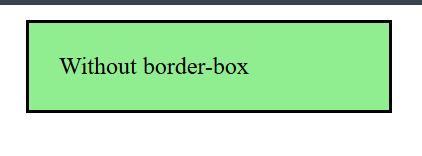
  <div class="box">Without border-box</div>
</body>
</html>
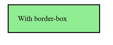
Add box-sizing: border-box and see how the dimensions shift:
<!DOCTYPE html>
<html>
<head>
  <style>
    .box {
      width: 200px;
      padding: 20px;
      border: 2px solid black;
      margin: 10px;
      background-color: lightgreen;
      box-sizing: border-box;
    }
  </style>
</head>
<body>
  <div class="box">With border-box</div>
</body>
</html>
Learn more in here.
The box-sizing property allows us to include the padding and border in an element's total width and height.
Why Dig Deeper?
CSS 2.1 explains why margin: auto centers a block or why floats behave the way they do. It’s the starting point for troubleshooting and mastering newer specs.
Selectors Level 3
Next is Selectors Level 3.
This spec, released in 2011 and refined since, upgrades your ability to target elements precisely.
It builds on CSS 2.1’s basic selectors with more powerful options. Check the official spec for details.
Key Concepts
-
Pseudo-classes: Includes
:hover,:first-child, and:not(). -
Attribute Selectors: Target elements like
[type="text"]. -
Combinators: Use
>(child),+(adjacent sibling), and~(general sibling) for relationships.
Try this:
<!DOCTYPE html>
<html lang="en">
<head>
  <meta charset="UTF-8">
  <title>CSS Selector Demo</title>
  <style>
    div:not(.special) {
      color: red;
    }

    p + span {
      font-weight: bold;
    }
  </style>
</head>
<body>
  <h2>div:not(.special)</h2>

  <div>This div is red (no class)</div>
  <div class="special">This div is not red (has class "special")</div>
  <div>This one is also red</div>

  <hr>

  <h2>p + span</h2>

  <p>This is a paragraph.</p>
  <span>This span is bold (immediately follows the paragraph).</span>

  <p>Another paragraph.</p>
  <div>Some other element in between.</div>
  <span>This span is normal (not immediately after a paragraph).</span>
</body>
</html>
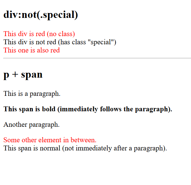
This targets divs without the special class and bolds spans after p tags.
Why It’s Worth It
Selectors Level 3 reduces the need for extra classes, making your CSS leaner.
Explore :nth-child() or attribute selectors in the spec to level up your targeting game.
CSS Color Module Level 3
Now, CSS Color Module Level 3.
Finalized in 2018, this spec defines how colors work in CSS, including transparency.
It’s straightforward but powerful—see the official spec for the full rundown.
Key Concepts
-
RGB and HSL: Use
rgb(255, 0, 0)orhsl(0, 100%, 50%)for precise colors. -
Opacity:
rgba()andhsla()add an alpha channel. -
Named Colors: Beyond basics, you get names like
rebeccapurple.
Try this:
<!DOCTYPE html>
<html>
<head>
  <style>
    button {
      background: rgba(0, 128, 255, 0.7); /* semi-transparent blue */
      color: hsl(200, 50%, 20%); /* dark desaturated blue */
      border: none;
      padding: 10px 20px;
      font-size: 16px;
      cursor: pointer;
      border-radius: 5px;
    }

    body {
      background: #f5f5f5;
      font-family: sans-serif;
      padding: 2rem;
    }
  </style>
</head>
<body>

  <button>Click Me</button>

</body>
</html>
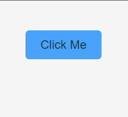
Adjust the alpha or HSL values to see the effect.
Why Care?
This spec gives you control over colors and opacity, which are key for modern designs. It’s a stepping stone to gradients and overlays in later modules.
CSS Flexible Box Layout Module Level 1 (Flexbox)
On to Flexbox, or CSS Flexible Box Layout Module Level 1. Stable since 2017, it’s the best tool for one-dimensional layouts like rows or columns.
The official spec has everything you need.
Key Concepts
-
Flex Container:
display: flexsets it up. -
Flex Items: Control them with
flex-grow,flex-shrink, andflex-basis. -
Alignment:
justify-contentandalign-itemshandle spacing.
Test this:
<!DOCTYPE html>
<html lang="en">
<head>
  <meta charset="UTF-8">
  <title>Flexbox Example</title>
  <style>
    .container {
      display: flex;
      justify-content: space-between;
      background: #eee;
      padding: 10px;
    }

    .item {
      flex: 1;
      background: #4caf50;
      color: white;
      margin: 0 5px;
      padding: 20px;
      text-align: center;
      border-radius: 4px;
    }

    /* Optional: prevent the first and last items from having double margin */
    .item:first-child {
      margin-left: 0;
    }
    .item:last-child {
      margin-right: 0;
    }
  </style>
</head>
<body>

  <h2>Flexbox with <code>justify-content: space-between</code> and <code>flex: 1</code></h2>

  <div class="container">
    <div class="item">Item 1</div>
    <div class="item">Item 2</div>
    <div class="item">Item 3</div>
  </div>

</body>
</html>
Items spread out and grow evenly. Swap space-between for center to see the difference.
Why It’s a Must-Know
Flexbox simplifies navigation bars, card rows, and other linear layouts. Check the spec for order or align-self to fine-tune further.
CSS Grid Layout Module Level 1
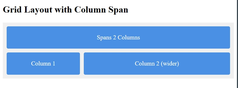
Lastly, CSS Grid Layout Module Level 1. Stable since 2017, Grid handles two-dimensional layouts—rows and columns together. The official spec is your resource.
Key Concepts
-
Grid Container:
display: gridkicks it off. -
Grid Tracks: Set rows and columns with
grid-template-columnsandgrid-template-rows. - Grid Areas: Name sections for placement.
Try this:
<!DOCTYPE html>
<html lang="en">
<head>
  <meta charset="UTF-8">
  <title>CSS Grid Column Span Example</title>
  <style>
    .grid {
      display: grid;
      grid-template-columns: 1fr 2fr;
      grid-gap: 10px;
      background: #f0f0f0;
      padding: 10px;
    }

    .grid div {
      background: #4a90e2;
      color: white;
      padding: 20px;
      text-align: center;
      border-radius: 4px;
    }

    .item {
      grid-column: 1 / 3; /* Spans both columns */
      background: #7ed6df;
    }
  </style>
</head>
<body>

  <h2>Grid Layout with Column Span</h2>

  <div class="grid">
    <div class="item">Spans 2 Columns</div>
    <div>Column 1</div>
    <div>Column 2 (wider)</div>
Why It's Awesome
Grid is ideal for complex layouts like dashboards. Look into minmax() or auto-fit in the spec for responsive designs.
Quick Reference Table
| Full Specification Name | Friendly Name | What It Does | Killer Feature | Official Link |
|---|---|---|---|---|
| CSS Level 2 Revision 1 | CSS 2.1 | Core styling rules | Box Model | CSS 2.1 |
| Selectors Level 3 | Selectors L3 | Precise targeting | :not() |
Selectors L3 |
| CSS Color Module Level 3 | Color L3 | Colors and transparency | rgba() |
Color L3 |
| CSS Flexible Box Layout Module Level 1 | Flexbox | One-dimensional layouts | justify-content |
Flexbox |
| CSS Grid Layout Module Level 1 | Grid | Two-dimensional layouts | grid-template-areas |
Grid |
Where to Go From Here
These five specs—CSS 2.1, Selectors Level 3, Color Module Level 3, Flexbox, and Grid—give you a strong base for tackling most CSS tasks.
They handle the fundamentals, element targeting, colors, and both simple and complex layouts.
The official spec pages linked above are packed with examples and details, so start there to dig deeper.
Try building a small project—like a landing page or a dashboard—using these specs to see how they fit together.
Want more? Check out the W3C’s CSS Current Work page for newer modules like CSS Color Level 4 or Grid Level 2.
Share your favorite spec or a cool trick you’ve learned in the comments—I’d love to see what you’re working with.
Or, if you build something with these, drop a link and let’s check it out!



Top comments (1)
Pretty good choices. All the CSS specs contain a mine of useful information, but these are a sound foundation. I might have chosen Selectors level 4 over level 3 for its killer feature
:has()as well as the:nth-child(an + b of S)microsyntax. If I was to select a sixth choice it would be the Cascading and Inheritance Level 5 spec for its killer feature Cascade Layers.