
Here is the some shape which we will target to create using css. For this we are mainly focusing on CSS "border-radius" property.

Lets start:
First we will create a div to make this box like structure in html file.
my.html
<div class="box"></div> <!-- created a div with class "box" in it -->
Now we will start our css styling step by step in out style.css file.
1. Give some width and height to the div
style.css
.box {
  width: 300px;
  height: 200px;
}
2. Then we will give some background color to the div so that it will not hide with white background
.box {
  width: 300px;
  height: 200px;
  background-color: red;
}
With this our box will look like this:

3. Now the main task giving border to make desired shape.
.box {
  width: 300px;
  height: 200px;
  background-color: red;
  border-radius: 50px 10px 100px 500px / 50px 10px 300px 500px;
}
oh my god!!!, what is this alien maths calculation. Is it an algorithm to launch a Rocket 🚀🚀. Surely not explaining step by step border-radius property below:
Let's break down this CSS code for the .box class, specifically focusing on the border-radius property.
_
// border-radius: 50px 10px 100px 500px / 50px 10px 300px 500px;_
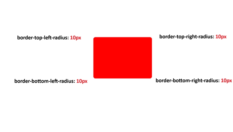
The border-radius property in CSS is a shorthand property for setting the four border-top-left-radius, border-top-right-radius, border-bottom-right-radius, and border-bottom-left-radius properties.
When you use a single value (e.g., border-radius: 10px;), all four corners will have the same radius.
However, the syntax used in your example is more complex and allows for elliptical corners.
Understanding the / separator:
The key to understanding this particular syntax is the / (slash) separator. It divides the values into two sets:
Values before the /: These define the horizontal radii of the corners.
Values after the /: These define the vertical radii of the corners.
Breaking down the values:
Both sets of values (before and after the slash) follow the same order, starting from the top-left corner and going clockwise:
Top-Left
Top-Right
Bottom-Right
Bottom-Left
Let's apply this to your code:
Horizontal Radii (before /): 50px 10px 100px 500px
Top-Left Horizontal Radius: 50px
Top-Right Horizontal Radius: 10px
Bottom-Right Horizontal Radius: 100px
Bottom-Left Horizontal Radius: 500px
Vertical Radii (after /): 50px 10px 300px 500px
Top-Left Vertical Radius: 50px
Top-Right Vertical Radius: 10px
Bottom-Right Vertical Radius: 300px
Bottom-Left Vertical Radius: 500px
How it forms the corners:
Each corner of the .box element will have an elliptical shape, where:
Top-Left Corner:
Horizontal radius: 50px
Vertical radius: 50px
(This will result in a perfect quarter-circle because both radii are the same.)

Top-Right Corner:
Horizontal radius: 10px
Vertical radius: 10px
(Another perfect quarter-circle.)

Bottom-Right Corner:
Horizontal radius: 100px
Vertical radius: 300px
(This will be an ellipse, stretched more vertically.)

Bottom-Left Corner:
Horizontal radius: 500px
Vertical radius: 500px
(This will result in a perfect quarter-circle.)

In summary:
This CSS code is creating a box with highly customized, and in some cases, elliptical, rounded corners. The border-radius property with the / separator gives you very fine-grained control over the shape of each corner, allowing for distinct horizontal and vertical radii for each.

Top comments (1)
This is very much in detail , great !