
Modern web development is about making websites that users can work on together in real-time. Many popular websites today let multiple people see and interact with the same content at the same time.
With AI now powering much of modern development, there's a new approach trending: "Vibe Coding". If you spend time on dev Twitter, You've probably seen developers on Twitter showcasing how they built entire apps in hours using AI tools - that's 'Vibe Coding' in action. Vibe Coding is about using AI to automate significant portions of your development process - from writing actual code to handling complex logic, not just DevOps tasks.
In this tutorial, I'll show you how to build a collaborative Pinterest-style wall using Lovable and Velt.
If you've not heard already, lovable is becoming a very popular tool for developers to build UI components. It's an AI interface that lets you build UI components by describing what you want or uploading reference images. And Velt is a library that lets you add real-time collaboration features to your app with just a few lines of code!
We'll create a masonry grid layout where multiple users can see each other's cursors and leave comments on images in real-time. A masonry grid is a grid of items where each item's width is determined by the width of the previous item. Something similar to a Pinterest wall.
Key Features We'll Add to Our App:
- Sleek Control Panel: A minimalist control panel that lets you change theme, view comments and more.
- Live Cursors and Presence: See who's viewing your Masonry layout in real-time with cursor tracking.
- Real-time Image Annotations: Add comments directly on images in your Masonry grid
- Dark/Light Mode Toggle: Switch themes with a single click in the control panel
By the end of this tutorial, you'll have these core collaboration features working and know how to build them into a larger, more sophisticated application.
These days we're all so connected that it's hard to imagine any kind of software not being collaborative. And with the help of AI and tools like Lovable, it's becoming a piece of cake to build apps that are both beautiful and functional.
What is Masonry Layout?
A Masonry layout is a grid of items where each item's width is determined by the width of the previous item. This creates a very nice, Pinterest-like layout. The concept was first popularized by the Pinterest website. The reason it's so popular is that it's a great way to display images in a way that is both visually appealing and easy to scan.
Here's an example of a Masonry layout:

Looks good right? Let's vibe code it!
Challenges of Building a Pinterest-like Masonry Grid from Scratch
Creating a Pinterest-style Masonry layout might seem easy, but developers actually encounter several complex challenges:
Frontend Requirements
You need a responsive layout that works on all devices. The Masonry grid needs to handle images of different sizes and adjust smoothly when the browser window changes size. Some key challenges include:
- Dynamic Image Sizing: Images in a Masonry layout have different heights, and you need to calculate positions perfectly to keep spacing perfect and avoid gaps.
- Infinite Scrolling: Users expect the ability to scroll endlessly, which means loading new content without disruptions from page refreshes.
- Performance Issues: Loading too many images at once can make your app slow and unresponsive, so your app needs to handle this gracefully.
- Responsive Design: The experience needs to be uniform across mobile. tablet, and desktop interfaces.
Here's what these challenges look like in code. First, the basic Masonry layout calculation:
// Calculating positions for Masonry layout items
    const calculateLayout = (items, containerWidth, columnWidth, gap) => {
  const columnCount = Math.floor((containerWidth + gap) / (columnWidth + gap));
  const columnHeights = Array(columnCount).fill(0);

  return items.map((item) => {
// Find the shortest columnconst shortestColumnIndex = columnHeights.indexOf(
      Math.min(...columnHeights)
    );

// Calculate positionconst x = shortestColumnIndex * (columnWidth + gap);
    const y = columnHeights[shortestColumnIndex];

// Update column height
    columnHeights[shortestColumnIndex] += item.height + gap;

    return { ...item, x, y };
  });
};
And then you'd need to handle the infinite scrolling logic separately:
// Infinite scroll handlinguseEffect(() => {
  const handleScroll = () => {
    const scrollHeight = document.documentElement.scrollHeight;
    const scrollTop = document.documentElement.scrollTop;
    const clientHeight = document.documentElement.clientHeight;

// If user has scrolled to the bottom, load more itemsif (scrollHeight - scrollTop <= clientHeight + 200 && !isLoading) {
      setIsLoading(true);
      loadMoreItems();
    }
  };

  window.addEventListener("scroll", handleScroll);
  return () => window.removeEventListener("scroll", handleScroll);
}, [isLoading]);
While you could build this from scratch, there's a smarter way. This is where Lovable and our Vibe Coding approach make all the difference.
A quick note on Unsplash:
Unsplash is a popular platform that provides high-quality, royalty-free images via its API. By using the Unsplash API, developers can programmatically fetch random or curated images for their applications without having to host or manage image assets themselves. This makes it perfect for projects like our Pinterest-style wall, where you want a steady stream of beautiful images with minimal backend complexity.
Backend Complexity
The backend is where things get even trickier. You need to build:
- Efficient Image Storage: Store and serve images of different sizes for different devices (We'll use Unsplash API for this so we don't need to store anything!)
- Pagination & Caching: Fetch just enough content to keep the app responsive and avoid lag.
- Real-time Updates: When multiple users are working together, updates need to happen instantly
- User Presence Tracking: Show who's currently viewing the same images
- Comment Storage: Store contextual comments tied to specific images and coordinate positions.
For example, handling real-time updates for multiple users adds another layer of complexity:
// WebSocket setup for real-time collaborationconst socket = new WebSocket("wss://your-server.com/ws");

socket.onmessage = (event) => {
  const data = JSON.parse(event.data);

  if (data.type === "cursor_move") {
    updateUserCursor(data.userId, data.position);
  } else if (data.type === "new_comment") {
    addNewComment(data.imageId, data.comment);
  }
};

// Handling disconnects and reconnects
socket.onclose = () => {
// Attempt to reconnectsetTimeout(() => {
// Reconnection logic
  }, 1000);
};
Building all this from scratch would take weeks of work, testing, and debugging – and that's before you even start dealing with edge cases!
Fortunately, there's a simpler way. Rather than spending months building your own real-time collaboration infrastructure, you can leverage specialized toolkits that handle these complex challenges for you. That's where Velt comes in.
Velt is a specialized toolkit that streamlines adding real-time collaboration features to any application. It provides production-ready, prebuilt components that integrate seamlessly with your existing code:
- Ready-to-use Components: Cursors, comments, presence indicators, and notification systems ready to use.
- Real-time Synchronization: All changes are instantly synced across all users
- Simple Integration: Just a few lines of code to add powerful collaboration features
- Handles the Hard Parts: Velt takes care of WebSockets, state management, and all the complex backend stuff

Think of Velt as the "Firebase for collaboration" - it handles all the complex real-time infrastructure so you can focus on building your app's unique features rather than reinventing collaboration tools.
Now let's explore how we can use Velt along with Lovable to build our collaborative Pinterest wall!
Vibe Coding Our Solution with Lovable and Velt
Step 1: Generate the UI with Lovable
Lovable excels at creating UI components from descriptions or reference images. For our Pinterest-style wall, we'll use a reference image to guide the AI toward the exact layout we want.
Best Ways to Craft an Effective Lovable Prompt:
I have been experimenting with Lovable and a lot of other tools to find the best way to create an effective prompt. I've been "vibe coding" for a while now and found that the best way to create a prompt is to use a combination of the following:
- Include a reference image: Visual examples dramatically improve output quality
- Reference existing libraries: Mention specific component libraries or frameworks you want to use
- Be explicit about requirements: Clearly state functionality, styling, and behavior expectations
- Specify what to avoid: Mention any patterns, libraries, or approaches you don't want
If you follow these steps, you'll get the best results.
We'll use a Pinterest screenshot as our reference and craft a prompt that generates a responsive Masonry grid with collaboration-ready structure, here's the prompt I am going to use:
I've attached a screenshot of my Pinterest wall. This type of layout is called a Masonry Layout or a Masonry Grid. I am making a website where I can show users exactly this layout with a nice control panel at the bottom.

The layout will be filled with random Unsplash images. We can use the Unsplash API to fetch the images and display them in the Masonry grid.

The Grid should be responsive and should adjust itself based on the screen size. It should be smooth and it should be an infinite scroll grid. The way infinite scroll should work is when the user scrolls to the bottom of the grid, the grid should load 10 more images by making a call to the unsplash API and showing it properly in the Masonry grid.

The control panel at the bottom will contain the following options:
- User presence
- Comment button
- Comments stack
- Dark/Light mode toggle

The control panel should be minimalist and should have a dark theme option. Just add the buttons in the control panel for now, we will add the functionality later.

I've also added a blog for you to refer to, while creating the Masonry grid. Please try to use the same libraries and components for the Masonry grid as used in the blog.

After it’s done generating, it’ll create a UI for you but you might not see the images at first. This is because it doesn’t have an API key from Unsplash. You need to generate one by going to their developer website here.
You can add your Unsplash API key to the .env file in the root of the project.
VITE_UNSPLASH_CLIENT_ID=your_unsplash_client_id
In order to be able to edit the code, you need to sync your GitHub account with Lovable so it can create a brand new repository for you. You will then be able to clone the repository and edit the code.
To do this, find the option to sync your GitHub account at the top right corner of the Lovable editor:

This is what it created for light mode and dark mode:
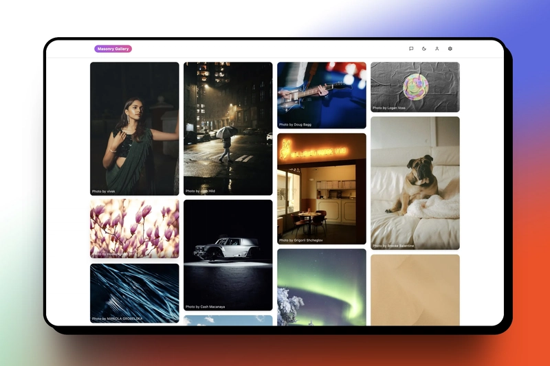

But we'll make some more adjustments and style changes to make it look even better! We’re using images via Unsplash API to make sure that the app layout keeps updating with new images at fixed intervals.


The UI is already coming together really well!
Step 2: Add Real-time Collaboration with Velt
Let's install Velt SDK:
npm install @veltdev/react
npm install --save-dev @veltdev/types
Now we'll set up Velt in our app. To do that, we first create a velt.tsx file with our providers:
// velt.tsximport {
  VeltProvider as BaseVeltProvider,
  useVeltClient,
} from "@veltdev/react";

// These are our test users for demonstrationconst USERS = [
  {
    id: "user1",
    name: "John Doe",
    profileUrl: "https://randomuser.me/api/portraits/men/62.jpg",
  },
  {
    id: "user2",
    name: "Jane Smith",
    profileUrl: "https://randomuser.me/api/portraits/women/2.jpg",
  },
];

// Our main provider componentexport function VeltProvider({ children }) {
// State to manage current userconst [user, setUser] = useState(null);

// Load saved user or use defaultuseEffect(() => {
    const savedUserId = localStorage.getItem("currentUserId");
    const savedUser = savedUserId
      ? USERS.find((u) => u.id === savedUserId)
      : USERS[0];
    setUser(savedUser || USERS[0]);
  }, []);

// Function to switch between usersconst switchUser = () => {
    const currentIndex = USERS.findIndex((u) => u.id === user?.id);
    const nextUser = USERS[(currentIndex + 1) % USERS.length];
    localStorage.setItem("currentUserId", nextUser.id);
    setUser(nextUser);
  };

// Wrap our app with Velt providersreturn (
    <UserContext.Provider value={{ user, switchUser }}>
      <BaseVeltProvider apiKey={import.meta.env.VITE_VELT_API_KEY}>
        <VeltUserProvider user={user}>{children}</VeltUserProvider>
      </BaseVeltProvider>
    </UserContext.Provider>
  );
}
This code establishes the foundation for our collaborative features. The VeltProvider wraps our entire app with Velt's collaboration functionality, while the user management system provides a simple way to switch between different users for testing. We're using local storage to persist the current user session across page reloads.
It's a clean way to handle user context in our collaborative app.
Next, we need to add these providers to our main App:
// App.tsximport { VeltProvider, VeltDocumentProvider } from "@/lib/velt";
import { VeltCursor } from "@veltdev/react";

const App = () => (
  <QueryClientProvider client={queryClient}>
    <VeltProvider>
      <VeltDocumentProvider>
        <VeltCursor />
        <BrowserRouter>
          <Routes>
            <Route path="/" element={<Index />} />
            <Route path="*" element={<NotFound />} />
          </Routes>
        </BrowserRouter>
      </VeltDocumentProvider>
    </VeltProvider>
  </QueryClientProvider>
);
The important bits here are:
-
VeltProvider- Wraps our app with Velt functionality -
VeltDocumentProvider- Sets up the document context for collaboration -
VeltCursor- Shows users' cursors on the screen
In Velt, a Document represents a shared collaborative space where users can interact. Think of it as a virtual room where all the real-time collaboration happens. Each document has a unique identifier and can contain various collaborative elements like comments, cursors, and presence indicators. The VeltDocumentProvider component we're using sets up this shared space for our Pinterest wall, ensuring that all users are synchronized within the same collaborative context.
Finally, let's add comments to our Masonry grid:
// MasonryGrid.tsximport { VeltComments } from "@veltdev/react";

const MasonryGrid = () => {
  const [isDarkMode, setIsDarkMode] = useState(false);

// Check if dark mode is enableduseEffect(() => {
    const checkDarkMode = () => {
      const isDark = document.documentElement.classList.contains("dark");
      setIsDarkMode(isDark);
    };

    checkDarkMode();

// Watch for theme changesconst observer = new MutationObserver((mutations) => {
      mutations.forEach((mutation) => {
        if (mutation.attributeName === "class") {
          checkDarkMode();
        }
      });
    });

    observer.observe(document.documentElement, { attributes: true });

    return () => observer.disconnect();
  }, []);

  return (
    <>
      <VeltComments darkMode={isDarkMode} />
      {/* Rest of the Masonry grid */}
    </>
  );
};
This code adds the VeltComments component to our grid, which provides real-time commenting functionality. The component includes features like comment threads, reactions, and user mentions. We're also passing the darkMode prop to ensure the comments UI matches our app's theme, automatically updating whenever the theme changes.
With just these few additions, our app now supports real-time collaboration! Users can see each other's cursors as they navigate the page and add comments anywhere they want.
Step 3: Adding the Comments Sidebar and attaching the comments to the images
Now let's enhance our collaboration features with two key improvements:
- A comments sidebar to view all comments in one place
- The ability to attach comments directly to specific images
This approach maintains better context - users can see which comments belong to which images, making collaboration much more organized and meaningful.
Let's start with the comments sidebar using Velt's VeltCommentsSidebar component:
// Toolbar.tsximport { VeltCommentsSidebar } from "@veltdev/react";

const Toolbar = () => {
  return (
    <div className="flex justify-between items-center p-4">
      <VeltCommentsSidebar darkMode={isDarkMode} />
      <VeltSidebarButton>
        {" "}
        // button to trigger the comments sidebar
        <Button
          variant="ghost"
          size="icon"
          className={cn(
            "rounded-full text-gray-400 hover:text-white hover:bg-white/10 h-8 w-8 p-0"
          )}
        >
          <Inbox className="h-5 w-5" strokeWidth={1.5} />
        </Button>
      </VeltSidebarButton>
    </div>
  );
};
And done! It's that simple. We're using the VeltCommentsSidebar component to actually display the stack and the VeltSidebarButton component to trigger it.
Now let's add the comments to the images. To do this, we'll need to enable a few options on the VeltComments component.
// MasonryGrid.tsximport { VeltComments } from "@veltdev/react";

<VeltComments
  darkMode={isDarkMode}
  popoverMode={true}
  popoverTriangleComponent={false}
/>;
Let's break down what each option does:
-
popoverMode: Popover mode means that comments can be attached to specific target elements. The UX pattern is very similar to commenting in Google Sheets. -
popoverTriangleComponent: Adds a small triangular pointer to the popover, making it clear which element the comment is associated with. We’ll keep this false since in our demo we’re only allowing to comment on the images.
Now we'll generate a unique id for each image:
const imageId = `image-${index}`;// you can use the Unsplash id or any other unique id
These unique IDs are essential for Velt to track which comments belong to which images. Without them, the commenting system wouldn't know where to attach or display comments in our Masonry grid.
Then we'll attach this to the VeltCommentTool in our Toolbar.tsx file:
<VeltCommentTool targetElementId={imageId} />
This tool allows users to add comments specifically to this image by clicking it.
and then, we'll add a property called data-velt-target-comment-element-id to the image div for velt to know where to attach the comments.
<div data-velt-target-comment-element-id={imageId}>
  <img src={image.url} alt={image.alt} />
</div>
To display the number of comments and the latest commenter for each image, we can add a VeltCommentBubble component to each image's container. This component takes the same imageId we used earlier to track which image it belongs to.
<VeltCommentBubble
  targetElementId={imageId}
  commentCountType="total"
/>
This will show the comment count and the user who commented on it.
And that's it! We've completed our app!
With just a few lines of code and with the power of Lovable and Velt, we built this in under 15 minutes!
Testing Our Feature
In just a few steps, we've built a fully functional collaborative image gallery featuring:
- Real-time presence indicators showing who's currently viewing the app
- Dark/Light mode toggle for user preference
- Live cursor tracking so users can see where others are focusing
- Image-specific commenting with real-time updates and threading
- Responsive Masonry layout that works across all devices
- Beautiful, Pinterest-inspired UI generated by Lovable from a single AI prompt
Here's our finished application in action:
Live Demo: Check out the working application
Source Code: View the complete implementation on Github
Taking It Further: Advanced Velt Features
Ready to add even more collaborative power to your app? Consider these Velt features for your next iteration:
- Live Reactions - Let users react to specific images with emojis in real time
- Follow Mode - Let users follow another user's actions (great for demos)
- Huddles - Create instant audio/video meeting spaces within your app
The Power of Modern Development
What we built above shows how modern development is changing. Instead of coding every feature from scratch, we used AI tools like Lovable for quick UI generation and Velt for adding real-time collaboration.
With just two tools, we turned an idea into a working collaborative app in under an hour—something that used to take days or even weeks.
This new way of building lets developers:
- Skip boilerplate code and focus on core features
- Prototype and launch faster
- Deliver better user experiences with less effort
- Save time and reduce costs
As AI tools and SDKs improve, creating apps with chat, comments, live updates and smart interfaces is easier than ever. The real shift? Developers can now build real products faster by combining the right tools, not writing more code.
If you’re building anything collaborative, it’s time to rethink your dev workflow. Work smarter, ship faster.
Thankyou for reading! If you found this article useful, share it with your peers and community.
If You ❤️ My Content! Connect Me on Twitter
Check SaaS Tools I Use 👉🏼Access here!
I am open to collaborating on Blog Articles and Guest Posts🫱🏼🫲🏼 📅Contact Here

Top comments (4)
The speed you built this with Lovable and Velt is wild, makes me rethink my whole prototyping process. What's your dream real-time collab feature to add next?
Thanks! For your question, I'll go with emoji reactions🔥
With Velt it's easy to add any collab features in minutes!
Excelente articulo gracias colega.
Thanks Nelson!