3

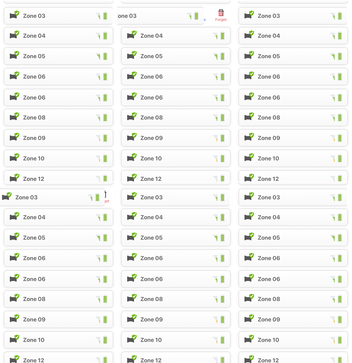
A while back, we worked with a Ux/Graphics designer that was enamored with the (then) emerging "swipe to edit" trend for iOS apps. We ended up with something that looks like this on a swipe:

enter image description here

(nevermind the inconsistent color on the action icons)

Basically, a list view of stuff. And the user can swipe from right to left, which reveals the actions they can do on that item.

The flow works really nicely. BUT, users (many of ours are non-techie types) don't seem to discover this. Tapping and panning they get, but not these more specific gestures. They don't even seem to discover them, and when they do, they're surprised. I would say that despite iOS's support for the paradigm, it's not near as obvious to invoke yet.


Solution Ideas

I'm left at a fork in the road about which way to go from here:

  1. Overcome the lack of discoverability with some help. Do a pop up the first time they come to the screen that informs them that there's this "hidden" feature they can use.

  2. Somehow annotate the rows on the right (small left facing chevron?) hinting that swiping that way might lead to something.

  3. Abandon the swipe as an edit action entry point, and do something else to make these row specific actions available and more discoverable.

Are other apps experiencing this same problem? How do they get around it? And what about Android (which we're beginning a port to right now).

(I think I've seen some apps that enable this model, but don't depend on it as the sole way of doing the actions, providing an alternate method somehow).

2
  • 4
    Possible duplicate of How to indicate that specific sections of a page can be swiped Commented Sep 19, 2018 at 9:21
  • are you already using a hold gesture (long tap)? i see a lot of users try to do that when visual intuition fails to give them "More...", and you can use both it and the swipe. I'm not a fan of 1-time "lessons" fwiw Commented Sep 19, 2018 at 20:31

2 Answers 2

4

Many apps opt to keep the swiping as a discoverability feature, because they rely on their target audience figuring things out on their own. But, not every group will do that, and generally the older they get, the less likely they will trial and error their way through an application.

As you mentioned there are multiple ways to figure out what your users do find intuitive. The easiest 'fix' to try out, is to add a cue that tells your users they can edit the item. This could simply be a label saying 'edit', or a button. The main thing is that it's something they can press to reveal more actions.

This list of actions (rename, locate and forget) needs to be presented in a way that naturally flows from the previous action. You could opt for a drawer, iOS modal menu, or a pop-up, basically something that contains the actions and is easily tapped.

Testing this remains important of course.

7

enter image description here

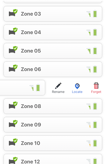
I have seen some apps use a brief animation that slides over, partly revealing the hidden feature, and then slides back to notify the user of the hidden features. This could be done upon first load or when a user taps on one of the list items. Previews like this avoid the interruption of a pop-up while telling the user that there are hidden features. As well, the motion of the animation hints to the user to swipe that list item to the left.

3
  • 2
    To add to this, such visualizations are usually referred to as "Onboarding". It is - in most cases - better to use this for new users than having a permanent sign there (as OP suggested with 2)), because you only need to learn this once. Commented Sep 21, 2018 at 8:51
  • Btw Mike what tool did you use to make this animation? Commented Sep 21, 2018 at 9:05
  • 1
    @Big_Chair +1 to your comment - I learned a new term! I used Photoshop's timeline tool with their tween animation tool to make it quick. Commented Sep 21, 2018 at 15:50

Start asking to get answers

Find the answer to your question by asking.

Ask question

Explore related questions

See similar questions with these tags.