
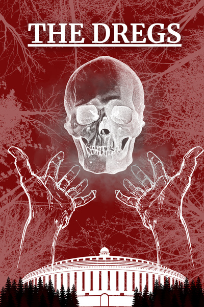
Is my book cover too bland!?
#1
I've seen many people write in these threads about the importance of covers in attracting readers, and it made me wonder if mine works or not.
I made it in Canva and I'm not sure if it's bland or not, help!
Other options:


I made it in Canva and I'm not sure if it's bland or not, help!
Other options:
The Dregs |
The Empire's unwanted are given one chance to earn a place among its citizens: survive the Trials.
Captured by enforcers, Raymond is forced into a brutal spectacle where criminals, vagrants, and the forgotten fight for citizenship. Armed with nothing but his instincts and a hatred he cannot let go of, he must survive each trial, even as every victory draws him deeper into the Empire he swore to despise.
- Report this post
- Rep (0)
- Edited by Hoot likes cats at
Re: Is my book cover bland?
#2
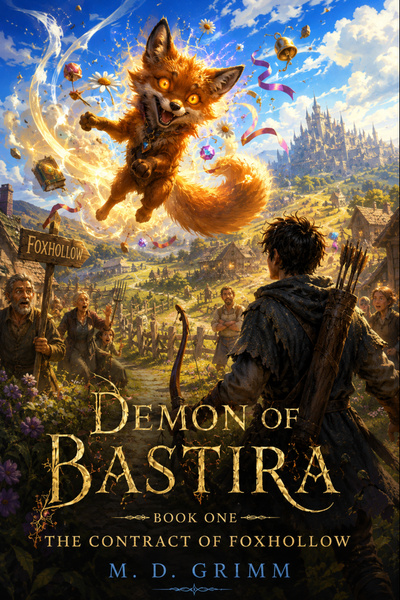
I'd say so. Personally, I think most people are naturally drawn to covers with a character's face on them. At the same time, if you feel your current cover does a good job of conveying what your story is about to prospective readers, then that's what matters most.
Not every cover needs to have an anime girl on the front. Yours definitely gives off the vibe of a more traditional fantasy story.
Not every cover needs to have an anime girl on the front. Yours definitely gives off the vibe of a more traditional fantasy story.
 |
Re: Is my book cover too bland!?
#3
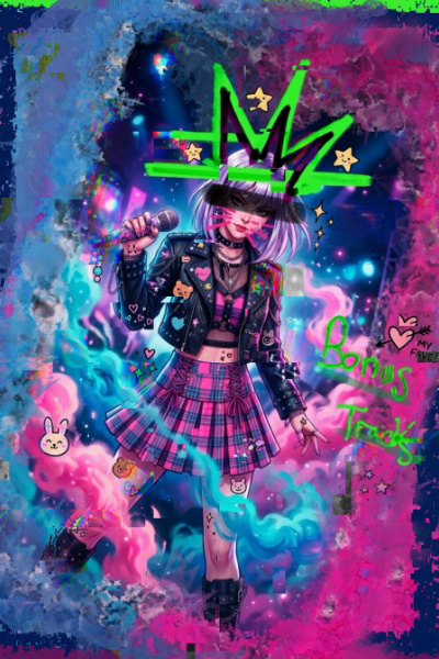
For me it seems effective at grabbing initial attention since it sticks out from the "generic anime look and colors generated with AI" average but at the same time, I don't feel it gives enough stuff to be excited about when one looks closer. Also the font choice seems suboptimal and too modern.
Re: Is my book cover too bland!?
#4
To me, it conveys exactly nothing. Although if a reader happens to click through, they will see that the cover says something vaguely pro-cat. That text is not readable in a smaller size, like your sig, though.
I, too, give it points for not being "just another cover", but that only goes so far by itself.
I, too, give it points for not being "just another cover", but that only goes so far by itself.
What if Monty Python and Terry Pratchett wrote 6 books based on Herman Melville's Bartleby The Scrivener.

Re: Is my book cover too bland!?
#5
Maybe if you sized up the central image to make it larger in the thumb nail?
Re: Is my book cover too bland!?
#6ayebcee Wrote: For me it seems effective at grabbing initial attention since it sticks out from the "generic anime look and colors generated with AI" average but at the same time, I don't feel it gives enough stuff to be excited about when one looks closer. Also the font choice seems suboptimal and too modern.Hi, how are you doing?
I updated the thread and added some alternatives, I'd love to hear your opinion/s!
|
The Dregs |
The Empire's unwanted are given one chance to earn a place among its citizens: survive the Trials.
Captured by enforcers, Raymond is forced into a brutal spectacle where criminals, vagrants, and the forgotten fight for citizenship. Armed with nothing but his instincts and a hatred he cannot let go of, he must survive each trial, even as every victory draws him deeper into the Empire he swore to despise.
Re: Is my book cover too bland!?
#7M. D. Grimm Wrote: Maybe if you sized up the central image to make it larger in the thumb nail?Hi, how are you?
I tried something like that, you can see different alternatives i've updated in the thread.
|
The Dregs |
The Empire's unwanted are given one chance to earn a place among its citizens: survive the Trials.
Captured by enforcers, Raymond is forced into a brutal spectacle where criminals, vagrants, and the forgotten fight for citizenship. Armed with nothing but his instincts and a hatred he cannot let go of, he must survive each trial, even as every victory draws him deeper into the Empire he swore to despise.
Re: Is my book cover too bland!?
#8
I rather like the white one. Would just play with title font make it heavier, thicker, bigger perhaps. Gives a nice texture and contrast, the goldblack goes nice with the b&w too.
Do agree that they don't really convey much of anything immediately obvious, but make the blurb stand out as much as possible and the interest factor should help pair up well enough.
Do agree that they don't really convey much of anything immediately obvious, but make the blurb stand out as much as possible and the interest factor should help pair up well enough.
Re: Is my book cover too bland!?
#9Evercrest Wrote: I rather like the white one. Would just play with title font make it heavier, thicker, bigger perhaps. Gives a nice texture and contrast, the goldblack goes nice with the b&w too.Hi, thanks for the opinion.
Do agree that they don't really convey much of anything immediately obvious, but make the blurb stand out as much as possible and the interest factor should help pair up well enough.
Do you think that maybe the white has more "contrast" because all the other ones are red?
|
The Dregs |
The Empire's unwanted are given one chance to earn a place among its citizens: survive the Trials.
Captured by enforcers, Raymond is forced into a brutal spectacle where criminals, vagrants, and the forgotten fight for citizenship. Armed with nothing but his instincts and a hatred he cannot let go of, he must survive each trial, even as every victory draws him deeper into the Empire he swore to despise.
Re: Is my book cover too bland!?
#11Hoot likes cats Wrote: Hi, thanks for the opinion.Perhaps. But white/black/gold is also just a very uniform combo that's hard to mess up. The red and gold isn't bad but it does require a lot more attention to detail to be at a higher level of craft. Imho at least.
Do you think that maybe the white has more "contrast" because all the other ones are red?
Re: Is my book cover too bland!?
#12ayebcee Wrote: I'm pretty undecided between these two.
Im curious why you chose the one with that skull, the smaller one
|
The Dregs |
The Empire's unwanted are given one chance to earn a place among its citizens: survive the Trials.
Captured by enforcers, Raymond is forced into a brutal spectacle where criminals, vagrants, and the forgotten fight for citizenship. Armed with nothing but his instincts and a hatred he cannot let go of, he must survive each trial, even as every victory draws him deeper into the Empire he swore to despise.
Re: Is my book cover too bland!?
#13Hoot likes cats Wrote:It looked less generic than the skull here that screams "stock image" – though that aside, this is pretty interesting too, although I wonder if it's because the color sticks out so much from the previous ones.ayebcee Wrote: I'm pretty undecided between these two.
Re: Is my book cover too bland!?
#14
I like the gold one.
You should figure out a way to get your name back on, but I recommend (given the way your name is structured) that you use "By Hoot Likes Cats" rather than just "Hoot Likes Cats" otherwise it looks more like a tag than an author's credit.
You should figure out a way to get your name back on, but I recommend (given the way your name is structured) that you use "By Hoot Likes Cats" rather than just "Hoot Likes Cats" otherwise it looks more like a tag than an author's credit.
What if Monty Python and Terry Pratchett wrote 6 books based on Herman Melville's Bartleby The Scrivener.
Re: Is my book cover too bland!?
#15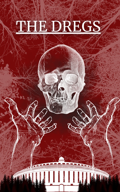
I like this one. White on red pops well. The title is easy to read, and the skull and hands give a slight ominous feel. Aesthetically it is pleasing. It doesn’t give a lot of clues about the story content though, but all the options have that issue.
If you want to try and generate some ideas I find it helpful to take a very detailed summary of the story and plot. Include details about your main characters (things they like, major plots points they are part of) and ask ChatGPT or Gemini to generate cover art ideas.
From there you can take what you like and rework it until you are happy
- Report this post
- Rep (1)
- Edited by M. D. Grimm at
Re: Is my book cover too bland!?
#16M. D. Grimm Wrote: If you want to try and generate some ideas I find it helpful to take a very detailed summary of the story and plot. Include details about your main characters (things they like, major plots points they are part of) and ask ChatGPT or Gemini to generate cover art ideas.I put the entire text of my book, plus my worldbuilding documents into NotebookLM and ask it to help me brainstorm things like art prompts, blurb ideas, and advertisement strategies.
What if Monty Python and Terry Pratchett wrote 6 books based on Herman Melville's Bartleby The Scrivener.
Re: Is my book cover too bland!?
#17
Bland is very fixable, and honestly a good problem to have, because it usually means the bones are fine and you just need one element to pop. The thing that helped mine most was checking that it still reads at thumbnail size, since that is how most people meet it in the lists. If the title and the main figure survive being shrunk to a postage stamp, you are most of the way there.
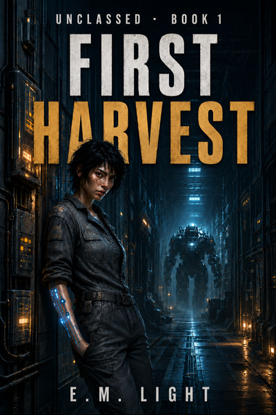
FIRST HARVEST: a female-lead progression LitRPG. She came up Unclassed, below the System's floor, so she builds her own ladder out of dead enforcers. Ongoing · new chapters daily.
Re: Is my book cover too bland!?
#18Hoot likes cats Wrote: I've seen many people write in these threads about the importance of covers in attracting readers, and it made me wonder if mine works or not.Yes and no. With the flood of bland AI, nobody cares about flashy cool anime characters posing in a cool way anymore. For me personally, it is important that cover is not AI gen ****.
As for your options, that depends on whether you want to convey something or be more pleasing to a reader.
Personally, I like the one with white background more.
Re: Is my book cover too bland!?
#19
a lot of folks seem to like the white cover. Here's my only beef with the white cover. Compare it to the red one, which also has outstretched hands. In the red one, the hands look fine, but in the white one, the hands look like absolute chaos. Too many extra lines make it look like I've got double-vision when I look at it.
What if Monty Python and Terry Pratchett wrote 6 books based on Herman Melville's Bartleby The Scrivener.
Re: Is my book cover too bland!?
#20Evercrest Wrote: I rather like the white one. Would just play with title font make it heavier, thicker, bigger perhaps. Gives a nice texture and contrast, the goldblack goes nice with the b&w too.When you say "blurb", you would be referring to the synopsis?
Do agree that they don't really convey much of anything immediately obvious, but make the blurb stand out as much as possible and the interest factor should help pair up well enough.
|
The Dregs |
The Empire's unwanted are given one chance to earn a place among its citizens: survive the Trials.
Captured by enforcers, Raymond is forced into a brutal spectacle where criminals, vagrants, and the forgotten fight for citizenship. Armed with nothing but his instincts and a hatred he cannot let go of, he must survive each trial, even as every victory draws him deeper into the Empire he swore to despise.