How to create Tables using Plotly in Python?
Last Updated :
05 Sep, 2020
Plotly is a Python library that is used to design graphs, especially interactive graphs. It can plot various graphs and charts like histogram, barplot, boxplot, spreadplot, and many more. It is mainly used in data analysis as well as financial analysis. plotly is an interactive visualization library.
Tables in Plotly
A table helps in organizing the data into columns and rows. The use of tables is prevalent throughout all communication, research, and data analysis. They privilege rapid entrance and proportionately elementary comparison of information. It can be created using the Table() method of graph_objects class.
Syntax: plotly.graph_objects.Table(arg=None, cells=None, columnorder=None, columnwidth=None, header=None, **kwargs)
Parameters:
arg: dict of properties compatible with this constructor or an instance of plotly.graph_objects.Table
cells: plotly.graph_objects.table.Cells instance or dict with compatible properties
columnorder: Specifies the rendered order of the data columns; for example, a value 2 at position 0 means that column index 0 in the data will be rendered as the third column, as columns have an index base of zero.
columnwidth: The width of columns expressed as a ratio. Columns fill the available width in proportion of their specified column widths.
header: plotly.graph_objects.table.Header instance or dict with compatible properties
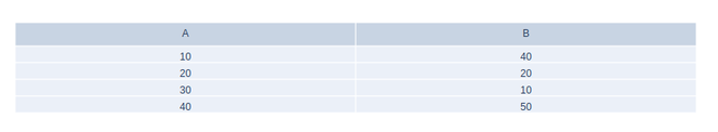
Example:
Python3
import plotly.graph_objects as go

fig = go.Figure(data=[go.Table(
    header=dict(values=['A', 'B']),
    cells=dict(values=[[10, 20, 30, 40],
                       [40, 20, 10, 50]]))
])
fig.show()
Output:
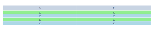
Changing Row Colors
Adding colors in alternative rows will make it easier to understand the data more efficiently. It distinguish the data from each other and the values can be separately seen easily in the data format.
Example:
Python3
import plotly.graph_objects as go

color1 = 'lightgreen'
color2 = 'lightblue'

fig = go.Figure(data=[go.Table(
    header=dict(values=['A', 'B']),
    cells=dict(values=[[10, 20, 30, 40],
                       [40, 20, 10, 50]],
               fill_color=[[color1, color2, color1,
                            color2, color1]*2],))
])
fig.show()
Output:
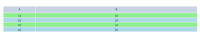
Varying Row and Column Size
It is possible to change the row and column size by using the columnwidth parameter. The width of columns is expressed as a ratio. Columns fill the available width in the proportion of their specified column widths.
Example:
Python3
import plotly.graph_objects as go

color1 = 'lightgreen'
color2 = 'lightblue'

fig = go.Figure(data=[go.Table(
    # Ratio for column width
    columnwidth=[1, 5],
    header=dict(values=['A', 'B']),
    cells=dict(values=[[10, 20, 30, 40],
                       [40, 20, 10, 50]],
               fill_color=[[color1, color2, color1,
                            color2, color1]*2],))
])
fig.show()
Output:
Similar Reads
How to Create Stacked area plot using Plotly in Python? Plotly is a Python library that is used to design graphs, especially interactive graphs. It can plot various graphs and charts like histogram, barplot, boxplot, spreadplot, and many more. It is mainly used in data analysis as well as financial analysis. plotly is an interactive visualization library
2 min read
How to create Stacked bar chart in Python-Plotly? Plotly is a Python library which is used to design graphs, especially interactive graphs. It can plot various graphs and charts like histogram, barplot, boxplot, spreadplot and many more. It is mainly used in data analysis as well as financial analysis. plotly is an interactive visualization library
2 min read
PostgreSQL - Create Tables in Python Creating tables in PostgreSQL using Python is an essential skill for developers working with databases. This article will explore the process of creating new tables in the PostgreSQL database using Python.Why Create PostgreSQL Tables with Python?Using Python to create PostgreSQL tables is beneficial
4 min read
Carpet Plots using Plotly in Python A Plotly is a Python library that is used to design graphs, especially interactive graphs. It can plot various graphs and charts like histogram, barplot, boxplot, spreadplot, and many more. It is mainly used in data analysis as well as financial analysis. Plotly is an interactive visualization libra
3 min read
How to Create a Population Pyramid Using Plotly in Python? A population pyramid is a graphical representation of data that contains two entities, namely the age and gender of a specific population. It is generally used by demographers to study the population. The age value is divided into sub-categories and the gender column contains the population of that
3 min read