How to Create Subplots in Matplotlib with Python?
Last Updated :
17 Mar, 2025
Matplotlib is a widely used data visualization library in Python that provides powerful tools for creating a variety of plots. One of the most useful features of Matplotlib is its ability to create multiple subplots within a single figure using the plt.subplots() method. This allows users to display multiple related visualizations side by side, making data analysis more insightful and effective.
What are subplots in matplotlib?
Subplots in Matplotlib refer to multiple plots arranged within a single figure. The matplotlib.pyplot.subplots() method provides an easy way to create a figure with multiple plots. Given the number of rows and columns, it returns a tuple (fig, ax), where fig is the entire figure object and ax is an array of axes objects representing individual subplots.
Creating subplots using plt.subplots()
Below are different ways to create subplots in Matplotlib along with examples demonstrating their usage.
1. Creating a grid of subplots
The following example creates a 3x3 grid of subplots, iterating over them to plot random lines.
Python
import matplotlib.pyplot as plt
import numpy as np

# Creating subplots
fig, ax = plt.subplots(3, 3)

# Plot random data in each subplot
for row in ax:
    for col in row:
        col.plot(np.random.randint(0, 5, 5), np.random.randint(0, 5, 5))

plt.show()
Output
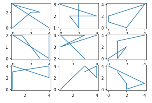
Explanation: This code creates a 3×3 grid of subplots using Matplotlib. It then iterates over each subplot and plots random integer data using NumPy. Each subplot receives a unique set of random values, generating different plots within the grid.
2. Creating Subplots for Different Mathematical Functions
The following example creates a 2x2 grid and plots the sine, cosine, tangent, and sinc functions with different line styles and colors.
Python
import matplotlib.pyplot as plt
import numpy as np

# Creating subplots
fig, ax = plt.subplots(2, 2)

# Generating data
x = np.linspace(0, 10, 1000)

# Plot functions with different styles
ax[0, 0].plot(x, np.sin(x), 'r-.', label='sin(x)')
ax[0, 1].plot(x, np.cos(x), 'g--', label='cos(x)')
ax[1, 0].plot(x, np.tan(x), 'y-', label='tan(x)')
ax[1, 1].plot(x, np.sinc(x), 'c.-', label='sinc(x)')

# Adding legends and showing the figure
for axes in ax.flat:
    axes.legend()
plt.tight_layout()
plt.show()
Output

Explanation: This code creates a 2×2 grid of subplots using Matplotlib and plots different mathematical functions (sin, cos, tan, and sinc) with distinct line styles. It generates x values using NumPy and assigns each function to a specific subplot.
3. Line plots in subplots
This example generates sine, cosine, and tangent functions and plots them in separate subplots.
Python
import matplotlib.pyplot as plt
import numpy as np

# Generate random data for subplots
x = np.linspace(0, 10, 100)
y1 = np.sin(x)
y2 = np.cos(x)
y3 = np.tan(x)

# Create subplots with line plots
fig, axes = plt.subplots(nrows=1, ncols=3, figsize=(12, 4))

axes[0].plot(x, y1, color='blue', label='sin(x)')
axes[1].plot(x, y2, color='green', label='cos(x)')
axes[2].plot(x, y3, color='orange', label='tan(x)')

# Add titles and legends
axes[0].set_title('Sine Function')
axes[1].set_title('Cosine Function')
axes[2].set_title('Tangent Function')

for ax in axes:
    ax.legend()

# Adjust layout for better spacing
plt.tight_layout()

# Display the figure
plt.show()
Output:

Explanation: This code creates a single-row, three-column subplot layout using Matplotlib, plotting sin(x), cos(x) and tan(x) with distinct colors. Titles and legends are added for clarity and plt.tight_layout() ensures proper spacing before displaying the figure.
4. Bar plots in subplots
This example creates a DataFrame and generates three bar charts to visualize categorical data.
Python
import matplotlib.pyplot as plt
import pandas as pd

# Create a DataFrame with random categorical data
data = {'Category': ['A', 'B', 'C', 'D'],'Value1': np.random.randint(1, 10, 4),'Value2': np.random.randint(1, 10, 4),'Value3': np.random.randint(1, 10, 4)}

df = pd.DataFrame(data)

# Create subplots with bar plots
fig, axes = plt.subplots(nrows=1, ncols=3, figsize=(12, 4))

df.plot(kind='bar', x='Category', y='Value1', color='skyblue', ax=axes[0])
df.plot(kind='bar', x='Category', y='Value2', color='lightgreen', ax=axes[1])
df.plot(kind='bar', x='Category', y='Value3', color='coral', ax=axes[2])

# Add titles
axes[0].set_title('Value1 Distribution')
axes[1].set_title('Value2 Distribution')
axes[2].set_title('Value3 Distribution')

# Adjust layout for better spacing
plt.tight_layout()

# Display the figure
plt.show()
Output:
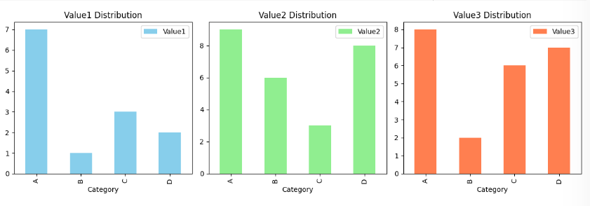
Explanation: This code creates a DataFrame with random categorical data and a 1×3 subplot layout, plotting bar charts for Value1, Value2 and Value3 with distinct colors, adding titles and adjusting spacing for clarity.
5. Pie charts in subplots
The following example generates three pie charts in subplots.
Python
import matplotlib.pyplot as plt

# Generate random data for subplots
labels = ['Category 1', 'Category 2', 'Category 3']
sizes1 = np.random.randint(1, 10, 3)
sizes2 = np.random.randint(1, 10, 3)
sizes3 = np.random.randint(1, 10, 3)

# Create subplots with pie charts
fig, axes = plt.subplots(nrows=1, ncols=3, figsize=(12, 4))

axes[0].pie(sizes1, labels=labels, autopct='%1.1f%%', colors=['lightcoral', 'lightblue', 'lightgreen'])
axes[1].pie(sizes2, labels=labels, autopct='%1.1f%%', colors=['gold', 'lightseagreen', 'lightpink'])
axes[2].pie(sizes3, labels=labels, autopct='%1.1f%%', colors=['lightskyblue', 'lightgreen', 'lightcoral'])

# Add titles
axes[0].set_title('Pie Chart 1')
axes[1].set_title('Pie Chart 2')
axes[2].set_title('Pie Chart 3')

# Adjust layout for better spacing
plt.tight_layout()

# Display the figure
plt.show()
Output:
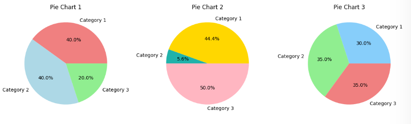
Explanation: This code creates a 1×3 subplot layout using Matplotlib, generating three pie charts with random category sizes and distinct colors. Titles are added for clarity and plt.tight_layout() ensures proper spacing before displaying the figure.
6. Customizing Subplots using gridspec
This example demonstrates creating a custom subplot layout using GridSpec in Matplotlib. It arranges four subplots in a non-standard grid, displaying a line plot, scatter plot, bar plot and pie chart.
Python
import matplotlib.pyplot as plt
import matplotlib.gridspec as gridspec
import numpy as np

# Creating a custom layout with different subplot sizes
fig = plt.figure(figsize=(12, 6))

# Using gridspec to define the layout
gs = gridspec.GridSpec(2, 3, width_ratios=[1, 2, 1], height_ratios=[2, 1])

# Creating subplots based on the layout
ax1 = plt.subplot(gs[0, 0])
ax2 = plt.subplot(gs[0, 1])
ax3 = plt.subplot(gs[0, 2])
ax4 = plt.subplot(gs[1, :])

# Customizing each subplot with different visualizations

# Subplot 1: Line Plot
x = np.linspace(0, 10, 100)
y1 = np.sin(x)
ax1.plot(x, y1, color='blue')
ax1.set_title('Line Plot - Sine Function')

# Subplot 2: Scatter Plot
x = np.random.rand(30)
y2 = 3 * x + np.random.randn(30)
ax2.scatter(x, y2, color='green')
ax2.set_title('Scatter Plot')

# Subplot 3: Bar Plot
categories = ['A', 'B', 'C', 'D']
values = np.random.randint(1, 10, 4)
ax3.bar(categories, values, color='orange')
ax3.set_title('Bar Plot')

# Subplot 4: Pie Chart
labels = ['Category 1', 'Category 2', 'Category 3']
sizes = np.random.randint(1, 10, 3)
ax4.pie(sizes, labels=labels, autopct='%1.1f%%', colors=['lightcoral', 'lightblue', 'lightgreen'])
ax4.set_title('Pie Chart')

# Adjusting layout for better spacing
plt.tight_layout()

# Displaying the figure
plt.show()
Output:
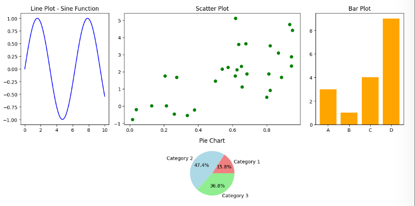
Explanation: This code uses GridSpec to create a custom 2×3 subplot layout with varying sizes. It plots a sine wave (line plot), a scatter plot, a bar chart and a pie chart in separate subplots. Titles are added for clarity and plt.tight_layout() ensures proper spacing before displaying the figure.
Similar Reads
How to Generate Subplots With Python's Matplotlib Data visualization plays a pivotal role in the process of analyzing and interpreting data. The Matplotlib library in Python offers a robust toolkit for crafting diverse plots and charts. One standout feature is its capability to generate subplots within a single figure, providing a valuable tool for
6 min read
How to Draw Shapes in Matplotlib with Python Matplotlib provides a collection of classes and functions that allow you to draw and manipulate various shapes on your plots. Whether you're adding annotations, creating diagrams, or visualizing data, understanding how to use these tools effectively will enhance your ability to create compelling vis
2 min read
How to Create Multiple Subplots in Matplotlib in Python? To create multiple plots use matplotlib.pyplot.subplots method which returns the figure along with the objects Axes object or array of Axes object. nrows, ncols attributes of subplots() method determine the number of rows and columns of the subplot grid. By default, it returns a figure with a single
3 min read
How to Create Matplotlib Plots Without a GUI To create and save plots using Matplotlib without opening a GUI window, you need to configure Matplotlib to use a non-interactive backend. This can be achieved by setting the backend to 'Agg', which is suitable for generating plots without displaying them. Let's see how to set the backend to Agg: Me
2 min read
Matplotlib.axes.SubplotBase() in Python Matplotlib is a library in Python and it is numerical - mathematical extension for NumPy library. The Axes Class contains most of the figure elements: Axis, Tick, Line2D, Text, Polygon, etc., and sets the coordinate system. And the instances of Axes supports callbacks through a callbacks attribute.
2 min read