Create Error Bars in Plotly - Python
Last Updated :
21 Oct, 2021
Plotly is a Python library that is used to design graphs, especially interactive graphs. It can plot various graphs and charts like histogram, barplot, boxplot, spreadplot, and many more. It is mainly used in data analysis as well as financial analysis. plotly is an interactive visualization library.
Error Bars in Plotly
For functions representing 2D data points such as px.scatter, px.line, px.bar, etc., error bars are given as a column name which is the value of the error_x (for the error on x position) and error_y (for the error on y position). Error bars are the graphical presentation alternation of data and used on graphs to imply the error or uncertainty in a reported capacity.
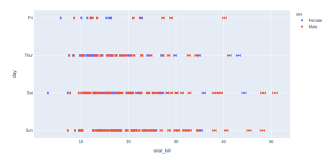
Example 1: In this example, we will plot a simple error plot using tips() data set.
Python3
import plotly.express as px


df = px.data.tips()
df["error"] = df["total_bill"]/100

fig = px.scatter(df, x="total_bill", y="day", color="sex",
                 error_x="error", error_y="error")
fig.show()
Output:
Example 2:
Python3
import plotly.express as px

df = px.data.tips()
df["e"] = df["total_bill"]/100

fig = px.bar(df, x="total_bill", y="day", color="sex",
             error_x="e", error_y="e")
fig.show()
Output:
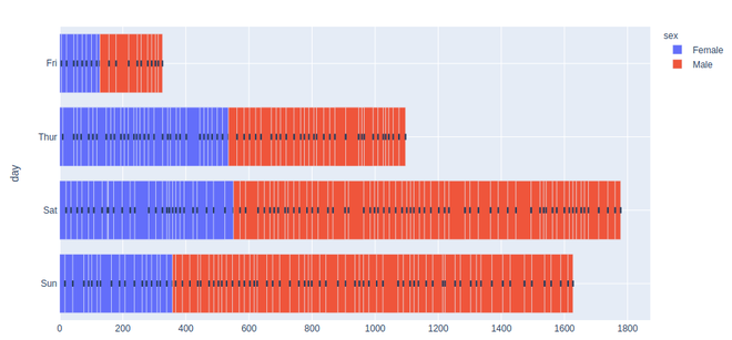
The above example my seems something meshed up, but once you zoom it you'll understand the graph more accurately.

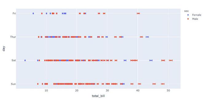
Example 3: In this example, we will see Asymmetric Error Bars, Asymmetric errors arise when there is a non-linear dependence of a result.
Python3
import plotly.express as px


df = px.data.tips()
df["error"] = df["total_bill"]/100
df["W_error"] = df["total_bill"] - df["tip"]

fig = px.scatter(df, x="total_bill", y="day", color="sex",
                 error_x="error", error_y="W_error")
fig.show()
Output:
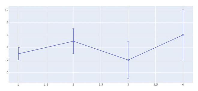
Example 4: In this example, we will see Symmetric Error Bars, Symmetric mean absolute percentage error is an accuracy measure based on percentage errors.
Python3
import plotly.graph_objects as go
x_data = [1, 2, 3, 4]
y_data = [3, 5, 2, 6]

fig = go.Figure(data = go.Scatter(
        x= x_data,
        y= y_data,
        error_y = dict(

              # value of error bar given in data coordinates
            type ='data',
            array = [1, 2, 3,4],
            visible = True)
    ))
fig.show()
Output:
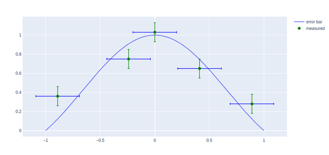
Example 5: In this example, we will see how to coloring and styling the error bar using their attributes.
Python3
import plotly.express as px
import plotly.graph_objects as go
import numpy as np

X = np.linspace(-1, 1, 100)
Y = np.sinc(X)

x = [-0.89, -0.24, -0.0, 0.41, 0.89, ]
y = [0.36, 0.75, 1.03, 0.65, 0.28, ]

fig = go.Figure()
fig.add_trace(go.Scatter(
    x=X, y=Y,
    name='error bar'
))

fig.add_trace(go.Scatter(
    x=x, y=y,
    mode='markers',
    name='measured',
    error_y=dict(
        type='constant',
        value=0.1,
        color='green',
        thickness=1.5,
        width=3,
    ),
    error_x=dict(
        type='constant',
        value=0.2,
        color='blue',
        thickness=1.5,
        width=3,
    ),
    marker=dict(color='green', size=8)
))

fig.show()
Output:
Similar Reads
Circular Bar Plot in Python In this guide, we'll dive into the world of circular bar plots in Python. We'll explore what they are, why they're useful, and how you can create them to add a stylish touch to your data visualization projects. What is a Circular Bar Plot?Circular bar plots, also known as radial bar charts or circul
4 min read
Bar chart using Plotly in Python Plotly is a Python library which is used to design graphs, especially interactive graphs. It can plot various graphs and charts like histogram, barplot, boxplot, spreadplot, and many more. It is mainly used in data analysis as well as financial analysis. Plotly is an interactive visualization librar
4 min read
How to group Bar Charts in Python-Plotly? Plotly is a Python library which is used to design graphs, especially interactive graphs. It can plot various graphs and charts like histogram, barplot, boxplot, spreadplot and many more. It is mainly used in data analysis as well as financial analysis. plotly is an interactive visualization library
2 min read
How to create Stacked bar chart in Python-Plotly? Plotly is a Python library which is used to design graphs, especially interactive graphs. It can plot various graphs and charts like histogram, barplot, boxplot, spreadplot and many more. It is mainly used in data analysis as well as financial analysis. plotly is an interactive visualization library
2 min read
plotly.figure_factory.create_bullet() in Python Plotly library of Python can be very useful for data visualization and understanding the data simply and easily. plotly.figure_factory.create_bulletThis method is used to create bullet charts. This function can take both dataframes or a sequence of dictionaries. Syntax: plotly.figure_factory.create_
2 min read