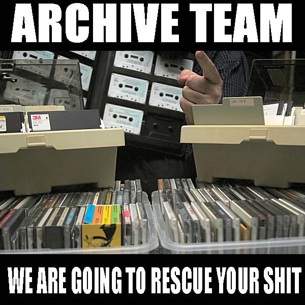 Formed in 2009, the Archive Team (not to be confused with the archive.org Archive-It Team) is a rogue archivist collective dedicated to saving copies of rapidly dying or deleted websites for the sake of history and digital heritage. The group is 100% composed of volunteers and interested parties, and has expanded into a large amount of related projects for saving online and digital history.

ResponsiveImageBundle


Overview:
The ResponsiveImageBundle adds the ability to easily create styled and responsive images (scaled, cropped, greyscale) in Symfony3. Responsive images are generated as <picture> tags or as <mg> tags with sizes and scrset attributes.
A crop and focus area widget is also provided to ensure that cropped images always include the most important part of the image.
The bundle uses FlySystem filesystem abstraction layer giving you control over where images are stored. Events are used to drive the system, giving more flexibiltiy and the ability to implement queuing of intensive image processing.
Features
- Image objects are stored via Doctrine ORM
- Handles uploading images to a "FlySystem" filesystem
- Images styles are defined in configuration.
- Breakpoints and pictures sets are defined in configuration
- Handles creation of styled images on the fly (as they are viewed) if using a local filesystem
- Includes a widget to define an image's crop and focus areas giving art direction to styled images
Quick and basic setup
Out of the box, ResponsiveImage bundle should work with minimal configuration.
Step 1: Download, enable the bundle and import its services and configuration
Download with composer
composer require irishdan/responsive-image-bundle
Enable the bundle and OneupFlysystem in the kernel
// app/AppKernel.php

public function registerBundles()
{
    $bundles = array(
        // ...
        new IrishDan\ResponsiveImageBundle\ResponsiveImageBundle(),
        new Oneup\FlysystemBundle\OneupFlysystemBundle(),
    );
}
Step 2: Import its services, default configuration and the local image routing
Import responsive image services, default and filesystem configuration.
imports:
    - { resource: "@ResponsiveImageBundle/Resources/config/services.yml" }
    - { resource: "@ResponsiveImageBundle/Resources/config/config.responsive_image_defaults.yml" }
    - { resource: "@ResponsiveImageBundle/Resources/config/config.responsive_image_filesystem.yml" }
Import the routing for local on the fly image generation.
responsive_image:
    resource: "@ResponsiveImageBundle/Resources/config/routing.yml"
    prefix:   /
Step 3: Install the bundle and generate a ResponsiveImage entity and it's CRUD.
php bin/console responsive_image:generate:entity
php bin/console responsive_image:generate:crud
With the generated image entity and CRUD you can now, create and upload images, apply 'art direction' to images.
Step 4: Define some image styles in your configuration file. (Usually config.yml)
responsive_image:
    image_styles:
        groovy_thumbnail_style:
            effect: crop
            width: 180
            height: 180
        groovy_thumbnail_style_base:
            effect: scale
            width: 240
        groovy_thumbnail_style_mobile:
            effect: scale
            height:480
        groovy_thumbnail_style_mobile:
            effect: crop
            width: 200
            height: 300
            greyscale: true
You can now render a styled in your twig template like so:
{{ styled_image(image, 'groovy_thumbnail_style') }}
Step 5: Define some breakpoints and "picture sets"
breakpoints:
    base:
        media_query: 'min-width: 0px'
    mobile:
        media_query: 'min-width: 300px'
    desktop:
        media_query: 'min-width: 1100px'
    groovey_picture_set:
        fallback: 'groovy_thumbnail_style'
        sources:
            base: groovy_thumbnail_style_base
            mobile: groovy_thumbnail_style_mobile
            desktop: groovy_thumbnail_style_desktop
You can now render <picture> responsive images or render responsive background image css in twig templates
<head>
    {{ background_responsive_image(image, 'picture_set_name', '#header') }}
</head>
<body>
    {{ picture_image(image, 'groovey_picture_set') }}
</body>
Step 6: Define some size sets
responsive_image:
    size_sets:
        blog_sizes:
            fallback: 'groovy_thumbnail_style_base'
            sizes:
                10vw:
                    breakpoint: 'mobile'
            srcsets: [ 'groovy_thumbnail_style_mobile', 'groovy_thumbnail_style_desktop' ]
You can now render <img> responsive images width srcset and sizes attributes in twig templates.
{{ sizes_image(image, 'blog_sizes') }}
Documentation
- Installation and Setup
- Filesystems
- Image entities
- Uploading
- Styled image generation
- Image rendering
- Art Direction
- Commands
- Configuration
- Urls
- Events
- Tests
Attribution
- Intervention is the standalone PHP Imagine Library is used by this bundle for image transformations
- OneupFlysystemBundle which used Flysystem filesystem astraction library, is required by this bundle
- The CropFocus art direction widget javascript was created by following this TutsPlus tutorial