Click Try It! to start a request and see the response here!
<script id="ssr-props" data-initial-props="{"baseUrl":"/","apiBaseUrl":"/","search":{"appId":"T28YKFATPY","searchApiKey":"MDBlYTM3NDM1ZDQwZmJiZTM2ODMzY2RkYTJkMjlkZWJhNjRjYmVhN2UwNTA3OTgzNjRmZDAyN2UwNDc3NjU4N3RhZ0ZpbHRlcnM9KHByb2plY3Q6NjFmNDEzNDhmZDY4YWQwMjY0M2I1ZDVmKSwodmVyc2lvbjpub25lLHZlcnNpb246NjFmNDEzNDlmZDY4YWQwMjY0M2I1ZDY1KSwoaGlkZGVuOm5vbmUsaGlkZGVuOmZhbHNlKSwoaW5kZXg6Q3VzdG9tUGFnZSxpbmRleDpQYWdlLGluZGV4OlR1dG9yaWFsKQ==","indexName":"readme_search_v2","projectsMeta":[{"modules":{"landing":false,"docs":true,"examples":true,"reference":true,"graphql":false,"changelog":false,"discuss":false,"suggested_edits":true,"logs":false,"custompages":false,"tutorials":true},"id":"61f41348fd68ad02643b5d5f","name":"Budibase Docs","subdomain":"budibase","nav_names":{"docs":"Documentation","reference":"API Reference","changelog":"","discuss":"","tutorials":""}}],"UrlManager":{"options":{"parent":null,"hasOneChild":null,"project":null,"version":null,"lang":"en"},"defaults":{"child":null,"lang":"en","version":null}},"urlManagerOpts":{"lang":"en","parent":{"childrenProjects":[]},"project":{"subdomain":"budibase"},"version":"1.0.9"}},"loginUrl":"https://dash.readme.com/to/budibase","glossaryTerms":[{"_id":"62275c7f666b31001362cc9f","term":"Budibase DB","definition":"The internal data source provided by Budibase. Any data you store on it is stored directly on your Budibase instance."},{"_id":"623231de2ad6a200563d459c","term":"Data Sources","definition":"Budibase is built up of multiple data sources, this can be the internal Budibase DB, but can also be your remote MySQL, PostgreSQL, REST or one of the many other sources available in Budibase."},{"_id":"623240949b153c00a0c4ad3c","term":"Settings Panel","definition":"The Settings Panel is where you can configure every property of a design element. By default this is displayed, when clicking an element when you're in the Budibase Design Section, on the right."},{"_id":"6260338bbcc1060670bc9776","term":"Binding","definition":"A method for passing dynamic values into queries, form fields, elements, and more!"},{"_id":"62680666100bf800445199d4","term":"Schema","definition":"A blueprint of how your data should be constructed."},{"_id":"627935881f0fef0283be16a3","term":"Default Value","definition":"The value a form field will have on initial load."}],"meta":{"title":"Create an application","type":"reference"},"oauth":false,"suggestedEdits":true,"variables":{"user":{},"defaults":[]},"doc":{"_id":"621cdd3805e8e50055c7b454","metadata":{"image":[],"title":"","description":""},"api":{"method":"post","url":"","auth":"required","params":[],"results":{"codes":[]},"apiSetting":"621cdd3705e8e50055c7b442"},"next":{"description":"","pages":[]},"title":"Create an application","updates":[],"type":"endpoint","slug":"post_applications","excerpt":"","body":"","order":0,"isReference":true,"deprecated":false,"hidden":false,"sync_unique":"post_applications","link_url":"","link_external":false,"pendingAlgoliaPublish":false,"previousSlug":"","slugUpdatedAt":"2022-02-27T22:05:32.009Z","swagger":{"path":"/applications"},"category":"621cdd3705e8e50055c7b443","createdAt":"2022-02-28T14:33:28.781Z","updatedAt":"2022-03-07T11:01:24.000Z","parentDoc":"621cdd3805e8e50055c7b445","project":"61f41348fd68ad02643b5d5f","version":"61f41349fd68ad02643b5d65","__v":0,"tutorials":[]},"hideTOC":false,"oasDefinition":{"openapi":"3.0.0","info":{"title":"Budibase API","description":"The public API for Budibase apps and its services.","version":"1.0.0"},"servers":[{"url":"https://budibase.app/api/public/v1","description":"Budibase Cloud API"},{"url":"{protocol}://{hostname}/api/public/v1","description":"Budibase self hosted API","variables":{"protocol":{"default":"http","description":"Whether HTTP or HTTPS should be used to communicate with your Budibase instance."},"hostname":{"default":"localhost:10000","description":"The URL of your Budibase instance."}}}],"components":{"parameters":{"tableId":{"in":"path","name":"tableId","required":true,"description":"The ID of the table which this request is targeting.","schema":{"type":"string"}},"rowId":{"in":"path","name":"rowId","required":true,"description":"The ID of the row which this request is targeting.","schema":{"type":"string"}},"appId":{"in":"header","name":"x-budibase-app-id","required":true,"description":"The ID of the app which this request is targeting.","schema":{"type":"string"}},"appIdUrl":{"in":"path","name":"appId","required":true,"description":"The ID of the app which this request is targeting.","schema":{"type":"string"}},"queryId":{"in":"path","name":"queryId","required":true,"description":"The ID of the query which this request is targeting.","schema":{"type":"string"}},"userId":{"in":"path","name":"userId","required":true,"description":"The ID of the user which this request is targeting.","schema":{"type":"string"}}},"examples":{"application":{"value":{"data":{"_id":"app_metadata","appId":"app_dev_957b12f943d348faa61db7e18e088d0f","version":"1.0.58-alpha.0","name":"App name","url":"/app-url","tenantId":"default","updatedAt":"2022-02-22T13:00:54.035Z","createdAt":"2022-02-11T18:02:26.961Z","status":"development"}}},"applications":{"value":{"data":[{"_id":"app_metadata","appId":"app_dev_957b12f943d348faa61db7e18e088d0f","version":"1.0.58-alpha.0","name":"App name","url":"/app-url","tenantId":"default","updatedAt":"2022-02-22T13:00:54.035Z","createdAt":"2022-02-11T18:02:26.961Z","status":"development"}]}},"inputRow":{"value":{"_id":"ro_ta_5b1649e42a5b41dea4ef7742a36a7a70_e6dc7e38cf1343b2b56760265201cda4","type":"row","tableId":"ta_5b1649e42a5b41dea4ef7742a36a7a70","name":"Mike","age":30,"relationship":["ro_ta_..."]}},"row":{"value":{"data":{"_id":"ro_ta_5b1649e42a5b41dea4ef7742a36a7a70_e6dc7e38cf1343b2b56760265201cda4","type":"row","tableId":"ta_5b1649e42a5b41dea4ef7742a36a7a70","name":"Mike","age":30,"relationship":[{"primaryDisplay":"Joe","_id":"ro_ta_..."}]}}},"enrichedRow":{"value":{"data":{"_id":"ro_ta_5b1649e42a5b41dea4ef7742a36a7a70_e6dc7e38cf1343b2b56760265201cda4","name":"eg","tableId":"ta_5b1649e42a5b41dea4ef7742a36a7a70","type":"row","relationship":[{"_id":"ro_ta_users_us_8f3d717147d74d759d8cef5b6712062f","name":"Joe","tableId":"ta_users","internal":[{"_id":"ro_ta_5b1649e42a5b41dea4ef7742a36a7a70_e6dc7e38cf1343b2b56760265201cda4","primaryDisplay":"eg"}]}]}}},"rows":{"value":{"data":[{"_id":"ro_ta_5b1649e42a5b41dea4ef7742a36a7a70_e6dc7e38cf1343b2b56760265201cda4","type":"row","tableId":"ta_5b1649e42a5b41dea4ef7742a36a7a70","name":"Mike","age":30,"relationship":[{"primaryDisplay":"Joe","_id":"ro_ta_..."}]}],"hasNextPage":true,"bookmark":10}},"table":{"value":{"data":{"_id":"ta_5b1649e42a5b41dea4ef7742a36a7a70","name":"People","schema":{"name":{"type":"string","name":"name"},"age":{"type":"number","name":"age"},"relationship":{"type":"link","name":"relationship","tableId":"ta_...","fieldName":"relatedColumn","relationshipType":"many-to-many"}}}}},"tables":{"value":{"data":[{"_id":"ta_5b1649e42a5b41dea4ef7742a36a7a70","name":"People","schema":{"name":{"type":"string","name":"name"},"age":{"type":"number","name":"age"},"relationship":{"type":"link","name":"relationship","tableId":"ta_...","fieldName":"relatedColumn","relationshipType":"many-to-many"}}}]}},"query":{"value":{"data":{"_id":"query_datasource_plus_4d8be0c506b9465daf4bf84d890fdab6_454854487c574d45bc4029b1e153219e","datasourceId":"datasource_plus_4d8be0c506b9465daf4bf84d890fdab6","parameters":[],"fields":{"sql":"select * from persons"},"queryVerb":"read","name":"Help","schema":{"personid":{"name":"personid","type":"string"},"lastname":{"name":"lastname","type":"string"},"firstname":{"name":"firstname","type":"string"},"address":{"name":"address","type":"string"},"city":{"name":"city","type":"string"}},"transformer":"return data","readable":true}}},"queries":{"value":{"data":[{"_id":"query_datasource_plus_4d8be0c506b9465daf4bf84d890fdab6_454854487c574d45bc4029b1e153219e","datasourceId":"datasource_plus_4d8be0c506b9465daf4bf84d890fdab6","parameters":[],"fields":{"sql":"select * from persons"},"queryVerb":"read","name":"Help","schema":{"personid":{"name":"personid","type":"string"},"lastname":{"name":"lastname","type":"string"},"firstname":{"name":"firstname","type":"string"},"address":{"name":"address","type":"string"},"city":{"name":"city","type":"string"}},"transformer":"return data","readable":true}]}},"restResponse":{"value":{"data":[{"value":"<html lang='en-GB'></html>"}],"pagination":{"cursor":"2"},"raw":"<html lang='en-GB'></html>","headers":{"content-type":"text/html; charset=ISO-8859-1"}}},"sqlResponse":{"value":{"data":[{"personid":1,"lastname":"Hughes","firstname":"Mike","address":"123 Fake Street","city":"Belfast"},{"personid":2,"lastname":"Smith","firstname":"John","address":"64 Updown Road","city":"Dublin"}]}},"user":{"value":{"data":{"_id":"us_693a73206518477283a8d5ae31103252","email":"test@test.com","roles":{"app_957b12f943d348faa61db7e18e088d0f":"BASIC"},"builder":{"global":false},"admin":{"global":true},"tenantId":"default","status":"active","budibaseAccess":true,"csrfToken":"9c70291d-7137-48f9-9166-99ab5473a3d4","userId":"us_693a73206518477283a8d5ae31103252","roleId":"ADMIN","role":{"_id":"ADMIN","name":"Admin","permissionId":"admin","inherits":"POWER"}}}},"users":{"value":{"data":[{"_id":"us_693a73206518477283a8d5ae31103252","email":"test@test.com","roles":{"app_957b12f943d348faa61db7e18e088d0f":"BASIC"},"builder":{"global":false},"admin":{"global":true},"tenantId":"default","status":"active","budibaseAccess":true,"csrfToken":"9c70291d-7137-48f9-9166-99ab5473a3d4","userId":"us_693a73206518477283a8d5ae31103252","roleId":"ADMIN","role":{"_id":"ADMIN","name":"Admin","permissionId":"admin","inherits":"POWER"}}]}}},"securitySchemes":{"ApiKeyAuth":{"type":"apiKey","in":"header","name":"x-budibase-api-key","description":"Your individual API key, this will provide access based on the configured RBAC settings of your user."}},"schemas":{"application":{"type":"object","properties":{"name":{"description":"The name of the app.","type":"string"},"url":{"description":"The URL by which the app is accessed, this must be URL encoded.","type":"string"}},"required":["name"]},"applicationOutput":{"type":"object","properties":{"data":{"type":"object","properties":{"name":{"description":"The name of the app.","type":"string"},"url":{"description":"The URL by which the app is accessed, this must be URL encoded.","type":"string"},"_id":{"description":"The ID of the app.","type":"string"},"status":{"description":"The status of the app, stating it if is the development or published version.","type":"string","enum":["development","published"]},"createdAt":{"description":"States when the app was created, will be constant. Stored in ISO format.","type":"string"},"updatedAt":{"description":"States the last time the app was updated - stored in ISO format.","type":"string"},"version":{"description":"States the version of the Budibase client this app is currently based on.","type":"string"},"tenantId":{"description":"In a multi-tenant environment this will state the tenant this app is within.","type":"string"},"lockedBy":{"description":"The user this app is currently being built by.","type":"object"}},"required":["_id","name","url","status","createdAt","updatedAt","version"]}},"required":["data"]},"applicationSearch":{"type":"object","properties":{"data":{"type":"array","items":{"type":"object","properties":{"name":{"description":"The name of the app.","type":"string"},"url":{"description":"The URL by which the app is accessed, this must be URL encoded.","type":"string"},"_id":{"description":"The ID of the app.","type":"string"},"status":{"description":"The status of the app, stating it if is the development or published version.","type":"string","enum":["development","published"]},"createdAt":{"description":"States when the app was created, will be constant. Stored in ISO format.","type":"string"},"updatedAt":{"description":"States the last time the app was updated - stored in ISO format.","type":"string"},"version":{"description":"States the version of the Budibase client this app is currently based on.","type":"string"},"tenantId":{"description":"In a multi-tenant environment this will state the tenant this app is within.","type":"string"},"lockedBy":{"description":"The user this app is currently being built by.","type":"object"}},"required":["_id","name","url","status","createdAt","updatedAt","version"]}}},"required":["data"]},"row":{"description":"The row to be created/updated, based on the table schema.","type":"object","additionalProperties":{"description":"Key value properties of any type, depending on the table schema."}},"searchOutput":{"type":"object","required":["data"],"properties":{"data":{"description":"An array of rows, these will each contain an _id field which can be used to update or delete them.","type":"array","items":{"type":"object"}},"bookmark":{"description":"If pagination in use, this should be provided.","oneOf":[{"type":"string"},{"type":"integer"}]},"hasNextPage":{"description":"If pagination in use, this will determine if there is another page to fetch.","type":"boolean"}}},"rowOutput":{"type":"object","properties":{"data":{"description":"The row to be created/updated, based on the table schema.","type":"object","additionalProperties":{"description":"Key value properties of any type, depending on the table schema."},"properties":{"_id":{"description":"The ID of the row.","type":"string"},"tableId":{"description":"The ID of the table this row comes from.","type":"string"}},"required":["tableId","_id"]}},"required":["data"]},"table":{"description":"The table to be created/updated.","type":"object","required":["name","schema"],"properties":{"name":{"description":"The name of the table.","type":"string"},"primaryDisplay":{"type":"string","description":"The name of the column which should be used in relationship tags when relating to this table."},"schema":{"type":"object","additionalProperties":{"oneOf":[{"type":"object","properties":{"type":{"type":"string","enum":["link"],"description":"A relationship column."},"constraints":{"type":"object","description":"A constraint can be applied to the column which will be validated against when a row is saved.","properties":{"type":{"type":"string","enum":["string","number","object","boolean"]},"presence":{"type":"boolean","description":"Defines whether the column is required or not."}}},"name":{"type":"string","description":"The name of the column."},"autocolumn":{"type":"boolean","description":"Defines whether the column is automatically generated."},"fieldName":{"type":"string","description":"The name of the column which a relationship column is related to in another table."},"tableId":{"type":"string","description":"The ID of the table which a relationship column is related to."},"relationshipType":{"type":"string","enum":["one-to-many","many-to-one","many-to-many"],"description":"Defines the type of relationship that this column will be used for."},"through":{"type":"string","description":"When using a SQL table that contains many to many relationships this defines the table the relationships are linked through."},"foreignKey":{"type":"string","description":"When using a SQL table that contains a one to many relationship this defines the foreign key."},"throughFrom":{"type":"string","description":"When using a SQL table that utilises a through table, this defines the primary key in the through table for this table."},"throughTo":{"type":"string","description":"When using a SQL table that utilises a through table, this defines the primary key in the through table for the related table."}}},{"type":"object","properties":{"type":{"type":"string","enum":["formula"],"description":"A formula column."},"constraints":{"type":"object","description":"A constraint can be applied to the column which will be validated against when a row is saved.","properties":{"type":{"type":"string","enum":["string","number","object","boolean"]},"presence":{"type":"boolean","description":"Defines whether the column is required or not."}}},"name":{"type":"string","description":"The name of the column."},"autocolumn":{"type":"boolean","description":"Defines whether the column is automatically generated."},"formula":{"type":"string","description":"Defines a Handlebars or JavaScript formula to use, note that Javascript formulas are expected to be provided in the base64 format."},"formulaType":{"type":"string","enum":["static","dynamic"],"description":"Defines whether this is a static or dynamic formula."}}},{"type":"object","properties":{"type":{"type":"string","enum":["string","longform","options","number","boolean","array","datetime","attachment","link","formula","auto","json","internal"],"description":"Defines the type of the column, most explain themselves, a link column is a relationship."},"constraints":{"type":"object","description":"A constraint can be applied to the column which will be validated against when a row is saved.","properties":{"type":{"type":"string","enum":["string","number","object","boolean"]},"presence":{"type":"boolean","description":"Defines whether the column is required or not."}}},"name":{"type":"string","description":"The name of the column."},"autocolumn":{"type":"boolean","description":"Defines whether the column is automatically generated."}}}]}}}},"tableOutput":{"type":"object","properties":{"data":{"description":"The table to be created/updated.","type":"object","required":["name","schema","_id"],"properties":{"name":{"description":"The name of the table.","type":"string"},"primaryDisplay":{"type":"string","description":"The name of the column which should be used in relationship tags when relating to this table."},"schema":{"type":"object","additionalProperties":{"oneOf":[{"type":"object","properties":{"type":{"type":"string","enum":["link"],"description":"A relationship column."},"constraints":{"type":"object","description":"A constraint can be applied to the column which will be validated against when a row is saved.","properties":{"type":{"type":"string","enum":["string","number","object","boolean"]},"presence":{"type":"boolean","description":"Defines whether the column is required or not."}}},"name":{"type":"string","description":"The name of the column."},"autocolumn":{"type":"boolean","description":"Defines whether the column is automatically generated."},"fieldName":{"type":"string","description":"The name of the column which a relationship column is related to in another table."},"tableId":{"type":"string","description":"The ID of the table which a relationship column is related to."},"relationshipType":{"type":"string","enum":["one-to-many","many-to-one","many-to-many"],"description":"Defines the type of relationship that this column will be used for."},"through":{"type":"string","description":"When using a SQL table that contains many to many relationships this defines the table the relationships are linked through."},"foreignKey":{"type":"string","description":"When using a SQL table that contains a one to many relationship this defines the foreign key."},"throughFrom":{"type":"string","description":"When using a SQL table that utilises a through table, this defines the primary key in the through table for this table."},"throughTo":{"type":"string","description":"When using a SQL table that utilises a through table, this defines the primary key in the through table for the related table."}}},{"type":"object","properties":{"type":{"type":"string","enum":["formula"],"description":"A formula column."},"constraints":{"type":"object","description":"A constraint can be applied to the column which will be validated against when a row is saved.","properties":{"type":{"type":"string","enum":["string","number","object","boolean"]},"presence":{"type":"boolean","description":"Defines whether the column is required or not."}}},"name":{"type":"string","description":"The name of the column."},"autocolumn":{"type":"boolean","description":"Defines whether the column is automatically generated."},"formula":{"type":"string","description":"Defines a Handlebars or JavaScript formula to use, note that Javascript formulas are expected to be provided in the base64 format."},"formulaType":{"type":"string","enum":["static","dynamic"],"description":"Defines whether this is a static or dynamic formula."}}},{"type":"object","properties":{"type":{"type":"string","enum":["string","longform","options","number","boolean","array","datetime","attachment","link","formula","auto","json","internal"],"description":"Defines the type of the column, most explain themselves, a link column is a relationship."},"constraints":{"type":"object","description":"A constraint can be applied to the column which will be validated against when a row is saved.","properties":{"type":{"type":"string","enum":["string","number","object","boolean"]},"presence":{"type":"boolean","description":"Defines whether the column is required or not."}}},"name":{"type":"string","description":"The name of the column."},"autocolumn":{"type":"boolean","description":"Defines whether the column is automatically generated."}}}]}},"_id":{"description":"The ID of the table.","type":"string"}}}},"required":["data"]},"tableSearch":{"type":"object","properties":{"data":{"type":"array","items":{"description":"The table to be created/updated.","type":"object","required":["name","schema","_id"],"properties":{"name":{"description":"The name of the table.","type":"string"},"primaryDisplay":{"type":"string","description":"The name of the column which should be used in relationship tags when relating to this table."},"schema":{"type":"object","additionalProperties":{"oneOf":[{"type":"object","properties":{"type":{"type":"string","enum":["link"],"description":"A relationship column."},"constraints":{"type":"object","description":"A constraint can be applied to the column which will be validated against when a row is saved.","properties":{"type":{"type":"string","enum":["string","number","object","boolean"]},"presence":{"type":"boolean","description":"Defines whether the column is required or not."}}},"name":{"type":"string","description":"The name of the column."},"autocolumn":{"type":"boolean","description":"Defines whether the column is automatically generated."},"fieldName":{"type":"string","description":"The name of the column which a relationship column is related to in another table."},"tableId":{"type":"string","description":"The ID of the table which a relationship column is related to."},"relationshipType":{"type":"string","enum":["one-to-many","many-to-one","many-to-many"],"description":"Defines the type of relationship that this column will be used for."},"through":{"type":"string","description":"When using a SQL table that contains many to many relationships this defines the table the relationships are linked through."},"foreignKey":{"type":"string","description":"When using a SQL table that contains a one to many relationship this defines the foreign key."},"throughFrom":{"type":"string","description":"When using a SQL table that utilises a through table, this defines the primary key in the through table for this table."},"throughTo":{"type":"string","description":"When using a SQL table that utilises a through table, this defines the primary key in the through table for the related table."}}},{"type":"object","properties":{"type":{"type":"string","enum":["formula"],"description":"A formula column."},"constraints":{"type":"object","description":"A constraint can be applied to the column which will be validated against when a row is saved.","properties":{"type":{"type":"string","enum":["string","number","object","boolean"]},"presence":{"type":"boolean","description":"Defines whether the column is required or not."}}},"name":{"type":"string","description":"The name of the column."},"autocolumn":{"type":"boolean","description":"Defines whether the column is automatically generated."},"formula":{"type":"string","description":"Defines a Handlebars or JavaScript formula to use, note that Javascript formulas are expected to be provided in the base64 format."},"formulaType":{"type":"string","enum":["static","dynamic"],"description":"Defines whether this is a static or dynamic formula."}}},{"type":"object","properties":{"type":{"type":"string","enum":["string","longform","options","number","boolean","array","datetime","attachment","link","formula","auto","json","internal"],"description":"Defines the type of the column, most explain themselves, a link column is a relationship."},"constraints":{"type":"object","description":"A constraint can be applied to the column which will be validated against when a row is saved.","properties":{"type":{"type":"string","enum":["string","number","object","boolean"]},"presence":{"type":"boolean","description":"Defines whether the column is required or not."}}},"name":{"type":"string","description":"The name of the column."},"autocolumn":{"type":"boolean","description":"Defines whether the column is automatically generated."}}}]}},"_id":{"description":"The ID of the table.","type":"string"}}}}},"required":["data"]},"executeQuery":{"description":"The parameters required for executing a query.","type":"object","properties":{"parameters":{"type":"object","description":"This contains the required parameters for the query, this depends on query type, setup and bindings.","additionalProperties":{"description":"Key value properties of any type, depending on the query output schema."}},"pagination":{"type":"object","description":"For supported query types (currently on REST) pagination can be performed using these properties.","properties":{"page":{"type":"string","description":"The page which has been returned from a previous query."},"limit":{"type":"number","description":"The number of rows to return per page."}}}}},"executeQueryOutput":{"type":"object","properties":{"data":{"description":"The data response from the query.","type":"array","items":{"type":"object"}},"extra":{"description":"Extra information that is not part of the main data, e.g. headers.","type":"object","properties":{"headers":{"description":"If carrying out a REST request, this will contain the response headers.","type":"object"},"raw":{"description":"The raw query response, as a string.","type":"string"}}},"pagination":{"description":"If pagination is supported, this will contain the bookmark/anchor information for it.","type":"object"}},"required":["data"]},"query":{"type":"object","properties":{"_id":{"description":"The ID of the query.","type":"string"},"datasourceId":{"description":"The ID of the data source the query belongs to.","type":"string"},"parameters":{"description":"The bindings which are required to perform this query.","type":"array","items":{"type":"string"}},"fields":{"description":"The fields that are used to perform this query, e.g. the sql statement","type":"object"},"queryVerb":{"description":"The verb that describes this query.","enum":["create","read","update","delete"]},"name":{"description":"The name of the query.","type":"string"},"schema":{"description":"The schema of the data returned when the query is executed.","type":"object"},"transformer":{"description":"The JavaScript transformer function, applied after the query responds with data.","type":"string"},"readable":{"description":"Whether the query has readable data.","type":"boolean"}},"required":["name","schema","_id"]},"querySearch":{"type":"object","properties":{"data":{"type":"array","items":{"type":"object","properties":{"_id":{"description":"The ID of the query.","type":"string"},"datasourceId":{"description":"The ID of the data source the query belongs to.","type":"string"},"parameters":{"description":"The bindings which are required to perform this query.","type":"array","items":{"type":"string"}},"fields":{"description":"The fields that are used to perform this query, e.g. the sql statement","type":"object"},"queryVerb":{"description":"The verb that describes this query.","enum":["create","read","update","delete"]},"name":{"description":"The name of the query.","type":"string"},"schema":{"description":"The schema of the data returned when the query is executed.","type":"object"},"transformer":{"description":"The JavaScript transformer function, applied after the query responds with data.","type":"string"},"readable":{"description":"Whether the query has readable data.","type":"boolean"}},"required":["name","schema","_id"]}}},"required":["data"]},"user":{"type":"object","properties":{"email":{"description":"The email address of the user, this must be unique.","type":"string"},"password":{"description":"The password of the user if using password based login - this will never be returned. This can be left out of subsequent requests (updates) and will be enriched back into the user structure.","type":"string"},"status":{"description":"The status of the user, if they are active.","type":"string","enum":["active"]},"firstName":{"description":"The first name of the user","type":"string"},"lastName":{"description":"The last name of the user","type":"string"},"forceResetPassword":{"description":"If set to true forces the user to reset their password on first login.","type":"boolean"},"builder":{"description":"Describes if the user is a builder user or not.","type":"object","properties":{"global":{"description":"If set to true the user will be able to build any app in the system.","type":"boolean"}}},"admin":{"description":"Describes if the user is an admin user or not.","type":"object","properties":{"global":{"description":"If set to true the user will be able to administrate the system.","type":"boolean"}}},"roles":{"description":"Contains the roles of the user per app (assuming they are not a builder user).","type":"object","additionalProperties":{"type":"string","description":"A map of app ID (production app ID, minus the _dev component) to a role ID, e.g. ADMIN."}}},"required":["email","roles"]},"userOutput":{"type":"object","properties":{"data":{"type":"object","properties":{"email":{"description":"The email address of the user, this must be unique.","type":"string"},"password":{"description":"The password of the user if using password based login - this will never be returned. This can be left out of subsequent requests (updates) and will be enriched back into the user structure.","type":"string"},"status":{"description":"The status of the user, if they are active.","type":"string","enum":["active"]},"firstName":{"description":"The first name of the user","type":"string"},"lastName":{"description":"The last name of the user","type":"string"},"forceResetPassword":{"description":"If set to true forces the user to reset their password on first login.","type":"boolean"},"builder":{"description":"Describes if the user is a builder user or not.","type":"object","properties":{"global":{"description":"If set to true the user will be able to build any app in the system.","type":"boolean"}}},"admin":{"description":"Describes if the user is an admin user or not.","type":"object","properties":{"global":{"description":"If set to true the user will be able to administrate the system.","type":"boolean"}}},"roles":{"description":"Contains the roles of the user per app (assuming they are not a builder user).","type":"object","additionalProperties":{"type":"string","description":"A map of app ID (production app ID, minus the _dev component) to a role ID, e.g. ADMIN."}},"_id":{"description":"The ID of the user.","type":"string"}},"required":["email","roles","_id"]}},"required":["data"]},"userSearch":{"type":"object","properties":{"data":{"type":"array","items":{"type":"object","properties":{"email":{"description":"The email address of the user, this must be unique.","type":"string"},"password":{"description":"The password of the user if using password based login - this will never be returned. This can be left out of subsequent requests (updates) and will be enriched back into the user structure.","type":"string"},"status":{"description":"The status of the user, if they are active.","type":"string","enum":["active"]},"firstName":{"description":"The first name of the user","type":"string"},"lastName":{"description":"The last name of the user","type":"string"},"forceResetPassword":{"description":"If set to true forces the user to reset their password on first login.","type":"boolean"},"builder":{"description":"Describes if the user is a builder user or not.","type":"object","properties":{"global":{"description":"If set to true the user will be able to build any app in the system.","type":"boolean"}}},"admin":{"description":"Describes if the user is an admin user or not.","type":"object","properties":{"global":{"description":"If set to true the user will be able to administrate the system.","type":"boolean"}}},"roles":{"description":"Contains the roles of the user per app (assuming they are not a builder user).","type":"object","additionalProperties":{"type":"string","description":"A map of app ID (production app ID, minus the _dev component) to a role ID, e.g. ADMIN."}},"_id":{"description":"The ID of the user.","type":"string"}},"required":["email","roles","_id"]}}},"required":["data"]},"nameSearch":{"type":"object","properties":{"name":{"type":"string","description":"The name to be used when searching - this will be used in a case insensitive starts with match."}},"required":["name"]}}},"security":[{"ApiKeyAuth":[]}],"paths":{"/applications":{"post":{"summary":"Create an application","tags":["applications"],"parameters":[{"$ref":"#/components/parameters/appId"}],"requestBody":{"required":true,"content":{"application/json":{"schema":{"$ref":"#/components/schemas/application"}}}},"responses":{"200":{"description":"Returns the created application.","content":{"application/json":{"schema":{"$ref":"#/components/schemas/applicationOutput"},"examples":{"application":{"$ref":"#/components/examples/application"}}}}}}}},"/applications/{appId}":{"put":{"summary":"Update an application","tags":["applications"],"parameters":[{"$ref":"#/components/parameters/appIdUrl"}],"requestBody":{"required":true,"content":{"application/json":{"schema":{"$ref":"#/components/schemas/application"}}}},"responses":{"200":{"description":"Returns the updated application.","content":{"application/json":{"schema":{"$ref":"#/components/schemas/applicationOutput"},"examples":{"application":{"$ref":"#/components/examples/application"}}}}}}},"delete":{"summary":"Delete an application","tags":["applications"],"parameters":[{"$ref":"#/components/parameters/appIdUrl"}],"responses":{"200":{"description":"Returns the deleted application.","content":{"application/json":{"schema":{"$ref":"#/components/schemas/applicationOutput"},"examples":{"application":{"$ref":"#/components/examples/application"}}}}}}},"get":{"summary":"Retrieve an application","tags":["applications"],"parameters":[{"$ref":"#/components/parameters/appIdUrl"}],"responses":{"200":{"description":"Returns the retrieved application.","content":{"application/json":{"schema":{"$ref":"#/components/schemas/applicationOutput"},"examples":{"application":{"$ref":"#/components/examples/application"}}}}}}}},"/applications/search":{"post":{"summary":"Search for applications","description":"Based on application properties (currently only name) search for applications.","tags":["applications"],"requestBody":{"required":true,"content":{"application/json":{"schema":{"$ref":"#/components/schemas/nameSearch"}}}},"responses":{"200":{"description":"Returns the applications that were found based on the search parameters.","content":{"application/json":{"schema":{"$ref":"#/components/schemas/applicationSearch"},"examples":{"applications":{"$ref":"#/components/examples/applications"}}}}}}}},"/queries/{queryId}":{"post":{"summary":"Execute a query","description":"Queries which have been created within a Budibase app can be executed using this,","tags":["queries"],"parameters":[{"$ref":"#/components/parameters/queryId"},{"$ref":"#/components/parameters/appId"}],"requestBody":{"required":true,"content":{"application/json":{"schema":{"$ref":"#/components/schemas/executeQuery"}}}},"responses":{"200":{"description":"Returns the result of the query execution.","content":{"application/json":{"schema":{"$ref":"#/components/schemas/executeQueryOutput"},"examples":{"REST":{"$ref":"#/components/examples/restResponse"},"SQL":{"$ref":"#/components/examples/sqlResponse"}}}}}}}},"/queries/search":{"post":{"summary":"Search for queries","description":"Based on query properties (currently only name) search for queries.","tags":["queries"],"parameters":[{"$ref":"#/components/parameters/appId"}],"requestBody":{"required":true,"content":{"application/json":{"schema":{"$ref":"#/components/schemas/nameSearch"}}}},"responses":{"200":{"description":"Returns the queries found based on the search parameters.","content":{"application/json":{"schema":{"$ref":"#/components/schemas/querySearch"},"examples":{"queries":{"$ref":"#/components/examples/queries"}}}}}}}},"/tables/{tableId}/rows":{"post":{"summary":"Create a row","description":"Creates a row within the specified table.","tags":["rows"],"parameters":[{"$ref":"#/components/parameters/tableId"},{"$ref":"#/components/parameters/appId"}],"requestBody":{"required":true,"content":{"application/json":{"schema":{"$ref":"#/components/schemas/row"},"examples":{"row":{"$ref":"#/components/examples/inputRow"}}}}},"responses":{"200":{"description":"Returns the created row, including the ID which has been generated for it. This can be found in the Budibase portal, viewed under the developer information.","content":{"application/json":{"schema":{"$ref":"#/components/schemas/rowOutput"},"examples":{"row":{"$ref":"#/components/examples/row"}}}}}}}},"/tables/{tableId}/rows/{rowId}":{"put":{"summary":"Update a row","description":"Updates a row within the specified table.","tags":["rows"],"parameters":[{"$ref":"#/components/parameters/tableId"},{"$ref":"#/components/parameters/rowId"},{"$ref":"#/components/parameters/appId"}],"requestBody":{"required":true,"content":{"application/json":{"schema":{"$ref":"#/components/schemas/row"},"examples":{"row":{"$ref":"#/components/examples/inputRow"}}}}},"responses":{"200":{"description":"Returns the created row, including the ID which has been generated for it.","content":{"application/json":{"schema":{"$ref":"#/components/schemas/rowOutput"},"examples":{"row":{"$ref":"#/components/examples/row"}}}}}}},"delete":{"summary":"Delete a row","description":"Deletes a row within the specified table.","tags":["rows"],"parameters":[{"$ref":"#/components/parameters/tableId"},{"$ref":"#/components/parameters/rowId"},{"$ref":"#/components/parameters/appId"}],"responses":{"200":{"description":"Returns the deleted row, including the ID which has been generated for it.","content":{"application/json":{"schema":{"$ref":"#/components/schemas/rowOutput"},"examples":{"row":{"$ref":"#/components/examples/row"}}}}}}},"get":{"summary":"Retrieve a row","description":"This gets a single row, it will be enriched with the full related rows, rather than the squashed \"primaryDisplay\" format returned by the search endpoint.","tags":["rows"],"parameters":[{"$ref":"#/components/parameters/tableId"},{"$ref":"#/components/parameters/rowId"},{"$ref":"#/components/parameters/appId"}],"responses":{"200":{"description":"Returns the retrieved row.","content":{"application/json":{"schema":{"$ref":"#/components/schemas/rowOutput"},"examples":{"enrichedRow":{"$ref":"#/components/examples/enrichedRow"}}}}}}}},"/tables/{tableId}/rows/search":{"post":{"summary":"Search for rows","tags":["rows"],"parameters":[{"$ref":"#/components/parameters/tableId"},{"$ref":"#/components/parameters/appId"}],"requestBody":{"required":true,"content":{"application/json":{"schema":{"type":"object","required":["query"],"properties":{"query":{"type":"object","properties":{"string":{"type":"object","example":{"columnName1":"value","columnName2":"value"},"description":"A map of field name to the string to search for, this will look for rows that have a value starting with the string value.","additionalProperties":{"type":"string","description":"The value to search for in the column."}},"fuzzy":{"type":"object","description":"A fuzzy search, only supported by internal tables."},"range":{"type":"object","description":"Searches within a range, the format of this must be columnName -> [low, high].","example":{"columnName1":[10,20]}},"equal":{"type":"object","description":"Searches for rows that have a column value that is exactly the value set."},"notEqual":{"type":"object","description":"Searches for any row which does not contain the specified column value."},"empty":{"type":"object","description":"Searches for rows which do not contain the specified column. The object should simply contain keys of the column names, these can map to any value.","example":{"columnName1":""}},"notEmpty":{"type":"object","description":"Searches for rows which have the specified column."},"oneOf":{"type":"object","description":"Searches for rows which have a column value that is any of the specified values. The format of this must be columnName -> [value1, value2]."}}},"paginate":{"type":"boolean","description":"Enables pagination, by default this is disabled."},"bookmark":{"oneOf":[{"type":"string"},{"type":"integer"}],"description":"If retrieving another page, the bookmark from the previous request must be supplied."},"limit":{"type":"integer","description":"The maximum number of rows to return, useful when paginating, for internal tables this will be limited to 1000, for SQL tables it will be 5000."},"sort":{"type":"object","description":"A set of parameters describing the sort behaviour of the search.","properties":{"order":{"type":"string","enum":["ascending","descending"],"description":"The order of the sort, by default this is ascending."},"column":{"type":"string","description":"The name of the column by which the rows will be sorted."},"type":{"type":"string","enum":["string","number"],"description":"Defines whether the column should be treated as a string or as numbers when sorting."}}}}}}}},"responses":{"200":{"description":"The response will contain an array of rows that match the search parameters.","content":{"application/json":{"schema":{"$ref":"#/components/schemas/searchOutput"},"examples":{"search":{"$ref":"#/components/examples/rows"}}}}}}}},"/tables":{"post":{"summary":"Create a table","description":"Create a table, this could be internal or external.","tags":["tables"],"parameters":[{"$ref":"#/components/parameters/appId"}],"requestBody":{"content":{"application/json":{"schema":{"$ref":"#/components/schemas/table"},"examples":{"table":{"$ref":"#/components/examples/table"}}}}},"responses":{"200":{"description":"Returns the created table, including the ID which has been generated for it. This can be internal or external data sources.","content":{"application/json":{"schema":{"$ref":"#/components/schemas/tableOutput"},"examples":{"table":{"$ref":"#/components/examples/table"}}}}}}}},"/tables/{tableId}":{"put":{"summary":"Update a table","description":"Update a table, this could be internal or external.","tags":["tables"],"parameters":[{"$ref":"#/components/parameters/tableId"},{"$ref":"#/components/parameters/appId"}],"requestBody":{"content":{"application/json":{"schema":{"$ref":"#/components/schemas/table"},"examples":{"table":{"$ref":"#/components/examples/table"}}}}},"responses":{"200":{"description":"Returns the updated table.","content":{"application/json":{"schema":{"$ref":"#/components/schemas/tableOutput"},"examples":{"table":{"$ref":"#/components/examples/table"}}}}}}},"delete":{"summary":"Delete a table","description":"Delete a table, this could be internal or external.","tags":["tables"],"parameters":[{"$ref":"#/components/parameters/tableId"},{"$ref":"#/components/parameters/appId"}],"responses":{"200":{"description":"Returns the deleted table.","content":{"application/json":{"schema":{"$ref":"#/components/schemas/tableOutput"},"examples":{"table":{"$ref":"#/components/examples/table"}}}}}}},"get":{"summary":"Retrieve a table","description":"Lookup a table, this could be internal or external.","tags":["tables"],"parameters":[{"$ref":"#/components/parameters/tableId"},{"$ref":"#/components/parameters/appId"}],"responses":{"200":{"description":"Returns the retrieved table.","content":{"application/json":{"schema":{"$ref":"#/components/schemas/tableOutput"},"examples":{"table":{"$ref":"#/components/examples/table"}}}}}}}},"/tables/search":{"post":{"summary":"Search for tables","description":"Based on table properties (currently only name) search for tables. This could be an internal or an external table.","tags":["tables"],"parameters":[{"$ref":"#/components/parameters/appId"}],"requestBody":{"required":true,"content":{"application/json":{"schema":{"$ref":"#/components/schemas/nameSearch"}}}},"responses":{"200":{"description":"Returns the found tables, based on the search parameters.","content":{"application/json":{"schema":{"$ref":"#/components/schemas/tableSearch"},"examples":{"tables":{"$ref":"#/components/examples/tables"}}}}}}}},"/users":{"post":{"summary":"Create a user","tags":["users"],"requestBody":{"required":true,"content":{"application/json":{"schema":{"$ref":"#/components/schemas/user"}}}},"responses":{"200":{"description":"Returns the created user.","content":{"application/json":{"schema":{"$ref":"#/components/schemas/userOutput"},"examples":{"user":{"$ref":"#/components/examples/user"}}}}}}}},"/users/{userId}":{"put":{"summary":"Update a user","tags":["users"],"parameters":[{"$ref":"#/components/parameters/userId"}],"requestBody":{"required":true,"content":{"application/json":{"schema":{"$ref":"#/components/schemas/user"}}}},"responses":{"200":{"description":"Returns the updated user.","content":{"application/json":{"schema":{"$ref":"#/components/schemas/userOutput"},"examples":{"user":{"$ref":"#/components/examples/user"}}}}}}},"delete":{"summary":"Delete a user","tags":["users"],"parameters":[{"$ref":"#/components/parameters/userId"}],"responses":{"200":{"description":"Returns the deleted user.","content":{"application/json":{"schema":{"$ref":"#/components/schemas/userOutput"},"examples":{"user":{"$ref":"#/components/examples/user"}}}}}}},"get":{"summary":"Retrieve a user","tags":["users"],"parameters":[{"$ref":"#/components/parameters/userId"}],"responses":{"200":{"description":"Returns the retrieved user.","content":{"application/json":{"schema":{"$ref":"#/components/schemas/userOutput"},"examples":{"user":{"$ref":"#/components/examples/user"}}}}}}}},"/users/search":{"post":{"summary":"Search for users","description":"Based on user properties (currently only name) search for users.","tags":["users"],"requestBody":{"required":true,"content":{"application/json":{"schema":{"$ref":"#/components/schemas/nameSearch"}}}},"responses":{"200":{"description":"Returns the found users based on search parameters.","content":{"application/json":{"schema":{"$ref":"#/components/schemas/userSearch"},"examples":{"users":{"$ref":"#/components/examples/users"}}}}}}}}},"tags":[],"x-readme":{"explorer-enabled":true,"proxy-enabled":true,"samples-enabled":true},"_id":"621cdd3705e8e50055c7b442"},"oasPublicUrl":"@budibase/v1.0.9#3iote64ll1c4frc5","sidebars":{"doc":[{"_id":"62272753d85a98006f655cce","title":"Getting started","slug":"getting-started-1","order":0,"reference":false,"project":"61f41348fd68ad02643b5d5f","version":"61f41349fd68ad02643b5d65","createdAt":"2022-03-08T09:52:19.539Z","__v":0,"pages":[{"_id":"62272786875bf104e9532933","metadata":{"image":[],"title":"","description":""},"api":{"method":"get","url":"","auth":"required","results":{"codes":[{"name":"","code":"{}","language":"json","status":200},{"name":"","code":"{}","language":"json","status":400}]},"params":[]},"next":{"description":"Ready to get started? Check one of the pages linked below!","pages":[{"type":"doc","icon":"file-text-o","name":"Quickstart tutorials","slug":"quickstart-tutorials","category":"Getting started"},{"type":"url","icon":"file-text-o","name":"Budibase Templates","value":"https://budibase.com/templates/"}]},"title":"Overview","updates":[],"type":"basic","slug":"what-is-budibase","excerpt":"Budibase is an open-source low code platform that helps you create business apps in minutes","body":"[block:api-header]\n{\n \"title\": \"What is Budibase\"\n}\n[/block]\nBudibase is an all-in-one low-code platform for building, designing, and automating business apps, such as; admin panels, forms, internal tools, client portals, and more. Before Budibase, it could take developers weeks to build simple CRUD apps; with Budibase, building CRUD apps takes minutes. \n[block:image]\n{\n \"images\": [\n {\n \"image\": [\n \"https://files.readme.io/1ab423b-graph-ui.png\",\n \"graph-ui.png\",\n 1280,\n 720,\n \"#9b96ab\"\n ],\n \"sizing\": \"original\",\n \"caption\": \"\"\n }\n ]\n}\n[/block]\n\n[block:api-header]\n{\n \"title\": \"Why Budibase\"\n}\n[/block]\nThere are a variety of tools and frameworks available to you when building a web application. However, we believe Budibase is the best choice for building modern, full-stack business applications.\n- Open-source - You can [inspect the codebase](https://github.com/Budibase/budibase), [Deploy Budibase on your own infrastructure](doc:hosting-methods), and build apps with confidence knowing Budibase will always be around.\n- All-in-one platform - Unlike other platforms, Budibase has a [built-in database](doc:budibasedb), [External Data Sources](doc:external-data-sources), a design GUI, and an automation section - you can build a full-stack app right within Budibase without ever leaving!\n- Design - Budibase apps look beautiful by default. We've spent a lot of time and effort building components that are accessible, performative, and look great. Also, unlike other platforms, Budibase apps work perfectly across desktop and mobile.\n- Real apps - With Budibase, you build real, high-performing single-page applications. Your apps can be public-facing apps, private apps, or both - and they can contain multiple screens too!\n[block:api-header]\n{\n \"title\": \"How Budibase works\"\n}\n[/block]\nBuilding apps with Budibase involves 4 simple steps:\n\n1. **Install Budibase** - [Use Budibase Cloud](https://account.budibase.app/register) to get started in seconds, or self-host your apps using [Docker](doc:docker-compose), [Kubernetes](doc:kubernetes-k8s) , or [DigitalOcean](doc:digitalocean).\n2. **Add data** - You can connect to data sources like PostgreSQL, Rest APIs, MS SQL, MySQL and more, or start from scratch with Budibase's built-in database (Budibase DB, built on top of CouchDB).\n3. **Design your UI** - Build beautiful, accessible user interfaces people enjoy using. Autogenerate CRUD screens from your data, or create custom screens from scratch. Use powerful components, such as tables, buttons, form inputs, to enrich your interface. Switch from light mode to dark mode with just a click.\n4. **Automate processes** - In seconds, setup automations such as email alerts, Slack notifications, CRON actions, and more.\n[block:api-header]\n{\n \"title\": \"Getting started\"\n}\n[/block]\nAfter [Installing](doc:hosting-methods) Budibase, we advise users to either begin with a [Quickstart tutorial](doc:quickstart-tutorials) or use a [Budibase template](https://budibase.com/templates/).","order":0,"isReference":false,"deprecated":false,"hidden":false,"sync_unique":"","link_url":"","link_external":false,"pendingAlgoliaPublish":false,"previousSlug":"","slugUpdatedAt":"2022-03-08T07:45:57.131Z","createdAt":"2022-03-08T09:53:10.745Z","updatedAt":"2022-04-20T09:58:33.714Z","user":"620d112e42d78f05786a3201","category":"62272753d85a98006f655cce","project":"61f41348fd68ad02643b5d5f","version":"61f41349fd68ad02643b5d65","__v":1,"parentDoc":null,"tutorials":[],"children":[],"childrenPages":[]},{"_id":"622619c3306d17006c24475a","metadata":{"image":[],"title":"","description":""},"api":{"method":"get","url":"","auth":"required","results":{"codes":[{"name":"","code":"{}","language":"json","status":200},{"name":"","code":"{}","language":"json","status":400}]},"params":[]},"next":{"description":"What's next? Either dive into creating your first app in the Quickstart, or self-hosting instructions on the page relevant to your stack!","pages":[{"type":"doc","icon":"file-text-o","name":"Budibase CLI setup","slug":"budibase-cli-setup","category":"Getting started"},{"type":"doc","icon":"file-text-o","name":"Quickstart","slug":"quickstart-tutorials","category":"Getting started"},{"type":"doc","icon":"file-text-o","name":"DigitalOcean","slug":"digitalocean","category":"Self-hosting"},{"type":"doc","icon":"file-text-o","name":"Docker","slug":"docker-compose","category":"Self-hosting"},{"type":"doc","icon":"file-text-o","name":"Kubernetes","slug":"kubernetes-k8s","category":"Self-hosting"}]},"title":"Install","updates":[],"type":"basic","slug":"hosting-methods","excerpt":"Use Budibase Cloud or run Budibase on your own self-hosted environment","body":"When getting started with Budibase, you have two options:\n1. Use Budibase Cloud - we host your apps. This is the easier, faster option. No docs are required to get started.\n2. Self-host Budibase - you host your apps. You can find further instructions below.\n[block:api-header]\n{\n \"title\": \"Host with Budibase Cloud\"\n}\n[/block]\nThe onboarding process is simple, minimal, and takes seconds. No docs are required, simply click the link below:\n- [Get started with Budibase Cloud](https://account.budibase.app/register)\n[block:api-header]\n{\n \"title\": \"Self-host Budibase\"\n}\n[/block]\nYou can self-host Budibase in under 5 minutes. We understand a lot of users need to host their apps on their own systems. This is why we've put a lot of effort into simplifying the self-hosting process. You only have to set up your Budibase instance **once**. Once your instance is up and running, other members of your team can build and interact with Budibase simply by accessing the URL that you have hosted your Budibase instance on.\n[block:callout]\n{\n \"type\": \"warning\",\n \"title\": \"Self-hosting is not for everyone\",\n \"body\": \"When diving into the world of self-hosting, be sure to know what you're doing. Self-hosting means you have to understand how servers work, implement security, maintain the servers, and figure out what's wrong when something goes wrong. If you do not understand this or don't have the time to dive into understanding all of this, we highly recommend the <a href=\\\"https://account.budibase.app/register\\\" target=\\\"_blank\\\">cloud-hosted solution</a>.\"\n}\n[/block]\nTo read more about self-hosting, check the [Docker](doc:docker-compose), [Kubernetes](doc:kubernetes-k8s) and [DigitalOcean](doc:digitalocean) pages.","order":1,"isReference":false,"deprecated":false,"hidden":false,"sync_unique":"","link_url":"","link_external":false,"pendingAlgoliaPublish":false,"previousSlug":"","slugUpdatedAt":"2022-03-06T19:59:56.548Z","createdAt":"2022-03-07T14:42:11.647Z","updatedAt":"2022-03-28T09:39:42.288Z","user":"620d112e42d78f05786a3201","category":"62272753d85a98006f655cce","project":"61f41348fd68ad02643b5d5f","version":"61f41349fd68ad02643b5d65","__v":4,"parentDoc":null,"tutorials":[],"children":[{"_id":"622f54612f3db2005bac3117","metadata":{"image":[],"title":"","description":""},"api":{"method":"get","url":"","auth":"required","results":{"codes":[{"name":"","code":"{}","language":"json","status":200},{"name":"","code":"{}","language":"json","status":400}]},"params":[]},"next":{"description":"","pages":[]},"title":"Budibase CLI setup","updates":["6279121c30673301a650ff4b"],"type":"basic","slug":"budibase-cli-setup","excerpt":"","body":"The Budibase CLI is how you initialise, manage and update your Budibase installation. \n[block:callout]\n{\n \"type\": \"warning\",\n \"title\": \"You must have Docker before installing the Budibase CLI\",\n \"body\": \"The Budibase CLI makes running a docker self-hosted installation easier. To use the CLI you must first [install Docker](https://docs.budibase.com/docs/docker-compose).\"\n}\n[/block]\n\n[block:api-header]\n{\n \"title\": \"Downloading Budibase CLI\"\n}\n[/block]\n\n If you have NodeJS installed, you can follow the recipe below:\n[block:tutorial-tile]\n{\n \"title\": \"Budibase CLI setup [NPM]\",\n \"id\": \"625569e9f6aae902ecda98bb\",\n \"slug\": \"budibase-cli-setup-npm\",\n \"backgroundColor\": \"#018FF4\",\n \"emoji\": \"🤖\",\n \"link\": \"https://docs.budibase.com/v1.0.9/recipes/budibase-cli-setup-npm\",\n \"align\": \"default\",\n \"_id\": \"625569e9f6aae902ecda98bb\"\n}\n[/block]\nOr simply run the following to install the Budibase CLI:\n[block:code]\n{\n \"codes\": [\n {\n \"code\": \"npm i -g @budibase/cli\",\n \"language\": \"shell\"\n }\n ]\n}\n[/block]\nAlternatively, you can just download the Budibase CLI for your operating system here:\n\n* [Windows](https://github.com/Budibase/budibase/releases/latest/download/cli-win.exe)\n* [Mac](https://github.com/Budibase/budibase/releases/latest/download/cli-macos)\n* [Linux](https://github.com/Budibase/budibase/releases/latest/download/cli-linux)\n\nIf you do download from the above links, the steps are slightly different compared to downloading the CLI from NPM. After downloading the CLI, you will have to make it executable. Let's take the cli-linux for example:\n\n\n[block:code]\n{\n \"codes\": [\n {\n \"code\": \"# optional - if you have already downloaded this just navigate to the file\\nwget https://github.com/Budibase/budibase/releases/latest/download/cli-linux\\n\\nchmod +x cli-linux\\n\\n# optional - rename to budi\\nmv cli-linux budi\",\n \"language\": \"shell\"\n }\n ]\n}\n[/block]\nWhen following the rest of this guide, when you see the budi command being used, you will need to replace it with:\n[block:code]\n{\n \"codes\": [\n {\n \"code\": \"./budi\",\n \"language\": \"shell\"\n }\n ]\n}\n[/block]\n\n[block:api-header]\n{\n \"title\": \"Running Budibase\"\n}\n[/block]\nOnce the CLI is installed, navigate to the directory where you would like to store the files for your Budibase installation, and run:\n[block:code]\n{\n \"codes\": [\n {\n \"code\": \"budi hosting --init # or ./cli-linux hosting --init\",\n \"language\": \"shell\"\n }\n ]\n}\n[/block]\n\n[block:code]\n{\n \"codes\": [\n {\n \"code\": \"? This will create multiple files in the current directory, should continue? Yes\\n\\n# Feel free to configure your port\\n? Please enter the port on which you want your installation to run: 10000\\n\\nThe configuration has been written successfully - please check the .env file for more details.\",\n \"language\": \"shell\"\n }\n ]\n}\n[/block]\n\n[block:callout]\n{\n \"type\": \"info\",\n \"body\": \"If you have an ARM based CPU, you will have to make a slight update to your docker-compose.yaml . Update the couchdb-service part of your compose config with platform: amd64\"\n}\n[/block]\n\n[block:code]\n{\n \"codes\": [\n {\n \"code\": \" couchdb-service:\\n platform: linux/amd64\\n ...\",\n \"language\": \"yaml\"\n }\n ]\n}\n[/block]\n\n[block:api-header]\n{\n \"title\": \"First Time Budibase Setup\"\n}\n[/block]\nYou can now start the Budibase services with the following command:\n[block:code]\n{\n \"codes\": [\n {\n \"code\": \"budi hosting --start\",\n \"language\": \"shell\"\n }\n ]\n}\n[/block]\nYou will then see:\n[block:code]\n{\n \"codes\": [\n {\n \"code\": \"Starting services, this may take a moment.\\nServices started, please go to http://localhost:10000 for next steps.\",\n \"language\": \"text\"\n }\n ]\n}\n[/block]","order":0,"isReference":false,"deprecated":false,"hidden":false,"sync_unique":"","link_url":"","link_external":false,"pendingAlgoliaPublish":false,"previousSlug":"budibase-cli-setup-1","slugUpdatedAt":"2022-03-14T15:16:10.917Z","createdAt":"2022-03-14T14:42:41.187Z","updatedAt":"2022-05-09T14:20:57.602Z","user":"61f4148e3f856f0040c73a88","parentDoc":"622619c3306d17006c24475a","category":"62272753d85a98006f655cce","project":"61f41348fd68ad02643b5d5f","version":"61f41349fd68ad02643b5d65","__v":1,"tutorials":[]},{"_id":"622619f56a24fb009afed940","metadata":{"image":[],"title":"","description":""},"api":{"method":"get","url":"","auth":"required","results":{"codes":[{"name":"","code":"{}","language":"json","status":200},{"name":"","code":"{}","language":"json","status":400}]},"params":[]},"next":{"description":"","pages":[{"type":"doc","icon":"file-text-o","name":"Reverse proxy","slug":"reverse-proxy","category":"Self-hosting"},{"type":"doc","icon":"file-text-o","name":"Hosting settings","slug":"hosting-settings","category":"Self-hosting"}]},"title":"Docker","updates":["62263f897d0835057ff8d1b6"],"type":"basic","slug":"docker-compose","excerpt":"Deploy Budibase using Docker","body":"The first step to getting your Budibase platform up and running with [Docker](https://www.docker.com/) is to make sure that you have the following installed:\n\n1. [Docker Engine](https://docs.docker.com/engine/install/) - for Windows and OSX this means installing the Desktop client, for Linux follow the instructions for your distro; this will require installing the Docker Engine and CLI, as well as [Containerd](https://containerd.io/).\n2. [Docker Compose](https://docs.docker.com/compose/install/) - follow the instructions for your operating system to install Compose, this controls the orchestration of the Docker containers which make up the Budibase platform.\n\nThe pre-requisites for installing Docker are minimal, in general, the most important factor is that your OS is up to date - on Linux systems you will need a relatively up-to-date kernel. To help with this we have provided some scripts to help with installation and setup on a Linux based system, found below:\n- [Scripts for setting up on a Linux based system](https://github.com/Budibase/budibase/tree/master/hosting/scripts/linux)\n\nTo run the Budibase platform the minimum requirements are simply those required to install and run Docker, these can be found in the [Docker documentation](https://docs.docker.com/).\n\nFor running in production, we recommend the use of a Linux host. If you run into any issues getting this setup we recommend checking the output of this script - if you are missing some services here you may need to perform a distribution upgrade.\n[block:api-header]\n{\n \"title\": \"Setting up Budibase\"\n}\n[/block]\nOnce you have Docker fully installed the rest of the process should be simple! You'll want to download the following files to your host:\n\n1. [docker-compose.yaml](https://raw.githubusercontent.com/Budibase/budibase/master/hosting/docker-compose.yaml) - this defines the images used by Budibase and how to orchestrate them.\n2. [.env](https://raw.githubusercontent.com/Budibase/budibase/master/hosting/.env) - this contains all the default settings for your Budibase platform.\n[block:callout]\n{\n \"type\": \"warning\",\n \"body\": \"If you are planning to run the cluster in a production environment, you will want update the values in the secrets section of the `.env` file before moving on, so that only you can access the database, file storage and internal APIs etc. Using a new UUID for each secret is a good approach.\",\n \"title\": \"If running in production, update secrets in `.env`\"\n}\n[/block]\nIf you have an ARM-based CPU, you will have to update your docker-compose.yaml. Update the couchdb-service part of your compose config with:\n[block:code]\n{\n \"codes\": [\n {\n \"code\": \" couchdb-service:\\n platform: linux/amd64\\n ...\",\n \"language\": \"text\"\n }\n ]\n}\n[/block]\nOnce you have these files downloaded, running the platform is as simple as:\n[block:code]\n{\n \"codes\": [\n {\n \"code\": \"docker-compose up\",\n \"language\": \"shell\"\n }\n ]\n}\n[/block]\nRunning the above command in a prompt or terminal will start up the Budibase cluster, installing the latest images for our required services and setting up a network to run them across - this may take some time to download the necessary resources.\n\nWhen the cluster is ready you'll see a mixture of log messages from the various Budibase services. \n\nYou can access your new installation at: \n```\n<server-ip>:10000\n```\n\nIf you run into any issues the easiest way to resolve them would be to [raise a discussion in our community](https://github.com/Budibase/budibase/discussions).\n[block:api-header]\n{\n \"title\": \"Further information\"\n}\n[/block]\nFor those out there interested in a more advanced setup you may want to make alternations to the `docker-compose.yaml` config file. Below, we've covered the various services and their purposes:\n\n1. [CouchDB](https://couchdb.apache.org/) - this is our database service, making use of a docker volume to persist data.\n2. [Minio](https://min.io/) - an open-source alternative to S3, acting as an object store for files, binary data, attachments and so on.\n3. [Nginx](https://www.nginx.com/) - our proxy engine, this provides a single interface by which all services can be communicated with as required.\n4. [Budibase Worker](https://github.com/Budibase/budibase/tree/master/packages/worker) - a background service engine that can handle tasks in the background of the main app servers.\n5. [Budibase Server](https://github.com/Budibase/budibase/tree/master/packages/server) - the main face of the Budibase platform, providing the APIs which your apps will make use of.\n\nAll of these services need to be able to communicate with each other, however, they can be hosted separately if desired, as long as they have the correct URLs to reach each other they will function.","order":1,"isReference":false,"deprecated":false,"hidden":false,"sync_unique":"","link_url":"","link_external":false,"pendingAlgoliaPublish":false,"previousSlug":"","slugUpdatedAt":"2022-03-06T20:33:30.752Z","createdAt":"2022-03-07T14:43:01.050Z","updatedAt":"2022-04-01T10:06:23.771Z","user":"61f705dcd635f20030c0b502","parentDoc":"622619c3306d17006c24475a","category":"62272753d85a98006f655cce","project":"61f41348fd68ad02643b5d5f","version":"61f41349fd68ad02643b5d65","__v":2,"tutorials":[]},{"_id":"622619eebca087002289204c","metadata":{"image":[],"title":"","description":""},"api":{"method":"get","url":"","auth":"required","results":{"codes":[{"name":"","code":"{}","language":"json","status":200},{"name":"","code":"{}","language":"json","status":400}]},"params":[]},"next":{"description":"","pages":[{"type":"doc","icon":"file-text-o","name":"Hosting settings","slug":"hosting-settings","category":"Self-hosting"},{"type":"doc","icon":"file-text-o","name":"Reverse proxy","slug":"reverse-proxy","category":"Self-hosting"}]},"title":"Kubernetes","updates":["6263b92d00a6cb0090736fb8"],"type":"basic","slug":"kubernetes-k8s","excerpt":"Set up Budibase in your Kubernetes cluster.","body":"There are a few command-line utilities we have to set up before we can get started with Budibase on Kubernetes. Follow the guides below to set up Kubectl and Helm.\n\n- [helm CLI](https://helm.sh/docs/intro/install/)\n- [kubectl CLI](https://kubernetes.io/docs/tasks/tools/#kubectl)\n\n\n> 📘 Info\n> \n> We recommend running on K8S nodes with at least 2GB of memory, but we recommend larger instances for higher volume use cases.\n\n---\n\n## Setting up a Kubernetes Cluster\nIf you don't already have an existing Kubernetes cluster, follow one of the guides below for your provider.\n\n- [AWS guide](https://docs.aws.amazon.com/eks/latest/userguide/getting-started-eksctl.html)\n- [Google Cloud guide](https://cloud.google.com/kubernetes-engine/docs/how-to)\n- [Minikube](https://minikube.sigs.k8s.io/docs/start/)\n- [K3S](https://rancher.com/docs/k3s/latest/en/quick-start/)\n- [MicroK8S](https://microk8s.io/docs)\n\n---\n\n## Install Budibase Helm Chart\nNow that you have your Kubernetes cluster up and running, you can now install the Budibase helm chart which will provision all the relevant infrastructure for running Budibase in a K8S environment. Run the commands below to download the helm chart from our repository, and install it.\n\n> 🚧 Required\n>\n> You must install Budibase in a Kubernetes namespace called Budibase. This helps segregate your Budibase resources from the rest of your cluster.\n\n```\nhelm repo add budibase https://budibase.github.io/budibase/\nhelm repo update\nhelm install --create-namespace --namespace budibase budibase budibase/budibase\n```\n\nWait a few moments as Budibase creates all the containers and resources. You can then run:\n```\nkubectl get pods -n budibase\n```\nYou should now be able to see your new Budibase installation up and running in your K8S cluster.\n\n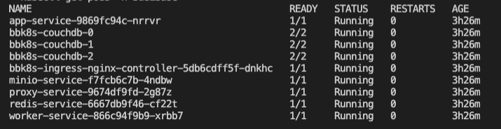\n\nTime to build! To use your new installation, you need to get the IP address of your ingress controller. Budibase makes use of the [NGINX ingress controller](https://kubernetes.github.io/ingress-nginx/how-it-works/) to direct incoming traffic to the other Budibase services. \n\nYou can access your Budibase installation using the IP address of the ingress controller, which you can grab using the following command:\n\n```\nkubectl get ingress -n budibase\n```\n\nVisit the ingress URL in your browser and you will see that your Budibase installation is up and running.\n[block:image]\n{\n \"images\": [\n {\n \"image\": [\n \"https://files.readme.io/022091e-Screenshot_2021-08-17_at_18.06.17.png\",\n \"Screenshot 2021-08-17 at 18.06.17.png\",\n 932,\n 945,\n \"#1b1c1d\"\n ],\n \"caption\": \"Budibase admin interface\",\n \"sizing\": \"80\",\n \"border\": false\n }\n ]\n}\n[/block]\n### Upgrading your Chart\nTo get the latest and greatest, you can run the following commands to update the repo and install the latest Budibase Helm Chart to your environment!\n\n```\nhelm repo update\nhelm upgrade -n budibase budibase budibase/budibase\n```\n\n---\n\n## Configuration\n\n### Cloud Specific Load Balancers\nBy default, Budibase configures a basic NGINX ingress controller to route traffic to your Budibase services. If you want to run a load balancer for your specific cloud, you can turn off the NGINX ingress controller bundled with Budibase and run your own ingress controller for your specific cloud.\n\n```\ningress:\n nginx: false\n aws: true\n```\n\n### Using a Custom Domain\nIf you are using a custom domain for your installation, you need to add it in the host section of the ingress controller in **values.yaml**. Notice here how we have added *yourdomain.com*. You should then be able to set up an A record in your DNS provider to point to the URL of your ingress controller.\n\n```\ningress:\n enabled: true\n nginx: true\n className: \"\"\n annotations: \n kubernetes.io/ingress.class: nginx\n hosts:\n - host: yourdomain.com\n paths:\n - path: /\n pathType: Prefix\n backend:\n service:\n name: proxy-service\n port:\n number: 10000 \n```\n\n### Scaling Budibase \nYou can scale up nodes in your installation by updating the **replicaCount** of a given service in the **values.yaml** of the Budibase helm chart. For example, if we wanted to scale up the worker and app service due to high load, we can update our **values.yaml** to have a higher **replicaCount**. Once updated, upgrade your chart to apply the changes.\n\n```\nservices:\n dns: cluster.local\n\n proxy:\n port: 10000\n replicaCount: 1\n\n apps:\n port: 4002\n replicaCount: 2\n logLevel: info\n\n worker:\n port: 4001\n replicaCount: 2\n```\n\n### Secrets Management\nIf you have createSecrets set to true in your values.yaml, budibase will create the following credentials for you:\n- An internal API key, that can be used for API requests.\n- a JWT secret\n- Object store access key (if using MinIO)\n- Object store secret key (if using MinIO)\nIf you need to read the value of your secrets, you can do so using **kubectl** and the following commands to read the values out from your k8s secrets:\n\n```\n# for internal API key\nkubectl get secret budibase-budibase -o go-template='{{ .data.internalApiKey }}' -n budibase | base64 --decode\n\n# JWT secret\nkubectl get secret budibase-budibase -o go-template='{{ .data.jwtSecret }}' -n budibase | base64 --decode\n\n# MinIO Access Key\nkubectl get secret budibase-budibase -o go-template='{{ .data.objectStoreAccess }}' -n budibase | base64 --decode\n\n# MinIO Secret Key\nkubectl get secret budibase-budibase -o go-template='{{ .data.objectStoreSecret }}' -n budibase | base64 --decode\n```\n\n### Redis\nThe Budibase helm chart ships with a [Redis](https://redis.io/) server that will be included by default. If you want to use your own external Redis cluster, you can configure the values.yaml file in the helm chart to switch off the Budibase one by turning enabled off. Here's what your configuration may look like if you wanted to circumvent the default bundled Redis and use an external Redis cluster hosted on [myrediscluster.io](myrediscluster.io).\n\n```\n redis:\n enabled: false # disable if using external redis\n port: 6379\n replicaCount: 1\n host: \"myrediscluster.io\"\n password: \"your-redis-password\"\n```\n\n### CouchDB\nThe Budibase helm chart will automatically bring up a 3 node couchDB cluster within your environment. If you would rather use an existing CouchDB instance, you can turn off the one Budibase supplies and point at your own. Please note - you must set up search in your [CouchDB cluster](https://docs.couchdb.org/en/stable/ddocs/search.html) in order to use all the search functionality that Budibase provides. Below is an example configuration of how you would point Budibase to a CouchDB installation hosted on mycouch.io:\n\n```\n couchdb:\n enabled: false\n replicaCount: 3\n url: \"http://mycouch.io:1234\"\n user: \"couchuser\"\n password: \"couchpassword\"\n```\n\n### MinIO/Amazon S3\nBudibase ships with a MinIO server included for object storage. Since MinIO is Amazon S3 compliant, you can switch out the bundled MinIO for an S3 bucket in your AWS account. Here's how your **values.yaml** should look if you want to use S3 instead of MinIO.\n\n```\n objectStore:\n minio: false\n browser: false\n port: 9000\n replicaCount: 1\n accessKey: \"your-access-key\" # AWS_ACCESS_KEY\n secretKey: \"your-secret-key\" # AWS_SECRET_ACCESS_KEY\n```\n\n---\n\n## Troubleshooting\n\n### Connection Issues In My Cluster\nMake sure that your Budibase installation is running in the Budibase namespace in Kubernetes. The proxy that routes traffic to Budibase services relies on this.\n\n### Still Having issues? \nIf you need a hand or have discovered a bug, please [raise a discussion on our GitHub discussions forum](https://github.com/Budibase/budibase/discussions). For Kubernetes installations, try to include the following information in your discussion:\n- Which K8S provider you are using (AWS/MiniKube etc)\n- Screenshots/Logs of errors that are occurring\n- Screenshots of your values.yaml if you have changed any configuration\n- Anything else that is relevant to the issue you are having.","order":2,"isReference":false,"deprecated":false,"hidden":false,"sync_unique":"","link_url":"","link_external":false,"pendingAlgoliaPublish":false,"previousSlug":"","slugUpdatedAt":"2022-03-06T20:33:30.416Z","createdAt":"2022-03-07T14:42:54.154Z","updatedAt":"2022-05-09T12:15:48.936Z","user":"62305339d41c2e01663bfee8","parentDoc":"622619c3306d17006c24475a","category":"62272753d85a98006f655cce","project":"61f41348fd68ad02643b5d5f","version":"61f41349fd68ad02643b5d65","__v":2,"tutorials":[]},{"_id":"622619d30c433800146bfa4a","metadata":{"image":[],"title":"","description":""},"api":{"method":"get","url":"","auth":"required","results":{"codes":[{"name":"","code":"{}","language":"json","status":200},{"name":"","code":"{}","language":"json","status":400}]},"params":[]},"next":{"description":"","pages":[{"type":"doc","icon":"file-text-o","name":"Hosting settings","slug":"hosting-settings","category":"Self-hosting"},{"type":"doc","icon":"file-text-o","name":"Reverse proxy","slug":"reverse-proxy","category":"Self-hosting"}]},"title":"DigitalOcean","updates":[],"type":"basic","slug":"digitalocean","excerpt":"One-click Budibase setup using DigitalOcean","body":"The simplest way to self-host Budibase is to use DigitalOcean. If you don't have an account, you can use our referral code to get $100 of free DigitalOcean credit!\n\n- [Sign-up to Digital Ocean with the Budibase referral code](https://www.digitalocean.com/?refcode=0caaa6085a82&utm_campaign=Referral_Invite&utm_medium=Referral_Program&utm_source=CopyPaste)\n\nOnce you've signed up, use our one-click offering on the DigitalOcean marketplace to deploy your Budibase server to DigitalOcean with ease.\n\n- [Set-up Budibase on DigitalOcean](https://cloud.digitalocean.com/login?i=09038e&onboarding_origin=marketplace)","order":3,"isReference":false,"deprecated":false,"hidden":false,"sync_unique":"","link_url":"","link_external":false,"pendingAlgoliaPublish":false,"previousSlug":"","slugUpdatedAt":"2022-03-06T20:24:14.126Z","createdAt":"2022-03-07T14:42:27.472Z","updatedAt":"2022-03-07T17:38:20.960Z","user":"61f4148e3f856f0040c73a88","category":"62272753d85a98006f655cce","project":"61f41348fd68ad02643b5d5f","version":"61f41349fd68ad02643b5d65","__v":2,"parentDoc":"622619c3306d17006c24475a","tutorials":[]},{"_id":"627e57ae53b9a100429b4111","metadata":{"image":[],"title":"","description":""},"api":{"method":"get","url":"","auth":"required","results":{"codes":[{"name":"","code":"{}","language":"json","status":200},{"name":"","code":"{}","language":"json","status":400}]},"params":[]},"next":{"description":"","pages":[]},"title":"Portainer","updates":[],"type":"basic","slug":"portainer","excerpt":"Use the Budibase portainer template to allow rapid deployments.","body":"We've added a Portainer template file, which can be pulled into Portainer to allow rapid deployments.\n\n## How to add the template to portainer\n\n1. Go to Portainer settings\n\n2. Enter ```https://raw.githubusercontent.com/Budibase/budibase/master/hosting/portainer/template.json``` into the app settings URL field, and click save:\n[block:image]\n{\n \"images\": [\n {\n \"image\": [\n \"https://files.readme.io/d0dd859-161258575-bcc22294-f441-4ed5-8944-006a8df775f0.png\",\n \"161258575-bcc22294-f441-4ed5-8944-006a8df775f0.png\",\n 911,\n 131,\n \"#f7f7f7\"\n ],\n \"border\": true\n }\n ]\n}\n[/block]\n3. Go to templates, and see that Budibase is now an option:\n[block:image]\n{\n \"images\": [\n {\n \"image\": [\n \"https://files.readme.io/9e263f7-161258649-36c5ff2d-8b88-4684-be9f-77ac2ff0a10c.png\",\n \"161258649-36c5ff2d-8b88-4684-be9f-77ac2ff0a10c.png\",\n 383,\n 100,\n \"#e7e8e8\"\n ],\n \"border\": true\n }\n ]\n}\n[/block]","order":999,"isReference":false,"deprecated":false,"hidden":false,"sync_unique":"","link_url":"","link_external":false,"pendingAlgoliaPublish":false,"previousSlug":"","slugUpdatedAt":"2022-05-13T04:28:19.645Z","createdAt":"2022-05-13T13:05:50.974Z","updatedAt":"2022-05-13T13:08:38.119Z","user":"61f4148e3f856f0040c73a88","parentDoc":"622619c3306d17006c24475a","category":"62272753d85a98006f655cce","project":"61f41348fd68ad02643b5d5f","version":"61f41349fd68ad02643b5d65","__v":0,"tutorials":[]}],"childrenPages":[{"_id":"622f54612f3db2005bac3117","metadata":{"image":[],"title":"","description":""},"api":{"method":"get","url":"","auth":"required","results":{"codes":[{"name":"","code":"{}","language":"json","status":200},{"name":"","code":"{}","language":"json","status":400}]},"params":[]},"next":{"description":"","pages":[]},"title":"Budibase CLI setup","updates":["6279121c30673301a650ff4b"],"type":"basic","slug":"budibase-cli-setup","excerpt":"","body":"The Budibase CLI is how you initialise, manage and update your Budibase installation. \n[block:callout]\n{\n \"type\": \"warning\",\n \"title\": \"You must have Docker before installing the Budibase CLI\",\n \"body\": \"The Budibase CLI makes running a docker self-hosted installation easier. To use the CLI you must first [install Docker](https://docs.budibase.com/docs/docker-compose).\"\n}\n[/block]\n\n[block:api-header]\n{\n \"title\": \"Downloading Budibase CLI\"\n}\n[/block]\n\n If you have NodeJS installed, you can follow the recipe below:\n[block:tutorial-tile]\n{\n \"title\": \"Budibase CLI setup [NPM]\",\n \"id\": \"625569e9f6aae902ecda98bb\",\n \"slug\": \"budibase-cli-setup-npm\",\n \"backgroundColor\": \"#018FF4\",\n \"emoji\": \"🤖\",\n \"link\": \"https://docs.budibase.com/v1.0.9/recipes/budibase-cli-setup-npm\",\n \"align\": \"default\",\n \"_id\": \"625569e9f6aae902ecda98bb\"\n}\n[/block]\nOr simply run the following to install the Budibase CLI:\n[block:code]\n{\n \"codes\": [\n {\n \"code\": \"npm i -g @budibase/cli\",\n \"language\": \"shell\"\n }\n ]\n}\n[/block]\nAlternatively, you can just download the Budibase CLI for your operating system here:\n\n* [Windows](https://github.com/Budibase/budibase/releases/latest/download/cli-win.exe)\n* [Mac](https://github.com/Budibase/budibase/releases/latest/download/cli-macos)\n* [Linux](https://github.com/Budibase/budibase/releases/latest/download/cli-linux)\n\nIf you do download from the above links, the steps are slightly different compared to downloading the CLI from NPM. After downloading the CLI, you will have to make it executable. Let's take the cli-linux for example:\n\n\n[block:code]\n{\n \"codes\": [\n {\n \"code\": \"# optional - if you have already downloaded this just navigate to the file\\nwget https://github.com/Budibase/budibase/releases/latest/download/cli-linux\\n\\nchmod +x cli-linux\\n\\n# optional - rename to budi\\nmv cli-linux budi\",\n \"language\": \"shell\"\n }\n ]\n}\n[/block]\nWhen following the rest of this guide, when you see the budi command being used, you will need to replace it with:\n[block:code]\n{\n \"codes\": [\n {\n \"code\": \"./budi\",\n \"language\": \"shell\"\n }\n ]\n}\n[/block]\n\n[block:api-header]\n{\n \"title\": \"Running Budibase\"\n}\n[/block]\nOnce the CLI is installed, navigate to the directory where you would like to store the files for your Budibase installation, and run:\n[block:code]\n{\n \"codes\": [\n {\n \"code\": \"budi hosting --init # or ./cli-linux hosting --init\",\n \"language\": \"shell\"\n }\n ]\n}\n[/block]\n\n[block:code]\n{\n \"codes\": [\n {\n \"code\": \"? This will create multiple files in the current directory, should continue? Yes\\n\\n# Feel free to configure your port\\n? Please enter the port on which you want your installation to run: 10000\\n\\nThe configuration has been written successfully - please check the .env file for more details.\",\n \"language\": \"shell\"\n }\n ]\n}\n[/block]\n\n[block:callout]\n{\n \"type\": \"info\",\n \"body\": \"If you have an ARM based CPU, you will have to make a slight update to your docker-compose.yaml . Update the couchdb-service part of your compose config with platform: amd64\"\n}\n[/block]\n\n[block:code]\n{\n \"codes\": [\n {\n \"code\": \" couchdb-service:\\n platform: linux/amd64\\n ...\",\n \"language\": \"yaml\"\n }\n ]\n}\n[/block]\n\n[block:api-header]\n{\n \"title\": \"First Time Budibase Setup\"\n}\n[/block]\nYou can now start the Budibase services with the following command:\n[block:code]\n{\n \"codes\": [\n {\n \"code\": \"budi hosting --start\",\n \"language\": \"shell\"\n }\n ]\n}\n[/block]\nYou will then see:\n[block:code]\n{\n \"codes\": [\n {\n \"code\": \"Starting services, this may take a moment.\\nServices started, please go to http://localhost:10000 for next steps.\",\n \"language\": \"text\"\n }\n ]\n}\n[/block]","order":0,"isReference":false,"deprecated":false,"hidden":false,"sync_unique":"","link_url":"","link_external":false,"pendingAlgoliaPublish":false,"previousSlug":"budibase-cli-setup-1","slugUpdatedAt":"2022-03-14T15:16:10.917Z","createdAt":"2022-03-14T14:42:41.187Z","updatedAt":"2022-05-09T14:20:57.602Z","user":"61f4148e3f856f0040c73a88","parentDoc":"622619c3306d17006c24475a","category":"62272753d85a98006f655cce","project":"61f41348fd68ad02643b5d5f","version":"61f41349fd68ad02643b5d65","__v":1,"tutorials":[]},{"_id":"622619f56a24fb009afed940","metadata":{"image":[],"title":"","description":""},"api":{"method":"get","url":"","auth":"required","results":{"codes":[{"name":"","code":"{}","language":"json","status":200},{"name":"","code":"{}","language":"json","status":400}]},"params":[]},"next":{"description":"","pages":[{"type":"doc","icon":"file-text-o","name":"Reverse proxy","slug":"reverse-proxy","category":"Self-hosting"},{"type":"doc","icon":"file-text-o","name":"Hosting settings","slug":"hosting-settings","category":"Self-hosting"}]},"title":"Docker","updates":["62263f897d0835057ff8d1b6"],"type":"basic","slug":"docker-compose","excerpt":"Deploy Budibase using Docker","body":"The first step to getting your Budibase platform up and running with [Docker](https://www.docker.com/) is to make sure that you have the following installed:\n\n1. [Docker Engine](https://docs.docker.com/engine/install/) - for Windows and OSX this means installing the Desktop client, for Linux follow the instructions for your distro; this will require installing the Docker Engine and CLI, as well as [Containerd](https://containerd.io/).\n2. [Docker Compose](https://docs.docker.com/compose/install/) - follow the instructions for your operating system to install Compose, this controls the orchestration of the Docker containers which make up the Budibase platform.\n\nThe pre-requisites for installing Docker are minimal, in general, the most important factor is that your OS is up to date - on Linux systems you will need a relatively up-to-date kernel. To help with this we have provided some scripts to help with installation and setup on a Linux based system, found below:\n- [Scripts for setting up on a Linux based system](https://github.com/Budibase/budibase/tree/master/hosting/scripts/linux)\n\nTo run the Budibase platform the minimum requirements are simply those required to install and run Docker, these can be found in the [Docker documentation](https://docs.docker.com/).\n\nFor running in production, we recommend the use of a Linux host. If you run into any issues getting this setup we recommend checking the output of this script - if you are missing some services here you may need to perform a distribution upgrade.\n[block:api-header]\n{\n \"title\": \"Setting up Budibase\"\n}\n[/block]\nOnce you have Docker fully installed the rest of the process should be simple! You'll want to download the following files to your host:\n\n1. [docker-compose.yaml](https://raw.githubusercontent.com/Budibase/budibase/master/hosting/docker-compose.yaml) - this defines the images used by Budibase and how to orchestrate them.\n2. [.env](https://raw.githubusercontent.com/Budibase/budibase/master/hosting/.env) - this contains all the default settings for your Budibase platform.\n[block:callout]\n{\n \"type\": \"warning\",\n \"body\": \"If you are planning to run the cluster in a production environment, you will want update the values in the secrets section of the `.env` file before moving on, so that only you can access the database, file storage and internal APIs etc. Using a new UUID for each secret is a good approach.\",\n \"title\": \"If running in production, update secrets in `.env`\"\n}\n[/block]\nIf you have an ARM-based CPU, you will have to update your docker-compose.yaml. Update the couchdb-service part of your compose config with:\n[block:code]\n{\n \"codes\": [\n {\n \"code\": \" couchdb-service:\\n platform: linux/amd64\\n ...\",\n \"language\": \"text\"\n }\n ]\n}\n[/block]\nOnce you have these files downloaded, running the platform is as simple as:\n[block:code]\n{\n \"codes\": [\n {\n \"code\": \"docker-compose up\",\n \"language\": \"shell\"\n }\n ]\n}\n[/block]\nRunning the above command in a prompt or terminal will start up the Budibase cluster, installing the latest images for our required services and setting up a network to run them across - this may take some time to download the necessary resources.\n\nWhen the cluster is ready you'll see a mixture of log messages from the various Budibase services. \n\nYou can access your new installation at: \n```\n<server-ip>:10000\n```\n\nIf you run into any issues the easiest way to resolve them would be to [raise a discussion in our community](https://github.com/Budibase/budibase/discussions).\n[block:api-header]\n{\n \"title\": \"Further information\"\n}\n[/block]\nFor those out there interested in a more advanced setup you may want to make alternations to the `docker-compose.yaml` config file. Below, we've covered the various services and their purposes:\n\n1. [CouchDB](https://couchdb.apache.org/) - this is our database service, making use of a docker volume to persist data.\n2. [Minio](https://min.io/) - an open-source alternative to S3, acting as an object store for files, binary data, attachments and so on.\n3. [Nginx](https://www.nginx.com/) - our proxy engine, this provides a single interface by which all services can be communicated with as required.\n4. [Budibase Worker](https://github.com/Budibase/budibase/tree/master/packages/worker) - a background service engine that can handle tasks in the background of the main app servers.\n5. [Budibase Server](https://github.com/Budibase/budibase/tree/master/packages/server) - the main face of the Budibase platform, providing the APIs which your apps will make use of.\n\nAll of these services need to be able to communicate with each other, however, they can be hosted separately if desired, as long as they have the correct URLs to reach each other they will function.","order":1,"isReference":false,"deprecated":false,"hidden":false,"sync_unique":"","link_url":"","link_external":false,"pendingAlgoliaPublish":false,"previousSlug":"","slugUpdatedAt":"2022-03-06T20:33:30.752Z","createdAt":"2022-03-07T14:43:01.050Z","updatedAt":"2022-04-01T10:06:23.771Z","user":"61f705dcd635f20030c0b502","parentDoc":"622619c3306d17006c24475a","category":"62272753d85a98006f655cce","project":"61f41348fd68ad02643b5d5f","version":"61f41349fd68ad02643b5d65","__v":2,"tutorials":[]},{"_id":"622619eebca087002289204c","metadata":{"image":[],"title":"","description":""},"api":{"method":"get","url":"","auth":"required","results":{"codes":[{"name":"","code":"{}","language":"json","status":200},{"name":"","code":"{}","language":"json","status":400}]},"params":[]},"next":{"description":"","pages":[{"type":"doc","icon":"file-text-o","name":"Hosting settings","slug":"hosting-settings","category":"Self-hosting"},{"type":"doc","icon":"file-text-o","name":"Reverse proxy","slug":"reverse-proxy","category":"Self-hosting"}]},"title":"Kubernetes","updates":["6263b92d00a6cb0090736fb8"],"type":"basic","slug":"kubernetes-k8s","excerpt":"Set up Budibase in your Kubernetes cluster.","body":"There are a few command-line utilities we have to set up before we can get started with Budibase on Kubernetes. Follow the guides below to set up Kubectl and Helm.\n\n- [helm CLI](https://helm.sh/docs/intro/install/)\n- [kubectl CLI](https://kubernetes.io/docs/tasks/tools/#kubectl)\n\n\n> 📘 Info\n> \n> We recommend running on K8S nodes with at least 2GB of memory, but we recommend larger instances for higher volume use cases.\n\n---\n\n## Setting up a Kubernetes Cluster\nIf you don't already have an existing Kubernetes cluster, follow one of the guides below for your provider.\n\n- [AWS guide](https://docs.aws.amazon.com/eks/latest/userguide/getting-started-eksctl.html)\n- [Google Cloud guide](https://cloud.google.com/kubernetes-engine/docs/how-to)\n- [Minikube](https://minikube.sigs.k8s.io/docs/start/)\n- [K3S](https://rancher.com/docs/k3s/latest/en/quick-start/)\n- [MicroK8S](https://microk8s.io/docs)\n\n---\n\n## Install Budibase Helm Chart\nNow that you have your Kubernetes cluster up and running, you can now install the Budibase helm chart which will provision all the relevant infrastructure for running Budibase in a K8S environment. Run the commands below to download the helm chart from our repository, and install it.\n\n> 🚧 Required\n>\n> You must install Budibase in a Kubernetes namespace called Budibase. This helps segregate your Budibase resources from the rest of your cluster.\n\n```\nhelm repo add budibase https://budibase.github.io/budibase/\nhelm repo update\nhelm install --create-namespace --namespace budibase budibase budibase/budibase\n```\n\nWait a few moments as Budibase creates all the containers and resources. You can then run:\n```\nkubectl get pods -n budibase\n```\nYou should now be able to see your new Budibase installation up and running in your K8S cluster.\n\n\n\nTime to build! To use your new installation, you need to get the IP address of your ingress controller. Budibase makes use of the [NGINX ingress controller](https://kubernetes.github.io/ingress-nginx/how-it-works/) to direct incoming traffic to the other Budibase services. \n\nYou can access your Budibase installation using the IP address of the ingress controller, which you can grab using the following command:\n\n```\nkubectl get ingress -n budibase\n```\n\nVisit the ingress URL in your browser and you will see that your Budibase installation is up and running.\n[block:image]\n{\n \"images\": [\n {\n \"image\": [\n \"https://files.readme.io/022091e-Screenshot_2021-08-17_at_18.06.17.png\",\n \"Screenshot 2021-08-17 at 18.06.17.png\",\n 932,\n 945,\n \"#1b1c1d\"\n ],\n \"caption\": \"Budibase admin interface\",\n \"sizing\": \"80\",\n \"border\": false\n }\n ]\n}\n[/block]\n### Upgrading your Chart\nTo get the latest and greatest, you can run the following commands to update the repo and install the latest Budibase Helm Chart to your environment!\n\n```\nhelm repo update\nhelm upgrade -n budibase budibase budibase/budibase\n```\n\n---\n\n## Configuration\n\n### Cloud Specific Load Balancers\nBy default, Budibase configures a basic NGINX ingress controller to route traffic to your Budibase services. If you want to run a load balancer for your specific cloud, you can turn off the NGINX ingress controller bundled with Budibase and run your own ingress controller for your specific cloud.\n\n```\ningress:\n nginx: false\n aws: true\n```\n\n### Using a Custom Domain\nIf you are using a custom domain for your installation, you need to add it in the host section of the ingress controller in **values.yaml**. Notice here how we have added *yourdomain.com*. You should then be able to set up an A record in your DNS provider to point to the URL of your ingress controller.\n\n```\ningress:\n enabled: true\n nginx: true\n className: \"\"\n annotations: \n kubernetes.io/ingress.class: nginx\n hosts:\n - host: yourdomain.com\n paths:\n - path: /\n pathType: Prefix\n backend:\n service:\n name: proxy-service\n port:\n number: 10000 \n```\n\n### Scaling Budibase \nYou can scale up nodes in your installation by updating the **replicaCount** of a given service in the **values.yaml** of the Budibase helm chart. For example, if we wanted to scale up the worker and app service due to high load, we can update our **values.yaml** to have a higher **replicaCount**. Once updated, upgrade your chart to apply the changes.\n\n```\nservices:\n dns: cluster.local\n\n proxy:\n port: 10000\n replicaCount: 1\n\n apps:\n port: 4002\n replicaCount: 2\n logLevel: info\n\n worker:\n port: 4001\n replicaCount: 2\n```\n\n### Secrets Management\nIf you have createSecrets set to true in your values.yaml, budibase will create the following credentials for you:\n- An internal API key, that can be used for API requests.\n- a JWT secret\n- Object store access key (if using MinIO)\n- Object store secret key (if using MinIO)\nIf you need to read the value of your secrets, you can do so using **kubectl** and the following commands to read the values out from your k8s secrets:\n\n```\n# for internal API key\nkubectl get secret budibase-budibase -o go-template='{{ .data.internalApiKey }}' -n budibase | base64 --decode\n\n# JWT secret\nkubectl get secret budibase-budibase -o go-template='{{ .data.jwtSecret }}' -n budibase | base64 --decode\n\n# MinIO Access Key\nkubectl get secret budibase-budibase -o go-template='{{ .data.objectStoreAccess }}' -n budibase | base64 --decode\n\n# MinIO Secret Key\nkubectl get secret budibase-budibase -o go-template='{{ .data.objectStoreSecret }}' -n budibase | base64 --decode\n```\n\n### Redis\nThe Budibase helm chart ships with a [Redis](https://redis.io/) server that will be included by default. If you want to use your own external Redis cluster, you can configure the values.yaml file in the helm chart to switch off the Budibase one by turning enabled off. Here's what your configuration may look like if you wanted to circumvent the default bundled Redis and use an external Redis cluster hosted on [myrediscluster.io](myrediscluster.io).\n\n```\n redis:\n enabled: false # disable if using external redis\n port: 6379\n replicaCount: 1\n host: \"myrediscluster.io\"\n password: \"your-redis-password\"\n```\n\n### CouchDB\nThe Budibase helm chart will automatically bring up a 3 node couchDB cluster within your environment. If you would rather use an existing CouchDB instance, you can turn off the one Budibase supplies and point at your own. Please note - you must set up search in your [CouchDB cluster](https://docs.couchdb.org/en/stable/ddocs/search.html) in order to use all the search functionality that Budibase provides. Below is an example configuration of how you would point Budibase to a CouchDB installation hosted on mycouch.io:\n\n```\n couchdb:\n enabled: false\n replicaCount: 3\n url: \"http://mycouch.io:1234\"\n user: \"couchuser\"\n password: \"couchpassword\"\n```\n\n### MinIO/Amazon S3\nBudibase ships with a MinIO server included for object storage. Since MinIO is Amazon S3 compliant, you can switch out the bundled MinIO for an S3 bucket in your AWS account. Here's how your **values.yaml** should look if you want to use S3 instead of MinIO.\n\n```\n objectStore:\n minio: false\n browser: false\n port: 9000\n replicaCount: 1\n accessKey: \"your-access-key\" # AWS_ACCESS_KEY\n secretKey: \"your-secret-key\" # AWS_SECRET_ACCESS_KEY\n```\n\n---\n\n## Troubleshooting\n\n### Connection Issues In My Cluster\nMake sure that your Budibase installation is running in the Budibase namespace in Kubernetes. The proxy that routes traffic to Budibase services relies on this.\n\n### Still Having issues? \nIf you need a hand or have discovered a bug, please [raise a discussion on our GitHub discussions forum](https://github.com/Budibase/budibase/discussions). For Kubernetes installations, try to include the following information in your discussion:\n- Which K8S provider you are using (AWS/MiniKube etc)\n- Screenshots/Logs of errors that are occurring\n- Screenshots of your values.yaml if you have changed any configuration\n- Anything else that is relevant to the issue you are having.","order":2,"isReference":false,"deprecated":false,"hidden":false,"sync_unique":"","link_url":"","link_external":false,"pendingAlgoliaPublish":false,"previousSlug":"","slugUpdatedAt":"2022-03-06T20:33:30.416Z","createdAt":"2022-03-07T14:42:54.154Z","updatedAt":"2022-05-09T12:15:48.936Z","user":"62305339d41c2e01663bfee8","parentDoc":"622619c3306d17006c24475a","category":"62272753d85a98006f655cce","project":"61f41348fd68ad02643b5d5f","version":"61f41349fd68ad02643b5d65","__v":2,"tutorials":[]},{"_id":"622619d30c433800146bfa4a","metadata":{"image":[],"title":"","description":""},"api":{"method":"get","url":"","auth":"required","results":{"codes":[{"name":"","code":"{}","language":"json","status":200},{"name":"","code":"{}","language":"json","status":400}]},"params":[]},"next":{"description":"","pages":[{"type":"doc","icon":"file-text-o","name":"Hosting settings","slug":"hosting-settings","category":"Self-hosting"},{"type":"doc","icon":"file-text-o","name":"Reverse proxy","slug":"reverse-proxy","category":"Self-hosting"}]},"title":"DigitalOcean","updates":[],"type":"basic","slug":"digitalocean","excerpt":"One-click Budibase setup using DigitalOcean","body":"The simplest way to self-host Budibase is to use DigitalOcean. If you don't have an account, you can use our referral code to get $100 of free DigitalOcean credit!\n\n- [Sign-up to Digital Ocean with the Budibase referral code](https://www.digitalocean.com/?refcode=0caaa6085a82&utm_campaign=Referral_Invite&utm_medium=Referral_Program&utm_source=CopyPaste)\n\nOnce you've signed up, use our one-click offering on the DigitalOcean marketplace to deploy your Budibase server to DigitalOcean with ease.\n\n- [Set-up Budibase on DigitalOcean](https://cloud.digitalocean.com/login?i=09038e&onboarding_origin=marketplace)","order":3,"isReference":false,"deprecated":false,"hidden":false,"sync_unique":"","link_url":"","link_external":false,"pendingAlgoliaPublish":false,"previousSlug":"","slugUpdatedAt":"2022-03-06T20:24:14.126Z","createdAt":"2022-03-07T14:42:27.472Z","updatedAt":"2022-03-07T17:38:20.960Z","user":"61f4148e3f856f0040c73a88","category":"62272753d85a98006f655cce","project":"61f41348fd68ad02643b5d5f","version":"61f41349fd68ad02643b5d65","__v":2,"parentDoc":"622619c3306d17006c24475a","tutorials":[]},{"_id":"627e57ae53b9a100429b4111","metadata":{"image":[],"title":"","description":""},"api":{"method":"get","url":"","auth":"required","results":{"codes":[{"name":"","code":"{}","language":"json","status":200},{"name":"","code":"{}","language":"json","status":400}]},"params":[]},"next":{"description":"","pages":[]},"title":"Portainer","updates":[],"type":"basic","slug":"portainer","excerpt":"Use the Budibase portainer template to allow rapid deployments.","body":"We've added a Portainer template file, which can be pulled into Portainer to allow rapid deployments.\n\n## How to add the template to portainer\n\n1. Go to Portainer settings\n\n2. Enter ```https://raw.githubusercontent.com/Budibase/budibase/master/hosting/portainer/template.json``` into the app settings URL field, and click save:\n[block:image]\n{\n \"images\": [\n {\n \"image\": [\n \"https://files.readme.io/d0dd859-161258575-bcc22294-f441-4ed5-8944-006a8df775f0.png\",\n \"161258575-bcc22294-f441-4ed5-8944-006a8df775f0.png\",\n 911,\n 131,\n \"#f7f7f7\"\n ],\n \"border\": true\n }\n ]\n}\n[/block]\n3. Go to templates, and see that Budibase is now an option:\n[block:image]\n{\n \"images\": [\n {\n \"image\": [\n \"https://files.readme.io/9e263f7-161258649-36c5ff2d-8b88-4684-be9f-77ac2ff0a10c.png\",\n \"161258649-36c5ff2d-8b88-4684-be9f-77ac2ff0a10c.png\",\n 383,\n 100,\n \"#e7e8e8\"\n ],\n \"border\": true\n }\n ]\n}\n[/block]","order":999,"isReference":false,"deprecated":false,"hidden":false,"sync_unique":"","link_url":"","link_external":false,"pendingAlgoliaPublish":false,"previousSlug":"","slugUpdatedAt":"2022-05-13T04:28:19.645Z","createdAt":"2022-05-13T13:05:50.974Z","updatedAt":"2022-05-13T13:08:38.119Z","user":"61f4148e3f856f0040c73a88","parentDoc":"622619c3306d17006c24475a","category":"62272753d85a98006f655cce","project":"61f41348fd68ad02643b5d5f","version":"61f41349fd68ad02643b5d65","__v":0,"tutorials":[]}]},{"_id":"62273cf16aa4c0003e96bbb5","metadata":{"image":[],"title":"","description":""},"api":{"method":"get","url":"","auth":"required","results":{"codes":[{"name":"","code":"{}","language":"json","status":200},{"name":"","code":"{}","language":"json","status":400}]},"params":[]},"next":{"description":"","pages":[]},"title":"Quickstart tutorials","updates":[],"type":"basic","slug":"quickstart-tutorials","excerpt":"Get a quick walkthrough of Budibase and how it works.","body":"To help you get started with Budibase, we've created two quickstart tutorials. With both tutorials, we build the same app, using the same data, just stored in different databases. \n\n1. [Budibase DB quickstart tutorial](doc:build-a-crud-app) - This tutorial is faster and easier to complete - there's no need to connect to an external database such as PostgreSQL. Everything you need is right within Budibase. This tutorial takes under 5 minutes.\n2. [PostgreSQL quickstart tutorial](doc:build-a-crud-app-sql) - This tutorial should take between 5 and 10 minutes and involves connecting to a PostgreSQL database.","order":2,"isReference":false,"deprecated":false,"hidden":false,"sync_unique":"","link_url":"","link_external":false,"pendingAlgoliaPublish":false,"previousSlug":"","slugUpdatedAt":"2022-03-07T18:25:11.685Z","createdAt":"2022-03-08T11:24:33.372Z","updatedAt":"2022-03-29T14:35:44.090Z","user":"61f4148e3f856f0040c73a88","category":"62272753d85a98006f655cce","project":"61f41348fd68ad02643b5d5f","version":"61f41349fd68ad02643b5d65","__v":0,"parentDoc":null,"tutorials":[],"children":[{"_id":"62261781de2b85026c6314fb","metadata":{"image":[],"title":"","description":""},"api":{"method":"get","url":"","auth":"required","results":{"codes":[{"name":"","code":"{}","language":"json","status":200},{"name":"","code":"{}","language":"json","status":400}]},"params":[]},"next":{"description":"","pages":[]},"title":"Quickstart: Budibase DB","updates":[],"type":"basic","slug":"build-a-crud-app","excerpt":"","body":"This tutorial will take less than 5 minutes, and at the end, you will have successfully built a complete CRUD application.\n\nIn this tutorial, we will use Budibase DB to create a Vehicle Maintenance Log app, consisting of:\n- A Vehicles table, to view vehicles\n- A Service Log table, to record the service history of a vehicle\n\n---\n\n## Getting started\n1. Download the following CSV\n[block:embed]\n{\n \"html\": false,\n \"url\": \"https://docs.google.com/spreadsheets/d/1Ni1ah_VU1pRZKuNxzby7ldznlnznS7z6f7jTs0_NPck/edit?usp=sharing\",\n \"title\": \"bb-quickstart-vehicles\",\n \"favicon\": \"https://ssl.gstatic.com/docs/spreadsheets/favicon3.ico\",\n \"image\": \"https://lh5.googleusercontent.com/U6qEet-Quae0hvq1-TRpsoVJr9D4reteZXFatsgz-q9nRD-y2QOXsGA_I9X4crWi0L5d1o_kkbMT5g=w1200-h630-p\"\n}\n[/block]\n2. Create a new account at https://account.budibase.app/register (onboarding takes a few seconds)\n3. Once onboarded, create a new app and call it: *Vehicle Maintenance Log*\n\n---\n\n## Data\n\n### Add Vehicles table (CSV upload)\n\n4. When asked what database you would like to use, select Budibase DB.\n5. Name your table: *Vehicles*\n6. Click the CSV upload button\n7. Upload the CSV you downloaded in step 1\n[block:embed]\n{\n \"html\": \"<iframe class=\\\"embedly-embed\\\" src=\\\"//cdn.embedly.com/widgets/media.html?src=https%3A%2F%2Fwww.youtube.com%2Fembed%2FWPadw3_wYFE%3Ffeature%3Doembed&display_name=YouTube&url=https%3A%2F%2Fwww.youtube.com%2Fwatch%3Fv%3DWPadw3_wYFE&image=https%3A%2F%2Fi.ytimg.com%2Fvi%2FWPadw3_wYFE%2Fhqdefault.jpg&key=f2aa6fc3595946d0afc3d76cbbd25dc3&type=text%2Fhtml&schema=youtube\\\" width=\\\"854\\\" height=\\\"480\\\" scrolling=\\\"no\\\" title=\\\"YouTube embed\\\" frameborder=\\\"0\\\" allow=\\\"autoplay; fullscreen\\\" allowfullscreen=\\\"true\\\"></iframe>\",\n \"url\": \"https://www.youtube.com/watch?v=WPadw3_wYFE&ab_channel=Budibase\",\n \"title\": \"How to: Importing data from a CSV file\",\n \"favicon\": \"https://www.youtube.com/s/desktop/d8ff51a7/img/favicon.ico\",\n \"image\": \"https://i.ytimg.com/vi/WPadw3_wYFE/hqdefault.jpg\"\n}\n[/block]\n### Add service log table (from scratch)\n\n8. Click on **Budibase DB**, and create a new table. Call your table *Service Log*, and uncheck “Generate screens in design section” - we will add these manually.\n9. Create the following columns:\n[block:parameters]\n{\n \"data\": {\n \"h-0\": \"Column name\",\n \"h-1\": \"Column type\",\n \"0-0\": \"Description\",\n \"0-1\": \"Text\",\n \"1-0\": \"Vehicle\",\n \"1-1\": \"Relationship (one Vehicle has Many Service Logs)\",\n \"2-0\": \"Service Date\",\n \"2-1\": \"Datetime\",\n \"3-0\": \"Category\",\n \"3-1\": \"Options - Our options are; \\nBrakes, Tyres, Engine, Transmission\\n*Use a new line when listing each option.\",\n \"4-0\": \"Mileage\",\n \"4-1\": \"Number\"\n },\n \"cols\": 2,\n \"rows\": 5\n}\n[/block]\n10. Finally, create some rows in the Service Log table, so that we have data to test with.\n[block:embed]\n{\n \"html\": \"<iframe class=\\\"embedly-embed\\\" src=\\\"//cdn.embedly.com/widgets/media.html?src=https%3A%2F%2Fwww.youtube.com%2Fembed%2FaRXbLqQYtkA%3Ffeature%3Doembed&display_name=YouTube&url=https%3A%2F%2Fwww.youtube.com%2Fwatch%3Fv%3DaRXbLqQYtkA&image=https%3A%2F%2Fi.ytimg.com%2Fvi%2FaRXbLqQYtkA%2Fhqdefault.jpg&key=f2aa6fc3595946d0afc3d76cbbd25dc3&type=text%2Fhtml&schema=youtube\\\" width=\\\"854\\\" height=\\\"480\\\" scrolling=\\\"no\\\" title=\\\"YouTube embed\\\" frameborder=\\\"0\\\" allow=\\\"autoplay; fullscreen\\\" allowfullscreen=\\\"true\\\"></iframe>\",\n \"url\": \"https://www.youtube.com/watch?v=aRXbLqQYtkA&ab_channel=Budibase\",\n \"title\": \"How to: Create a table from scratch\",\n \"favicon\": \"https://www.youtube.com/s/desktop/d8ff51a7/img/favicon.ico\",\n \"image\": \"https://i.ytimg.com/vi/aRXbLqQYtkA/hqdefault.jpg\"\n}\n[/block]\n---\n\n## Designing our UI\n\n### Add screens\n\n11. Click the **Design** tab, and click the **Add screen** button.\n12. Under autogenerated screens select Vehicles and Service log table, then click **Add screens**\n13. Click the preview button and view your new Vehicle Maintenance Log app\n[block:callout]\n{\n \"type\": \"success\",\n \"body\": \"You now have a fully working Vehicle Maintenance Log app.\",\n \"title\": \"Success!\"\n}\n[/block]","order":0,"isReference":false,"deprecated":false,"hidden":false,"sync_unique":"","link_url":"","link_external":false,"pendingAlgoliaPublish":false,"previousSlug":"","slugUpdatedAt":"2022-03-07T09:20:15.994Z","createdAt":"2022-03-07T14:32:33.410Z","updatedAt":"2022-03-10T14:06:45.974Z","user":"61f4148e3f856f0040c73a88","category":"62272753d85a98006f655cce","project":"61f41348fd68ad02643b5d5f","version":"61f41349fd68ad02643b5d65","__v":0,"parentDoc":"62273cf16aa4c0003e96bbb5","tutorials":[]},{"_id":"6226178fc9eff000837bc9a0","metadata":{"image":[],"title":"","description":""},"api":{"method":"get","url":"","auth":"required","results":{"codes":[{"name":"","code":"{}","language":"json","status":200},{"name":"","code":"{}","language":"json","status":400}]},"params":[]},"next":{"description":"","pages":[]},"title":"Quickstart: PostgreSQL","updates":["623ecb2d93fe1b0089cdcc9e"],"type":"basic","slug":"build-a-crud-app-sql","excerpt":"","body":"This tutorial will take between 5 and 10 minutes, and at the end, you will have successfully built a complete CRUD application.\nThis guide will take show you how to build a “Vehicle Maintenance Log” application. For this guide, we will use Postgres. As far as Budibase is concerned, the process is the same, regardless of your database.\n\nIn this tutorial, we will create a Vehicle Maintenance Log app, consisting of:\n- A Vehicles table, to view vehicles\n- A Service Log table, to record the service history of a vehicle\n\nWe will use the following table structure:\n[block:image]\n{\n \"images\": [\n {\n \"image\": [\n \"https://files.readme.io/ceaf9f6-Vehicles.png\",\n \"Vehicles.png\",\n 633,\n 195,\n \"#f3f3f3\"\n ]\n }\n ]\n}\n[/block]\n---\n\n## Getting started\n1. Run the following script\n[block:code]\n{\n \"codes\": [\n {\n \"code\": \"CREATE TABLE public.\\\"Vehicles\\\" (\\n \\\"id\\\" SERIAL PRIMARY KEY,\\n \\\"Registration\\\" TEXT NULL,\\n \\\"Make\\\" TEXT NULL,\\n \\\"Model\\\" TEXT NULL,\\n \\\"Colour\\\" TEXT NULL,\\n \\\"Year\\\" INT NULL);\\n \\n\\nCREATE TABLE public.\\\"ServiceLog\\\" (\\n \\\"id\\\" SERIAL PRIMARY KEY,\\n \\\"Description\\\" TEXT NULL,\\n \\\"VehicleId\\\" INT NULL,\\n \\\"ServiceDate\\\" TIMESTAMP NULL,\\n \\\"Category\\\" TEXT NULL,\\n \\\"Mileage\\\" INT NULL);\\n\\n\\nINSERT INTO public.\\\"Vehicles\\\"(\\\"Registration\\\", \\\"Make\\\", \\\"Model\\\", \\\"Colour\\\", \\\"Year\\\")\\nVALUES ('FAZ 9837','Volkswagen','Polo','White',2002);\\nINSERT INTO public.\\\"Vehicles\\\"(\\\"Registration\\\", \\\"Make\\\", \\\"Model\\\", \\\"Colour\\\", \\\"Year\\\")\\nVALUES ('JHI 8827','BMW','M3','Black',2013);\\nINSERT INTO public.\\\"Vehicles\\\"(\\\"Registration\\\", \\\"Make\\\", \\\"Model\\\", \\\"Colour\\\", \\\"Year\\\")\\nVALUES ('D903PI','Volvo','XC40','Grey',2014);\\nINSERT INTO public.\\\"Vehicles\\\"(\\\"Registration\\\", \\\"Make\\\", \\\"Model\\\", \\\"Colour\\\", \\\"Year\\\")\\nVALUES ('YFI002','Volkswagen','Golf','Dark Blue',2018);\\nINSERT INTO public.\\\"Vehicles\\\"(\\\"Registration\\\", \\\"Make\\\", \\\"Model\\\", \\\"Colour\\\", \\\"Year\\\")\\nVALUES ('HGT5677','Skoda','Octavia','Graphite',2009);\\nINSERT INTO public.\\\"Vehicles\\\"(\\\"Registration\\\", \\\"Make\\\", \\\"Model\\\", \\\"Colour\\\", \\\"Year\\\")\\nVALUES ('PPF9276','Skoda','Octavia','Graphite',2021);\\nINSERT INTO public.\\\"Vehicles\\\"(\\\"Registration\\\", \\\"Make\\\", \\\"Model\\\", \\\"Colour\\\", \\\"Year\\\")\\nVALUES ('J893FT','Toyota','Corolla','Red',2015);\\nINSERT INTO public.\\\"Vehicles\\\"(\\\"Registration\\\", \\\"Make\\\", \\\"Model\\\", \\\"Colour\\\", \\\"Year\\\")\\nVALUES ('MJK776','Honda','HR-V','Silver',2015);\\n\\n\\nINSERT INTO public.\\\"ServiceLog\\\"(\\\"Description\\\", \\\"VehicleId\\\", \\\"ServiceDate\\\", \\\"Category\\\", \\\"Mileage\\\")\\nVALUES ('Change front brakes', 1, '2021-05-04', 'Brakes', 20667);\\nINSERT INTO public.\\\"ServiceLog\\\"(\\\"Description\\\", \\\"VehicleId\\\", \\\"ServiceDate\\\", \\\"Category\\\", \\\"Mileage\\\")\\nVALUES ('Tyres - full set', 1, '2021-05-04', 'Tyres', 20667);\\nINSERT INTO public.\\\"ServiceLog\\\"(\\\"Description\\\", \\\"VehicleId\\\", \\\"ServiceDate\\\", \\\"Category\\\", \\\"Mileage\\\")\\nVALUES ('Engine tune up', 2, '2021-07-14', 'Engine', 50889);\\nINSERT INTO public.\\\"ServiceLog\\\"(\\\"Description\\\", \\\"VehicleId\\\", \\\"ServiceDate\\\", \\\"Category\\\", \\\"Mileage\\\")\\nVALUES ('Replace transmission', 3, '2021-09-26', 'Transmission', 98002);\",\n \"language\": \"sql\"\n }\n ]\n}\n[/block]\n2. Create a new account at https://account.budibase.app/register (onboarding takes a few seconds)\n3. Once onboarded, create a new app and call it: *Vehicle Maintenance Log*\n\n---\n\n## Connecting to your SQL tables\n4. When asked what database you would like to use, select PostgreSQL\n5. Complete the configuration to connect to your PostgreSQL database\n[block:callout]\n{\n \"type\": \"info\",\n \"body\": \"Note that if you are connecting to a database on `localhost`, your host should be set to `host.docker.internal`, or `172.17.0.1` if running on Linux.\"\n}\n[/block]\n6. Once you have added your connection details, click **Fetch tables from database**. This will read the tables in your database.\n[block:embed]\n{\n \"html\": \"<iframe class=\\\"embedly-embed\\\" src=\\\"//cdn.embedly.com/widgets/media.html?src=https%3A%2F%2Fwww.youtube.com%2Fembed%2FhpOVNDUnka4%3Ffeature%3Doembed&display_name=YouTube&url=https%3A%2F%2Fwww.youtube.com%2Fwatch%3Fv%3DhpOVNDUnka4&image=https%3A%2F%2Fi.ytimg.com%2Fvi%2FhpOVNDUnka4%2Fhqdefault.jpg&key=f2aa6fc3595946d0afc3d76cbbd25dc3&type=text%2Fhtml&schema=youtube\\\" width=\\\"854\\\" height=\\\"480\\\" scrolling=\\\"no\\\" title=\\\"YouTube embed\\\" frameborder=\\\"0\\\" allow=\\\"autoplay; fullscreen\\\" allowfullscreen=\\\"true\\\"></iframe>\",\n \"url\": \"https://www.youtube.com/watch?v=hpOVNDUnka4&ab_channel=Budibase\",\n \"title\": \"How to: Reading tables from a SQL database\",\n \"favicon\": \"https://www.youtube.com/s/desktop/d8ff51a7/img/favicon.ico\",\n \"image\": \"https://i.ytimg.com/vi/hpOVNDUnka4/hqdefault.jpg\"\n}\n[/block]\n---\n\n## Creating Screens from your SQL tables\nOnce Budibase knows about your SQL tables, it can autogenerate screens (the user interface) that allows listing, creating, editing a deleting of records from tables. Of course, these generated screens are completely customizable - but Budibase gives you a huge headstart.\n\n7. Go to the “Design” section.\n8. Create a new screen, and from the list of autogenerated screens, select **Vehicle**.\n\n---\n\n## Using relationships between SQL tables\nBudibase allows you to declare relationships between your table. We are going to set up our one-to-many relationship between Vehicles and Deals.\n[block:callout]\n{\n \"type\": \"info\",\n \"body\": \"Budibase does not modify your tables. We are simply telling Budibase about your existing database structure.\"\n}\n[/block]\nTo define a relationship:\n9. Select your SQL datasource\n10. Click on **Define Relationship**, then:\n- Set relationship type to “One”. \n- The from (“One”) table is “Vehicles”. \n- The to (“Many”) table is “Service Logs”. \n- The “From Table Column” is how your relationship will be named in your Vehicles table. We will call this **Service Logs**. \n- The “To Table Column” is how your relationship will be named in your Service Log table. We will call this “Vehicle”\n\nThe relationship is now created, and by default the first columns of each table will be used as the display columns. \nThe display columns tell Budibase how to describe the Vehicle from the Service Log table, and vice versa. This is equivalent to a column alias:\n```\nSELECT ServiceLog.*, Registration as Vehicle \nFROM ServiceLog \nINNER JOIN Vehicles on ServiceLog.VehicleId = Vehicles.id\n```\nTo change the display columns\n11. Select the Service Log table\n12. Click the “Edit” icon beside the “Category” column\n13. Toggle “Use as table display column”\n14. Click “Save Column”\n\nNow the Vehicles table should show the Service Log category, rather than the description. \n[block:embed]\n{\n \"html\": \"<iframe class=\\\"embedly-embed\\\" src=\\\"//cdn.embedly.com/widgets/media.html?src=https%3A%2F%2Fwww.youtube.com%2Fembed%2FdcOg43XT_fE%3Ffeature%3Doembed&display_name=YouTube&url=https%3A%2F%2Fwww.youtube.com%2Fwatch%3Fv%3DdcOg43XT_fE&image=https%3A%2F%2Fi.ytimg.com%2Fvi%2FdcOg43XT_fE%2Fhqdefault.jpg&key=f2aa6fc3595946d0afc3d76cbbd25dc3&type=text%2Fhtml&schema=youtube\\\" width=\\\"854\\\" height=\\\"480\\\" scrolling=\\\"no\\\" title=\\\"YouTube embed\\\" frameborder=\\\"0\\\" allow=\\\"autoplay; fullscreen\\\" allowfullscreen=\\\"true\\\"></iframe>\",\n \"url\": \"https://www.youtube.com/watch?v=dcOg43XT_fE&ab_channel=Budibase\",\n \"title\": \"How to: describing SQL relationships\",\n \"favicon\": \"https://www.youtube.com/s/desktop/d8ff51a7/img/favicon.ico\",\n \"image\": \"https://i.ytimg.com/vi/dcOg43XT_fE/hqdefault.jpg\"\n}\n[/block]\n---\n\n## Add Service Logs CRUD screens\n15. Go to the “Design” section.\n16. Create a new screen, and from the list of autogenerated screens, select **Service Logs**.\n17. Click the preview button and view your new Vehicle Maintenance Log app\n[block:callout]\n{\n \"type\": \"success\",\n \"body\": \"You now have a fully working Vehicle Maintenance Log app.\",\n \"title\": \"Success\"\n}\n[/block]","order":1,"isReference":false,"deprecated":false,"hidden":false,"sync_unique":"","link_url":"","link_external":false,"pendingAlgoliaPublish":false,"previousSlug":"","slugUpdatedAt":"2022-03-06T20:24:13.236Z","createdAt":"2022-03-07T14:32:47.043Z","updatedAt":"2022-03-26T15:29:35.927Z","user":"62305339d41c2e01663bfee8","category":"62272753d85a98006f655cce","project":"61f41348fd68ad02643b5d5f","version":"61f41349fd68ad02643b5d65","__v":1,"parentDoc":"62273cf16aa4c0003e96bbb5","tutorials":[]}],"childrenPages":[{"_id":"62261781de2b85026c6314fb","metadata":{"image":[],"title":"","description":""},"api":{"method":"get","url":"","auth":"required","results":{"codes":[{"name":"","code":"{}","language":"json","status":200},{"name":"","code":"{}","language":"json","status":400}]},"params":[]},"next":{"description":"","pages":[]},"title":"Quickstart: Budibase DB","updates":[],"type":"basic","slug":"build-a-crud-app","excerpt":"","body":"This tutorial will take less than 5 minutes, and at the end, you will have successfully built a complete CRUD application.\n\nIn this tutorial, we will use Budibase DB to create a Vehicle Maintenance Log app, consisting of:\n- A Vehicles table, to view vehicles\n- A Service Log table, to record the service history of a vehicle\n\n---\n\n## Getting started\n1. Download the following CSV\n[block:embed]\n{\n \"html\": false,\n \"url\": \"https://docs.google.com/spreadsheets/d/1Ni1ah_VU1pRZKuNxzby7ldznlnznS7z6f7jTs0_NPck/edit?usp=sharing\",\n \"title\": \"bb-quickstart-vehicles\",\n \"favicon\": \"https://ssl.gstatic.com/docs/spreadsheets/favicon3.ico\",\n \"image\": \"https://lh5.googleusercontent.com/U6qEet-Quae0hvq1-TRpsoVJr9D4reteZXFatsgz-q9nRD-y2QOXsGA_I9X4crWi0L5d1o_kkbMT5g=w1200-h630-p\"\n}\n[/block]\n2. Create a new account at https://account.budibase.app/register (onboarding takes a few seconds)\n3. Once onboarded, create a new app and call it: *Vehicle Maintenance Log*\n\n---\n\n## Data\n\n### Add Vehicles table (CSV upload)\n\n4. When asked what database you would like to use, select Budibase DB.\n5. Name your table: *Vehicles*\n6. Click the CSV upload button\n7. Upload the CSV you downloaded in step 1\n[block:embed]\n{\n \"html\": \"<iframe class=\\\"embedly-embed\\\" src=\\\"//cdn.embedly.com/widgets/media.html?src=https%3A%2F%2Fwww.youtube.com%2Fembed%2FWPadw3_wYFE%3Ffeature%3Doembed&display_name=YouTube&url=https%3A%2F%2Fwww.youtube.com%2Fwatch%3Fv%3DWPadw3_wYFE&image=https%3A%2F%2Fi.ytimg.com%2Fvi%2FWPadw3_wYFE%2Fhqdefault.jpg&key=f2aa6fc3595946d0afc3d76cbbd25dc3&type=text%2Fhtml&schema=youtube\\\" width=\\\"854\\\" height=\\\"480\\\" scrolling=\\\"no\\\" title=\\\"YouTube embed\\\" frameborder=\\\"0\\\" allow=\\\"autoplay; fullscreen\\\" allowfullscreen=\\\"true\\\"></iframe>\",\n \"url\": \"https://www.youtube.com/watch?v=WPadw3_wYFE&ab_channel=Budibase\",\n \"title\": \"How to: Importing data from a CSV file\",\n \"favicon\": \"https://www.youtube.com/s/desktop/d8ff51a7/img/favicon.ico\",\n \"image\": \"https://i.ytimg.com/vi/WPadw3_wYFE/hqdefault.jpg\"\n}\n[/block]\n### Add service log table (from scratch)\n\n8. Click on **Budibase DB**, and create a new table. Call your table *Service Log*, and uncheck “Generate screens in design section” - we will add these manually.\n9. Create the following columns:\n[block:parameters]\n{\n \"data\": {\n \"h-0\": \"Column name\",\n \"h-1\": \"Column type\",\n \"0-0\": \"Description\",\n \"0-1\": \"Text\",\n \"1-0\": \"Vehicle\",\n \"1-1\": \"Relationship (one Vehicle has Many Service Logs)\",\n \"2-0\": \"Service Date\",\n \"2-1\": \"Datetime\",\n \"3-0\": \"Category\",\n \"3-1\": \"Options - Our options are; \\nBrakes, Tyres, Engine, Transmission\\n*Use a new line when listing each option.\",\n \"4-0\": \"Mileage\",\n \"4-1\": \"Number\"\n },\n \"cols\": 2,\n \"rows\": 5\n}\n[/block]\n10. Finally, create some rows in the Service Log table, so that we have data to test with.\n[block:embed]\n{\n \"html\": \"<iframe class=\\\"embedly-embed\\\" src=\\\"//cdn.embedly.com/widgets/media.html?src=https%3A%2F%2Fwww.youtube.com%2Fembed%2FaRXbLqQYtkA%3Ffeature%3Doembed&display_name=YouTube&url=https%3A%2F%2Fwww.youtube.com%2Fwatch%3Fv%3DaRXbLqQYtkA&image=https%3A%2F%2Fi.ytimg.com%2Fvi%2FaRXbLqQYtkA%2Fhqdefault.jpg&key=f2aa6fc3595946d0afc3d76cbbd25dc3&type=text%2Fhtml&schema=youtube\\\" width=\\\"854\\\" height=\\\"480\\\" scrolling=\\\"no\\\" title=\\\"YouTube embed\\\" frameborder=\\\"0\\\" allow=\\\"autoplay; fullscreen\\\" allowfullscreen=\\\"true\\\"></iframe>\",\n \"url\": \"https://www.youtube.com/watch?v=aRXbLqQYtkA&ab_channel=Budibase\",\n \"title\": \"How to: Create a table from scratch\",\n \"favicon\": \"https://www.youtube.com/s/desktop/d8ff51a7/img/favicon.ico\",\n \"image\": \"https://i.ytimg.com/vi/aRXbLqQYtkA/hqdefault.jpg\"\n}\n[/block]\n---\n\n## Designing our UI\n\n### Add screens\n\n11. Click the **Design** tab, and click the **Add screen** button.\n12. Under autogenerated screens select Vehicles and Service log table, then click **Add screens**\n13. Click the preview button and view your new Vehicle Maintenance Log app\n[block:callout]\n{\n \"type\": \"success\",\n \"body\": \"You now have a fully working Vehicle Maintenance Log app.\",\n \"title\": \"Success!\"\n}\n[/block]","order":0,"isReference":false,"deprecated":false,"hidden":false,"sync_unique":"","link_url":"","link_external":false,"pendingAlgoliaPublish":false,"previousSlug":"","slugUpdatedAt":"2022-03-07T09:20:15.994Z","createdAt":"2022-03-07T14:32:33.410Z","updatedAt":"2022-03-10T14:06:45.974Z","user":"61f4148e3f856f0040c73a88","category":"62272753d85a98006f655cce","project":"61f41348fd68ad02643b5d5f","version":"61f41349fd68ad02643b5d65","__v":0,"parentDoc":"62273cf16aa4c0003e96bbb5","tutorials":[]},{"_id":"6226178fc9eff000837bc9a0","metadata":{"image":[],"title":"","description":""},"api":{"method":"get","url":"","auth":"required","results":{"codes":[{"name":"","code":"{}","language":"json","status":200},{"name":"","code":"{}","language":"json","status":400}]},"params":[]},"next":{"description":"","pages":[]},"title":"Quickstart: PostgreSQL","updates":["623ecb2d93fe1b0089cdcc9e"],"type":"basic","slug":"build-a-crud-app-sql","excerpt":"","body":"This tutorial will take between 5 and 10 minutes, and at the end, you will have successfully built a complete CRUD application.\nThis guide will take show you how to build a “Vehicle Maintenance Log” application. For this guide, we will use Postgres. As far as Budibase is concerned, the process is the same, regardless of your database.\n\nIn this tutorial, we will create a Vehicle Maintenance Log app, consisting of:\n- A Vehicles table, to view vehicles\n- A Service Log table, to record the service history of a vehicle\n\nWe will use the following table structure:\n[block:image]\n{\n \"images\": [\n {\n \"image\": [\n \"https://files.readme.io/ceaf9f6-Vehicles.png\",\n \"Vehicles.png\",\n 633,\n 195,\n \"#f3f3f3\"\n ]\n }\n ]\n}\n[/block]\n---\n\n## Getting started\n1. Run the following script\n[block:code]\n{\n \"codes\": [\n {\n \"code\": \"CREATE TABLE public.\\\"Vehicles\\\" (\\n \\\"id\\\" SERIAL PRIMARY KEY,\\n \\\"Registration\\\" TEXT NULL,\\n \\\"Make\\\" TEXT NULL,\\n \\\"Model\\\" TEXT NULL,\\n \\\"Colour\\\" TEXT NULL,\\n \\\"Year\\\" INT NULL);\\n \\n\\nCREATE TABLE public.\\\"ServiceLog\\\" (\\n \\\"id\\\" SERIAL PRIMARY KEY,\\n \\\"Description\\\" TEXT NULL,\\n \\\"VehicleId\\\" INT NULL,\\n \\\"ServiceDate\\\" TIMESTAMP NULL,\\n \\\"Category\\\" TEXT NULL,\\n \\\"Mileage\\\" INT NULL);\\n\\n\\nINSERT INTO public.\\\"Vehicles\\\"(\\\"Registration\\\", \\\"Make\\\", \\\"Model\\\", \\\"Colour\\\", \\\"Year\\\")\\nVALUES ('FAZ 9837','Volkswagen','Polo','White',2002);\\nINSERT INTO public.\\\"Vehicles\\\"(\\\"Registration\\\", \\\"Make\\\", \\\"Model\\\", \\\"Colour\\\", \\\"Year\\\")\\nVALUES ('JHI 8827','BMW','M3','Black',2013);\\nINSERT INTO public.\\\"Vehicles\\\"(\\\"Registration\\\", \\\"Make\\\", \\\"Model\\\", \\\"Colour\\\", \\\"Year\\\")\\nVALUES ('D903PI','Volvo','XC40','Grey',2014);\\nINSERT INTO public.\\\"Vehicles\\\"(\\\"Registration\\\", \\\"Make\\\", \\\"Model\\\", \\\"Colour\\\", \\\"Year\\\")\\nVALUES ('YFI002','Volkswagen','Golf','Dark Blue',2018);\\nINSERT INTO public.\\\"Vehicles\\\"(\\\"Registration\\\", \\\"Make\\\", \\\"Model\\\", \\\"Colour\\\", \\\"Year\\\")\\nVALUES ('HGT5677','Skoda','Octavia','Graphite',2009);\\nINSERT INTO public.\\\"Vehicles\\\"(\\\"Registration\\\", \\\"Make\\\", \\\"Model\\\", \\\"Colour\\\", \\\"Year\\\")\\nVALUES ('PPF9276','Skoda','Octavia','Graphite',2021);\\nINSERT INTO public.\\\"Vehicles\\\"(\\\"Registration\\\", \\\"Make\\\", \\\"Model\\\", \\\"Colour\\\", \\\"Year\\\")\\nVALUES ('J893FT','Toyota','Corolla','Red',2015);\\nINSERT INTO public.\\\"Vehicles\\\"(\\\"Registration\\\", \\\"Make\\\", \\\"Model\\\", \\\"Colour\\\", \\\"Year\\\")\\nVALUES ('MJK776','Honda','HR-V','Silver',2015);\\n\\n\\nINSERT INTO public.\\\"ServiceLog\\\"(\\\"Description\\\", \\\"VehicleId\\\", \\\"ServiceDate\\\", \\\"Category\\\", \\\"Mileage\\\")\\nVALUES ('Change front brakes', 1, '2021-05-04', 'Brakes', 20667);\\nINSERT INTO public.\\\"ServiceLog\\\"(\\\"Description\\\", \\\"VehicleId\\\", \\\"ServiceDate\\\", \\\"Category\\\", \\\"Mileage\\\")\\nVALUES ('Tyres - full set', 1, '2021-05-04', 'Tyres', 20667);\\nINSERT INTO public.\\\"ServiceLog\\\"(\\\"Description\\\", \\\"VehicleId\\\", \\\"ServiceDate\\\", \\\"Category\\\", \\\"Mileage\\\")\\nVALUES ('Engine tune up', 2, '2021-07-14', 'Engine', 50889);\\nINSERT INTO public.\\\"ServiceLog\\\"(\\\"Description\\\", \\\"VehicleId\\\", \\\"ServiceDate\\\", \\\"Category\\\", \\\"Mileage\\\")\\nVALUES ('Replace transmission', 3, '2021-09-26', 'Transmission', 98002);\",\n \"language\": \"sql\"\n }\n ]\n}\n[/block]\n2. Create a new account at https://account.budibase.app/register (onboarding takes a few seconds)\n3. Once onboarded, create a new app and call it: *Vehicle Maintenance Log*\n\n---\n\n## Connecting to your SQL tables\n4. When asked what database you would like to use, select PostgreSQL\n5. Complete the configuration to connect to your PostgreSQL database\n[block:callout]\n{\n \"type\": \"info\",\n \"body\": \"Note that if you are connecting to a database on `localhost`, your host should be set to `host.docker.internal`, or `172.17.0.1` if running on Linux.\"\n}\n[/block]\n6. Once you have added your connection details, click **Fetch tables from database**. This will read the tables in your database.\n[block:embed]\n{\n \"html\": \"<iframe class=\\\"embedly-embed\\\" src=\\\"//cdn.embedly.com/widgets/media.html?src=https%3A%2F%2Fwww.youtube.com%2Fembed%2FhpOVNDUnka4%3Ffeature%3Doembed&display_name=YouTube&url=https%3A%2F%2Fwww.youtube.com%2Fwatch%3Fv%3DhpOVNDUnka4&image=https%3A%2F%2Fi.ytimg.com%2Fvi%2FhpOVNDUnka4%2Fhqdefault.jpg&key=f2aa6fc3595946d0afc3d76cbbd25dc3&type=text%2Fhtml&schema=youtube\\\" width=\\\"854\\\" height=\\\"480\\\" scrolling=\\\"no\\\" title=\\\"YouTube embed\\\" frameborder=\\\"0\\\" allow=\\\"autoplay; fullscreen\\\" allowfullscreen=\\\"true\\\"></iframe>\",\n \"url\": \"https://www.youtube.com/watch?v=hpOVNDUnka4&ab_channel=Budibase\",\n \"title\": \"How to: Reading tables from a SQL database\",\n \"favicon\": \"https://www.youtube.com/s/desktop/d8ff51a7/img/favicon.ico\",\n \"image\": \"https://i.ytimg.com/vi/hpOVNDUnka4/hqdefault.jpg\"\n}\n[/block]\n---\n\n## Creating Screens from your SQL tables\nOnce Budibase knows about your SQL tables, it can autogenerate screens (the user interface) that allows listing, creating, editing a deleting of records from tables. Of course, these generated screens are completely customizable - but Budibase gives you a huge headstart.\n\n7. Go to the “Design” section.\n8. Create a new screen, and from the list of autogenerated screens, select **Vehicle**.\n\n---\n\n## Using relationships between SQL tables\nBudibase allows you to declare relationships between your table. We are going to set up our one-to-many relationship between Vehicles and Deals.\n[block:callout]\n{\n \"type\": \"info\",\n \"body\": \"Budibase does not modify your tables. We are simply telling Budibase about your existing database structure.\"\n}\n[/block]\nTo define a relationship:\n9. Select your SQL datasource\n10. Click on **Define Relationship**, then:\n- Set relationship type to “One”. \n- The from (“One”) table is “Vehicles”. \n- The to (“Many”) table is “Service Logs”. \n- The “From Table Column” is how your relationship will be named in your Vehicles table. We will call this **Service Logs**. \n- The “To Table Column” is how your relationship will be named in your Service Log table. We will call this “Vehicle”\n\nThe relationship is now created, and by default the first columns of each table will be used as the display columns. \nThe display columns tell Budibase how to describe the Vehicle from the Service Log table, and vice versa. This is equivalent to a column alias:\n```\nSELECT ServiceLog.*, Registration as Vehicle \nFROM ServiceLog \nINNER JOIN Vehicles on ServiceLog.VehicleId = Vehicles.id\n```\nTo change the display columns\n11. Select the Service Log table\n12. Click the “Edit” icon beside the “Category” column\n13. Toggle “Use as table display column”\n14. Click “Save Column”\n\nNow the Vehicles table should show the Service Log category, rather than the description. \n[block:embed]\n{\n \"html\": \"<iframe class=\\\"embedly-embed\\\" src=\\\"//cdn.embedly.com/widgets/media.html?src=https%3A%2F%2Fwww.youtube.com%2Fembed%2FdcOg43XT_fE%3Ffeature%3Doembed&display_name=YouTube&url=https%3A%2F%2Fwww.youtube.com%2Fwatch%3Fv%3DdcOg43XT_fE&image=https%3A%2F%2Fi.ytimg.com%2Fvi%2FdcOg43XT_fE%2Fhqdefault.jpg&key=f2aa6fc3595946d0afc3d76cbbd25dc3&type=text%2Fhtml&schema=youtube\\\" width=\\\"854\\\" height=\\\"480\\\" scrolling=\\\"no\\\" title=\\\"YouTube embed\\\" frameborder=\\\"0\\\" allow=\\\"autoplay; fullscreen\\\" allowfullscreen=\\\"true\\\"></iframe>\",\n \"url\": \"https://www.youtube.com/watch?v=dcOg43XT_fE&ab_channel=Budibase\",\n \"title\": \"How to: describing SQL relationships\",\n \"favicon\": \"https://www.youtube.com/s/desktop/d8ff51a7/img/favicon.ico\",\n \"image\": \"https://i.ytimg.com/vi/dcOg43XT_fE/hqdefault.jpg\"\n}\n[/block]\n---\n\n## Add Service Logs CRUD screens\n15. Go to the “Design” section.\n16. Create a new screen, and from the list of autogenerated screens, select **Service Logs**.\n17. Click the preview button and view your new Vehicle Maintenance Log app\n[block:callout]\n{\n \"type\": \"success\",\n \"body\": \"You now have a fully working Vehicle Maintenance Log app.\",\n \"title\": \"Success\"\n}\n[/block]","order":1,"isReference":false,"deprecated":false,"hidden":false,"sync_unique":"","link_url":"","link_external":false,"pendingAlgoliaPublish":false,"previousSlug":"","slugUpdatedAt":"2022-03-06T20:24:13.236Z","createdAt":"2022-03-07T14:32:47.043Z","updatedAt":"2022-03-26T15:29:35.927Z","user":"62305339d41c2e01663bfee8","category":"62272753d85a98006f655cce","project":"61f41348fd68ad02643b5d5f","version":"61f41349fd68ad02643b5d65","__v":1,"parentDoc":"62273cf16aa4c0003e96bbb5","tutorials":[]}]},{"_id":"622a05346435610020811abf","metadata":{"image":[],"title":"","description":""},"api":{"method":"get","url":"","auth":"required","results":{"codes":[{"name":"","code":"{}","language":"json","status":200},{"name":"","code":"{}","language":"json","status":400}]},"params":[]},"next":{"description":"","pages":[]},"title":"Public API","updates":["627a8b57992d3f009d43138c","62841cc1a94ab2003f7ef707"],"type":"basic","slug":"public-api","excerpt":"Information about the public API","body":"This page covers some key information you need to know about using the Budibase Public API and our OpenAPI 3.0 specification. The Budibase API provides access to resources including applications, users, tables and data through a RESTful API - allowing for much deeper integration with your business use cases.\n[block:callout]\n{\n \"type\": \"info\",\n \"title\": \"Public API Reference\",\n \"body\": \"This article covers the important general points about the Budibase Public API, if you are looking for in-depth information about the individual endpoints please check out our [API Reference](https://docs.budibase.com/reference).\"\n}\n[/block]\n\n[block:api-header]\n{\n \"title\": \"How to get your API key\"\n}\n[/block]\nThe Budibase API requires an API key be specified as a header, specifically the `x-budibase-api-key` header. Each user will have their own API key which can be generated through the Budibase portal, you'll find this in the user dropdown menu in the top right.\n[block:image]\n{\n \"images\": [\n {\n \"image\": [\n \"https://files.readme.io/7b29204-Capture.PNG\",\n \"Capture.PNG\",\n 409,\n 361,\n \"#1c1c1c\"\n ],\n \"caption\": \"User menu with API key option\"\n }\n ]\n}\n[/block]\nThe \"View API key\" will open a menu, that allows generating a new API key (this will invalidate your old API key), from here you can copy your API key and start using it!\n[block:image]\n{\n \"images\": [\n {\n \"image\": [\n \"https://files.readme.io/5ddaa4f-Capture.PNG\",\n \"Capture.PNG\",\n 405,\n 345,\n \"#222323\"\n ],\n \"caption\": \"API key menu\"\n }\n ]\n}\n[/block]\n\n[block:api-header]\n{\n \"title\": \"Getting an App ID\"\n}\n[/block]\nData-related endpoints will require an `x-budibase-app-id` header. Your App's ID can be retrieved by accessing your app from the Budibase dashboard, and locating your App ID from your browser's address bar after the URL's `/builder/app/` path. \n\nFor example: `<hostname>/builder/app/<your-app-id>/other-path` where `<hostname>` could be `localhost` and `<your-app-id>` could be `app_dev_567abc890opq123`.\n[block:api-header]\n{\n \"title\": \"Getting a table's ID and row's ID\"\n}\n[/block]\nData-related endpoints in the Budibase API may call for a `tableId` or `rowId`. Your desired Table ID can be retrieved by accessing your app from the Budibase dashboard and then navigating to the \"Data\" editor. The Table ID can be found in the address bar after the URL's `/data/table/` path.\n\nTable ID example: `<hostname>/builder/app/<your-app-id>/data/table/<table-id>` where `<table-id>` could be `ta_123a456b789c123d345e678f`.\n\nWhile browsing database tables, you can retrieve a row's ID by locating the value under the row's `ID` column. You may have to toggle \"Auto columns\" in order for the `ID` column to be visible. \n[block:api-header]\n{\n \"title\": \"Getting the OpenAPI specification\"\n}\n[/block]\nThe Budibase Public API has been defined using the OpenAPI 3.0 specification which allows for easy integration between external applications and Budibase. You can learn more about the OpenAPI initiative [here](https://swagger.io/specification/).\n\nYou can find the specification for the latest release of Budibase through our Github repository.\n\n1. [YAML specification](https://github.com/Budibase/budibase/blob/master/packages/server/specs/openapi.yaml)\n2. [JSON specification](https://github.com/Budibase/budibase/blob/master/packages/server/specs/openapi.json)\n[block:api-header]\n{\n \"title\": \"Using with Insomnia\"\n}\n[/block]\nInsomnia is an open-source REST API client for developers. To import the Budibase API Collection first choose the **Insomnia** root element as shown below:\n[block:image]\n{\n \"images\": [\n {\n \"image\": [\n \"https://files.readme.io/d6ac76c-Microsoft_Teams_Notification_2022-05-10_16-20-101.jpg\",\n \"Microsoft Teams Notification 2022-05-10 16-20-10(1).jpg\",\n 1381,\n 357,\n \"#343435\"\n ]\n }\n ]\n}\n[/block]\nWe want to import a collection from a URL so choose the **Create** button, then **URL** as shown below:\n[block:image]\n{\n \"images\": [\n {\n \"image\": [\n \"https://files.readme.io/6620265-2022-05-10_16-21-20-Create-From_URL.jpg\",\n \"2022-05-10 16-21-20-Create-From_URL.jpg\",\n 1697,\n 1266,\n \"#40413f\"\n ]\n }\n ]\n}\n[/block]\nPaste the URL below into the dialog box, then choose **Fetch and Import**\n```\nhttps://raw.githubusercontent.com/Budibase/budibase/master/packages/server/specs/openapi.yaml\n\n```\n[block:image]\n{\n \"images\": [\n {\n \"image\": [\n \"https://files.readme.io/020cf06-Insomnia_2022-05-10_16-22-491.jpg\",\n \"Insomnia 2022-05-10 16-22-49(1).jpg\",\n 1626,\n 470,\n \"#cccdcb\"\n ]\n }\n ]\n}\n[/block]\nYou will be asked how you would like to import the collection. Choose **New** as shown below:\n[block:image]\n{\n \"images\": [\n {\n \"image\": [\n \"https://files.readme.io/e442fe1-Insomnia_2022-05-10_16-23-141.jpg\",\n \"Insomnia 2022-05-10 16-23-14(1).jpg\",\n 1626,\n 470,\n \"#a1a2a1\"\n ]\n }\n ]\n}\n[/block]\nNext choose **Request Collection** \n[block:image]\n{\n \"images\": [\n {\n \"image\": [\n \"https://files.readme.io/530935b-Insomnia_2022-05-10_16-23-371.jpg\",\n \"Insomnia 2022-05-10 16-23-37(1).jpg\",\n 1626,\n 470,\n \"#a0a29f\"\n ]\n }\n ]\n}\n[/block]\nThen **OK** to confirm the import succeeded.\n[block:image]\n{\n \"images\": [\n {\n \"image\": [\n \"https://files.readme.io/73cb733-Insomnia_2022-05-10_16-23-541.jpg\",\n \"Insomnia 2022-05-10 16-23-54(1).jpg\",\n 1626,\n 470,\n \"#676867\"\n ]\n }\n ]\n}\n[/block]\nTo view the imported API collection choose the collection name as highlighted below:\n[block:image]\n{\n \"images\": [\n {\n \"image\": [\n \"https://files.readme.io/5cd1633-2022-05-10_16-24-12-choose-collection.jpg\",\n \"2022-05-10 16-24-12-choose-collection.jpg\",\n 1695,\n 642,\n \"#2e302f\"\n ]\n }\n ]\n}\n[/block]\nThe next step is to personalise your environment variables to match your Budibase installation. Choose the **OpenAPI env** drop-down menu, then **Manage Environments **\n\n[block:image]\n{\n \"images\": [\n {\n \"image\": [\n \"https://files.readme.io/b3d69d7-2022-05-10_16-27-11-Manage-Environments.jpg\",\n \"2022-05-10 16-27-11-Manage-Environments.jpg\",\n 522,\n 509,\n \"#a7a9a6\"\n ]\n }\n ]\n}\n[/block]\nAmend the values for each variable, entering the API key you obtained from your Budibase installation.\n[block:image]\n{\n \"images\": [\n {\n \"image\": [\n \"https://files.readme.io/28953c8-Insomnia_-_Budibase_API_1.0.0_OpenAPI_env__Search_for_applications_2022-05-10_16-29-441.jpg\",\n \"Insomnia - Budibase API 1.0.0 (OpenAPI env) – Search for applications 2022-05-10 16-29-44(1).jpg\",\n 1332,\n 643,\n \"#f7f8f5\"\n ]\n }\n ]\n}\n[/block]\nWith the environment variables set you can try making some requests. The example below shows a request to **Search for applications**. Amend the value of the **name** string (set to inventory in this example), then choose the **Send** button to view the result.\n[block:image]\n{\n \"images\": [\n {\n \"image\": [\n \"https://files.readme.io/94cf9f7-Insomnia_-_Budibase_API_1.0.0_OpenAPI_env__Search_for_applications_2022-05-10_16-28-181.jpg\",\n \"Insomnia - Budibase API 1.0.0 (OpenAPI env) – Search for applications 2022-05-10 16-28-18(1).jpg\",\n 1924,\n 1492,\n \"#5d5d5c\"\n ]\n }\n ]\n}\n[/block]\nTo generate code for this request choose the drop-down arrow beside **Search for application**, then choose **Generate code**, then choose your preferred language from the top-left menu.\n[block:api-header]\n{\n \"title\": \"Using with Postman\"\n}\n[/block]\nThe Budibase OpenAPI specification makes it easy to use Budibase with Postman, you can import the Budibase API as a new collection. With Postman open choose the \"**Import**\" button at the top-left. Choose **Import via link** and paste the following URL:\n```\nhttps://raw.githubusercontent.com/Budibase/budibase/master/packages/server/specs/openapi.yaml\n```\nChoose **continue** and you should see a new collection as shown below.\n[block:image]\n{\n \"images\": [\n {\n \"image\": [\n \"https://files.readme.io/614b871-Capture.PNG\",\n \"Capture.PNG\",\n 571,\n 661,\n \"#e1e0df\"\n ],\n \"caption\": \"Postman Budibase collection\"\n }\n ]\n}\n[/block]\nAll that you need to do to this is adjust a two parameters about the API, the authorization to input your API key and the host (by default the collection will link to the Budibase Cloud, but you may wish to target your own self hosted Budibase instance). These settings are changed within the collection settings, click the three dots icon on the Budibase API collection, then click \"Edit\" - see the open this opens below.\n[block:image]\n{\n \"images\": [\n {\n \"image\": [\n \"https://files.readme.io/75a0730-Capture.PNG\",\n \"Capture.PNG\",\n 807,\n 884,\n \"#f1f0ef\"\n ],\n \"caption\": \"Postman edit collection menu\"\n }\n ]\n}\n[/block]\nFirst go to the \"Authorization\" tab and adjust the \"Value\" of the API key header to be that of your own API key. Then go to the \"Variables\" tab and change the \"Current value\" of the `baseUrl` variable to be wherever the Budibase instance you wish to target is hosted; make sure that the `/api/public/v1` on the end of the URL is maintained, this is required to access the Public API.","order":3,"isReference":false,"deprecated":false,"hidden":false,"sync_unique":"","link_url":"","link_external":false,"pendingAlgoliaPublish":false,"previousSlug":"","slugUpdatedAt":"2022-03-09T20:19:19.296Z","createdAt":"2022-03-10T14:03:32.298Z","updatedAt":"2022-05-18T08:14:19.944Z","user":"6225e5600c433800146bb6c8","category":"62272753d85a98006f655cce","project":"61f41348fd68ad02643b5d5f","version":"61f41349fd68ad02643b5d65","__v":2,"parentDoc":null,"tutorials":[],"children":[],"childrenPages":[]},{"_id":"622b23d2aec68102ea7f732b","metadata":{"image":[],"title":"","description":""},"api":{"method":"get","url":"","auth":"required","results":{"codes":[{"name":"","code":"{}","language":"json","status":200},{"name":"","code":"{}","language":"json","status":400}]},"params":[]},"next":{"description":"","pages":[]},"title":"Guides and resources","updates":[],"type":"basic","slug":"examples-and-guides","excerpt":"To help you adopt Budibase quicker and uncover what's possible, we've dedicated this section of the documentation to guides, examples, templates, and more.","body":"To help you adopt Budibase quicker and uncover what's possible, we've dedicated this documentation section to guides, examples, templates, and more.\n\n \n\n[block:api-header]\n{\n \"title\": \"Guides\"\n}\n[/block]\nBelow are several guides to help you build apps and find success with Budibase. We have a [set of examples](https://github.com/Budibase/budibase/tree/develop/examples) in our [main repository](https://github.com/Budibase/budibase) to help you get started and accommodate the guides:\n[block:parameters]\n{\n \"data\": {\n \"h-0\": \"Title\",\n \"h-1\": \"Guide\",\n \"h-2\": \"Example\",\n \"0-0\": \"How to build a CRUD app with Budibase and Next.js\",\n \"0-1\": \"[Blog](https://budibase.com/blog/building-a-crud-app-with-budibase-and-next.js/)\",\n \"0-2\": \"[Github](https://github.com/Budibase/budibase/tree/develop/examples/nextjs-api-sales)\",\n \"1-0\": \"How to build a simple CRUD app using Budibase DB\",\n \"1-1\": \"[Docs](doc:build-a-crud-app)\",\n \"2-0\": \"How to build a simple CRUD app using PostgreSQL\",\n \"2-1\": \"[Docs](doc:build-a-crud-app-sql)\",\n \"3-1\": \"[Video](https://www.youtube.com/watch?v=BZZT1JmRM1A)\",\n \"3-0\": \"Build a LOW CODE Internal App in 15 Minutes with Users, Auth, Discord, and MORE!\",\n \"h-3\": \"Author\",\n \"0-3\": \"Budibase\",\n \"1-3\": \"Budibase\",\n \"2-3\": \"Budibase\",\n \"3-3\": \"James Quick\",\n \"4-0\": \"Creating related rows in more than one table\",\n \"4-1\": \"[Github answer](https://github.com/Budibase/budibase/discussions/4998)\",\n \"5-0\": \"Access child form fields data from the parent\",\n \"5-1\": \"[Github answer](https://github.com/Budibase/budibase/discussions/5119)\",\n \"6-0\": \"Add a linking/lookup table\",\n \"6-1\": \"[Github answer](https://github.com/Budibase/budibase/discussions/5299)\",\n \"7-0\": \"How to build a public form\",\n \"7-1\": \"[Blog](https://budibase.com/blog/public-forms-how-to-build-them-in-minutes/)\"\n },\n \"cols\": 2,\n \"rows\": 8\n}\n[/block]\n \n\n\n## Build an internal app in 15 minutes\n[@Jamesqquick](https://twitter.com/jamesqquick) \n[block:embed]\n{\n \"html\": \"<iframe class=\\\"embedly-embed\\\" src=\\\"//cdn.embedly.com/widgets/media.html?src=https%3A%2F%2Fwww.youtube.com%2Fembed%2FBZZT1JmRM1A%3Ffeature%3Doembed&display_name=YouTube&url=https%3A%2F%2Fwww.youtube.com%2Fwatch%3Fv%3DBZZT1JmRM1A&image=https%3A%2F%2Fi.ytimg.com%2Fvi%2FBZZT1JmRM1A%2Fhqdefault.jpg&key=f2aa6fc3595946d0afc3d76cbbd25dc3&type=text%2Fhtml&schema=youtube\\\" width=\\\"854\\\" height=\\\"480\\\" scrolling=\\\"no\\\" title=\\\"YouTube embed\\\" frameborder=\\\"0\\\" allow=\\\"autoplay; fullscreen\\\" allowfullscreen=\\\"true\\\"></iframe>\",\n \"url\": \"https://www.youtube.com/watch?v=BZZT1JmRM1A\",\n \"title\": \"Build a LOW CODE Internal App in 15 Minutes with Users, Auth, Discord, and MORE!\",\n \"favicon\": \"https://www.youtube.com/s/desktop/2d95dd0c/img/favicon.ico\",\n \"image\": \"https://i.ytimg.com/vi/BZZT1JmRM1A/hqdefault.jpg\"\n}\n[/block]\n\n\n \n\n[block:api-header]\n{\n \"title\": \"Templates\"\n}\n[/block]\nExplore over [50 Budibase templates](https://budibase.com/templates/). Templates are free, 100% customizable, and take a couple of clicks to install. Find 6 of our favorite templates below:\n[block:html]\n{\n \"html\": \"<ol> \\n\\t<li><a href=\\\"https://budibase.com/professional-services/templates/employee-timesheet-template/\\\" target=\\\"_blank\\\">Employee timesheet app</a><br></li>\\n\\t<li><a href=\\\"https://budibase.com/it/templates/open-source-it-asset-management-software/\\\" target=\\\"_blank\\\">IT asset management app</a></li>\\n\\t<li><a href=\\\"https://budibase.com/business-apps/templates/open-source-ticketing-system/\\\" target=\\\"_blank\\\">Ticket system</a><br></li>\\n\\t<li><a href=\\\"https://budibase.com/business-apps/templates/applicant-tracking-system/\\\" target=\\\"_blank\\\">Applicant tracking system</a></li>\\n\\t<li><a href=\\\"https://budibase.com/business-apps/templates/employee-directory-template/\\\" target=\\\"_blank\\\">Employee directory</a></li>\\n\\t<li><a href=\\\"https://budibase.com/forms/templates/multi-step-lead-form/\\\" target=\\\"_blank\\\">Multi-step lead form</a></li>\\n</ol>\\n\\n<a href=\\\"https://github.com/Budibase/budibase/tree/develop/examples/nextjs-api-sales\\\" target=\\\"_blank\\\">Explore more templates</a><br>\"\n}\n[/block]\n\n ","order":4,"isReference":false,"deprecated":false,"hidden":false,"sync_unique":"","link_url":"","link_external":false,"pendingAlgoliaPublish":false,"previousSlug":"","slugUpdatedAt":"2022-03-11T01:12:42.945Z","createdAt":"2022-03-11T10:26:26.930Z","updatedAt":"2022-04-25T15:53:53.618Z","user":"61f4148e3f856f0040c73a88","category":"62272753d85a98006f655cce","project":"61f41348fd68ad02643b5d5f","version":"61f41349fd68ad02643b5d65","__v":0,"parentDoc":null,"tutorials":[],"children":[],"childrenPages":[]},{"_id":"62610c4f41788c0014fbb6d2","metadata":{"image":[],"title":"","description":""},"api":{"method":"get","url":"","auth":"required","results":{"codes":[{"name":"","code":"{}","language":"json","status":200},{"name":"","code":"{}","language":"json","status":400}]},"params":[]},"next":{"description":"","pages":[]},"title":"Recent updates","updates":[],"type":"link","slug":"updates","excerpt":"","body":"","order":5,"isReference":false,"deprecated":false,"hidden":false,"sync_unique":"","link_url":"https://github.com/Budibase/budibase/discussions/categories/changelog","link_external":true,"pendingAlgoliaPublish":false,"previousSlug":"","slugUpdatedAt":"2022-04-20T18:52:00.115Z","createdAt":"2022-04-21T07:48:31.093Z","updatedAt":"2022-04-21T07:50:36.054Z","user":"61f4148e3f856f0040c73a88","category":"62272753d85a98006f655cce","project":"61f41348fd68ad02643b5d5f","version":"61f41349fd68ad02643b5d65","__v":0,"parentDoc":null,"tutorials":[],"children":[],"childrenPages":[]}]},{"_id":"621605457183130013487d85","title":"Data","slug":"data","order":1,"reference":false,"project":"61f41348fd68ad02643b5d5f","version":"61f41349fd68ad02643b5d65","createdAt":"2022-02-23T09:58:29.730Z","__v":0,"pages":[{"_id":"621605941b175002b0891b73","metadata":{"image":[],"title":"","description":""},"api":{"method":"get","url":"","auth":"required","results":{"codes":[{"name":"","code":"{}","language":"json","status":200},{"name":"","code":"{}","language":"json","status":400}]},"params":[]},"next":{"description":"Now that you understand the basics of data sources, you might want to dive into these pages next","pages":[{"type":"doc","icon":"file-text-o","name":"BudibaseDB","slug":"budibasedb","category":"Data"},{"type":"doc","icon":"file-text-o","name":"PostgreSQL + MySQL","slug":"postgresql","category":"Data"},{"type":"doc","icon":"file-text-o","name":"MongoDB","slug":"mongodb","category":"Data"},{"type":"doc","icon":"file-text-o","name":"Airtable","slug":"airtable","category":"Data"},{"type":"doc","icon":"file-text-o","name":"REST API","slug":"rest","category":"Data"}]},"title":"Introduction","updates":[],"type":"basic","slug":"data","excerpt":"","body":"The data section in the Budibase UI is where you add and manage your data. Budibase apps rely on data and it is strongly advised to create your data structure before designing your web application. Your data structure will involve tables, columns, rows, and views - these are the building blocks that hold and present your data in a structured manner.\n\nPredefining the data structure also greatly helps in building the UI as the UI can be automatically generated based on the data structure, as well as any logic, filtering, and sorting.\n\nWithin Budibase we have a single built-in data source and several external data sources. When using a self-hosted instance of Budibase, an external data source can still live on the same device, just not within the Budibase container.\n[block:api-header]\n{\n \"title\": \"Getting started with Data\"\n}\n[/block]\nBy default, every App installation will start with a <<glossary:Budibase DB>> data source. This database contains a `Users` table which is considered a special table. This table is not removable as the functioning of your application depends on it. Any further BudibaseDB tables will also be added to this same source.\n[block:api-header]\n{\n \"title\": \"Adding new Data Sources\"\n}\n[/block]\nYou can easily add new data sources to any application you're setting up. There's a broad set of available external data sources you can connect to right from the Budibase UI. You can add new data sources by clicking the `+` icon on the top left of the screen when you're in your app on the Data tab, as seen in the image below.\n[block:image]\n{\n \"images\": [\n {\n \"image\": [\n \"https://files.readme.io/93609e7-add-data-source.png\",\n \"add-data-source.png\",\n 341,\n 220,\n \"#363637\"\n ],\n \"caption\": \"Add a data source by clicking the + icon on this screen\"\n }\n ]\n}\n[/block]\nOnce you've clicked the Add Data Source button, you'll see a modal presented with the available data sources. Pick the data source of choice, and you'll be presented with a configuration screen to connect to your remote data source.\n[block:image]\n{\n \"images\": [\n {\n \"image\": [\n \"https://files.readme.io/c931e89-data-sources.png\",\n \"data-sources.png\",\n 494,\n 669,\n \"#353535\"\n ],\n \"caption\": \"Choose a data source\"\n }\n ]\n}\n[/block]\nYou can add as many data sources as you like easily. To know more about each particular data source, look at the relevant documentation page in the menu.","order":0,"isReference":false,"deprecated":false,"hidden":false,"sync_unique":"","link_url":"","link_external":false,"pendingAlgoliaPublish":false,"previousSlug":"","slugUpdatedAt":"2022-02-23T08:22:38.167Z","createdAt":"2022-02-23T09:59:48.463Z","updatedAt":"2022-03-08T13:39:31.784Z","user":"620d112e42d78f05786a3201","category":"621605457183130013487d85","project":"61f41348fd68ad02643b5d5f","version":"61f41349fd68ad02643b5d65","__v":4,"parentDoc":null,"tutorials":[],"children":[],"childrenPages":[]},{"_id":"62164ddb0e885303564bbd06","metadata":{"image":[],"title":"","description":""},"api":{"method":"get","url":"","auth":"required","results":{"codes":[{"name":"","code":"{}","language":"json","status":200},{"name":"","code":"{}","language":"json","status":400}]},"params":[]},"next":{"description":"","pages":[]},"title":"Budibase DB","updates":[],"type":"basic","slug":"budibasedb","excerpt":"","body":"This data source is the one that is native to Budibase. Any data you add here is stored directly on your Budibase instance.\n[block:api-header]\n{\n \"title\": \"Creating a table\"\n}\n[/block]\nYou can create a table when you're in the `data` section in your application. \n\nThe recommended flow is to go to your Budibase DB instance from the sidebar, and then click the `Create Table` button. A shortcut to this is when you press the `+` button on the top left and choose Budibase DB.\n[block:image]\n{\n \"images\": [\n {\n \"image\": [\n \"https://files.readme.io/2cdb03b-create-table.png\",\n \"create-table.png\",\n 260,\n 193,\n \"#343840\"\n ],\n \"caption\": \"Create a new table using this button\"\n }\n ]\n}\n[/block]\nWhen creating a new Budibase DB table you can choose which built-in (auto types) columns you want to have. Each of these will be automatically maintained, created and updated based on the properties. You can choose to omit as you see fit. These can be added post-creation too through the \"Create Column\" method.\n[block:parameters]\n{\n \"data\": {\n \"h-0\": \"Name\",\n \"h-1\": \"Description\",\n \"0-0\": \"Auto ID\",\n \"1-0\": \"Created by\",\n \"2-0\": \"Created at\",\n \"3-0\": \"Updated by\",\n \"4-0\": \"Updated at\",\n \"0-1\": \"An automatically generated ID\",\n \"1-1\": \"The user who created the row\",\n \"2-1\": \"When this row was created\",\n \"3-1\": \"The user who updated the row last\",\n \"4-1\": \"The time when the row was updated last\"\n },\n \"cols\": 2,\n \"rows\": 5\n}\n[/block]\n\n[block:api-header]\n{\n \"title\": \"CSV upload\"\n}\n[/block]\nWhen you already have existing data, you can import this using a CSV file when creating a table. This will automatically identify columns and create them for you, after which you can specify data types per column. \n\nIn the example below I imported a CSV with 4 columns representing a table of countries. After the file uploaded the screen below was shown.\n\n[block:image]\n{\n \"images\": [\n {\n \"image\": [\n \"https://files.readme.io/e3cb064-csv-data-types.png\",\n \"csv-data-types.png\",\n 363,\n 374,\n \"#353636\"\n ]\n }\n ]\n}\n[/block]\nAs you can see, it automatically identified the 4 columns and allowed me to pick the data types for each column.\n\n### Adding columns\nTo add new columns to an existing Budibase DB table, navigate to the table you want to edit, then click the `Create Column` button on top of the table. This will display a dialog where you can configure the column you want to add.\n[block:image]\n{\n \"images\": [\n {\n \"image\": [\n \"https://files.readme.io/f4ffcbd-add-new-column.png\",\n \"add-new-column.png\",\n 408,\n 595,\n \"#333435\"\n ]\n }\n ]\n}\n[/block]\n### Editing columns\n1. Step into the table through the sidebar\n2. Hover over the column name you want to edit\n3. Click the pencil icon\n[block:image]\n{\n \"images\": [\n {\n \"image\": [\n \"https://files.readme.io/abb36bc-edit-column.png\",\n \"edit-column.png\",\n 317,\n 111,\n \"#2d2d2d\"\n ]\n }\n ]\n}\n[/block]\n### Selecting the display column\nThe display column is an important aspect when you're setting up relationships in tables. The column you select as a display column will be the one visually displayed inside a relationship column in another table.\n\nSelecting a column during the table creation is only possible if you import data using a `CSV` file. To select a display column in any other situation, edit the column you want to make the display. This will give you the *Use as table display column* option as shown below.\n[block:image]\n{\n \"images\": [\n {\n \"image\": [\n \"https://files.readme.io/6a5e268-make-display-column.png\",\n \"make-display-column.png\",\n 255,\n 84,\n \"#38393a\"\n ]\n }\n ]\n}\n[/block]\n---\n[block:api-header]\n{\n \"title\": \"Data Types\"\n}\n[/block]\nWithin Budibase DB there are several data types to choose.\n[block:parameters]\n{\n \"data\": {\n \"h-0\": \"Name\",\n \"h-1\": \"Description\",\n \"0-0\": \"[Text](doc:text)\",\n \"1-0\": \"Long Form Text\",\n \"2-0\": \"Options\",\n \"3-0\": \"Multi-select\",\n \"4-0\": \"[Number](doc:number)\",\n \"5-0\": \"[Boolean (True/False)](doc:boolean-truefalse)\",\n \"6-0\": \"[Date/time](doc:datetime)\",\n \"7-0\": \"[Attachments](doc:attachments)\",\n \"8-0\": \"[Relationships](doc:relationships)\",\n \"9-0\": \"[Formula](doc:formula)\",\n \"10-0\": \"[JSON](doc:json)\",\n \"11-0\": \"Auto Column\",\n \"0-1\": \"Storage of (relatively) short text\",\n \"1-1\": \"Allows you to store large amounts of texts, also supports markdown\",\n \"2-1\": \"Predefined list of options of which one can be selected\",\n \"3-1\": \"Predefined list of options of which multiple can be selected\",\n \"4-1\": \"Storage of number\",\n \"5-1\": \"Storage of true/false\",\n \"6-1\": \"Storage of a date with a time\",\n \"7-1\": \"Storage of a file. Limited to 20MB per file\",\n \"8-1\": \"Creates a link between this table and another table\",\n \"9-1\": \"Allows you to set a formulated column, which will be calculated based on what you define. You can use handlebars or JavaScript\",\n \"11-1\": \"Auto columns can be added post-creation of the database by selecting data type.\",\n \"10-1\": \"Allows you to store JSON within a row, with the option to define a schema\"\n },\n \"cols\": 2,\n \"rows\": 12\n}\n[/block]\n\n[block:api-header]\n{\n \"title\": \"Column Definitions\"\n}\n[/block]\nMost of the columns defined below are available for all data types\n[block:parameters]\n{\n \"data\": {\n \"h-0\": \"Property Name\",\n \"h-1\": \"Description\",\n \"0-0\": \"Name\",\n \"0-1\": \"The name of the column, used for querying and displaying\",\n \"1-0\": \"Type\",\n \"1-1\": \"The type of data you want to store.\",\n \"2-0\": \"Required\",\n \"2-1\": \"Enabling this requires this field to be filled for all rows\",\n \"3-0\": \"Use as table display column\",\n \"3-1\": \"Enabling this will make the newly created column the display column. This will also automatically make the field required\",\n \"4-0\": \"Primary index\",\n \"4-1\": \"Enabling this allows you to search in this field\",\n \"5-0\": \"Secondary index\",\n \"5-1\": \"When primary index is in use, you can enable a second index for searching\"\n },\n \"cols\": 2,\n \"rows\": 6\n}\n[/block]\nMost of the columns below are limited to a single type of data.\n[block:parameters]\n{\n \"data\": {\n \"h-0\": \"Property Name\",\n \"h-1\": \"Description\",\n \"0-0\": \"Maximum Length\",\n \"0-1\": \"The maximum length that can be stored in **this** column\",\n \"h-2\": \"Data Types\",\n \"0-2\": \"Text\",\n \"1-0\": \"Enable Rich Text Format Support\",\n \"1-1\": \"Enabling this will allow you to store markdown\",\n \"1-2\": \"Long Form Text\",\n \"2-2\": \"Options, Multi-select\",\n \"2-0\": \"Options\",\n \"2-1\": \"The select-able options available for this column, one per line.\",\n \"3-0\": \"Min Value\",\n \"3-2\": \"Number\",\n \"3-1\": \"When set, any value entered in the database lower than this number will be rejected\",\n \"4-0\": \"Max Value\",\n \"4-1\": \"When set, any value entered in the database higher than this number will be rejected\",\n \"4-2\": \"Number\",\n \"5-0\": \"Earliest\",\n \"6-0\": \"Latest\",\n \"5-2\": \"Date/time\",\n \"6-2\": \"Date/time\",\n \"5-1\": \"When set, any date before the specified date is rejected for new rows\",\n \"6-1\": \"When set, any date after the specified date is rejected for new rows\",\n \"7-0\": \"Table\",\n \"7-2\": \"Relationship\",\n \"7-1\": \"Allow a relationship to the specified table\",\n \"8-0\": \"Column name in other table\",\n \"8-1\": \"The relationship created will also be visible in the related table, this will set the new column name on the related table\",\n \"8-2\": \"Relationship\",\n \"9-0\": \"Formula\",\n \"9-2\": \"Formula\",\n \"9-1\": \"Allows you to set a formulated column, which will be calculated based on what you define. Allows you to define handlebars and JavaScript\"\n },\n \"cols\": 3,\n \"rows\": 10\n}\n[/block]","order":1,"isReference":false,"deprecated":false,"hidden":false,"sync_unique":"","link_url":"","link_external":false,"pendingAlgoliaPublish":false,"previousSlug":"","slugUpdatedAt":"2022-02-23T05:06:47.527Z","createdAt":"2022-02-23T15:08:11.942Z","updatedAt":"2022-04-27T18:50:15.958Z","user":"62305339d41c2e01663bfee8","category":"621605457183130013487d85","project":"61f41348fd68ad02643b5d5f","version":"61f41349fd68ad02643b5d65","__v":0,"parentDoc":null,"tutorials":[],"children":[{"_id":"6226183361c1bd035e8b2694","metadata":{"image":[],"title":"","description":""},"api":{"method":"get","url":"","auth":"required","results":{"codes":[{"name":"","code":"{}","language":"json","status":200},{"name":"","code":"{}","language":"json","status":400}]},"params":[]},"next":{"description":"","pages":[{"type":"doc","icon":"file-text-o","name":"Bindings","slug":"bindings","category":"Design"},{"type":"doc","icon":"file-text-o","name":"Repeater","slug":"repeater","category":"Design"}]},"title":"Text","updates":[],"type":"basic","slug":"text","excerpt":"This topic describes the string/text data types, supported in Budibase","body":"The text data type stores text, including numbers - also known as a string. A text column is a good choice if you want to store data like names, addresses, or simple custom data. It is a popular data type and one you are more than likely going to use.\n\n \n\n---\n\n \n\n## Creating a text column\n\nThe process for creating a text column takes a few seconds.\n\n1. First, click the Create New Column button\n2. Give your text column a name - we used Name in the video above.\n3. Due to the popularity of the text data type, it is shown by default; so there's no need to change it.\n4. Click Save Column\n5. Add data to your new column by adding rows.\n\n \n\n---\n\n \n\n## Using the text data type\n\nIn the Design section, you can pull in information from your Text column, using the [Repeater](doc:repeater) component and [Bindings](doc:bindings) .","order":0,"isReference":false,"deprecated":false,"hidden":false,"sync_unique":"","link_url":"","link_external":false,"pendingAlgoliaPublish":false,"previousSlug":"","slugUpdatedAt":"2022-03-07T10:29:03.160Z","createdAt":"2022-03-07T14:35:31.936Z","updatedAt":"2022-03-09T16:04:45.347Z","user":"61f4148e3f856f0040c73a88","parentDoc":"62164ddb0e885303564bbd06","category":"621605457183130013487d85","project":"61f41348fd68ad02643b5d5f","version":"61f41349fd68ad02643b5d65","__v":1,"tutorials":[]},{"_id":"6226183ddcf06b00289a7394","metadata":{"image":[],"title":"","description":""},"api":{"method":"get","url":"","auth":"required","results":{"codes":[{"name":"","code":"{}","language":"json","status":200},{"name":"","code":"{}","language":"json","status":400}]},"params":[]},"next":{"description":"","pages":[]},"title":"Number","updates":[],"type":"basic","slug":"number","excerpt":"This topic describes the number data types, supported in Budibase","body":"The number data type stores numbers. A number column is a good choice if you want to store data like age, values, scores, IDs. The number column type is important when you need to do calculations within your data. Within the Number data type, you can provide min and max values. This allows you to add additional validation to your data type.\n[block:api-header]\n{\n \"title\": \"Creating a number column\"\n}\n[/block]\nThe process for creating a number column takes a few seconds.\n\n1. First, click the Create New Column button\n2. Give your column a name - we used Score in the video above.\n3. Choose Number as your data type\n4. Give it a min of 1, and a max of 5\n5. Click Save Column\n[block:api-header]\n{\n \"title\": \"Using the number data type\"\n}\n[/block]\nIn the Design section, you can pull in information from your number column, using the [Repeater](doc:repeater) component and [Bindings](doc:bindings) \n[block:api-header]\n{\n \"title\": \"Important considerations\"\n}\n[/block]\n* A number column can only include numbers. \n* It cannot include punctuation marks, letters.\n* Telephone numbers need to be stored as a text/string data type because they often begin with a 0 and if they were stored as an integer then the leading zero would be discounted.","order":1,"isReference":false,"deprecated":false,"hidden":false,"sync_unique":"","link_url":"","link_external":false,"pendingAlgoliaPublish":false,"previousSlug":"","slugUpdatedAt":"2022-03-06T20:08:12.136Z","createdAt":"2022-03-07T14:35:41.618Z","updatedAt":"2022-03-08T21:39:30.349Z","user":"620d112e42d78f05786a3201","parentDoc":"62164ddb0e885303564bbd06","category":"621605457183130013487d85","project":"61f41348fd68ad02643b5d5f","version":"61f41349fd68ad02643b5d65","__v":0,"tutorials":[]},{"_id":"622618568e1ead0064cdb80c","metadata":{"image":[],"title":"","description":""},"api":{"method":"get","url":"","auth":"required","results":{"codes":[{"name":"","code":"{}","language":"json","status":200},{"name":"","code":"{}","language":"json","status":400}]},"params":[]},"next":{"description":"","pages":[]},"title":"Date/time","updates":[],"type":"basic","slug":"datetime","excerpt":"The date data type stores dates.","body":"The date/time data type stores dates. This is important when using components, or displaying information that relies on time/dates. A calendar component, for example, will utilize the date field. With Budibase, you can also provide an earliest and latest date, within your date/time data type. This allows you to add additional validation so dates added have to fall after, before, or in between the earlier and latest dates. The date's within Budibase comply with ISO8601 formating - `2020-09-24T13:12:04.622Z`. Thankfully, we have a date picker that removes the need for data entry and makes life easier.\n[block:api-header]\n{\n \"title\": \"Creating a date/time column\"\n}\n[/block]\nThe process for creating a date column takes a few seconds.\n\n1. First, click the Create New Column button\n2. Give your column a name - we used Date Started in the video above.\n3. Choose date/time as your data type\n4. Add an earliest or latest date - we added an earliest date \n5. Click Save Column\n[block:api-header]\n{\n \"title\": \"Using the date/time data type\"\n}\n[/block]\nIn the Design section, you can pull in information from your date/time column, using the [Repeater](doc:repeater) component and [Bindings](doc:bindings)","order":2,"isReference":false,"deprecated":false,"hidden":false,"sync_unique":"","link_url":"","link_external":false,"pendingAlgoliaPublish":false,"previousSlug":"","slugUpdatedAt":"2022-03-06T19:59:55.317Z","createdAt":"2022-03-07T14:36:06.116Z","updatedAt":"2022-03-08T21:40:48.457Z","user":"620d112e42d78f05786a3201","parentDoc":"62164ddb0e885303564bbd06","category":"621605457183130013487d85","project":"61f41348fd68ad02643b5d5f","version":"61f41349fd68ad02643b5d65","__v":0,"tutorials":[]},{"_id":"6226184afb161200eefccd52","metadata":{"image":[],"title":"","description":""},"api":{"method":"get","url":"","auth":"required","results":{"codes":[{"name":"","code":"{}","language":"json","status":200},{"name":"","code":"{}","language":"json","status":400}]},"params":[]},"next":{"description":"","pages":[]},"title":"Boolean (True/False)","updates":[],"type":"basic","slug":"boolean-truefalse","excerpt":"","body":"True/False is a data type that has one of two possible values (usually denoted as true/false, yes/no, Boolean). Within your UI, this is usually displayed in the form of a checkbox.\n\n[block:api-header]\n{\n \"title\": \"Creating a Boolean column\"\n}\n[/block]\n1. First, click the Create New Column button\n2. Give your column a name - we used Completed in the video above.\n3. Choose True/False as your data type\n4. Click Save Column\n[block:api-header]\n{\n \"title\": \"Using the boolean data type\"\n}\n[/block]\nIn the Design section, you can pull in information from your true/false column, using the [Repeater](doc:repeater) component and [Bindings](doc:bindings).","order":3,"isReference":false,"deprecated":false,"hidden":false,"sync_unique":"","link_url":"","link_external":false,"pendingAlgoliaPublish":false,"previousSlug":"","slugUpdatedAt":"2022-03-06T21:24:12.153Z","createdAt":"2022-03-07T14:35:54.737Z","updatedAt":"2022-05-04T15:27:02.285Z","user":"62305339d41c2e01663bfee8","parentDoc":"62164ddb0e885303564bbd06","category":"621605457183130013487d85","project":"61f41348fd68ad02643b5d5f","version":"61f41349fd68ad02643b5d65","__v":0,"tutorials":[]},{"_id":"622618619429fb0053ecc2b6","metadata":{"image":[],"title":"","description":""},"api":{"method":"get","url":"","auth":"required","results":{"codes":[{"name":"","code":"{}","language":"json","status":200},{"name":"","code":"{}","language":"json","status":400}]},"params":[]},"next":{"description":"","pages":[]},"title":"Attachments","updates":[],"type":"basic","slug":"attachments","excerpt":"Learn more about how Budibase manages static files.","body":"Almost every web application needs to manage static files in some way.\n\nThese could be images, text files, audio files and more. With budibase, you can upload your static files to your budibase applications with ease. We are going to cover how to upload and display your files both inside the budibase builder and in your web applications themselves.\n\nLet's get started.\n[block:api-header]\n{\n \"title\": \"The Attachment Field Type\"\n}\n[/block]\nIn Budibase, static files are stored under the **Attachment** field type. Attachments can be any static file - images, CSV files, and even code. To create an attachment field type, add a new column to a new or existing [tables](ref:tables) and select the **Attachment** type. An attachment field can have as many attachments in it as you like, but the maximum file upload size per file is **20MB**.\n[block:api-header]\n{\n \"title\": \"Uploading Attachments\"\n}\n[/block]\nWhen you create a new [row](ref:post_tables-tableid-rows) in your table by clicking the \"Create New Row\" button above the backend data table, you will be presented with a dropzone component for your attachment field that you can use to upload files.\n[block:callout]\n{\n \"type\": \"info\",\n \"body\": \"A **Dropzone** component is a commonly used file upload component in web applications. It allows you to drop files from your computer into the dropzone area, or to navigate your file system to find the file that you want.\"\n}\n[/block]\nOnce you have selected your files, image files are processed in the background and resized. Other files are just stored as is, without any kind of resizing or transformation applied. These files will remain on your machine until you deploy - at which point they will be uploaded to the Budibase hosting cloud.\n\nYour attachments will be displayed like any regular field - inside grids and tables, forms and more Budibase components.\n\nTo see attachments in action, take a look at the following example section. We will build a small app for storing country data using Budibase attachments.\n[block:api-header]\n{\n \"title\": \"Example\"\n}\n[/block]\nIn this example, we will be creating a simple web application that will be used to store information about different countries around the world. Some of the information we are going to include in our application:\n\n* Country Name\n* Country Population\n* Country Flag\n* Travel Guide\n\n### Creating Countries Table and Columns\n\nLet's begin by creating a table to store data for our countries.\n\nNext, we need to create columns in our `Countries` table. Let's look at the information we need to include about each country and decide which data types are the best to use for our columns.\n\n* **Country Name**: Country names are just letters, so a **Text** type is a good fit here.\n* **Country Population**: We should use a **Number** type for this.\n* **Country Flag**: This will require an image file - here is where **Attachment** types come in.\n* **Travel Guide**: We can store PDF travel guides for each country here. Let's use another **Attachment** type.\n\nWatch the video below to find out how to set up your table as detailed above.\n\n[block:embed]\n{\n \"html\": \"<iframe class=\\\"embedly-embed\\\" src=\\\"//cdn.embedly.com/widgets/media.html?src=https%3A%2F%2Fwww.youtube.com%2Fembed%2F78qLHu6ShkY%3Ffeature%3Doembed&display_name=YouTube&url=https%3A%2F%2Fwww.youtube.com%2Fwatch%3Fv%3D78qLHu6ShkY&image=https%3A%2F%2Fi.ytimg.com%2Fvi%2F78qLHu6ShkY%2Fhqdefault.jpg&key=f2aa6fc3595946d0afc3d76cbbd25dc3&type=text%2Fhtml&schema=youtube\\\" width=\\\"854\\\" height=\\\"480\\\" scrolling=\\\"no\\\" title=\\\"YouTube embed\\\" frameborder=\\\"0\\\" allow=\\\"autoplay; fullscreen\\\" allowfullscreen=\\\"true\\\"></iframe>\",\n \"url\": \"https://www.youtube.com/watch?v=78qLHu6ShkY&feature=youtu.be\",\n \"title\": \"Budibase - Creating attachment type columns\",\n \"favicon\": \"https://www.youtube.com/s/desktop/58ec298f/img/favicon.ico\",\n \"image\": \"https://i.ytimg.com/vi/78qLHu6ShkY/hqdefault.jpg\"\n}\n[/block]\n\n[block:api-header]\n{\n \"title\": \"Creating Rows and Uploading Data\"\n}\n[/block]\nNow that we have set up our columns, we can start to add some rows to our `Countries` table. You will now notice that on row creation, you will be presented with dropzone components inside the row creation popover for both of our attachment types - `Flag` and `Travel Guides`.\n\nLet's create a row for Spain. Follow along with the video below to find out how.\n\nHere are the files used in the video below if you don't have your own:\n\n* [Spanish Flag Image](https://upload.wikimedia.org/wikipedia/en/thumb/9/9a/Flag_of_Spain.svg/750px-Flag_of_Spain.svg.png)\n* [Spanish Travel Guide](https://www.madeforspainandportugal.com/wp-content/uploads/2016/01/Spain-with-Made-for-Spain.pdf)\n\n[block:embed]\n{\n \"html\": \"<iframe class=\\\"embedly-embed\\\" src=\\\"//cdn.embedly.com/widgets/media.html?src=https%3A%2F%2Fwww.youtube.com%2Fembed%2FyULNH7MHez8%3Ffeature%3Doembed&display_name=YouTube&url=https%3A%2F%2Fwww.youtube.com%2Fwatch%3Fv%3DyULNH7MHez8&image=https%3A%2F%2Fi.ytimg.com%2Fvi%2FyULNH7MHez8%2Fhqdefault.jpg&key=f2aa6fc3595946d0afc3d76cbbd25dc3&type=text%2Fhtml&schema=youtube\\\" width=\\\"854\\\" height=\\\"480\\\" scrolling=\\\"no\\\" title=\\\"YouTube embed\\\" frameborder=\\\"0\\\" allow=\\\"autoplay; fullscreen\\\" allowfullscreen=\\\"true\\\"></iframe>\",\n \"url\": \"https://www.youtube.com/watch?v=yULNH7MHez8&feature=youtu.be\",\n \"title\": \"How to create a row, with an attachment\",\n \"favicon\": \"https://www.youtube.com/s/desktop/58ec298f/img/favicon.ico\",\n \"image\": \"https://i.ytimg.com/vi/yULNH7MHez8/hqdefault.jpg\"\n}\n[/block]\nMuy bien! 🇪🇸\n\nLet's see what's been automatically created for us in the front-end of our app.\n\n### Front-end\n\nNavigate over to the \"Frontend\" tab in the builder. You will notice that some screens have been created for us when we created our Countries table.\n\n* **Countries - New**: A screen with a form that can be used to create a brand new country.\n* **Countries - List**: A screen with a table containing all the countries in your countries table.\n* **Countries - Detail**: A screen used to represent a single country. When you click the **View** button in the Countries List table, you will be navigated to the detail page for that country.\n\nLet's preview our application and interact with our attachments! Click the preview button on the top right of the builder. You will be navigated to your app in your default browser. Log in with the credentials that you set up when you initially created your app and you will see the homepage of your new app. Navigate to the automatically created \"Countries\" link in your navbar - you should see your countries listed in a table:\n[block:image]\n{\n \"images\": [\n {\n \"image\": [\n \"https://files.readme.io/2aeb51f-countries.png\",\n \"countries.png\",\n 1919,\n 969,\n \"#f4eef3\"\n ]\n }\n ]\n}\n[/block]","order":4,"isReference":false,"deprecated":false,"hidden":false,"sync_unique":"","link_url":"","link_external":false,"pendingAlgoliaPublish":false,"previousSlug":"","slugUpdatedAt":"2022-03-06T20:47:13.994Z","createdAt":"2022-03-07T14:36:17.018Z","updatedAt":"2022-03-09T14:13:41.434Z","user":"620d112e42d78f05786a3201","parentDoc":"62164ddb0e885303564bbd06","category":"621605457183130013487d85","project":"61f41348fd68ad02643b5d5f","version":"61f41349fd68ad02643b5d65","__v":0,"tutorials":[]},{"_id":"6226186b508a1300827c201b","metadata":{"image":[],"title":"","description":""},"api":{"method":"get","url":"","auth":"required","results":{"codes":[{"name":"","code":"{}","language":"json","status":200},{"name":"","code":"{}","language":"json","status":400}]},"params":[]},"next":{"description":"","pages":[]},"title":"Relationships","updates":[],"type":"basic","slug":"relationships","excerpt":"","body":"This section covers one of the more complex topics of your Budibase web app, the ability to create relationships between different rows. It is important to note that when a relation between two rows is formed these two particular rows become joined, rather than any particular fields in the rows being joined. The relationship is bi-directional, in that when it is created each row will have a relation to the other one. A row is also allowed to relate to many rows, meaning that many to many relationships can be created in your web app (if required).\n[block:api-header]\n{\n \"title\": \"Creating a relationship column\"\n}\n[/block]\nThe process of creating a relationship column allowing rows in two different tables to be linked is quite simple.\n\n1. First, create/pick two tables that the relationship should be formed between.\n2. Make sure that in both tables there is a column defined that can be used for display purposes, when creating this column make sure to set it with the _Display column_ toggle.\n3. Click the _Create new column_ button in either of the two tables and select the _Relationship_ data type from the dropdown.\n4. Here you will need to select two options, the tables to which this column relates, and the name of the relationship column in the other table as well. The example coming up should explain why it is necessary to name the column in the other tables.\n5. At this point, you will now have a relationship formed between the two tables! If you create a row in one of the tables, then go to the other table and create a row you should see the first row that was created as an option in the relationship multi-select.\n[block:api-header]\n{\n \"title\": \"Example\"\n}\n[/block]\nIn this example, we will be creating a web app for tracking students, teachers, parking spots for teachers and classes in a school - specifically how they relate to each other.\n\nSpecifically, we are going to break these down into the three relationship types that can be modeled with Budibase. Below we will map out the relationships that we are going to create, first describing them then walking through how to build them.\n\n### One-to-one\n[block:image]\n{\n \"images\": [\n {\n \"image\": [\n \"https://files.readme.io/763ab24-one-to-one.png\",\n \"one-to-one.png\",\n 801,\n 401,\n \"#070707\"\n ]\n }\n ]\n}\n[/block]\nThe first relationship type we can model in Budibase is the most basic of types, linking two rows to each other. In this case, a Teacher is assigned a single parking spot and that parking spot can only be used by a single teacher.\n\n### One-to-many\n\n[block:image]\n{\n \"images\": [\n {\n \"image\": [\n \"https://files.readme.io/28d7cbb-one-to-many.png\",\n \"one-to-many.png\",\n 800,\n 400,\n \"#060606\"\n ]\n }\n ]\n}\n[/block]\nThe second relationship we can model in Budibase is one of the most common, linking a single row to many other rows. Here we can see that a class can only be taught by a single teacher however a teacher is capable of teaching many different classes.\n\n### Many-to-many\n\n[block:image]\n{\n \"images\": [\n {\n \"image\": [\n \"https://files.readme.io/57e6b3d-many-to-many.png\",\n \"many-to-many.png\",\n 800,\n 400,\n \"#070707\"\n ]\n }\n ]\n}\n[/block]\nThe last relationship we can model is arguably one of the most complexes but again very common in real-life systems. Here we can see that students are able to take many classes and each class can have many different students in it.\n\n### Building it in Budibase\n\nTo create this in Budibase all we need to do is:\n\n1. Create the four tables, students, classes, teachers, and parking spots. In each of these, we will initially create a display text column and mark these as the _Display column -_ for example, N_ame_ or _Subject_.\n2. First, we will create the teacher to parking spot relationship, starting in the teacher table we create a relationship type column, call it `ParkingSpot` and set the table to parking spots - then name the column in the other table `Teacher`.\n3. Second, we create the teacher to classes relationship, hopefully, at this point, it should be clear how this is done. Simply create a relationship from the teacher table to the class table, name the column `Classes` and in the other table call the column `Teacher`.\n4. Lastly, we create the students to classes relationship, the same as before but set the relationship table to classes, call the column in the students table `Classes` and call the column in the other table `Students`.\n\nAs you can see by creating three relationship columns we were able to make a fairly complex web of relationships, which can now be easily managed when creating/updating rows in any of the tables.\n\n### Video Demonstration\n\nBased on the example above here is a video showing how easy it is to create in the Budibase Builder!\n\n[block:embed]\n{\n \"html\": \"<iframe class=\\\"embedly-embed\\\" src=\\\"//cdn.embedly.com/widgets/media.html?src=https%3A%2F%2Fwww.youtube.com%2Fembed%2FQLZOYcf_Lmk%3Ffeature%3Doembed&display_name=YouTube&url=https%3A%2F%2Fwww.youtube.com%2Fwatch%3Fv%3DQLZOYcf_Lmk&image=https%3A%2F%2Fi.ytimg.com%2Fvi%2FQLZOYcf_Lmk%2Fhqdefault.jpg&key=f2aa6fc3595946d0afc3d76cbbd25dc3&type=text%2Fhtml&schema=youtube\\\" width=\\\"854\\\" height=\\\"480\\\" scrolling=\\\"no\\\" title=\\\"YouTube embed\\\" frameborder=\\\"0\\\" allow=\\\"autoplay; fullscreen\\\" allowfullscreen=\\\"true\\\"></iframe>\",\n \"url\": \"https://www.youtube.com/watch?v=QLZOYcf_Lmk&feature=youtu.be\",\n \"title\": \"How to create a relationship between two internal tables\",\n \"favicon\": \"https://www.youtube.com/s/desktop/58ec298f/img/favicon.ico\",\n \"image\": \"https://i.ytimg.com/vi/QLZOYcf_Lmk/hqdefault.jpg\"\n}\n[/block]","order":5,"isReference":false,"deprecated":false,"hidden":false,"sync_unique":"","link_url":"","link_external":false,"pendingAlgoliaPublish":false,"previousSlug":"","slugUpdatedAt":"2022-03-06T19:55:36.387Z","createdAt":"2022-03-07T14:36:27.433Z","updatedAt":"2022-03-09T14:23:38.650Z","user":"620d112e42d78f05786a3201","parentDoc":"62164ddb0e885303564bbd06","category":"621605457183130013487d85","project":"61f41348fd68ad02643b5d5f","version":"61f41349fd68ad02643b5d65","__v":0,"tutorials":[]},{"_id":"62261874dcf06b00289a73a7","metadata":{"image":[],"title":"","description":""},"api":{"method":"get","url":"","auth":"required","results":{"codes":[{"name":"","code":"{}","language":"json","status":200},{"name":"","code":"{}","language":"json","status":400}]},"params":[]},"next":{"description":"","pages":[]},"title":"Formula","updates":[],"type":"basic","slug":"formula","excerpt":"Generating values","body":"Just like with the other data types, start by creating a new column. Select Formula and you will be presented with a textbox. Use Handlebars to construct the expression you are interested in and hit the Save Column button.\n\nIf you want some assistance when writing your expression you can click the lightning bolt icon to the right of the formula field. This will open a modal where you can select the fields and handlebars expressions you want directly.\n[block:image]\n{\n \"images\": [\n {\n \"image\": [\n \"https://files.readme.io/b39a364-formula.png\",\n \"formula.png\",\n 786,\n 968,\n \"#353637\"\n ]\n }\n ]\n}\n[/block]\n \n\n[block:api-header]\n{\n \"title\": \"Fields from relationships\"\n}\n[/block]\nA common use case for formulas is to access fields from a linked table. \nFor example, you may have one manufacturer for many products, and in your products table you wish to display the manufacturers industry. \n\nTo do this, create a formula column in the products table and then grab the Industry field from the first linked manufacturer:\n[block:image]\n{\n \"images\": [\n {\n \"image\": [\n \"https://files.readme.io/e56ee86-Screenshot_2022-04-14_at_22.22.32.png\",\n \"Screenshot 2022-04-14 at 22.22.32.png\",\n 708,\n 912,\n \"#212224\"\n ]\n }\n ]\n}\n[/block]\n\n[block:image]\n{\n \"images\": [\n {\n \"image\": [\n \"https://files.readme.io/c53de1b-Screenshot_2022-04-14_at_22.26.08.png\",\n \"Screenshot 2022-04-14 at 22.26.08.png\",\n 2064,\n 606,\n \"#161615\"\n ]\n }\n ]\n}\n[/block]\n \n\n[block:api-header]\n{\n \"title\": \"Tutorial: Test scores using sum\"\n}\n[/block]\nShow the total score of a test by summing each of the question scores. \n\n#### Steps\n1. Create a 'Questions' table and a 'Tests' table. \n2. Establish a One Test -> Many Questions relationship.\n3. Add a *Number* type column named 'Points' to the 'Questions' table. \n[block:image]\n{\n \"images\": [\n {\n \"image\": [\n \"https://files.readme.io/54ffa6f-Screenshot_2022-05-16_at_13.43.03.png\",\n \"Screenshot 2022-05-16 at 13.43.03.png\",\n 877,\n 475,\n \"#161616\"\n ]\n }\n ]\n}\n[/block]\n4. In the 'Tests' table, create a new *Formula* column named 'Total'. Enter the binding:\n[block:code]\n{\n \"codes\": [\n {\n \"code\": \"{{ sum (pluck Questions 'Points') }}\",\n \"language\": \"text\"\n }\n ]\n}\n[/block]\nThe first handle bar expression to get evaluated is the **pluck** function. This takes the array of related *Questions* and maps it to an array of their 'Points' values.\nThen the sum function simply adds up each value from that array of points. \n\nThe equivalent in JavaScript is: \n[block:code]\n{\n \"codes\": [\n {\n \"code\": \"return $(\\\"Questions\\\").map(q => q.Points).reduce((a, b) => a + b)\",\n \"language\": \"javascript\"\n }\n ]\n}\n[/block]\n\n[block:image]\n{\n \"images\": [\n {\n \"image\": [\n \"https://files.readme.io/754396b-Screenshot_2022-05-16_at_13.52.26.png\",\n \"Screenshot 2022-05-16 at 13.52.26.png\",\n 966,\n 203,\n \"#1e1e1e\"\n ]\n }\n ]\n}\n[/block]\n\n[block:callout]\n{\n \"type\": \"info\",\n \"title\": \"Number Typing\",\n \"body\": \"If you want to numerically sort on a formula field or use numeric operators in a filter for a static formula field, then you must use JavaScript bindings.\\nHandlebars always return a string type.\"\n}\n[/block]","order":6,"isReference":false,"deprecated":false,"hidden":false,"sync_unique":"","link_url":"","link_external":false,"pendingAlgoliaPublish":false,"previousSlug":"","slugUpdatedAt":"2022-03-06T20:08:12.136Z","createdAt":"2022-03-07T14:36:36.577Z","updatedAt":"2022-05-16T13:00:25.790Z","user":"62305339d41c2e01663bfee8","parentDoc":"62164ddb0e885303564bbd06","category":"621605457183130013487d85","project":"61f41348fd68ad02643b5d5f","version":"61f41349fd68ad02643b5d65","__v":0,"tutorials":[]},{"_id":"62261879f711ff0162785599","metadata":{"image":[],"title":"","description":""},"api":{"method":"get","url":"","auth":"required","results":{"codes":[{"name":"","code":"{}","language":"json","status":200},{"name":"","code":"{}","language":"json","status":400}]},"params":[]},"next":{"description":"","pages":[]},"title":"JSON","updates":[],"type":"basic","slug":"json","excerpt":"","body":"The JSON data type is available for internal tables. JSON fields have a schema, which can be configured when creating or editing the column. Having the correct schema is important as the builder and client library use this to know what bindings are available and what form fields are available. Extra data that is not in the schema can be stored, but no bindings will exist for it.\n\nThe JSON field schema can be edited by either a form or by providing an example JSON payload. If you are using deep JSON structures (e.g. multiple levels of objects or arrays) then you will need to use the JSON schema editor, as the form editor only goes one level deep.\n\nSchema editor button when creating or editing a JSON column:\n[block:image]\n{\n \"images\": [\n {\n \"image\": [\n \"https://files.readme.io/1ef75ae-145810969-46b3262f-03b1-4750-b490-fb51ba48538a_1.png\",\n \"145810969-46b3262f-03b1-4750-b490-fb51ba48538a (1).png\",\n 488,\n 502,\n \"#1b1b1c\"\n ]\n }\n ]\n}\n[/block]\n## Editing JSON (Form)\nUsing the JSON form editor, you can update your JSON without having to write JSON.\n[block:image]\n{\n \"images\": [\n {\n \"image\": [\n \"https://files.readme.io/c1fee5f-145811398-fccb00cf-ae4d-4758-b777-19ea98f93e7d_1.png\",\n \"145811398-fccb00cf-ae4d-4758-b777-19ea98f93e7d (1).png\",\n 693,\n 544,\n \"#1a1b1c\"\n ]\n }\n ]\n}\n[/block]\n## Editing JSON (raw)\nUsing the JSON schema editor, you can write and edit raw JSON.\n\n[block:image]\n{\n \"images\": [\n {\n \"image\": [\n \"https://files.readme.io/d019a49-145811736-9ad06ea6-15c7-4a06-b3a3-936927e09720_1.png\",\n \"145811736-9ad06ea6-15c7-4a06-b3a3-936927e09720 (1).png\",\n 710,\n 861,\n \"#0e0e0e\"\n ]\n }\n ]\n}\n[/block]\n## Displaying data within a JSON column\nJSON field schema is merged with table schema in client apps, and basically treated as new top level columns. This means you can filter on nested values, or display them inside tables, as if they were normal fields in your table. Here's an example of a table showing all columns inside the table containing the JSON field above:\n[block:image]\n{\n \"images\": [\n {\n \"image\": [\n \"https://files.readme.io/27347e2-145813246-1ed77cd1-4613-4ee8-8f85-a1b1d8a39da5_1.png\",\n \"145813246-1ed77cd1-4613-4ee8-8f85-a1b1d8a39da5 (1).png\",\n 1138,\n 182,\n \"#2e3134\"\n ]\n }\n ]\n}\n[/block]\n## Displaying JSON arrays\nIn that screenshot, you can see that it has pulled out fields from within the JSON field and displayed them automatically. It also is showing the JSON fields as a whole (as it shows all columns by default) - but you can easily control what gets displayed by using the table setting:\n[block:image]\n{\n \"images\": [\n {\n \"image\": [\n \"https://files.readme.io/e4d3026-145813415-de271d75-99e2-47f5-964c-d71e33476225_1.png\",\n \"145813415-de271d75-99e2-47f5-964c-d71e33476225 (1).png\",\n 230,\n 312,\n \"#151515\"\n ]\n }\n ]\n}\n[/block]\n---\n\n## Filtering\nYou can filter using fields inside your JSON. Here's an example of filtering using the nested value Car.Make:\n[block:image]\n{\n \"images\": [\n {\n \"image\": [\n \"https://files.readme.io/665a9f1-145813879-c03d502f-29e7-4a38-84f6-da03bc950d85_1.png\",\n \"145813879-c03d502f-29e7-4a38-84f6-da03bc950d85 (1).png\",\n 1264,\n 245,\n \"#202021\"\n ]\n }\n ]\n}\n[/block]\n---\n\n## Data bindings\nData bindings will be automatically generated for all available fields inside your JSON, including nested fields (e.g. *Car.Make*). Data bindings will be generated until an array is hit, at which point no further bindings can be generated. You can read about how arrays are handled down below. Bindings are also provided for the JSON field as a whole and any array fields, both of which integrate very nicely with JS bindings.\n\nHere's an example of all the data bindings provided for the JSON field above. My table is called **People** and my JSON column is called **Data**.\n[block:image]\n{\n \"images\": [\n {\n \"image\": [\n \"https://files.readme.io/2b3ab0c-145812656-2bd83f85-524e-46bc-a83c-5dcf9d321428_1.png\",\n \"145812656-2bd83f85-524e-46bc-a83c-5dcf9d321428 (1).png\",\n 299,\n 231,\n \"#262626\"\n ]\n }\n ]\n}\n[/block]\n---\n\n## Arrays\nArrays inside JSON fields can be used as data sources. For this example, I've added a new property called **Friends** inside my JSON field, which is an array. Here's an example using a table block to display data of `Friends. The structure is: \n- a repeater block (to get the rows that contain the JSON fields),\n- then a table block (to show the data inside the array inside the JSON field).\n[block:image]\n{\n \"images\": [\n {\n \"image\": [\n \"https://files.readme.io/76b6f7b-145815015-8390a6c6-38b2-4d1b-a6df-0e264c1711c3_1.png\",\n \"145815015-8390a6c6-38b2-4d1b-a6df-0e264c1711c3 (1).png\",\n 1769,\n 630,\n \"#282829\"\n ]\n }\n ]\n}\n[/block]\nYou can see from this screenshot that the schema correctly determines all available fields inside the array objects and is listing them in the table. If you have an array of primitives (e.g. an array of numbers, or strings) then a fake schema entry **value** is generated. You can then display data inside primitive arrays using *Field.something.value*.\n\nYou can nest arrays as deep as you like. If your JSON structure looked something like this:\n```\n{\n \"array1\": [{\n \"array2\": [{\n \"array3\": [\"a\", \"b\", \"c\"]\n }]\n }]\n}\n```\n\nThen you can use a repeater on *Column.array1*, then put a repeater block inside that and target *array1.array2*, then put another repeater block inside that and target *array2.array3*, and finally get out the values. You can chain this as long as you like and the schema will always be available.\n\n---\n\n\n## JSON form field\nThere is a new form field component for JSON fields. It will render a text area that pretty prints the content as JSON. It also has forced validation to ensure that the input is valid JSON.\n\nThe new JSON field component:\n[block:image]\n{\n \"images\": [\n {\n \"image\": [\n \"https://files.readme.io/1d34354-145822205-4eaf0f40-4f3f-455b-85c4-e2aa1d07373f_1.png\",\n \"145822205-4eaf0f40-4f3f-455b-85c4-e2aa1d07373f (1).png\",\n 1157,\n 211,\n \"#2a2c2f\"\n ]\n }\n ]\n}\n[/block]\nValidation enforcing JSON syntax:\n[block:image]\n{\n \"images\": [\n {\n \"image\": [\n \"https://files.readme.io/498d8bc-145822308-9acafdf1-5af8-4165-af0e-f5b50fe1f1ba_1.png\",\n \"145822308-9acafdf1-5af8-4165-af0e-f5b50fe1f1ba (1).png\",\n 1396,\n 185,\n \"#2c2a2a\"\n ]\n }\n ]\n}\n[/block]\n---\n\n## JSON form integration\nSince nested JSON fields are considered normal fields, you can bind a form component to a nested JSON field. In my example, I have the field *Car.Make*. If I want to update this, I can simply add a text field and bind it to *Car.Make*, then save my whole row as normal. This will transparently update the value inside the JSON field with no extra configuration.\n\nBinding a form component to a nested JSON field:\n[block:image]\n{\n \"images\": [\n {\n \"image\": [\n \"https://files.readme.io/d539e3e-145822912-6a5b6fce-8004-4e8e-85a1-67e7087c3bd9_1.png\",\n \"145822912-6a5b6fce-8004-4e8e-85a1-67e7087c3bd9 (1).png\",\n 1018,\n 197,\n \"#2c2a2c\"\n ]\n }\n ]\n}\n[/block]\nWhen generating form components automatically (via the \"Update form fields\" button on field groups) the builder will always insert an actual JSON field form component for the whole JSON field, rather than individual inputs for every nested property. You can always add/remove fields as you see fit if you want to be able to directly update some nested fields.\n\nIf you have a form targetting a subsection of your JSON field, then the best way to save your full row value is to write a small JS binding and make use of the new *Form.Value* binding (which is an object of the whole value of the form) to insert the value into your JSON field. This is only really needed when you are iterating over JSON arrays and want to update one of the array elements.","order":7,"isReference":false,"deprecated":false,"hidden":false,"sync_unique":"","link_url":"","link_external":false,"pendingAlgoliaPublish":false,"previousSlug":"","slugUpdatedAt":"2022-03-07T00:41:36.885Z","createdAt":"2022-03-07T14:36:41.278Z","updatedAt":"2022-03-09T09:44:52.422Z","user":"61f4148e3f856f0040c73a88","parentDoc":"62164ddb0e885303564bbd06","category":"621605457183130013487d85","project":"61f41348fd68ad02643b5d5f","version":"61f41349fd68ad02643b5d65","__v":0,"tutorials":[]},{"_id":"6230a3d5d98df4004b78889c","metadata":{"image":[],"title":"","description":""},"api":{"method":"get","url":"","auth":"required","results":{"codes":[{"name":"","code":"{}","language":"json","status":200},{"name":"","code":"{}","language":"json","status":400}]},"params":[]},"next":{"description":"","pages":[]},"title":"Views","updates":[],"type":"basic","slug":"views","excerpt":"Learn more about views within Budibase","body":"Views are virtual tables. I understand this may seem confusing, but it is the best description, and hopefully you'll understand why after reading the following docs.\n\nWhen you create a View within Budibase, it presents you with all the data from its linked Table. This provides you with a canvas to manipulate your data without changing the data within the original table. This is crucial, as it protects your original data. It also allows you to create:\n\n1. Filters\n2. Groups\n3. Calculations\n\nWhen designing your UI, you can reference data from your Views. So, if you have a table of sales people and their total sales, you can create a View and a Calculation which gives you the total sales of all sales people. You can then reference the data from this View in the design section of Budibase, and display the answer to the calculation.\n[block:api-header]\n{\n \"title\": \"How to create a new view\"\n}\n[/block]\n\n[block:callout]\n{\n \"type\": \"info\",\n \"body\": \"You must have a Table before you can create a View\"\n}\n[/block]\nTo create a new table, click the `create new view` button, and give it a name.\n\nBy default, a view will display all the data in your table. You should add a filter and/or a calculation to change data is displayed.\n[block:embed]\n{\n \"html\": \"<iframe class=\\\"embedly-embed\\\" src=\\\"//cdn.embedly.com/widgets/media.html?src=https%3A%2F%2Fwww.youtube.com%2Fembed%2FoxSW6fqjLOQ%3Ffeature%3Doembed&display_name=YouTube&url=https%3A%2F%2Fwww.youtube.com%2Fwatch%3Fv%3DoxSW6fqjLOQ&image=https%3A%2F%2Fi.ytimg.com%2Fvi%2FoxSW6fqjLOQ%2Fhqdefault.jpg&key=f2aa6fc3595946d0afc3d76cbbd25dc3&type=text%2Fhtml&schema=youtube\\\" width=\\\"854\\\" height=\\\"480\\\" scrolling=\\\"no\\\" title=\\\"YouTube embed\\\" frameborder=\\\"0\\\" allow=\\\"autoplay; fullscreen\\\" allowfullscreen=\\\"true\\\"></iframe>\",\n \"url\": \"https://www.youtube.com/watch?v=oxSW6fqjLOQ&feature=youtu.be\",\n \"title\": \"How to create a view with a filter\",\n \"favicon\": \"https://www.youtube.com/s/desktop/a1277e8a/img/favicon.ico\",\n \"image\": \"https://i.ytimg.com/vi/oxSW6fqjLOQ/hqdefault.jpg\"\n}\n[/block]\n\n[block:api-header]\n{\n \"title\": \"Filters\"\n}\n[/block]\nOne of the core features of views is the ability to filter rows according to particular criteria. When a Row is filtered, it is not deleted—it's just hidden from the particular View you're using and remains within the table (Views are virtual tables!).\n\nTry adding filters when:\n\n* You need to focus on rows that meet certain conditions (e.g. Classes between May and June, and taught by Albert Einstein).\n* You need to display certain information, to certain people (e.g Each salesperson can only view their own commission).\n\n### How to create a new Filter\n\nTo create a new Filter:\n\n* [ ] Click the `Filter` button\n* [ ] Click `Add Filter`\n* [ ] Select the Column you would like to filter\n* [ ] Select a filter function\n* [ ] Type your query\n* [ ] Click `Save`\n[block:embed]\n{\n \"html\": \"<iframe class=\\\"embedly-embed\\\" src=\\\"//cdn.embedly.com/widgets/media.html?src=https%3A%2F%2Fwww.youtube.com%2Fembed%2FoxSW6fqjLOQ%3Ffeature%3Doembed&display_name=YouTube&url=https%3A%2F%2Fwww.youtube.com%2Fwatch%3Fv%3DoxSW6fqjLOQ&image=https%3A%2F%2Fi.ytimg.com%2Fvi%2FoxSW6fqjLOQ%2Fhqdefault.jpg&key=f2aa6fc3595946d0afc3d76cbbd25dc3&type=text%2Fhtml&schema=youtube\\\" width=\\\"854\\\" height=\\\"480\\\" scrolling=\\\"no\\\" title=\\\"YouTube embed\\\" frameborder=\\\"0\\\" allow=\\\"autoplay; fullscreen\\\" allowfullscreen=\\\"true\\\"></iframe>\",\n \"url\": \"https://www.youtube.com/watch?v=oxSW6fqjLOQ&feature=youtu.be\",\n \"title\": \"How to create a view with a filter\",\n \"favicon\": \"https://www.youtube.com/s/desktop/a1277e8a/img/favicon.ico\",\n \"image\": \"https://i.ytimg.com/vi/oxSW6fqjLOQ/hqdefault.jpg\"\n}\n[/block]\n### Filter Functions\n\n1. Equals\n2. Less than\n3. Less than or equal to\n4. More than\n5. More than or equal to\n6. Contains\n\n## Calculations\n\nWithin Budibase, calculations are predefined formulas. Instead of writing the formulas, you can simply select from the list of predefined options.\n\n### How to create a new Calculation\n[block:callout]\n{\n \"type\": \"info\",\n \"body\": \"You must have an active Calculation to use the Group feature\"\n}\n[/block]\nTo create a new Group:\n\n* [ ] Click the `Group` button\n* [ ] Select the Column you would like to Group by.\n* [ ] Click save\n\n## Groups\n\nBudibase's Group feature allows you to group your rows together based on the column of your choosing. You can only apply a group to a calculation.","order":8,"isReference":false,"deprecated":false,"hidden":false,"sync_unique":"","link_url":"","link_external":false,"pendingAlgoliaPublish":false,"previousSlug":"","slugUpdatedAt":"2022-03-15T04:37:37.678Z","createdAt":"2022-03-15T14:33:57.139Z","updatedAt":"2022-03-22T19:44:51.116Z","user":"620d112e42d78f05786a3201","parentDoc":"62164ddb0e885303564bbd06","category":"621605457183130013487d85","project":"61f41348fd68ad02643b5d5f","version":"61f41349fd68ad02643b5d65","__v":0,"tutorials":[]}],"childrenPages":[{"_id":"6226183361c1bd035e8b2694","metadata":{"image":[],"title":"","description":""},"api":{"method":"get","url":"","auth":"required","results":{"codes":[{"name":"","code":"{}","language":"json","status":200},{"name":"","code":"{}","language":"json","status":400}]},"params":[]},"next":{"description":"","pages":[{"type":"doc","icon":"file-text-o","name":"Bindings","slug":"bindings","category":"Design"},{"type":"doc","icon":"file-text-o","name":"Repeater","slug":"repeater","category":"Design"}]},"title":"Text","updates":[],"type":"basic","slug":"text","excerpt":"This topic describes the string/text data types, supported in Budibase","body":"The text data type stores text, including numbers - also known as a string. A text column is a good choice if you want to store data like names, addresses, or simple custom data. It is a popular data type and one you are more than likely going to use.\n\n \n\n---\n\n \n\n## Creating a text column\n\nThe process for creating a text column takes a few seconds.\n\n1. First, click the Create New Column button\n2. Give your text column a name - we used Name in the video above.\n3. Due to the popularity of the text data type, it is shown by default; so there's no need to change it.\n4. Click Save Column\n5. Add data to your new column by adding rows.\n\n \n\n---\n\n \n\n## Using the text data type\n\nIn the Design section, you can pull in information from your Text column, using the [Repeater](doc:repeater) component and [Bindings](doc:bindings) .","order":0,"isReference":false,"deprecated":false,"hidden":false,"sync_unique":"","link_url":"","link_external":false,"pendingAlgoliaPublish":false,"previousSlug":"","slugUpdatedAt":"2022-03-07T10:29:03.160Z","createdAt":"2022-03-07T14:35:31.936Z","updatedAt":"2022-03-09T16:04:45.347Z","user":"61f4148e3f856f0040c73a88","parentDoc":"62164ddb0e885303564bbd06","category":"621605457183130013487d85","project":"61f41348fd68ad02643b5d5f","version":"61f41349fd68ad02643b5d65","__v":1,"tutorials":[]},{"_id":"6226183ddcf06b00289a7394","metadata":{"image":[],"title":"","description":""},"api":{"method":"get","url":"","auth":"required","results":{"codes":[{"name":"","code":"{}","language":"json","status":200},{"name":"","code":"{}","language":"json","status":400}]},"params":[]},"next":{"description":"","pages":[]},"title":"Number","updates":[],"type":"basic","slug":"number","excerpt":"This topic describes the number data types, supported in Budibase","body":"The number data type stores numbers. A number column is a good choice if you want to store data like age, values, scores, IDs. The number column type is important when you need to do calculations within your data. Within the Number data type, you can provide min and max values. This allows you to add additional validation to your data type.\n[block:api-header]\n{\n \"title\": \"Creating a number column\"\n}\n[/block]\nThe process for creating a number column takes a few seconds.\n\n1. First, click the Create New Column button\n2. Give your column a name - we used Score in the video above.\n3. Choose Number as your data type\n4. Give it a min of 1, and a max of 5\n5. Click Save Column\n[block:api-header]\n{\n \"title\": \"Using the number data type\"\n}\n[/block]\nIn the Design section, you can pull in information from your number column, using the [Repeater](doc:repeater) component and [Bindings](doc:bindings) \n[block:api-header]\n{\n \"title\": \"Important considerations\"\n}\n[/block]\n* A number column can only include numbers. \n* It cannot include punctuation marks, letters.\n* Telephone numbers need to be stored as a text/string data type because they often begin with a 0 and if they were stored as an integer then the leading zero would be discounted.","order":1,"isReference":false,"deprecated":false,"hidden":false,"sync_unique":"","link_url":"","link_external":false,"pendingAlgoliaPublish":false,"previousSlug":"","slugUpdatedAt":"2022-03-06T20:08:12.136Z","createdAt":"2022-03-07T14:35:41.618Z","updatedAt":"2022-03-08T21:39:30.349Z","user":"620d112e42d78f05786a3201","parentDoc":"62164ddb0e885303564bbd06","category":"621605457183130013487d85","project":"61f41348fd68ad02643b5d5f","version":"61f41349fd68ad02643b5d65","__v":0,"tutorials":[]},{"_id":"622618568e1ead0064cdb80c","metadata":{"image":[],"title":"","description":""},"api":{"method":"get","url":"","auth":"required","results":{"codes":[{"name":"","code":"{}","language":"json","status":200},{"name":"","code":"{}","language":"json","status":400}]},"params":[]},"next":{"description":"","pages":[]},"title":"Date/time","updates":[],"type":"basic","slug":"datetime","excerpt":"The date data type stores dates.","body":"The date/time data type stores dates. This is important when using components, or displaying information that relies on time/dates. A calendar component, for example, will utilize the date field. With Budibase, you can also provide an earliest and latest date, within your date/time data type. This allows you to add additional validation so dates added have to fall after, before, or in between the earlier and latest dates. The date's within Budibase comply with ISO8601 formating - `2020-09-24T13:12:04.622Z`. Thankfully, we have a date picker that removes the need for data entry and makes life easier.\n[block:api-header]\n{\n \"title\": \"Creating a date/time column\"\n}\n[/block]\nThe process for creating a date column takes a few seconds.\n\n1. First, click the Create New Column button\n2. Give your column a name - we used Date Started in the video above.\n3. Choose date/time as your data type\n4. Add an earliest or latest date - we added an earliest date \n5. Click Save Column\n[block:api-header]\n{\n \"title\": \"Using the date/time data type\"\n}\n[/block]\nIn the Design section, you can pull in information from your date/time column, using the [Repeater](doc:repeater) component and [Bindings](doc:bindings)","order":2,"isReference":false,"deprecated":false,"hidden":false,"sync_unique":"","link_url":"","link_external":false,"pendingAlgoliaPublish":false,"previousSlug":"","slugUpdatedAt":"2022-03-06T19:59:55.317Z","createdAt":"2022-03-07T14:36:06.116Z","updatedAt":"2022-03-08T21:40:48.457Z","user":"620d112e42d78f05786a3201","parentDoc":"62164ddb0e885303564bbd06","category":"621605457183130013487d85","project":"61f41348fd68ad02643b5d5f","version":"61f41349fd68ad02643b5d65","__v":0,"tutorials":[]},{"_id":"6226184afb161200eefccd52","metadata":{"image":[],"title":"","description":""},"api":{"method":"get","url":"","auth":"required","results":{"codes":[{"name":"","code":"{}","language":"json","status":200},{"name":"","code":"{}","language":"json","status":400}]},"params":[]},"next":{"description":"","pages":[]},"title":"Boolean (True/False)","updates":[],"type":"basic","slug":"boolean-truefalse","excerpt":"","body":"True/False is a data type that has one of two possible values (usually denoted as true/false, yes/no, Boolean). Within your UI, this is usually displayed in the form of a checkbox.\n\n[block:api-header]\n{\n \"title\": \"Creating a Boolean column\"\n}\n[/block]\n1. First, click the Create New Column button\n2. Give your column a name - we used Completed in the video above.\n3. Choose True/False as your data type\n4. Click Save Column\n[block:api-header]\n{\n \"title\": \"Using the boolean data type\"\n}\n[/block]\nIn the Design section, you can pull in information from your true/false column, using the [Repeater](doc:repeater) component and [Bindings](doc:bindings).","order":3,"isReference":false,"deprecated":false,"hidden":false,"sync_unique":"","link_url":"","link_external":false,"pendingAlgoliaPublish":false,"previousSlug":"","slugUpdatedAt":"2022-03-06T21:24:12.153Z","createdAt":"2022-03-07T14:35:54.737Z","updatedAt":"2022-05-04T15:27:02.285Z","user":"62305339d41c2e01663bfee8","parentDoc":"62164ddb0e885303564bbd06","category":"621605457183130013487d85","project":"61f41348fd68ad02643b5d5f","version":"61f41349fd68ad02643b5d65","__v":0,"tutorials":[]},{"_id":"622618619429fb0053ecc2b6","metadata":{"image":[],"title":"","description":""},"api":{"method":"get","url":"","auth":"required","results":{"codes":[{"name":"","code":"{}","language":"json","status":200},{"name":"","code":"{}","language":"json","status":400}]},"params":[]},"next":{"description":"","pages":[]},"title":"Attachments","updates":[],"type":"basic","slug":"attachments","excerpt":"Learn more about how Budibase manages static files.","body":"Almost every web application needs to manage static files in some way.\n\nThese could be images, text files, audio files and more. With budibase, you can upload your static files to your budibase applications with ease. We are going to cover how to upload and display your files both inside the budibase builder and in your web applications themselves.\n\nLet's get started.\n[block:api-header]\n{\n \"title\": \"The Attachment Field Type\"\n}\n[/block]\nIn Budibase, static files are stored under the **Attachment** field type. Attachments can be any static file - images, CSV files, and even code. To create an attachment field type, add a new column to a new or existing [tables](ref:tables) and select the **Attachment** type. An attachment field can have as many attachments in it as you like, but the maximum file upload size per file is **20MB**.\n[block:api-header]\n{\n \"title\": \"Uploading Attachments\"\n}\n[/block]\nWhen you create a new [row](ref:post_tables-tableid-rows) in your table by clicking the \"Create New Row\" button above the backend data table, you will be presented with a dropzone component for your attachment field that you can use to upload files.\n[block:callout]\n{\n \"type\": \"info\",\n \"body\": \"A **Dropzone** component is a commonly used file upload component in web applications. It allows you to drop files from your computer into the dropzone area, or to navigate your file system to find the file that you want.\"\n}\n[/block]\nOnce you have selected your files, image files are processed in the background and resized. Other files are just stored as is, without any kind of resizing or transformation applied. These files will remain on your machine until you deploy - at which point they will be uploaded to the Budibase hosting cloud.\n\nYour attachments will be displayed like any regular field - inside grids and tables, forms and more Budibase components.\n\nTo see attachments in action, take a look at the following example section. We will build a small app for storing country data using Budibase attachments.\n[block:api-header]\n{\n \"title\": \"Example\"\n}\n[/block]\nIn this example, we will be creating a simple web application that will be used to store information about different countries around the world. Some of the information we are going to include in our application:\n\n* Country Name\n* Country Population\n* Country Flag\n* Travel Guide\n\n### Creating Countries Table and Columns\n\nLet's begin by creating a table to store data for our countries.\n\nNext, we need to create columns in our `Countries` table. Let's look at the information we need to include about each country and decide which data types are the best to use for our columns.\n\n* **Country Name**: Country names are just letters, so a **Text** type is a good fit here.\n* **Country Population**: We should use a **Number** type for this.\n* **Country Flag**: This will require an image file - here is where **Attachment** types come in.\n* **Travel Guide**: We can store PDF travel guides for each country here. Let's use another **Attachment** type.\n\nWatch the video below to find out how to set up your table as detailed above.\n\n[block:embed]\n{\n \"html\": \"<iframe class=\\\"embedly-embed\\\" src=\\\"//cdn.embedly.com/widgets/media.html?src=https%3A%2F%2Fwww.youtube.com%2Fembed%2F78qLHu6ShkY%3Ffeature%3Doembed&display_name=YouTube&url=https%3A%2F%2Fwww.youtube.com%2Fwatch%3Fv%3D78qLHu6ShkY&image=https%3A%2F%2Fi.ytimg.com%2Fvi%2F78qLHu6ShkY%2Fhqdefault.jpg&key=f2aa6fc3595946d0afc3d76cbbd25dc3&type=text%2Fhtml&schema=youtube\\\" width=\\\"854\\\" height=\\\"480\\\" scrolling=\\\"no\\\" title=\\\"YouTube embed\\\" frameborder=\\\"0\\\" allow=\\\"autoplay; fullscreen\\\" allowfullscreen=\\\"true\\\"></iframe>\",\n \"url\": \"https://www.youtube.com/watch?v=78qLHu6ShkY&feature=youtu.be\",\n \"title\": \"Budibase - Creating attachment type columns\",\n \"favicon\": \"https://www.youtube.com/s/desktop/58ec298f/img/favicon.ico\",\n \"image\": \"https://i.ytimg.com/vi/78qLHu6ShkY/hqdefault.jpg\"\n}\n[/block]\n\n[block:api-header]\n{\n \"title\": \"Creating Rows and Uploading Data\"\n}\n[/block]\nNow that we have set up our columns, we can start to add some rows to our `Countries` table. You will now notice that on row creation, you will be presented with dropzone components inside the row creation popover for both of our attachment types - `Flag` and `Travel Guides`.\n\nLet's create a row for Spain. Follow along with the video below to find out how.\n\nHere are the files used in the video below if you don't have your own:\n\n* [Spanish Flag Image](https://upload.wikimedia.org/wikipedia/en/thumb/9/9a/Flag_of_Spain.svg/750px-Flag_of_Spain.svg.png)\n* [Spanish Travel Guide](https://www.madeforspainandportugal.com/wp-content/uploads/2016/01/Spain-with-Made-for-Spain.pdf)\n\n[block:embed]\n{\n \"html\": \"<iframe class=\\\"embedly-embed\\\" src=\\\"//cdn.embedly.com/widgets/media.html?src=https%3A%2F%2Fwww.youtube.com%2Fembed%2FyULNH7MHez8%3Ffeature%3Doembed&display_name=YouTube&url=https%3A%2F%2Fwww.youtube.com%2Fwatch%3Fv%3DyULNH7MHez8&image=https%3A%2F%2Fi.ytimg.com%2Fvi%2FyULNH7MHez8%2Fhqdefault.jpg&key=f2aa6fc3595946d0afc3d76cbbd25dc3&type=text%2Fhtml&schema=youtube\\\" width=\\\"854\\\" height=\\\"480\\\" scrolling=\\\"no\\\" title=\\\"YouTube embed\\\" frameborder=\\\"0\\\" allow=\\\"autoplay; fullscreen\\\" allowfullscreen=\\\"true\\\"></iframe>\",\n \"url\": \"https://www.youtube.com/watch?v=yULNH7MHez8&feature=youtu.be\",\n \"title\": \"How to create a row, with an attachment\",\n \"favicon\": \"https://www.youtube.com/s/desktop/58ec298f/img/favicon.ico\",\n \"image\": \"https://i.ytimg.com/vi/yULNH7MHez8/hqdefault.jpg\"\n}\n[/block]\nMuy bien! 🇪🇸\n\nLet's see what's been automatically created for us in the front-end of our app.\n\n### Front-end\n\nNavigate over to the \"Frontend\" tab in the builder. You will notice that some screens have been created for us when we created our Countries table.\n\n* **Countries - New**: A screen with a form that can be used to create a brand new country.\n* **Countries - List**: A screen with a table containing all the countries in your countries table.\n* **Countries - Detail**: A screen used to represent a single country. When you click the **View** button in the Countries List table, you will be navigated to the detail page for that country.\n\nLet's preview our application and interact with our attachments! Click the preview button on the top right of the builder. You will be navigated to your app in your default browser. Log in with the credentials that you set up when you initially created your app and you will see the homepage of your new app. Navigate to the automatically created \"Countries\" link in your navbar - you should see your countries listed in a table:\n[block:image]\n{\n \"images\": [\n {\n \"image\": [\n \"https://files.readme.io/2aeb51f-countries.png\",\n \"countries.png\",\n 1919,\n 969,\n \"#f4eef3\"\n ]\n }\n ]\n}\n[/block]","order":4,"isReference":false,"deprecated":false,"hidden":false,"sync_unique":"","link_url":"","link_external":false,"pendingAlgoliaPublish":false,"previousSlug":"","slugUpdatedAt":"2022-03-06T20:47:13.994Z","createdAt":"2022-03-07T14:36:17.018Z","updatedAt":"2022-03-09T14:13:41.434Z","user":"620d112e42d78f05786a3201","parentDoc":"62164ddb0e885303564bbd06","category":"621605457183130013487d85","project":"61f41348fd68ad02643b5d5f","version":"61f41349fd68ad02643b5d65","__v":0,"tutorials":[]},{"_id":"6226186b508a1300827c201b","metadata":{"image":[],"title":"","description":""},"api":{"method":"get","url":"","auth":"required","results":{"codes":[{"name":"","code":"{}","language":"json","status":200},{"name":"","code":"{}","language":"json","status":400}]},"params":[]},"next":{"description":"","pages":[]},"title":"Relationships","updates":[],"type":"basic","slug":"relationships","excerpt":"","body":"This section covers one of the more complex topics of your Budibase web app, the ability to create relationships between different rows. It is important to note that when a relation between two rows is formed these two particular rows become joined, rather than any particular fields in the rows being joined. The relationship is bi-directional, in that when it is created each row will have a relation to the other one. A row is also allowed to relate to many rows, meaning that many to many relationships can be created in your web app (if required).\n[block:api-header]\n{\n \"title\": \"Creating a relationship column\"\n}\n[/block]\nThe process of creating a relationship column allowing rows in two different tables to be linked is quite simple.\n\n1. First, create/pick two tables that the relationship should be formed between.\n2. Make sure that in both tables there is a column defined that can be used for display purposes, when creating this column make sure to set it with the _Display column_ toggle.\n3. Click the _Create new column_ button in either of the two tables and select the _Relationship_ data type from the dropdown.\n4. Here you will need to select two options, the tables to which this column relates, and the name of the relationship column in the other table as well. The example coming up should explain why it is necessary to name the column in the other tables.\n5. At this point, you will now have a relationship formed between the two tables! If you create a row in one of the tables, then go to the other table and create a row you should see the first row that was created as an option in the relationship multi-select.\n[block:api-header]\n{\n \"title\": \"Example\"\n}\n[/block]\nIn this example, we will be creating a web app for tracking students, teachers, parking spots for teachers and classes in a school - specifically how they relate to each other.\n\nSpecifically, we are going to break these down into the three relationship types that can be modeled with Budibase. Below we will map out the relationships that we are going to create, first describing them then walking through how to build them.\n\n### One-to-one\n[block:image]\n{\n \"images\": [\n {\n \"image\": [\n \"https://files.readme.io/763ab24-one-to-one.png\",\n \"one-to-one.png\",\n 801,\n 401,\n \"#070707\"\n ]\n }\n ]\n}\n[/block]\nThe first relationship type we can model in Budibase is the most basic of types, linking two rows to each other. In this case, a Teacher is assigned a single parking spot and that parking spot can only be used by a single teacher.\n\n### One-to-many\n\n[block:image]\n{\n \"images\": [\n {\n \"image\": [\n \"https://files.readme.io/28d7cbb-one-to-many.png\",\n \"one-to-many.png\",\n 800,\n 400,\n \"#060606\"\n ]\n }\n ]\n}\n[/block]\nThe second relationship we can model in Budibase is one of the most common, linking a single row to many other rows. Here we can see that a class can only be taught by a single teacher however a teacher is capable of teaching many different classes.\n\n### Many-to-many\n\n[block:image]\n{\n \"images\": [\n {\n \"image\": [\n \"https://files.readme.io/57e6b3d-many-to-many.png\",\n \"many-to-many.png\",\n 800,\n 400,\n \"#070707\"\n ]\n }\n ]\n}\n[/block]\nThe last relationship we can model is arguably one of the most complexes but again very common in real-life systems. Here we can see that students are able to take many classes and each class can have many different students in it.\n\n### Building it in Budibase\n\nTo create this in Budibase all we need to do is:\n\n1. Create the four tables, students, classes, teachers, and parking spots. In each of these, we will initially create a display text column and mark these as the _Display column -_ for example, N_ame_ or _Subject_.\n2. First, we will create the teacher to parking spot relationship, starting in the teacher table we create a relationship type column, call it `ParkingSpot` and set the table to parking spots - then name the column in the other table `Teacher`.\n3. Second, we create the teacher to classes relationship, hopefully, at this point, it should be clear how this is done. Simply create a relationship from the teacher table to the class table, name the column `Classes` and in the other table call the column `Teacher`.\n4. Lastly, we create the students to classes relationship, the same as before but set the relationship table to classes, call the column in the students table `Classes` and call the column in the other table `Students`.\n\nAs you can see by creating three relationship columns we were able to make a fairly complex web of relationships, which can now be easily managed when creating/updating rows in any of the tables.\n\n### Video Demonstration\n\nBased on the example above here is a video showing how easy it is to create in the Budibase Builder!\n\n[block:embed]\n{\n \"html\": \"<iframe class=\\\"embedly-embed\\\" src=\\\"//cdn.embedly.com/widgets/media.html?src=https%3A%2F%2Fwww.youtube.com%2Fembed%2FQLZOYcf_Lmk%3Ffeature%3Doembed&display_name=YouTube&url=https%3A%2F%2Fwww.youtube.com%2Fwatch%3Fv%3DQLZOYcf_Lmk&image=https%3A%2F%2Fi.ytimg.com%2Fvi%2FQLZOYcf_Lmk%2Fhqdefault.jpg&key=f2aa6fc3595946d0afc3d76cbbd25dc3&type=text%2Fhtml&schema=youtube\\\" width=\\\"854\\\" height=\\\"480\\\" scrolling=\\\"no\\\" title=\\\"YouTube embed\\\" frameborder=\\\"0\\\" allow=\\\"autoplay; fullscreen\\\" allowfullscreen=\\\"true\\\"></iframe>\",\n \"url\": \"https://www.youtube.com/watch?v=QLZOYcf_Lmk&feature=youtu.be\",\n \"title\": \"How to create a relationship between two internal tables\",\n \"favicon\": \"https://www.youtube.com/s/desktop/58ec298f/img/favicon.ico\",\n \"image\": \"https://i.ytimg.com/vi/QLZOYcf_Lmk/hqdefault.jpg\"\n}\n[/block]","order":5,"isReference":false,"deprecated":false,"hidden":false,"sync_unique":"","link_url":"","link_external":false,"pendingAlgoliaPublish":false,"previousSlug":"","slugUpdatedAt":"2022-03-06T19:55:36.387Z","createdAt":"2022-03-07T14:36:27.433Z","updatedAt":"2022-03-09T14:23:38.650Z","user":"620d112e42d78f05786a3201","parentDoc":"62164ddb0e885303564bbd06","category":"621605457183130013487d85","project":"61f41348fd68ad02643b5d5f","version":"61f41349fd68ad02643b5d65","__v":0,"tutorials":[]},{"_id":"62261874dcf06b00289a73a7","metadata":{"image":[],"title":"","description":""},"api":{"method":"get","url":"","auth":"required","results":{"codes":[{"name":"","code":"{}","language":"json","status":200},{"name":"","code":"{}","language":"json","status":400}]},"params":[]},"next":{"description":"","pages":[]},"title":"Formula","updates":[],"type":"basic","slug":"formula","excerpt":"Generating values","body":"Just like with the other data types, start by creating a new column. Select Formula and you will be presented with a textbox. Use Handlebars to construct the expression you are interested in and hit the Save Column button.\n\nIf you want some assistance when writing your expression you can click the lightning bolt icon to the right of the formula field. This will open a modal where you can select the fields and handlebars expressions you want directly.\n[block:image]\n{\n \"images\": [\n {\n \"image\": [\n \"https://files.readme.io/b39a364-formula.png\",\n \"formula.png\",\n 786,\n 968,\n \"#353637\"\n ]\n }\n ]\n}\n[/block]\n \n\n[block:api-header]\n{\n \"title\": \"Fields from relationships\"\n}\n[/block]\nA common use case for formulas is to access fields from a linked table. \nFor example, you may have one manufacturer for many products, and in your products table you wish to display the manufacturers industry. \n\nTo do this, create a formula column in the products table and then grab the Industry field from the first linked manufacturer:\n[block:image]\n{\n \"images\": [\n {\n \"image\": [\n \"https://files.readme.io/e56ee86-Screenshot_2022-04-14_at_22.22.32.png\",\n \"Screenshot 2022-04-14 at 22.22.32.png\",\n 708,\n 912,\n \"#212224\"\n ]\n }\n ]\n}\n[/block]\n\n[block:image]\n{\n \"images\": [\n {\n \"image\": [\n \"https://files.readme.io/c53de1b-Screenshot_2022-04-14_at_22.26.08.png\",\n \"Screenshot 2022-04-14 at 22.26.08.png\",\n 2064,\n 606,\n \"#161615\"\n ]\n }\n ]\n}\n[/block]\n \n\n[block:api-header]\n{\n \"title\": \"Tutorial: Test scores using sum\"\n}\n[/block]\nShow the total score of a test by summing each of the question scores. \n\n#### Steps\n1. Create a 'Questions' table and a 'Tests' table. \n2. Establish a One Test -> Many Questions relationship.\n3. Add a *Number* type column named 'Points' to the 'Questions' table. \n[block:image]\n{\n \"images\": [\n {\n \"image\": [\n \"https://files.readme.io/54ffa6f-Screenshot_2022-05-16_at_13.43.03.png\",\n \"Screenshot 2022-05-16 at 13.43.03.png\",\n 877,\n 475,\n \"#161616\"\n ]\n }\n ]\n}\n[/block]\n4. In the 'Tests' table, create a new *Formula* column named 'Total'. Enter the binding:\n[block:code]\n{\n \"codes\": [\n {\n \"code\": \"{{ sum (pluck Questions 'Points') }}\",\n \"language\": \"text\"\n }\n ]\n}\n[/block]\nThe first handle bar expression to get evaluated is the **pluck** function. This takes the array of related *Questions* and maps it to an array of their 'Points' values.\nThen the sum function simply adds up each value from that array of points. \n\nThe equivalent in JavaScript is: \n[block:code]\n{\n \"codes\": [\n {\n \"code\": \"return $(\\\"Questions\\\").map(q => q.Points).reduce((a, b) => a + b)\",\n \"language\": \"javascript\"\n }\n ]\n}\n[/block]\n\n[block:image]\n{\n \"images\": [\n {\n \"image\": [\n \"https://files.readme.io/754396b-Screenshot_2022-05-16_at_13.52.26.png\",\n \"Screenshot 2022-05-16 at 13.52.26.png\",\n 966,\n 203,\n \"#1e1e1e\"\n ]\n }\n ]\n}\n[/block]\n\n[block:callout]\n{\n \"type\": \"info\",\n \"title\": \"Number Typing\",\n \"body\": \"If you want to numerically sort on a formula field or use numeric operators in a filter for a static formula field, then you must use JavaScript bindings.\\nHandlebars always return a string type.\"\n}\n[/block]","order":6,"isReference":false,"deprecated":false,"hidden":false,"sync_unique":"","link_url":"","link_external":false,"pendingAlgoliaPublish":false,"previousSlug":"","slugUpdatedAt":"2022-03-06T20:08:12.136Z","createdAt":"2022-03-07T14:36:36.577Z","updatedAt":"2022-05-16T13:00:25.790Z","user":"62305339d41c2e01663bfee8","parentDoc":"62164ddb0e885303564bbd06","category":"621605457183130013487d85","project":"61f41348fd68ad02643b5d5f","version":"61f41349fd68ad02643b5d65","__v":0,"tutorials":[]},{"_id":"62261879f711ff0162785599","metadata":{"image":[],"title":"","description":""},"api":{"method":"get","url":"","auth":"required","results":{"codes":[{"name":"","code":"{}","language":"json","status":200},{"name":"","code":"{}","language":"json","status":400}]},"params":[]},"next":{"description":"","pages":[]},"title":"JSON","updates":[],"type":"basic","slug":"json","excerpt":"","body":"The JSON data type is available for internal tables. JSON fields have a schema, which can be configured when creating or editing the column. Having the correct schema is important as the builder and client library use this to know what bindings are available and what form fields are available. Extra data that is not in the schema can be stored, but no bindings will exist for it.\n\nThe JSON field schema can be edited by either a form or by providing an example JSON payload. If you are using deep JSON structures (e.g. multiple levels of objects or arrays) then you will need to use the JSON schema editor, as the form editor only goes one level deep.\n\nSchema editor button when creating or editing a JSON column:\n[block:image]\n{\n \"images\": [\n {\n \"image\": [\n \"https://files.readme.io/1ef75ae-145810969-46b3262f-03b1-4750-b490-fb51ba48538a_1.png\",\n \"145810969-46b3262f-03b1-4750-b490-fb51ba48538a (1).png\",\n 488,\n 502,\n \"#1b1b1c\"\n ]\n }\n ]\n}\n[/block]\n## Editing JSON (Form)\nUsing the JSON form editor, you can update your JSON without having to write JSON.\n[block:image]\n{\n \"images\": [\n {\n \"image\": [\n \"https://files.readme.io/c1fee5f-145811398-fccb00cf-ae4d-4758-b777-19ea98f93e7d_1.png\",\n \"145811398-fccb00cf-ae4d-4758-b777-19ea98f93e7d (1).png\",\n 693,\n 544,\n \"#1a1b1c\"\n ]\n }\n ]\n}\n[/block]\n## Editing JSON (raw)\nUsing the JSON schema editor, you can write and edit raw JSON.\n\n[block:image]\n{\n \"images\": [\n {\n \"image\": [\n \"https://files.readme.io/d019a49-145811736-9ad06ea6-15c7-4a06-b3a3-936927e09720_1.png\",\n \"145811736-9ad06ea6-15c7-4a06-b3a3-936927e09720 (1).png\",\n 710,\n 861,\n \"#0e0e0e\"\n ]\n }\n ]\n}\n[/block]\n## Displaying data within a JSON column\nJSON field schema is merged with table schema in client apps, and basically treated as new top level columns. This means you can filter on nested values, or display them inside tables, as if they were normal fields in your table. Here's an example of a table showing all columns inside the table containing the JSON field above:\n[block:image]\n{\n \"images\": [\n {\n \"image\": [\n \"https://files.readme.io/27347e2-145813246-1ed77cd1-4613-4ee8-8f85-a1b1d8a39da5_1.png\",\n \"145813246-1ed77cd1-4613-4ee8-8f85-a1b1d8a39da5 (1).png\",\n 1138,\n 182,\n \"#2e3134\"\n ]\n }\n ]\n}\n[/block]\n## Displaying JSON arrays\nIn that screenshot, you can see that it has pulled out fields from within the JSON field and displayed them automatically. It also is showing the JSON fields as a whole (as it shows all columns by default) - but you can easily control what gets displayed by using the table setting:\n[block:image]\n{\n \"images\": [\n {\n \"image\": [\n \"https://files.readme.io/e4d3026-145813415-de271d75-99e2-47f5-964c-d71e33476225_1.png\",\n \"145813415-de271d75-99e2-47f5-964c-d71e33476225 (1).png\",\n 230,\n 312,\n \"#151515\"\n ]\n }\n ]\n}\n[/block]\n---\n\n## Filtering\nYou can filter using fields inside your JSON. Here's an example of filtering using the nested value Car.Make:\n[block:image]\n{\n \"images\": [\n {\n \"image\": [\n \"https://files.readme.io/665a9f1-145813879-c03d502f-29e7-4a38-84f6-da03bc950d85_1.png\",\n \"145813879-c03d502f-29e7-4a38-84f6-da03bc950d85 (1).png\",\n 1264,\n 245,\n \"#202021\"\n ]\n }\n ]\n}\n[/block]\n---\n\n## Data bindings\nData bindings will be automatically generated for all available fields inside your JSON, including nested fields (e.g. *Car.Make*). Data bindings will be generated until an array is hit, at which point no further bindings can be generated. You can read about how arrays are handled down below. Bindings are also provided for the JSON field as a whole and any array fields, both of which integrate very nicely with JS bindings.\n\nHere's an example of all the data bindings provided for the JSON field above. My table is called **People** and my JSON column is called **Data**.\n[block:image]\n{\n \"images\": [\n {\n \"image\": [\n \"https://files.readme.io/2b3ab0c-145812656-2bd83f85-524e-46bc-a83c-5dcf9d321428_1.png\",\n \"145812656-2bd83f85-524e-46bc-a83c-5dcf9d321428 (1).png\",\n 299,\n 231,\n \"#262626\"\n ]\n }\n ]\n}\n[/block]\n---\n\n## Arrays\nArrays inside JSON fields can be used as data sources. For this example, I've added a new property called **Friends** inside my JSON field, which is an array. Here's an example using a table block to display data of `Friends. The structure is: \n- a repeater block (to get the rows that contain the JSON fields),\n- then a table block (to show the data inside the array inside the JSON field).\n[block:image]\n{\n \"images\": [\n {\n \"image\": [\n \"https://files.readme.io/76b6f7b-145815015-8390a6c6-38b2-4d1b-a6df-0e264c1711c3_1.png\",\n \"145815015-8390a6c6-38b2-4d1b-a6df-0e264c1711c3 (1).png\",\n 1769,\n 630,\n \"#282829\"\n ]\n }\n ]\n}\n[/block]\nYou can see from this screenshot that the schema correctly determines all available fields inside the array objects and is listing them in the table. If you have an array of primitives (e.g. an array of numbers, or strings) then a fake schema entry **value** is generated. You can then display data inside primitive arrays using *Field.something.value*.\n\nYou can nest arrays as deep as you like. If your JSON structure looked something like this:\n```\n{\n \"array1\": [{\n \"array2\": [{\n \"array3\": [\"a\", \"b\", \"c\"]\n }]\n }]\n}\n```\n\nThen you can use a repeater on *Column.array1*, then put a repeater block inside that and target *array1.array2*, then put another repeater block inside that and target *array2.array3*, and finally get out the values. You can chain this as long as you like and the schema will always be available.\n\n---\n\n\n## JSON form field\nThere is a new form field component for JSON fields. It will render a text area that pretty prints the content as JSON. It also has forced validation to ensure that the input is valid JSON.\n\nThe new JSON field component:\n[block:image]\n{\n \"images\": [\n {\n \"image\": [\n \"https://files.readme.io/1d34354-145822205-4eaf0f40-4f3f-455b-85c4-e2aa1d07373f_1.png\",\n \"145822205-4eaf0f40-4f3f-455b-85c4-e2aa1d07373f (1).png\",\n 1157,\n 211,\n \"#2a2c2f\"\n ]\n }\n ]\n}\n[/block]\nValidation enforcing JSON syntax:\n[block:image]\n{\n \"images\": [\n {\n \"image\": [\n \"https://files.readme.io/498d8bc-145822308-9acafdf1-5af8-4165-af0e-f5b50fe1f1ba_1.png\",\n \"145822308-9acafdf1-5af8-4165-af0e-f5b50fe1f1ba (1).png\",\n 1396,\n 185,\n \"#2c2a2a\"\n ]\n }\n ]\n}\n[/block]\n---\n\n## JSON form integration\nSince nested JSON fields are considered normal fields, you can bind a form component to a nested JSON field. In my example, I have the field *Car.Make*. If I want to update this, I can simply add a text field and bind it to *Car.Make*, then save my whole row as normal. This will transparently update the value inside the JSON field with no extra configuration.\n\nBinding a form component to a nested JSON field:\n[block:image]\n{\n \"images\": [\n {\n \"image\": [\n \"https://files.readme.io/d539e3e-145822912-6a5b6fce-8004-4e8e-85a1-67e7087c3bd9_1.png\",\n \"145822912-6a5b6fce-8004-4e8e-85a1-67e7087c3bd9 (1).png\",\n 1018,\n 197,\n \"#2c2a2c\"\n ]\n }\n ]\n}\n[/block]\nWhen generating form components automatically (via the \"Update form fields\" button on field groups) the builder will always insert an actual JSON field form component for the whole JSON field, rather than individual inputs for every nested property. You can always add/remove fields as you see fit if you want to be able to directly update some nested fields.\n\nIf you have a form targetting a subsection of your JSON field, then the best way to save your full row value is to write a small JS binding and make use of the new *Form.Value* binding (which is an object of the whole value of the form) to insert the value into your JSON field. This is only really needed when you are iterating over JSON arrays and want to update one of the array elements.","order":7,"isReference":false,"deprecated":false,"hidden":false,"sync_unique":"","link_url":"","link_external":false,"pendingAlgoliaPublish":false,"previousSlug":"","slugUpdatedAt":"2022-03-07T00:41:36.885Z","createdAt":"2022-03-07T14:36:41.278Z","updatedAt":"2022-03-09T09:44:52.422Z","user":"61f4148e3f856f0040c73a88","parentDoc":"62164ddb0e885303564bbd06","category":"621605457183130013487d85","project":"61f41348fd68ad02643b5d5f","version":"61f41349fd68ad02643b5d65","__v":0,"tutorials":[]},{"_id":"6230a3d5d98df4004b78889c","metadata":{"image":[],"title":"","description":""},"api":{"method":"get","url":"","auth":"required","results":{"codes":[{"name":"","code":"{}","language":"json","status":200},{"name":"","code":"{}","language":"json","status":400}]},"params":[]},"next":{"description":"","pages":[]},"title":"Views","updates":[],"type":"basic","slug":"views","excerpt":"Learn more about views within Budibase","body":"Views are virtual tables. I understand this may seem confusing, but it is the best description, and hopefully you'll understand why after reading the following docs.\n\nWhen you create a View within Budibase, it presents you with all the data from its linked Table. This provides you with a canvas to manipulate your data without changing the data within the original table. This is crucial, as it protects your original data. It also allows you to create:\n\n1. Filters\n2. Groups\n3. Calculations\n\nWhen designing your UI, you can reference data from your Views. So, if you have a table of sales people and their total sales, you can create a View and a Calculation which gives you the total sales of all sales people. You can then reference the data from this View in the design section of Budibase, and display the answer to the calculation.\n[block:api-header]\n{\n \"title\": \"How to create a new view\"\n}\n[/block]\n\n[block:callout]\n{\n \"type\": \"info\",\n \"body\": \"You must have a Table before you can create a View\"\n}\n[/block]\nTo create a new table, click the `create new view` button, and give it a name.\n\nBy default, a view will display all the data in your table. You should add a filter and/or a calculation to change data is displayed.\n[block:embed]\n{\n \"html\": \"<iframe class=\\\"embedly-embed\\\" src=\\\"//cdn.embedly.com/widgets/media.html?src=https%3A%2F%2Fwww.youtube.com%2Fembed%2FoxSW6fqjLOQ%3Ffeature%3Doembed&display_name=YouTube&url=https%3A%2F%2Fwww.youtube.com%2Fwatch%3Fv%3DoxSW6fqjLOQ&image=https%3A%2F%2Fi.ytimg.com%2Fvi%2FoxSW6fqjLOQ%2Fhqdefault.jpg&key=f2aa6fc3595946d0afc3d76cbbd25dc3&type=text%2Fhtml&schema=youtube\\\" width=\\\"854\\\" height=\\\"480\\\" scrolling=\\\"no\\\" title=\\\"YouTube embed\\\" frameborder=\\\"0\\\" allow=\\\"autoplay; fullscreen\\\" allowfullscreen=\\\"true\\\"></iframe>\",\n \"url\": \"https://www.youtube.com/watch?v=oxSW6fqjLOQ&feature=youtu.be\",\n \"title\": \"How to create a view with a filter\",\n \"favicon\": \"https://www.youtube.com/s/desktop/a1277e8a/img/favicon.ico\",\n \"image\": \"https://i.ytimg.com/vi/oxSW6fqjLOQ/hqdefault.jpg\"\n}\n[/block]\n\n[block:api-header]\n{\n \"title\": \"Filters\"\n}\n[/block]\nOne of the core features of views is the ability to filter rows according to particular criteria. When a Row is filtered, it is not deleted—it's just hidden from the particular View you're using and remains within the table (Views are virtual tables!).\n\nTry adding filters when:\n\n* You need to focus on rows that meet certain conditions (e.g. Classes between May and June, and taught by Albert Einstein).\n* You need to display certain information, to certain people (e.g Each salesperson can only view their own commission).\n\n### How to create a new Filter\n\nTo create a new Filter:\n\n* [ ] Click the `Filter` button\n* [ ] Click `Add Filter`\n* [ ] Select the Column you would like to filter\n* [ ] Select a filter function\n* [ ] Type your query\n* [ ] Click `Save`\n[block:embed]\n{\n \"html\": \"<iframe class=\\\"embedly-embed\\\" src=\\\"//cdn.embedly.com/widgets/media.html?src=https%3A%2F%2Fwww.youtube.com%2Fembed%2FoxSW6fqjLOQ%3Ffeature%3Doembed&display_name=YouTube&url=https%3A%2F%2Fwww.youtube.com%2Fwatch%3Fv%3DoxSW6fqjLOQ&image=https%3A%2F%2Fi.ytimg.com%2Fvi%2FoxSW6fqjLOQ%2Fhqdefault.jpg&key=f2aa6fc3595946d0afc3d76cbbd25dc3&type=text%2Fhtml&schema=youtube\\\" width=\\\"854\\\" height=\\\"480\\\" scrolling=\\\"no\\\" title=\\\"YouTube embed\\\" frameborder=\\\"0\\\" allow=\\\"autoplay; fullscreen\\\" allowfullscreen=\\\"true\\\"></iframe>\",\n \"url\": \"https://www.youtube.com/watch?v=oxSW6fqjLOQ&feature=youtu.be\",\n \"title\": \"How to create a view with a filter\",\n \"favicon\": \"https://www.youtube.com/s/desktop/a1277e8a/img/favicon.ico\",\n \"image\": \"https://i.ytimg.com/vi/oxSW6fqjLOQ/hqdefault.jpg\"\n}\n[/block]\n### Filter Functions\n\n1. Equals\n2. Less than\n3. Less than or equal to\n4. More than\n5. More than or equal to\n6. Contains\n\n## Calculations\n\nWithin Budibase, calculations are predefined formulas. Instead of writing the formulas, you can simply select from the list of predefined options.\n\n### How to create a new Calculation\n[block:callout]\n{\n \"type\": \"info\",\n \"body\": \"You must have an active Calculation to use the Group feature\"\n}\n[/block]\nTo create a new Group:\n\n* [ ] Click the `Group` button\n* [ ] Select the Column you would like to Group by.\n* [ ] Click save\n\n## Groups\n\nBudibase's Group feature allows you to group your rows together based on the column of your choosing. You can only apply a group to a calculation.","order":8,"isReference":false,"deprecated":false,"hidden":false,"sync_unique":"","link_url":"","link_external":false,"pendingAlgoliaPublish":false,"previousSlug":"","slugUpdatedAt":"2022-03-15T04:37:37.678Z","createdAt":"2022-03-15T14:33:57.139Z","updatedAt":"2022-03-22T19:44:51.116Z","user":"620d112e42d78f05786a3201","parentDoc":"62164ddb0e885303564bbd06","category":"621605457183130013487d85","project":"61f41348fd68ad02643b5d5f","version":"61f41349fd68ad02643b5d65","__v":0,"tutorials":[]}]},{"_id":"62164b4e5f2dd70053450dff","metadata":{"image":[],"title":"","description":""},"api":{"method":"get","url":"","auth":"required","results":{"codes":[{"name":"","code":"{}","language":"json","status":200},{"name":"","code":"{}","language":"json","status":400}]},"params":[]},"next":{"description":"","pages":[]},"title":"PostgreSQL + MySQL","updates":[],"type":"basic","slug":"postgresql","excerpt":"","body":"When you already have a database running, or would prefer to manage your database separately, starting with PostgreSQL or MySQL is a great way to start. You can add external databases through the Budibase interface with a few clicks.\n[block:api-header]\n{\n \"title\": \"Adding the remote data source\"\n}\n[/block]\nWhen you want to add a new remote data source, you need to head over to the data page in the BudibaseUI, en press the `+` on the top left. \n[block:image]\n{\n \"images\": [\n {\n \"image\": [\n \"https://files.readme.io/4e33800-add-data-source.png\",\n \"add-data-source.png\",\n 341,\n 220,\n \"#363637\"\n ]\n }\n ]\n}\n[/block]\nYou'll be promoted with choosing which data-source you want. You'll either pick PostgreSQL or MySQL. If you want to connect a MariaDB database you'll also have to pick MySQL as they're compatible sources.\n\nAfter selecting the preferred data source you'll be prompted to configure the connection. \n[block:image]\n{\n \"images\": [\n {\n \"image\": [\n \"https://files.readme.io/1b13908-mysql-postgresql.png\",\n \"mysql-postgresql.png\",\n 969,\n 452,\n \"#303133\"\n ]\n }\n ]\n}\n[/block]\n\n[block:callout]\n{\n \"type\": \"info\",\n \"body\": \"Make sure you have the Budibase IP [Whitelisted](doc:whitelisting) if you're using the Cloud-hosted solution.\",\n \"title\": \"Whitelisting IP\"\n}\n[/block]\n\n[block:api-header]\n{\n \"title\": \"Fetching Tables\"\n}\n[/block]\nBy default when you add a new data source, the tables will be fetched after the connection has been confirmed. However, in the dialog where you configure a new data source, you can skip fetching tables. \n\nFetching tables can also be triggered at any stage after the source has been added. This is especially useful when you've added, removed, or updated a new table after you've added the connection to Budibase. \n\nTo fetch tables, head over to the added data source in the sidebar, and scroll past the configuration of the data source.\n\n[block:image]\n{\n \"images\": [\n {\n \"image\": [\n \"https://files.readme.io/c960c81-fetch-tables.png\",\n \"fetch-tables.png\",\n 662,\n 157,\n \"#24262a\"\n ]\n }\n ]\n}\n[/block]\n\n[block:api-header]\n{\n \"title\": \"Creating Relationships\"\n}\n[/block]\nTo help Budibase understand your database you will need to create relationships between the different tables. This can be done from the configuration screen of your data source. To get there, click your data source in the sidebar and scroll down until you find `Relationships`. \n[block:image]\n{\n \"images\": [\n {\n \"image\": [\n \"https://files.readme.io/0aec24a-define-relationship.png\",\n \"define-relationship.png\",\n 686,\n 132,\n \"#272727\"\n ]\n }\n ]\n}\n[/block]\nWhen you click the define relationship button, you get a form in which you can specify the relationship. \n\n### One-to-one / One-to-many\nWhen you define a one-to-one or one-to-many relationship you'll need to pick the \"One\" relation type. Then you will have to choose the table and column of the primary index you want to refer to. After that, you need to choose the table and the column in which this primary ID is referenced. For example, if you have a pets table, and an owner table, you first will have to select the owner primary index, and then select the pets \"owner\" column. \n[block:image]\n{\n \"images\": [\n {\n \"image\": [\n \"https://files.readme.io/9d4fd4b-one-one-relationship.png\",\n \"one-one-relationship.png\",\n 421,\n 794,\n \"#333333\"\n ]\n }\n ]\n}\n[/block]\nAfter setting this up, an `owner_id` column will be added to the `pets` table, as well as a `pets` column to be added to the `owner` table. These columns will only be added internally, meaning this column will not be added to the remote data source. This is to properly keep track of the relations without messing up a remote source. Visually, when you navigate to both tables, you'll see the relations displayed as blocks referring to the related row in the other table.\n[block:image]\n{\n \"images\": [\n {\n \"image\": [\n \"https://files.readme.io/7fc4ba4-pets-owner.png\",\n \"pets-owner.png\",\n 2172,\n 382,\n \"#2e2e2e\"\n ]\n }\n ]\n}\n[/block]\n\n[block:image]\n{\n \"images\": [\n {\n \"image\": [\n \"https://files.readme.io/9d53fcb-owner-pets.png\",\n \"owner-pets.png\",\n 2178,\n 226,\n \"#2f2f2f\"\n ]\n }\n ]\n}\n[/block]\n### Many-to-many\nWith a many-to-many relationship, a join table will have to be created. The steps as above will be followed but a \"through\" needs to be selected during configuration. This `through` refers to the join table that needs to be created.\n\nThis can be useful, like the example above, if every pet can have multiple owners.","order":2,"isReference":false,"deprecated":false,"hidden":false,"sync_unique":"","link_url":"","link_external":false,"pendingAlgoliaPublish":false,"previousSlug":"","slugUpdatedAt":"2022-02-23T00:30:13.556Z","createdAt":"2022-02-23T14:57:18.292Z","updatedAt":"2022-04-04T14:02:11.981Z","user":"62305339d41c2e01663bfee8","parentDoc":null,"category":"621605457183130013487d85","project":"61f41348fd68ad02643b5d5f","version":"61f41349fd68ad02643b5d65","__v":0,"tutorials":[],"children":[{"_id":"624af655e5161500276946b5","metadata":{"image":[],"title":"","description":""},"api":{"method":"get","url":"","auth":"required","results":{"codes":[{"name":"","code":"{}","language":"json","status":200},{"name":"","code":"{}","language":"json","status":400}]},"params":[]},"next":{"description":"","pages":[]},"title":"Custom queries","updates":[],"type":"basic","slug":"custom-queries","excerpt":"","body":"Budibase supports the ability to write custom queries. These queries can be really useful if you want to not just fetch single table (rows).\n\nWriting these queries is quite straightforward. Head over to your data source, and scroll down until you find the queries section. Click the `Add Query` button, which will guide you to a form to configure your query. \n\nAn example would be to query all pet names from a specific owner. For this demonstration we've used a custom binding to insert the `ownerID` into the query.\n[block:image]\n{\n \"images\": [\n {\n \"image\": [\n \"https://files.readme.io/3ffa1e1-4a73ef1-query-owners-pets.png\",\n \"4a73ef1-query-owners-pets.png\",\n 1432,\n 1394,\n \"#262626\"\n ]\n }\n ]\n}\n[/block]\n\n[block:api-header]\n{\n \"title\": \"Using query bindings\"\n}\n[/block]\nYou can also override the default binding values. \n\nWhen you use the query as a data source for your provider, you can click on the cog icon.\n[block:image]\n{\n \"images\": [\n {\n \"image\": [\n \"https://files.readme.io/f4c82ad-Screenshot_2022-04-04_at_14.52.37.png\",\n \"Screenshot 2022-04-04 at 14.52.37.png\",\n 252,\n 173,\n \"#1f1f1f\"\n ]\n }\n ]\n}\n[/block]\nThis will show a query bindings drawer where you can add a dynamic value to override the default.\n[block:image]\n{\n \"images\": [\n {\n \"image\": [\n \"https://files.readme.io/42caffe-Screenshot_2022-04-04_at_14.59.01.png\",\n \"Screenshot 2022-04-04 at 14.59.01.png\",\n 1109,\n 187,\n \"#222324\"\n ]\n }\n ]\n}\n[/block]\n\n[block:api-header]\n{\n \"title\": \"Editing custom queries\"\n}\n[/block]\nA list of your custom queries can be found underneath the associated data sources. Simply click on the query to be able to edit the config. \n\nIt is also possible to **delete** queries that are no longer needed, or **duplicate** queries, which can useful in cases where an additional query only requires minor changes. \n\nTo access these options, hover over the query and click the **…** \n[block:image]\n{\n \"images\": [\n {\n \"image\": [\n \"https://files.readme.io/4f2e995-Screenshot_2022-05-09_at_08.59.35.png\",\n \"Screenshot 2022-05-09 at 08.59.35.png\",\n 596,\n 416,\n \"#222222\"\n ]\n }\n ]\n}\n[/block]","order":0,"isReference":false,"deprecated":false,"hidden":false,"sync_unique":"","link_url":"","link_external":false,"pendingAlgoliaPublish":false,"previousSlug":"","slugUpdatedAt":"2022-04-04T03:57:22.264Z","createdAt":"2022-04-04T13:44:53.718Z","updatedAt":"2022-05-09T07:59:51.254Z","user":"62305339d41c2e01663bfee8","parentDoc":"62164b4e5f2dd70053450dff","category":"621605457183130013487d85","project":"61f41348fd68ad02643b5d5f","version":"61f41349fd68ad02643b5d65","__v":0,"tutorials":[]}],"childrenPages":[{"_id":"624af655e5161500276946b5","metadata":{"image":[],"title":"","description":""},"api":{"method":"get","url":"","auth":"required","results":{"codes":[{"name":"","code":"{}","language":"json","status":200},{"name":"","code":"{}","language":"json","status":400}]},"params":[]},"next":{"description":"","pages":[]},"title":"Custom queries","updates":[],"type":"basic","slug":"custom-queries","excerpt":"","body":"Budibase supports the ability to write custom queries. These queries can be really useful if you want to not just fetch single table (rows).\n\nWriting these queries is quite straightforward. Head over to your data source, and scroll down until you find the queries section. Click the `Add Query` button, which will guide you to a form to configure your query. \n\nAn example would be to query all pet names from a specific owner. For this demonstration we've used a custom binding to insert the `ownerID` into the query.\n[block:image]\n{\n \"images\": [\n {\n \"image\": [\n \"https://files.readme.io/3ffa1e1-4a73ef1-query-owners-pets.png\",\n \"4a73ef1-query-owners-pets.png\",\n 1432,\n 1394,\n \"#262626\"\n ]\n }\n ]\n}\n[/block]\n\n[block:api-header]\n{\n \"title\": \"Using query bindings\"\n}\n[/block]\nYou can also override the default binding values. \n\nWhen you use the query as a data source for your provider, you can click on the cog icon.\n[block:image]\n{\n \"images\": [\n {\n \"image\": [\n \"https://files.readme.io/f4c82ad-Screenshot_2022-04-04_at_14.52.37.png\",\n \"Screenshot 2022-04-04 at 14.52.37.png\",\n 252,\n 173,\n \"#1f1f1f\"\n ]\n }\n ]\n}\n[/block]\nThis will show a query bindings drawer where you can add a dynamic value to override the default.\n[block:image]\n{\n \"images\": [\n {\n \"image\": [\n \"https://files.readme.io/42caffe-Screenshot_2022-04-04_at_14.59.01.png\",\n \"Screenshot 2022-04-04 at 14.59.01.png\",\n 1109,\n 187,\n \"#222324\"\n ]\n }\n ]\n}\n[/block]\n\n[block:api-header]\n{\n \"title\": \"Editing custom queries\"\n}\n[/block]\nA list of your custom queries can be found underneath the associated data sources. Simply click on the query to be able to edit the config. \n\nIt is also possible to **delete** queries that are no longer needed, or **duplicate** queries, which can useful in cases where an additional query only requires minor changes. \n\nTo access these options, hover over the query and click the **…** \n[block:image]\n{\n \"images\": [\n {\n \"image\": [\n \"https://files.readme.io/4f2e995-Screenshot_2022-05-09_at_08.59.35.png\",\n \"Screenshot 2022-05-09 at 08.59.35.png\",\n 596,\n 416,\n \"#222222\"\n ]\n }\n ]\n}\n[/block]","order":0,"isReference":false,"deprecated":false,"hidden":false,"sync_unique":"","link_url":"","link_external":false,"pendingAlgoliaPublish":false,"previousSlug":"","slugUpdatedAt":"2022-04-04T03:57:22.264Z","createdAt":"2022-04-04T13:44:53.718Z","updatedAt":"2022-05-09T07:59:51.254Z","user":"62305339d41c2e01663bfee8","parentDoc":"62164b4e5f2dd70053450dff","category":"621605457183130013487d85","project":"61f41348fd68ad02643b5d5f","version":"61f41349fd68ad02643b5d65","__v":0,"tutorials":[]}]},{"_id":"623afd5470594201a261603d","metadata":{"image":[],"title":"","description":""},"api":{"method":"get","url":"","auth":"required","results":{"codes":[{"name":"","code":"{}","language":"json","status":200},{"name":"","code":"{}","language":"json","status":400}]},"params":[]},"next":{"description":"","pages":[]},"title":"MongoDB","updates":[],"type":"basic","slug":"mongodb","excerpt":"","body":"MongoDB is a very powerful database, and connecting it to Budibase is done with a few clicks. \n\nBefore we get started, make sure you've got the following: \n\n * `ConnectionString` for connecting to the database remotely including username and password\n * Added the Budibase IP to the Mongo Atlas IP Access List, check [Whitelisting](doc:whitelisting) for the Budibase IP if you're using the cloud-hosted solution\n * The Database name \n\nNow that you have everything you need to hook up your MongoDB installation to Budibase, let's get started\n[block:callout]\n{\n \"type\": \"info\",\n \"title\": \"ConnectionString\",\n \"body\": \"Don't know how to get the ConnectionString? [Check this useful guide by MongoDB](https://docs.mongodb.com/drivers/node/current/fundamentals/connection/).\"\n}\n[/block]\n\n[block:callout]\n{\n \"type\": \"success\",\n \"title\": \"Don't have a Mongo database yet?\",\n \"body\": \"The easiest way to get started is by signing up for the (from) free offering from Mongo directly: <a href=\\\"https://www.mongodb.com/atlas/database\\\" target=\\\"_blank\\\">MongoDB Atlas</a>. We've also used MongoDB Atlas for writing this guide, and testing our integrations!\"\n}\n[/block]\n\n[block:api-header]\n{\n \"title\": \"Connect your MongoDB\"\n}\n[/block]\nTo connect your MongoDB <<glossary:Data Sources>>, head over to the data section in the Budibase UI. Then, click the `+` icon in the left-hand settings panel to add a new data source.\n[block:image]\n{\n \"images\": [\n {\n \"image\": [\n \"https://files.readme.io/91efe96-add-data-source.png\",\n \"add-data-source.png\",\n 570,\n 202,\n \"#363637\"\n ],\n \"caption\": \"Press the `+` icon to add a data source\"\n }\n ]\n}\n[/block]\nYou will be presented a dialog, in which you choose `MongoDB`. Then you will be presented with the connection configuration.\n[block:image]\n{\n \"images\": [\n {\n \"image\": [\n \"https://files.readme.io/7acce0f-mongo-connectionstring.jpeg\",\n \"mongo-connectionstring.jpeg\",\n 673,\n 345,\n \"#313336\"\n ],\n \"caption\": \"A standard connectionstring when connecting to MongoDB Atlas\"\n }\n ]\n}\n[/block]\nPaste your ConnectionString, and enter the database name which you want to connect with, and click `Save and continue to query`.\n\nPressing this button will save the ConnectionString into your Budibase installation. \n[block:callout]\n{\n \"type\": \"info\",\n \"title\": \"Connect to MongoDB Atlas\",\n \"body\": \"Connecting to a hosted instance of MongoDB Atlas should be straightforward, but do check the useful guide on <a href=\\\"https://www.mongodb.com/docs/atlas/connect-to-database-deployment/#use-the-connect-to-your-database-deployment-dialog-to-connect\\\" target=\\\"_blank\\\">connecting to a database</a>\"\n}\n[/block]\n\n[block:api-header]\n{\n \"title\": \"Adding a Query\"\n}\n[/block]\nNow we're at the fun part. Now that you have added the connection to your database, you can start querying your data to use it straight away in your application.\n\nThe first step is to click the \"add query button, which is located on the data source page you just added. If you're not on this page, click on the MongoDB connection in the list of data sources on the left.\n[block:image]\n{\n \"images\": [\n {\n \"image\": [\n \"https://files.readme.io/29d5e4b-queries.png\",\n \"queries.png\",\n 1388,\n 348,\n \"#35373a\"\n ]\n }\n ]\n}\n[/block]\nThere are several steps involved in setting up a query. \n\n### Query Configuration\n[block:image]\n{\n \"images\": [\n {\n \"image\": [\n \"https://files.readme.io/d478411-query-configuration.png\",\n \"query-configuration.png\",\n 1386,\n 496,\n \"#303030\"\n ]\n }\n ]\n}\n[/block]\nConfiguring your query is essential in making sure it runs correctly. In the table below you'll find what each field means.\n[block:parameters]\n{\n \"data\": {\n \"h-0\": \"Field\",\n \"h-1\": \"Description\",\n \"0-0\": \"Query Name\",\n \"1-0\": \"Function\",\n \"2-0\": \"Access Level\",\n \"3-0\": \"Collection\",\n \"4-0\": \"Action Types\",\n \"0-1\": \"The name you want to give the query, this is a visual name. The name is used when selecting a <<glossary:Data Sources>> inside the design section\",\n \"1-1\": \"The action you want to perform. This is a MongoDB specified function. Choosing a function influences the options you get offered to you for actionTypes\",\n \"2-1\": \"Which level do you want to be able to access this query?\",\n \"3-1\": \"The MongoDB collection you want to query\",\n \"4-1\": \"The action-type defined by MongoDB, based on the Function you've selected.\"\n },\n \"cols\": 2,\n \"rows\": 5\n}\n[/block]\n\n[block:callout]\n{\n \"type\": \"success\",\n \"title\": \"What do the action types mean?\",\n \"body\": \"The action types are defined by MongoDB. You can read more about those in the [MongoDB Documentation](https://docs.mongodb.com/v4.4/reference/method/js-collection/)\"\n}\n[/block]\n### Bindings\n\nBindings in Queries allow you to insert data when using the query. You can use HandleBar [Bindings](doc:bindings) inside the query. A simple, but common, example of a binding would be an ObjectID. This allows you to query a single ID based on a binding you've specified, even from the UI of your application.\n\nLet's take a look at an example where we pass the ID from a binding into the query. Our binding looks like this.\n[block:image]\n{\n \"images\": [\n {\n \"image\": [\n \"https://files.readme.io/6af491a-mongodb-binding.png\",\n \"mongodb-binding.png\",\n 1322,\n 352,\n \"#353535\"\n ]\n }\n ]\n}\n[/block]\nThen, adjusting our query, we add the `id` using handlebars directly into the string\n[block:image]\n{\n \"images\": [\n {\n \"image\": [\n \"https://files.readme.io/7e3e4ec-bound-query.png\",\n \"bound-query.png\",\n 1338,\n 614,\n \"#131313\"\n ]\n }\n ]\n}\n[/block]\nNow, wherever you use the created query as a data source in a [Data Provider](doc:data-provider), you can configure the bindings directly from there, using the gearwheel behind the provider selection\n[block:image]\n{\n \"images\": [\n {\n \"image\": [\n \"https://files.readme.io/c136975-configure-binding.png\",\n \"configure-binding.png\",\n 484,\n 160,\n \"#353535\"\n ]\n }\n ]\n}\n[/block]\nThis will then open up the configuration modal, where you can bind the value, for example using a [Form](doc:forms) input. \n[block:image]\n{\n \"images\": [\n {\n \"image\": [\n \"https://files.readme.io/d6e9ca3-mongodb-query-binding.png\",\n \"mongodb-query-binding.png\",\n 1932,\n 246,\n \"#373737\"\n ]\n }\n ]\n}\n[/block]\n### Fields\n\nThe fields section in the MongoDB query page, is where you enter the query. The query is expected to be a `JSON` Object as defined by the MongoDB documentation. As an example, we're looking at a simple query just fetching based on ID from the database.\n[block:image]\n{\n \"images\": [\n {\n \"image\": [\n \"https://files.readme.io/15a8878-bound-query.png\",\n \"bound-query.png\",\n 1338,\n 614,\n \"#131313\"\n ]\n }\n ]\n}\n[/block]\n\n[block:callout]\n{\n \"type\": \"warning\",\n \"title\": \"Stringify the Queries\",\n \"body\": \"If you take a look at the MongoDB documentation, and you find queries there, they're most likely not stringified. As the `Fields` box only supports JSON objects, you should convert it to strings.\"\n}\n[/block]\n\n### Transformer\nThe transformer is intended for you to have a layer between the data received from your MongoDB database, and how it ends up in your interface. By default you `return` the data directly received, but manipulating, or restructuring, data in the transformer can be very useful to be able to limit what is returned, or to make it more eye-friendly.\n\nThe `transformer` box accepts JavaScript, and is ran within a function. This means you have to return the data you want to get back from the query.\n[block:callout]\n{\n \"type\": \"success\",\n \"title\": \"Transformer\",\n \"body\": \"To understand how Transformers work, read about them on the [Transformers page](doc:transformers)\"\n}\n[/block]\n\n[block:api-header]\n{\n \"title\": \"Saving the Query\"\n}\n[/block]\nNow that you have configured the entire query correctly, it's time to save the query. You can't save the query without running it first so we know it actually is working.\n\nSo the first thing you want to do now, is click the `Run Query` button\n[block:image]\n{\n \"images\": [\n {\n \"image\": [\n \"https://files.readme.io/b2b5724-mongo-run-query.png\",\n \"mongo-run-query.png\",\n 1328,\n 196,\n \"#3b3b3b\"\n ]\n }\n ]\n}\n[/block]\nAs soon as you click the button, the query will be executed. When the query is successful, the result will be displayed below. There you can inspect the result, configure the schema and preview it in a table.\n[block:image]\n{\n \"images\": [\n {\n \"image\": [\n \"https://files.readme.io/70ff61e-mongo-runquery-result.png\",\n \"mongo-runquery-result.png\",\n 1336,\n 408,\n \"#3a3a3a\"\n ]\n }\n ]\n}\n[/block]\n### Configuring Schema\nConfiguring the schema is important for Budibase, as it allows the interface to understand what kind of data it is dealing with. In order for you to configure the data, click the `Schema` Tab, which is next to the `JSON` tab in the results section. You should then be presented with a page like this:\n[block:image]\n{\n \"images\": [\n {\n \"image\": [\n \"https://files.readme.io/2edbd43-mongo-results-schema.png\",\n \"mongo-results-schema.png\",\n 1400,\n 672,\n \"#2f2f2f\"\n ]\n }\n ]\n}\n[/block]","order":3,"isReference":false,"deprecated":false,"hidden":false,"sync_unique":"","link_url":"","link_external":false,"pendingAlgoliaPublish":false,"previousSlug":"","slugUpdatedAt":"2022-03-23T00:59:06.095Z","createdAt":"2022-03-23T10:58:28.627Z","updatedAt":"2022-03-30T13:54:03.718Z","user":"620d112e42d78f05786a3201","category":"621605457183130013487d85","project":"61f41348fd68ad02643b5d5f","version":"61f41349fd68ad02643b5d65","__v":0,"parentDoc":null,"tutorials":[],"children":[],"childrenPages":[]},{"_id":"623d90cd7882ff011fcb6e79","metadata":{"image":[],"title":"","description":""},"api":{"method":"get","url":"","auth":"required","results":{"codes":[{"name":"","code":"{}","language":"json","status":200},{"name":"","code":"{}","language":"json","status":400}]},"params":[]},"next":{"description":"","pages":[]},"title":"Airtable","updates":[],"type":"basic","slug":"airtable","excerpt":"","body":"Airtable is an amazing tool, and you can connect it to Budibase through some simple configurations. This allows you to enhance both tools, and let them work together easily.\n[block:callout]\n{\n \"type\": \"success\",\n \"title\": \"Airtable API page\",\n \"body\": \"Most, if not all, IDs, examples and data structures, for connecting to your Airtable Base(s) can be found in the amazing API reference page from Airtable. They offer a complete API overview entirely tailored to your base. To make the integration with Budibase as smooth as possible, keep the tab open.\\n\\n<a href=\\\"https://airtable.com/api\\\" target=\\\"_blank\\\">Head over to the Airtable API page</a>\"\n}\n[/block]\n\n[block:api-header]\n{\n \"title\": \"Connect Airtable to Budibase\"\n}\n[/block]\nTo connect Airtable to Budibase, you need to add a new Data Source. Head over to the data section in the Budibase UI, and click the `+` Icon in the left navigation. \n[block:image]\n{\n \"images\": [\n {\n \"image\": [\n \"https://files.readme.io/d3cd179-add-data-source.png\",\n \"add-data-source.png\",\n 570,\n 202,\n \"#363637\"\n ]\n }\n ]\n}\n[/block]\nA dialog will open, allowing you to choose which data source you want to add. Choose Airtable, and click continue. \n\nYou will be prompted to enter your API key and the base. You can get your API key from your <a href=\"https://airtable.com/account\" target=\"_blank\">Account page inside Airtable</a>. To retrieve the `base` from Airtable, head over to the <a href=\"https://airtable.com/api\" target=\"_blank\">REST API page</a>. This page should list all your bases for you. Click on the base you want to connect, and the `base ID` should be given to you.\n\nEnter the data into the configuration, and click `Save` to store the details of your integration. This is all you need to do to connect Airtable. The next step, is to query your data.\n[block:api-header]\n{\n \"title\": \"Query Airtable Data\"\n}\n[/block]\nTo query data from your Airtable base, click the `Add query` button below the Airtable configuration\n[block:image]\n{\n \"images\": [\n {\n \"image\": [\n \"https://files.readme.io/02704af-airtable-add-query.png\",\n \"airtable-add-query.png\",\n 1404,\n 830,\n \"#323335\"\n ]\n }\n ]\n}\n[/block]\nFirst, enter a name for your query, this is purely cosmetical and has no impact on the inner workings. It will be displayed to you when you pick a data source in a [Data Provider](doc:data-provider) in the Budibase Design section.\n\nChoose the function you want to perform. There are detailed instructions on how to complete each function below.\n\nThen there are the specific fields.\n[block:image]\n{\n \"images\": [\n {\n \"image\": [\n \"https://files.readme.io/da9edcf-airtable-fields.png\",\n \"airtable-fields.png\",\n 1328,\n 422,\n \"#303030\"\n ]\n }\n ]\n}\n[/block]\nThe `Table` field accepts both the table name and the table ID. It is highly recommended to enter the ID as shown above. You can retrieve the ID for your table from the <a href=\"https://airtable.com/api\" target=\"_blank\">Airtable REST API page</a>. \n\nThe `View` field accepts the name of the view you've created in your base. The default is `Grid view` (yes, including a space).\n\nThe `NumRecords` field is an optional field, by default all data will be returned, but if you want to limit the results you could enter a number here.\n\nAfter filling in all these details, you should be able to `Run Query` and then preview the results below the query. If you're happy with the results, you can click the `Save` button.\n\n### Function: Read\nWhen you select the `read` function, you will be querying data from Airtable, so you can display it in your application. You don't need any further instructions based on the configuration you've already done above. \n\n### Function: Create\nWhen you choose the `Create` function, you will be able to insert records directly into your Airtable view. A `Query` field will be displayed, in which you can enter a `JSON` object for a single records, like so\n[block:code]\n{\n \"codes\": [\n {\n \"code\": \"{\\n \\\"Name\\\": \\\"The Budibase Card\\\",\\n \\\"Start date\\\": \\\"2022-03-29\\\",\\n \\\"Deadline\\\": \\\"2022-03-31\\\",\\n \\\"Status\\\": \\\"To do\\\",\\n \\\"Priority\\\": \\\"High\\\"\\n}\",\n \"language\": \"json\"\n }\n ]\n}\n[/block]\nThe structure of course depends on what kind of data you're storing inside your Airtable. Luckily you can find this structure easily in the API page of Airtable, but you could also use the `Read` function to fetch the data you already have stored in your Airtable.\n\nOnce you're happy with your data, click the `Run Query` button, and you should see your newly created data appear in Airtable directly.\n\n### Function: Update\nThe `Update` function works almost the same as the `Create` function, the only difference is: you need a record ID. You can find the record ID by doing a `Read` function first, store the record ID, and then send an `Update` function. This is where [Bindings](doc:bindings) come in.\n\n### Function: Delete\nThe `Delete` function also requires a query, but this time much simpler than `Create` and `Update`. All you have to provide is the `ID` and the `deleted` boolean, like so:\n[block:code]\n{\n \"codes\": [\n {\n \"code\": \"{\\n \\\"id\\\": \\\"rechNCPnvIRob8Ytz\\\",\\n \\\"deleted\\\": true\\n}\",\n \"language\": \"json\"\n }\n ]\n}\n[/block]\nYou can retrieve the ID of the data you want to Delete using a `Read` function. If you want to integrate this into your UI, you will have to look into [Bindings](doc:bindings).\n[block:api-header]\n{\n \"title\": \"Bindings\"\n}\n[/block]\nBindings in Queries allow you to insert data when using the query. You can use HandleBar [Bindings](doc:bindings) inside the query. A simple, but common, example of a binding would be a record ID. This allows you to, for example, update a single record based on a binding you've specified, even from the UI of your application.\n\nLet's take a look at an example where we pass the ID from a binding into the query. Our binding looks like this.\n[block:image]\n{\n \"images\": [\n {\n \"image\": [\n \"https://files.readme.io/6af491a-mongodb-binding.png\",\n \"airtable-binding.png\",\n 1322,\n 352,\n \"#353535\"\n ]\n }\n ]\n}\n[/block]\nThen, adjusting our query, we add the `id` using handlebars directly into the string\n[block:image]\n{\n \"images\": [\n {\n \"image\": [\n \"https://files.readme.io/7902140-airtable-binding.png\",\n \"airtable-binding.png\",\n 1350,\n 620,\n \"#141414\"\n ]\n }\n ]\n}\n[/block]\nNow, wherever you use the created query as a data source in a [Data Provider](doc:data-provider), you can configure the bindings directly from there, using the gearwheel behind the provider selection\n[block:image]\n{\n \"images\": [\n {\n \"image\": [\n \"https://files.readme.io/b7a426f-airtable-query-selector.png\",\n \"airtable-query-selector.png\",\n 486,\n 136,\n \"#363636\"\n ]\n }\n ]\n}\n[/block]\nThis will then open up the configuration modal, where you can bind the value, for example using a [Form](doc:forms) input. \n[block:image]\n{\n \"images\": [\n {\n \"image\": [\n \"https://files.readme.io/d6e9ca3-mongodb-query-binding.png\",\n \"airtable-query-binding.png\",\n 1932,\n 246,\n \"#373737\"\n ]\n }\n ]\n}\n[/block]","order":4,"isReference":false,"deprecated":false,"hidden":false,"sync_unique":"","link_url":"","link_external":false,"pendingAlgoliaPublish":false,"previousSlug":"","slugUpdatedAt":"2022-03-24T19:18:16.825Z","createdAt":"2022-03-25T09:52:13.797Z","updatedAt":"2022-03-25T15:01:00.694Z","user":"620d112e42d78f05786a3201","category":"621605457183130013487d85","project":"61f41348fd68ad02643b5d5f","version":"61f41349fd68ad02643b5d65","__v":0,"parentDoc":null,"tutorials":[],"children":[],"childrenPages":[]},{"_id":"622617ca8500010173efba09","metadata":{"image":[],"title":"","description":""},"api":{"method":"get","url":"","auth":"required","results":{"codes":[{"name":"","code":"{}","language":"json","status":200},{"name":"","code":"{}","language":"json","status":400}]},"params":[]},"next":{"description":"","pages":[{"type":"doc","icon":"file-text-o","name":"REST Queries","slug":"rest-queries","category":"Data"},{"type":"doc","icon":"file-text-o","name":"REST Bindings (tutorial)","slug":"rest-bindings","category":"Data"},{"type":"doc","icon":"file-text-o","name":"REST Query Import","slug":"rest-query-import","category":"Data"},{"type":"doc","icon":"file-text-o","name":"REST Authentication","slug":"rest-authentication","category":"Data"},{"type":"doc","icon":"file-text-o","name":"REST Variables","slug":"rest-variables","category":"Data"}]},"title":"REST API","updates":[],"type":"basic","slug":"rest","excerpt":"Access APIs using the REST data source","body":"The REST data source is a powerful integration in Budibase that allows you to connect to data over HTTP.\n[block:image]\n{\n \"images\": [\n {\n \"image\": [\n \"https://files.readme.io/4973857-Screenshot_2021-12-21_at_14.56.06_1.png\",\n \"Screenshot 2021-12-21 at 14.56.06 (1).png\",\n 1415,\n 1210,\n \"#1c1c1d\"\n ]\n }\n ]\n}\n[/block]\n\n[block:api-header]\n{\n \"title\": \"Add a new REST datasource\"\n}\n[/block]\nTo add a new `REST` data source click: \n- Data > Sources > Add > Rest > Continue\n[block:image]\n{\n \"images\": [\n {\n \"image\": [\n \"https://files.readme.io/ebf7871-create-rest.gif\",\n \"create-rest.gif\",\n 1314,\n 880,\n \"#1c1c1c\"\n ]\n }\n ]\n}\n[/block]\n\n[block:api-header]\n{\n \"title\": \"Configuration\"\n}\n[/block]\nAdd additional configuration to your data source in the form of queries, default headers, authentication and variables. Use the **Save** button when you have completed your changes. \n\n### Name \nBy default the REST data source will have a name like REST or REST-1, you can change this to something recognisable if desired.\n\n### Queries\nA query is an individual request in the rest data source. Either create one from scratch or import an existing. For more details see: [Rest Bindings](doc:rest-bindings)","order":5,"isReference":false,"deprecated":false,"hidden":false,"sync_unique":"","link_url":"","link_external":false,"pendingAlgoliaPublish":false,"previousSlug":"","slugUpdatedAt":"2022-03-07T01:57:49.770Z","createdAt":"2022-03-07T14:33:46.855Z","updatedAt":"2022-03-17T09:21:07.823Z","user":"620d112e42d78f05786a3201","parentDoc":null,"category":"621605457183130013487d85","project":"61f41348fd68ad02643b5d5f","version":"61f41349fd68ad02643b5d65","__v":1,"tutorials":[],"children":[{"_id":"622886e34caf790092ae2bbe","metadata":{"image":[],"title":"","description":""},"api":{"method":"get","url":"","auth":"required","results":{"codes":[{"name":"","code":"{}","language":"json","status":200},{"name":"","code":"{}","language":"json","status":400}]},"params":[]},"next":{"description":"","pages":[]},"title":"REST queries","updates":[],"type":"basic","slug":"rest-queries","excerpt":"","body":"## Creating a new request\nFirst, create a REST datasource if you do not have one already. For more details, see: [REST](doc:rest). Click the **Add query** button to open the query editor.\n[block:image]\n{\n \"images\": [\n {\n \"image\": [\n \"https://files.readme.io/90a4546-Screenshot_2022-01-04_at_11.22.12_1.png\",\n \"Screenshot 2022-01-04 at 11.22.12 (1).png\",\n 1378,\n 628,\n \"#1a1a1c\"\n ]\n }\n ]\n}\n[/block]\n \n\n---\n\n \n\n### Name your query\nGive your query a recognizable name that will appear in the datasource navigator. For example, a query that retrieves a list of applications could be called applications. \n[block:image]\n{\n \"images\": [\n {\n \"image\": [\n \"https://files.readme.io/79f159c-Screenshot_2022-01-04_at_11.35.09.png\",\n \"Screenshot 2022-01-04 at 11.35.09.png\",\n 858,\n 236,\n \"#1a1a1b\"\n ]\n }\n ]\n}\n[/block]\n \n\n---\n\n \n\n\n### API endpoint URL\nEnter the URL of the API endpoint you are using. The URL is the requested resource including the protocol, domain name, and path. \n[block:image]\n{\n \"images\": [\n {\n \"image\": [\n \"https://files.readme.io/d3b6ce9-Screenshot_2022-01-04_at_13.20.07.png\",\n \"Screenshot 2022-01-04 at 13.20.07.png\",\n 1038,\n 226,\n \"#1e1e1e\"\n ]\n }\n ]\n}\n[/block]\n \n\n---\n\n \n\n### Method\nSelect the HTTP method used by the API endpoint you are using. \n- GET retrieves data from an API.\n- POST sends new data to an API.\n- PATCH and PUT update existing data.\n- DELETE removes existing data.\n[block:image]\n{\n \"images\": [\n {\n \"image\": [\n \"https://files.readme.io/a124afd-Screenshot_2022-01-04_at_11.37.37.png\",\n \"Screenshot 2022-01-04 at 11.37.37.png\",\n 480,\n 534,\n \"#161616\"\n ]\n }\n ]\n}\n[/block]\n \n\n---\n\n \n\n### Access level\nSelect the access level required by the logged-in end-user. If the user visits a page where a query is executed and the access level is beyond the scope of the user's access the query will not run.\n[block:image]\n{\n \"images\": [\n {\n \"image\": [\n \"https://files.readme.io/4b0b571-Screenshot_2022-01-04_at_13.21.49.png\",\n \"Screenshot 2022-01-04 at 13.21.49.png\",\n 578,\n 476,\n \"#181818\"\n ]\n }\n ]\n}\n[/block]\n \n\n---\n\n \n\n### Params\n URL parameters can be configured in the params tab. \n- Parameters are appended to the end of the request URL, following *?* and listed in key value pairs, separated by *&* using the following syntax: *?status=all&other=value*\n- Parameters can be hardcoded or they can use bindings or variables. \n[block:image]\n{\n \"images\": [\n {\n \"image\": [\n \"https://files.readme.io/fc4c06e-Screenshot_2022-01-04_at_13.34.14.png\",\n \"Screenshot 2022-01-04 at 13.34.14.png\",\n 2048,\n 568,\n \"#1b1b1c\"\n ]\n }\n ]\n}\n[/block]\n \n\n---\n\n \n\n### Bindings\nUse bindings to supply additional information to the query at runtime. Using the example from above we can replace the hardcoded value of *all* with a binding named *status* that has a default value of *all*. Now we can change the value of *status* by supplying it from within an application using the query. \n[block:image]\n{\n \"images\": [\n {\n \"image\": [\n \"https://files.readme.io/3600cb6-Screenshot_2022-01-04_at_13.31.34.png\",\n \"Screenshot 2022-01-04 at 13.31.34.png\",\n 1968,\n 358,\n \"#1a1a1a\"\n ]\n }\n ]\n}\n[/block]\n \n\n---\n\n \n\n### Headers\nUse headers to supply key-value pairs accepted by your API. \n- Switch the Active toggle to off to prevent the headers from being sent while keeping it's configuration. \n- Headers can be hardcoded or they can use [REST Bindings](doc:rest-bindings) or [REST Variables](doc:rest-variables).\n[block:image]\n{\n \"images\": [\n {\n \"image\": [\n \"https://files.readme.io/0569efd-Screenshot_2022-01-04_at_15.38.48.png\",\n \"Screenshot 2022-01-04 at 15.38.48.png\",\n 2002,\n 358,\n \"#1a1a1b\"\n ]\n }\n ]\n}\n[/block]\n \n\n---\n\n \n\n### Body\nUse a request body to send information to an API endpoint. \n- The Content-Type header will automatically be set when using:\n - raw(JSON) / application/json\n - raw(XML) / application/xml\n - raw(Text) / text/plain\n- If you manually select a Content-Type header, that value will be overridden by the body type\n- The body can be hardcoded or it can use [REST Bindings](doc:rest-bindings) or [REST Variables](doc:rest-variables) .\n[block:image]\n{\n \"images\": [\n {\n \"image\": [\n \"https://files.readme.io/6762fb3-Screenshot_2022-01-04_at_15.44.42.png\",\n \"Screenshot 2022-01-04 at 15.44.42.png\",\n 1936,\n 628,\n \"#0c0c0c\"\n ]\n }\n ]\n}\n[/block]\n \n\n---\n\n \n\n### Transformer\n[Transformers](doc:transformers) can be used to augment the format of the returned data.\n[block:image]\n{\n \"images\": [\n {\n \"image\": [\n \"https://files.readme.io/8dc9b53-Screenshot_2022-01-04_at_16.07.50.png\",\n \"Screenshot 2022-01-04 at 16.07.50.png\",\n 1974,\n 592,\n \"#0b0b0b\"\n ]\n }\n ]\n}\n[/block]\n \n\n---\n\n \n\n### Authentication\nPreset authentication strategies configured at the REST data source level can be used to authenticate queries. For more information on using [REST Authentication](doc:rest-authentication).\n[block:image]\n{\n \"images\": [\n {\n \"image\": [\n \"https://files.readme.io/6b960c3-Screenshot_2022-01-04_at_16.11.02.png\",\n \"Screenshot 2022-01-04 at 16.11.02.png\",\n 524,\n 302,\n \"#1d1d1d\"\n ]\n }\n ]\n}\n[/block]\n \n\n---\n\n \n\n### Sending the request\nWhen your query is crafted you can use the **Send** button to preview the results of your query. When your query has been successfully executed you may save the query using **Save Query**\n[block:image]\n{\n \"images\": [\n {\n \"image\": [\n \"https://files.readme.io/920a65b-Screenshot_2022-01-04_at_15.59.24.png\",\n \"Screenshot 2022-01-04 at 15.59.24.png\",\n 2048,\n 888,\n \"#131414\"\n ]\n }\n ]\n}\n[/block]\n \n\n \n\n---\n\n \n\n## Using response data\nWhen your query is crafted you can use the **Send** button to preview the results of your query. When your query has been successfully executed you may save the query using **Save Query**.\n\nThe saved query can then be used as the data source of a [Data Provider](doc:data-provider) or by the [Execute Query](doc:referencing) action. \n\n \n\n---\n\n \n\n### Modifying the schema\nThe response schema may be updated by:\n- Adding or removing fields\n- Changing the data type used when displaying the result in tables\n[block:image]\n{\n \"images\": [\n {\n \"image\": [\n \"https://files.readme.io/496ce40-Screenshot_2022-01-04_at_16.03.14.png\",\n \"Screenshot 2022-01-04 at 16.03.14.png\",\n 1964,\n 604,\n \"#1a1a1b\"\n ]\n }\n ]\n}\n[/block]\n \n\n---\n\n \n\n### Creating dynamic variables\nThe response schema and headers can be used to create dynamic variables. For more information on static and dynamic variables see [REST Variables](doc:rest-variables) \n[block:image]\n{\n \"images\": [\n {\n \"image\": [\n \"https://files.readme.io/3aaa81c-Screenshot_2022-01-04_at_16.04.27.png\",\n \"Screenshot 2022-01-04 at 16.04.27.png\",\n 2260,\n 426,\n \"#1a1b1c\"\n ]\n }\n ]\n}\n[/block]\n\n[block:image]\n{\n \"images\": [\n {\n \"image\": [\n \"https://files.readme.io/a83f2cc-Screenshot_2022-01-04_at_16.05.44.png\",\n \"Screenshot 2022-01-04 at 16.05.44.png\",\n 2228,\n 390,\n \"#18191a\"\n ]\n }\n ]\n}\n[/block]","order":0,"isReference":false,"deprecated":false,"hidden":false,"sync_unique":"","link_url":"","link_external":false,"pendingAlgoliaPublish":false,"previousSlug":"","slugUpdatedAt":"2022-03-08T20:25:45.933Z","createdAt":"2022-03-09T10:52:19.766Z","updatedAt":"2022-05-18T14:46:03.194Z","user":"62305339d41c2e01663bfee8","parentDoc":"622617ca8500010173efba09","category":"621605457183130013487d85","project":"61f41348fd68ad02643b5d5f","version":"61f41349fd68ad02643b5d65","__v":0,"tutorials":[]},{"_id":"62288a6495342b004b982d65","metadata":{"image":[],"title":"","description":""},"api":{"method":"get","url":"","auth":"required","results":{"codes":[{"name":"","code":"{}","language":"json","status":200},{"name":"","code":"{}","language":"json","status":400}]},"params":[]},"next":{"description":"","pages":[]},"title":"REST bindings (tutorial)","updates":[],"type":"basic","slug":"rest-bindings","excerpt":"","body":"Use bindings to supply additional information to a query at runtime. In this example we have:\n- An API endpoint that accepts a status field to filter a list of applications\n- A query named *applications*\n- An application that supplies data to the bindings of the query\n[block:image]\n{\n \"images\": [\n {\n \"image\": [\n \"https://files.readme.io/79188f5-Screenshot_2022-01-04_at_15.19.06.png\",\n \"Screenshot 2022-01-04 at 15.19.06.png\",\n 2644,\n 1382,\n \"#f7f7f7\"\n ]\n }\n ]\n}\n[/block]\n \n\n---\n\n \n\n## Creating a binding\nWe can create a binding named *status* with a default value of *all*. \n[block:image]\n{\n \"images\": [\n {\n \"image\": [\n \"https://files.readme.io/85475c5-Screenshot_2022-01-04_at_13.31.34_1.png\",\n \"Screenshot 2022-01-04 at 13.31.34 (1).png\",\n 1968,\n 358,\n \"#1a1a1a\"\n ]\n }\n ]\n}\n[/block]\n \n\n---\n\n \n\n## Using a binding\nUsing handlebars the binding can be referenced throughout the query in the following places:\n- URL\n- Params\n- Headers\n- Body\n- Transformer\n\n \n\n### Params example\nThe binding can be used as the value of a param of the same name. While the name can be shared it is not required.\n[block:image]\n{\n \"images\": [\n {\n \"image\": [\n \"https://files.readme.io/df1c2e0-Screenshot_2022-01-04_at_13.44.11.png\",\n \"Screenshot 2022-01-04 at 13.44.11.png\",\n 2020,\n 580,\n \"#1b1b1c\"\n ]\n }\n ]\n}\n[/block]\n \n\n### Headers example\nThe binding can be used as the value of a header of the same name. As above the binding and header name may or may not be shared. \n[block:image]\n{\n \"images\": [\n {\n \"image\": [\n \"https://files.readme.io/faddba2-Screenshot_2022-01-04_at_14.52.40.png\",\n \"Screenshot 2022-01-04 at 14.52.40.png\",\n 1926,\n 348,\n \"#1a1a1a\"\n ]\n }\n ]\n}\n[/block]\n \n\n### Body example\nThe binding can be used in any part of the request body. e.g. as the value of a JSON field. \n[block:image]\n{\n \"images\": [\n {\n \"image\": [\n \"https://files.readme.io/2ee1845-Screenshot_2022-01-04_at_15.43.15.png\",\n \"Screenshot 2022-01-04 at 15.43.15.png\",\n 1956,\n 648,\n \"#0d0d0d\"\n ]\n }\n ]\n}\n[/block]\n \n\n---\n\n \n\n## Supplying data to a binding\nIn our application we have the following structure:\n[block:image]\n{\n \"images\": [\n {\n \"image\": [\n \"https://files.readme.io/41aab34-Screenshot_2022-01-04_at_14.48.42.png\",\n \"Screenshot 2022-01-04 at 14.48.42.png\",\n 488,\n 496,\n \"#242424\"\n ]\n }\n ]\n}\n[/block]\n \n\n### Form: Status Form\nThe form will hold the value of our selected status. This is the top-level component so that the value can be accessed by components nested underneath. \n- Type: *Create* \n - While this form does not create anything, this option is required to indicate that the input schema (the bindings) should be used rather than the schema returned by the query. \n - Update may also be used to the same effect.\n- Schema: *applications* \n - The input schema of our REST query\n[block:image]\n{\n \"images\": [\n {\n \"image\": [\n \"https://files.readme.io/f7c6107-Screenshot_2022-01-04_at_14.58.08.png\",\n \"Screenshot 2022-01-04 at 14.58.08.png\",\n 530,\n 580,\n \"#202020\"\n ]\n }\n ]\n}\n[/block]\n \n\n### Options Picker: Picker\nWe use an options picker in the form to provide our possible status values.\n[block:image]\n{\n \"images\": [\n {\n \"image\": [\n \"https://files.readme.io/19e58b0-Screenshot_2022-01-04_at_15.08.57.png\",\n \"Screenshot 2022-01-04 at 15.08.57.png\",\n 506,\n 1274,\n \"#1e1e1e\"\n ]\n }\n ]\n}\n[/block]\n\n[block:image]\n{\n \"images\": [\n {\n \"image\": [\n \"https://files.readme.io/ca6d606-Screenshot_2022-01-04_at_15.13.41.png\",\n \"Screenshot 2022-01-04 at 15.13.41.png\",\n 2298,\n 534,\n \"#1d1d1e\"\n ]\n }\n ]\n}\n[/block]\n- Field: status\n- Adds the selection to the form under the name *status*\n- Options source: *Custom*\n - Custom options are specified using the Define *Options* drawer\n\n \n\n### Data Provider: Applications provider\nWe use a data provider to run the REST query\n[block:image]\n{\n \"images\": [\n {\n \"image\": [\n \"https://files.readme.io/c9b72b2-Screenshot_2022-01-04_at_15.23.23.png\",\n \"Screenshot 2022-01-04 at 15.23.23.png\",\n 512,\n 442,\n \"#202020\"\n ]\n }\n ]\n}\n[/block]\n- Data: *applications*\n - The REST query\n\nTo link the query bindings to the form we use the bindings drawer:\n[block:image]\n{\n \"images\": [\n {\n \"image\": [\n \"https://files.readme.io/26a7a37-Screenshot_2022-01-04_at_15.26.27.png\",\n \"Screenshot 2022-01-04 at 15.26.27.png\",\n 3356,\n 1582,\n \"#666566\"\n ]\n }\n ]\n}\n[/block]\nThe value of the binding is \n```:\n{{ Status form.Fields.status }}\n```\n Which represents the status field in our form. \n\n \n\n---\n\n \n\n## Conclusion\nWe are now able to:\n- Specify a binding used in a REST query\n- Specify where the value of that binding will be used using handlebars\n- Create an application that supplies data to the binding and runs the query\n\n ","order":1,"isReference":false,"deprecated":false,"hidden":false,"sync_unique":"","link_url":"","link_external":false,"pendingAlgoliaPublish":false,"previousSlug":"","slugUpdatedAt":"2022-03-08T20:25:45.087Z","createdAt":"2022-03-09T11:07:16.280Z","updatedAt":"2022-04-27T11:12:19.601Z","user":"61f4148e3f856f0040c73a88","parentDoc":"622617ca8500010173efba09","category":"621605457183130013487d85","project":"61f41348fd68ad02643b5d5f","version":"61f41349fd68ad02643b5d65","__v":0,"tutorials":[]},{"_id":"622896f3118d300014dfdcf8","metadata":{"image":[],"title":"","description":""},"api":{"method":"get","url":"","auth":"required","results":{"codes":[{"name":"","code":"{}","language":"json","status":200},{"name":"","code":"{}","language":"json","status":400}]},"params":[]},"next":{"description":"","pages":[]},"title":"REST query import","updates":[],"type":"basic","slug":"rest-query-import","excerpt":"","body":"The REST query import feature allows you to import one or more queries at a time. \n\n \n\n## Import Formats\nThe supported formats for import are:\n- Swagger 2.0 / OpenAPI 2.0 (YAML or JSON)\n- CURL\n\n \n\n---\n\n \n\n## Import Sources\n\n### URL\nEnter the link to your API documentation.\n[block:image]\n{\n \"images\": [\n {\n \"image\": [\n \"https://files.readme.io/5f983df-Screenshot_2021-12-21_at_16.19.06.png\",\n \"Screenshot 2021-12-21 at 16.19.06.png\",\n 1322,\n 808,\n \"#1d1d1e\"\n ]\n }\n ]\n}\n[/block]\n \n\n### File\nUpload a file containing your API documentation.\n[block:image]\n{\n \"images\": [\n {\n \"image\": [\n \"https://files.readme.io/f809121-Screenshot_2021-12-21_at_16.19.14.png\",\n \"Screenshot 2021-12-21 at 16.19.14.png\",\n 1306,\n 1236,\n \"#1f2020\"\n ]\n }\n ]\n}\n[/block]\n \n\n### Text\nEnter the documentation string directly.\n[block:image]\n{\n \"images\": [\n {\n \"image\": [\n \"https://files.readme.io/1964b06-Screenshot_2021-12-21_at_16.19.22.png\",\n \"Screenshot 2021-12-21 at 16.19.22.png\",\n 1304,\n 890,\n \"#1c1c1d\"\n ]\n }\n ]\n}\n[/block]\n \n\n---\n\n \n\n## Query location\nWhen the import completes the new queries will be displayed in the data source\n[block:image]\n{\n \"images\": [\n {\n \"image\": [\n \"https://files.readme.io/b70fe0c-Screenshot_2021-12-21_at_16.29.33.png\",\n \"Screenshot 2021-12-21 at 16.29.33.png\",\n 1976,\n 1630,\n \"#1d1d1d\"\n ]\n }\n ]\n}\n[/block]\n \n\n---\n\n \n\n## Import into a new datasource\nTo import queries into a new datasource use\n- Data > Sources > Add > Rest > Import\n[block:image]\n{\n \"images\": [\n {\n \"image\": [\n \"https://files.readme.io/c9c36e1-Screenshot_2021-12-21_at_16.13.10.png\",\n \"Screenshot 2021-12-21 at 16.13.10.png\",\n 990,\n 1336,\n \"#212122\"\n ]\n }\n ]\n}\n[/block]\n \n\n---\n\n \n\n## Import into an existing datasource\nTo import queries into a new datasource use\n- Data > Sources > Select REST source > Queries > Import\n[block:image]\n{\n \"images\": [\n {\n \"image\": [\n \"https://files.readme.io/fb13a16-Screenshot_2021-12-21_at_16.25.47.png\",\n \"Screenshot 2021-12-21 at 16.25.47.png\",\n 1336,\n 876,\n \"#212122\"\n ]\n }\n ]\n}\n[/block]","order":2,"isReference":false,"deprecated":false,"hidden":false,"sync_unique":"","link_url":"","link_external":false,"pendingAlgoliaPublish":false,"previousSlug":"","slugUpdatedAt":"2022-03-08T20:25:45.382Z","createdAt":"2022-03-09T12:00:51.727Z","updatedAt":"2022-04-27T11:12:25.730Z","user":"61f4148e3f856f0040c73a88","parentDoc":"622617ca8500010173efba09","category":"621605457183130013487d85","project":"61f41348fd68ad02643b5d5f","version":"61f41349fd68ad02643b5d65","__v":0,"tutorials":[]},{"_id":"622896fc15df4500744c1002","metadata":{"image":[],"title":"","description":""},"api":{"method":"get","url":"","auth":"required","results":{"codes":[{"name":"","code":"{}","language":"json","status":200},{"name":"","code":"{}","language":"json","status":400}]},"params":[]},"next":{"description":"","pages":[]},"title":"REST authentication","updates":[],"type":"basic","slug":"rest-authentication","excerpt":"","body":"Authentication configs are specified at the datasource level and can be selected from queries within the datasource. Adding authentication to a datasource allows queries to run well-known authentication strategies and can reduce the amount of configuration needed when multiple queries share the same authentication. \n\n \n\n---\n\n \n\n## Datasource Configuration\nA REST datasource can contain multiple authentication configs of well known types. \n- Multiple configs of the same type can exist\n- Configs must have a unique name\n[block:image]\n{\n \"images\": [\n {\n \"image\": [\n \"https://files.readme.io/4e4c806-Screenshot_2022-01-04_at_16.25.27.png\",\n \"Screenshot 2022-01-04 at 16.25.27.png\",\n 1358,\n 672,\n \"#191919\"\n ]\n }\n ]\n}\n[/block]\nThe appropriate information is added to the request when authentication is selected. \n- **Basic Auth **- Adds the Base64 encoded username and password to the Authorization header\n- **Bearer Token** - Adds the token to the Authorization header as Bearer token\n\n \n\n---\n\n \n\n## Query Configuration\nFrom within a query use the Auth dropdown to select the desired authentication config to be added to the query.\n[block:image]\n{\n \"images\": [\n {\n \"image\": [\n \"https://files.readme.io/ec515cb-Screenshot_2022-01-04_at_16.31.34.png\",\n \"Screenshot 2022-01-04 at 16.31.34.png\",\n 2136,\n 644,\n \"#1c1c1d\"\n ]\n }\n ]\n}\n[/block]","order":3,"isReference":false,"deprecated":false,"hidden":false,"sync_unique":"","link_url":"","link_external":false,"pendingAlgoliaPublish":false,"previousSlug":"","slugUpdatedAt":"2022-03-08T20:25:47.652Z","createdAt":"2022-03-09T12:01:00.852Z","updatedAt":"2022-04-27T11:12:29.953Z","user":"61f4148e3f856f0040c73a88","parentDoc":"622617ca8500010173efba09","category":"621605457183130013487d85","project":"61f41348fd68ad02643b5d5f","version":"61f41349fd68ad02643b5d65","__v":0,"tutorials":[]},{"_id":"62289706e096c100a6f8e29f","metadata":{"image":[],"title":"","description":""},"api":{"method":"get","url":"","auth":"required","results":{"codes":[{"name":"","code":"{}","language":"json","status":200},{"name":"","code":"{}","language":"json","status":400}]},"params":[]},"next":{"description":"","pages":[]},"title":"REST variables","updates":[],"type":"basic","slug":"rest-variables","excerpt":"","body":"Variables are a useful way to reuse data across REST queries. Variables come in two forms; static and dynamic.\n[block:image]\n{\n \"images\": [\n {\n \"image\": [\n \"https://files.readme.io/aa44cd1-Screenshot_2022-01-04_at_17.08.13.png\",\n \"Screenshot 2022-01-04 at 17.08.13.png\",\n 1332,\n 878,\n \"#202020\"\n ]\n }\n ]\n}\n[/block]\n \n\n---\n\n \n\n## Static Variables\nStatic variables store data that does not change. These can range from constants used in the metadata of the request to information about the request itself that can be used in the URL such as API version or hostname. \n\nVariables nested inside other variables will not be evaluated. \n[block:image]\n{\n \"images\": [\n {\n \"image\": [\n \"https://files.readme.io/6334065-Screenshot_2022-01-04_at_17.10.35.png\",\n \"Screenshot 2022-01-04 at 17.10.35.png\",\n 1336,\n 584,\n \"#191919\"\n ]\n }\n ]\n}\n[/block]\n \n\n---\n\n \n\n## Dynamic Variables\nDynamic variables provide a way to chain data between queries. \n\n- Response data from one query can be used to create a dynamic variable\n - Header\n - Body field\n- The result of the variable will be cached for a short period of time\n- A variable will be re-evaluated if a query using it fails, in which case the query will retry once\n- A query will fail if a variable cannot be evaluated\n\n \n\n### Header Variables\nUse the **...** menu alongside response headers to select **Create dynamic variable** \n[block:image]\n{\n \"images\": [\n {\n \"image\": [\n \"https://files.readme.io/eaeaecd-Screenshot_2022-01-04_at_17.27.24.png\",\n \"Screenshot 2022-01-04 at 17.27.24.png\",\n 2228,\n 916,\n \"#161717\"\n ]\n }\n ]\n}\n[/block]\nGive the variable a name. \n- The name must be unique\n- The name will be used to bind this variable in your query. e.g *cookie* can be used as *{{cookie}}*\n[block:image]\n{\n \"images\": [\n {\n \"image\": [\n \"https://files.readme.io/3051a94-Screenshot_2022-01-04_at_17.28.22.png\",\n \"Screenshot 2022-01-04 at 17.28.22.png\",\n 844,\n 700,\n \"#1f2022\"\n ]\n }\n ]\n}\n[/block]\nThe variable will appear in the **Dynamic Variables** tab \n\n[block:image]\n{\n \"images\": [\n {\n \"image\": [\n \"https://files.readme.io/301bb4f-Screenshot_2022-01-04_at_17.32.24.png\",\n \"Screenshot 2022-01-04 at 17.32.24.png\",\n 1992,\n 536,\n \"#1c1d1e\"\n ]\n }\n ]\n}\n[/block]\n \n\n### Body Variables\nUse the ... menu alongside schema items to select **Create dynamic variable** \n[block:image]\n{\n \"images\": [\n {\n \"image\": [\n \"https://files.readme.io/21d418f-Screenshot_2022-01-04_at_17.33.45.png\",\n \"Screenshot 2022-01-04 at 17.33.45.png\",\n 2290,\n 460,\n \"#1b1c1d\"\n ]\n }\n ]\n}\n[/block]\nGive the variable a name as above\n[block:image]\n{\n \"images\": [\n {\n \"image\": [\n \"https://files.readme.io/cbec0f3-Screenshot_2022-01-04_at_17.34.50.png\",\n \"Screenshot 2022-01-04 at 17.34.50.png\",\n 830,\n 670,\n \"#202123\"\n ]\n }\n ]\n}\n[/block]\nThe variable will appear in the **Dynamic Variables** tab \n[block:image]\n{\n \"images\": [\n {\n \"image\": [\n \"https://files.readme.io/b53eeae-Screenshot_2022-01-04_at_17.35.29.png\",\n \"Screenshot 2022-01-04 at 17.35.29.png\",\n 1992,\n 606,\n \"#1b1b1c\"\n ]\n }\n ]\n}\n[/block]\n \n\n### Editing Dynamic Variables\nIn the above example we can see the *user_id* variable is bound to *{{ data.0.[user] }}* which is an object. To access nested data in the response body we can update the variable expression to reference the nested fields using dot notation e.g. *{{ data.0.[user._id] }}* . \nAlternatively, a query transformer can be used to update the schema so that the desired field is exposed in the schema directly. \n\nDynamic variables can also be created manually using the Add variable button. \n\n- Access header data using \n```\n{{ info.headers.[header-name] }}\n```\n- Access body data using \n```\n{{ data.0.[body-field] }}\n```\n[block:image]\n{\n \"images\": [\n {\n \"image\": [\n \"https://files.readme.io/a946bc3-Screenshot_2022-01-04_at_17.40.52.png\",\n \"Screenshot 2022-01-04 at 17.40.52.png\",\n 1958,\n 610,\n \"#1b1c1d\"\n ]\n }\n ]\n}\n[/block]\n \n\n---\n\n \n\n## Editing Dynamic Variables\nOnce a variable has been defined it can be used in the exact same way as a binding. \n- For example, a variable named **my-id** can be referenced in the headers, params, or body of a query using *{{my-id}} *\n- For more details see [REST Bindings](doc:rest-bindings) \n\n ","order":4,"isReference":false,"deprecated":false,"hidden":false,"sync_unique":"","link_url":"","link_external":false,"pendingAlgoliaPublish":false,"previousSlug":"","slugUpdatedAt":"2022-03-08T20:25:47.368Z","createdAt":"2022-03-09T12:01:10.241Z","updatedAt":"2022-04-27T11:12:35.386Z","user":"61f4148e3f856f0040c73a88","parentDoc":"622617ca8500010173efba09","category":"621605457183130013487d85","project":"61f41348fd68ad02643b5d5f","version":"61f41349fd68ad02643b5d65","__v":0,"tutorials":[]},{"_id":"623c82b96413210a7e1a9548","metadata":{"image":[],"title":"","description":""},"api":{"method":"get","url":"","auth":"required","results":{"codes":[{"name":"","code":"{}","language":"json","status":200},{"name":"","code":"{}","language":"json","status":400}]},"params":[]},"next":{"description":"","pages":[]},"title":"REST pagination","updates":[],"type":"basic","slug":"rest-pagination","excerpt":"","body":"Paginated REST API calls can be connected to a paginated Table. \n\nTo setup, click on the 'Pagination' tab of your REST Query.\n[block:api-header]\n{\n \"title\": \"Configuration\"\n}\n[/block]\n**Pagination type:** \n - Page number based\n - Cursor based\n\n**Pagination parameters location**: The location that the paging parameters should be injected. \n - Query params\n - Request body\n[block:callout]\n{\n \"type\": \"warning\",\n \"title\": \"Param Conflicts\",\n \"body\": \"Make sure that the field names used in the Pagination tab do not conflict with any names used in the Params tab of your query.\"\n}\n[/block]\n----\n\n[block:parameters]\n{\n \"data\": {\n \"h-0\": \"Page Number Based\",\n \"h-1\": \"Cursor Based\",\n \"0-0\": \"**Page number name**:\\nQuery/Request Body field name for the page number\",\n \"1-0\": \"**Page size name**:\\nQuery/Request Body field name for the page size\",\n \"0-1\": \"**Request cursor name**: Query/Request Body field name for the cursor token\",\n \"1-1\": \"**Request limit name**:\\nQuery/Request Body field name for the max results\",\n \"2-1\": \"**Response body name for cursor**:\\nResponse Body field path for the next cursor token.\\n\\n_This path will be taken directly from the API response before transformation_\"\n },\n \"cols\": 2,\n \"rows\": 3\n}\n[/block]\n----\n\n[block:callout]\n{\n \"type\": \"info\",\n \"title\": \"Before and After Cursors\",\n \"body\": \"Some API's offer a before and after cursor. Budibase only takes a 'next' token, however as you iterate forward through the table, the tokens of the previous pages are automatically kept in memory and used when stepping backwards.\\n\\nWith that in mind, you could also use the API's 'before' token to paginate results in reverse order.\"\n}\n[/block]\nYou can then select this query as the data source for a table, making sure the 'Paginate' checkbox is ticked.\n\n----\n\n\n[block:api-header]\n{\n \"title\": \"Example: Recent Tweets\"\n}\n[/block]\nFor this example, we will be using Twitter's recent tweets API as it supports cursor based pagination: \nhttps://developer.twitter.com/en/docs/twitter-api/tweets/search/api-reference/get-tweets-search-recent\n\n1. Create a new REST Datasource. Add in your Bearer token for Authentication.\n\n2. Click **Add query** and input **GET**: https://api.twitter.com/2/tweets/search/recent \n\n3. Add some query params:\n[block:image]\n{\n \"images\": [\n {\n \"image\": [\n \"https://files.readme.io/9f6b3ff-Screenshot_2022-03-24_at_16.13.48.png\",\n \"Screenshot 2022-03-24 at 16.13.48.png\",\n 1262,\n 424,\n \"#1c1c1d\"\n ]\n }\n ]\n}\n[/block]\n4. Add the pagination params:\n[block:image]\n{\n \"images\": [\n {\n \"image\": [\n \"https://files.readme.io/696e500-Screenshot_2022-03-24_at_16.17.14.png\",\n \"Screenshot 2022-03-24 at 16.17.14.png\",\n 1262,\n 424,\n \"#1e1f1f\"\n ]\n }\n ]\n}\n[/block]\n5. Exclude the meta data from the response using the transformer, and click 'Send'. \nUnder the Schema tab, undesired fields can be removed with the 'X'. \nThen click 'Save'.\n[block:image]\n{\n \"images\": [\n {\n \"image\": [\n \"https://files.readme.io/e674577-Screenshot_2022-03-24_at_16.18.25.png\",\n \"Screenshot 2022-03-24 at 16.18.25.png\",\n 980,\n 853,\n \"#191e23\"\n ]\n }\n ]\n}\n[/block]\n6. Finally a paginated table can be created, linked to our query datasource:\n[block:image]\n{\n \"images\": [\n {\n \"image\": [\n \"https://files.readme.io/3b4392a-Screenshot_2022-03-24_at_16.23.02.png\",\n \"Screenshot 2022-03-24 at 16.23.02.png\",\n 980,\n 881,\n \"#a3a3a4\"\n ]\n }\n ]\n}\n[/block]","order":5,"isReference":false,"deprecated":false,"hidden":false,"sync_unique":"","link_url":"","link_external":false,"pendingAlgoliaPublish":false,"previousSlug":"","slugUpdatedAt":"2022-03-24T14:13:54.014Z","createdAt":"2022-03-24T14:39:53.522Z","updatedAt":"2022-04-27T11:12:53.359Z","user":"61f4148e3f856f0040c73a88","parentDoc":"622617ca8500010173efba09","category":"621605457183130013487d85","project":"61f41348fd68ad02643b5d5f","version":"61f41349fd68ad02643b5d65","__v":0,"tutorials":[]}],"childrenPages":[{"_id":"622886e34caf790092ae2bbe","metadata":{"image":[],"title":"","description":""},"api":{"method":"get","url":"","auth":"required","results":{"codes":[{"name":"","code":"{}","language":"json","status":200},{"name":"","code":"{}","language":"json","status":400}]},"params":[]},"next":{"description":"","pages":[]},"title":"REST queries","updates":[],"type":"basic","slug":"rest-queries","excerpt":"","body":"## Creating a new request\nFirst, create a REST datasource if you do not have one already. For more details, see: [REST](doc:rest). Click the **Add query** button to open the query editor.\n[block:image]\n{\n \"images\": [\n {\n \"image\": [\n \"https://files.readme.io/90a4546-Screenshot_2022-01-04_at_11.22.12_1.png\",\n \"Screenshot 2022-01-04 at 11.22.12 (1).png\",\n 1378,\n 628,\n \"#1a1a1c\"\n ]\n }\n ]\n}\n[/block]\n \n\n---\n\n \n\n### Name your query\nGive your query a recognizable name that will appear in the datasource navigator. For example, a query that retrieves a list of applications could be called applications. \n[block:image]\n{\n \"images\": [\n {\n \"image\": [\n \"https://files.readme.io/79f159c-Screenshot_2022-01-04_at_11.35.09.png\",\n \"Screenshot 2022-01-04 at 11.35.09.png\",\n 858,\n 236,\n \"#1a1a1b\"\n ]\n }\n ]\n}\n[/block]\n \n\n---\n\n \n\n\n### API endpoint URL\nEnter the URL of the API endpoint you are using. The URL is the requested resource including the protocol, domain name, and path. \n[block:image]\n{\n \"images\": [\n {\n \"image\": [\n \"https://files.readme.io/d3b6ce9-Screenshot_2022-01-04_at_13.20.07.png\",\n \"Screenshot 2022-01-04 at 13.20.07.png\",\n 1038,\n 226,\n \"#1e1e1e\"\n ]\n }\n ]\n}\n[/block]\n \n\n---\n\n \n\n### Method\nSelect the HTTP method used by the API endpoint you are using. \n- GET retrieves data from an API.\n- POST sends new data to an API.\n- PATCH and PUT update existing data.\n- DELETE removes existing data.\n[block:image]\n{\n \"images\": [\n {\n \"image\": [\n \"https://files.readme.io/a124afd-Screenshot_2022-01-04_at_11.37.37.png\",\n \"Screenshot 2022-01-04 at 11.37.37.png\",\n 480,\n 534,\n \"#161616\"\n ]\n }\n ]\n}\n[/block]\n \n\n---\n\n \n\n### Access level\nSelect the access level required by the logged-in end-user. If the user visits a page where a query is executed and the access level is beyond the scope of the user's access the query will not run.\n[block:image]\n{\n \"images\": [\n {\n \"image\": [\n \"https://files.readme.io/4b0b571-Screenshot_2022-01-04_at_13.21.49.png\",\n \"Screenshot 2022-01-04 at 13.21.49.png\",\n 578,\n 476,\n \"#181818\"\n ]\n }\n ]\n}\n[/block]\n \n\n---\n\n \n\n### Params\n URL parameters can be configured in the params tab. \n- Parameters are appended to the end of the request URL, following *?* and listed in key value pairs, separated by *&* using the following syntax: *?status=all&other=value*\n- Parameters can be hardcoded or they can use bindings or variables. \n[block:image]\n{\n \"images\": [\n {\n \"image\": [\n \"https://files.readme.io/fc4c06e-Screenshot_2022-01-04_at_13.34.14.png\",\n \"Screenshot 2022-01-04 at 13.34.14.png\",\n 2048,\n 568,\n \"#1b1b1c\"\n ]\n }\n ]\n}\n[/block]\n \n\n---\n\n \n\n### Bindings\nUse bindings to supply additional information to the query at runtime. Using the example from above we can replace the hardcoded value of *all* with a binding named *status* that has a default value of *all*. Now we can change the value of *status* by supplying it from within an application using the query. \n[block:image]\n{\n \"images\": [\n {\n \"image\": [\n \"https://files.readme.io/3600cb6-Screenshot_2022-01-04_at_13.31.34.png\",\n \"Screenshot 2022-01-04 at 13.31.34.png\",\n 1968,\n 358,\n \"#1a1a1a\"\n ]\n }\n ]\n}\n[/block]\n \n\n---\n\n \n\n### Headers\nUse headers to supply key-value pairs accepted by your API. \n- Switch the Active toggle to off to prevent the headers from being sent while keeping it's configuration. \n- Headers can be hardcoded or they can use [REST Bindings](doc:rest-bindings) or [REST Variables](doc:rest-variables).\n[block:image]\n{\n \"images\": [\n {\n \"image\": [\n \"https://files.readme.io/0569efd-Screenshot_2022-01-04_at_15.38.48.png\",\n \"Screenshot 2022-01-04 at 15.38.48.png\",\n 2002,\n 358,\n \"#1a1a1b\"\n ]\n }\n ]\n}\n[/block]\n \n\n---\n\n \n\n### Body\nUse a request body to send information to an API endpoint. \n- The Content-Type header will automatically be set when using:\n - raw(JSON) / application/json\n - raw(XML) / application/xml\n - raw(Text) / text/plain\n- If you manually select a Content-Type header, that value will be overridden by the body type\n- The body can be hardcoded or it can use [REST Bindings](doc:rest-bindings) or [REST Variables](doc:rest-variables) .\n[block:image]\n{\n \"images\": [\n {\n \"image\": [\n \"https://files.readme.io/6762fb3-Screenshot_2022-01-04_at_15.44.42.png\",\n \"Screenshot 2022-01-04 at 15.44.42.png\",\n 1936,\n 628,\n \"#0c0c0c\"\n ]\n }\n ]\n}\n[/block]\n \n\n---\n\n \n\n### Transformer\n[Transformers](doc:transformers) can be used to augment the format of the returned data.\n[block:image]\n{\n \"images\": [\n {\n \"image\": [\n \"https://files.readme.io/8dc9b53-Screenshot_2022-01-04_at_16.07.50.png\",\n \"Screenshot 2022-01-04 at 16.07.50.png\",\n 1974,\n 592,\n \"#0b0b0b\"\n ]\n }\n ]\n}\n[/block]\n \n\n---\n\n \n\n### Authentication\nPreset authentication strategies configured at the REST data source level can be used to authenticate queries. For more information on using [REST Authentication](doc:rest-authentication).\n[block:image]\n{\n \"images\": [\n {\n \"image\": [\n \"https://files.readme.io/6b960c3-Screenshot_2022-01-04_at_16.11.02.png\",\n \"Screenshot 2022-01-04 at 16.11.02.png\",\n 524,\n 302,\n \"#1d1d1d\"\n ]\n }\n ]\n}\n[/block]\n \n\n---\n\n \n\n### Sending the request\nWhen your query is crafted you can use the **Send** button to preview the results of your query. When your query has been successfully executed you may save the query using **Save Query**\n[block:image]\n{\n \"images\": [\n {\n \"image\": [\n \"https://files.readme.io/920a65b-Screenshot_2022-01-04_at_15.59.24.png\",\n \"Screenshot 2022-01-04 at 15.59.24.png\",\n 2048,\n 888,\n \"#131414\"\n ]\n }\n ]\n}\n[/block]\n \n\n \n\n---\n\n \n\n## Using response data\nWhen your query is crafted you can use the **Send** button to preview the results of your query. When your query has been successfully executed you may save the query using **Save Query**.\n\nThe saved query can then be used as the data source of a [Data Provider](doc:data-provider) or by the [Execute Query](doc:referencing) action. \n\n \n\n---\n\n \n\n### Modifying the schema\nThe response schema may be updated by:\n- Adding or removing fields\n- Changing the data type used when displaying the result in tables\n[block:image]\n{\n \"images\": [\n {\n \"image\": [\n \"https://files.readme.io/496ce40-Screenshot_2022-01-04_at_16.03.14.png\",\n \"Screenshot 2022-01-04 at 16.03.14.png\",\n 1964,\n 604,\n \"#1a1a1b\"\n ]\n }\n ]\n}\n[/block]\n \n\n---\n\n \n\n### Creating dynamic variables\nThe response schema and headers can be used to create dynamic variables. For more information on static and dynamic variables see [REST Variables](doc:rest-variables) \n[block:image]\n{\n \"images\": [\n {\n \"image\": [\n \"https://files.readme.io/3aaa81c-Screenshot_2022-01-04_at_16.04.27.png\",\n \"Screenshot 2022-01-04 at 16.04.27.png\",\n 2260,\n 426,\n \"#1a1b1c\"\n ]\n }\n ]\n}\n[/block]\n\n[block:image]\n{\n \"images\": [\n {\n \"image\": [\n \"https://files.readme.io/a83f2cc-Screenshot_2022-01-04_at_16.05.44.png\",\n \"Screenshot 2022-01-04 at 16.05.44.png\",\n 2228,\n 390,\n \"#18191a\"\n ]\n }\n ]\n}\n[/block]","order":0,"isReference":false,"deprecated":false,"hidden":false,"sync_unique":"","link_url":"","link_external":false,"pendingAlgoliaPublish":false,"previousSlug":"","slugUpdatedAt":"2022-03-08T20:25:45.933Z","createdAt":"2022-03-09T10:52:19.766Z","updatedAt":"2022-05-18T14:46:03.194Z","user":"62305339d41c2e01663bfee8","parentDoc":"622617ca8500010173efba09","category":"621605457183130013487d85","project":"61f41348fd68ad02643b5d5f","version":"61f41349fd68ad02643b5d65","__v":0,"tutorials":[]},{"_id":"62288a6495342b004b982d65","metadata":{"image":[],"title":"","description":""},"api":{"method":"get","url":"","auth":"required","results":{"codes":[{"name":"","code":"{}","language":"json","status":200},{"name":"","code":"{}","language":"json","status":400}]},"params":[]},"next":{"description":"","pages":[]},"title":"REST bindings (tutorial)","updates":[],"type":"basic","slug":"rest-bindings","excerpt":"","body":"Use bindings to supply additional information to a query at runtime. In this example we have:\n- An API endpoint that accepts a status field to filter a list of applications\n- A query named *applications*\n- An application that supplies data to the bindings of the query\n[block:image]\n{\n \"images\": [\n {\n \"image\": [\n \"https://files.readme.io/79188f5-Screenshot_2022-01-04_at_15.19.06.png\",\n \"Screenshot 2022-01-04 at 15.19.06.png\",\n 2644,\n 1382,\n \"#f7f7f7\"\n ]\n }\n ]\n}\n[/block]\n \n\n---\n\n \n\n## Creating a binding\nWe can create a binding named *status* with a default value of *all*. \n[block:image]\n{\n \"images\": [\n {\n \"image\": [\n \"https://files.readme.io/85475c5-Screenshot_2022-01-04_at_13.31.34_1.png\",\n \"Screenshot 2022-01-04 at 13.31.34 (1).png\",\n 1968,\n 358,\n \"#1a1a1a\"\n ]\n }\n ]\n}\n[/block]\n \n\n---\n\n \n\n## Using a binding\nUsing handlebars the binding can be referenced throughout the query in the following places:\n- URL\n- Params\n- Headers\n- Body\n- Transformer\n\n \n\n### Params example\nThe binding can be used as the value of a param of the same name. While the name can be shared it is not required.\n[block:image]\n{\n \"images\": [\n {\n \"image\": [\n \"https://files.readme.io/df1c2e0-Screenshot_2022-01-04_at_13.44.11.png\",\n \"Screenshot 2022-01-04 at 13.44.11.png\",\n 2020,\n 580,\n \"#1b1b1c\"\n ]\n }\n ]\n}\n[/block]\n \n\n### Headers example\nThe binding can be used as the value of a header of the same name. As above the binding and header name may or may not be shared. \n[block:image]\n{\n \"images\": [\n {\n \"image\": [\n \"https://files.readme.io/faddba2-Screenshot_2022-01-04_at_14.52.40.png\",\n \"Screenshot 2022-01-04 at 14.52.40.png\",\n 1926,\n 348,\n \"#1a1a1a\"\n ]\n }\n ]\n}\n[/block]\n \n\n### Body example\nThe binding can be used in any part of the request body. e.g. as the value of a JSON field. \n[block:image]\n{\n \"images\": [\n {\n \"image\": [\n \"https://files.readme.io/2ee1845-Screenshot_2022-01-04_at_15.43.15.png\",\n \"Screenshot 2022-01-04 at 15.43.15.png\",\n 1956,\n 648,\n \"#0d0d0d\"\n ]\n }\n ]\n}\n[/block]\n \n\n---\n\n \n\n## Supplying data to a binding\nIn our application we have the following structure:\n[block:image]\n{\n \"images\": [\n {\n \"image\": [\n \"https://files.readme.io/41aab34-Screenshot_2022-01-04_at_14.48.42.png\",\n \"Screenshot 2022-01-04 at 14.48.42.png\",\n 488,\n 496,\n \"#242424\"\n ]\n }\n ]\n}\n[/block]\n \n\n### Form: Status Form\nThe form will hold the value of our selected status. This is the top-level component so that the value can be accessed by components nested underneath. \n- Type: *Create* \n - While this form does not create anything, this option is required to indicate that the input schema (the bindings) should be used rather than the schema returned by the query. \n - Update may also be used to the same effect.\n- Schema: *applications* \n - The input schema of our REST query\n[block:image]\n{\n \"images\": [\n {\n \"image\": [\n \"https://files.readme.io/f7c6107-Screenshot_2022-01-04_at_14.58.08.png\",\n \"Screenshot 2022-01-04 at 14.58.08.png\",\n 530,\n 580,\n \"#202020\"\n ]\n }\n ]\n}\n[/block]\n \n\n### Options Picker: Picker\nWe use an options picker in the form to provide our possible status values.\n[block:image]\n{\n \"images\": [\n {\n \"image\": [\n \"https://files.readme.io/19e58b0-Screenshot_2022-01-04_at_15.08.57.png\",\n \"Screenshot 2022-01-04 at 15.08.57.png\",\n 506,\n 1274,\n \"#1e1e1e\"\n ]\n }\n ]\n}\n[/block]\n\n[block:image]\n{\n \"images\": [\n {\n \"image\": [\n \"https://files.readme.io/ca6d606-Screenshot_2022-01-04_at_15.13.41.png\",\n \"Screenshot 2022-01-04 at 15.13.41.png\",\n 2298,\n 534,\n \"#1d1d1e\"\n ]\n }\n ]\n}\n[/block]\n- Field: status\n- Adds the selection to the form under the name *status*\n- Options source: *Custom*\n - Custom options are specified using the Define *Options* drawer\n\n \n\n### Data Provider: Applications provider\nWe use a data provider to run the REST query\n[block:image]\n{\n \"images\": [\n {\n \"image\": [\n \"https://files.readme.io/c9b72b2-Screenshot_2022-01-04_at_15.23.23.png\",\n \"Screenshot 2022-01-04 at 15.23.23.png\",\n 512,\n 442,\n \"#202020\"\n ]\n }\n ]\n}\n[/block]\n- Data: *applications*\n - The REST query\n\nTo link the query bindings to the form we use the bindings drawer:\n[block:image]\n{\n \"images\": [\n {\n \"image\": [\n \"https://files.readme.io/26a7a37-Screenshot_2022-01-04_at_15.26.27.png\",\n \"Screenshot 2022-01-04 at 15.26.27.png\",\n 3356,\n 1582,\n \"#666566\"\n ]\n }\n ]\n}\n[/block]\nThe value of the binding is \n```:\n{{ Status form.Fields.status }}\n```\n Which represents the status field in our form. \n\n \n\n---\n\n \n\n## Conclusion\nWe are now able to:\n- Specify a binding used in a REST query\n- Specify where the value of that binding will be used using handlebars\n- Create an application that supplies data to the binding and runs the query\n\n ","order":1,"isReference":false,"deprecated":false,"hidden":false,"sync_unique":"","link_url":"","link_external":false,"pendingAlgoliaPublish":false,"previousSlug":"","slugUpdatedAt":"2022-03-08T20:25:45.087Z","createdAt":"2022-03-09T11:07:16.280Z","updatedAt":"2022-04-27T11:12:19.601Z","user":"61f4148e3f856f0040c73a88","parentDoc":"622617ca8500010173efba09","category":"621605457183130013487d85","project":"61f41348fd68ad02643b5d5f","version":"61f41349fd68ad02643b5d65","__v":0,"tutorials":[]},{"_id":"622896f3118d300014dfdcf8","metadata":{"image":[],"title":"","description":""},"api":{"method":"get","url":"","auth":"required","results":{"codes":[{"name":"","code":"{}","language":"json","status":200},{"name":"","code":"{}","language":"json","status":400}]},"params":[]},"next":{"description":"","pages":[]},"title":"REST query import","updates":[],"type":"basic","slug":"rest-query-import","excerpt":"","body":"The REST query import feature allows you to import one or more queries at a time. \n\n \n\n## Import Formats\nThe supported formats for import are:\n- Swagger 2.0 / OpenAPI 2.0 (YAML or JSON)\n- CURL\n\n \n\n---\n\n \n\n## Import Sources\n\n### URL\nEnter the link to your API documentation.\n[block:image]\n{\n \"images\": [\n {\n \"image\": [\n \"https://files.readme.io/5f983df-Screenshot_2021-12-21_at_16.19.06.png\",\n \"Screenshot 2021-12-21 at 16.19.06.png\",\n 1322,\n 808,\n \"#1d1d1e\"\n ]\n }\n ]\n}\n[/block]\n \n\n### File\nUpload a file containing your API documentation.\n[block:image]\n{\n \"images\": [\n {\n \"image\": [\n \"https://files.readme.io/f809121-Screenshot_2021-12-21_at_16.19.14.png\",\n \"Screenshot 2021-12-21 at 16.19.14.png\",\n 1306,\n 1236,\n \"#1f2020\"\n ]\n }\n ]\n}\n[/block]\n \n\n### Text\nEnter the documentation string directly.\n[block:image]\n{\n \"images\": [\n {\n \"image\": [\n \"https://files.readme.io/1964b06-Screenshot_2021-12-21_at_16.19.22.png\",\n \"Screenshot 2021-12-21 at 16.19.22.png\",\n 1304,\n 890,\n \"#1c1c1d\"\n ]\n }\n ]\n}\n[/block]\n \n\n---\n\n \n\n## Query location\nWhen the import completes the new queries will be displayed in the data source\n[block:image]\n{\n \"images\": [\n {\n \"image\": [\n \"https://files.readme.io/b70fe0c-Screenshot_2021-12-21_at_16.29.33.png\",\n \"Screenshot 2021-12-21 at 16.29.33.png\",\n 1976,\n 1630,\n \"#1d1d1d\"\n ]\n }\n ]\n}\n[/block]\n \n\n---\n\n \n\n## Import into a new datasource\nTo import queries into a new datasource use\n- Data > Sources > Add > Rest > Import\n[block:image]\n{\n \"images\": [\n {\n \"image\": [\n \"https://files.readme.io/c9c36e1-Screenshot_2021-12-21_at_16.13.10.png\",\n \"Screenshot 2021-12-21 at 16.13.10.png\",\n 990,\n 1336,\n \"#212122\"\n ]\n }\n ]\n}\n[/block]\n \n\n---\n\n \n\n## Import into an existing datasource\nTo import queries into a new datasource use\n- Data > Sources > Select REST source > Queries > Import\n[block:image]\n{\n \"images\": [\n {\n \"image\": [\n \"https://files.readme.io/fb13a16-Screenshot_2021-12-21_at_16.25.47.png\",\n \"Screenshot 2021-12-21 at 16.25.47.png\",\n 1336,\n 876,\n \"#212122\"\n ]\n }\n ]\n}\n[/block]","order":2,"isReference":false,"deprecated":false,"hidden":false,"sync_unique":"","link_url":"","link_external":false,"pendingAlgoliaPublish":false,"previousSlug":"","slugUpdatedAt":"2022-03-08T20:25:45.382Z","createdAt":"2022-03-09T12:00:51.727Z","updatedAt":"2022-04-27T11:12:25.730Z","user":"61f4148e3f856f0040c73a88","parentDoc":"622617ca8500010173efba09","category":"621605457183130013487d85","project":"61f41348fd68ad02643b5d5f","version":"61f41349fd68ad02643b5d65","__v":0,"tutorials":[]},{"_id":"622896fc15df4500744c1002","metadata":{"image":[],"title":"","description":""},"api":{"method":"get","url":"","auth":"required","results":{"codes":[{"name":"","code":"{}","language":"json","status":200},{"name":"","code":"{}","language":"json","status":400}]},"params":[]},"next":{"description":"","pages":[]},"title":"REST authentication","updates":[],"type":"basic","slug":"rest-authentication","excerpt":"","body":"Authentication configs are specified at the datasource level and can be selected from queries within the datasource. Adding authentication to a datasource allows queries to run well-known authentication strategies and can reduce the amount of configuration needed when multiple queries share the same authentication. \n\n \n\n---\n\n \n\n## Datasource Configuration\nA REST datasource can contain multiple authentication configs of well known types. \n- Multiple configs of the same type can exist\n- Configs must have a unique name\n[block:image]\n{\n \"images\": [\n {\n \"image\": [\n \"https://files.readme.io/4e4c806-Screenshot_2022-01-04_at_16.25.27.png\",\n \"Screenshot 2022-01-04 at 16.25.27.png\",\n 1358,\n 672,\n \"#191919\"\n ]\n }\n ]\n}\n[/block]\nThe appropriate information is added to the request when authentication is selected. \n- **Basic Auth **- Adds the Base64 encoded username and password to the Authorization header\n- **Bearer Token** - Adds the token to the Authorization header as Bearer token\n\n \n\n---\n\n \n\n## Query Configuration\nFrom within a query use the Auth dropdown to select the desired authentication config to be added to the query.\n[block:image]\n{\n \"images\": [\n {\n \"image\": [\n \"https://files.readme.io/ec515cb-Screenshot_2022-01-04_at_16.31.34.png\",\n \"Screenshot 2022-01-04 at 16.31.34.png\",\n 2136,\n 644,\n \"#1c1c1d\"\n ]\n }\n ]\n}\n[/block]","order":3,"isReference":false,"deprecated":false,"hidden":false,"sync_unique":"","link_url":"","link_external":false,"pendingAlgoliaPublish":false,"previousSlug":"","slugUpdatedAt":"2022-03-08T20:25:47.652Z","createdAt":"2022-03-09T12:01:00.852Z","updatedAt":"2022-04-27T11:12:29.953Z","user":"61f4148e3f856f0040c73a88","parentDoc":"622617ca8500010173efba09","category":"621605457183130013487d85","project":"61f41348fd68ad02643b5d5f","version":"61f41349fd68ad02643b5d65","__v":0,"tutorials":[]},{"_id":"62289706e096c100a6f8e29f","metadata":{"image":[],"title":"","description":""},"api":{"method":"get","url":"","auth":"required","results":{"codes":[{"name":"","code":"{}","language":"json","status":200},{"name":"","code":"{}","language":"json","status":400}]},"params":[]},"next":{"description":"","pages":[]},"title":"REST variables","updates":[],"type":"basic","slug":"rest-variables","excerpt":"","body":"Variables are a useful way to reuse data across REST queries. Variables come in two forms; static and dynamic.\n[block:image]\n{\n \"images\": [\n {\n \"image\": [\n \"https://files.readme.io/aa44cd1-Screenshot_2022-01-04_at_17.08.13.png\",\n \"Screenshot 2022-01-04 at 17.08.13.png\",\n 1332,\n 878,\n \"#202020\"\n ]\n }\n ]\n}\n[/block]\n \n\n---\n\n \n\n## Static Variables\nStatic variables store data that does not change. These can range from constants used in the metadata of the request to information about the request itself that can be used in the URL such as API version or hostname. \n\nVariables nested inside other variables will not be evaluated. \n[block:image]\n{\n \"images\": [\n {\n \"image\": [\n \"https://files.readme.io/6334065-Screenshot_2022-01-04_at_17.10.35.png\",\n \"Screenshot 2022-01-04 at 17.10.35.png\",\n 1336,\n 584,\n \"#191919\"\n ]\n }\n ]\n}\n[/block]\n \n\n---\n\n \n\n## Dynamic Variables\nDynamic variables provide a way to chain data between queries. \n\n- Response data from one query can be used to create a dynamic variable\n - Header\n - Body field\n- The result of the variable will be cached for a short period of time\n- A variable will be re-evaluated if a query using it fails, in which case the query will retry once\n- A query will fail if a variable cannot be evaluated\n\n \n\n### Header Variables\nUse the **...** menu alongside response headers to select **Create dynamic variable** \n[block:image]\n{\n \"images\": [\n {\n \"image\": [\n \"https://files.readme.io/eaeaecd-Screenshot_2022-01-04_at_17.27.24.png\",\n \"Screenshot 2022-01-04 at 17.27.24.png\",\n 2228,\n 916,\n \"#161717\"\n ]\n }\n ]\n}\n[/block]\nGive the variable a name. \n- The name must be unique\n- The name will be used to bind this variable in your query. e.g *cookie* can be used as *{{cookie}}*\n[block:image]\n{\n \"images\": [\n {\n \"image\": [\n \"https://files.readme.io/3051a94-Screenshot_2022-01-04_at_17.28.22.png\",\n \"Screenshot 2022-01-04 at 17.28.22.png\",\n 844,\n 700,\n \"#1f2022\"\n ]\n }\n ]\n}\n[/block]\nThe variable will appear in the **Dynamic Variables** tab \n\n[block:image]\n{\n \"images\": [\n {\n \"image\": [\n \"https://files.readme.io/301bb4f-Screenshot_2022-01-04_at_17.32.24.png\",\n \"Screenshot 2022-01-04 at 17.32.24.png\",\n 1992,\n 536,\n \"#1c1d1e\"\n ]\n }\n ]\n}\n[/block]\n \n\n### Body Variables\nUse the ... menu alongside schema items to select **Create dynamic variable** \n[block:image]\n{\n \"images\": [\n {\n \"image\": [\n \"https://files.readme.io/21d418f-Screenshot_2022-01-04_at_17.33.45.png\",\n \"Screenshot 2022-01-04 at 17.33.45.png\",\n 2290,\n 460,\n \"#1b1c1d\"\n ]\n }\n ]\n}\n[/block]\nGive the variable a name as above\n[block:image]\n{\n \"images\": [\n {\n \"image\": [\n \"https://files.readme.io/cbec0f3-Screenshot_2022-01-04_at_17.34.50.png\",\n \"Screenshot 2022-01-04 at 17.34.50.png\",\n 830,\n 670,\n \"#202123\"\n ]\n }\n ]\n}\n[/block]\nThe variable will appear in the **Dynamic Variables** tab \n[block:image]\n{\n \"images\": [\n {\n \"image\": [\n \"https://files.readme.io/b53eeae-Screenshot_2022-01-04_at_17.35.29.png\",\n \"Screenshot 2022-01-04 at 17.35.29.png\",\n 1992,\n 606,\n \"#1b1b1c\"\n ]\n }\n ]\n}\n[/block]\n \n\n### Editing Dynamic Variables\nIn the above example we can see the *user_id* variable is bound to *{{ data.0.[user] }}* which is an object. To access nested data in the response body we can update the variable expression to reference the nested fields using dot notation e.g. *{{ data.0.[user._id] }}* . \nAlternatively, a query transformer can be used to update the schema so that the desired field is exposed in the schema directly. \n\nDynamic variables can also be created manually using the Add variable button. \n\n- Access header data using \n```\n{{ info.headers.[header-name] }}\n```\n- Access body data using \n```\n{{ data.0.[body-field] }}\n```\n[block:image]\n{\n \"images\": [\n {\n \"image\": [\n \"https://files.readme.io/a946bc3-Screenshot_2022-01-04_at_17.40.52.png\",\n \"Screenshot 2022-01-04 at 17.40.52.png\",\n 1958,\n 610,\n \"#1b1c1d\"\n ]\n }\n ]\n}\n[/block]\n \n\n---\n\n \n\n## Editing Dynamic Variables\nOnce a variable has been defined it can be used in the exact same way as a binding. \n- For example, a variable named **my-id** can be referenced in the headers, params, or body of a query using *{{my-id}} *\n- For more details see [REST Bindings](doc:rest-bindings) \n\n ","order":4,"isReference":false,"deprecated":false,"hidden":false,"sync_unique":"","link_url":"","link_external":false,"pendingAlgoliaPublish":false,"previousSlug":"","slugUpdatedAt":"2022-03-08T20:25:47.368Z","createdAt":"2022-03-09T12:01:10.241Z","updatedAt":"2022-04-27T11:12:35.386Z","user":"61f4148e3f856f0040c73a88","parentDoc":"622617ca8500010173efba09","category":"621605457183130013487d85","project":"61f41348fd68ad02643b5d5f","version":"61f41349fd68ad02643b5d65","__v":0,"tutorials":[]},{"_id":"623c82b96413210a7e1a9548","metadata":{"image":[],"title":"","description":""},"api":{"method":"get","url":"","auth":"required","results":{"codes":[{"name":"","code":"{}","language":"json","status":200},{"name":"","code":"{}","language":"json","status":400}]},"params":[]},"next":{"description":"","pages":[]},"title":"REST pagination","updates":[],"type":"basic","slug":"rest-pagination","excerpt":"","body":"Paginated REST API calls can be connected to a paginated Table. \n\nTo setup, click on the 'Pagination' tab of your REST Query.\n[block:api-header]\n{\n \"title\": \"Configuration\"\n}\n[/block]\n**Pagination type:** \n - Page number based\n - Cursor based\n\n**Pagination parameters location**: The location that the paging parameters should be injected. \n - Query params\n - Request body\n[block:callout]\n{\n \"type\": \"warning\",\n \"title\": \"Param Conflicts\",\n \"body\": \"Make sure that the field names used in the Pagination tab do not conflict with any names used in the Params tab of your query.\"\n}\n[/block]\n----\n\n[block:parameters]\n{\n \"data\": {\n \"h-0\": \"Page Number Based\",\n \"h-1\": \"Cursor Based\",\n \"0-0\": \"**Page number name**:\\nQuery/Request Body field name for the page number\",\n \"1-0\": \"**Page size name**:\\nQuery/Request Body field name for the page size\",\n \"0-1\": \"**Request cursor name**: Query/Request Body field name for the cursor token\",\n \"1-1\": \"**Request limit name**:\\nQuery/Request Body field name for the max results\",\n \"2-1\": \"**Response body name for cursor**:\\nResponse Body field path for the next cursor token.\\n\\n_This path will be taken directly from the API response before transformation_\"\n },\n \"cols\": 2,\n \"rows\": 3\n}\n[/block]\n----\n\n[block:callout]\n{\n \"type\": \"info\",\n \"title\": \"Before and After Cursors\",\n \"body\": \"Some API's offer a before and after cursor. Budibase only takes a 'next' token, however as you iterate forward through the table, the tokens of the previous pages are automatically kept in memory and used when stepping backwards.\\n\\nWith that in mind, you could also use the API's 'before' token to paginate results in reverse order.\"\n}\n[/block]\nYou can then select this query as the data source for a table, making sure the 'Paginate' checkbox is ticked.\n\n----\n\n\n[block:api-header]\n{\n \"title\": \"Example: Recent Tweets\"\n}\n[/block]\nFor this example, we will be using Twitter's recent tweets API as it supports cursor based pagination: \nhttps://developer.twitter.com/en/docs/twitter-api/tweets/search/api-reference/get-tweets-search-recent\n\n1. Create a new REST Datasource. Add in your Bearer token for Authentication.\n\n2. Click **Add query** and input **GET**: https://api.twitter.com/2/tweets/search/recent \n\n3. Add some query params:\n[block:image]\n{\n \"images\": [\n {\n \"image\": [\n \"https://files.readme.io/9f6b3ff-Screenshot_2022-03-24_at_16.13.48.png\",\n \"Screenshot 2022-03-24 at 16.13.48.png\",\n 1262,\n 424,\n \"#1c1c1d\"\n ]\n }\n ]\n}\n[/block]\n4. Add the pagination params:\n[block:image]\n{\n \"images\": [\n {\n \"image\": [\n \"https://files.readme.io/696e500-Screenshot_2022-03-24_at_16.17.14.png\",\n \"Screenshot 2022-03-24 at 16.17.14.png\",\n 1262,\n 424,\n \"#1e1f1f\"\n ]\n }\n ]\n}\n[/block]\n5. Exclude the meta data from the response using the transformer, and click 'Send'. \nUnder the Schema tab, undesired fields can be removed with the 'X'. \nThen click 'Save'.\n[block:image]\n{\n \"images\": [\n {\n \"image\": [\n \"https://files.readme.io/e674577-Screenshot_2022-03-24_at_16.18.25.png\",\n \"Screenshot 2022-03-24 at 16.18.25.png\",\n 980,\n 853,\n \"#191e23\"\n ]\n }\n ]\n}\n[/block]\n6. Finally a paginated table can be created, linked to our query datasource:\n[block:image]\n{\n \"images\": [\n {\n \"image\": [\n \"https://files.readme.io/3b4392a-Screenshot_2022-03-24_at_16.23.02.png\",\n \"Screenshot 2022-03-24 at 16.23.02.png\",\n 980,\n 881,\n \"#a3a3a4\"\n ]\n }\n ]\n}\n[/block]","order":5,"isReference":false,"deprecated":false,"hidden":false,"sync_unique":"","link_url":"","link_external":false,"pendingAlgoliaPublish":false,"previousSlug":"","slugUpdatedAt":"2022-03-24T14:13:54.014Z","createdAt":"2022-03-24T14:39:53.522Z","updatedAt":"2022-04-27T11:12:53.359Z","user":"61f4148e3f856f0040c73a88","parentDoc":"622617ca8500010173efba09","category":"621605457183130013487d85","project":"61f41348fd68ad02643b5d5f","version":"61f41349fd68ad02643b5d65","__v":0,"tutorials":[]}]},{"_id":"62287a3a36689d002e54f956","metadata":{"image":[],"title":"","description":""},"api":{"method":"get","url":"","auth":"required","results":{"codes":[{"name":"","code":"{}","language":"json","status":200},{"name":"","code":"{}","language":"json","status":400}]},"params":[]},"next":{"description":"","pages":[]},"title":"Transformers","updates":[],"type":"basic","slug":"transformers","excerpt":"Using Budibase query transformers","body":"In this section, we will cover how to use Budibase data transformers, which can be used as part of data source queries. It is often a requirement when retrieving data from various sources to transform to fit your app's use case - from simply extracting properties from deeper JSON objects to enriching your data with more information transformers can be used for a wide variety of applications. \n\n[block:callout]\n{\n \"type\": \"info\",\n \"body\": \"We recommend the Modern [JavaScript Tutorial ](https://javascript.info/)to pick up the basics, for transformers you will specifically benefit from knowledge around data types, such as [Arrays](https://javascript.info/array), [Array Methods](https://javascript.info/array-methods) and [Objects](https://javascript.info/keys-values-entries).\",\n \"title\": \"This section requires JavaScript knowledge\"\n}\n[/block]\nTo create a transformer first you need to create an external data source and a query, steps for this can be found in the [External Data Sources](doc:external-data-sources) section. \n\n\n## Tutorial\nIn the example below we will be transforming some data from the [Open Brewery Database](https://www.openbrewerydb.org/) - we will be creating an app that has tallies of the number of breweries by US state.\n\nWhen you first create a query you'll see the transformer code editor in its own section, as seen below.\n[block:image]\n{\n \"images\": [\n {\n \"image\": [\n \"https://files.readme.io/d0712b5-transformers.png\",\n \"transformers.png\",\n 677,\n 552,\n \"#151516\"\n ]\n }\n ]\n}\n[/block]\n\n[block:callout]\n{\n \"type\": \"info\",\n \"body\": \"There are two properties that are accessible by default within the transformer. First, the data which as its name suggests contains the data retrieved by the query. Secondly, params, which contain the query bindings/parameters that were provided when it was called.\"\n}\n[/block]\nThis will return the data exactly the way it is retrieved from the data source, it is recommended to get your query up and running correctly first before altering your transformer, this will allow you to look at the initial schema of the data returned. In our example so far we have:\n\n1. Setup a REST data source, with our URL set to\n```\nhttps://api.openbrewerydb.org\n```\n2. Created a query and set the path to *breweries*\n3. Ran the query to see the schema\n\nThe schema for this query appears as below:\n[block:image]\n{\n \"images\": [\n {\n \"image\": [\n \"https://files.readme.io/af6297b-image_4.png\",\n \"image (4).png\",\n 678,\n 524,\n \"#292a2b\"\n ]\n }\n ]\n}\n[/block]\nUsing this information we can now write the transformer function that will be used. Initially we just want to write a function which will:\n\n1. Work through the array of breweries that are returned by the API, in the format shown above\n2. Extract the state and add it to a total count of states that have been seen\n3. Return a new structure that contains only the state name and the count of breweries within\n\nYou can see the basic transformer we have written to do this below.\n[block:image]\n{\n \"images\": [\n {\n \"image\": [\n \"https://files.readme.io/f8083e7-image_5.png\",\n \"image (5).png\",\n 693,\n 758,\n \"#1a1b1b\"\n ]\n }\n ]\n}\n[/block]\nHere we have taken the data, written a for loop that iterates through a fills up an object with counts for each state (using the state's name as the key into the object), and finally, we've mapped these totals to our output structure, an object with a state and count property. You can see from this that we can drastically change the format of the data; using JavaScript you can change the data in a multitude of ways.\n\nFor the last part, we want to add data that simply isn't a part of the query, enriching the application logic that we've provided as part of the transformer. We are going to add a URL that points to an image of the states flag for each of the state entries, to do this we will create a URL dynamically to http://flags.ox3.in/ - a repository of SVG flags. You can see the final function which does this below.\n[block:image]\n{\n \"images\": [\n {\n \"image\": [\n \"https://files.readme.io/79ab930-image_6.png\",\n \"image (6).png\",\n 682,\n 922,\n \"#111010\"\n ]\n }\n ]\n}\n[/block]\nThis may look a little complicated, but all we have done is added a map of the state names to state codes, then at the end when we produce the final data we lookup the state name in the map and build a URL that has the code in it. You can see in our results section we now have a \"flag\" property, which can be used in the design section with something like an image or card component. We've thrown together a quick example of how this can all come together in your design, using only a data provider, repeater and card component bound to the \"state\", \"count\" and \"flag\" properties our transformer produced.\n[block:image]\n{\n \"images\": [\n {\n \"image\": [\n \"https://files.readme.io/522188e-image_7.png\",\n \"image (7).png\",\n 622,\n 826,\n \"#dedbe1\"\n ]\n }\n ]\n}\n[/block]\nHopefully, this has helped to demonstrate how transformers can be used to get the data you need for your application, happy coding!","order":6,"isReference":false,"deprecated":false,"hidden":false,"sync_unique":"","link_url":"","link_external":false,"pendingAlgoliaPublish":false,"previousSlug":"","slugUpdatedAt":"2022-03-08T20:25:43.698Z","createdAt":"2022-03-09T09:58:18.492Z","updatedAt":"2022-03-09T16:09:42.318Z","user":"61f4148e3f856f0040c73a88","parentDoc":null,"category":"621605457183130013487d85","project":"61f41348fd68ad02643b5d5f","version":"61f41349fd68ad02643b5d65","__v":0,"tutorials":[],"children":[],"childrenPages":[]},{"_id":"62164d5aa9da3103e571089c","metadata":{"image":[],"title":"","description":""},"api":{"method":"get","url":"","auth":"required","results":{"codes":[{"name":"","code":"{}","language":"json","status":200},{"name":"","code":"{}","language":"json","status":400}]},"params":[]},"next":{"description":"","pages":[]},"title":"Whitelisting","updates":[],"type":"basic","slug":"whitelisting","excerpt":"","body":"Budibase offers a cloud-hosted solution that can interact with remote data sources. These can be hosted somewhere else (either your own server or a third party). \n\nWhenever you have the ability to whitelist IPs for accessing your data, you should do this from a security point of view. We can accommodate this, as Budibase uses a fixed IP to reach your database(s).\n\n## Budibase IP\nThe IP address you want to whitelist for data access is: \n```\n34.246.43.190\n```","order":7,"isReference":false,"deprecated":false,"hidden":false,"sync_unique":"","link_url":"","link_external":false,"pendingAlgoliaPublish":false,"previousSlug":"","slugUpdatedAt":"2022-02-23T12:45:25.825Z","createdAt":"2022-02-23T15:06:02.417Z","updatedAt":"2022-03-18T12:23:43.568Z","user":"621362f285ce8e00ae3da0cd","parentDoc":null,"category":"621605457183130013487d85","project":"61f41348fd68ad02643b5d5f","version":"61f41349fd68ad02643b5d65","__v":0,"tutorials":[],"children":[],"childrenPages":[]},{"_id":"6260141e5ccf030013a001cc","metadata":{"image":[],"title":"","description":""},"api":{"method":"get","url":"","auth":"required","results":{"codes":[{"name":"","code":"{}","language":"json","status":200},{"name":"","code":"{}","language":"json","status":400}]},"params":[]},"next":{"description":"","pages":[]},"title":"URL variables","updates":[],"type":"basic","slug":"url-parameters","excerpt":"Passing data between screens","body":"Oftentimes you will need to pass information between screens. This takes two main forms:\n\n1. Links (<a href=\"https://docs.budibase.com/docs/link\">Link Element</a>, <a href=\"https://docs.budibase.com/docs/table#general\">Table Links</a>)\n2. 'Navigate To' Action\n\nA common example is opening a detailed view for a row entry, as seen in the creation of <a href=\"https://docs.budibase.com/docs/screens#autogenerated-screens\">autogenerated screens</a> \n[block:api-header]\n{\n \"title\": \"Navigate To with table row buttons\"\n}\n[/block]\nSome templates such as the *Client Contact List* app use <a href=\"https://docs.budibase.com/docs/button#adding-buttons-to-table-rows\">row buttons</a> instead of links.\n\nIn this case, navigation is controlled by the navigation action:\n[block:image]\n{\n \"images\": [\n {\n \"image\": [\n \"https://files.readme.io/39afb8b-Screenshot_2022-04-20_at_17.05.15.png\",\n \"Screenshot 2022-04-20 at 17.05.15.png\",\n 747,\n 188,\n \"#202123\"\n ]\n }\n ]\n}\n[/block]\nHere we are passing the row id of the client into the URL path. \n\nIn the `/clients/:id` details screen we will be able to make use of this row id. \nA word prefixed with a colon within a route denotes a path variable. \n\nThe id is accessed using the `{{ URL.id }}` <<glossary:Binding>>\n\nFor example, because we only want to show the chosen client, we can add the following <a href=\"https://docs.budibase.com/docs/searchfilter-data#static-filtering\">Filter</a> to the clients' <a href=\"https://docs.budibase.com/docs/data-provider\">Data Provider</a>\n[block:image]\n{\n \"images\": [\n {\n \"image\": [\n \"https://files.readme.io/e0eff42-Screenshot_2022-04-20_at_19.01.31.png\",\n \"Screenshot 2022-04-20 at 19.01.31.png\",\n 1184,\n 430,\n \"#232426\"\n ]\n }\n ]\n}\n[/block]\nThis can then be used in conjunction with a <a href=\"https://docs.budibase.com/docs/repeater\">Repeater</a> to access the fields of the filtered client:\n[block:image]\n{\n \"images\": [\n {\n \"image\": [\n \"https://files.readme.io/866cde4-Screenshot_2022-04-20_at_19.22.10.png\",\n \"Screenshot 2022-04-20 at 19.22.10.png\",\n 436,\n 900,\n \"#242424\"\n ]\n }\n ]\n}\n[/block]\n\n[block:api-header]\n{\n \"title\": \"Link navigation\"\n}\n[/block]\nIf you do not need the power of <a href=\"https://docs.budibase.com/docs/actions\">actions</a>, then links are the most convenient way to do navigation. \n\nFor a table, simply check *Link table rows* and select the `/clients/:id` details screen from the *Link screen* dropdown:\n[block:image]\n{\n \"images\": [\n {\n \"image\": [\n \"https://files.readme.io/26d0608-Screenshot_2022-04-20_at_19.30.56.png\",\n \"Screenshot 2022-04-20 at 19.30.56.png\",\n 470,\n 560,\n \"#1b1b1c\"\n ]\n }\n ]\n}\n[/block]\n\n[block:callout]\n{\n \"type\": \"success\",\n \"title\": \"Link magic\",\n \"body\": \"In this case we do not replace the :id variable with the binding. \\nBecause it's a table row link, Budibase understands that it should automatically pass in the table row id.\"\n}\n[/block]\n\n[block:api-header]\n{\n \"title\": \"Multiple variables\"\n}\n[/block]\nWhilst passing a row id is the most common use case, you can pass many variables into the URL, with each being separated by a slash, e.g. `/clients/:id/:companyId/:timestamp/:customName/:etc`\n\nA detailed example can be found in this <a href=\"https://github.com/Budibase/budibase/discussions/5299#discussioncomment-2530261\">discussion.</a>","order":8,"isReference":false,"deprecated":false,"hidden":false,"sync_unique":"","link_url":"","link_external":false,"pendingAlgoliaPublish":false,"previousSlug":"","slugUpdatedAt":"2022-04-19T20:14:42.541Z","createdAt":"2022-04-20T14:09:34.181Z","updatedAt":"2022-05-04T14:48:00.340Z","user":"62305339d41c2e01663bfee8","category":"621605457183130013487d85","project":"61f41348fd68ad02643b5d5f","version":"61f41349fd68ad02643b5d65","__v":0,"parentDoc":null,"tutorials":[],"children":[],"childrenPages":[]},{"_id":"627287ca29e6320013d6c5c9","metadata":{"image":[],"title":"","description":""},"api":{"method":"get","url":"","auth":"required","results":{"codes":[{"name":"","code":"{}","language":"json","status":200},{"name":"","code":"{}","language":"json","status":400}]},"params":[]},"next":{"description":"","pages":[]},"title":"Users table","updates":[],"type":"basic","slug":"users-table","excerpt":"","body":"The **Users** table is a special <<glossary:Budibase DB>> table that stores all of the users that have access to the app. \n\nIt has a unique icon to differentiate it from other tables: \n[block:image]\n{\n \"images\": [\n {\n \"image\": [\n \"https://files.readme.io/1bec690-Screenshot_2022-05-04_at_15.02.08.png\",\n \"Screenshot 2022-05-04 at 15.02.08.png\",\n 135,\n 104,\n \"#2a2a2b\"\n ]\n }\n ]\n}\n[/block]\nUnlike regular tables, you cannot add rows to the users table. \nInstead, [User Management](doc:user-management) is handled through the [Admin Portal](doc:portal).\n\nThe standard columns include:\n[block:image]\n{\n \"images\": [\n {\n \"image\": [\n \"https://files.readme.io/a987a36-Screenshot_2022-05-04_at_15.15.00.png\",\n \"Screenshot 2022-05-04 at 15.15.00.png\",\n 839,\n 104,\n \"#151515\"\n ]\n }\n ]\n}\n[/block]\n\n[block:api-header]\n{\n \"title\": \"Created By / Updated By columns\"\n}\n[/block]\nEvery time an internal table is created, two auto-columns are added to the Users table:\n\n- [table name]-Created By\n- [table name]-Updated By\n\nThese can be used to <a href=\"https://docs.budibase.com/docs/fetching-data#display-user-specific-data\">display user specific data</a> for the currently logged-in user.\n\nWhen a row is created through the UI, the user will appear in the 'Created By' column. This is also true of an updated row, where the user will get automatically saved to the 'Updated By' column. \n[block:image]\n{\n \"images\": [\n {\n \"image\": [\n \"https://files.readme.io/9dc955a-Screenshot_2022-05-12_at_14.14.24.png\",\n \"Screenshot 2022-05-12 at 14.14.24.png\",\n 119,\n 92,\n \"#2e2e2e\"\n ]\n }\n ]\n}\n[/block]\n\n[block:callout]\n{\n \"type\": \"warning\",\n \"title\": \"Autogenerated column\",\n \"body\": \"The wand icon indicates that this column is autogenerated and auto-populated.\\nThe values cannot be overwritten or saved manually.\"\n}\n[/block]\n\n[block:api-header]\n{\n \"title\": \"Custom columns\"\n}\n[/block]\nWhilst you cannot edit the standard columns or the auto-columns, you can create and edit custom columns. \n\nThis can be useful for adding user metadata innate to your app, [formulas](doc:formula), or any other <a href=\"https://docs.budibase.com/docs/budibasedb#data-types\">data type</a> you want. \n[block:api-header]\n{\n \"title\": \"Current User bindings\"\n}\n[/block]\nThere are globally available [Bindings](doc:bindings) for every column in the Users table, including the custom columns. \n\n<img src=\"https://files.readme.io/a1428ab-Screenshot_2022-05-04_at_11.24.06.png\" />\n\nFor example, these can be used to display the name of the currently logged-in user, or [Add filtering](doc:searchfilter-data) on the **_id** to get related user data.","order":999,"isReference":false,"deprecated":false,"hidden":false,"sync_unique":"","link_url":"","link_external":false,"pendingAlgoliaPublish":false,"previousSlug":"","slugUpdatedAt":"2022-05-03T19:31:41.244Z","createdAt":"2022-05-04T14:03:54.864Z","updatedAt":"2022-05-12T13:19:55.774Z","user":"62305339d41c2e01663bfee8","category":"621605457183130013487d85","project":"61f41348fd68ad02643b5d5f","version":"61f41349fd68ad02643b5d65","__v":0,"tutorials":[],"children":[],"childrenPages":[]}]},{"_id":"62160549fd29c2003508fd10","title":"Design","slug":"design","order":2,"reference":false,"project":"61f41348fd68ad02643b5d5f","version":"61f41349fd68ad02643b5d65","createdAt":"2022-02-23T09:58:33.609Z","__v":0,"pages":[{"_id":"6268ff76a3da2b00243243fc","metadata":{"image":[],"title":"","description":""},"api":{"method":"get","url":"","auth":"required","results":{"codes":[{"name":"","code":"{}","language":"json","status":200},{"name":"","code":"{}","language":"json","status":400}]},"params":[]},"next":{"description":"","pages":[]},"title":"Data in design","updates":[],"type":"basic","slug":"working-with-data","excerpt":"","body":"","order":0,"isReference":false,"deprecated":false,"hidden":false,"sync_unique":"","link_url":"","link_external":false,"pendingAlgoliaPublish":false,"previousSlug":"","slugUpdatedAt":"2022-04-26T17:39:36.918Z","createdAt":"2022-04-27T08:31:50.875Z","updatedAt":"2022-04-27T08:56:37.108Z","user":"61f4148e3f856f0040c73a88","category":"62160549fd29c2003508fd10","project":"61f41348fd68ad02643b5d5f","version":"61f41349fd68ad02643b5d65","__v":0,"parentDoc":null,"tutorials":[],"children":[{"_id":"6228aece26f0b300b3cbcf2d","metadata":{"image":[],"title":"","description":""},"api":{"method":"get","url":"","auth":"required","results":{"codes":[{"name":"","code":"{}","language":"json","status":200},{"name":"","code":"{}","language":"json","status":400}]},"params":[]},"next":{"description":"","pages":[]},"title":"Displaying data","updates":[],"type":"basic","slug":"fetching-data","excerpt":"","body":"A data provider component fetches data and provides it to all child components. Any child components which take in data to display have a simple setting for which data provider is providing their data. You can hook up as many components as you like to the same data provider, and they'll all be in sync with each other.\n\nData providers have settings to control filtering, sorting, and pagination. Because all of these data settings are handled by the data provider, it keeps all components as purely presentational. You can update the source of your data provider and your whole dashboard will instantly reflect an entirely different table!\n[block:html]\n{\n \"html\": \"<div style=\\\"padding:56.25% 0 0 0;position:relative;\\\"><iframe src=\\\"https://player.vimeo.com/video/698637775?h=f888470323&badge=0&autopause=0&player_id=0&app_id=58479\\\" frameborder=\\\"0\\\" allow=\\\"autoplay; fullscreen; picture-in-picture\\\" allowfullscreen style=\\\"position:absolute;top:0;left:0;width:100%;height:100%;\\\" title=\\\"New Recording - 12/04/2022, 15:29:20\\\"></iframe></div><script src=\\\"https://player.vimeo.com/api/player.js\\\"></script>\"\n}\n[/block]\n\n[block:api-header]\n{\n \"title\": \"Fetching data\"\n}\n[/block]\n\n[block:callout]\n{\n \"type\": \"info\",\n \"body\": \"To fetch and display data within your user interface, you need to use the [Data Provider](doc:data-provider).\"\n}\n[/block]\nAfter adding a Data Provider, you must navigate to the settings panel (the right panel) select a data source - the dropdown beside the label data. See the image below:\n[block:image]\n{\n \"images\": [\n {\n \"image\": [\n \"https://files.readme.io/b94b86a-image_9.png\",\n \"image (9).png\",\n 258,\n 517,\n \"#f8f8f8\"\n ]\n }\n ]\n}\n[/block]\n \n\n---\n\n \n\n### Displaying data (multiple records)\nAfter adding a data provider and selecting a data source, the next step is to add a component that allows you to display your data. In many cases you will probably use one of the following components:\n- [Table](doc:table) \n- [Card](doc:card)\n- [Chart](doc:chart) \n\nAfter adding a data provider, chart, and table, your component tree would look like:\n[block:image]\n{\n \"images\": [\n {\n \"image\": [\n \"https://files.readme.io/5dacea3-image_11.png\",\n \"image (11).png\",\n 241,\n 103,\n \"#f5f5f5\"\n ]\n }\n ]\n}\n[/block]\nNotice, in the image below, how the one data provider supplies two components with data:\n[block:image]\n{\n \"images\": [\n {\n \"image\": [\n \"https://files.readme.io/f415ec3-image_12.png\",\n \"image (12).png\",\n 800,\n 665,\n \"#e7eff2\"\n ]\n }\n ]\n}\n[/block]\n \n\n[block:api-header]\n{\n \"title\": \"Display user specific data\"\n}\n[/block]\nSometimes, when building apps, you only want to display the data related to the user. For example, only show the sales records created by the user (specific salesperson). To do this, using the [Data Provider](doc:data-provider), in the settings panel, click the dropdown under the Data label, and under Relationships, select either `Current User.Table-Created By` or `Current User.Table-Updated By`.\n\n\n[block:image]\n{\n \"images\": [\n {\n \"image\": [\n \"https://files.readme.io/fc71794-CleanShot_2022-04-14_at_11.23.45.png\",\n \"CleanShot 2022-04-14 at 11.23.45.png\",\n 259,\n 284,\n \"#1c1c1c\"\n ]\n }\n ]\n}\n[/block]\nI've created a quick video below to help demonstrate how to do this in Budibase (including a bonus conditional UI tip).\n[block:html]\n{\n \"html\": \"<div style=\\\"padding:56.25% 0 0 0;position:relative;\\\"><iframe src=\\\"https://player.vimeo.com/video/699377362?h=49d0a0ecc1&badge=0&autopause=0&player_id=0&app_id=58479\\\" frameborder=\\\"0\\\" allow=\\\"autoplay; fullscreen; picture-in-picture\\\" allowfullscreen style=\\\"position:absolute;top:0;left:0;width:100%;height:100%;\\\" title=\\\"New Recording - 14/04/2022, 11:14:44\\\"></iframe></div><script src=\\\"https://player.vimeo.com/api/player.js\\\"></script>\"\n}\n[/block]\n \n\n---\n\n \n[block:api-header]\n{\n \"title\": \"Displaying relational data\"\n}\n[/block]\nYou can also use a relationship data source to access data from any table relationship.\n\nFor example, you may be viewing the details of a manufacturer, but also want to see a list of their products on the same screen.\n\n**Data**\nOne Manufacturer -> Many Products \n\n**Design**\n1. Add a <a href=\"https://docs.budibase.com/docs/blocks#table-block\">Table Block</a> nested below the [Repeater](doc:repeater) of the <a href=\"https://docs.budibase.com/docs/screens#autogenerated-screens\">Autogenerated</a> 'Manufacturer Detail' screen. \n[block:image]\n{\n \"images\": [\n {\n \"image\": [\n \"https://files.readme.io/cd57a9b-Screenshot_2022-04-27_at_12.33.09.png\",\n \"Screenshot 2022-04-27 at 12.33.09.png\",\n 190,\n 163,\n \"#272727\"\n ]\n }\n ]\n}\n[/block]\n2. Select the *Products* relationship column from the data source dropdown\n[block:image]\n{\n \"images\": [\n {\n \"image\": [\n \"https://files.readme.io/bb8be0e-Screenshot_2022-04-27_at_12.34.57.png\",\n \"Screenshot 2022-04-27 at 12.34.57.png\",\n 952,\n 707,\n \"#a1a1a2\"\n ]\n }\n ]\n}\n[/block]","order":0,"isReference":false,"deprecated":false,"hidden":false,"sync_unique":"","link_url":"","link_external":false,"pendingAlgoliaPublish":false,"previousSlug":"","slugUpdatedAt":"2022-03-08T20:25:45.433Z","createdAt":"2022-03-09T13:42:38.860Z","updatedAt":"2022-05-12T14:01:52.672Z","user":"62305339d41c2e01663bfee8","parentDoc":"6268ff76a3da2b00243243fc","category":"62160549fd29c2003508fd10","project":"61f41348fd68ad02643b5d5f","version":"61f41349fd68ad02643b5d65","__v":0,"tutorials":[]},{"_id":"622618cb77f498019857a80a","metadata":{"image":[],"title":"","description":""},"api":{"method":"get","url":"","auth":"required","results":{"codes":[{"name":"","code":"{}","language":"json","status":200},{"name":"","code":"{}","language":"json","status":400}]},"params":[]},"next":{"description":"","pages":[]},"title":"Bindings","updates":["62507d4efe640900a44ab21c"],"type":"basic","slug":"bindings","excerpt":"","body":"Budibase is focused on building data-centric applications - to be able to do this you need a way to manipulate data. To do this Budibase has the ability to bind data into any design or automation element through the use of <a href=\"https://handlebarsjs.com/\" target=\"_blank\">Handlebars syntax</a> or [JavaScript](doc:javascript) \n[block:callout]\n{\n \"type\": \"success\",\n \"title\": \"Handlebars Helpers\",\n \"body\": \"For much more detailed documentation on all the handlebars helpers Budibase provides, you can find the entire suite of Budibase handlebars helpers in the <a href=\\\"https://github.com/Budibase/handlebars-helpers\\\" target=\\\"_blank\\\">handlebars-helpers repository on Github</a>\"\n}\n[/block]\nThere are a number of places that bindings can be utilized throughout the Budibase Builder such as:\n\n 1. External data source queries - when building a query it is possible to utilize Handlebars syntax to specify where parameters should be inserted, e.g. `SELECT * FROM users WHERE username = {{ value }}`\n 2. The value of components in design - the values of most components in the design can be populated with bindings; anywhere that a value in the components setting has a lightning bolt next to it a binding can be inserted. Clicking the binding button (the bolt) will open the binding drawer.\n 3. Automation steps - automations have the ability to make use of data from previous steps, this can be found in the binding panel; opened in the same manner as with the design bindings.\nWhen making use of bindings it is possible to manipulate the data using the Budibase Handlebars helpers, these allow performing calculations, carrying out some basic logical comparisons, and some array/string functions. The full list of options available is as follows:\n\n- Arrays - the ability to sort, slice, get an item at a specific index, etc.\n- Comparison - simple logic such as greater than, equal to, less than, contains, etc.\n- Dates - the ability to format dates as you desire, using syntax like `\"DD-MM-YYYY\"` - there is only one helper for this and it can be used as such: `{{ date tableName.dateProperty \"DD-MM-YYYY\" }}` you can also use now instead of a table/data source data property if desired.\n- Math - math functions like adding, subtracting, averaging, etc.\n- Number - these helpers allow formatting numbers, for example setting precision, setting to an exponential, adding commas, etc.\n- String - the ability to manipulate strings, such as splitting them (useful with the array helpers), appending, capitalization, etc.\n- URL - the ability to encode/decode URI and escape URLs.\n[block:callout]\n{\n \"type\": \"warning\",\n \"title\": \"Handlebars helpers and queries\",\n \"body\": \"Handlebars helpers can be used in automations, the design, and data table formula columns, but they cannot be used as part of data source queries - as part of a query you can only use singular Handlebars statements like `{{ value }}`.\"\n}\n[/block]\nBelow is a video showing some of the capabilities of Budibase bindings in the design panel - showing how to add a repeater to make use of table data and then displaying some date values as well as carrying out some complex string manipulation.\n[block:html]\n{\n \"html\": \"<div style=\\\"padding:56.25% 0 0 0;position:relative;\\\"><iframe src=\\\"https://player.vimeo.com/video/699021696?h=8154e27b30&badge=0&autopause=0&player_id=0&app_id=58479\\\" frameborder=\\\"0\\\" allow=\\\"autoplay; fullscreen; picture-in-picture\\\" allowfullscreen style=\\\"position:absolute;top:0;left:0;width:100%;height:100%;\\\" title=\\\"Repeater Bindings\\\"></iframe></div><script src=\\\"https://player.vimeo.com/api/player.js\\\"></script>\"\n}\n[/block]\n\n[block:api-header]\n{\n \"title\": \"Tips and tricks\"\n}\n[/block]\n It is important to remember that Handlebars does allow quite complex statements, which can make use of comparative logic (especially with our comparison helpers). Below we've detailed a few tips which should help you get started with bindings and Handlebars syntax.\n\n### Chaining helpers\nHandlebars allows chaining helpers together to create quite complex statements - for example, if I had the string \"Username: Michael\" and I wanted to just get the name I could do the following:\n[block:code]\n{\n \"codes\": [\n {\n \"code\": \"{{ last ( split \\\"Username: Joe\\\" \\\": \\\" ) }}\",\n \"language\": \"handlebars\"\n }\n ]\n}\n[/block]\nIn the example we split the string by the colon and space in the middle, then get the last element of the array produced by the split helper. Chaining helpers simply requires wrapping each layer of helpers with parentheses, although it is important to remember parameter order, for example, if we had the string \"My name is Joe Bloggs\" and we wanted to get the string \"Joe Bloggs\" we would do the following: \n[block:code]\n{\n \"codes\": [\n {\n \"code\": \"{{ join ( after ( split \\\"My name is Joe Bloggs\\\" \\\" \\\" ) 3 ) \\\" \\\" }}\",\n \"language\": \"handlebars\"\n }\n ]\n}\n[/block]\nTake note with this statement of where the \"join\" and \"after\" last parameters are positioned, here we are splitting the string into an array by the spaces, then selecting the elements in the array after index 3, then finally re-joining the string with a space again.\n\n### Iteration\nA powerful feature that can be utilized with Handlebars is the ability to iterate over an object or array. This can be extremely useful when paired up with data sources, for example, if you had a DynamoDB table that contains JSON you might want to do the following:\n[block:code]\n{\n \"codes\": [\n {\n \"code\": \"{{#forIn Query 1.object.json}}\\n property: {{@key}} - value: {{.}}\\n{{/forIn}}\",\n \"language\": \"handlebars\"\n }\n ]\n}\n[/block]\nIn the example above it is assumed that the `Query 1.array` property is an array consisting of objects that contain `username` property.\n\n### Conditionals and comparisons\nHandlebars is capable of carrying out logic when running a block, this is a core component that can be used to produce more conditional outputs. An example of this might be pulling information from an external data source, which has information about a customer's total spending, we might do something like:\n[block:code]\n{\n \"codes\": [\n {\n \"code\": \"{{#if ( gte Query 1.Customer.spending 1000 )}}\\n Thanks {{Query 1.Customer.name}}! We value your patronage.\\n{{else}}\\n Hi {{Query 1.Customer.name}}!\\n{{/if}}\",\n \"language\": \"handlebars\"\n }\n ]\n}\n[/block]\nAs you can see from this example we can wrap a statement in an #if block which allows us to produce a specific output when a condition is met. We have also made use of the gte helper which checks if the first property is greater than or equal to the second property. Chaining together a few different helpers and then finishing with comparison can allow us to perform some very specific logic. We can also make use of regex to perform conditional logic, as such:\n[block:code]\n{\n \"codes\": [\n {\n \"code\": \"{{#if ( test \\\"hello there\\\" (toRegex \\\"there\\\"))}}\\n Over there!\\n{{/if}}\",\n \"language\": \"handlebars\"\n }\n ]\n}\n[/block]\nWe can use the `test` helper to run a regex expression against a string, this regex can come from the `toRegex` helper or it can be directly input as a string; or even a property of a table, query or automation step!\n[block:api-header]\n{\n \"title\": \"JavaScript Bindings\"\n}\n[/block]\nWhen using JavaScript instead of the handlebars, the syntax will be a little different, using dollar sign parenthesis. For example:\n[block:code]\n{\n \"codes\": [\n {\n \"code\": \"return $(\\\"Query 1.Customer.name\\\")\",\n \"language\": \"javascript\"\n }\n ]\n}\n[/block]\nTo read more about JavaScript bindings, head over to the [Using JavaScript](doc:javascript) guide.","order":1,"isReference":false,"deprecated":false,"hidden":false,"sync_unique":"","link_url":"","link_external":false,"pendingAlgoliaPublish":false,"previousSlug":"","slugUpdatedAt":"2022-03-07T01:25:16.085Z","createdAt":"2022-03-07T14:38:03.868Z","updatedAt":"2022-04-21T14:51:39.591Z","user":"620d112e42d78f05786a3201","category":"62160549fd29c2003508fd10","project":"61f41348fd68ad02643b5d5f","version":"61f41349fd68ad02643b5d65","__v":1,"parentDoc":"6268ff76a3da2b00243243fc","tutorials":[]},{"_id":"6261120431f13e005ae14a16","metadata":{"image":[],"title":"","description":""},"api":{"method":"get","url":"","auth":"required","results":{"codes":[{"name":"","code":"{}","language":"json","status":200},{"name":"","code":"{}","language":"json","status":400}]},"params":[]},"next":{"description":"","pages":[{"type":"doc","icon":"file-text-o","name":"Transformers","slug":"transformers","category":"Data"}]},"title":"JavaScript in design","updates":[],"type":"basic","slug":"javascript","excerpt":"You can use JavaScript within bindings or JS Scripting Actions in Automations. This guide is here to help you understand how this works.","body":"Budibase is a low-code tool, which means, you can use code to improve your applications! But it also means in certain situations writing code is necessary. Budibase supports the use of JavaScript in several places to customize your applications.\n[block:callout]\n{\n \"type\": \"warning\",\n \"title\": \"Limitations\",\n \"body\": \"JavaScript within Budibase is server-side synchronous only. Async interactions (such as API calls, or `await`) aren't supported. There also is no DOM-interaction as the code is executed server-side.\"\n}\n[/block]\n\n[block:api-header]\n{\n \"title\": \"Using JavaScript code in Bindings\"\n}\n[/block]\n[Bindings](doc:bindings) are extremely powerful tools to customize anything that's displayed in an application without the need to change how it is stored inside the database. But even more powerful is using JavaScript with bindings.\n\nJavaScript inside bindings is executed server-side and synchronous. This means there's no async support, nor is there DOM access. Third-party libraries also cannot be added.\n\nTo use JavaScript anywhere in [Bindings](doc:bindings), you need to press the Lightning icon on any field that supports it, and then click the \"JavaScript\" tab.\n[block:image]\n{\n \"images\": [\n {\n \"image\": [\n \"https://files.readme.io/7e15b38-javascript-tab.png\",\n \"javascript-tab.png\",\n 643,\n 275,\n \"#1c1c1c\"\n ]\n }\n ]\n}\n[/block]\nIn essence, the JavaScript box is a synchronous function. It expects a value to be returned and can use values from bindings, which are all listed on the left.\n\nIn this situation we've got access to a [Data Provider](doc:data-provider) that provides us with a list of check-ins from the <a href=\"https://budibase.com/logistics/templates/remote-fleet-management-system/\" target=\"_blank\">Remote Fleet Management System Template</a>.\n\nBecause we've got a list of items, we can do calculations with them. In our case, we've got a column that lists how much was spent on fuel for each check-in. Perhaps we want to sum up all the fuel values from the results.\n[block:code]\n{\n \"codes\": [\n {\n \"code\": \"const checkins = $(\\\"Data Provider.Rows\\\");\\nlet totalFuelCost = 0;\\n\\nfor (let i in checkins) {\\n\\ttotalFuelCost +=\\tcheckins[i].fuel_price;\\n}\\n\\nreturn \\\"Total Fuel Cost: $ \\\" + totalFuelCost;\",\n \"language\": \"javascript\"\n }\n ]\n}\n[/block]\nWe've used the binding `Data Provider.Rows` as that is the default binding that returns all the rows from the [Data Provider](doc:data-provider). You can also find this in the auto-complete box on the left. When you click one of the items in the autocomplete box it will insert it into your code.\n[block:image]\n{\n \"images\": [\n {\n \"image\": [\n \"https://files.readme.io/9f16b91-auto-complete-box-bindings.png\",\n \"auto-complete-box-bindings.png\",\n 312,\n 270,\n \"#252525\"\n ]\n }\n ]\n}\n[/block]\n\n[block:callout]\n{\n \"type\": \"success\",\n \"title\": \"Bindings Shortcut\",\n \"body\": \"You can use the Ctrl+Space shortcut to get a quick list of available bindings that are navigable with the arrow keys, and selectable on press of the enter key.\"\n}\n[/block]\nAfter entering the code, you can click \"Save\" on the top-right, and the binding should work automatically.\n[block:image]\n{\n \"images\": [\n {\n \"image\": [\n \"https://files.readme.io/feadaf6-binding-result.png\",\n \"binding-result.png\",\n 235,\n 69,\n \"#d4d9e4\"\n ]\n }\n ]\n}\n[/block]\nNow of course this is just a number that's being used, but you can do anything JavaScript related here.\n\n### Using a Date Column\nWhenever you use a `Date` Column as a data type you will actually be provided with an ISO string, which is compatible with `new Date(Value)` by default. \n\nYou should also always return a value that's parseable by the JavaScript `Date` function. \n[block:code]\n{\n \"codes\": [\n {\n \"code\": \"const date = new Date($(\\\"Value\\\"));\\ndate.setDate(date.getDate() + 3);\\nreturn date;\",\n \"language\": \"javascript\"\n }\n ]\n}\n[/block]\nAs an example, the code above adds 3 days to the provided Date and then returns the Date Object.\n[block:api-header]\n{\n \"title\": \"Using JavaScript in Automation\"\n}\n[/block]\nYou can learn about using data in automations in this [Data in Automations](doc:data-in-automations) guide.\n[block:api-header]\n{\n \"title\": \"Using JavaScript with Transformers\"\n}\n[/block]\nWhen dealing with external <<glossary:Data Sources>> you can create custom queries. But with queries comes the ability to transform the data in a way your app can consume it easier. For example, when querying a [REST API](doc:rest), you could transform the data using JavaScript to a format that only returns what you want to return.\n\nThere's an [In Depth Guide](doc:transformers) for you to dive into how to use transformers with JavaScript.","order":2,"isReference":false,"deprecated":false,"hidden":false,"sync_unique":"","link_url":"","link_external":false,"pendingAlgoliaPublish":false,"previousSlug":"using-javascript","slugUpdatedAt":"2022-04-21T14:02:48.601Z","createdAt":"2022-04-21T08:12:52.361Z","updatedAt":"2022-05-04T21:39:25.212Z","user":"62305339d41c2e01663bfee8","category":"62160549fd29c2003508fd10","project":"61f41348fd68ad02643b5d5f","version":"61f41349fd68ad02643b5d65","__v":1,"parentDoc":"6268ff76a3da2b00243243fc","tutorials":[]},{"_id":"6226192efb161200eefccda9","metadata":{"image":[],"title":"","description":""},"api":{"method":"get","url":"","auth":"required","results":{"codes":[{"name":"","code":"{}","language":"json","status":200},{"name":"","code":"{}","language":"json","status":400}]},"params":[]},"next":{"description":"","pages":[]},"title":"Adding filtering","updates":[],"type":"basic","slug":"searchfilter-data","excerpt":"","body":"Below are the different methods of filtering within Budibase.\n[block:api-header]\n{\n \"title\": \"Dynamic filtering\"\n}\n[/block]\nIf you have a [Table](doc:table) component connected to a [Data Provider](doc:data-provider) component, you can add dynamic filtering by simply adding the [Dynamic filter](doc:dynamic-filter) component. This should work as soon as you add it.\n\n[block:image]\n{\n \"images\": [\n {\n \"image\": [\n \"https://files.readme.io/d2c31f1-144852752-8817cecc-b160-4985-8911-fcadd94afbec.png\",\n \"144852752-8817cecc-b160-4985-8911-fcadd94afbec.png\",\n 1564,\n 917,\n \"#8d8d8d\"\n ]\n }\n ]\n}\n[/block]\n \n\n[block:api-header]\n{\n \"title\": \"Static filtering\"\n}\n[/block]\nOnce you have added a data source to your dataprovider component you can access the filter drawer by simply clicking on it. In the drawer that comes up, you can add an expression. This is where you select a column you want to filter on. Let's say you wanted to filter out all rows with a price greater than 100 - you would select the appropriate column, select \"More than\", \"value\" and then type in 100. You are not limited to just one expression, you can add as many as you like. \n[block:image]\n{\n \"images\": [\n {\n \"image\": [\n \"https://files.readme.io/7fc93f1-filter_1.png\",\n \"filter (1).png\",\n 1676,\n 772,\n \"#343435\"\n ]\n }\n ]\n}\n[/block]\n \n\n[block:api-header]\n{\n \"title\": \"Filtering data from the front-end\"\n}\n[/block]\nOften you will find yourself wanting to let the user filter the data on the front-end. This can be achieved as well but requires a bit more work. To get started you will need a Form component. Select the schema you want, most often it will be the same thing you select in the data provider. Inside the form, put a Data Provider component as well as a field of your choice, an easy one to get started with is the Number Field. On the field component you select the column you want to filter on. In the example below we'll use the unit price.\n[block:image]\n{\n \"images\": [\n {\n \"image\": [\n \"https://files.readme.io/c496a60-structure.png\",\n \"structure.png\",\n 476,\n 330,\n \"#383838\"\n ]\n }\n ]\n}\n[/block]\nIn the data provider, select the define filters button. Next, add an expression and select the same `Unit Price` that you selected for the number field component, `More than` and `Binding`. Select the lightning bolt icon to the right and select the number field from the list of bindings that comes up. After saving your users should now be able to filter the data themselves.\n[block:image]\n{\n \"images\": [\n {\n \"image\": [\n \"https://files.readme.io/770e268-dynamic_filter.png\",\n \"dynamic_filter.png\",\n 1680,\n 492,\n \"#353637\"\n ]\n }\n ]\n}\n[/block]\n \n\n[block:api-header]\n{\n \"title\": \"Video tutorial with two option pickers\"\n}\n[/block]\n\n[block:embed]\n{\n \"html\": \"<iframe class=\\\"embedly-embed\\\" src=\\\"//cdn.embedly.com/widgets/media.html?src=https%3A%2F%2Fwww.youtube.com%2Fembed%2FhmmLdeY-5d4%3Ffeature%3Doembed&display_name=YouTube&url=https%3A%2F%2Fwww.youtube.com%2Fwatch%3Fv%3DhmmLdeY-5d4&image=https%3A%2F%2Fi.ytimg.com%2Fvi%2FhmmLdeY-5d4%2Fhqdefault.jpg&key=f2aa6fc3595946d0afc3d76cbbd25dc3&type=text%2Fhtml&schema=youtube\\\" width=\\\"854\\\" height=\\\"480\\\" scrolling=\\\"no\\\" title=\\\"YouTube embed\\\" frameborder=\\\"0\\\" allow=\\\"autoplay; fullscreen\\\" allowfullscreen=\\\"true\\\"></iframe>\",\n \"url\": \"https://www.youtube.com/watch?v=hmmLdeY-5d4&ab_channel=Budibase\",\n \"title\": \"How to: Dynamic filtering of data using forms and dataproviders\",\n \"favicon\": \"https://www.youtube.com/s/desktop/58ec298f/img/favicon.ico\",\n \"image\": \"https://i.ytimg.com/vi/hmmLdeY-5d4/hqdefault.jpg\"\n}\n[/block]","order":3,"isReference":false,"deprecated":false,"hidden":false,"sync_unique":"","link_url":"","link_external":false,"pendingAlgoliaPublish":false,"previousSlug":"","slugUpdatedAt":"2022-03-06T21:24:12.153Z","createdAt":"2022-03-07T14:39:42.545Z","updatedAt":"2022-05-04T14:52:21.376Z","user":"62305339d41c2e01663bfee8","parentDoc":"6268ff76a3da2b00243243fc","category":"62160549fd29c2003508fd10","project":"61f41348fd68ad02643b5d5f","version":"61f41349fd68ad02643b5d65","__v":0,"tutorials":[]},{"_id":"6255981b6cb62a00144e2449","metadata":{"image":[],"title":"","description":""},"api":{"method":"get","url":"","auth":"required","results":{"codes":[{"name":"","code":"{}","language":"json","status":200},{"name":"","code":"{}","language":"json","status":400}]},"params":[]},"next":{"description":"","pages":[]},"title":"Adding search","updates":[],"type":"basic","slug":"adding-a-search-field","excerpt":"A quickstart on how to add and connect a search field to your data within Budibase","body":"Most internal apps involve viewing and interacting with data. Adding search to your data display component, such as a [Table](doc:table) provides a better experience for the end-user. Using Budibase, there are three ways to achieve this:\n\n1. Using the table block - the opinionated, fast way\n2. Using a form, table, and text input - the flexible way\n3. Using a table and dynamic filter - the filter/search hybrid approach (also very easy)\n\nThankfully, this guide will cover all three methods for adding search to a table. For each process, you will need data. In the tutorials, we will use the following CSV. If you have data, please continue to the tutorials below. If you don't have data, please download (File > Download) the following CSV and upload it to the [Budibase DB](doc:budibasedb). \n[block:embed]\n{\n \"html\": false,\n \"url\": \"https://docs.google.com/spreadsheets/d/1kPc6pY_vyWcaaP9Ddp_OwOG2oeUAKhgg-u-mJi5n8ck/edit?usp=sharing\",\n \"title\": \"Budibase-sales-example\",\n \"favicon\": \"https://ssl.gstatic.com/docs/spreadsheets/favicon3.ico\",\n \"image\": \"https://lh6.googleusercontent.com/vEi1U8TSKGZ2xOjrih3K_myrN-rLRMLs2OXqQ61mAYXB3QGnEkG2KaWp42SUJvXF6Uzf6Z6UyMcLMA=w1200-h630-p\",\n \"iframe\": true\n}\n[/block]\n \n\n**Right, let's do this 🏁** \n\n \n\n---\n\n \n\n\n# 1. Using the table block (the easy way)\n\nThis is the easiest and fastest way to allow users to view and search data. But, it is opinionated. You cannot customize where the search input goes or augment the search functionality. \n\nTo add search using the table block, simply add the`Table Block`. Give your table a title, select your Data source (under Data), and choose your Search Columns - in our case, Regions. *Please note, that the searchable text field will appear only if the data type of the field you choose is text/string. If the field is stored as an option, a Select component will appear instead.* \n[block:html]\n{\n \"html\": \"<div style=\\\"padding:56.19% 0 0 0;position:relative;\\\"><iframe src=\\\"https://player.vimeo.com/video/699020240?h=7e5cc8874d&badge=0&autopause=0&player_id=0&app_id=58479\\\" frameborder=\\\"0\\\" allow=\\\"autoplay; fullscreen; picture-in-picture\\\" allowfullscreen style=\\\"position:absolute;top:0;left:0;width:100%;height:100%;\\\" title=\\\"New Recording - 13/04/2022, 14:07:31\\\"></iframe></div><script src=\\\"https://player.vimeo.com/api/player.js\\\"></script>\"\n}\n[/block]\n \n\n---\n\n \n\n# 2. Using a form and text input (flexible way)\n\nHere's a quick overview of what we're going to do:\n\n- Display data in a table\n- Add a form and text field\n- Connect the table's data to the search input\n\n## Display data in a table\n\nOur first step is to connect and display data from our database in a table within our User Interface (design section). To do that, we must first add a [Data Provider](doc:data-provider). Once you add the data provider, use the `data property` in the settings panel to select your data source. Now, add a table component, as shown in the video below. You should now have a table with data.\n[block:html]\n{\n \"html\": \"<div style=\\\"padding:56.25% 0 0 0;position:relative;\\\"><iframe src=\\\"https://player.vimeo.com/video/698637775?h=f888470323&badge=0&autopause=0&player_id=0&app_id=58479\\\" frameborder=\\\"0\\\" allow=\\\"autoplay; fullscreen; picture-in-picture\\\" allowfullscreen style=\\\"position:absolute;top:0;left:0;width:100%;height:100%;\\\" title=\\\"New Recording - 12/04/2022, 15:29:20\\\"></iframe></div><script src=\\\"https://player.vimeo.com/api/player.js\\\"></script>\"\n}\n[/block]\n\n \n\n\n## Add a form and text field\n\nTo add search to our table, we must wrap our data provider and table with a form. \n\n### Adding the form component\nAdd a form component. In your component tree, move your form component above your data provider, and then nest your data provider (with the nested table) inside your form. In the form's settings panel, change its type to `update`. And change the Schema of your form to your data source, in our case *Sales*.\n[block:html]\n{\n \"html\": \"<div style=\\\"padding:56.19% 0 0 0;position:relative;\\\"><iframe src=\\\"https://player.vimeo.com/video/699005181?h=a974b0fb95&badge=0&autopause=0&player_id=0&app_id=58479\\\" frameborder=\\\"0\\\" allow=\\\"autoplay; fullscreen; picture-in-picture\\\" allowfullscreen style=\\\"position:absolute;top:0;left:0;width:100%;height:100%;\\\" title=\\\"New Recording - 13/04/2022, 13:26:52\\\"></iframe></div><script src=\\\"https://player.vimeo.com/api/player.js\\\"></script>\"\n}\n[/block]\n### Adding the text field component\nIn your component tree, click on `New Data Provider`. Add a `Text Field`. Move the text field above the table. In the text field settings panel, click the dropdown under the label `Field` and select the field you would like to allow users to search - in our case, *Region*. Additionally, you can add a placeholder.\n[block:html]\n{\n \"html\": \"<div style=\\\"padding:56.19% 0 0 0;position:relative;\\\"><iframe src=\\\"https://player.vimeo.com/video/699007261?h=7e820faf5b&badge=0&autopause=0&player_id=0&app_id=58479\\\" frameborder=\\\"0\\\" allow=\\\"autoplay; fullscreen; picture-in-picture\\\" allowfullscreen style=\\\"position:absolute;top:0;left:0;width:100%;height:100%;\\\" title=\\\"New Recording - 13/04/2022, 13:33:14\\\"></iframe></div><script src=\\\"https://player.vimeo.com/api/player.js\\\"></script>\"\n}\n[/block]\n## Connect the table's data to the search input\n\nNow that our components are in place, we need to tell our data provider to filter the table when a user enters a search query. To do this, click on the New Data Provider component within our tree. In the settings panel, click `Define Filters`.\n\n### Define filters\nWithin the define filters interface, we can inform our data provider how to filter our data. In our scenario, we will click the `Add filter` button. We will select the field we want users to search by - in our case *Region*. We will then select Equals. Then change `Value` to `Binding`. And on the last input (with the placeholder Value), click the lightning bolt. Then, under Bindable Values, select the Form Field binding - in our case `New Form.Fields.Region`. Then click *Save*, and *Save* again. Below is a video to help you with the above steps.\n[block:html]\n{\n \"html\": \"<div style=\\\"padding:75% 0 0 0;position:relative;\\\"><iframe src=\\\"https://player.vimeo.com/video/699013551?h=355e1a9bbf&badge=0&autopause=0&player_id=0&app_id=58479\\\" frameborder=\\\"0\\\" allow=\\\"autoplay; fullscreen; picture-in-picture\\\" allowfullscreen style=\\\"position:absolute;top:0;left:0;width:100%;height:100%;\\\" title=\\\"New Recording - 13/04/2022, 13:50:29\\\"></iframe></div><script src=\\\"https://player.vimeo.com/api/player.js\\\"></script>\"\n}\n[/block]\n \n\n---\n\n \n\n\n# 3. Using a table and dynamic filter - the filter/search hybrid approach\n\nThis approach does not provide a search input. But it is easy to set up and allows your users to filter/search their table data. We can add dynamic filtering to our data in 3 simple steps:\n\n1. Add a data provider and change the Data setting to match your data source - in our case *Sales*.\n2. Add a dynamic filter component\n3. Add a table component\n\nAnd that's it. Here's a quick video to demonstrate the steps above.\n[block:html]\n{\n \"html\": \"<div style=\\\"padding:56.25% 0 0 0;position:relative;\\\"><iframe src=\\\"https://player.vimeo.com/video/699034264?h=b00845540e&badge=0&autopause=0&player_id=0&app_id=58479\\\" frameborder=\\\"0\\\" allow=\\\"autoplay; fullscreen; picture-in-picture\\\" allowfullscreen style=\\\"position:absolute;top:0;left:0;width:100%;height:100%;\\\" title=\\\"New Recording - 13/04/2022, 14:42:11\\\"></iframe></div><script src=\\\"https://player.vimeo.com/api/player.js\\\"></script>\"\n}\n[/block]\n \n\n---\n\n \n\n[block:callout]\n{\n \"type\": \"info\",\n \"body\": \"If you're running into any issues with adding search functionality to your data, [open a discussion](https://github.com/Budibase/budibase/discussions) within our community forum.\",\n \"title\": \"Ask the community about Search\"\n}\n[/block]","order":4,"isReference":false,"deprecated":false,"hidden":false,"sync_unique":"","link_url":"","link_external":false,"pendingAlgoliaPublish":false,"previousSlug":"","slugUpdatedAt":"2022-04-11T17:55:06.187Z","createdAt":"2022-04-12T15:17:47.458Z","updatedAt":"2022-04-20T13:34:16.117Z","user":"61f4148e3f856f0040c73a88","category":"62160549fd29c2003508fd10","project":"61f41348fd68ad02643b5d5f","version":"61f41349fd68ad02643b5d65","__v":0,"parentDoc":"6268ff76a3da2b00243243fc","tutorials":[]}],"childrenPages":[{"_id":"6228aece26f0b300b3cbcf2d","metadata":{"image":[],"title":"","description":""},"api":{"method":"get","url":"","auth":"required","results":{"codes":[{"name":"","code":"{}","language":"json","status":200},{"name":"","code":"{}","language":"json","status":400}]},"params":[]},"next":{"description":"","pages":[]},"title":"Displaying data","updates":[],"type":"basic","slug":"fetching-data","excerpt":"","body":"A data provider component fetches data and provides it to all child components. Any child components which take in data to display have a simple setting for which data provider is providing their data. You can hook up as many components as you like to the same data provider, and they'll all be in sync with each other.\n\nData providers have settings to control filtering, sorting, and pagination. Because all of these data settings are handled by the data provider, it keeps all components as purely presentational. You can update the source of your data provider and your whole dashboard will instantly reflect an entirely different table!\n[block:html]\n{\n \"html\": \"<div style=\\\"padding:56.25% 0 0 0;position:relative;\\\"><iframe src=\\\"https://player.vimeo.com/video/698637775?h=f888470323&badge=0&autopause=0&player_id=0&app_id=58479\\\" frameborder=\\\"0\\\" allow=\\\"autoplay; fullscreen; picture-in-picture\\\" allowfullscreen style=\\\"position:absolute;top:0;left:0;width:100%;height:100%;\\\" title=\\\"New Recording - 12/04/2022, 15:29:20\\\"></iframe></div><script src=\\\"https://player.vimeo.com/api/player.js\\\"></script>\"\n}\n[/block]\n\n[block:api-header]\n{\n \"title\": \"Fetching data\"\n}\n[/block]\n\n[block:callout]\n{\n \"type\": \"info\",\n \"body\": \"To fetch and display data within your user interface, you need to use the [Data Provider](doc:data-provider).\"\n}\n[/block]\nAfter adding a Data Provider, you must navigate to the settings panel (the right panel) select a data source - the dropdown beside the label data. See the image below:\n[block:image]\n{\n \"images\": [\n {\n \"image\": [\n \"https://files.readme.io/b94b86a-image_9.png\",\n \"image (9).png\",\n 258,\n 517,\n \"#f8f8f8\"\n ]\n }\n ]\n}\n[/block]\n \n\n---\n\n \n\n### Displaying data (multiple records)\nAfter adding a data provider and selecting a data source, the next step is to add a component that allows you to display your data. In many cases you will probably use one of the following components:\n- [Table](doc:table) \n- [Card](doc:card)\n- [Chart](doc:chart) \n\nAfter adding a data provider, chart, and table, your component tree would look like:\n[block:image]\n{\n \"images\": [\n {\n \"image\": [\n \"https://files.readme.io/5dacea3-image_11.png\",\n \"image (11).png\",\n 241,\n 103,\n \"#f5f5f5\"\n ]\n }\n ]\n}\n[/block]\nNotice, in the image below, how the one data provider supplies two components with data:\n[block:image]\n{\n \"images\": [\n {\n \"image\": [\n \"https://files.readme.io/f415ec3-image_12.png\",\n \"image (12).png\",\n 800,\n 665,\n \"#e7eff2\"\n ]\n }\n ]\n}\n[/block]\n \n\n[block:api-header]\n{\n \"title\": \"Display user specific data\"\n}\n[/block]\nSometimes, when building apps, you only want to display the data related to the user. For example, only show the sales records created by the user (specific salesperson). To do this, using the [Data Provider](doc:data-provider), in the settings panel, click the dropdown under the Data label, and under Relationships, select either `Current User.Table-Created By` or `Current User.Table-Updated By`.\n\n\n[block:image]\n{\n \"images\": [\n {\n \"image\": [\n \"https://files.readme.io/fc71794-CleanShot_2022-04-14_at_11.23.45.png\",\n \"CleanShot 2022-04-14 at 11.23.45.png\",\n 259,\n 284,\n \"#1c1c1c\"\n ]\n }\n ]\n}\n[/block]\nI've created a quick video below to help demonstrate how to do this in Budibase (including a bonus conditional UI tip).\n[block:html]\n{\n \"html\": \"<div style=\\\"padding:56.25% 0 0 0;position:relative;\\\"><iframe src=\\\"https://player.vimeo.com/video/699377362?h=49d0a0ecc1&badge=0&autopause=0&player_id=0&app_id=58479\\\" frameborder=\\\"0\\\" allow=\\\"autoplay; fullscreen; picture-in-picture\\\" allowfullscreen style=\\\"position:absolute;top:0;left:0;width:100%;height:100%;\\\" title=\\\"New Recording - 14/04/2022, 11:14:44\\\"></iframe></div><script src=\\\"https://player.vimeo.com/api/player.js\\\"></script>\"\n}\n[/block]\n \n\n---\n\n \n[block:api-header]\n{\n \"title\": \"Displaying relational data\"\n}\n[/block]\nYou can also use a relationship data source to access data from any table relationship.\n\nFor example, you may be viewing the details of a manufacturer, but also want to see a list of their products on the same screen.\n\n**Data**\nOne Manufacturer -> Many Products \n\n**Design**\n1. Add a <a href=\"https://docs.budibase.com/docs/blocks#table-block\">Table Block</a> nested below the [Repeater](doc:repeater) of the <a href=\"https://docs.budibase.com/docs/screens#autogenerated-screens\">Autogenerated</a> 'Manufacturer Detail' screen. \n[block:image]\n{\n \"images\": [\n {\n \"image\": [\n \"https://files.readme.io/cd57a9b-Screenshot_2022-04-27_at_12.33.09.png\",\n \"Screenshot 2022-04-27 at 12.33.09.png\",\n 190,\n 163,\n \"#272727\"\n ]\n }\n ]\n}\n[/block]\n2. Select the *Products* relationship column from the data source dropdown\n[block:image]\n{\n \"images\": [\n {\n \"image\": [\n \"https://files.readme.io/bb8be0e-Screenshot_2022-04-27_at_12.34.57.png\",\n \"Screenshot 2022-04-27 at 12.34.57.png\",\n 952,\n 707,\n \"#a1a1a2\"\n ]\n }\n ]\n}\n[/block]","order":0,"isReference":false,"deprecated":false,"hidden":false,"sync_unique":"","link_url":"","link_external":false,"pendingAlgoliaPublish":false,"previousSlug":"","slugUpdatedAt":"2022-03-08T20:25:45.433Z","createdAt":"2022-03-09T13:42:38.860Z","updatedAt":"2022-05-12T14:01:52.672Z","user":"62305339d41c2e01663bfee8","parentDoc":"6268ff76a3da2b00243243fc","category":"62160549fd29c2003508fd10","project":"61f41348fd68ad02643b5d5f","version":"61f41349fd68ad02643b5d65","__v":0,"tutorials":[]},{"_id":"622618cb77f498019857a80a","metadata":{"image":[],"title":"","description":""},"api":{"method":"get","url":"","auth":"required","results":{"codes":[{"name":"","code":"{}","language":"json","status":200},{"name":"","code":"{}","language":"json","status":400}]},"params":[]},"next":{"description":"","pages":[]},"title":"Bindings","updates":["62507d4efe640900a44ab21c"],"type":"basic","slug":"bindings","excerpt":"","body":"Budibase is focused on building data-centric applications - to be able to do this you need a way to manipulate data. To do this Budibase has the ability to bind data into any design or automation element through the use of <a href=\"https://handlebarsjs.com/\" target=\"_blank\">Handlebars syntax</a> or [JavaScript](doc:javascript) \n[block:callout]\n{\n \"type\": \"success\",\n \"title\": \"Handlebars Helpers\",\n \"body\": \"For much more detailed documentation on all the handlebars helpers Budibase provides, you can find the entire suite of Budibase handlebars helpers in the <a href=\\\"https://github.com/Budibase/handlebars-helpers\\\" target=\\\"_blank\\\">handlebars-helpers repository on Github</a>\"\n}\n[/block]\nThere are a number of places that bindings can be utilized throughout the Budibase Builder such as:\n\n 1. External data source queries - when building a query it is possible to utilize Handlebars syntax to specify where parameters should be inserted, e.g. `SELECT * FROM users WHERE username = {{ value }}`\n 2. The value of components in design - the values of most components in the design can be populated with bindings; anywhere that a value in the components setting has a lightning bolt next to it a binding can be inserted. Clicking the binding button (the bolt) will open the binding drawer.\n 3. Automation steps - automations have the ability to make use of data from previous steps, this can be found in the binding panel; opened in the same manner as with the design bindings.\nWhen making use of bindings it is possible to manipulate the data using the Budibase Handlebars helpers, these allow performing calculations, carrying out some basic logical comparisons, and some array/string functions. The full list of options available is as follows:\n\n- Arrays - the ability to sort, slice, get an item at a specific index, etc.\n- Comparison - simple logic such as greater than, equal to, less than, contains, etc.\n- Dates - the ability to format dates as you desire, using syntax like `\"DD-MM-YYYY\"` - there is only one helper for this and it can be used as such: `{{ date tableName.dateProperty \"DD-MM-YYYY\" }}` you can also use now instead of a table/data source data property if desired.\n- Math - math functions like adding, subtracting, averaging, etc.\n- Number - these helpers allow formatting numbers, for example setting precision, setting to an exponential, adding commas, etc.\n- String - the ability to manipulate strings, such as splitting them (useful with the array helpers), appending, capitalization, etc.\n- URL - the ability to encode/decode URI and escape URLs.\n[block:callout]\n{\n \"type\": \"warning\",\n \"title\": \"Handlebars helpers and queries\",\n \"body\": \"Handlebars helpers can be used in automations, the design, and data table formula columns, but they cannot be used as part of data source queries - as part of a query you can only use singular Handlebars statements like `{{ value }}`.\"\n}\n[/block]\nBelow is a video showing some of the capabilities of Budibase bindings in the design panel - showing how to add a repeater to make use of table data and then displaying some date values as well as carrying out some complex string manipulation.\n[block:html]\n{\n \"html\": \"<div style=\\\"padding:56.25% 0 0 0;position:relative;\\\"><iframe src=\\\"https://player.vimeo.com/video/699021696?h=8154e27b30&badge=0&autopause=0&player_id=0&app_id=58479\\\" frameborder=\\\"0\\\" allow=\\\"autoplay; fullscreen; picture-in-picture\\\" allowfullscreen style=\\\"position:absolute;top:0;left:0;width:100%;height:100%;\\\" title=\\\"Repeater Bindings\\\"></iframe></div><script src=\\\"https://player.vimeo.com/api/player.js\\\"></script>\"\n}\n[/block]\n\n[block:api-header]\n{\n \"title\": \"Tips and tricks\"\n}\n[/block]\n It is important to remember that Handlebars does allow quite complex statements, which can make use of comparative logic (especially with our comparison helpers). Below we've detailed a few tips which should help you get started with bindings and Handlebars syntax.\n\n### Chaining helpers\nHandlebars allows chaining helpers together to create quite complex statements - for example, if I had the string \"Username: Michael\" and I wanted to just get the name I could do the following:\n[block:code]\n{\n \"codes\": [\n {\n \"code\": \"{{ last ( split \\\"Username: Joe\\\" \\\": \\\" ) }}\",\n \"language\": \"handlebars\"\n }\n ]\n}\n[/block]\nIn the example we split the string by the colon and space in the middle, then get the last element of the array produced by the split helper. Chaining helpers simply requires wrapping each layer of helpers with parentheses, although it is important to remember parameter order, for example, if we had the string \"My name is Joe Bloggs\" and we wanted to get the string \"Joe Bloggs\" we would do the following: \n[block:code]\n{\n \"codes\": [\n {\n \"code\": \"{{ join ( after ( split \\\"My name is Joe Bloggs\\\" \\\" \\\" ) 3 ) \\\" \\\" }}\",\n \"language\": \"handlebars\"\n }\n ]\n}\n[/block]\nTake note with this statement of where the \"join\" and \"after\" last parameters are positioned, here we are splitting the string into an array by the spaces, then selecting the elements in the array after index 3, then finally re-joining the string with a space again.\n\n### Iteration\nA powerful feature that can be utilized with Handlebars is the ability to iterate over an object or array. This can be extremely useful when paired up with data sources, for example, if you had a DynamoDB table that contains JSON you might want to do the following:\n[block:code]\n{\n \"codes\": [\n {\n \"code\": \"{{#forIn Query 1.object.json}}\\n property: {{@key}} - value: {{.}}\\n{{/forIn}}\",\n \"language\": \"handlebars\"\n }\n ]\n}\n[/block]\nIn the example above it is assumed that the `Query 1.array` property is an array consisting of objects that contain `username` property.\n\n### Conditionals and comparisons\nHandlebars is capable of carrying out logic when running a block, this is a core component that can be used to produce more conditional outputs. An example of this might be pulling information from an external data source, which has information about a customer's total spending, we might do something like:\n[block:code]\n{\n \"codes\": [\n {\n \"code\": \"{{#if ( gte Query 1.Customer.spending 1000 )}}\\n Thanks {{Query 1.Customer.name}}! We value your patronage.\\n{{else}}\\n Hi {{Query 1.Customer.name}}!\\n{{/if}}\",\n \"language\": \"handlebars\"\n }\n ]\n}\n[/block]\nAs you can see from this example we can wrap a statement in an #if block which allows us to produce a specific output when a condition is met. We have also made use of the gte helper which checks if the first property is greater than or equal to the second property. Chaining together a few different helpers and then finishing with comparison can allow us to perform some very specific logic. We can also make use of regex to perform conditional logic, as such:\n[block:code]\n{\n \"codes\": [\n {\n \"code\": \"{{#if ( test \\\"hello there\\\" (toRegex \\\"there\\\"))}}\\n Over there!\\n{{/if}}\",\n \"language\": \"handlebars\"\n }\n ]\n}\n[/block]\nWe can use the `test` helper to run a regex expression against a string, this regex can come from the `toRegex` helper or it can be directly input as a string; or even a property of a table, query or automation step!\n[block:api-header]\n{\n \"title\": \"JavaScript Bindings\"\n}\n[/block]\nWhen using JavaScript instead of the handlebars, the syntax will be a little different, using dollar sign parenthesis. For example:\n[block:code]\n{\n \"codes\": [\n {\n \"code\": \"return $(\\\"Query 1.Customer.name\\\")\",\n \"language\": \"javascript\"\n }\n ]\n}\n[/block]\nTo read more about JavaScript bindings, head over to the [Using JavaScript](doc:javascript) guide.","order":1,"isReference":false,"deprecated":false,"hidden":false,"sync_unique":"","link_url":"","link_external":false,"pendingAlgoliaPublish":false,"previousSlug":"","slugUpdatedAt":"2022-03-07T01:25:16.085Z","createdAt":"2022-03-07T14:38:03.868Z","updatedAt":"2022-04-21T14:51:39.591Z","user":"620d112e42d78f05786a3201","category":"62160549fd29c2003508fd10","project":"61f41348fd68ad02643b5d5f","version":"61f41349fd68ad02643b5d65","__v":1,"parentDoc":"6268ff76a3da2b00243243fc","tutorials":[]},{"_id":"6261120431f13e005ae14a16","metadata":{"image":[],"title":"","description":""},"api":{"method":"get","url":"","auth":"required","results":{"codes":[{"name":"","code":"{}","language":"json","status":200},{"name":"","code":"{}","language":"json","status":400}]},"params":[]},"next":{"description":"","pages":[{"type":"doc","icon":"file-text-o","name":"Transformers","slug":"transformers","category":"Data"}]},"title":"JavaScript in design","updates":[],"type":"basic","slug":"javascript","excerpt":"You can use JavaScript within bindings or JS Scripting Actions in Automations. This guide is here to help you understand how this works.","body":"Budibase is a low-code tool, which means, you can use code to improve your applications! But it also means in certain situations writing code is necessary. Budibase supports the use of JavaScript in several places to customize your applications.\n[block:callout]\n{\n \"type\": \"warning\",\n \"title\": \"Limitations\",\n \"body\": \"JavaScript within Budibase is server-side synchronous only. Async interactions (such as API calls, or `await`) aren't supported. There also is no DOM-interaction as the code is executed server-side.\"\n}\n[/block]\n\n[block:api-header]\n{\n \"title\": \"Using JavaScript code in Bindings\"\n}\n[/block]\n[Bindings](doc:bindings) are extremely powerful tools to customize anything that's displayed in an application without the need to change how it is stored inside the database. But even more powerful is using JavaScript with bindings.\n\nJavaScript inside bindings is executed server-side and synchronous. This means there's no async support, nor is there DOM access. Third-party libraries also cannot be added.\n\nTo use JavaScript anywhere in [Bindings](doc:bindings), you need to press the Lightning icon on any field that supports it, and then click the \"JavaScript\" tab.\n[block:image]\n{\n \"images\": [\n {\n \"image\": [\n \"https://files.readme.io/7e15b38-javascript-tab.png\",\n \"javascript-tab.png\",\n 643,\n 275,\n \"#1c1c1c\"\n ]\n }\n ]\n}\n[/block]\nIn essence, the JavaScript box is a synchronous function. It expects a value to be returned and can use values from bindings, which are all listed on the left.\n\nIn this situation we've got access to a [Data Provider](doc:data-provider) that provides us with a list of check-ins from the <a href=\"https://budibase.com/logistics/templates/remote-fleet-management-system/\" target=\"_blank\">Remote Fleet Management System Template</a>.\n\nBecause we've got a list of items, we can do calculations with them. In our case, we've got a column that lists how much was spent on fuel for each check-in. Perhaps we want to sum up all the fuel values from the results.\n[block:code]\n{\n \"codes\": [\n {\n \"code\": \"const checkins = $(\\\"Data Provider.Rows\\\");\\nlet totalFuelCost = 0;\\n\\nfor (let i in checkins) {\\n\\ttotalFuelCost +=\\tcheckins[i].fuel_price;\\n}\\n\\nreturn \\\"Total Fuel Cost: $ \\\" + totalFuelCost;\",\n \"language\": \"javascript\"\n }\n ]\n}\n[/block]\nWe've used the binding `Data Provider.Rows` as that is the default binding that returns all the rows from the [Data Provider](doc:data-provider). You can also find this in the auto-complete box on the left. When you click one of the items in the autocomplete box it will insert it into your code.\n[block:image]\n{\n \"images\": [\n {\n \"image\": [\n \"https://files.readme.io/9f16b91-auto-complete-box-bindings.png\",\n \"auto-complete-box-bindings.png\",\n 312,\n 270,\n \"#252525\"\n ]\n }\n ]\n}\n[/block]\n\n[block:callout]\n{\n \"type\": \"success\",\n \"title\": \"Bindings Shortcut\",\n \"body\": \"You can use the Ctrl+Space shortcut to get a quick list of available bindings that are navigable with the arrow keys, and selectable on press of the enter key.\"\n}\n[/block]\nAfter entering the code, you can click \"Save\" on the top-right, and the binding should work automatically.\n[block:image]\n{\n \"images\": [\n {\n \"image\": [\n \"https://files.readme.io/feadaf6-binding-result.png\",\n \"binding-result.png\",\n 235,\n 69,\n \"#d4d9e4\"\n ]\n }\n ]\n}\n[/block]\nNow of course this is just a number that's being used, but you can do anything JavaScript related here.\n\n### Using a Date Column\nWhenever you use a `Date` Column as a data type you will actually be provided with an ISO string, which is compatible with `new Date(Value)` by default. \n\nYou should also always return a value that's parseable by the JavaScript `Date` function. \n[block:code]\n{\n \"codes\": [\n {\n \"code\": \"const date = new Date($(\\\"Value\\\"));\\ndate.setDate(date.getDate() + 3);\\nreturn date;\",\n \"language\": \"javascript\"\n }\n ]\n}\n[/block]\nAs an example, the code above adds 3 days to the provided Date and then returns the Date Object.\n[block:api-header]\n{\n \"title\": \"Using JavaScript in Automation\"\n}\n[/block]\nYou can learn about using data in automations in this [Data in Automations](doc:data-in-automations) guide.\n[block:api-header]\n{\n \"title\": \"Using JavaScript with Transformers\"\n}\n[/block]\nWhen dealing with external <<glossary:Data Sources>> you can create custom queries. But with queries comes the ability to transform the data in a way your app can consume it easier. For example, when querying a [REST API](doc:rest), you could transform the data using JavaScript to a format that only returns what you want to return.\n\nThere's an [In Depth Guide](doc:transformers) for you to dive into how to use transformers with JavaScript.","order":2,"isReference":false,"deprecated":false,"hidden":false,"sync_unique":"","link_url":"","link_external":false,"pendingAlgoliaPublish":false,"previousSlug":"using-javascript","slugUpdatedAt":"2022-04-21T14:02:48.601Z","createdAt":"2022-04-21T08:12:52.361Z","updatedAt":"2022-05-04T21:39:25.212Z","user":"62305339d41c2e01663bfee8","category":"62160549fd29c2003508fd10","project":"61f41348fd68ad02643b5d5f","version":"61f41349fd68ad02643b5d65","__v":1,"parentDoc":"6268ff76a3da2b00243243fc","tutorials":[]},{"_id":"6226192efb161200eefccda9","metadata":{"image":[],"title":"","description":""},"api":{"method":"get","url":"","auth":"required","results":{"codes":[{"name":"","code":"{}","language":"json","status":200},{"name":"","code":"{}","language":"json","status":400}]},"params":[]},"next":{"description":"","pages":[]},"title":"Adding filtering","updates":[],"type":"basic","slug":"searchfilter-data","excerpt":"","body":"Below are the different methods of filtering within Budibase.\n[block:api-header]\n{\n \"title\": \"Dynamic filtering\"\n}\n[/block]\nIf you have a [Table](doc:table) component connected to a [Data Provider](doc:data-provider) component, you can add dynamic filtering by simply adding the [Dynamic filter](doc:dynamic-filter) component. This should work as soon as you add it.\n\n[block:image]\n{\n \"images\": [\n {\n \"image\": [\n \"https://files.readme.io/d2c31f1-144852752-8817cecc-b160-4985-8911-fcadd94afbec.png\",\n \"144852752-8817cecc-b160-4985-8911-fcadd94afbec.png\",\n 1564,\n 917,\n \"#8d8d8d\"\n ]\n }\n ]\n}\n[/block]\n \n\n[block:api-header]\n{\n \"title\": \"Static filtering\"\n}\n[/block]\nOnce you have added a data source to your dataprovider component you can access the filter drawer by simply clicking on it. In the drawer that comes up, you can add an expression. This is where you select a column you want to filter on. Let's say you wanted to filter out all rows with a price greater than 100 - you would select the appropriate column, select \"More than\", \"value\" and then type in 100. You are not limited to just one expression, you can add as many as you like. \n[block:image]\n{\n \"images\": [\n {\n \"image\": [\n \"https://files.readme.io/7fc93f1-filter_1.png\",\n \"filter (1).png\",\n 1676,\n 772,\n \"#343435\"\n ]\n }\n ]\n}\n[/block]\n \n\n[block:api-header]\n{\n \"title\": \"Filtering data from the front-end\"\n}\n[/block]\nOften you will find yourself wanting to let the user filter the data on the front-end. This can be achieved as well but requires a bit more work. To get started you will need a Form component. Select the schema you want, most often it will be the same thing you select in the data provider. Inside the form, put a Data Provider component as well as a field of your choice, an easy one to get started with is the Number Field. On the field component you select the column you want to filter on. In the example below we'll use the unit price.\n[block:image]\n{\n \"images\": [\n {\n \"image\": [\n \"https://files.readme.io/c496a60-structure.png\",\n \"structure.png\",\n 476,\n 330,\n \"#383838\"\n ]\n }\n ]\n}\n[/block]\nIn the data provider, select the define filters button. Next, add an expression and select the same `Unit Price` that you selected for the number field component, `More than` and `Binding`. Select the lightning bolt icon to the right and select the number field from the list of bindings that comes up. After saving your users should now be able to filter the data themselves.\n[block:image]\n{\n \"images\": [\n {\n \"image\": [\n \"https://files.readme.io/770e268-dynamic_filter.png\",\n \"dynamic_filter.png\",\n 1680,\n 492,\n \"#353637\"\n ]\n }\n ]\n}\n[/block]\n \n\n[block:api-header]\n{\n \"title\": \"Video tutorial with two option pickers\"\n}\n[/block]\n\n[block:embed]\n{\n \"html\": \"<iframe class=\\\"embedly-embed\\\" src=\\\"//cdn.embedly.com/widgets/media.html?src=https%3A%2F%2Fwww.youtube.com%2Fembed%2FhmmLdeY-5d4%3Ffeature%3Doembed&display_name=YouTube&url=https%3A%2F%2Fwww.youtube.com%2Fwatch%3Fv%3DhmmLdeY-5d4&image=https%3A%2F%2Fi.ytimg.com%2Fvi%2FhmmLdeY-5d4%2Fhqdefault.jpg&key=f2aa6fc3595946d0afc3d76cbbd25dc3&type=text%2Fhtml&schema=youtube\\\" width=\\\"854\\\" height=\\\"480\\\" scrolling=\\\"no\\\" title=\\\"YouTube embed\\\" frameborder=\\\"0\\\" allow=\\\"autoplay; fullscreen\\\" allowfullscreen=\\\"true\\\"></iframe>\",\n \"url\": \"https://www.youtube.com/watch?v=hmmLdeY-5d4&ab_channel=Budibase\",\n \"title\": \"How to: Dynamic filtering of data using forms and dataproviders\",\n \"favicon\": \"https://www.youtube.com/s/desktop/58ec298f/img/favicon.ico\",\n \"image\": \"https://i.ytimg.com/vi/hmmLdeY-5d4/hqdefault.jpg\"\n}\n[/block]","order":3,"isReference":false,"deprecated":false,"hidden":false,"sync_unique":"","link_url":"","link_external":false,"pendingAlgoliaPublish":false,"previousSlug":"","slugUpdatedAt":"2022-03-06T21:24:12.153Z","createdAt":"2022-03-07T14:39:42.545Z","updatedAt":"2022-05-04T14:52:21.376Z","user":"62305339d41c2e01663bfee8","parentDoc":"6268ff76a3da2b00243243fc","category":"62160549fd29c2003508fd10","project":"61f41348fd68ad02643b5d5f","version":"61f41349fd68ad02643b5d65","__v":0,"tutorials":[]},{"_id":"6255981b6cb62a00144e2449","metadata":{"image":[],"title":"","description":""},"api":{"method":"get","url":"","auth":"required","results":{"codes":[{"name":"","code":"{}","language":"json","status":200},{"name":"","code":"{}","language":"json","status":400}]},"params":[]},"next":{"description":"","pages":[]},"title":"Adding search","updates":[],"type":"basic","slug":"adding-a-search-field","excerpt":"A quickstart on how to add and connect a search field to your data within Budibase","body":"Most internal apps involve viewing and interacting with data. Adding search to your data display component, such as a [Table](doc:table) provides a better experience for the end-user. Using Budibase, there are three ways to achieve this:\n\n1. Using the table block - the opinionated, fast way\n2. Using a form, table, and text input - the flexible way\n3. Using a table and dynamic filter - the filter/search hybrid approach (also very easy)\n\nThankfully, this guide will cover all three methods for adding search to a table. For each process, you will need data. In the tutorials, we will use the following CSV. If you have data, please continue to the tutorials below. If you don't have data, please download (File > Download) the following CSV and upload it to the [Budibase DB](doc:budibasedb). \n[block:embed]\n{\n \"html\": false,\n \"url\": \"https://docs.google.com/spreadsheets/d/1kPc6pY_vyWcaaP9Ddp_OwOG2oeUAKhgg-u-mJi5n8ck/edit?usp=sharing\",\n \"title\": \"Budibase-sales-example\",\n \"favicon\": \"https://ssl.gstatic.com/docs/spreadsheets/favicon3.ico\",\n \"image\": \"https://lh6.googleusercontent.com/vEi1U8TSKGZ2xOjrih3K_myrN-rLRMLs2OXqQ61mAYXB3QGnEkG2KaWp42SUJvXF6Uzf6Z6UyMcLMA=w1200-h630-p\",\n \"iframe\": true\n}\n[/block]\n \n\n**Right, let's do this 🏁** \n\n \n\n---\n\n \n\n\n# 1. Using the table block (the easy way)\n\nThis is the easiest and fastest way to allow users to view and search data. But, it is opinionated. You cannot customize where the search input goes or augment the search functionality. \n\nTo add search using the table block, simply add the`Table Block`. Give your table a title, select your Data source (under Data), and choose your Search Columns - in our case, Regions. *Please note, that the searchable text field will appear only if the data type of the field you choose is text/string. If the field is stored as an option, a Select component will appear instead.* \n[block:html]\n{\n \"html\": \"<div style=\\\"padding:56.19% 0 0 0;position:relative;\\\"><iframe src=\\\"https://player.vimeo.com/video/699020240?h=7e5cc8874d&badge=0&autopause=0&player_id=0&app_id=58479\\\" frameborder=\\\"0\\\" allow=\\\"autoplay; fullscreen; picture-in-picture\\\" allowfullscreen style=\\\"position:absolute;top:0;left:0;width:100%;height:100%;\\\" title=\\\"New Recording - 13/04/2022, 14:07:31\\\"></iframe></div><script src=\\\"https://player.vimeo.com/api/player.js\\\"></script>\"\n}\n[/block]\n \n\n---\n\n \n\n# 2. Using a form and text input (flexible way)\n\nHere's a quick overview of what we're going to do:\n\n- Display data in a table\n- Add a form and text field\n- Connect the table's data to the search input\n\n## Display data in a table\n\nOur first step is to connect and display data from our database in a table within our User Interface (design section). To do that, we must first add a [Data Provider](doc:data-provider). Once you add the data provider, use the `data property` in the settings panel to select your data source. Now, add a table component, as shown in the video below. You should now have a table with data.\n[block:html]\n{\n \"html\": \"<div style=\\\"padding:56.25% 0 0 0;position:relative;\\\"><iframe src=\\\"https://player.vimeo.com/video/698637775?h=f888470323&badge=0&autopause=0&player_id=0&app_id=58479\\\" frameborder=\\\"0\\\" allow=\\\"autoplay; fullscreen; picture-in-picture\\\" allowfullscreen style=\\\"position:absolute;top:0;left:0;width:100%;height:100%;\\\" title=\\\"New Recording - 12/04/2022, 15:29:20\\\"></iframe></div><script src=\\\"https://player.vimeo.com/api/player.js\\\"></script>\"\n}\n[/block]\n\n \n\n\n## Add a form and text field\n\nTo add search to our table, we must wrap our data provider and table with a form. \n\n### Adding the form component\nAdd a form component. In your component tree, move your form component above your data provider, and then nest your data provider (with the nested table) inside your form. In the form's settings panel, change its type to `update`. And change the Schema of your form to your data source, in our case *Sales*.\n[block:html]\n{\n \"html\": \"<div style=\\\"padding:56.19% 0 0 0;position:relative;\\\"><iframe src=\\\"https://player.vimeo.com/video/699005181?h=a974b0fb95&badge=0&autopause=0&player_id=0&app_id=58479\\\" frameborder=\\\"0\\\" allow=\\\"autoplay; fullscreen; picture-in-picture\\\" allowfullscreen style=\\\"position:absolute;top:0;left:0;width:100%;height:100%;\\\" title=\\\"New Recording - 13/04/2022, 13:26:52\\\"></iframe></div><script src=\\\"https://player.vimeo.com/api/player.js\\\"></script>\"\n}\n[/block]\n### Adding the text field component\nIn your component tree, click on `New Data Provider`. Add a `Text Field`. Move the text field above the table. In the text field settings panel, click the dropdown under the label `Field` and select the field you would like to allow users to search - in our case, *Region*. Additionally, you can add a placeholder.\n[block:html]\n{\n \"html\": \"<div style=\\\"padding:56.19% 0 0 0;position:relative;\\\"><iframe src=\\\"https://player.vimeo.com/video/699007261?h=7e820faf5b&badge=0&autopause=0&player_id=0&app_id=58479\\\" frameborder=\\\"0\\\" allow=\\\"autoplay; fullscreen; picture-in-picture\\\" allowfullscreen style=\\\"position:absolute;top:0;left:0;width:100%;height:100%;\\\" title=\\\"New Recording - 13/04/2022, 13:33:14\\\"></iframe></div><script src=\\\"https://player.vimeo.com/api/player.js\\\"></script>\"\n}\n[/block]\n## Connect the table's data to the search input\n\nNow that our components are in place, we need to tell our data provider to filter the table when a user enters a search query. To do this, click on the New Data Provider component within our tree. In the settings panel, click `Define Filters`.\n\n### Define filters\nWithin the define filters interface, we can inform our data provider how to filter our data. In our scenario, we will click the `Add filter` button. We will select the field we want users to search by - in our case *Region*. We will then select Equals. Then change `Value` to `Binding`. And on the last input (with the placeholder Value), click the lightning bolt. Then, under Bindable Values, select the Form Field binding - in our case `New Form.Fields.Region`. Then click *Save*, and *Save* again. Below is a video to help you with the above steps.\n[block:html]\n{\n \"html\": \"<div style=\\\"padding:75% 0 0 0;position:relative;\\\"><iframe src=\\\"https://player.vimeo.com/video/699013551?h=355e1a9bbf&badge=0&autopause=0&player_id=0&app_id=58479\\\" frameborder=\\\"0\\\" allow=\\\"autoplay; fullscreen; picture-in-picture\\\" allowfullscreen style=\\\"position:absolute;top:0;left:0;width:100%;height:100%;\\\" title=\\\"New Recording - 13/04/2022, 13:50:29\\\"></iframe></div><script src=\\\"https://player.vimeo.com/api/player.js\\\"></script>\"\n}\n[/block]\n \n\n---\n\n \n\n\n# 3. Using a table and dynamic filter - the filter/search hybrid approach\n\nThis approach does not provide a search input. But it is easy to set up and allows your users to filter/search their table data. We can add dynamic filtering to our data in 3 simple steps:\n\n1. Add a data provider and change the Data setting to match your data source - in our case *Sales*.\n2. Add a dynamic filter component\n3. Add a table component\n\nAnd that's it. Here's a quick video to demonstrate the steps above.\n[block:html]\n{\n \"html\": \"<div style=\\\"padding:56.25% 0 0 0;position:relative;\\\"><iframe src=\\\"https://player.vimeo.com/video/699034264?h=b00845540e&badge=0&autopause=0&player_id=0&app_id=58479\\\" frameborder=\\\"0\\\" allow=\\\"autoplay; fullscreen; picture-in-picture\\\" allowfullscreen style=\\\"position:absolute;top:0;left:0;width:100%;height:100%;\\\" title=\\\"New Recording - 13/04/2022, 14:42:11\\\"></iframe></div><script src=\\\"https://player.vimeo.com/api/player.js\\\"></script>\"\n}\n[/block]\n \n\n---\n\n \n\n[block:callout]\n{\n \"type\": \"info\",\n \"body\": \"If you're running into any issues with adding search functionality to your data, [open a discussion](https://github.com/Budibase/budibase/discussions) within our community forum.\",\n \"title\": \"Ask the community about Search\"\n}\n[/block]","order":4,"isReference":false,"deprecated":false,"hidden":false,"sync_unique":"","link_url":"","link_external":false,"pendingAlgoliaPublish":false,"previousSlug":"","slugUpdatedAt":"2022-04-11T17:55:06.187Z","createdAt":"2022-04-12T15:17:47.458Z","updatedAt":"2022-04-20T13:34:16.117Z","user":"61f4148e3f856f0040c73a88","category":"62160549fd29c2003508fd10","project":"61f41348fd68ad02643b5d5f","version":"61f41349fd68ad02643b5d65","__v":0,"parentDoc":"6268ff76a3da2b00243243fc","tutorials":[]}]},{"_id":"625fe4ddb702db008ffd5bba","metadata":{"image":[],"title":"","description":""},"api":{"method":"get","url":"","auth":"required","results":{"codes":[{"name":"","code":"{}","language":"json","status":200},{"name":"","code":"{}","language":"json","status":400}]},"params":[]},"next":{"description":"","pages":[]},"title":"Design guides","updates":[],"type":"basic","slug":"design-guides","excerpt":"","body":"Budibase streamlines the design process making it easier and faster to build beautiful UIs. We've worked hard to provide our users with the right balance between simplicity and flexibility. We believe in making the design process as straightforward as possible, and our mission is to help IT professionals build apps they're proud of.\n\nWithin this section, we will cover several design workflows that promote great design within Budibase.\n\n\n[block:parameters]\n{\n \"data\": {\n \"0-0\": \"[Displaying data](doc:fetching-data)\",\n \"0-1\": \"[Displaying data](doc:fetching-data)\",\n \"1-0\": \"[Designing for mobile](doc:designing-for-mobile)\",\n \"2-0\": \"[Theming your app](doc:app-theming)\",\n \"3-0\": \"[Adding search](doc:adding-a-search-field)\",\n \"4-0\": \"[Adding filtering](doc:searchfilter-data)\"\n },\n \"cols\": 1,\n \"rows\": 5\n}\n[/block]","order":1,"isReference":false,"deprecated":false,"hidden":false,"sync_unique":"","link_url":"","link_external":false,"pendingAlgoliaPublish":false,"previousSlug":"","slugUpdatedAt":"2022-04-19T20:14:42.104Z","createdAt":"2022-04-20T10:47:57.903Z","updatedAt":"2022-04-21T07:53:43.833Z","user":"61f4148e3f856f0040c73a88","category":"62160549fd29c2003508fd10","project":"61f41348fd68ad02643b5d5f","version":"61f41349fd68ad02643b5d65","__v":0,"parentDoc":null,"tutorials":[],"children":[{"_id":"625fd6bf533b41003ddd66dc","metadata":{"image":[],"title":"","description":""},"api":{"method":"get","url":"","auth":"required","results":{"codes":[{"name":"","code":"{}","language":"json","status":200},{"name":"","code":"{}","language":"json","status":400}]},"params":[]},"next":{"description":"","pages":[]},"title":"Designing for mobile","updates":[],"type":"basic","slug":"designing-for-mobile","excerpt":"Learn how to design Budibase apps that look great on mobile.","body":"Budibase allows you to build apps that look great across multiple devices, including desktops, tablets, and mobile. A few simple techniques that you can use to improve the design and usability of the apps you're building for your team.\n\n[block:api-header]\n{\n \"title\": \"Key responsive settings and defaults\"\n}\n[/block]\n### Breakpoints\nBreakpoints are the points in screen size or orientation where an app is triggered to adjust its layout. Breakpoints are how we define our app when it's being used on mobile, tablet, or desktop. Budibase comes with default breakpoints. Users cannot edit these breakpoints. You can visualize the breakpoints (and your design) within the design section by selecting the device toggle (see GIF below).\n[block:image]\n{\n \"images\": [\n {\n \"image\": [\n \"https://files.readme.io/c1e1a84-CleanShot_2022-04-20_at_11.12.54.gif\",\n \"CleanShot 2022-04-20 at 11.12.54.gif\",\n 1200,\n 675,\n \"#504c52\"\n ]\n }\n ]\n}\n[/block]\n### Flexbox\nFlexbox is a one-dimensional layout method for arranging items in rows or columns. Items flex (expand) to fill additional space or shrink to fit into smaller spaces. Budibase uses flexbox to help users structure their apps. You can access the flexbox properties within the [Container](doc:container) component - your components must be wrapped in a container for Flexbox to arrange your components.\n\n### Flex wrap\nThe flex-wrap property sets whether flex items are forced onto one line or can wrap onto multiple lines. If wrapping is allowed, it sets the direction in that lines are stacked. So, within Budibase, if you have a row of cards and you select flex-wrap, the cards will 'stack'. In the GIF below, selecting the flex-wrap icon tells the browser to 'wrap' the elements within that container and allow them to stack - therefore free the initial component to take up the remaining space in the row.\n[block:image]\n{\n \"images\": [\n {\n \"image\": [\n \"https://files.readme.io/e54de2a-CleanShot_2022-04-20_at_11.02.47.gif\",\n \"CleanShot 2022-04-20 at 11.02.47.gif\",\n 1200,\n 724,\n \"#78757d\"\n ],\n \"caption\": \"flex wrap in budibase\"\n }\n ]\n}\n[/block]\n### Update a component's setting based on the device\nYou can conditionally tell Budibase to update a component's setting if the user is on a particular device. For example, you may want to position your form labels to the left when the user is on desktop and above when on mobile. Here's a quick demonstration:\n[block:html]\n{\n \"html\": \"<div style=\\\"padding:56.25% 0 0 0;position:relative;\\\"><iframe src=\\\"https://player.vimeo.com/video/701187718?h=e9c3bb6188&badge=0&autopause=0&player_id=0&app_id=58479\\\" frameborder=\\\"0\\\" allow=\\\"autoplay; fullscreen; picture-in-picture\\\" allowfullscreen style=\\\"position:absolute;top:0;left:0;width:100%;height:100%;\\\" title=\\\"New Recording - 20/04/2022, 11:34:35\\\"></iframe></div><script src=\\\"https://player.vimeo.com/api/player.js\\\"></script>\"\n}\n[/block]\n### Hamburger menu \nA hamburger menu is a menu button that enables a drop-down function for navbar links that helps save space in restricted designs. If you use either the side navigation or top navigation layout, Budibase will add a hamburger menu to your app. This is only visible when your users are on a mobile device.\n[block:image]\n{\n \"images\": [\n {\n \"image\": [\n \"https://files.readme.io/b292301-CleanShot_2022-04-20_at_11.09.15.gif\",\n \"CleanShot 2022-04-20 at 11.09.15.gif\",\n 1200,\n 738,\n \"#6e6771\"\n ]\n }\n ]\n}\n[/block]","order":0,"isReference":false,"deprecated":false,"hidden":false,"sync_unique":"","link_url":"","link_external":false,"pendingAlgoliaPublish":false,"previousSlug":"designing-for-mobile-1","slugUpdatedAt":"2022-04-20T10:03:59.004Z","createdAt":"2022-04-20T09:47:43.834Z","updatedAt":"2022-04-20T10:36:31.019Z","user":"61f4148e3f856f0040c73a88","parentDoc":"625fe4ddb702db008ffd5bba","category":"62160549fd29c2003508fd10","project":"61f41348fd68ad02643b5d5f","version":"61f41349fd68ad02643b5d65","__v":0,"tutorials":[]},{"_id":"622618ead031d5027f0a2b5d","metadata":{"image":[],"title":"","description":""},"api":{"method":"get","url":"","auth":"required","results":{"codes":[{"name":"","code":"{}","language":"json","status":200},{"name":"","code":"{}","language":"json","status":400}]},"params":[]},"next":{"description":"","pages":[]},"title":"Theming your app","updates":[],"type":"basic","slug":"app-theming","excerpt":"","body":"To streamline the design process, users can update app-level theme settings. Updating these settings will update the style of all the screens within your app. Users can quickly update the theme of your app using the theming interface.\n[block:image]\n{\n \"images\": [\n {\n \"image\": [\n \"https://files.readme.io/d40073e-CleanShot_2022-04-20_at_14.24.422x.png\",\n \"CleanShot 2022-04-20 at 14.24.42@2x.png\",\n 2756,\n 106,\n \"#241f1f\"\n ]\n }\n ]\n}\n[/block]\n\n[block:api-header]\n{\n \"title\": \"Theme\"\n}\n[/block]\nBudibase ships with four themes: lightest, light, dark, and darkest. Changing the theme will change the color palette your app uses. This is a great feature and allows you to update the core look of your app with just one click.\n[block:image]\n{\n \"images\": [\n {\n \"image\": [\n \"https://files.readme.io/38f6c6c-CleanShot_2022-04-20_at_11.58.03.gif\",\n \"CleanShot 2022-04-20 at 11.58.03.gif\",\n 1200,\n 675,\n \"#d1c8d5\"\n ]\n }\n ]\n}\n[/block]\n\n[block:api-header]\n{\n \"title\": \"Button shape\"\n}\n[/block]\nYou can customize the shape of your buttons at the app level using the theming interface.\n[block:image]\n{\n \"images\": [\n {\n \"image\": [\n \"https://files.readme.io/0111339-CleanShot_2022-04-20_at_14.10.16.gif\",\n \"CleanShot 2022-04-20 at 14.10.16.gif\",\n 1200,\n 675,\n \"#443a50\"\n ]\n }\n ]\n}\n[/block]\n\n[block:api-header]\n{\n \"title\": \"Accent color + accent hover color\"\n}\n[/block]\n**Accent color**\nThe accent color represents your brand's primary color. Changing this setting will change the color of your action button, links, input highlights, and more.\n\n**Accent hover color** \nThe accent hover color is the color of the element after a user has hovered their mouse over it.\n[block:image]\n{\n \"images\": [\n {\n \"image\": [\n \"https://files.readme.io/674c3eb-CleanShot_2022-04-20_at_14.14.39.gif\",\n \"CleanShot 2022-04-20 at 14.14.39.gif\",\n 1200,\n 675,\n \"#463b4c\"\n ]\n }\n ]\n}\n[/block]\n\n[block:api-header]\n{\n \"title\": \"Navigation background and text color\"\n}\n[/block]\nWithin the theme settings, you can change your navigation's background color and text color. See the GIF below for a quick demo.\n[block:image]\n{\n \"images\": [\n {\n \"image\": [\n \"https://files.readme.io/3886c4d-CleanShot_2022-04-20_at_14.19.37.gif\",\n \"CleanShot 2022-04-20 at 14.19.37.gif\",\n 1200,\n 675,\n \"#423746\"\n ]\n }\n ]\n}\n[/block]\n\n[block:api-header]\n{\n \"title\": \"Reset theme settings\"\n}\n[/block]\nClick the Reset button at the bottom of the theme settings modal to reset all the theme settings back to the original Budibase default values.\n[block:image]\n{\n \"images\": [\n {\n \"image\": [\n \"https://files.readme.io/e49e6c1-CleanShot_2022-04-20_at_14.22.47.gif\",\n \"CleanShot 2022-04-20 at 14.22.47.gif\",\n 1200,\n 675,\n \"#64415d\"\n ]\n }\n ]\n}\n[/block]","order":1,"isReference":false,"deprecated":false,"hidden":false,"sync_unique":"","link_url":"","link_external":false,"pendingAlgoliaPublish":false,"previousSlug":"app-theming-coming-soon","slugUpdatedAt":"2022-04-20T13:48:32.556Z","createdAt":"2022-03-07T14:38:34.138Z","updatedAt":"2022-04-20T13:39:58.816Z","user":"61f4148e3f856f0040c73a88","category":"62160549fd29c2003508fd10","project":"61f41348fd68ad02643b5d5f","version":"61f41349fd68ad02643b5d65","__v":0,"parentDoc":"625fe4ddb702db008ffd5bba","tutorials":[]}],"childrenPages":[{"_id":"625fd6bf533b41003ddd66dc","metadata":{"image":[],"title":"","description":""},"api":{"method":"get","url":"","auth":"required","results":{"codes":[{"name":"","code":"{}","language":"json","status":200},{"name":"","code":"{}","language":"json","status":400}]},"params":[]},"next":{"description":"","pages":[]},"title":"Designing for mobile","updates":[],"type":"basic","slug":"designing-for-mobile","excerpt":"Learn how to design Budibase apps that look great on mobile.","body":"Budibase allows you to build apps that look great across multiple devices, including desktops, tablets, and mobile. A few simple techniques that you can use to improve the design and usability of the apps you're building for your team.\n\n[block:api-header]\n{\n \"title\": \"Key responsive settings and defaults\"\n}\n[/block]\n### Breakpoints\nBreakpoints are the points in screen size or orientation where an app is triggered to adjust its layout. Breakpoints are how we define our app when it's being used on mobile, tablet, or desktop. Budibase comes with default breakpoints. Users cannot edit these breakpoints. You can visualize the breakpoints (and your design) within the design section by selecting the device toggle (see GIF below).\n[block:image]\n{\n \"images\": [\n {\n \"image\": [\n \"https://files.readme.io/c1e1a84-CleanShot_2022-04-20_at_11.12.54.gif\",\n \"CleanShot 2022-04-20 at 11.12.54.gif\",\n 1200,\n 675,\n \"#504c52\"\n ]\n }\n ]\n}\n[/block]\n### Flexbox\nFlexbox is a one-dimensional layout method for arranging items in rows or columns. Items flex (expand) to fill additional space or shrink to fit into smaller spaces. Budibase uses flexbox to help users structure their apps. You can access the flexbox properties within the [Container](doc:container) component - your components must be wrapped in a container for Flexbox to arrange your components.\n\n### Flex wrap\nThe flex-wrap property sets whether flex items are forced onto one line or can wrap onto multiple lines. If wrapping is allowed, it sets the direction in that lines are stacked. So, within Budibase, if you have a row of cards and you select flex-wrap, the cards will 'stack'. In the GIF below, selecting the flex-wrap icon tells the browser to 'wrap' the elements within that container and allow them to stack - therefore free the initial component to take up the remaining space in the row.\n[block:image]\n{\n \"images\": [\n {\n \"image\": [\n \"https://files.readme.io/e54de2a-CleanShot_2022-04-20_at_11.02.47.gif\",\n \"CleanShot 2022-04-20 at 11.02.47.gif\",\n 1200,\n 724,\n \"#78757d\"\n ],\n \"caption\": \"flex wrap in budibase\"\n }\n ]\n}\n[/block]\n### Update a component's setting based on the device\nYou can conditionally tell Budibase to update a component's setting if the user is on a particular device. For example, you may want to position your form labels to the left when the user is on desktop and above when on mobile. Here's a quick demonstration:\n[block:html]\n{\n \"html\": \"<div style=\\\"padding:56.25% 0 0 0;position:relative;\\\"><iframe src=\\\"https://player.vimeo.com/video/701187718?h=e9c3bb6188&badge=0&autopause=0&player_id=0&app_id=58479\\\" frameborder=\\\"0\\\" allow=\\\"autoplay; fullscreen; picture-in-picture\\\" allowfullscreen style=\\\"position:absolute;top:0;left:0;width:100%;height:100%;\\\" title=\\\"New Recording - 20/04/2022, 11:34:35\\\"></iframe></div><script src=\\\"https://player.vimeo.com/api/player.js\\\"></script>\"\n}\n[/block]\n### Hamburger menu \nA hamburger menu is a menu button that enables a drop-down function for navbar links that helps save space in restricted designs. If you use either the side navigation or top navigation layout, Budibase will add a hamburger menu to your app. This is only visible when your users are on a mobile device.\n[block:image]\n{\n \"images\": [\n {\n \"image\": [\n \"https://files.readme.io/b292301-CleanShot_2022-04-20_at_11.09.15.gif\",\n \"CleanShot 2022-04-20 at 11.09.15.gif\",\n 1200,\n 738,\n \"#6e6771\"\n ]\n }\n ]\n}\n[/block]","order":0,"isReference":false,"deprecated":false,"hidden":false,"sync_unique":"","link_url":"","link_external":false,"pendingAlgoliaPublish":false,"previousSlug":"designing-for-mobile-1","slugUpdatedAt":"2022-04-20T10:03:59.004Z","createdAt":"2022-04-20T09:47:43.834Z","updatedAt":"2022-04-20T10:36:31.019Z","user":"61f4148e3f856f0040c73a88","parentDoc":"625fe4ddb702db008ffd5bba","category":"62160549fd29c2003508fd10","project":"61f41348fd68ad02643b5d5f","version":"61f41349fd68ad02643b5d65","__v":0,"tutorials":[]},{"_id":"622618ead031d5027f0a2b5d","metadata":{"image":[],"title":"","description":""},"api":{"method":"get","url":"","auth":"required","results":{"codes":[{"name":"","code":"{}","language":"json","status":200},{"name":"","code":"{}","language":"json","status":400}]},"params":[]},"next":{"description":"","pages":[]},"title":"Theming your app","updates":[],"type":"basic","slug":"app-theming","excerpt":"","body":"To streamline the design process, users can update app-level theme settings. Updating these settings will update the style of all the screens within your app. Users can quickly update the theme of your app using the theming interface.\n[block:image]\n{\n \"images\": [\n {\n \"image\": [\n \"https://files.readme.io/d40073e-CleanShot_2022-04-20_at_14.24.422x.png\",\n \"CleanShot 2022-04-20 at 14.24.42@2x.png\",\n 2756,\n 106,\n \"#241f1f\"\n ]\n }\n ]\n}\n[/block]\n\n[block:api-header]\n{\n \"title\": \"Theme\"\n}\n[/block]\nBudibase ships with four themes: lightest, light, dark, and darkest. Changing the theme will change the color palette your app uses. This is a great feature and allows you to update the core look of your app with just one click.\n[block:image]\n{\n \"images\": [\n {\n \"image\": [\n \"https://files.readme.io/38f6c6c-CleanShot_2022-04-20_at_11.58.03.gif\",\n \"CleanShot 2022-04-20 at 11.58.03.gif\",\n 1200,\n 675,\n \"#d1c8d5\"\n ]\n }\n ]\n}\n[/block]\n\n[block:api-header]\n{\n \"title\": \"Button shape\"\n}\n[/block]\nYou can customize the shape of your buttons at the app level using the theming interface.\n[block:image]\n{\n \"images\": [\n {\n \"image\": [\n \"https://files.readme.io/0111339-CleanShot_2022-04-20_at_14.10.16.gif\",\n \"CleanShot 2022-04-20 at 14.10.16.gif\",\n 1200,\n 675,\n \"#443a50\"\n ]\n }\n ]\n}\n[/block]\n\n[block:api-header]\n{\n \"title\": \"Accent color + accent hover color\"\n}\n[/block]\n**Accent color**\nThe accent color represents your brand's primary color. Changing this setting will change the color of your action button, links, input highlights, and more.\n\n**Accent hover color** \nThe accent hover color is the color of the element after a user has hovered their mouse over it.\n[block:image]\n{\n \"images\": [\n {\n \"image\": [\n \"https://files.readme.io/674c3eb-CleanShot_2022-04-20_at_14.14.39.gif\",\n \"CleanShot 2022-04-20 at 14.14.39.gif\",\n 1200,\n 675,\n \"#463b4c\"\n ]\n }\n ]\n}\n[/block]\n\n[block:api-header]\n{\n \"title\": \"Navigation background and text color\"\n}\n[/block]\nWithin the theme settings, you can change your navigation's background color and text color. See the GIF below for a quick demo.\n[block:image]\n{\n \"images\": [\n {\n \"image\": [\n \"https://files.readme.io/3886c4d-CleanShot_2022-04-20_at_14.19.37.gif\",\n \"CleanShot 2022-04-20 at 14.19.37.gif\",\n 1200,\n 675,\n \"#423746\"\n ]\n }\n ]\n}\n[/block]\n\n[block:api-header]\n{\n \"title\": \"Reset theme settings\"\n}\n[/block]\nClick the Reset button at the bottom of the theme settings modal to reset all the theme settings back to the original Budibase default values.\n[block:image]\n{\n \"images\": [\n {\n \"image\": [\n \"https://files.readme.io/e49e6c1-CleanShot_2022-04-20_at_14.22.47.gif\",\n \"CleanShot 2022-04-20 at 14.22.47.gif\",\n 1200,\n 675,\n \"#64415d\"\n ]\n }\n ]\n}\n[/block]","order":1,"isReference":false,"deprecated":false,"hidden":false,"sync_unique":"","link_url":"","link_external":false,"pendingAlgoliaPublish":false,"previousSlug":"app-theming-coming-soon","slugUpdatedAt":"2022-04-20T13:48:32.556Z","createdAt":"2022-03-07T14:38:34.138Z","updatedAt":"2022-04-20T13:39:58.816Z","user":"61f4148e3f856f0040c73a88","category":"62160549fd29c2003508fd10","project":"61f41348fd68ad02643b5d5f","version":"61f41349fd68ad02643b5d65","__v":0,"parentDoc":"625fe4ddb702db008ffd5bba","tutorials":[]}]},{"_id":"622618b1bca08700228917f8","metadata":{"image":[],"title":"","description":""},"api":{"method":"get","url":"","auth":"required","results":{"codes":[{"name":"","code":"{}","language":"json","status":200},{"name":"","code":"{}","language":"json","status":400}]},"params":[]},"next":{"description":"","pages":[]},"title":"Screens","updates":[],"type":"basic","slug":"screens","excerpt":"","body":"Budibase apps are single-page applications that contain either a single screen or multiple screens.\n\n \n\n## Adding a screen\nWhen adding a screen, you can either add a blank screen or add an autogenerated screen.\n[block:image]\n{\n \"images\": [\n {\n \"image\": [\n \"https://files.readme.io/c8defa3-CleanShot_2022-03-09_at_15.38.23.png\",\n \"CleanShot 2022-03-09 at 15.38.23.png\",\n 1250,\n 537,\n \"#111111\"\n ]\n }\n ]\n}\n[/block]\n \n\n### Blank screens\nWhen adding a blank screen, give your a screen and a URL. In the example below, I named my screen ```Home``` , and set the URL to ```/```. After clicking **Continue**, a blank screen was generated (see image below). I can add components to this screen, change the navigation, update the screen's access.\n[block:image]\n{\n \"images\": [\n {\n \"image\": [\n \"https://files.readme.io/f085392-CleanShot_2022-03-09_at_15.42.25.png\",\n \"CleanShot 2022-03-09 at 15.42.25.png\",\n 2560,\n 1357,\n \"#b1b1b1\"\n ]\n }\n ]\n}\n[/block]\n\n \n\n### Autogenerated screens\nAutogenerated screens, are screens generated from a table's data. Budibase is smart, it can read your data and generate screens from that data. When you add autogenerated screens, Budibase will add 3 different screens:\n\n1. List screen - Basically, this is your Read screen. It's where you can see a list of all the data within your table.\n2. Detail screen - This is your Update and Delete screen. This screen allows your users to view, update and delete individual records from your table of data.\n3. New screen - This is your Create screen. This is where your users can create new records.\n\n**These screens, are interlinked, and combined, provide full CRUD functionality**. Pretty nice, right!\n\n#### Adding autogenerated screens\nWhen you click the add screen button / icon in the design section, you will see a list of autogenerated screens available:\n[block:image]\n{\n \"images\": [\n {\n \"image\": [\n \"https://files.readme.io/aa6347f-CleanShot_2022-03-09_at_15.46.02.png\",\n \"CleanShot 2022-03-09 at 15.46.02.png\",\n 1187,\n 554,\n \"#2f2f30\"\n ]\n }\n ]\n}\n[/block]\nWhen you click the 'Add Screens' button, Budibase will create 3 (list, detail, new) screens.\n\n[block:image]\n{\n \"images\": [\n {\n \"image\": [\n \"https://files.readme.io/684b6d3-ezgif.com-gif-maker_7.gif\",\n \"ezgif.com-gif-maker (7).gif\",\n 1200,\n 675,\n \"#b3b4b6\"\n ]\n }\n ]\n}\n[/block]\nThese screens, combined, provide you with full CRUD functionality, allowing your users to create, read, update and delete data.\n[block:api-header]\n{\n \"title\": \"Background color\"\n}\n[/block]\nSimilar to containers, it is possible to add a <a href=\"https://docs.budibase.com/docs/container#container-background-color\">background color</a> to your screen.","order":2,"isReference":false,"deprecated":false,"hidden":false,"sync_unique":"","link_url":"","link_external":false,"pendingAlgoliaPublish":false,"previousSlug":"","slugUpdatedAt":"2022-03-06T20:33:30.416Z","createdAt":"2022-03-07T14:37:37.257Z","updatedAt":"2022-04-28T09:19:51.000Z","user":"62305339d41c2e01663bfee8","category":"62160549fd29c2003508fd10","project":"61f41348fd68ad02643b5d5f","version":"61f41349fd68ad02643b5d65","__v":0,"parentDoc":null,"tutorials":[],"children":[],"childrenPages":[]},{"_id":"622618b6fb161200eefccd80","metadata":{"image":[],"title":"","description":""},"api":{"method":"get","url":"","auth":"required","results":{"codes":[{"name":"","code":"{}","language":"json","status":200},{"name":"","code":"{}","language":"json","status":400}]},"params":[]},"next":{"description":"","pages":[]},"title":"Layouts","updates":[],"type":"basic","slug":"layouts","excerpt":"","body":"Budibase uses layouts that wrap your screens. This is where you put components that you want to display across different screens. Basically a shortcut for you, so you don't have to re-build the same thing over and over.\n[block:image]\n{\n \"images\": [\n {\n \"image\": [\n \"https://files.readme.io/e6202d8-layouts-1.png\",\n \"layouts-1.png\",\n 510,\n 886,\n \"#212121\"\n ]\n }\n ]\n}\n[/block]\nAll Budibase applications start off with two Layouts: Navigation and Empty. On the right-hand side you can see all the options that are available to you. The difference between the two starting layouts is that the navigation is turned off in the Emptylayout. Other options you will find here is the Links, where you can configure the navigation links, text options and some other goodies.\n[block:image]\n{\n \"images\": [\n {\n \"image\": [\n \"https://files.readme.io/09b73bb-layouts-2.png\",\n \"layouts-2.png\",\n 500,\n 1136,\n \"#202020\"\n ]\n }\n ]\n}\n[/block]","order":3,"isReference":false,"deprecated":false,"hidden":false,"sync_unique":"","link_url":"","link_external":false,"pendingAlgoliaPublish":false,"previousSlug":"","slugUpdatedAt":"2022-03-06T21:24:12.153Z","createdAt":"2022-03-07T14:37:42.821Z","updatedAt":"2022-03-14T08:59:28.148Z","user":"620d112e42d78f05786a3201","category":"62160549fd29c2003508fd10","project":"61f41348fd68ad02643b5d5f","version":"61f41349fd68ad02643b5d65","__v":0,"parentDoc":null,"tutorials":[],"children":[],"childrenPages":[]},{"_id":"622618c0adca1504834b55f1","metadata":{"image":[],"title":"","description":""},"api":{"method":"get","url":"","auth":"required","results":{"codes":[{"name":"","code":"{}","language":"json","status":200},{"name":"","code":"{}","language":"json","status":400}]},"params":[]},"next":{"description":"","pages":[]},"title":"Components","updates":[],"type":"basic","slug":"components","excerpt":"Learn about Components within Budibase","body":"Components are the building blocks of Budibase. They are used to construct your user interface. At Budibase we use the Spectrum design system created by Adobe. This gives you a great out-of-the-box experience where things just work. As a plus, you also get themes by default.\n\nThere are a number of components in Budibase. They can be found along the top of the preview window in the Design section.\n[block:api-header]\n{\n \"title\": \"Using components\"\n}\n[/block]\nWhen you have added a component you will be able to see the options that you can tweak on the right side under the Settings bar. Some components also have a toolbar that will appear above it in the preview window.\n[block:image]\n{\n \"images\": [\n {\n \"image\": [\n \"https://files.readme.io/c15e230-toolbar.png\",\n \"toolbar.png\",\n 1324,\n 558,\n \"#222529\"\n ]\n }\n ]\n}\n[/block]","order":4,"isReference":false,"deprecated":false,"hidden":false,"sync_unique":"","link_url":"","link_external":false,"pendingAlgoliaPublish":false,"previousSlug":"","slugUpdatedAt":"2022-03-07T12:56:46.336Z","createdAt":"2022-03-07T14:37:52.726Z","updatedAt":"2022-03-09T20:08:02.699Z","user":"620d112e42d78f05786a3201","category":"62160549fd29c2003508fd10","project":"61f41348fd68ad02643b5d5f","version":"61f41349fd68ad02643b5d65","__v":0,"parentDoc":null,"tutorials":[],"children":[{"_id":"6228ba90f1929202c1802ad0","metadata":{"image":[],"title":"","description":""},"api":{"method":"get","url":"","auth":"required","results":{"codes":[{"name":"","code":"{}","language":"json","status":200},{"name":"","code":"{}","language":"json","status":400}]},"params":[]},"next":{"description":"Learn more about the individual components mentioned in this guide","pages":[{"type":"doc","icon":"file-text-o","name":"Card","slug":"card","category":"Design"},{"type":"doc","icon":"file-text-o","name":"Repeater","slug":"repeater","category":"Design"},{"type":"doc","icon":"file-text-o","name":"Table","slug":"table","category":"Design"}]},"title":"Blocks","updates":[],"type":"basic","slug":"blocks","excerpt":"Working with pre-built components in the Design Section","body":"Blocks in the Budibase are pre-built components comprised of multiple [Components](doc:components) themselves. They perform a common functionality and take away the complexity of having to repeat yourself.\n\nBlocks especially shine if, on a single page, you only add one way of displaying data from a [Data Provider](doc:data-provider). \n\nAs of this moment, there are 3 types of blocks available to be used immediately.\n[block:api-header]\n{\n \"title\": \"Adding a Block\"\n}\n[/block]\nTo add a block to your application, head over to the design section, then press the `Blocks` button to pick a block of choice.\n[block:image]\n{\n \"images\": [\n {\n \"image\": [\n \"https://files.readme.io/7c2e6d8-add-blocks.png\",\n \"add-blocks.png\",\n 496,\n 360,\n \"#727272\"\n ]\n }\n ]\n}\n[/block]\nOnce you choose one of the blocks you want to have, it will appear in the design straight away. The only thing you have to do now is position the block in the place on your page where you want it to be.\n[block:api-header]\n{\n \"title\": \"Configuring Blocks\"\n}\n[/block]\nConfiguration of blocks is done by clicking the block you just added. Immediately a settings panel will appear on the right.\n[block:image]\n{\n \"images\": [\n {\n \"image\": [\n \"https://files.readme.io/b3dcd71-table-block-settings.png\",\n \"table-block-settings.png\",\n 500,\n 818,\n \"#353535\"\n ]\n }\n ]\n}\n[/block]\nIn this panel, all configuration options are displayed in a structured manner. The most important selection you will have to make first is picking which data table you want to be displayed. This will automatically give you all options of all the available <<glossary:Data Sources>>.\n\nAll other options available to you in the settings panel are comprised of the different [Components](doc:components) that were merged within the block you just selected. To learn about which components are used for each block, look at the respective section below.\n[block:api-header]\n{\n \"title\": \"Types of Blocks\"\n}\n[/block]\n### Table Block\nThe \"Table Block\" is the easiest way to quickly display any data in a table. The Table Block effectively merges both the [Data Provider](doc:data-provider) and the [Table](doc:table) component into one. It also integrates [Searching and filtering data](doc:searchfilter-data). This helps you simplify the logic of the page, and not have to worry about configuring two different components. \n\n### Cards Block\n\nThe `Cards Block` is a useful block that merges three different components into one. In order, the Cards Block uses [Data Provider](doc:data-provider), [Repeater](doc:repeater) and [Card](doc:card) components. \n\nAll the configuration options relevant to all three components are available in the sidebar. \n\n### Repeater Block\n\nThe Repeater Block is a quick way to have both the [Data Provider](doc:data-provider) and the [Repeater](doc:repeater) component into one. This way you can still configure *what* exactly is repeated within the repeater, but don't have to worry about having both the repeater component and the data source component.","order":0,"isReference":false,"deprecated":false,"hidden":false,"sync_unique":"","link_url":"","link_external":false,"pendingAlgoliaPublish":false,"previousSlug":"","slugUpdatedAt":"2022-03-09T02:22:46.803Z","createdAt":"2022-03-09T14:32:48.710Z","updatedAt":"2022-03-17T13:20:08.944Z","user":"620d112e42d78f05786a3201","category":"62160549fd29c2003508fd10","project":"61f41348fd68ad02643b5d5f","version":"61f41349fd68ad02643b5d65","__v":1,"parentDoc":"622618c0adca1504834b55f1","tutorials":[]},{"_id":"6227cbe79b497f0027d06bf4","metadata":{"image":[],"title":"","description":""},"api":{"method":"get","url":"","auth":"required","results":{"codes":[{"name":"","code":"{}","language":"json","status":200},{"name":"","code":"{}","language":"json","status":400}]},"params":[]},"next":{"description":"","pages":[]},"title":"Container","updates":[],"type":"basic","slug":"container","excerpt":"","body":"A Container is a `div` with pre-defined styles. They are the building blocks of your application and critical for responsive design. Containers are used to structure your application and layout other components/elements in a structured way. You can use [flexbox](https://developer.mozilla.org/en-US/docs/Web/CSS/CSS_Flexible_Box_Layout/Basic_Concepts_of_Flexbox) to layout the items within your container.\n[block:image]\n{\n \"images\": [\n {\n \"image\": [\n \"https://files.readme.io/fe98df8-CleanShot_2022-03-23_at_13.31.27.png\",\n \"CleanShot 2022-03-23 at 13.31.27.png\",\n 1216,\n 151,\n \"#26292d\"\n ]\n }\n ]\n}\n[/block]\n\n[block:callout]\n{\n \"type\": \"info\",\n \"title\": \"Learn Flexbox\",\n \"body\": \"Budibase containers use flexbox to layout components. A great resource for learning flexbox is [flexbox froggy.](https://flexboxfroggy.com/)\"\n}\n[/block]\n\n[block:api-header]\n{\n \"title\": \"Container settings\"\n}\n[/block]\nThere are several general settings for the container component, most of which are shared with other components as well.\n[block:image]\n{\n \"images\": [\n {\n \"image\": [\n \"https://files.readme.io/3906b9f-CleanShot_2022-03-23_at_13.32.24.png\",\n \"CleanShot 2022-03-23 at 13.32.24.png\",\n 237,\n 468,\n \"#1e1e1e\"\n ]\n }\n ]\n}\n[/block]\n\n[block:parameters]\n{\n \"data\": {\n \"h-0\": \"Setting\",\n \"h-1\": \"Description\",\n \"0-0\": \"Name\",\n \"0-1\": \"Change the name of your component, and how it reads within the component tree.\",\n \"1-0\": \"Direction\",\n \"1-1\": \"Change the direction of the components nested within your container. You can layout your components in a row (→) or a column (↓).\",\n \"2-0\": \"Horizontal align\",\n \"2-1\": \"The horizontal. align setting is used to align the items on the main axis, the direction in which flex-direction has set the flow. The initial value is **left** which will line the items up at the start edge of the container, but you could also set the value to **right** to line them up at the end, or **center** to line them up in the center.\\n\\nYou can also use the value **stretch** to take all the spare space between the items, and share it out evenly between the items so there will be an equal amount of space between each item.\",\n \"3-0\": \"Vertical align\",\n \"3-1\": \"The vertical align property will align the items on the cross axis. The initial value is **top** which aligns the items along the top of the container (like they're handing from a roof), but you could also set the value to the **bottom** to align the items along the bottom (like they're standing on the floor), or **middle** to line them up in the center.\\n\\nYou can also use the value to **stretch**, to stretch the items to fill the height of the container.\",\n \"4-0\": \"Size\",\n \"4-1\": \"Where the **grow** option deals with adding space in the main axis, the **shrink** property controls how it is taken away.\",\n \"5-0\": \"Gap\",\n \"5-1\": \"The **gap** property sets the gaps (gutters) between items stored within a container. You can select the different sizes of gaps you would like between your items.\",\n \"6-0\": \"Wrap\",\n \"6-1\": \"Select the **wrap** to wrap your components onto multiple lines. This is critical when designing for mobile resolutions.\\n\\nWith **nowrap**, the items are laid out in a single line which may cause the flex container to overflow.\"\n },\n \"cols\": 2,\n \"rows\": 7\n}\n[/block]\n\n[block:api-header]\n{\n \"title\": \"Container background color\"\n}\n[/block]\nYou can also splash some color into your apps with containers!\n[block:image]\n{\n \"images\": [\n {\n \"image\": [\n \"https://files.readme.io/5190f3e-Screenshot_2022-04-28_at_09.38.24.png\",\n \"Screenshot 2022-04-28 at 09.38.24.png\",\n 241,\n 395,\n \"#222121\"\n ]\n }\n ]\n}\n[/block]\nTo clear the selected color, click on the `X` in the bottom right of the panel. \n\nFor additional flare, there are a range of gradients available.\n[block:parameters]\n{\n \"data\": {\n \"h-0\": \"Title\",\n \"h-1\": \"Gradient\",\n \"0-0\": \"Warm Flame\",\n \"0-1\": \"<img src=\\\"https://files.readme.io/1a42339-Screenshot_2022-04-28_at_09.58.00.png\\\" />\",\n \"1-0\": \"Night Fade\",\n \"2-0\": \"Spring Warmth\",\n \"3-0\": \"Sunny Morning\",\n \"4-0\": \"Winter Neva\",\n \"1-1\": \"<img src=\\\"https://files.readme.io/fc0fe3c-Screenshot_2022-04-28_at_10.04.07.png\\\" />\",\n \"2-1\": \"<img src=\\\"https://files.readme.io/b17c898-Screenshot_2022-04-28_at_10.00.24.png\\\" />\",\n \"3-1\": \"<img src=\\\"https://files.readme.io/6d1c984-Screenshot_2022-04-28_at_10.00.59.png\\\" />\",\n \"4-1\": \"<img src=\\\"https://files.readme.io/be3cf7c-Screenshot_2022-04-28_at_10.01.13.png\\\" />\",\n \"5-1\": \"<img src=\\\"https://files.readme.io/b91a8a2-Screenshot_2022-04-28_at_10.01.36.png\\\" />\",\n \"6-1\": \"<img src=\\\"https://files.readme.io/8d459f9-Screenshot_2022-04-28_at_10.02.02.png\\\" />\",\n \"7-1\": \"<img src=\\\"https://files.readme.io/de2f85d-Screenshot_2022-04-28_at_10.02.20.png\\\" />\",\n \"8-1\": \"<img src=\\\"https://files.readme.io/dfe425f-Screenshot_2022-04-28_at_10.04.59.png\\\" />\",\n \"9-1\": \"<img src=\\\"https://files.readme.io/35ae5bb-Screenshot_2022-04-28_at_10.05.20.png\\\" />\",\n \"10-1\": \"<img src=\\\"https://files.readme.io/59146cd-Screenshot_2022-04-28_at_10.05.44.png\\\" />\",\n \"11-1\": \"<img src=\\\"https://files.readme.io/2d10e99-Screenshot_2022-04-28_at_10.06.03.png\\\" />\",\n \"12-1\": \"<img src=\\\"https://files.readme.io/cd3f175-Screenshot_2022-04-28_at_10.06.31.png\\\" />\",\n \"13-1\": \"<img src=\\\"https://files.readme.io/6b32daa-Screenshot_2022-04-28_at_10.06.56.png\\\" />\",\n \"5-0\": \"Tempting Azure\",\n \"6-0\": \"Heavy Rain\",\n \"7-0\": \"Deep Blue\",\n \"8-0\": \"Near Moon\",\n \"9-0\": \"Wild Apple\",\n \"10-0\": \"Plum Plate\",\n \"11-0\": \"Peach Kiss\",\n \"12-0\": \"Flamingo Sunrise\",\n \"13-0\": \"Bud Mist\",\n \"14-0\": \"Ballet Slipper\",\n \"15-0\": \"Black Noir\",\n \"14-1\": \"<img src=\\\"https://files.readme.io/2d88d97-Screenshot_2022-04-28_at_10.07.20.png\\\" />\",\n \"15-1\": \"<img src=\\\"https://files.readme.io/6fccf79-Screenshot_2022-04-28_at_10.07.41.png\\\" />\"\n },\n \"cols\": 2,\n \"rows\": 16\n}\n[/block]\nYou can also add background colors to your [Screens](doc:screens)","order":1,"isReference":false,"deprecated":false,"hidden":false,"sync_unique":"","link_url":"","link_external":false,"pendingAlgoliaPublish":false,"previousSlug":"","slugUpdatedAt":"2022-03-08T20:25:45.561Z","createdAt":"2022-03-08T21:34:31.425Z","updatedAt":"2022-04-28T12:21:41.048Z","user":"62305339d41c2e01663bfee8","parentDoc":"622618c0adca1504834b55f1","category":"62160549fd29c2003508fd10","project":"61f41348fd68ad02643b5d5f","version":"61f41349fd68ad02643b5d65","__v":0,"tutorials":[]},{"_id":"6227cbec577c84010e1ca8a3","metadata":{"image":[],"title":"","description":""},"api":{"method":"get","url":"","auth":"required","results":{"codes":[{"name":"","code":"{}","language":"json","status":200},{"name":"","code":"{}","language":"json","status":400}]},"params":[]},"next":{"description":"","pages":[]},"title":"Data Provider","updates":[],"type":"basic","slug":"data-provider","excerpt":"","body":"The data provider component is one of the most important components in Budibase. It exposes data to your children. Whenever you want to use data from your backend or from external sources you need this component.\n \nIn addition to controlling which data source that should be available to your children it also lets you sort and filter your data. For example, let's say that we have a list of invoices in a table. To only show relevant data to the user we simply filter it on the status `isPaid`. \n\nOnce you have added your data provider you need to select which data source you want to use. It's as simple as clicking the Data dropdown.\n[block:image]\n{\n \"images\": [\n {\n \"image\": [\n \"https://files.readme.io/c06f8e4-CleanShot_2022-03-09_at_17.08.152x.png\",\n \"CleanShot 2022-03-09 at 17.08.15@2x.png\",\n 1010,\n 262,\n \"#202020\"\n ]\n }\n ]\n}\n[/block]\n\n[block:api-header]\n{\n \"title\": \"Structure\"\n}\n[/block]\nSomething that is worth thinking about when working with the Data Provider component is that the component structure is important. Only the children of your provider will have access to the data.\n\nThere are a number of different ways in which you can use the Data Provider; Charts, Tables, and/or Repeaters.\n\nIf you choose to use a Chart or Table you can simply add them as a child and select the provider in the settings. However, if you want to build something a bit more custom, maybe you want a list of cards, then you will need the Repeater component. You can learn more about the [Repeater](doc:repeater). Here's an example of a list of fictive invoices:\n[block:image]\n{\n \"images\": [\n {\n \"image\": [\n \"https://files.readme.io/80241da-provider-repeater.png\",\n \"provider-repeater.png\",\n 1986,\n 702,\n \"#222224\"\n ]\n }\n ]\n}\n[/block]","order":2,"isReference":false,"deprecated":false,"hidden":false,"sync_unique":"","link_url":"","link_external":false,"pendingAlgoliaPublish":false,"previousSlug":"","slugUpdatedAt":"2022-03-08T20:59:00.759Z","createdAt":"2022-03-08T21:34:36.957Z","updatedAt":"2022-03-09T20:09:02.968Z","user":"620d112e42d78f05786a3201","parentDoc":"622618c0adca1504834b55f1","category":"62160549fd29c2003508fd10","project":"61f41348fd68ad02643b5d5f","version":"61f41349fd68ad02643b5d65","__v":0,"tutorials":[]},{"_id":"6227cbf00fb50700a861cff7","metadata":{"image":[],"title":"","description":""},"api":{"method":"get","url":"","auth":"required","results":{"codes":[{"name":"","code":"{}","language":"json","status":200},{"name":"","code":"{}","language":"json","status":400}]},"params":[]},"next":{"description":"","pages":[]},"title":"Repeater","updates":[],"type":"basic","slug":"repeater","excerpt":"","body":"The repeater component is used to loop over your data. Every child of your repeater will thus be repeated for every row in the data provider that you have selected.\n\nTo get started with it, add it as a child to a [Data Provider](doc:data-provider) and in the settings, select the data provider. You can then add your components and get started. An example structure can be seen below:\n[block:image]\n{\n \"images\": [\n {\n \"image\": [\n \"https://files.readme.io/9c97204-repeaterstructure.png\",\n \"repeaterstructure.png\",\n 3580,\n 1740,\n \"#9d9d9e\"\n ]\n }\n ]\n}\n[/block]","order":3,"isReference":false,"deprecated":false,"hidden":false,"sync_unique":"","link_url":"","link_external":false,"pendingAlgoliaPublish":false,"previousSlug":"","slugUpdatedAt":"2022-03-08T20:25:45.674Z","createdAt":"2022-03-08T21:34:40.732Z","updatedAt":"2022-03-09T17:10:24.036Z","user":"61f4148e3f856f0040c73a88","parentDoc":"622618c0adca1504834b55f1","category":"62160549fd29c2003508fd10","project":"61f41348fd68ad02643b5d5f","version":"61f41349fd68ad02643b5d65","__v":0,"tutorials":[]},{"_id":"6234805543f93a0501eb44ff","metadata":{"image":[],"title":"","description":""},"api":{"method":"get","url":"","auth":"required","results":{"codes":[{"name":"","code":"{}","language":"json","status":200},{"name":"","code":"{}","language":"json","status":400}]},"params":[]},"next":{"description":"","pages":[]},"title":"Table","updates":[],"type":"basic","slug":"table","excerpt":"A quickstart on using Budibase tables to interact with your data.","body":"[block:image]\n{\n \"images\": [\n {\n \"image\": [\n \"https://files.readme.io/d373575-countries-table.png\",\n \"countries-table.png\",\n 1666,\n 1016,\n \"#f6f7f8\"\n ]\n }\n ]\n}\n[/block]\nThe Table Component inside Budibase is great for displaying data to users. It's highly configurable, performant and customizable. Most apps built with Budibase involve displaying data within a table, and interacting with that data. \n\n\n[block:api-header]\n{\n \"title\": \"Getting data into a table\"\n}\n[/block]\nTo get data into the Table, you need to have the table nested in a [Data Provider](doc:data-provider).\n[block:callout]\n{\n \"type\": \"success\",\n \"title\": \"Table Block\",\n \"body\": \"Want to quickly load a table with data, plus add search and filter options? Use the Table Block instead, read more about that in the [Blocks](doc:blocks) documentation.\"\n}\n[/block]\nIn the <<glossary:Settings Panel>> you will find a lot of options of customization for the Table component. You can find all the definitions below.\n[block:api-header]\n{\n \"title\": \"General\"\n}\n[/block]\nThere are several general settings for Table, most of which are shared with other components as well.\n[block:parameters]\n{\n \"data\": {\n \"h-0\": \"Setting\",\n \"h-1\": \"Description\",\n \"0-0\": \"Name\",\n \"1-0\": \"Data Provider\",\n \"2-0\": \"Row Count\",\n \"3-0\": \"Columns\",\n \"4-0\": \"Size\",\n \"5-0\": \"Quiet\",\n \"6-0\": \"Compact\",\n \"7-0\": \"Show auto-columns\",\n \"8-0\": \"Allow row selection\",\n \"9-0\": \"Link table rows\",\n \"10-0\": \"Open link screens in modal\",\n \"11-0\": \"Link screen\",\n \"0-1\": \"The name of the table, which is not visible to the users, but visible in the structure sidebar\",\n \"1-1\": \"The provider of data for this table, this most likely is the wrapping component in your structure.\",\n \"2-1\": \"The number of rows you want to have visible\",\n \"3-1\": \"Configure which columns you want to have displayed. See detailed explanation below\",\n \"4-1\": \"Medium or Large font size\",\n \"5-1\": \"Removes background-colour\",\n \"6-1\": \"Makes all the margins and paddings smaller, allowing for more data on screen at once.\",\n \"7-1\": \"Displays the auto-columns available in the data source, such as `createdAt` and `updatedBy`. See also [Budibase DB](doc:budibasedb)\",\n \"8-1\": \"Adds checkboxes in front of rows, allowing your users to select one or more rows\",\n \"9-1\": \"Adds the ability to the table to click a row\",\n \"10-1\": \"Instead of opening the link defined in`link screen` to be opened in the same window, it will open in a modal instead\",\n \"11-1\": \"Define which link is clicked when `link table rows` is enabled. You can use Handlebars or JavaScript for this. Read more about this in [Bindings](doc:bindings). \\n\\nThis field also allows you to input external URLs\"\n },\n \"cols\": 2,\n \"rows\": 12\n}\n[/block]\n\n[block:api-header]\n{\n \"title\": \"Configure Columns\"\n}\n[/block]\nWhen pressing the configure columns setting, you will be shown a modal where you can define which columns you want to display.\n[block:image]\n{\n \"images\": [\n {\n \"image\": [\n \"https://files.readme.io/8e48f43-define-columns.png\",\n \"define-columns.png\",\n 1848,\n 466,\n \"#373839\"\n ]\n }\n ]\n}\n[/block]\nBy default this screen is empty, but you can press `Add all columns` to automatically add all columns defined in the data. \nIf you wish to remove a column, press the `X` on the right hand side.\n[block:image]\n{\n \"images\": [\n {\n \"image\": [\n \"https://files.readme.io/f0b93ea-all-columns.png\",\n \"all-columns.png\",\n 1848,\n 716,\n \"#343435\"\n ]\n }\n ]\n}\n[/block]\n### Changing column labels\nAfter you've added columns to your table, you can customize the label displayed in the UI. This is great so you don't need to stick with the column name itself. Changing this will reflect in the UI preview as soon as you hit `save`.\n\n### Sorting columns\nIn front of every column you can see a small dotted icon, dragging this allows you to reposition the columns in every order you want. \n\n### Adding auto-columns\nIf you press the `Add column` button after you added all columns already, you can pick the auto-columns as well. This gives you a nice control over which columns you want, and which you don't.\n\n### Advanced Column Customization\nNext we're going to look at advanced column customization. You can get to this through the gearwheel behind every column in the `Configure Columns` section.\n[block:image]\n{\n \"images\": [\n {\n \"image\": [\n \"https://files.readme.io/774059b-advanced-customization.png\",\n \"advanced-customization.png\",\n 408,\n 258,\n \"#323232\"\n ]\n }\n ]\n}\n[/block]\nPressing this icon, you will be shown a new modal screen with all the advanced options.\n\n[block:image]\n{\n \"images\": [\n {\n \"image\": [\n \"https://files.readme.io/7133616-advanced-options.png\",\n \"advanced-options.png\",\n 448,\n 494,\n \"#353535\"\n ]\n }\n ]\n}\n[/block]\n#### Width\nThe width of every column can be customized here. There are different modes supported here.\n[block:parameters]\n{\n \"data\": {\n \"h-0\": \"Mode\",\n \"h-1\": \"\",\n \"0-0\": \"*empty* \",\n \"1-0\": \"auto\",\n \"2-0\": \"custom\",\n \"0-1\": \"By default, when the field is left empty, the margins of all columns will automatically adjust to fit the window\",\n \"1-1\": \"When typing `auto` into the screen, the width will adjust based on the widest value of the column\",\n \"2-1\": \"A custom mode, which allows you to put any `css` supported width in here, such as `200px`\"\n },\n \"cols\": 2,\n \"rows\": 3\n}\n[/block]\n#### Alignment\nThis setting allows you to align the text. By default `left` alignment is used, but now you can also select `center` and `right`. \n\n#### Value\nThe value field allows you to override the value using [Bindings](doc:bindings). A great example of what you could do here is to convert a `cents` column to be displayed with currency symbol and decimals. So if you have 499 in your `cents` column, you could input this in the `Value` field \n[block:code]\n{\n \"codes\": [\n {\n \"code\": \"$ {{ divide Value 100 }}\",\n \"language\": \"handlebars\"\n }\n ]\n}\n[/block]\n#### Background and Text colour\nThen there are the background and text colour fields. They of course go hand-in-hand. When clicking the circle behind the definition, you can pick from predefined colors, or input your own color\n[block:image]\n{\n \"images\": [\n {\n \"image\": [\n \"https://files.readme.io/fd1b311-colours.png\",\n \"colours.png\",\n 434,\n 586,\n \"#393738\"\n ]\n }\n ]\n}\n[/block]\n \n\n[block:api-header]\n{\n \"title\": \"Add components to your table\"\n}\n[/block]\nAdding components, such as buttons and links, to your table rows is simple. Adding a button allows you to assign button actions to rows.\n\n\n[block:html]\n{\n \"html\": \"<div style=\\\"padding:56.25% 0 0 0;position:relative;\\\"><iframe src=\\\"https://player.vimeo.com/video/698586950?h=dad122d383&badge=0&autopause=0&player_id=0&app_id=58479\\\" frameborder=\\\"0\\\" allow=\\\"autoplay; fullscreen; picture-in-picture\\\" allowfullscreen style=\\\"position:absolute;top:0;left:0;width:100%;height:100%;\\\" title=\\\"New Recording - 12/04/2022, 13:17:36\\\"></iframe></div><script src=\\\"https://player.vimeo.com/api/player.js\\\"></script>\"\n}\n[/block]\n\n \n\n[block:api-header]\n{\n \"title\": \"Advanced\"\n}\n[/block]\nBelow `General` in the <<glossary:Settings Panel>> is the `advanced` section. This section currently allows you to select a column that you want to append to the URL which you have defined in the `Link Screen` setting above. This allows you to make use of detail pages, or simply to know which item in the dataset was used.\n\nEspecially when you use an external URL in the `link screen` setting, like `https://google.com/search?q=`, then this can be useful for auto-filling the searchfield.","order":4,"isReference":false,"deprecated":false,"hidden":false,"sync_unique":"","link_url":"","link_external":false,"pendingAlgoliaPublish":false,"previousSlug":"table-v2","slugUpdatedAt":"2022-03-18T12:52:11.833Z","createdAt":"2022-03-18T12:51:33.158Z","updatedAt":"2022-04-28T07:53:12.793Z","user":"62305339d41c2e01663bfee8","parentDoc":"622618c0adca1504834b55f1","category":"62160549fd29c2003508fd10","project":"61f41348fd68ad02643b5d5f","version":"61f41349fd68ad02643b5d65","__v":0,"tutorials":[]},{"_id":"6227cbfef0750400692a8cf6","metadata":{"image":[],"title":"","description":""},"api":{"method":"get","url":"","auth":"required","results":{"codes":[{"name":"","code":"{}","language":"json","status":200},{"name":"","code":"{}","language":"json","status":400}]},"params":[]},"next":{"description":"","pages":[]},"title":"Button","updates":[],"type":"basic","slug":"button","excerpt":"Buttons allow users to perform an action or to navigate to another page. They have multiple styles for various needs and are ideal for calling attention to where a user needs to do something to move forward in a flow.","body":"Use the button component to encourage users to take action and make choices with a single click or tap. The Button component requires text and an [Action](doc:actions) . \n[block:image]\n{\n \"images\": [\n {\n \"image\": [\n \"https://files.readme.io/de769ea-CleanShot_2022-03-09_at_17.26.19.png\",\n \"CleanShot 2022-03-09 at 17.26.19.png\",\n 1392,\n 435,\n \"#232324\"\n ]\n }\n ]\n}\n[/block]\n\n[block:api-header]\n{\n \"title\": \"Customizing the Button\"\n}\n[/block]\n\n[block:parameters]\n{\n \"data\": {\n \"h-0\": \"Setting\",\n \"h-1\": \"Description\",\n \"0-0\": \"Name\",\n \"0-1\": \"Rename how the component reads in the tree.\",\n \"1-0\": \"Text\",\n \"1-1\": \"Update the button text\",\n \"2-0\": \"Variant\",\n \"2-1\": \"Budibase buttons come in a number of different variants including, Action, Primary, Secondary, Warning, and Over Background (for colored backgrounds).\",\n \"3-0\": \"Size\",\n \"3-1\": \"Change the size of the button (Medium and Large)\",\n \"4-0\": \"Quiet\",\n \"4-1\": \"Whether the button should be displayed with a quiet style.\",\n \"5-0\": \"Disabled\",\n \"5-1\": \"Whether the button is disabled.\",\n \"6-0\": \"On Click\",\n \"6-1\": \"Clicking this button will bring up the Actions panel. In the Actions panel, you can configure and chain [Actions](doc:actions) in response to a user clicking on the button.\"\n },\n \"cols\": 2,\n \"rows\": 7\n}\n[/block]\n\n[block:api-header]\n{\n \"title\": \"Adding Buttons to Table Rows\"\n}\n[/block]\nSimply click on the table, and select Elements > Button\n[block:image]\n{\n \"images\": [\n {\n \"image\": [\n \"https://files.readme.io/402e0c6-add_buttons_to_rows.png\",\n \"add_buttons_to_rows.png\",\n 450,\n 469,\n \"#858687\"\n ],\n \"caption\": \"\"\n }\n ]\n}\n[/block]\n\n[block:callout]\n{\n \"type\": \"warning\",\n \"title\": \"Table Block\",\n \"body\": \"You cannot add buttons to the rows of a <a href=\\\"https://docs.budibase.com/docs/blocks#table-block\\\">Table Block</a>, however you can still add row links.\"\n}\n[/block]","order":5,"isReference":false,"deprecated":false,"hidden":false,"sync_unique":"","link_url":"","link_external":false,"pendingAlgoliaPublish":false,"previousSlug":"","slugUpdatedAt":"2022-03-08T20:25:45.845Z","createdAt":"2022-03-08T21:34:54.998Z","updatedAt":"2022-04-26T13:51:09.524Z","user":"62305339d41c2e01663bfee8","parentDoc":"622618c0adca1504834b55f1","category":"62160549fd29c2003508fd10","project":"61f41348fd68ad02643b5d5f","version":"61f41349fd68ad02643b5d65","__v":0,"tutorials":[]},{"_id":"6228bf6fc7fb58005fe868ea","metadata":{"image":[],"title":"","description":""},"api":{"method":"get","url":"","auth":"required","results":{"codes":[{"name":"","code":"{}","language":"json","status":200},{"name":"","code":"{}","language":"json","status":400}]},"params":[]},"next":{"description":"","pages":[]},"title":"Dynamic filter","updates":[],"type":"basic","slug":"dynamic-filter","excerpt":"","body":"If you have a [Table](doc:table) component connected to a [Data Provider](doc:data-provider) component, you can add dynamic filtering by simply adding the Dynamic Filter component. \n[block:image]\n{\n \"images\": [\n {\n \"image\": [\n \"https://files.readme.io/b0a85ba-d2c31f1-144852752-8817cecc-b160-4985-8911-fcadd94afbec.png\",\n \"d2c31f1-144852752-8817cecc-b160-4985-8911-fcadd94afbec.png\",\n 1564,\n 917,\n \"#8d8d8d\"\n ]\n }\n ]\n}\n[/block]","order":6,"isReference":false,"deprecated":false,"hidden":false,"sync_unique":"","link_url":"","link_external":false,"pendingAlgoliaPublish":false,"previousSlug":"","slugUpdatedAt":"2022-03-08T20:25:44.561Z","createdAt":"2022-03-09T14:53:35.986Z","updatedAt":"2022-03-09T17:28:02.590Z","user":"61f4148e3f856f0040c73a88","parentDoc":"622618c0adca1504834b55f1","category":"62160549fd29c2003508fd10","project":"61f41348fd68ad02643b5d5f","version":"61f41349fd68ad02643b5d65","__v":0,"tutorials":[]},{"_id":"6227cbf936689d002e546c62","metadata":{"image":[],"title":"","description":""},"api":{"method":"get","url":"","auth":"required","results":{"codes":[{"name":"","code":"{}","language":"json","status":200},{"name":"","code":"{}","language":"json","status":400}]},"params":[]},"next":{"description":"Quickly convert your data to a list of cards? Check the Blocks page to learn more about the Cards Block","pages":[{"type":"doc","icon":"file-text-o","name":"Blocks","slug":"blocks","category":"Design","atwho_order":0}]},"title":"Card","updates":[],"type":"basic","slug":"card","excerpt":"","body":"Use the Card component to display lists of data to your users. Cards can contain content, images, and actions, and are a great alternative to the table component; especially, if you want to present an image for each card. You can switch between vertical and horizontal variants of the card using the settings panel.\n\nCards are highly flexible and have a lot of configuration options. We'll dive into those below\n[block:image]\n{\n \"images\": [\n {\n \"image\": [\n \"https://files.readme.io/0b85713-design-like-a-pro.gif\",\n \"design-like-a-pro.gif\",\n 1270,\n 760,\n \"#525f93\"\n ]\n }\n ]\n}\n[/block]\n\n[block:callout]\n{\n \"type\": \"info\",\n \"body\": \"Want to quickly convert your data to a list of cards? Use the Cards [Block](doc:blocks) instead\",\n \"title\": \"Cards Block\"\n}\n[/block]\n\n[block:api-header]\n{\n \"title\": \"Layout\"\n}\n[/block]\nThe card component has two different layout modes. Vertical and Horizontal. The vertical mode has every component aligned vertically, whereas the horizontal mode has the image left of the text elements.\n\nFor example purposes, I've loaded a list of countries into the database, with flags as images connected to it. In vertical mode, this looks like the following screenshot\n\n### Vertical Mode\n[block:image]\n{\n \"images\": [\n {\n \"image\": [\n \"https://files.readme.io/acd2e6c-cards-vertical.png\",\n \"cards-vertical.png\",\n 2126,\n 1142,\n \"#d6ceb7\"\n ],\n \"caption\": \"Vertical Cards Mode\"\n }\n ]\n}\n[/block]\nAs you can see, there's 3 items per row. However, this is purely dependent on the screen size. When you change the width of your browser window this can easily change to 1 (narrow or mobile), or 4 (or more) when you make your window wider.\n\nThe vertical mode is enabled by default, but in case horizontal mode is enabled, all you have to do is deselect \"Horizontal\" from the <<glossary:Settings Panel>>.\n\nThe order of elements visible in a card is from top to bottom, Image, Title, Subtitle and Description.\n\n### Horizontal Mode\nTo enable horizontal mode, you need to check `Horizontal` in the <<glossary:Settings Panel>>.\n[block:image]\n{\n \"images\": [\n {\n \"image\": [\n \"https://files.readme.io/8158dd0-horizontal-mode.png\",\n \"horizontal-mode.png\",\n 246,\n 106,\n \"#393a3d\"\n ]\n }\n ]\n}\n[/block]\nImmediately, the design will change into horizontal mode, which looks like the following screenshot\n[block:image]\n{\n \"images\": [\n {\n \"image\": [\n \"https://files.readme.io/69d8f87-cards-horizontal.png\",\n \"cards-horizontal.png\",\n 2116,\n 1152,\n \"#e4dbd3\"\n ],\n \"caption\": \"Horizontal Cards Mode\"\n }\n ]\n}\n[/block]\nAs you can see, the image has shifted to the left of the text elements, where the text elements themselves have not changed.\n[block:api-header]\n{\n \"title\": \"Card Elements\"\n}\n[/block]\nThe card consists of several default elements, which are bindable through Handlebars or JavaScript functions. Read more about binding in our [Bindings](doc:bindings) documentation. All elements can be configured in the settings panel.\n[block:parameters]\n{\n \"data\": {\n \"h-0\": \"Element\",\n \"h-1\": \"Description\",\n \"0-0\": \"Title\",\n \"1-0\": \"Subtitle\",\n \"2-0\": \"Description\",\n \"3-0\": \"Image\",\n \"3-1\": \"The image which can be displayed on top, or on the left of the card (depending on layout mode)\",\n \"0-1\": \"The top-most text element inside a card, printed as the largest font and bold\",\n \"1-1\": \"Directly below the title\",\n \"2-1\": \"Below the subtitle, in the smallest font.\"\n },\n \"cols\": 2,\n \"rows\": 4\n}\n[/block]\n\n[block:api-header]\n{\n \"title\": \"Button\"\n}\n[/block]\nNext to the default elements, there's an optional button element. You can enable the button by checking the `Button` in the settings panel\n[block:image]\n{\n \"images\": [\n {\n \"image\": [\n \"https://files.readme.io/e2230a5-button-settings.png\",\n \"button-settings.png\",\n 488,\n 366,\n \"#353536\"\n ]\n }\n ]\n}\n[/block]\nThe button text can be configured through [Bindings](doc:bindings), or simply text as demonstrated above. The button will then be added to the card as displayed below\n[block:image]\n{\n \"images\": [\n {\n \"image\": [\n \"https://files.readme.io/beda3aa-cards-with-button.png\",\n \"cards-with-button.png\",\n 1808,\n 772,\n \"#d9d0c9\"\n ]\n }\n ]\n}\n[/block]\nRight now the button doesn't do anything yet, when you click it, but that can be configured through the `Define Actions` button in the settings panel. \n[block:callout]\n{\n \"type\": \"success\",\n \"title\": \"Define Actions\",\n \"body\": \"To learn more about defining actions, read the [Actions](doc:actions) documentation\"\n}\n[/block]","order":7,"isReference":false,"deprecated":false,"hidden":false,"sync_unique":"","link_url":"","link_external":false,"pendingAlgoliaPublish":false,"previousSlug":"","slugUpdatedAt":"2022-03-08T20:25:43.698Z","createdAt":"2022-03-08T21:34:49.871Z","updatedAt":"2022-03-16T19:56:45.674Z","user":"620d112e42d78f05786a3201","parentDoc":"622618c0adca1504834b55f1","category":"62160549fd29c2003508fd10","project":"61f41348fd68ad02643b5d5f","version":"61f41349fd68ad02643b5d65","__v":1,"tutorials":[]},{"_id":"6250324e3cb009008f08be5a","metadata":{"image":[],"title":"","description":""},"api":{"method":"get","url":"","auth":"required","results":{"codes":[{"name":"","code":"{}","language":"json","status":200},{"name":"","code":"{}","language":"json","status":400}]},"params":[]},"next":{"description":"","pages":[]},"title":"Checkbox","updates":[],"type":"basic","slug":"checkbox","excerpt":"","body":"The `checkbox` component allows you to let the user check a box, or not. \n[block:image]\n{\n \"images\": [\n {\n \"image\": [\n \"https://files.readme.io/a61ec50-checkbox.png\",\n \"checkbox.png\",\n 810,\n 316,\n \"#eeeeee\"\n ]\n }\n ]\n}\n[/block]\n\n[block:api-header]\n{\n \"title\": \"Adding a checkbox\"\n}\n[/block]\nThe `Checkbox` component requires a [Form](doc:forms) component to be a parent.\n\nTo add a `Checkbox` component to your app, you need to click `Form > Checkbox`\n[block:image]\n{\n \"images\": [\n {\n \"image\": [\n \"https://files.readme.io/39308ff-add-checkbox.png\",\n \"add-checkbox.png\",\n 406,\n 326,\n \"#4a4a4a\"\n ]\n }\n ]\n}\n[/block]\n\n[block:api-header]\n{\n \"title\": \"Customizing the Checkbox\"\n}\n[/block]\nTo customize the checkbox, there are several settings in the <<glossary:Settings Panel>> that can be used.\n\n\n\n[block:parameters]\n{\n \"data\": {\n \"h-0\": \"Setting\",\n \"h-1\": \"Description\",\n \"0-0\": \"Default Value\",\n \"0-1\": \"Accepts `true` or `false` as values to have it checked or unchecked respectively\",\n \"1-0\": \"Text\",\n \"1-1\": \"The text shown to the right of the checkbox, this text is also clickable with the checkbox.\",\n \"2-0\": \"Size\",\n \"2-1\": \"The size of the text and the checkbox, there's presets from `small` to `extra large`.\",\n \"3-0\": \"Disabled\",\n \"3-1\": \"When checked, the user cannot change the value\"\n },\n \"cols\": 2,\n \"rows\": 4\n}\n[/block]","order":8,"isReference":false,"deprecated":false,"hidden":false,"sync_unique":"","link_url":"","link_external":false,"pendingAlgoliaPublish":false,"previousSlug":"","slugUpdatedAt":"2022-04-07T17:28:45.634Z","createdAt":"2022-04-08T13:02:06.352Z","updatedAt":"2022-04-08T13:02:06.352Z","user":"620d112e42d78f05786a3201","parentDoc":"622618c0adca1504834b55f1","category":"62160549fd29c2003508fd10","project":"61f41348fd68ad02643b5d5f","version":"61f41349fd68ad02643b5d65","__v":0,"tutorials":[]},{"_id":"6241c0545ce3de0092d5e832","metadata":{"image":[],"title":"","description":""},"api":{"method":"get","url":"","auth":"required","results":{"codes":[{"name":"","code":"{}","language":"json","status":200},{"name":"","code":"{}","language":"json","status":400}]},"params":[]},"next":{"description":"","pages":[]},"title":"Map","updates":[],"type":"basic","slug":"map","excerpt":"","body":"With the Map component, you are able to display an interactive map in any of your apps. It allows you to quickly embed a map, *and* gives you the ability to quickly display hundreds of markers on the map straight from any <<glossary:Data Sources>> you have access to.\n[block:image]\n{\n \"images\": [\n {\n \"image\": [\n \"https://files.readme.io/19b09e3-map.jpg\",\n \"map.jpg\",\n 1000,\n 676,\n \"#d3dacd\"\n ]\n }\n ]\n}\n[/block]\nThe map component supports creating markers with latitude/longitude bindings through a [Data Provider](doc:data-provider). \n[block:api-header]\n{\n \"title\": \"Adding a map to your UI\"\n}\n[/block]\nTo add a map to your UI, you need to: \n- add a [Data Provider](doc:data-provider)\n- Add your Map component to this by clicking `Component > Elements > Embedded Map`\nThe new map will immediately display a map of London.\n[block:image]\n{\n \"images\": [\n {\n \"image\": [\n \"https://files.readme.io/cdf037d-new-map.png\",\n \"new-map.png\",\n 872,\n 375,\n \"#d9dad2\"\n ]\n }\n ]\n}\n[/block]\nFrom now, you can start to configure your map to your liking.\n[block:api-header]\n{\n \"title\": \"Display markers on the map\"\n}\n[/block]\nTo display markers on the map, all you need to do is link up the parent [Data Provider](doc:data-provider) with the Embed Map. Select the correct provider in the <<glossary:Settings Panel>>, then select the column containing the latitudes in the `Latitude key` setting, and lastly, the Longitudes in the `Longitude key` setting.\n\nOnce you've selected all three of those settings, you should see the map rerender with the markers in view, and the markers should be rendered directly.\n[block:image]\n{\n \"images\": [\n {\n \"image\": [\n \"https://files.readme.io/d7f90b2-map-binding.png\",\n \"map-binding.png\",\n 241,\n 277,\n \"#212121\"\n ]\n }\n ]\n}\n[/block]\nTo also add a title to every marker, you can select the `Title key` setting in the <<glossary:Settings Panel>>. This title will appear when you click a marker.\n[block:api-header]\n{\n \"title\": \"Enable clicking on markers\"\n}\n[/block]\nIf you want to act on clicks on the markers, you can define [Actions](doc:actions) by clicking on the `Define actions` button labeled `On Click Marker` in the <<glossary:Settings Panel>>. This will show an [Actions](doc:actions) modal where you can customize your actions. \n\nOne of the [Bindings](doc:bindings) available to you is the `Clicked marker` object, which contains the data of the row of the table you've selected in the [Data Provider](doc:data-provider).\n\nA quick way to go from the map to a modal with a detail screen would be something like below.\n[block:image]\n{\n \"images\": [\n {\n \"image\": [\n \"https://files.readme.io/ba06d73-map-goto-detail.png\",\n \"map-goto-detail.png\",\n 977,\n 203,\n \"#1f2021\"\n ]\n }\n ]\n}\n[/block]\n\n[block:api-header]\n{\n \"title\": \"Enable creating markers\"\n}\n[/block]\nIf you want your users to be able to create new markers directly on the map, you can enable the `Enable creating markers` setting in the <<glossary:Settings Panel>>.\n[block:image]\n{\n \"images\": [\n {\n \"image\": [\n \"https://files.readme.io/7c67c8a-enable-new-markers.png\",\n \"enable-new-markers.png\",\n 195,\n 117,\n \"#252526\"\n ]\n }\n ]\n}\n[/block]\nBy default all this does, is enable the option to click on the map where there isn't a marker currently, and a new marker will be added on click, and show the `New Marker` popover, like below.\n[block:image]\n{\n \"images\": [\n {\n \"image\": [\n \"https://files.readme.io/882886f-new-marker-on-map.png\",\n \"new-marker-on-map.png\",\n 199,\n 135,\n \"#d5d7c5\"\n ]\n }\n ]\n}\n[/block]\nOnce the marker appears, two buttons will appear below the map, allowing the user to click the `Create Marker` button. See the quick video below. \n\n**Please be aware that the Create Marker buttons will only appear when you click the map.** \n\n[block:html]\n{\n \"html\": \"<div style=\\\"padding:56.25% 0 0 0;position:relative;\\\"><iframe src=\\\"https://player.vimeo.com/video/696463040?h=f2f989ec20&badge=0&autopause=0&player_id=0&app_id=58479\\\" frameborder=\\\"0\\\" allow=\\\"autoplay; fullscreen; picture-in-picture\\\" allowfullscreen style=\\\"position:absolute;top:0;left:0;width:100%;height:100%;\\\" title=\\\"New Recording - 06/04/2022, 10:34:57\\\"></iframe></div><script src=\\\"https://player.vimeo.com/api/player.js\\\"></script>\"\n}\n[/block]\nThis Create Marker button, by default, does nothing. But you can configure the actions done after clicking through the `Define actions` button displayed below the `Enable creating marker` setting in the <<glossary:Settings Panel>>. This will open up the [Actions](doc:actions) panel where you'll have access to 2 bindings; both latitude and longitude.\n[block:api-header]\n{\n \"title\": \"Changing the map tileset\"\n}\n[/block]\n\n[block:image]\n{\n \"images\": [\n {\n \"image\": [\n \"https://files.readme.io/802ee54-map-tilesets.jpg\",\n \"map-tilesets.jpg\",\n 2214,\n 536,\n \"#bdbec4\"\n ]\n }\n ]\n}\n[/block]\nThe rendering of the map is using `LeafletJS` under the hood. Therefore, you can look towards `LeafletJS` for documentation on other tilesets. \n\nYou can find the many more tilesets on the Leaflet-extra's Github page, including a [live interactive demo](https://leaflet-extras.github.io/leaflet-providers/preview/).\n\nThe URL for the tilesets can be found inside the code snippet on top. \n\nThe embeddable map is not limited to the tilesets found in the preview page above, however, it is limited to those services that either have no API key requirement or have the ability to provide the API key through the URL.\n\nOnce you'll find your tileset, paste it in the `Tile URL` setting in the <<glossary:Settings Panel>>.\n[block:callout]\n{\n \"type\": \"success\",\n \"title\": \"LeafletJS tileset bindings\",\n \"body\": \"LeafletJS tilesets have different bindings in the URL, you don't need to change this or replace them, they're part of the format LeafletJS understands. These are bindings like `{x},{y},{z}`. Just copy the URL as presented, and LeafletJS will take care of the rest\"\n}\n[/block]\n\n[block:api-header]\n{\n \"title\": \"Further settings\"\n}\n[/block]\nBesides the already referenced settings in this article, there are several more you might want to make use of, or understand what it means. You can find all of them in the table below.\n[block:parameters]\n{\n \"data\": {\n \"h-0\": \"Setting\",\n \"h-1\": \"Description\",\n \"0-0\": \"Enable Fullscreen\",\n \"0-1\": \"Shows an icon in the top-right corner allowing the user to see the map fullscreen when clicked\",\n \"1-0\": \"Enable location\",\n \"1-1\": \"Shows an icon in the bottom-right the user can click to display their own location on the map\",\n \"2-0\": \"Enable zoom\",\n \"2-1\": \"Allows the users to zoom in/out, either through scrolling, double-clicking or through the `+` and `-` buttons on the bottom-right.\",\n \"3-0\": \"Default location\",\n \"3-1\": \"This is the location the map will focus on when it's empty. Accepted input is `latitude,longitude` with a `.` as decimal marker. Once markers load this will be calculated\",\n \"4-0\": \"Default Zoom Level\",\n \"4-1\": \"The zoom level the map will be in by default, before markers are loaded. This is a value between 1-100 where 100 is the most zoomed in.\",\n \"5-0\": \"Map Attribution\",\n \"5-1\": \"The attribution displayed on the map. Usually required in terms when using a map provider.\"\n },\n \"cols\": 2,\n \"rows\": 6\n}\n[/block]","order":9,"isReference":false,"deprecated":false,"hidden":false,"sync_unique":"","link_url":"","link_external":false,"pendingAlgoliaPublish":false,"previousSlug":"","slugUpdatedAt":"2022-03-27T18:09:04.935Z","createdAt":"2022-03-28T14:04:04.280Z","updatedAt":"2022-04-06T09:48:24.512Z","user":"61f4148e3f856f0040c73a88","parentDoc":"622618c0adca1504834b55f1","category":"62160549fd29c2003508fd10","project":"61f41348fd68ad02643b5d5f","version":"61f41349fd68ad02643b5d65","__v":0,"tutorials":[]},{"_id":"6250036b98156d003f31d964","metadata":{"image":[],"title":"","description":""},"api":{"method":"get","url":"","auth":"required","results":{"codes":[{"name":"","code":"{}","language":"json","status":200},{"name":"","code":"{}","language":"json","status":400}]},"params":[]},"next":{"description":"","pages":[]},"title":"Paragraph","updates":[],"type":"basic","slug":"paragraph","excerpt":"","body":"The `Paragraph` element displays text inside your application. It's the `<p>` equivalent in `html`. But of course it supports [Bindings](doc:bindings) so you can render any text you like from any of the <<glossary:Data Sources>> you like.\n[block:api-header]\n{\n \"title\": \"Adding a Paragraph\"\n}\n[/block]\nThe `Paragraph` element can be found under `Elements > Paragraph`\n[block:image]\n{\n \"images\": [\n {\n \"image\": [\n \"https://files.readme.io/4c29591-add-paragraph.png\",\n \"add-paragraph.png\",\n 404,\n 254,\n \"#4a4a4a\"\n ]\n }\n ]\n}\n[/block]\nThen, using [Bindings](doc:bindings) on the `Text` setting in the <<glossary:Settings Panel>>, you can enter any text you like, including hard-coded text by just typing in the box.\n[block:api-header]\n{\n \"title\": \"Customizing text styling\"\n}\n[/block]\nThe `Paragraph` element has several ways of styling the text using the <<glossary:Settings Panel>>.\n[block:parameters]\n{\n \"data\": {\n \"h-0\": \"Setting\",\n \"h-1\": \"Description\",\n \"0-0\": \"Size\",\n \"0-1\": \"The size of the text, choose from several presets ranging from `extra small` to `3XL`.\",\n \"1-0\": \"Color\",\n \"1-1\": \"Change the color of the text. Press the `X` on the bottom to reset to default.\",\n \"2-0\": \"Bold/Italic/Underline\",\n \"2-1\": \"Adds the respective bold, italic and underline styling. Can be combined.\",\n \"3-0\": \"Alignment\",\n \"3-1\": \"The alignment of the text. Choose between left, right, center and justify.\"\n },\n \"cols\": 2,\n \"rows\": 4\n}\n[/block]","order":10,"isReference":false,"deprecated":false,"hidden":false,"sync_unique":"","link_url":"","link_external":false,"pendingAlgoliaPublish":false,"previousSlug":"","slugUpdatedAt":"2022-04-07T17:28:45.600Z","createdAt":"2022-04-08T09:42:03.456Z","updatedAt":"2022-04-08T09:42:03.456Z","user":"620d112e42d78f05786a3201","parentDoc":"622618c0adca1504834b55f1","category":"62160549fd29c2003508fd10","project":"61f41348fd68ad02643b5d5f","version":"61f41349fd68ad02643b5d65","__v":0,"tutorials":[]},{"_id":"624ff700bd98e70317d7d1a5","metadata":{"image":[],"title":"","description":""},"api":{"method":"get","url":"","auth":"required","results":{"codes":[{"name":"","code":"{}","language":"json","status":200},{"name":"","code":"{}","language":"json","status":400}]},"params":[]},"next":{"description":"","pages":[]},"title":"Markdown Viewer","updates":[],"type":"basic","slug":"markdown-viewer","excerpt":"","body":"The Markdown Viewer component is similar to the [Paragraph](doc:paragraph) element. It can display text in your application. But the difference is, that it can render markdown. It is really useful to display text coming from any markdown source, including the [Long Form Field](doc:long-form-field) element.\n[block:image]\n{\n \"images\": [\n {\n \"image\": [\n \"https://files.readme.io/e46adbd-markdown.png\",\n \"markdown.png\",\n 732,\n 678,\n \"#e1e1e1\"\n ]\n }\n ]\n}\n[/block]\nThe `Markdown` component has full support of all markdown elements as displayed above, including headers, images and tables. \n[block:api-header]\n{\n \"title\": \"Adding Markdown Viewer\"\n}\n[/block]\nTo add the markdown viewer, click `Elements > Markdown Viewer`\n[block:image]\n{\n \"images\": [\n {\n \"image\": [\n \"https://files.readme.io/18683e2-add-markdown-viewer.png\",\n \"add-markdown-viewer.png\",\n 370,\n 334,\n \"#454545\"\n ]\n }\n ]\n}\n[/block]\nFrom the <<glossary:Settings Panel>> you can configure the value of the markdown viewer element, where you can also use [Bindings](doc:bindings).","order":11,"isReference":false,"deprecated":false,"hidden":false,"sync_unique":"","link_url":"","link_external":false,"pendingAlgoliaPublish":false,"previousSlug":"","slugUpdatedAt":"2022-04-07T19:46:29.756Z","createdAt":"2022-04-08T08:49:04.820Z","updatedAt":"2022-04-08T09:54:19.454Z","user":"620d112e42d78f05786a3201","parentDoc":"622618c0adca1504834b55f1","category":"62160549fd29c2003508fd10","project":"61f41348fd68ad02643b5d5f","version":"61f41349fd68ad02643b5d65","__v":0,"tutorials":[]},{"_id":"6227cc0a7fc16800206e4813","metadata":{"image":[],"title":"","description":""},"api":{"method":"get","url":"","auth":"required","results":{"codes":[{"name":"","code":"{}","language":"json","status":200},{"name":"","code":"{}","language":"json","status":400}]},"params":[]},"next":{"description":"","pages":[]},"title":"Image","updates":[],"type":"basic","slug":"image","excerpt":"","body":"The image component is used to display images. To add an image, link to an image using the URL setting. For example, add ```https://source.unsplash.com/random``` to the URL setting, and a random image from [Unsplash](https://unsplash.com/) will be added to your app.\n\n[block:image]\n{\n \"images\": [\n {\n \"image\": [\n \"https://files.readme.io/cf47601-CleanShot_2022-03-09_at_17.30.22.png\",\n \"CleanShot 2022-03-09 at 17.30.22.png\",\n 2559,\n 1297,\n \"#212731\"\n ],\n \"sizing\": \"full\"\n }\n ]\n}\n[/block]","order":12,"isReference":false,"deprecated":false,"hidden":false,"sync_unique":"","link_url":"","link_external":false,"pendingAlgoliaPublish":false,"previousSlug":"","slugUpdatedAt":"2022-03-08T20:25:46.791Z","createdAt":"2022-03-08T21:35:06.239Z","updatedAt":"2022-03-21T20:53:18.569Z","user":"61f4148e3f856f0040c73a88","parentDoc":"622618c0adca1504834b55f1","category":"62160549fd29c2003508fd10","project":"61f41348fd68ad02643b5d5f","version":"61f41349fd68ad02643b5d65","__v":0,"tutorials":[]},{"_id":"6227cc0cc57a1b002e076a03","metadata":{"image":[],"title":"","description":""},"api":{"method":"get","url":"","auth":"required","results":{"codes":[{"name":"","code":"{}","language":"json","status":200},{"name":"","code":"{}","language":"json","status":400}]},"params":[]},"next":{"description":"","pages":[]},"title":"Embed","updates":[],"type":"basic","slug":"embed","excerpt":"","body":"The Embed component is used to embed content into your web application. This content is provided by an external application or other sources of interactive content such as a browser plug-in. Types of content can range from SVGs, PDFs, Maps, to web pages.\n[block:callout]\n{\n \"type\": \"danger\",\n \"body\": \"[Clickjacking](https://en.wikipedia.org/wiki/Clickjacking) is one kind of common iframe attack where hackers embed an invisible iframe into your document (or embed your document into their own malicious website) and use it to capture users' interactions. This is a common way to mislead users or steal sensitive data.\",\n \"title\": \"Clickjacking\"\n}\n[/block]\nA use case for Embed components is <a href=\"https://docs.budibase.com/docs/custom-css#global-styling\">Global Styling</a>","order":13,"isReference":false,"deprecated":false,"hidden":false,"sync_unique":"","link_url":"","link_external":false,"pendingAlgoliaPublish":false,"previousSlug":"","slugUpdatedAt":"2022-03-08T20:25:45.445Z","createdAt":"2022-03-08T21:35:08.620Z","updatedAt":"2022-05-12T09:47:10.742Z","user":"62305339d41c2e01663bfee8","parentDoc":"622618c0adca1504834b55f1","category":"62160549fd29c2003508fd10","project":"61f41348fd68ad02643b5d5f","version":"61f41349fd68ad02643b5d65","__v":0,"tutorials":[]},{"_id":"6228e4ca5a305f0283c1ff08","metadata":{"image":[],"title":"","description":""},"api":{"method":"get","url":"","auth":"required","results":{"codes":[{"name":"","code":"{}","language":"json","status":200},{"name":"","code":"{}","language":"json","status":400}]},"params":[]},"next":{"description":"","pages":[]},"title":"Icon","updates":[],"type":"basic","slug":"icon","excerpt":"","body":"The Icon component uses the fantastic [Font Awesome](https://fontawesome.com/) icon font, a project by Dave Gandy. Altogether Font Awesome provides more than 1500 symbols and glyphs for web-related actions. These icons are great, because they enable you to easily change color, size, and more via the Design panel. They are scalable vector graphics, which means that they look great on high-resolution displays.\n[block:image]\n{\n \"images\": [\n {\n \"image\": [\n \"https://files.readme.io/6a2b8c2-CleanShot_2022-03-09_at_17.36.27.png\",\n \"CleanShot 2022-03-09 at 17.36.27.png\",\n 1420,\n 437,\n \"#222222\"\n ]\n }\n ]\n}\n[/block]","order":14,"isReference":false,"deprecated":false,"hidden":false,"sync_unique":"","link_url":"","link_external":false,"pendingAlgoliaPublish":false,"previousSlug":"","slugUpdatedAt":"2022-03-09T01:14:16.010Z","createdAt":"2022-03-09T17:32:58.076Z","updatedAt":"2022-03-09T17:36:42.495Z","user":"61f4148e3f856f0040c73a88","parentDoc":"622618c0adca1504834b55f1","category":"62160549fd29c2003508fd10","project":"61f41348fd68ad02643b5d5f","version":"61f41349fd68ad02643b5d65","__v":0,"tutorials":[]},{"_id":"6238a5dbfd21c10044a7a33d","metadata":{"image":[],"title":"","description":""},"api":{"method":"get","url":"","auth":"required","results":{"codes":[{"name":"","code":"{}","language":"json","status":200},{"name":"","code":"{}","language":"json","status":400}]},"params":[]},"next":{"description":"","pages":[]},"title":"Divider","updates":[],"type":"basic","slug":"divider","excerpt":"Dividers bring clarity to a layout by grouping and dividing content in close proximity. They can also be used to establish rhythm and hierarchy.","body":"Dividers bring clarity to a layout by grouping and dividing content in close proximity. They can also be used to establish rhythm and hierarchy.\n\n[block:api-header]\n{\n \"title\": \"Size\"\n}\n[/block]\n\n[block:image]\n{\n \"images\": [\n {\n \"image\": [\n \"https://files.readme.io/77e0312-divider_options_size2x_5brp7y8CgO4sM7DlE8Zaes_1611634837410.png\",\n \"divider_options_size@2x_5brp7y8CgO4sM7DlE8Zaes_1611634837410.png\",\n 344,\n 192,\n \"#f2f2f2\"\n ],\n \"sizing\": \"smart\"\n }\n ]\n}\n[/block]\nThe small divider is the default size. This is used to divide similar components such as table rows, action button groups, and components within a panel.\n\nThe medium divider is used for dividing subsections on a page, or to separate different groupings of components such as panels, rails, etc.\n\nThe large divider should only be used for page titles or section titles.\n\n \n[block:api-header]\n{\n \"title\": \"Orientation\"\n}\n[/block]\n\n[block:image]\n{\n \"images\": [\n {\n \"image\": [\n \"https://files.readme.io/2abb58f-divider_options_orientation2x_hnG1dFZh7CiEHFhe1Ja0Y_1611634838550.png\",\n \"divider_options_orientation@2x_hnG1dFZh7CiEHFhe1Ja0Y_1611634838550.png\",\n 344,\n 192,\n \"#f4f4f4\"\n ],\n \"sizing\": \"smart\"\n }\n ]\n}\n[/block]\nBy default, dividers are horizontal and should be used for separating content vertically. The vertical divider is used to separate content horizontally.","order":15,"isReference":false,"deprecated":false,"hidden":false,"sync_unique":"","link_url":"","link_external":false,"pendingAlgoliaPublish":false,"previousSlug":"","slugUpdatedAt":"2022-03-21T04:07:22.405Z","createdAt":"2022-03-21T16:20:44.000Z","updatedAt":"2022-03-21T16:24:07.808Z","user":"61f4148e3f856f0040c73a88","parentDoc":"622618c0adca1504834b55f1","category":"62160549fd29c2003508fd10","project":"61f41348fd68ad02643b5d5f","version":"61f41349fd68ad02643b5d65","__v":0,"tutorials":[]},{"_id":"62443154ee62170084105882","metadata":{"image":[],"title":"","description":""},"api":{"method":"get","url":"","auth":"required","results":{"codes":[{"name":"","code":"{}","language":"json","status":200},{"name":"","code":"{}","language":"json","status":400}]},"params":[]},"next":{"description":"","pages":[]},"title":"Stat Card","updates":[],"type":"basic","slug":"stat-card","excerpt":"","body":"The `Stat Card` component is a really simple UI element to quickly display a number from a database, calculated or hardcoded in a card format, allowing you do display some quick data.\n[block:image]\n{\n \"images\": [\n {\n \"image\": [\n \"https://files.readme.io/89b2dc7-stat-cards.png\",\n \"stat-cards.png\",\n 1766,\n 382,\n \"#eef0f2\"\n ]\n }\n ]\n}\n[/block]\nAll three label properties (Title, Value, Label) support [Bindings](doc:bindings) through Handlebars or JavaScript functions. In the example above you can see this demonstrated in a mixture of ways, there's a calculation happening on an average latitude, there's a number of rows displayed from the database, and there's the current user's `firstname` displayed as the title. \n[block:api-header]\n{\n \"title\": \"Adding a Stat Card\"\n}\n[/block]\nThe Stat Card is located under `Card > Stat Card` in the Budibase design section. A wrapping [Data Provider](doc:data-provider) is not required as the Stat Card can also display information about the user, or run JavaScript functions. However, if you want to display data from <<glossary:Data Sources>> you'll need to add the Stat Card as a child of a [Data Provider](doc:data-provider) that has the Data Source connected.\n[block:image]\n{\n \"images\": [\n {\n \"image\": [\n \"https://files.readme.io/ff162a8-adding-stat-card.png\",\n \"adding-stat-card.png\",\n 195,\n 125,\n \"#555555\"\n ]\n }\n ]\n}\n[/block]\n\n[block:api-header]\n{\n \"title\": \"Displaying Data\"\n}\n[/block]\nIf you want to display data in a Stat Card, you can use [Bindings](doc:bindings) in the <<glossary:Settings Panel>>. There are three values you can set using Bindings.\n[block:parameters]\n{\n \"data\": {\n \"h-0\": \"Setting\",\n \"h-1\": \"Description\",\n \"0-0\": \"Title\",\n \"1-0\": \"Value\",\n \"2-0\": \"Label\",\n \"0-1\": \"The top-most text on the card\",\n \"1-1\": \"The middle text in blue, which is also the biggest text on the card.\",\n \"2-1\": \"The descriptor on the bottom of the card, which is the smallest\"\n },\n \"cols\": 2,\n \"rows\": 3\n}\n[/block]","order":16,"isReference":false,"deprecated":false,"hidden":false,"sync_unique":"","link_url":"","link_external":false,"pendingAlgoliaPublish":false,"previousSlug":"","slugUpdatedAt":"2022-03-29T18:20:05.499Z","createdAt":"2022-03-30T10:30:44.340Z","updatedAt":"2022-03-30T11:10:02.939Z","user":"620d112e42d78f05786a3201","parentDoc":"622618c0adca1504834b55f1","category":"62160549fd29c2003508fd10","project":"61f41348fd68ad02643b5d5f","version":"61f41349fd68ad02643b5d65","__v":0,"tutorials":[]},{"_id":"624d4e6d79e8820026e5d752","metadata":{"image":[],"title":"","description":""},"api":{"method":"get","url":"","auth":"required","results":{"codes":[{"name":"","code":"{}","language":"json","status":200},{"name":"","code":"{}","language":"json","status":400}]},"params":[]},"next":{"description":"","pages":[]},"title":"Option Picker","updates":[],"type":"basic","slug":"option-picker","excerpt":"","body":"The options picker component is a great tool to fill an options-type data column or let your users select an item from a table of choice. It allows your users to pick a single option from a dropdown that is filled based on the connected data source, or through a custom schema to be used in other manners.\n[block:image]\n{\n \"images\": [\n {\n \"image\": [\n \"https://files.readme.io/9118efb-options-picker.png\",\n \"options-picker.png\",\n 888,\n 636,\n \"#f8f8f8\"\n ]\n }\n ]\n}\n[/block]\n\n[block:api-header]\n{\n \"title\": \"Adding an options picker\"\n}\n[/block]\nTo add the options picker to your app, you first need to wrap it within a [Form](doc:forms) component. Once that is done you can add the `options picker` through `Form > Options Picker`\n[block:image]\n{\n \"images\": [\n {\n \"image\": [\n \"https://files.readme.io/44e9b87-add-option-picker.png\",\n \"add-option-picker.png\",\n 398,\n 560,\n \"#4c4947\"\n ]\n }\n ]\n}\n[/block]\nThe options picker will now be added in an empty state to your UI.\n[block:api-header]\n{\n \"title\": \"Displaying options in the Option Picker\"\n}\n[/block]\nTo display options in the option picker, you have a few routes to do this. Either you can let the options prefill based on the existing data or data-schema, or you can specify custom options so you can use the choice to do something else, for example, use in Automation, or transform it yourself before adding it to a table. Below is a quick table to highlight the purpose of each method.\n[block:parameters]\n{\n \"data\": {\n \"h-0\": \"Method\",\n \"h-1\": \"Description\",\n \"h-2\": \"Examples\",\n \"0-2\": \"Low, medium, high\\n\\n*1,2,3,4,5*\\n\\nCold, warm, hot\",\n \"0-0\": \"Schema\",\n \"1-0\": \"Data provider\",\n \"2-0\": \"Custom\",\n \"0-1\": \"When you configure your data structure, you may configure an options field to have predefined, static options. Use this method, when the options are defined and unlikely to change.\",\n \"1-1\": \"In some cases, you may want to populate your options picker with data from a field in your database, other than predefined options. So, when new data is entered in to your database, the Options picker is updated, dynamically. Use this method when the options are not predefined and likely to update.\",\n \"1-2\": \"Categories\\n\\nTags\",\n \"2-1\": \"The custom method allows you to define options in the design section of the Budibase builder. It also allows you to assign a value to an option. Using the custom method, you can also:\\n- populate values in the form, from an API request, or custom query.\\n- populate options in a form without giving the user write access to your database (good for public forms)\",\n \"2-2\": \"Thor = correct,\\nSpiderman = incorrect,\\nHulk = incorrect,\\nIron man = incorrect\"\n },\n \"cols\": 3,\n \"rows\": 3\n}\n[/block]\n### Using options from the parent form\nTo use options straight from the table schema of your form, you need to make sure you have your wrapping form linked to a table. You can do this in the <<glossary:Settings Panel>> of the form, and picking the correct table in the `schema` option.\n\nOnce this is done, you can return to the <<glossary:Settings Panel>> of the `Options Picker` and define your schema. For this, you only need to select the right field, or data column, in the `Field` option in the <<glossary:Settings Panel>>.\n\nYou will then automatically see the options defined in the table schema reflect.\n[block:callout]\n{\n \"type\": \"warning\",\n \"title\": \"Supported Column Types\",\n \"body\": \"When using a schema options source, the column must be of type 'Options' with the options provided. When using a data provider, options can be populated from Text rows.\"\n}\n[/block]\n### Using a data provider\nUsing a data provider is very similar to using the schema from the form, but in this case, it allows you to pick options from a data source that's different to what is configured in the form.\n\nTo be able to select a data provider, you of course need to have the form wrapped inside a [Data Provider](doc:data-provider). \n\nFirst, select `Data Provider` as the `options source` in the <<glossary:Settings Panel>>.\n[block:image]\n{\n \"images\": [\n {\n \"image\": [\n \"https://files.readme.io/30707b7-options-source.png\",\n \"options-source.png\",\n 512,\n 422,\n \"#323232\"\n ]\n }\n ]\n}\n[/block]\nNext, there are 3 selections to be made in the <<glossary:Settings Panel>>. The actual data provider, the label column, and the value column.\n[block:image]\n{\n \"images\": [\n {\n \"image\": [\n \"https://files.readme.io/3944bf5-options-data-provider-selections.png\",\n \"options-data-provider-selections.png\",\n 498,\n 406,\n \"#363636\"\n ]\n }\n ]\n}\n[/block]\nThe options provider should be the wrapping [Data Provider](doc:data-provider). The `Label` column is what is visible to the user to select from, and the `Value` column defines what is actually selected in the background. This can be an ID or an Option data-type column, for example.\n\nBelow is a quick demonstration of dynamically populating an options picker with values from your database, using a [Data Provider](doc:data-provider) .\n[block:html]\n{\n \"html\": \"<div style=\\\"padding:56.25% 0 0 0;position:relative;\\\"><iframe src=\\\"https://player.vimeo.com/video/699422605?h=79aef8980f&badge=0&autopause=0&player_id=0&app_id=58479\\\" frameborder=\\\"0\\\" allow=\\\"autoplay; fullscreen; picture-in-picture\\\" allowfullscreen style=\\\"position:absolute;top:0;left:0;width:100%;height:100%;\\\" title=\\\"New Recording - 14/04/2022, 13:54:04\\\"></iframe></div><script src=\\\"https://player.vimeo.com/api/player.js\\\"></script>\"\n}\n[/block]\n### Using custom options\nTo use custom options, you need to select `Custom` as the options source in the <<glossary:Settings Panel>>.\n\n[block:image]\n{\n \"images\": [\n {\n \"image\": [\n \"https://files.readme.io/5f2a694-custom-options-source.png\",\n \"custom-options-source.png\",\n 472,\n 432,\n \"#323232\"\n ]\n }\n ]\n}\n[/block]\nAfter selecting `Custom`, a new setting will appear in the <<glossary:Settings Panel>>, namely, `Define Options`. Clicking this will open up a modal where you can specify both label and value.\n[block:image]\n{\n \"images\": [\n {\n \"image\": [\n \"https://files.readme.io/e147220-custom-options.png\",\n \"custom-options.png\",\n 1068,\n 656,\n \"#333435\"\n ]\n }\n ]\n}\n[/block]\nAdd as many options as you need, and fill both the `label` and the `value` field. The `label` field is intended as visual to your users, where the `value` field is intended for usage in your application, such as storing in a data-source, or through other means.\n[block:api-header]\n{\n \"title\": \"Adding autocomplete\"\n}\n[/block]\nAutocomplete is a powerful feature which allows your user to type in the options picker to find the item they're looking for. This is especially useful when you have a long list of options to choose from. To enable this, you have to click the `Autocomplete` checkbox in the <<glossary:Settings Panel>>.\n\nThis will transform the dropdown to have a search field.\n[block:api-header]\n{\n \"title\": \"Using Radio Buttons\"\n}\n[/block]\nTo use Radio buttons, all you have to do is select the `Radio Button` option through the `Type` setting in the <<glossary:Settings Panel>>. \n[block:image]\n{\n \"images\": [\n {\n \"image\": [\n \"https://files.readme.io/ad513ed-radio-buttons.png\",\n \"radio-buttons.png\",\n 480,\n 338,\n \"#333333\"\n ]\n }\n ]\n}\n[/block]\nThis will automatically transform the UI to use radio buttons instead of a dropdown.\n[block:image]\n{\n \"images\": [\n {\n \"image\": [\n \"https://files.readme.io/95567f8-radio-buttons-example.png\",\n \"radio-buttons-example.png\",\n 822,\n 810,\n \"#f2f2f2\"\n ]\n }\n ]\n}\n[/block]\n### Horizontal or Vertical mode\nThe image above illustrates the vertical mode of the radio buttons. You can also specify `horizontal` mode in the <<glossary:Settings Panel>>.\n[block:image]\n{\n \"images\": [\n {\n \"image\": [\n \"https://files.readme.io/2f8c60c-radio-buttons-mode.png\",\n \"radio-buttons-mode.png\",\n 502,\n 302,\n \"#333333\"\n ]\n }\n ]\n}\n[/block]\nAfter selecting `horizontal`, your UI will look more compact, like below.\n[block:image]\n{\n \"images\": [\n {\n \"image\": [\n \"https://files.readme.io/bbd6b3a-radio-buttons-horizontal.png\",\n \"radio-buttons-horizontal.png\",\n 1248,\n 240,\n \"#eeeeee\"\n ]\n }\n ]\n}\n[/block]\n\n[block:api-header]\n{\n \"title\": \"Further settings\"\n}\n[/block]\nThere are more settings in the <<glossary:Settings Panel>> than have been discussed here. They're not complicated but might require explanation. You can find them in the reference table below.\n[block:parameters]\n{\n \"data\": {\n \"h-0\": \"Setting\",\n \"h-1\": \"Description\",\n \"1-0\": \"Name\",\n \"1-1\": \"The name of the field, displayed next to the options picker\",\n \"2-0\": \"Placeholder\",\n \"2-1\": \"The text displayed on the options panel when no option has been selected\",\n \"3-0\": \"Default value\",\n \"3-1\": \"A pre-selected value you can define using [Bindings](doc:bindings).\",\n \"4-0\": \"Disabled\",\n \"4-1\": \"Disables the field from editing\",\n \"5-0\": \"Configure Validation\",\n \"5-1\": \"Allows you to specify validation rules\",\n \"0-0\": \"Field\",\n \"0-1\": \"Connected field from the parent [Form](doc:forms) element, or custom by typing in a field name.\"\n },\n \"cols\": 2,\n \"rows\": 6\n}\n[/block]","order":17,"isReference":false,"deprecated":false,"hidden":false,"sync_unique":"","link_url":"","link_external":false,"pendingAlgoliaPublish":false,"previousSlug":"","slugUpdatedAt":"2022-04-05T19:07:11.403Z","createdAt":"2022-04-06T08:25:17.325Z","updatedAt":"2022-04-14T13:33:42.811Z","user":"61f4148e3f856f0040c73a88","parentDoc":"622618c0adca1504834b55f1","category":"62160549fd29c2003508fd10","project":"61f41348fd68ad02643b5d5f","version":"61f41349fd68ad02643b5d65","__v":0,"tutorials":[]},{"_id":"624ed24099764b0685073c65","metadata":{"image":[],"title":"","description":""},"api":{"method":"get","url":"","auth":"required","results":{"codes":[{"name":"","code":"{}","language":"json","status":200},{"name":"","code":"{}","language":"json","status":400}]},"params":[]},"next":{"description":"","pages":[]},"title":"Date Range","updates":[],"type":"basic","slug":"date-range","excerpt":"","body":"The Date Range component allows you to filter within a [Data Provider's](doc:data-provider) data-set, for example, everything in the past 7 days, or the last 3 months.\n[block:image]\n{\n \"images\": [\n {\n \"image\": [\n \"https://files.readme.io/e0f6f23-date-range.png\",\n \"date-range.png\",\n 868,\n 510,\n \"#f7f7f7\"\n ]\n }\n ]\n}\n[/block]\n\n[block:api-header]\n{\n \"title\": \"Adding a Date Range\"\n}\n[/block]\nThe `Date Range` component needs to have a [Data Provider](doc:data-provider) as a parent in order to have any functionality. \n\nTo add the `Date Range` component, click `Form > Date Range`\n[block:image]\n{\n \"images\": [\n {\n \"image\": [\n \"https://files.readme.io/b6fd48e-add-date-range.png\",\n \"add-date-range.png\",\n 370,\n 302,\n \"#404040\"\n ]\n }\n ]\n}\n[/block]\n\n[block:api-header]\n{\n \"title\": \"Connection to a Data Provider\"\n}\n[/block]\nTo initiate the connection to a data provider, choose the parent [Data Provider](doc:data-provider) in the <<glossary:Settings Panel>>, after which you can select the table column/field the filter should be applied to. Note that only date/time data fields function with the `Date Range` component. In this section you also choose the default selected preset.\n[block:image]\n{\n \"images\": [\n {\n \"image\": [\n \"https://files.readme.io/0cb900a-date-range-settings-panel.png\",\n \"date-range-settings-panel.png\",\n 494,\n 406,\n \"#363636\"\n ]\n }\n ]\n}\n[/block]\nAfter you've connected it correctly, it will start working immediately. There is no further configuration required.","order":18,"isReference":false,"deprecated":false,"hidden":false,"sync_unique":"","link_url":"","link_external":false,"pendingAlgoliaPublish":false,"previousSlug":"","slugUpdatedAt":"2022-04-07T07:13:51.185Z","createdAt":"2022-04-07T12:00:00.905Z","updatedAt":"2022-04-07T12:00:00.905Z","user":"620d112e42d78f05786a3201","parentDoc":"622618c0adca1504834b55f1","category":"62160549fd29c2003508fd10","project":"61f41348fd68ad02643b5d5f","version":"61f41349fd68ad02643b5d65","__v":0,"tutorials":[]},{"_id":"624d76f06b56b3070073f891","metadata":{"image":[],"title":"","description":""},"api":{"method":"get","url":"","auth":"required","results":{"codes":[{"name":"","code":"{}","language":"json","status":200},{"name":"","code":"{}","language":"json","status":400}]},"params":[]},"next":{"description":"","pages":[]},"title":"Multi-select Picker","updates":[],"type":"basic","slug":"multi-select-picker","excerpt":"","body":"The `multi-select` option is almost entirely the same as the [Option Picker](doc:option-picker), with the only difference being you can select more than one option in the dropdown.\n[block:callout]\n{\n \"type\": \"info\",\n \"title\": \"Explore features at Option Picker\",\n \"body\": \"To explore most features the multi-option picker offers, head over to the [Option Picker](doc:option-picker) page. This includes sources for the options, autocomplete, and more.\"\n}\n[/block]\n\n[block:api-header]\n{\n \"title\": \"Adding multi-select Picker\"\n}\n[/block]\nTo add the multi-select picker, choose it from `Form > Multi-select Picker. Make sure the picker is wrapped in a [Form](doc:forms) element to function correctly.\n[block:image]\n{\n \"images\": [\n {\n \"image\": [\n \"https://files.readme.io/2cb2ffd-add-multi-select.png\",\n \"add-multi-select.png\",\n 356,\n 300,\n \"#3e3e3e\"\n ]\n }\n ]\n}\n[/block]\n\n[block:api-header]\n{\n \"title\": \"Adding options to the picker\"\n}\n[/block]\nTo add options, head over to the [Option Picker](doc:option-picker#displaying-options-in-the-options-picker) page.\n[block:api-header]\n{\n \"title\": \"Retrieving data from the picker\"\n}\n[/block]\nOpposed to the option picker which returns 1 value, the multi-select picker returns an array of items, even if only one item is selected. When using the data, make sure you handle the data as an array in that situation. Storing the array in a text field will either fail or stringify.","order":19,"isReference":false,"deprecated":false,"hidden":false,"sync_unique":"","link_url":"","link_external":false,"pendingAlgoliaPublish":false,"previousSlug":"","slugUpdatedAt":"2022-04-06T08:12:39.911Z","createdAt":"2022-04-06T11:18:08.551Z","updatedAt":"2022-04-06T11:18:08.551Z","user":"620d112e42d78f05786a3201","parentDoc":"622618c0adca1504834b55f1","category":"62160549fd29c2003508fd10","project":"61f41348fd68ad02643b5d5f","version":"61f41349fd68ad02643b5d65","__v":0,"tutorials":[]},{"_id":"624d8d8baf04210014074450","metadata":{"image":[],"title":"","description":""},"api":{"method":"get","url":"","auth":"required","results":{"codes":[{"name":"","code":"{}","language":"json","status":200},{"name":"","code":"{}","language":"json","status":400}]},"params":[]},"next":{"description":"","pages":[]},"title":"Text Field","updates":[],"type":"basic","slug":"text-field","excerpt":"","body":"The text field is a text-input field where users can input text.\n[block:image]\n{\n \"images\": [\n {\n \"image\": [\n \"https://files.readme.io/1b3802d-textfield.png\",\n \"textfield.png\",\n 836,\n 138,\n \"#f6f6f6\"\n ],\n \"sizing\": \"smart\"\n }\n ]\n}\n[/block]\n\n[block:api-header]\n{\n \"title\": \"Adding a text field\"\n}\n[/block]\nA text field should only be added as a child of a form component.\n\nTo add a `text field` to your app, select `Form > Text Field`\n[block:image]\n{\n \"images\": [\n {\n \"image\": [\n \"https://files.readme.io/6e893be-add-textfield.png\",\n \"add-textfield.png\",\n 352,\n 356,\n \"#3b3b3b\"\n ],\n \"sizing\": \"original\"\n }\n ]\n}\n[/block]\n\n[block:api-header]\n{\n \"title\": \"Settings Panel\"\n}\n[/block]\nThere are a few settings that might need explanation, these are presented in the reference table below.\n[block:parameters]\n{\n \"data\": {\n \"h-0\": \"Setting\",\n \"h-1\": \"Description\",\n \"0-0\": \"Field\",\n \"0-1\": \"Connected field from the parent [Form](doc:forms) element, or custom by typing in a field name.\",\n \"1-0\": \"Label\",\n \"1-1\": \"The text visible to the user next to the `Text Field` as a descriptor of the field\",\n \"2-0\": \"Placeholder\",\n \"2-1\": \"The text displayed in a lighter tint inside the `Text Field`. Will only display when nothing is entered in the field.\",\n \"3-0\": \"Default Value\",\n \"3-1\": \"When a default value is provided, every time the form is opened this will be prefilled in the `Text Field`. Entering this will also prevent the `placeholder` from showing\",\n \"4-0\": \"Disabled\",\n \"4-1\": \"When checked, disables the field; The user cannot change the value.\"\n },\n \"cols\": 2,\n \"rows\": 5\n}\n[/block]","order":20,"isReference":false,"deprecated":false,"hidden":false,"sync_unique":"","link_url":"","link_external":false,"pendingAlgoliaPublish":false,"previousSlug":"","slugUpdatedAt":"2022-04-05T19:07:11.265Z","createdAt":"2022-04-06T12:54:35.994Z","updatedAt":"2022-04-07T14:21:52.378Z","user":"620d112e42d78f05786a3201","parentDoc":"622618c0adca1504834b55f1","category":"62160549fd29c2003508fd10","project":"61f41348fd68ad02643b5d5f","version":"61f41349fd68ad02643b5d65","__v":0,"tutorials":[]},{"_id":"624d8a7e29e9fd05031471ac","metadata":{"image":[],"title":"","description":""},"api":{"method":"get","url":"","auth":"required","results":{"codes":[{"name":"","code":"{}","language":"json","status":200},{"name":"","code":"{}","language":"json","status":400}]},"params":[]},"next":{"description":"","pages":[]},"title":"Long Form Field","updates":[],"type":"basic","slug":"long-form-field","excerpt":"","body":"The long form field is similar to [Text Field](doc:text-field), but allows for longer and multiline input.\n[block:image]\n{\n \"images\": [\n {\n \"image\": [\n \"https://files.readme.io/65fabc6-long-form-field.png\",\n \"long-form-field.png\",\n 872,\n 386,\n \"#fafafa\"\n ]\n }\n ]\n}\n[/block]\nYou can also enable rich-text editing with markdown support by selecting `Rich Text` in the Formatting setting in the <<glossary:Settings Panel>>.\n[block:image]\n{\n \"images\": [\n {\n \"image\": [\n \"https://files.readme.io/f3b6ce5-long-form-markdown.png\",\n \"long-form-markdown.png\",\n 924,\n 518,\n \"#f8f8f8\"\n ]\n }\n ]\n}\n[/block]\n\n[block:api-header]\n{\n \"title\": \"Adding Long Form Field\"\n}\n[/block]\nThe Long Form Field needs to be a child of a [Form](doc:forms) component in order to work.\n\nTo add a long form field to your app, click `Form > Long Form Field`.\n[block:image]\n{\n \"images\": [\n {\n \"image\": [\n \"https://files.readme.io/c324e2e-add-long-form-field.png\",\n \"add-long-form-field.png\",\n 374,\n 288,\n \"#3d3d3d\"\n ]\n }\n ]\n}\n[/block]\n\n[block:api-header]\n{\n \"title\": \"Further customization\"\n}\n[/block]\nTo further customize the Long Form Field, check out the [Text Field](doc:text-field) document, as all further settings apply to Long Form Fields too.","order":21,"isReference":false,"deprecated":false,"hidden":false,"sync_unique":"","link_url":"","link_external":false,"pendingAlgoliaPublish":false,"previousSlug":"","slugUpdatedAt":"2022-04-06T03:12:36.587Z","createdAt":"2022-04-06T12:41:34.005Z","updatedAt":"2022-04-06T13:23:21.757Z","user":"620d112e42d78f05786a3201","parentDoc":"622618c0adca1504834b55f1","category":"62160549fd29c2003508fd10","project":"61f41348fd68ad02643b5d5f","version":"61f41349fd68ad02643b5d65","__v":0,"tutorials":[]},{"_id":"624da110af04210014075304","metadata":{"image":[],"title":"","description":""},"api":{"method":"get","url":"","auth":"required","results":{"codes":[{"name":"","code":"{}","language":"json","status":200},{"name":"","code":"{}","language":"json","status":400}]},"params":[]},"next":{"description":"","pages":[]},"title":"Password Field","updates":[],"type":"basic","slug":"password-field","excerpt":"","body":"The Password Field component allows your users to input text without it being revealed to the world. \n[block:image]\n{\n \"images\": [\n {\n \"image\": [\n \"https://files.readme.io/6e13376-password-field.png\",\n \"password-field.png\",\n 874,\n 152,\n \"#f6f6f6\"\n ]\n }\n ]\n}\n[/block]\n\n[block:api-header]\n{\n \"title\": \"Add password field to your app\"\n}\n[/block]\nThe password field requires a [Form](doc:forms) component to be the wrapping component. To add the password field component to your app, you need to click `Form > Password Field`.\n[block:image]\n{\n \"images\": [\n {\n \"image\": [\n \"https://files.readme.io/2e8e524-add-password-field.png\",\n \"add-password-field.png\",\n 366,\n 308,\n \"#404040\"\n ]\n }\n ]\n}\n[/block]\n\n[block:callout]\n{\n \"type\": \"success\",\n \"title\": \"Further Configuration\",\n \"body\": \"Further configuration about the password field can be found in the [Text Field](doc:text-field#settings-panel) component page.\"\n}\n[/block]","order":22,"isReference":false,"deprecated":false,"hidden":false,"sync_unique":"","link_url":"","link_external":false,"pendingAlgoliaPublish":false,"previousSlug":"","slugUpdatedAt":"2022-04-05T19:07:11.265Z","createdAt":"2022-04-06T14:17:52.776Z","updatedAt":"2022-04-06T14:17:52.776Z","user":"620d112e42d78f05786a3201","parentDoc":"622618c0adca1504834b55f1","category":"62160549fd29c2003508fd10","project":"61f41348fd68ad02643b5d5f","version":"61f41349fd68ad02643b5d65","__v":0,"tutorials":[]},{"_id":"624da4f3b181f9008a7e9420","metadata":{"image":[],"title":"","description":""},"api":{"method":"get","url":"","auth":"required","results":{"codes":[{"name":"","code":"{}","language":"json","status":200},{"name":"","code":"{}","language":"json","status":400}]},"params":[]},"next":{"description":"","pages":[]},"title":"Date Picker","updates":[],"type":"basic","slug":"date-picker","excerpt":"","body":"The Date picker allows you to select a `Date`, `DateTime` or `Time`, depending on your settings.\n[block:image]\n{\n \"images\": [\n {\n \"image\": [\n \"https://files.readme.io/86452b5-datepicker-options.jpg\",\n \"datepicker-options.jpg\",\n 1418,\n 694,\n \"#f6f7f7\"\n ],\n \"caption\": \"Left: Date/time; Top-right: Date; Bottom-right: Time\"\n }\n ]\n}\n[/block]\nAs you can see above there's three flavours of the date and/or time pickers.\n[block:api-header]\n{\n \"title\": \"Add a Date Picker\"\n}\n[/block]\nThe `Date Picker` needs to be a child of the [Form](doc:forms) component. \n\nTo add the `Date Picker` component, click `Form > Date Picker`. \n[block:image]\n{\n \"images\": [\n {\n \"image\": [\n \"https://files.readme.io/55a7616-add-date-picker.png\",\n \"add-date-picker.png\",\n 384,\n 318,\n \"#444444\"\n ]\n }\n ]\n}\n[/block]\nAfter the Date Picker is added you can start to configure it.\n[block:api-header]\n{\n \"title\": \"Date, Date/time or Time?\"\n}\n[/block]\nTo choose between the different types of pickers, you can use two checkboxes in the <<glossary:Settings Panel>> to get three different results.\n\n[block:image]\n{\n \"images\": [\n {\n \"image\": [\n \"https://files.readme.io/13f6cc1-date-picker-checkboxes.png\",\n \"date-picker-checkboxes.png\",\n 376,\n 184,\n \"#373838\"\n ]\n }\n ]\n}\n[/block]\nTo get the results, only check the box which are mentioned below.\n\n * **Date/time**: ☑️ Show Time\n * **Date**: ☑️ Show Time + ☑️ Time Only\n * **Time**: ☑️ Time Only \n[block:api-header]\n{\n \"title\": \"Further configuration\"\n}\n[/block]\n\n[block:parameters]\n{\n \"data\": {\n \"h-0\": \"Setting\",\n \"h-1\": \"Description\",\n \"0-0\": \"Field\",\n \"0-1\": \"Connected field from the parent [Form](doc:forms) element, or custom by typing in a field name.\",\n \"1-0\": \"Label\",\n \"1-1\": \"The text visible to the user next to the `Date Picker` as a descriptor of the field\",\n \"2-0\": \"Placeholder\",\n \"2-1\": \"The text displayed in a lighter tint inside the `Date Picker`. Will only display when the picker has no value\",\n \"3-0\": \"Default Value\",\n \"3-1\": \"When a default value is provided, every time the form is opened this will be prefilled in the `Date Picker`. Entering this will also prevent the `Placeholder` from showing\",\n \"4-0\": \"Disabled\",\n \"4-1\": \"When checked, disables the field; The user cannot change the value.\"\n },\n \"cols\": 2,\n \"rows\": 5\n}\n[/block]","order":23,"isReference":false,"deprecated":false,"hidden":false,"sync_unique":"","link_url":"","link_external":false,"pendingAlgoliaPublish":false,"previousSlug":"","slugUpdatedAt":"2022-04-05T19:07:12.894Z","createdAt":"2022-04-06T14:34:27.262Z","updatedAt":"2022-04-07T10:47:30.967Z","user":"620d112e42d78f05786a3201","parentDoc":"622618c0adca1504834b55f1","category":"62160549fd29c2003508fd10","project":"61f41348fd68ad02643b5d5f","version":"61f41349fd68ad02643b5d65","__v":0,"tutorials":[]},{"_id":"624ec0d5841c4200707a8904","metadata":{"image":[],"title":"","description":""},"api":{"method":"get","url":"","auth":"required","results":{"codes":[{"name":"","code":"{}","language":"json","status":200},{"name":"","code":"{}","language":"json","status":400}]},"params":[]},"next":{"description":"","pages":[]},"title":"JSON Field","updates":[],"type":"basic","slug":"json-field","excerpt":"","body":"The JSON field allows you to enter JSON into a [Text Field](doc:text-field) with JSON formatting enabled.\n[block:image]\n{\n \"images\": [\n {\n \"image\": [\n \"https://files.readme.io/8fec4ee-json-box_Medium.jpeg\",\n \"json-box Medium.jpeg\",\n 640,\n 357,\n \"#fafafa\"\n ]\n }\n ]\n}\n[/block]\n\n[block:api-header]\n{\n \"title\": \"Adding JSON Field\"\n}\n[/block]\nThe `JSON field` component requires a [Form](doc:forms) component to be a parent. \n\nTo add the `JSON Field` component, click `Forms > JSON Field`.\n[block:image]\n{\n \"images\": [\n {\n \"image\": [\n \"https://files.readme.io/325470c-add-json-field.png\",\n \"add-json-field.png\",\n 370,\n 312,\n \"#414141\"\n ]\n }\n ]\n}\n[/block]\n\n[block:api-header]\n{\n \"title\": \"Further configuration\"\n}\n[/block]\n\n[block:parameters]\n{\n \"data\": {\n \"h-0\": \"Setting\",\n \"h-1\": \"Description\",\n \"0-0\": \"Field\",\n \"0-1\": \"Connected field from the parent [Form](doc:forms) element, or custom by typing in a field name.\",\n \"1-0\": \"Label\",\n \"1-1\": \"The text visible to the user next to the `JSON Field` as a descriptor of the field\",\n \"2-0\": \"Placeholder\",\n \"2-1\": \"The text displayed in a lighter tint inside the `JSON Field`. Will only display when the field has no value\",\n \"3-0\": \"Default Value\",\n \"3-1\": \"When a default value is provided, every time the form is opened this will be prefilled in the `JSON Field`. Entering this will also prevent the `Placeholder` from showing\",\n \"4-0\": \"Disabled\",\n \"4-1\": \"When checked, disables the field; The user cannot change the value.\"\n },\n \"cols\": 2,\n \"rows\": 5\n}\n[/block]","order":24,"isReference":false,"deprecated":false,"hidden":false,"sync_unique":"","link_url":"","link_external":false,"pendingAlgoliaPublish":false,"previousSlug":"","slugUpdatedAt":"2022-04-06T17:45:24.443Z","createdAt":"2022-04-07T10:45:41.341Z","updatedAt":"2022-04-07T10:47:16.173Z","user":"620d112e42d78f05786a3201","parentDoc":"622618c0adca1504834b55f1","category":"62160549fd29c2003508fd10","project":"61f41348fd68ad02643b5d5f","version":"61f41349fd68ad02643b5d65","__v":0,"tutorials":[]},{"_id":"624ef2c51385a80a2cdc4b9d","metadata":{"image":[],"title":"","description":""},"api":{"method":"get","url":"","auth":"required","results":{"codes":[{"name":"","code":"{}","language":"json","status":200},{"name":"","code":"{}","language":"json","status":400}]},"params":[]},"next":{"description":"","pages":[]},"title":"Number Field","updates":[],"type":"basic","slug":"number-field","excerpt":"","body":"The Number Field component is almost the same as the [Text Field](doc:text-field) component, however, it is configured to handle numbers only.\n[block:image]\n{\n \"images\": [\n {\n \"image\": [\n \"https://files.readme.io/8fb7f67-number-field.png\",\n \"number-field.png\",\n 872,\n 134,\n \"#f2f3f7\"\n ]\n }\n ]\n}\n[/block]\n\n[block:api-header]\n{\n \"title\": \"Add a number field\"\n}\n[/block]\nThe number field requires a [Form](doc:forms) component to be a parent.\n\nTo add a number field, click `Form > Number Field`\n[block:image]\n{\n \"images\": [\n {\n \"image\": [\n \"https://files.readme.io/30ef3c9-add-number-field.png\",\n \"add-number-field.png\",\n 374,\n 428,\n \"#434343\"\n ]\n }\n ]\n}\n[/block]\n\n[block:callout]\n{\n \"type\": \"info\",\n \"title\": \"Further configurations\",\n \"body\": \"For further configurations and explanations, head over to the [Text Field](doc:text-field) component.\"\n}\n[/block]","order":25,"isReference":false,"deprecated":false,"hidden":false,"sync_unique":"","link_url":"","link_external":false,"pendingAlgoliaPublish":false,"previousSlug":"","slugUpdatedAt":"2022-04-07T10:37:16.256Z","createdAt":"2022-04-07T14:18:45.787Z","updatedAt":"2022-04-07T14:21:17.855Z","user":"620d112e42d78f05786a3201","parentDoc":"622618c0adca1504834b55f1","category":"62160549fd29c2003508fd10","project":"61f41348fd68ad02643b5d5f","version":"61f41349fd68ad02643b5d65","__v":0,"tutorials":[]},{"_id":"624ef57e8ac68500207188a4","metadata":{"image":[],"title":"","description":""},"api":{"method":"get","url":"","auth":"required","results":{"codes":[{"name":"","code":"{}","language":"json","status":200},{"name":"","code":"{}","language":"json","status":400}]},"params":[]},"next":{"description":"","pages":[]},"title":"Attachment","updates":[],"type":"basic","slug":"attachment","excerpt":"","body":"The `Attachment` component allows your users to upload files to your Budibase app.\n[block:image]\n{\n \"images\": [\n {\n \"image\": [\n \"https://files.readme.io/27adfae-attachment.png\",\n \"attachment.png\",\n 870,\n 524,\n \"#f1f1f2\"\n ],\n \"border\": false\n }\n ]\n}\n[/block]\nThe `Attachment` component works especially well with <<glossary:Budibase DB>>'s [Attachment](doc:attachments) data type.\n[block:callout]\n{\n \"type\": \"info\",\n \"title\": \"Filesize\",\n \"body\": \"Remember the maximum filesize you can store in your database of choice\"\n}\n[/block]\n\n[block:api-header]\n{\n \"title\": \"Adding an Attachment component\"\n}\n[/block]\nThe `Attachment component` requires a [Form](doc:forms) component as a parent.\n\nTo add the Attachment component, click `Form > Attachment`.\n[block:image]\n{\n \"images\": [\n {\n \"image\": [\n \"https://files.readme.io/94aad56-add-attachment.png\",\n \"add-attachment.png\",\n 376,\n 298,\n \"#434343\"\n ]\n }\n ]\n}\n[/block]\nAfter the `Attachment` component is added you can immediately start using it, no further configuration is required.","order":26,"isReference":false,"deprecated":false,"hidden":false,"sync_unique":"","link_url":"","link_external":false,"pendingAlgoliaPublish":false,"previousSlug":"","slugUpdatedAt":"2022-04-06T17:45:22.500Z","createdAt":"2022-04-07T14:30:22.526Z","updatedAt":"2022-04-07T14:39:19.536Z","user":"620d112e42d78f05786a3201","parentDoc":"622618c0adca1504834b55f1","category":"62160549fd29c2003508fd10","project":"61f41348fd68ad02643b5d5f","version":"61f41349fd68ad02643b5d65","__v":0,"tutorials":[]},{"_id":"62500b489f33b0001425a0a1","metadata":{"image":[],"title":"","description":""},"api":{"method":"get","url":"","auth":"required","results":{"codes":[{"name":"","code":"{}","language":"json","status":200},{"name":"","code":"{}","language":"json","status":400}]},"params":[]},"next":{"description":"","pages":[]},"title":"Tag","updates":[],"type":"basic","slug":"tag","excerpt":"","body":"The `Tag` component can quickly display tags on, for example, a detail page. An optional delete button can be added which can be configured using [Actions](doc:actions).\n[block:image]\n{\n \"images\": [\n {\n \"image\": [\n \"https://files.readme.io/a18bea4-tags.png\",\n \"tags.png\",\n 964,\n 172,\n \"#dcdbd2\"\n ]\n }\n ]\n}\n[/block]\n\n[block:api-header]\n{\n \"title\": \"Adding a tag\"\n}\n[/block]\nTo add the `Tag` component, you can click `Component > Tag`.\n[block:image]\n{\n \"images\": [\n {\n \"image\": [\n \"https://files.readme.io/fb274ab-add-tag.png\",\n \"add-tag.png\",\n 380,\n 376,\n \"#474747\"\n ]\n }\n ]\n}\n[/block]\nBy default the `Tag` component is full with, but when you add them it to a [Container](doc:container), set the `Direction` setting to `Row` and `Horizontal Align` to `Left` or `Right` it will look like the screenshot above.\n[block:api-header]\n{\n \"title\": \"Customizing the tag\"\n}\n[/block]\nTo customize the tag, you have several settings in the <<glossary:Settings Panel>> you can use.\n[block:parameters]\n{\n \"data\": {\n \"0-0\": \"Size\",\n \"h-0\": \"Setting\",\n \"h-1\": \"Description\",\n \"0-1\": \"The size of text, choose between small, medium or large.\",\n \"1-0\": \"Color\",\n \"1-1\": \"Choose the color of the button, the text color will change accordingly.\",\n \"2-0\": \"Show Delete Icon\",\n \"2-1\": \"Will add a `X` to the tag which is clickable\",\n \"3-0\": \"On click delete icon\",\n \"3-1\": \"This setting will appear when the `Show Delete Icon` setting is checked. This will allow you to configure what happens when the user clicks the `X` using [Actions](doc:actions).\"\n },\n \"cols\": 2,\n \"rows\": 4\n}\n[/block]","order":27,"isReference":false,"deprecated":false,"hidden":false,"sync_unique":"","link_url":"","link_external":false,"pendingAlgoliaPublish":false,"previousSlug":"","slugUpdatedAt":"2022-04-07T17:28:44.684Z","createdAt":"2022-04-08T10:15:36.447Z","updatedAt":"2022-04-08T10:15:36.447Z","user":"620d112e42d78f05786a3201","parentDoc":"622618c0adca1504834b55f1","category":"62160549fd29c2003508fd10","project":"61f41348fd68ad02643b5d5f","version":"61f41349fd68ad02643b5d65","__v":0,"tutorials":[]},{"_id":"62501a17ef4172002ed75d22","metadata":{"image":[],"title":"","description":""},"api":{"method":"get","url":"","auth":"required","results":{"codes":[{"name":"","code":"{}","language":"json","status":200},{"name":"","code":"{}","language":"json","status":400}]},"params":[]},"next":{"description":"","pages":[]},"title":"Link","updates":[],"type":"basic","slug":"link","excerpt":"","body":"The `link` element is very similar to the [Paragraph](doc:paragraph) element in terms of styling and functionality, with the difference being, you can click a link! The entire text will be clickable.\n[block:callout]\n{\n \"type\": \"info\",\n \"title\": \"Styling\",\n \"body\": \"For styling reference, check the [Paragraph](doc:paragraph) component documentation.\"\n}\n[/block]\n\n[block:api-header]\n{\n \"title\": \"Adding a link\"\n}\n[/block]\nTo add the `link` element, click `Elements > Link`.\n[block:image]\n{\n \"images\": [\n {\n \"image\": [\n \"https://files.readme.io/53c67c5-add-link.png\",\n \"add-link.png\",\n 370,\n 334,\n \"#434343\"\n ]\n }\n ]\n}\n[/block]\nAfter adding the link there's 2 settings in the <<glossary:Settings Panel>> you want to change. The `URL`, or the location to which you want to link, and if the link should open in a new tab or not with the `New Tab` checkbox.","order":28,"isReference":false,"deprecated":false,"hidden":false,"sync_unique":"","link_url":"","link_external":false,"pendingAlgoliaPublish":false,"previousSlug":"","slugUpdatedAt":"2022-04-07T17:28:46.980Z","createdAt":"2022-04-08T11:18:47.349Z","updatedAt":"2022-04-08T11:18:47.349Z","user":"620d112e42d78f05786a3201","parentDoc":"622618c0adca1504834b55f1","category":"62160549fd29c2003508fd10","project":"61f41348fd68ad02643b5d5f","version":"61f41349fd68ad02643b5d65","__v":0,"tutorials":[]},{"_id":"625022a81510e000141c22e8","metadata":{"image":[],"title":"","description":""},"api":{"method":"get","url":"","auth":"required","results":{"codes":[{"name":"","code":"{}","language":"json","status":200},{"name":"","code":"{}","language":"json","status":400}]},"params":[]},"next":{"description":"","pages":[]},"title":"S3 File Upload","updates":[],"type":"basic","slug":"s3-file-upload","excerpt":"","body":"The `S3 File Upload` component is a special-built component that allows your users to directly upload from Budibase into an S3 Bucket.\n\nVisually the `S3 File Upload` component looks the same as the [Attachment](doc:attachment) component.\n[block:image]\n{\n \"images\": [\n {\n \"image\": [\n \"https://files.readme.io/78f281b-attachment.png\",\n \"attachment.png\",\n 870,\n 524,\n \"#f1f1f2\"\n ]\n }\n ]\n}\n[/block]\n\n[block:api-header]\n{\n \"title\": \"Add S3 Upload\"\n}\n[/block]\nThe `S3 File Upload` component requires a [Form](doc:forms) element to be a parent.\n\nTo add the `S3 File Upload` component, click `Form > S3 File Upload`\n[block:image]\n{\n \"images\": [\n {\n \"image\": [\n \"https://files.readme.io/c0afcae-add-s3-upload.png\",\n \"add-s3-upload.png\",\n 392,\n 298,\n \"#484848\"\n ]\n }\n ]\n}\n[/block]\n\n[block:api-header]\n{\n \"title\": \"Configuring S3 Connection\"\n}\n[/block]\nThe `S3 Upload Component` requires a `S3` data source to be added to the `Data` section in Budibase. After the S3 connection is established, you can select the data source, and enter bucket and file name in the <<glossary:Settings Panel>>.\n[block:image]\n{\n \"images\": [\n {\n \"image\": [\n \"https://files.readme.io/763d325-s3-upload-configuration.png\",\n \"s3-upload-configuration.png\",\n 484,\n 410,\n \"#333333\"\n ]\n }\n ]\n}\n[/block]","order":29,"isReference":false,"deprecated":false,"hidden":false,"sync_unique":"","link_url":"","link_external":false,"pendingAlgoliaPublish":false,"previousSlug":"","slugUpdatedAt":"2022-04-07T17:28:45.473Z","createdAt":"2022-04-08T11:55:20.915Z","updatedAt":"2022-04-08T11:55:20.915Z","user":"620d112e42d78f05786a3201","parentDoc":"622618c0adca1504834b55f1","category":"62160549fd29c2003508fd10","project":"61f41348fd68ad02643b5d5f","version":"61f41349fd68ad02643b5d65","__v":0,"tutorials":[]}],"childrenPages":[{"_id":"6228ba90f1929202c1802ad0","metadata":{"image":[],"title":"","description":""},"api":{"method":"get","url":"","auth":"required","results":{"codes":[{"name":"","code":"{}","language":"json","status":200},{"name":"","code":"{}","language":"json","status":400}]},"params":[]},"next":{"description":"Learn more about the individual components mentioned in this guide","pages":[{"type":"doc","icon":"file-text-o","name":"Card","slug":"card","category":"Design"},{"type":"doc","icon":"file-text-o","name":"Repeater","slug":"repeater","category":"Design"},{"type":"doc","icon":"file-text-o","name":"Table","slug":"table","category":"Design"}]},"title":"Blocks","updates":[],"type":"basic","slug":"blocks","excerpt":"Working with pre-built components in the Design Section","body":"Blocks in the Budibase are pre-built components comprised of multiple [Components](doc:components) themselves. They perform a common functionality and take away the complexity of having to repeat yourself.\n\nBlocks especially shine if, on a single page, you only add one way of displaying data from a [Data Provider](doc:data-provider). \n\nAs of this moment, there are 3 types of blocks available to be used immediately.\n[block:api-header]\n{\n \"title\": \"Adding a Block\"\n}\n[/block]\nTo add a block to your application, head over to the design section, then press the `Blocks` button to pick a block of choice.\n[block:image]\n{\n \"images\": [\n {\n \"image\": [\n \"https://files.readme.io/7c2e6d8-add-blocks.png\",\n \"add-blocks.png\",\n 496,\n 360,\n \"#727272\"\n ]\n }\n ]\n}\n[/block]\nOnce you choose one of the blocks you want to have, it will appear in the design straight away. The only thing you have to do now is position the block in the place on your page where you want it to be.\n[block:api-header]\n{\n \"title\": \"Configuring Blocks\"\n}\n[/block]\nConfiguration of blocks is done by clicking the block you just added. Immediately a settings panel will appear on the right.\n[block:image]\n{\n \"images\": [\n {\n \"image\": [\n \"https://files.readme.io/b3dcd71-table-block-settings.png\",\n \"table-block-settings.png\",\n 500,\n 818,\n \"#353535\"\n ]\n }\n ]\n}\n[/block]\nIn this panel, all configuration options are displayed in a structured manner. The most important selection you will have to make first is picking which data table you want to be displayed. This will automatically give you all options of all the available <<glossary:Data Sources>>.\n\nAll other options available to you in the settings panel are comprised of the different [Components](doc:components) that were merged within the block you just selected. To learn about which components are used for each block, look at the respective section below.\n[block:api-header]\n{\n \"title\": \"Types of Blocks\"\n}\n[/block]\n### Table Block\nThe \"Table Block\" is the easiest way to quickly display any data in a table. The Table Block effectively merges both the [Data Provider](doc:data-provider) and the [Table](doc:table) component into one. It also integrates [Searching and filtering data](doc:searchfilter-data). This helps you simplify the logic of the page, and not have to worry about configuring two different components. \n\n### Cards Block\n\nThe `Cards Block` is a useful block that merges three different components into one. In order, the Cards Block uses [Data Provider](doc:data-provider), [Repeater](doc:repeater) and [Card](doc:card) components. \n\nAll the configuration options relevant to all three components are available in the sidebar. \n\n### Repeater Block\n\nThe Repeater Block is a quick way to have both the [Data Provider](doc:data-provider) and the [Repeater](doc:repeater) component into one. This way you can still configure *what* exactly is repeated within the repeater, but don't have to worry about having both the repeater component and the data source component.","order":0,"isReference":false,"deprecated":false,"hidden":false,"sync_unique":"","link_url":"","link_external":false,"pendingAlgoliaPublish":false,"previousSlug":"","slugUpdatedAt":"2022-03-09T02:22:46.803Z","createdAt":"2022-03-09T14:32:48.710Z","updatedAt":"2022-03-17T13:20:08.944Z","user":"620d112e42d78f05786a3201","category":"62160549fd29c2003508fd10","project":"61f41348fd68ad02643b5d5f","version":"61f41349fd68ad02643b5d65","__v":1,"parentDoc":"622618c0adca1504834b55f1","tutorials":[]},{"_id":"6227cbe79b497f0027d06bf4","metadata":{"image":[],"title":"","description":""},"api":{"method":"get","url":"","auth":"required","results":{"codes":[{"name":"","code":"{}","language":"json","status":200},{"name":"","code":"{}","language":"json","status":400}]},"params":[]},"next":{"description":"","pages":[]},"title":"Container","updates":[],"type":"basic","slug":"container","excerpt":"","body":"A Container is a `div` with pre-defined styles. They are the building blocks of your application and critical for responsive design. Containers are used to structure your application and layout other components/elements in a structured way. You can use [flexbox](https://developer.mozilla.org/en-US/docs/Web/CSS/CSS_Flexible_Box_Layout/Basic_Concepts_of_Flexbox) to layout the items within your container.\n[block:image]\n{\n \"images\": [\n {\n \"image\": [\n \"https://files.readme.io/fe98df8-CleanShot_2022-03-23_at_13.31.27.png\",\n \"CleanShot 2022-03-23 at 13.31.27.png\",\n 1216,\n 151,\n \"#26292d\"\n ]\n }\n ]\n}\n[/block]\n\n[block:callout]\n{\n \"type\": \"info\",\n \"title\": \"Learn Flexbox\",\n \"body\": \"Budibase containers use flexbox to layout components. A great resource for learning flexbox is [flexbox froggy.](https://flexboxfroggy.com/)\"\n}\n[/block]\n\n[block:api-header]\n{\n \"title\": \"Container settings\"\n}\n[/block]\nThere are several general settings for the container component, most of which are shared with other components as well.\n[block:image]\n{\n \"images\": [\n {\n \"image\": [\n \"https://files.readme.io/3906b9f-CleanShot_2022-03-23_at_13.32.24.png\",\n \"CleanShot 2022-03-23 at 13.32.24.png\",\n 237,\n 468,\n \"#1e1e1e\"\n ]\n }\n ]\n}\n[/block]\n\n[block:parameters]\n{\n \"data\": {\n \"h-0\": \"Setting\",\n \"h-1\": \"Description\",\n \"0-0\": \"Name\",\n \"0-1\": \"Change the name of your component, and how it reads within the component tree.\",\n \"1-0\": \"Direction\",\n \"1-1\": \"Change the direction of the components nested within your container. You can layout your components in a row (→) or a column (↓).\",\n \"2-0\": \"Horizontal align\",\n \"2-1\": \"The horizontal. align setting is used to align the items on the main axis, the direction in which flex-direction has set the flow. The initial value is **left** which will line the items up at the start edge of the container, but you could also set the value to **right** to line them up at the end, or **center** to line them up in the center.\\n\\nYou can also use the value **stretch** to take all the spare space between the items, and share it out evenly between the items so there will be an equal amount of space between each item.\",\n \"3-0\": \"Vertical align\",\n \"3-1\": \"The vertical align property will align the items on the cross axis. The initial value is **top** which aligns the items along the top of the container (like they're handing from a roof), but you could also set the value to the **bottom** to align the items along the bottom (like they're standing on the floor), or **middle** to line them up in the center.\\n\\nYou can also use the value to **stretch**, to stretch the items to fill the height of the container.\",\n \"4-0\": \"Size\",\n \"4-1\": \"Where the **grow** option deals with adding space in the main axis, the **shrink** property controls how it is taken away.\",\n \"5-0\": \"Gap\",\n \"5-1\": \"The **gap** property sets the gaps (gutters) between items stored within a container. You can select the different sizes of gaps you would like between your items.\",\n \"6-0\": \"Wrap\",\n \"6-1\": \"Select the **wrap** to wrap your components onto multiple lines. This is critical when designing for mobile resolutions.\\n\\nWith **nowrap**, the items are laid out in a single line which may cause the flex container to overflow.\"\n },\n \"cols\": 2,\n \"rows\": 7\n}\n[/block]\n\n[block:api-header]\n{\n \"title\": \"Container background color\"\n}\n[/block]\nYou can also splash some color into your apps with containers!\n[block:image]\n{\n \"images\": [\n {\n \"image\": [\n \"https://files.readme.io/5190f3e-Screenshot_2022-04-28_at_09.38.24.png\",\n \"Screenshot 2022-04-28 at 09.38.24.png\",\n 241,\n 395,\n \"#222121\"\n ]\n }\n ]\n}\n[/block]\nTo clear the selected color, click on the `X` in the bottom right of the panel. \n\nFor additional flare, there are a range of gradients available.\n[block:parameters]\n{\n \"data\": {\n \"h-0\": \"Title\",\n \"h-1\": \"Gradient\",\n \"0-0\": \"Warm Flame\",\n \"0-1\": \"<img src=\\\"https://files.readme.io/1a42339-Screenshot_2022-04-28_at_09.58.00.png\\\" />\",\n \"1-0\": \"Night Fade\",\n \"2-0\": \"Spring Warmth\",\n \"3-0\": \"Sunny Morning\",\n \"4-0\": \"Winter Neva\",\n \"1-1\": \"<img src=\\\"https://files.readme.io/fc0fe3c-Screenshot_2022-04-28_at_10.04.07.png\\\" />\",\n \"2-1\": \"<img src=\\\"https://files.readme.io/b17c898-Screenshot_2022-04-28_at_10.00.24.png\\\" />\",\n \"3-1\": \"<img src=\\\"https://files.readme.io/6d1c984-Screenshot_2022-04-28_at_10.00.59.png\\\" />\",\n \"4-1\": \"<img src=\\\"https://files.readme.io/be3cf7c-Screenshot_2022-04-28_at_10.01.13.png\\\" />\",\n \"5-1\": \"<img src=\\\"https://files.readme.io/b91a8a2-Screenshot_2022-04-28_at_10.01.36.png\\\" />\",\n \"6-1\": \"<img src=\\\"https://files.readme.io/8d459f9-Screenshot_2022-04-28_at_10.02.02.png\\\" />\",\n \"7-1\": \"<img src=\\\"https://files.readme.io/de2f85d-Screenshot_2022-04-28_at_10.02.20.png\\\" />\",\n \"8-1\": \"<img src=\\\"https://files.readme.io/dfe425f-Screenshot_2022-04-28_at_10.04.59.png\\\" />\",\n \"9-1\": \"<img src=\\\"https://files.readme.io/35ae5bb-Screenshot_2022-04-28_at_10.05.20.png\\\" />\",\n \"10-1\": \"<img src=\\\"https://files.readme.io/59146cd-Screenshot_2022-04-28_at_10.05.44.png\\\" />\",\n \"11-1\": \"<img src=\\\"https://files.readme.io/2d10e99-Screenshot_2022-04-28_at_10.06.03.png\\\" />\",\n \"12-1\": \"<img src=\\\"https://files.readme.io/cd3f175-Screenshot_2022-04-28_at_10.06.31.png\\\" />\",\n \"13-1\": \"<img src=\\\"https://files.readme.io/6b32daa-Screenshot_2022-04-28_at_10.06.56.png\\\" />\",\n \"5-0\": \"Tempting Azure\",\n \"6-0\": \"Heavy Rain\",\n \"7-0\": \"Deep Blue\",\n \"8-0\": \"Near Moon\",\n \"9-0\": \"Wild Apple\",\n \"10-0\": \"Plum Plate\",\n \"11-0\": \"Peach Kiss\",\n \"12-0\": \"Flamingo Sunrise\",\n \"13-0\": \"Bud Mist\",\n \"14-0\": \"Ballet Slipper\",\n \"15-0\": \"Black Noir\",\n \"14-1\": \"<img src=\\\"https://files.readme.io/2d88d97-Screenshot_2022-04-28_at_10.07.20.png\\\" />\",\n \"15-1\": \"<img src=\\\"https://files.readme.io/6fccf79-Screenshot_2022-04-28_at_10.07.41.png\\\" />\"\n },\n \"cols\": 2,\n \"rows\": 16\n}\n[/block]\nYou can also add background colors to your [Screens](doc:screens)","order":1,"isReference":false,"deprecated":false,"hidden":false,"sync_unique":"","link_url":"","link_external":false,"pendingAlgoliaPublish":false,"previousSlug":"","slugUpdatedAt":"2022-03-08T20:25:45.561Z","createdAt":"2022-03-08T21:34:31.425Z","updatedAt":"2022-04-28T12:21:41.048Z","user":"62305339d41c2e01663bfee8","parentDoc":"622618c0adca1504834b55f1","category":"62160549fd29c2003508fd10","project":"61f41348fd68ad02643b5d5f","version":"61f41349fd68ad02643b5d65","__v":0,"tutorials":[]},{"_id":"6227cbec577c84010e1ca8a3","metadata":{"image":[],"title":"","description":""},"api":{"method":"get","url":"","auth":"required","results":{"codes":[{"name":"","code":"{}","language":"json","status":200},{"name":"","code":"{}","language":"json","status":400}]},"params":[]},"next":{"description":"","pages":[]},"title":"Data Provider","updates":[],"type":"basic","slug":"data-provider","excerpt":"","body":"The data provider component is one of the most important components in Budibase. It exposes data to your children. Whenever you want to use data from your backend or from external sources you need this component.\n \nIn addition to controlling which data source that should be available to your children it also lets you sort and filter your data. For example, let's say that we have a list of invoices in a table. To only show relevant data to the user we simply filter it on the status `isPaid`. \n\nOnce you have added your data provider you need to select which data source you want to use. It's as simple as clicking the Data dropdown.\n[block:image]\n{\n \"images\": [\n {\n \"image\": [\n \"https://files.readme.io/c06f8e4-CleanShot_2022-03-09_at_17.08.152x.png\",\n \"CleanShot 2022-03-09 at 17.08.15@2x.png\",\n 1010,\n 262,\n \"#202020\"\n ]\n }\n ]\n}\n[/block]\n\n[block:api-header]\n{\n \"title\": \"Structure\"\n}\n[/block]\nSomething that is worth thinking about when working with the Data Provider component is that the component structure is important. Only the children of your provider will have access to the data.\n\nThere are a number of different ways in which you can use the Data Provider; Charts, Tables, and/or Repeaters.\n\nIf you choose to use a Chart or Table you can simply add them as a child and select the provider in the settings. However, if you want to build something a bit more custom, maybe you want a list of cards, then you will need the Repeater component. You can learn more about the [Repeater](doc:repeater). Here's an example of a list of fictive invoices:\n[block:image]\n{\n \"images\": [\n {\n \"image\": [\n \"https://files.readme.io/80241da-provider-repeater.png\",\n \"provider-repeater.png\",\n 1986,\n 702,\n \"#222224\"\n ]\n }\n ]\n}\n[/block]","order":2,"isReference":false,"deprecated":false,"hidden":false,"sync_unique":"","link_url":"","link_external":false,"pendingAlgoliaPublish":false,"previousSlug":"","slugUpdatedAt":"2022-03-08T20:59:00.759Z","createdAt":"2022-03-08T21:34:36.957Z","updatedAt":"2022-03-09T20:09:02.968Z","user":"620d112e42d78f05786a3201","parentDoc":"622618c0adca1504834b55f1","category":"62160549fd29c2003508fd10","project":"61f41348fd68ad02643b5d5f","version":"61f41349fd68ad02643b5d65","__v":0,"tutorials":[]},{"_id":"6227cbf00fb50700a861cff7","metadata":{"image":[],"title":"","description":""},"api":{"method":"get","url":"","auth":"required","results":{"codes":[{"name":"","code":"{}","language":"json","status":200},{"name":"","code":"{}","language":"json","status":400}]},"params":[]},"next":{"description":"","pages":[]},"title":"Repeater","updates":[],"type":"basic","slug":"repeater","excerpt":"","body":"The repeater component is used to loop over your data. Every child of your repeater will thus be repeated for every row in the data provider that you have selected.\n\nTo get started with it, add it as a child to a [Data Provider](doc:data-provider) and in the settings, select the data provider. You can then add your components and get started. An example structure can be seen below:\n[block:image]\n{\n \"images\": [\n {\n \"image\": [\n \"https://files.readme.io/9c97204-repeaterstructure.png\",\n \"repeaterstructure.png\",\n 3580,\n 1740,\n \"#9d9d9e\"\n ]\n }\n ]\n}\n[/block]","order":3,"isReference":false,"deprecated":false,"hidden":false,"sync_unique":"","link_url":"","link_external":false,"pendingAlgoliaPublish":false,"previousSlug":"","slugUpdatedAt":"2022-03-08T20:25:45.674Z","createdAt":"2022-03-08T21:34:40.732Z","updatedAt":"2022-03-09T17:10:24.036Z","user":"61f4148e3f856f0040c73a88","parentDoc":"622618c0adca1504834b55f1","category":"62160549fd29c2003508fd10","project":"61f41348fd68ad02643b5d5f","version":"61f41349fd68ad02643b5d65","__v":0,"tutorials":[]},{"_id":"6234805543f93a0501eb44ff","metadata":{"image":[],"title":"","description":""},"api":{"method":"get","url":"","auth":"required","results":{"codes":[{"name":"","code":"{}","language":"json","status":200},{"name":"","code":"{}","language":"json","status":400}]},"params":[]},"next":{"description":"","pages":[]},"title":"Table","updates":[],"type":"basic","slug":"table","excerpt":"A quickstart on using Budibase tables to interact with your data.","body":"[block:image]\n{\n \"images\": [\n {\n \"image\": [\n \"https://files.readme.io/d373575-countries-table.png\",\n \"countries-table.png\",\n 1666,\n 1016,\n \"#f6f7f8\"\n ]\n }\n ]\n}\n[/block]\nThe Table Component inside Budibase is great for displaying data to users. It's highly configurable, performant and customizable. Most apps built with Budibase involve displaying data within a table, and interacting with that data. \n\n\n[block:api-header]\n{\n \"title\": \"Getting data into a table\"\n}\n[/block]\nTo get data into the Table, you need to have the table nested in a [Data Provider](doc:data-provider).\n[block:callout]\n{\n \"type\": \"success\",\n \"title\": \"Table Block\",\n \"body\": \"Want to quickly load a table with data, plus add search and filter options? Use the Table Block instead, read more about that in the [Blocks](doc:blocks) documentation.\"\n}\n[/block]\nIn the <<glossary:Settings Panel>> you will find a lot of options of customization for the Table component. You can find all the definitions below.\n[block:api-header]\n{\n \"title\": \"General\"\n}\n[/block]\nThere are several general settings for Table, most of which are shared with other components as well.\n[block:parameters]\n{\n \"data\": {\n \"h-0\": \"Setting\",\n \"h-1\": \"Description\",\n \"0-0\": \"Name\",\n \"1-0\": \"Data Provider\",\n \"2-0\": \"Row Count\",\n \"3-0\": \"Columns\",\n \"4-0\": \"Size\",\n \"5-0\": \"Quiet\",\n \"6-0\": \"Compact\",\n \"7-0\": \"Show auto-columns\",\n \"8-0\": \"Allow row selection\",\n \"9-0\": \"Link table rows\",\n \"10-0\": \"Open link screens in modal\",\n \"11-0\": \"Link screen\",\n \"0-1\": \"The name of the table, which is not visible to the users, but visible in the structure sidebar\",\n \"1-1\": \"The provider of data for this table, this most likely is the wrapping component in your structure.\",\n \"2-1\": \"The number of rows you want to have visible\",\n \"3-1\": \"Configure which columns you want to have displayed. See detailed explanation below\",\n \"4-1\": \"Medium or Large font size\",\n \"5-1\": \"Removes background-colour\",\n \"6-1\": \"Makes all the margins and paddings smaller, allowing for more data on screen at once.\",\n \"7-1\": \"Displays the auto-columns available in the data source, such as `createdAt` and `updatedBy`. See also [Budibase DB](doc:budibasedb)\",\n \"8-1\": \"Adds checkboxes in front of rows, allowing your users to select one or more rows\",\n \"9-1\": \"Adds the ability to the table to click a row\",\n \"10-1\": \"Instead of opening the link defined in`link screen` to be opened in the same window, it will open in a modal instead\",\n \"11-1\": \"Define which link is clicked when `link table rows` is enabled. You can use Handlebars or JavaScript for this. Read more about this in [Bindings](doc:bindings). \\n\\nThis field also allows you to input external URLs\"\n },\n \"cols\": 2,\n \"rows\": 12\n}\n[/block]\n\n[block:api-header]\n{\n \"title\": \"Configure Columns\"\n}\n[/block]\nWhen pressing the configure columns setting, you will be shown a modal where you can define which columns you want to display.\n[block:image]\n{\n \"images\": [\n {\n \"image\": [\n \"https://files.readme.io/8e48f43-define-columns.png\",\n \"define-columns.png\",\n 1848,\n 466,\n \"#373839\"\n ]\n }\n ]\n}\n[/block]\nBy default this screen is empty, but you can press `Add all columns` to automatically add all columns defined in the data. \nIf you wish to remove a column, press the `X` on the right hand side.\n[block:image]\n{\n \"images\": [\n {\n \"image\": [\n \"https://files.readme.io/f0b93ea-all-columns.png\",\n \"all-columns.png\",\n 1848,\n 716,\n \"#343435\"\n ]\n }\n ]\n}\n[/block]\n### Changing column labels\nAfter you've added columns to your table, you can customize the label displayed in the UI. This is great so you don't need to stick with the column name itself. Changing this will reflect in the UI preview as soon as you hit `save`.\n\n### Sorting columns\nIn front of every column you can see a small dotted icon, dragging this allows you to reposition the columns in every order you want. \n\n### Adding auto-columns\nIf you press the `Add column` button after you added all columns already, you can pick the auto-columns as well. This gives you a nice control over which columns you want, and which you don't.\n\n### Advanced Column Customization\nNext we're going to look at advanced column customization. You can get to this through the gearwheel behind every column in the `Configure Columns` section.\n[block:image]\n{\n \"images\": [\n {\n \"image\": [\n \"https://files.readme.io/774059b-advanced-customization.png\",\n \"advanced-customization.png\",\n 408,\n 258,\n \"#323232\"\n ]\n }\n ]\n}\n[/block]\nPressing this icon, you will be shown a new modal screen with all the advanced options.\n\n[block:image]\n{\n \"images\": [\n {\n \"image\": [\n \"https://files.readme.io/7133616-advanced-options.png\",\n \"advanced-options.png\",\n 448,\n 494,\n \"#353535\"\n ]\n }\n ]\n}\n[/block]\n#### Width\nThe width of every column can be customized here. There are different modes supported here.\n[block:parameters]\n{\n \"data\": {\n \"h-0\": \"Mode\",\n \"h-1\": \"\",\n \"0-0\": \"*empty* \",\n \"1-0\": \"auto\",\n \"2-0\": \"custom\",\n \"0-1\": \"By default, when the field is left empty, the margins of all columns will automatically adjust to fit the window\",\n \"1-1\": \"When typing `auto` into the screen, the width will adjust based on the widest value of the column\",\n \"2-1\": \"A custom mode, which allows you to put any `css` supported width in here, such as `200px`\"\n },\n \"cols\": 2,\n \"rows\": 3\n}\n[/block]\n#### Alignment\nThis setting allows you to align the text. By default `left` alignment is used, but now you can also select `center` and `right`. \n\n#### Value\nThe value field allows you to override the value using [Bindings](doc:bindings). A great example of what you could do here is to convert a `cents` column to be displayed with currency symbol and decimals. So if you have 499 in your `cents` column, you could input this in the `Value` field \n[block:code]\n{\n \"codes\": [\n {\n \"code\": \"$ {{ divide Value 100 }}\",\n \"language\": \"handlebars\"\n }\n ]\n}\n[/block]\n#### Background and Text colour\nThen there are the background and text colour fields. They of course go hand-in-hand. When clicking the circle behind the definition, you can pick from predefined colors, or input your own color\n[block:image]\n{\n \"images\": [\n {\n \"image\": [\n \"https://files.readme.io/fd1b311-colours.png\",\n \"colours.png\",\n 434,\n 586,\n \"#393738\"\n ]\n }\n ]\n}\n[/block]\n \n\n[block:api-header]\n{\n \"title\": \"Add components to your table\"\n}\n[/block]\nAdding components, such as buttons and links, to your table rows is simple. Adding a button allows you to assign button actions to rows.\n\n\n[block:html]\n{\n \"html\": \"<div style=\\\"padding:56.25% 0 0 0;position:relative;\\\"><iframe src=\\\"https://player.vimeo.com/video/698586950?h=dad122d383&badge=0&autopause=0&player_id=0&app_id=58479\\\" frameborder=\\\"0\\\" allow=\\\"autoplay; fullscreen; picture-in-picture\\\" allowfullscreen style=\\\"position:absolute;top:0;left:0;width:100%;height:100%;\\\" title=\\\"New Recording - 12/04/2022, 13:17:36\\\"></iframe></div><script src=\\\"https://player.vimeo.com/api/player.js\\\"></script>\"\n}\n[/block]\n\n \n\n[block:api-header]\n{\n \"title\": \"Advanced\"\n}\n[/block]\nBelow `General` in the <<glossary:Settings Panel>> is the `advanced` section. This section currently allows you to select a column that you want to append to the URL which you have defined in the `Link Screen` setting above. This allows you to make use of detail pages, or simply to know which item in the dataset was used.\n\nEspecially when you use an external URL in the `link screen` setting, like `https://google.com/search?q=`, then this can be useful for auto-filling the searchfield.","order":4,"isReference":false,"deprecated":false,"hidden":false,"sync_unique":"","link_url":"","link_external":false,"pendingAlgoliaPublish":false,"previousSlug":"table-v2","slugUpdatedAt":"2022-03-18T12:52:11.833Z","createdAt":"2022-03-18T12:51:33.158Z","updatedAt":"2022-04-28T07:53:12.793Z","user":"62305339d41c2e01663bfee8","parentDoc":"622618c0adca1504834b55f1","category":"62160549fd29c2003508fd10","project":"61f41348fd68ad02643b5d5f","version":"61f41349fd68ad02643b5d65","__v":0,"tutorials":[]},{"_id":"6227cbfef0750400692a8cf6","metadata":{"image":[],"title":"","description":""},"api":{"method":"get","url":"","auth":"required","results":{"codes":[{"name":"","code":"{}","language":"json","status":200},{"name":"","code":"{}","language":"json","status":400}]},"params":[]},"next":{"description":"","pages":[]},"title":"Button","updates":[],"type":"basic","slug":"button","excerpt":"Buttons allow users to perform an action or to navigate to another page. They have multiple styles for various needs and are ideal for calling attention to where a user needs to do something to move forward in a flow.","body":"Use the button component to encourage users to take action and make choices with a single click or tap. The Button component requires text and an [Action](doc:actions) . \n[block:image]\n{\n \"images\": [\n {\n \"image\": [\n \"https://files.readme.io/de769ea-CleanShot_2022-03-09_at_17.26.19.png\",\n \"CleanShot 2022-03-09 at 17.26.19.png\",\n 1392,\n 435,\n \"#232324\"\n ]\n }\n ]\n}\n[/block]\n\n[block:api-header]\n{\n \"title\": \"Customizing the Button\"\n}\n[/block]\n\n[block:parameters]\n{\n \"data\": {\n \"h-0\": \"Setting\",\n \"h-1\": \"Description\",\n \"0-0\": \"Name\",\n \"0-1\": \"Rename how the component reads in the tree.\",\n \"1-0\": \"Text\",\n \"1-1\": \"Update the button text\",\n \"2-0\": \"Variant\",\n \"2-1\": \"Budibase buttons come in a number of different variants including, Action, Primary, Secondary, Warning, and Over Background (for colored backgrounds).\",\n \"3-0\": \"Size\",\n \"3-1\": \"Change the size of the button (Medium and Large)\",\n \"4-0\": \"Quiet\",\n \"4-1\": \"Whether the button should be displayed with a quiet style.\",\n \"5-0\": \"Disabled\",\n \"5-1\": \"Whether the button is disabled.\",\n \"6-0\": \"On Click\",\n \"6-1\": \"Clicking this button will bring up the Actions panel. In the Actions panel, you can configure and chain [Actions](doc:actions) in response to a user clicking on the button.\"\n },\n \"cols\": 2,\n \"rows\": 7\n}\n[/block]\n\n[block:api-header]\n{\n \"title\": \"Adding Buttons to Table Rows\"\n}\n[/block]\nSimply click on the table, and select Elements > Button\n[block:image]\n{\n \"images\": [\n {\n \"image\": [\n \"https://files.readme.io/402e0c6-add_buttons_to_rows.png\",\n \"add_buttons_to_rows.png\",\n 450,\n 469,\n \"#858687\"\n ],\n \"caption\": \"\"\n }\n ]\n}\n[/block]\n\n[block:callout]\n{\n \"type\": \"warning\",\n \"title\": \"Table Block\",\n \"body\": \"You cannot add buttons to the rows of a <a href=\\\"https://docs.budibase.com/docs/blocks#table-block\\\">Table Block</a>, however you can still add row links.\"\n}\n[/block]","order":5,"isReference":false,"deprecated":false,"hidden":false,"sync_unique":"","link_url":"","link_external":false,"pendingAlgoliaPublish":false,"previousSlug":"","slugUpdatedAt":"2022-03-08T20:25:45.845Z","createdAt":"2022-03-08T21:34:54.998Z","updatedAt":"2022-04-26T13:51:09.524Z","user":"62305339d41c2e01663bfee8","parentDoc":"622618c0adca1504834b55f1","category":"62160549fd29c2003508fd10","project":"61f41348fd68ad02643b5d5f","version":"61f41349fd68ad02643b5d65","__v":0,"tutorials":[]},{"_id":"6228bf6fc7fb58005fe868ea","metadata":{"image":[],"title":"","description":""},"api":{"method":"get","url":"","auth":"required","results":{"codes":[{"name":"","code":"{}","language":"json","status":200},{"name":"","code":"{}","language":"json","status":400}]},"params":[]},"next":{"description":"","pages":[]},"title":"Dynamic filter","updates":[],"type":"basic","slug":"dynamic-filter","excerpt":"","body":"If you have a [Table](doc:table) component connected to a [Data Provider](doc:data-provider) component, you can add dynamic filtering by simply adding the Dynamic Filter component. \n[block:image]\n{\n \"images\": [\n {\n \"image\": [\n \"https://files.readme.io/b0a85ba-d2c31f1-144852752-8817cecc-b160-4985-8911-fcadd94afbec.png\",\n \"d2c31f1-144852752-8817cecc-b160-4985-8911-fcadd94afbec.png\",\n 1564,\n 917,\n \"#8d8d8d\"\n ]\n }\n ]\n}\n[/block]","order":6,"isReference":false,"deprecated":false,"hidden":false,"sync_unique":"","link_url":"","link_external":false,"pendingAlgoliaPublish":false,"previousSlug":"","slugUpdatedAt":"2022-03-08T20:25:44.561Z","createdAt":"2022-03-09T14:53:35.986Z","updatedAt":"2022-03-09T17:28:02.590Z","user":"61f4148e3f856f0040c73a88","parentDoc":"622618c0adca1504834b55f1","category":"62160549fd29c2003508fd10","project":"61f41348fd68ad02643b5d5f","version":"61f41349fd68ad02643b5d65","__v":0,"tutorials":[]},{"_id":"6227cbf936689d002e546c62","metadata":{"image":[],"title":"","description":""},"api":{"method":"get","url":"","auth":"required","results":{"codes":[{"name":"","code":"{}","language":"json","status":200},{"name":"","code":"{}","language":"json","status":400}]},"params":[]},"next":{"description":"Quickly convert your data to a list of cards? Check the Blocks page to learn more about the Cards Block","pages":[{"type":"doc","icon":"file-text-o","name":"Blocks","slug":"blocks","category":"Design","atwho_order":0}]},"title":"Card","updates":[],"type":"basic","slug":"card","excerpt":"","body":"Use the Card component to display lists of data to your users. Cards can contain content, images, and actions, and are a great alternative to the table component; especially, if you want to present an image for each card. You can switch between vertical and horizontal variants of the card using the settings panel.\n\nCards are highly flexible and have a lot of configuration options. We'll dive into those below\n[block:image]\n{\n \"images\": [\n {\n \"image\": [\n \"https://files.readme.io/0b85713-design-like-a-pro.gif\",\n \"design-like-a-pro.gif\",\n 1270,\n 760,\n \"#525f93\"\n ]\n }\n ]\n}\n[/block]\n\n[block:callout]\n{\n \"type\": \"info\",\n \"body\": \"Want to quickly convert your data to a list of cards? Use the Cards [Block](doc:blocks) instead\",\n \"title\": \"Cards Block\"\n}\n[/block]\n\n[block:api-header]\n{\n \"title\": \"Layout\"\n}\n[/block]\nThe card component has two different layout modes. Vertical and Horizontal. The vertical mode has every component aligned vertically, whereas the horizontal mode has the image left of the text elements.\n\nFor example purposes, I've loaded a list of countries into the database, with flags as images connected to it. In vertical mode, this looks like the following screenshot\n\n### Vertical Mode\n[block:image]\n{\n \"images\": [\n {\n \"image\": [\n \"https://files.readme.io/acd2e6c-cards-vertical.png\",\n \"cards-vertical.png\",\n 2126,\n 1142,\n \"#d6ceb7\"\n ],\n \"caption\": \"Vertical Cards Mode\"\n }\n ]\n}\n[/block]\nAs you can see, there's 3 items per row. However, this is purely dependent on the screen size. When you change the width of your browser window this can easily change to 1 (narrow or mobile), or 4 (or more) when you make your window wider.\n\nThe vertical mode is enabled by default, but in case horizontal mode is enabled, all you have to do is deselect \"Horizontal\" from the <<glossary:Settings Panel>>.\n\nThe order of elements visible in a card is from top to bottom, Image, Title, Subtitle and Description.\n\n### Horizontal Mode\nTo enable horizontal mode, you need to check `Horizontal` in the <<glossary:Settings Panel>>.\n[block:image]\n{\n \"images\": [\n {\n \"image\": [\n \"https://files.readme.io/8158dd0-horizontal-mode.png\",\n \"horizontal-mode.png\",\n 246,\n 106,\n \"#393a3d\"\n ]\n }\n ]\n}\n[/block]\nImmediately, the design will change into horizontal mode, which looks like the following screenshot\n[block:image]\n{\n \"images\": [\n {\n \"image\": [\n \"https://files.readme.io/69d8f87-cards-horizontal.png\",\n \"cards-horizontal.png\",\n 2116,\n 1152,\n \"#e4dbd3\"\n ],\n \"caption\": \"Horizontal Cards Mode\"\n }\n ]\n}\n[/block]\nAs you can see, the image has shifted to the left of the text elements, where the text elements themselves have not changed.\n[block:api-header]\n{\n \"title\": \"Card Elements\"\n}\n[/block]\nThe card consists of several default elements, which are bindable through Handlebars or JavaScript functions. Read more about binding in our [Bindings](doc:bindings) documentation. All elements can be configured in the settings panel.\n[block:parameters]\n{\n \"data\": {\n \"h-0\": \"Element\",\n \"h-1\": \"Description\",\n \"0-0\": \"Title\",\n \"1-0\": \"Subtitle\",\n \"2-0\": \"Description\",\n \"3-0\": \"Image\",\n \"3-1\": \"The image which can be displayed on top, or on the left of the card (depending on layout mode)\",\n \"0-1\": \"The top-most text element inside a card, printed as the largest font and bold\",\n \"1-1\": \"Directly below the title\",\n \"2-1\": \"Below the subtitle, in the smallest font.\"\n },\n \"cols\": 2,\n \"rows\": 4\n}\n[/block]\n\n[block:api-header]\n{\n \"title\": \"Button\"\n}\n[/block]\nNext to the default elements, there's an optional button element. You can enable the button by checking the `Button` in the settings panel\n[block:image]\n{\n \"images\": [\n {\n \"image\": [\n \"https://files.readme.io/e2230a5-button-settings.png\",\n \"button-settings.png\",\n 488,\n 366,\n \"#353536\"\n ]\n }\n ]\n}\n[/block]\nThe button text can be configured through [Bindings](doc:bindings), or simply text as demonstrated above. The button will then be added to the card as displayed below\n[block:image]\n{\n \"images\": [\n {\n \"image\": [\n \"https://files.readme.io/beda3aa-cards-with-button.png\",\n \"cards-with-button.png\",\n 1808,\n 772,\n \"#d9d0c9\"\n ]\n }\n ]\n}\n[/block]\nRight now the button doesn't do anything yet, when you click it, but that can be configured through the `Define Actions` button in the settings panel. \n[block:callout]\n{\n \"type\": \"success\",\n \"title\": \"Define Actions\",\n \"body\": \"To learn more about defining actions, read the [Actions](doc:actions) documentation\"\n}\n[/block]","order":7,"isReference":false,"deprecated":false,"hidden":false,"sync_unique":"","link_url":"","link_external":false,"pendingAlgoliaPublish":false,"previousSlug":"","slugUpdatedAt":"2022-03-08T20:25:43.698Z","createdAt":"2022-03-08T21:34:49.871Z","updatedAt":"2022-03-16T19:56:45.674Z","user":"620d112e42d78f05786a3201","parentDoc":"622618c0adca1504834b55f1","category":"62160549fd29c2003508fd10","project":"61f41348fd68ad02643b5d5f","version":"61f41349fd68ad02643b5d65","__v":1,"tutorials":[]},{"_id":"6250324e3cb009008f08be5a","metadata":{"image":[],"title":"","description":""},"api":{"method":"get","url":"","auth":"required","results":{"codes":[{"name":"","code":"{}","language":"json","status":200},{"name":"","code":"{}","language":"json","status":400}]},"params":[]},"next":{"description":"","pages":[]},"title":"Checkbox","updates":[],"type":"basic","slug":"checkbox","excerpt":"","body":"The `checkbox` component allows you to let the user check a box, or not. \n[block:image]\n{\n \"images\": [\n {\n \"image\": [\n \"https://files.readme.io/a61ec50-checkbox.png\",\n \"checkbox.png\",\n 810,\n 316,\n \"#eeeeee\"\n ]\n }\n ]\n}\n[/block]\n\n[block:api-header]\n{\n \"title\": \"Adding a checkbox\"\n}\n[/block]\nThe `Checkbox` component requires a [Form](doc:forms) component to be a parent.\n\nTo add a `Checkbox` component to your app, you need to click `Form > Checkbox`\n[block:image]\n{\n \"images\": [\n {\n \"image\": [\n \"https://files.readme.io/39308ff-add-checkbox.png\",\n \"add-checkbox.png\",\n 406,\n 326,\n \"#4a4a4a\"\n ]\n }\n ]\n}\n[/block]\n\n[block:api-header]\n{\n \"title\": \"Customizing the Checkbox\"\n}\n[/block]\nTo customize the checkbox, there are several settings in the <<glossary:Settings Panel>> that can be used.\n\n\n\n[block:parameters]\n{\n \"data\": {\n \"h-0\": \"Setting\",\n \"h-1\": \"Description\",\n \"0-0\": \"Default Value\",\n \"0-1\": \"Accepts `true` or `false` as values to have it checked or unchecked respectively\",\n \"1-0\": \"Text\",\n \"1-1\": \"The text shown to the right of the checkbox, this text is also clickable with the checkbox.\",\n \"2-0\": \"Size\",\n \"2-1\": \"The size of the text and the checkbox, there's presets from `small` to `extra large`.\",\n \"3-0\": \"Disabled\",\n \"3-1\": \"When checked, the user cannot change the value\"\n },\n \"cols\": 2,\n \"rows\": 4\n}\n[/block]","order":8,"isReference":false,"deprecated":false,"hidden":false,"sync_unique":"","link_url":"","link_external":false,"pendingAlgoliaPublish":false,"previousSlug":"","slugUpdatedAt":"2022-04-07T17:28:45.634Z","createdAt":"2022-04-08T13:02:06.352Z","updatedAt":"2022-04-08T13:02:06.352Z","user":"620d112e42d78f05786a3201","parentDoc":"622618c0adca1504834b55f1","category":"62160549fd29c2003508fd10","project":"61f41348fd68ad02643b5d5f","version":"61f41349fd68ad02643b5d65","__v":0,"tutorials":[]},{"_id":"6241c0545ce3de0092d5e832","metadata":{"image":[],"title":"","description":""},"api":{"method":"get","url":"","auth":"required","results":{"codes":[{"name":"","code":"{}","language":"json","status":200},{"name":"","code":"{}","language":"json","status":400}]},"params":[]},"next":{"description":"","pages":[]},"title":"Map","updates":[],"type":"basic","slug":"map","excerpt":"","body":"With the Map component, you are able to display an interactive map in any of your apps. It allows you to quickly embed a map, *and* gives you the ability to quickly display hundreds of markers on the map straight from any <<glossary:Data Sources>> you have access to.\n[block:image]\n{\n \"images\": [\n {\n \"image\": [\n \"https://files.readme.io/19b09e3-map.jpg\",\n \"map.jpg\",\n 1000,\n 676,\n \"#d3dacd\"\n ]\n }\n ]\n}\n[/block]\nThe map component supports creating markers with latitude/longitude bindings through a [Data Provider](doc:data-provider). \n[block:api-header]\n{\n \"title\": \"Adding a map to your UI\"\n}\n[/block]\nTo add a map to your UI, you need to: \n- add a [Data Provider](doc:data-provider)\n- Add your Map component to this by clicking `Component > Elements > Embedded Map`\nThe new map will immediately display a map of London.\n[block:image]\n{\n \"images\": [\n {\n \"image\": [\n \"https://files.readme.io/cdf037d-new-map.png\",\n \"new-map.png\",\n 872,\n 375,\n \"#d9dad2\"\n ]\n }\n ]\n}\n[/block]\nFrom now, you can start to configure your map to your liking.\n[block:api-header]\n{\n \"title\": \"Display markers on the map\"\n}\n[/block]\nTo display markers on the map, all you need to do is link up the parent [Data Provider](doc:data-provider) with the Embed Map. Select the correct provider in the <<glossary:Settings Panel>>, then select the column containing the latitudes in the `Latitude key` setting, and lastly, the Longitudes in the `Longitude key` setting.\n\nOnce you've selected all three of those settings, you should see the map rerender with the markers in view, and the markers should be rendered directly.\n[block:image]\n{\n \"images\": [\n {\n \"image\": [\n \"https://files.readme.io/d7f90b2-map-binding.png\",\n \"map-binding.png\",\n 241,\n 277,\n \"#212121\"\n ]\n }\n ]\n}\n[/block]\nTo also add a title to every marker, you can select the `Title key` setting in the <<glossary:Settings Panel>>. This title will appear when you click a marker.\n[block:api-header]\n{\n \"title\": \"Enable clicking on markers\"\n}\n[/block]\nIf you want to act on clicks on the markers, you can define [Actions](doc:actions) by clicking on the `Define actions` button labeled `On Click Marker` in the <<glossary:Settings Panel>>. This will show an [Actions](doc:actions) modal where you can customize your actions. \n\nOne of the [Bindings](doc:bindings) available to you is the `Clicked marker` object, which contains the data of the row of the table you've selected in the [Data Provider](doc:data-provider).\n\nA quick way to go from the map to a modal with a detail screen would be something like below.\n[block:image]\n{\n \"images\": [\n {\n \"image\": [\n \"https://files.readme.io/ba06d73-map-goto-detail.png\",\n \"map-goto-detail.png\",\n 977,\n 203,\n \"#1f2021\"\n ]\n }\n ]\n}\n[/block]\n\n[block:api-header]\n{\n \"title\": \"Enable creating markers\"\n}\n[/block]\nIf you want your users to be able to create new markers directly on the map, you can enable the `Enable creating markers` setting in the <<glossary:Settings Panel>>.\n[block:image]\n{\n \"images\": [\n {\n \"image\": [\n \"https://files.readme.io/7c67c8a-enable-new-markers.png\",\n \"enable-new-markers.png\",\n 195,\n 117,\n \"#252526\"\n ]\n }\n ]\n}\n[/block]\nBy default all this does, is enable the option to click on the map where there isn't a marker currently, and a new marker will be added on click, and show the `New Marker` popover, like below.\n[block:image]\n{\n \"images\": [\n {\n \"image\": [\n \"https://files.readme.io/882886f-new-marker-on-map.png\",\n \"new-marker-on-map.png\",\n 199,\n 135,\n \"#d5d7c5\"\n ]\n }\n ]\n}\n[/block]\nOnce the marker appears, two buttons will appear below the map, allowing the user to click the `Create Marker` button. See the quick video below. \n\n**Please be aware that the Create Marker buttons will only appear when you click the map.** \n\n[block:html]\n{\n \"html\": \"<div style=\\\"padding:56.25% 0 0 0;position:relative;\\\"><iframe src=\\\"https://player.vimeo.com/video/696463040?h=f2f989ec20&badge=0&autopause=0&player_id=0&app_id=58479\\\" frameborder=\\\"0\\\" allow=\\\"autoplay; fullscreen; picture-in-picture\\\" allowfullscreen style=\\\"position:absolute;top:0;left:0;width:100%;height:100%;\\\" title=\\\"New Recording - 06/04/2022, 10:34:57\\\"></iframe></div><script src=\\\"https://player.vimeo.com/api/player.js\\\"></script>\"\n}\n[/block]\nThis Create Marker button, by default, does nothing. But you can configure the actions done after clicking through the `Define actions` button displayed below the `Enable creating marker` setting in the <<glossary:Settings Panel>>. This will open up the [Actions](doc:actions) panel where you'll have access to 2 bindings; both latitude and longitude.\n[block:api-header]\n{\n \"title\": \"Changing the map tileset\"\n}\n[/block]\n\n[block:image]\n{\n \"images\": [\n {\n \"image\": [\n \"https://files.readme.io/802ee54-map-tilesets.jpg\",\n \"map-tilesets.jpg\",\n 2214,\n 536,\n \"#bdbec4\"\n ]\n }\n ]\n}\n[/block]\nThe rendering of the map is using `LeafletJS` under the hood. Therefore, you can look towards `LeafletJS` for documentation on other tilesets. \n\nYou can find the many more tilesets on the Leaflet-extra's Github page, including a [live interactive demo](https://leaflet-extras.github.io/leaflet-providers/preview/).\n\nThe URL for the tilesets can be found inside the code snippet on top. \n\nThe embeddable map is not limited to the tilesets found in the preview page above, however, it is limited to those services that either have no API key requirement or have the ability to provide the API key through the URL.\n\nOnce you'll find your tileset, paste it in the `Tile URL` setting in the <<glossary:Settings Panel>>.\n[block:callout]\n{\n \"type\": \"success\",\n \"title\": \"LeafletJS tileset bindings\",\n \"body\": \"LeafletJS tilesets have different bindings in the URL, you don't need to change this or replace them, they're part of the format LeafletJS understands. These are bindings like `{x},{y},{z}`. Just copy the URL as presented, and LeafletJS will take care of the rest\"\n}\n[/block]\n\n[block:api-header]\n{\n \"title\": \"Further settings\"\n}\n[/block]\nBesides the already referenced settings in this article, there are several more you might want to make use of, or understand what it means. You can find all of them in the table below.\n[block:parameters]\n{\n \"data\": {\n \"h-0\": \"Setting\",\n \"h-1\": \"Description\",\n \"0-0\": \"Enable Fullscreen\",\n \"0-1\": \"Shows an icon in the top-right corner allowing the user to see the map fullscreen when clicked\",\n \"1-0\": \"Enable location\",\n \"1-1\": \"Shows an icon in the bottom-right the user can click to display their own location on the map\",\n \"2-0\": \"Enable zoom\",\n \"2-1\": \"Allows the users to zoom in/out, either through scrolling, double-clicking or through the `+` and `-` buttons on the bottom-right.\",\n \"3-0\": \"Default location\",\n \"3-1\": \"This is the location the map will focus on when it's empty. Accepted input is `latitude,longitude` with a `.` as decimal marker. Once markers load this will be calculated\",\n \"4-0\": \"Default Zoom Level\",\n \"4-1\": \"The zoom level the map will be in by default, before markers are loaded. This is a value between 1-100 where 100 is the most zoomed in.\",\n \"5-0\": \"Map Attribution\",\n \"5-1\": \"The attribution displayed on the map. Usually required in terms when using a map provider.\"\n },\n \"cols\": 2,\n \"rows\": 6\n}\n[/block]","order":9,"isReference":false,"deprecated":false,"hidden":false,"sync_unique":"","link_url":"","link_external":false,"pendingAlgoliaPublish":false,"previousSlug":"","slugUpdatedAt":"2022-03-27T18:09:04.935Z","createdAt":"2022-03-28T14:04:04.280Z","updatedAt":"2022-04-06T09:48:24.512Z","user":"61f4148e3f856f0040c73a88","parentDoc":"622618c0adca1504834b55f1","category":"62160549fd29c2003508fd10","project":"61f41348fd68ad02643b5d5f","version":"61f41349fd68ad02643b5d65","__v":0,"tutorials":[]},{"_id":"6250036b98156d003f31d964","metadata":{"image":[],"title":"","description":""},"api":{"method":"get","url":"","auth":"required","results":{"codes":[{"name":"","code":"{}","language":"json","status":200},{"name":"","code":"{}","language":"json","status":400}]},"params":[]},"next":{"description":"","pages":[]},"title":"Paragraph","updates":[],"type":"basic","slug":"paragraph","excerpt":"","body":"The `Paragraph` element displays text inside your application. It's the `<p>` equivalent in `html`. But of course it supports [Bindings](doc:bindings) so you can render any text you like from any of the <<glossary:Data Sources>> you like.\n[block:api-header]\n{\n \"title\": \"Adding a Paragraph\"\n}\n[/block]\nThe `Paragraph` element can be found under `Elements > Paragraph`\n[block:image]\n{\n \"images\": [\n {\n \"image\": [\n \"https://files.readme.io/4c29591-add-paragraph.png\",\n \"add-paragraph.png\",\n 404,\n 254,\n \"#4a4a4a\"\n ]\n }\n ]\n}\n[/block]\nThen, using [Bindings](doc:bindings) on the `Text` setting in the <<glossary:Settings Panel>>, you can enter any text you like, including hard-coded text by just typing in the box.\n[block:api-header]\n{\n \"title\": \"Customizing text styling\"\n}\n[/block]\nThe `Paragraph` element has several ways of styling the text using the <<glossary:Settings Panel>>.\n[block:parameters]\n{\n \"data\": {\n \"h-0\": \"Setting\",\n \"h-1\": \"Description\",\n \"0-0\": \"Size\",\n \"0-1\": \"The size of the text, choose from several presets ranging from `extra small` to `3XL`.\",\n \"1-0\": \"Color\",\n \"1-1\": \"Change the color of the text. Press the `X` on the bottom to reset to default.\",\n \"2-0\": \"Bold/Italic/Underline\",\n \"2-1\": \"Adds the respective bold, italic and underline styling. Can be combined.\",\n \"3-0\": \"Alignment\",\n \"3-1\": \"The alignment of the text. Choose between left, right, center and justify.\"\n },\n \"cols\": 2,\n \"rows\": 4\n}\n[/block]","order":10,"isReference":false,"deprecated":false,"hidden":false,"sync_unique":"","link_url":"","link_external":false,"pendingAlgoliaPublish":false,"previousSlug":"","slugUpdatedAt":"2022-04-07T17:28:45.600Z","createdAt":"2022-04-08T09:42:03.456Z","updatedAt":"2022-04-08T09:42:03.456Z","user":"620d112e42d78f05786a3201","parentDoc":"622618c0adca1504834b55f1","category":"62160549fd29c2003508fd10","project":"61f41348fd68ad02643b5d5f","version":"61f41349fd68ad02643b5d65","__v":0,"tutorials":[]},{"_id":"624ff700bd98e70317d7d1a5","metadata":{"image":[],"title":"","description":""},"api":{"method":"get","url":"","auth":"required","results":{"codes":[{"name":"","code":"{}","language":"json","status":200},{"name":"","code":"{}","language":"json","status":400}]},"params":[]},"next":{"description":"","pages":[]},"title":"Markdown Viewer","updates":[],"type":"basic","slug":"markdown-viewer","excerpt":"","body":"The Markdown Viewer component is similar to the [Paragraph](doc:paragraph) element. It can display text in your application. But the difference is, that it can render markdown. It is really useful to display text coming from any markdown source, including the [Long Form Field](doc:long-form-field) element.\n[block:image]\n{\n \"images\": [\n {\n \"image\": [\n \"https://files.readme.io/e46adbd-markdown.png\",\n \"markdown.png\",\n 732,\n 678,\n \"#e1e1e1\"\n ]\n }\n ]\n}\n[/block]\nThe `Markdown` component has full support of all markdown elements as displayed above, including headers, images and tables. \n[block:api-header]\n{\n \"title\": \"Adding Markdown Viewer\"\n}\n[/block]\nTo add the markdown viewer, click `Elements > Markdown Viewer`\n[block:image]\n{\n \"images\": [\n {\n \"image\": [\n \"https://files.readme.io/18683e2-add-markdown-viewer.png\",\n \"add-markdown-viewer.png\",\n 370,\n 334,\n \"#454545\"\n ]\n }\n ]\n}\n[/block]\nFrom the <<glossary:Settings Panel>> you can configure the value of the markdown viewer element, where you can also use [Bindings](doc:bindings).","order":11,"isReference":false,"deprecated":false,"hidden":false,"sync_unique":"","link_url":"","link_external":false,"pendingAlgoliaPublish":false,"previousSlug":"","slugUpdatedAt":"2022-04-07T19:46:29.756Z","createdAt":"2022-04-08T08:49:04.820Z","updatedAt":"2022-04-08T09:54:19.454Z","user":"620d112e42d78f05786a3201","parentDoc":"622618c0adca1504834b55f1","category":"62160549fd29c2003508fd10","project":"61f41348fd68ad02643b5d5f","version":"61f41349fd68ad02643b5d65","__v":0,"tutorials":[]},{"_id":"6227cc0a7fc16800206e4813","metadata":{"image":[],"title":"","description":""},"api":{"method":"get","url":"","auth":"required","results":{"codes":[{"name":"","code":"{}","language":"json","status":200},{"name":"","code":"{}","language":"json","status":400}]},"params":[]},"next":{"description":"","pages":[]},"title":"Image","updates":[],"type":"basic","slug":"image","excerpt":"","body":"The image component is used to display images. To add an image, link to an image using the URL setting. For example, add ```https://source.unsplash.com/random``` to the URL setting, and a random image from [Unsplash](https://unsplash.com/) will be added to your app.\n\n[block:image]\n{\n \"images\": [\n {\n \"image\": [\n \"https://files.readme.io/cf47601-CleanShot_2022-03-09_at_17.30.22.png\",\n \"CleanShot 2022-03-09 at 17.30.22.png\",\n 2559,\n 1297,\n \"#212731\"\n ],\n \"sizing\": \"full\"\n }\n ]\n}\n[/block]","order":12,"isReference":false,"deprecated":false,"hidden":false,"sync_unique":"","link_url":"","link_external":false,"pendingAlgoliaPublish":false,"previousSlug":"","slugUpdatedAt":"2022-03-08T20:25:46.791Z","createdAt":"2022-03-08T21:35:06.239Z","updatedAt":"2022-03-21T20:53:18.569Z","user":"61f4148e3f856f0040c73a88","parentDoc":"622618c0adca1504834b55f1","category":"62160549fd29c2003508fd10","project":"61f41348fd68ad02643b5d5f","version":"61f41349fd68ad02643b5d65","__v":0,"tutorials":[]},{"_id":"6227cc0cc57a1b002e076a03","metadata":{"image":[],"title":"","description":""},"api":{"method":"get","url":"","auth":"required","results":{"codes":[{"name":"","code":"{}","language":"json","status":200},{"name":"","code":"{}","language":"json","status":400}]},"params":[]},"next":{"description":"","pages":[]},"title":"Embed","updates":[],"type":"basic","slug":"embed","excerpt":"","body":"The Embed component is used to embed content into your web application. This content is provided by an external application or other sources of interactive content such as a browser plug-in. Types of content can range from SVGs, PDFs, Maps, to web pages.\n[block:callout]\n{\n \"type\": \"danger\",\n \"body\": \"[Clickjacking](https://en.wikipedia.org/wiki/Clickjacking) is one kind of common iframe attack where hackers embed an invisible iframe into your document (or embed your document into their own malicious website) and use it to capture users' interactions. This is a common way to mislead users or steal sensitive data.\",\n \"title\": \"Clickjacking\"\n}\n[/block]\nA use case for Embed components is <a href=\"https://docs.budibase.com/docs/custom-css#global-styling\">Global Styling</a>","order":13,"isReference":false,"deprecated":false,"hidden":false,"sync_unique":"","link_url":"","link_external":false,"pendingAlgoliaPublish":false,"previousSlug":"","slugUpdatedAt":"2022-03-08T20:25:45.445Z","createdAt":"2022-03-08T21:35:08.620Z","updatedAt":"2022-05-12T09:47:10.742Z","user":"62305339d41c2e01663bfee8","parentDoc":"622618c0adca1504834b55f1","category":"62160549fd29c2003508fd10","project":"61f41348fd68ad02643b5d5f","version":"61f41349fd68ad02643b5d65","__v":0,"tutorials":[]},{"_id":"6228e4ca5a305f0283c1ff08","metadata":{"image":[],"title":"","description":""},"api":{"method":"get","url":"","auth":"required","results":{"codes":[{"name":"","code":"{}","language":"json","status":200},{"name":"","code":"{}","language":"json","status":400}]},"params":[]},"next":{"description":"","pages":[]},"title":"Icon","updates":[],"type":"basic","slug":"icon","excerpt":"","body":"The Icon component uses the fantastic [Font Awesome](https://fontawesome.com/) icon font, a project by Dave Gandy. Altogether Font Awesome provides more than 1500 symbols and glyphs for web-related actions. These icons are great, because they enable you to easily change color, size, and more via the Design panel. They are scalable vector graphics, which means that they look great on high-resolution displays.\n[block:image]\n{\n \"images\": [\n {\n \"image\": [\n \"https://files.readme.io/6a2b8c2-CleanShot_2022-03-09_at_17.36.27.png\",\n \"CleanShot 2022-03-09 at 17.36.27.png\",\n 1420,\n 437,\n \"#222222\"\n ]\n }\n ]\n}\n[/block]","order":14,"isReference":false,"deprecated":false,"hidden":false,"sync_unique":"","link_url":"","link_external":false,"pendingAlgoliaPublish":false,"previousSlug":"","slugUpdatedAt":"2022-03-09T01:14:16.010Z","createdAt":"2022-03-09T17:32:58.076Z","updatedAt":"2022-03-09T17:36:42.495Z","user":"61f4148e3f856f0040c73a88","parentDoc":"622618c0adca1504834b55f1","category":"62160549fd29c2003508fd10","project":"61f41348fd68ad02643b5d5f","version":"61f41349fd68ad02643b5d65","__v":0,"tutorials":[]},{"_id":"6238a5dbfd21c10044a7a33d","metadata":{"image":[],"title":"","description":""},"api":{"method":"get","url":"","auth":"required","results":{"codes":[{"name":"","code":"{}","language":"json","status":200},{"name":"","code":"{}","language":"json","status":400}]},"params":[]},"next":{"description":"","pages":[]},"title":"Divider","updates":[],"type":"basic","slug":"divider","excerpt":"Dividers bring clarity to a layout by grouping and dividing content in close proximity. They can also be used to establish rhythm and hierarchy.","body":"Dividers bring clarity to a layout by grouping and dividing content in close proximity. They can also be used to establish rhythm and hierarchy.\n\n[block:api-header]\n{\n \"title\": \"Size\"\n}\n[/block]\n\n[block:image]\n{\n \"images\": [\n {\n \"image\": [\n \"https://files.readme.io/77e0312-divider_options_size2x_5brp7y8CgO4sM7DlE8Zaes_1611634837410.png\",\n \"divider_options_size@2x_5brp7y8CgO4sM7DlE8Zaes_1611634837410.png\",\n 344,\n 192,\n \"#f2f2f2\"\n ],\n \"sizing\": \"smart\"\n }\n ]\n}\n[/block]\nThe small divider is the default size. This is used to divide similar components such as table rows, action button groups, and components within a panel.\n\nThe medium divider is used for dividing subsections on a page, or to separate different groupings of components such as panels, rails, etc.\n\nThe large divider should only be used for page titles or section titles.\n\n \n[block:api-header]\n{\n \"title\": \"Orientation\"\n}\n[/block]\n\n[block:image]\n{\n \"images\": [\n {\n \"image\": [\n \"https://files.readme.io/2abb58f-divider_options_orientation2x_hnG1dFZh7CiEHFhe1Ja0Y_1611634838550.png\",\n \"divider_options_orientation@2x_hnG1dFZh7CiEHFhe1Ja0Y_1611634838550.png\",\n 344,\n 192,\n \"#f4f4f4\"\n ],\n \"sizing\": \"smart\"\n }\n ]\n}\n[/block]\nBy default, dividers are horizontal and should be used for separating content vertically. The vertical divider is used to separate content horizontally.","order":15,"isReference":false,"deprecated":false,"hidden":false,"sync_unique":"","link_url":"","link_external":false,"pendingAlgoliaPublish":false,"previousSlug":"","slugUpdatedAt":"2022-03-21T04:07:22.405Z","createdAt":"2022-03-21T16:20:44.000Z","updatedAt":"2022-03-21T16:24:07.808Z","user":"61f4148e3f856f0040c73a88","parentDoc":"622618c0adca1504834b55f1","category":"62160549fd29c2003508fd10","project":"61f41348fd68ad02643b5d5f","version":"61f41349fd68ad02643b5d65","__v":0,"tutorials":[]},{"_id":"62443154ee62170084105882","metadata":{"image":[],"title":"","description":""},"api":{"method":"get","url":"","auth":"required","results":{"codes":[{"name":"","code":"{}","language":"json","status":200},{"name":"","code":"{}","language":"json","status":400}]},"params":[]},"next":{"description":"","pages":[]},"title":"Stat Card","updates":[],"type":"basic","slug":"stat-card","excerpt":"","body":"The `Stat Card` component is a really simple UI element to quickly display a number from a database, calculated or hardcoded in a card format, allowing you do display some quick data.\n[block:image]\n{\n \"images\": [\n {\n \"image\": [\n \"https://files.readme.io/89b2dc7-stat-cards.png\",\n \"stat-cards.png\",\n 1766,\n 382,\n \"#eef0f2\"\n ]\n }\n ]\n}\n[/block]\nAll three label properties (Title, Value, Label) support [Bindings](doc:bindings) through Handlebars or JavaScript functions. In the example above you can see this demonstrated in a mixture of ways, there's a calculation happening on an average latitude, there's a number of rows displayed from the database, and there's the current user's `firstname` displayed as the title. \n[block:api-header]\n{\n \"title\": \"Adding a Stat Card\"\n}\n[/block]\nThe Stat Card is located under `Card > Stat Card` in the Budibase design section. A wrapping [Data Provider](doc:data-provider) is not required as the Stat Card can also display information about the user, or run JavaScript functions. However, if you want to display data from <<glossary:Data Sources>> you'll need to add the Stat Card as a child of a [Data Provider](doc:data-provider) that has the Data Source connected.\n[block:image]\n{\n \"images\": [\n {\n \"image\": [\n \"https://files.readme.io/ff162a8-adding-stat-card.png\",\n \"adding-stat-card.png\",\n 195,\n 125,\n \"#555555\"\n ]\n }\n ]\n}\n[/block]\n\n[block:api-header]\n{\n \"title\": \"Displaying Data\"\n}\n[/block]\nIf you want to display data in a Stat Card, you can use [Bindings](doc:bindings) in the <<glossary:Settings Panel>>. There are three values you can set using Bindings.\n[block:parameters]\n{\n \"data\": {\n \"h-0\": \"Setting\",\n \"h-1\": \"Description\",\n \"0-0\": \"Title\",\n \"1-0\": \"Value\",\n \"2-0\": \"Label\",\n \"0-1\": \"The top-most text on the card\",\n \"1-1\": \"The middle text in blue, which is also the biggest text on the card.\",\n \"2-1\": \"The descriptor on the bottom of the card, which is the smallest\"\n },\n \"cols\": 2,\n \"rows\": 3\n}\n[/block]","order":16,"isReference":false,"deprecated":false,"hidden":false,"sync_unique":"","link_url":"","link_external":false,"pendingAlgoliaPublish":false,"previousSlug":"","slugUpdatedAt":"2022-03-29T18:20:05.499Z","createdAt":"2022-03-30T10:30:44.340Z","updatedAt":"2022-03-30T11:10:02.939Z","user":"620d112e42d78f05786a3201","parentDoc":"622618c0adca1504834b55f1","category":"62160549fd29c2003508fd10","project":"61f41348fd68ad02643b5d5f","version":"61f41349fd68ad02643b5d65","__v":0,"tutorials":[]},{"_id":"624d4e6d79e8820026e5d752","metadata":{"image":[],"title":"","description":""},"api":{"method":"get","url":"","auth":"required","results":{"codes":[{"name":"","code":"{}","language":"json","status":200},{"name":"","code":"{}","language":"json","status":400}]},"params":[]},"next":{"description":"","pages":[]},"title":"Option Picker","updates":[],"type":"basic","slug":"option-picker","excerpt":"","body":"The options picker component is a great tool to fill an options-type data column or let your users select an item from a table of choice. It allows your users to pick a single option from a dropdown that is filled based on the connected data source, or through a custom schema to be used in other manners.\n[block:image]\n{\n \"images\": [\n {\n \"image\": [\n \"https://files.readme.io/9118efb-options-picker.png\",\n \"options-picker.png\",\n 888,\n 636,\n \"#f8f8f8\"\n ]\n }\n ]\n}\n[/block]\n\n[block:api-header]\n{\n \"title\": \"Adding an options picker\"\n}\n[/block]\nTo add the options picker to your app, you first need to wrap it within a [Form](doc:forms) component. Once that is done you can add the `options picker` through `Form > Options Picker`\n[block:image]\n{\n \"images\": [\n {\n \"image\": [\n \"https://files.readme.io/44e9b87-add-option-picker.png\",\n \"add-option-picker.png\",\n 398,\n 560,\n \"#4c4947\"\n ]\n }\n ]\n}\n[/block]\nThe options picker will now be added in an empty state to your UI.\n[block:api-header]\n{\n \"title\": \"Displaying options in the Option Picker\"\n}\n[/block]\nTo display options in the option picker, you have a few routes to do this. Either you can let the options prefill based on the existing data or data-schema, or you can specify custom options so you can use the choice to do something else, for example, use in Automation, or transform it yourself before adding it to a table. Below is a quick table to highlight the purpose of each method.\n[block:parameters]\n{\n \"data\": {\n \"h-0\": \"Method\",\n \"h-1\": \"Description\",\n \"h-2\": \"Examples\",\n \"0-2\": \"Low, medium, high\\n\\n*1,2,3,4,5*\\n\\nCold, warm, hot\",\n \"0-0\": \"Schema\",\n \"1-0\": \"Data provider\",\n \"2-0\": \"Custom\",\n \"0-1\": \"When you configure your data structure, you may configure an options field to have predefined, static options. Use this method, when the options are defined and unlikely to change.\",\n \"1-1\": \"In some cases, you may want to populate your options picker with data from a field in your database, other than predefined options. So, when new data is entered in to your database, the Options picker is updated, dynamically. Use this method when the options are not predefined and likely to update.\",\n \"1-2\": \"Categories\\n\\nTags\",\n \"2-1\": \"The custom method allows you to define options in the design section of the Budibase builder. It also allows you to assign a value to an option. Using the custom method, you can also:\\n- populate values in the form, from an API request, or custom query.\\n- populate options in a form without giving the user write access to your database (good for public forms)\",\n \"2-2\": \"Thor = correct,\\nSpiderman = incorrect,\\nHulk = incorrect,\\nIron man = incorrect\"\n },\n \"cols\": 3,\n \"rows\": 3\n}\n[/block]\n### Using options from the parent form\nTo use options straight from the table schema of your form, you need to make sure you have your wrapping form linked to a table. You can do this in the <<glossary:Settings Panel>> of the form, and picking the correct table in the `schema` option.\n\nOnce this is done, you can return to the <<glossary:Settings Panel>> of the `Options Picker` and define your schema. For this, you only need to select the right field, or data column, in the `Field` option in the <<glossary:Settings Panel>>.\n\nYou will then automatically see the options defined in the table schema reflect.\n[block:callout]\n{\n \"type\": \"warning\",\n \"title\": \"Supported Column Types\",\n \"body\": \"When using a schema options source, the column must be of type 'Options' with the options provided. When using a data provider, options can be populated from Text rows.\"\n}\n[/block]\n### Using a data provider\nUsing a data provider is very similar to using the schema from the form, but in this case, it allows you to pick options from a data source that's different to what is configured in the form.\n\nTo be able to select a data provider, you of course need to have the form wrapped inside a [Data Provider](doc:data-provider). \n\nFirst, select `Data Provider` as the `options source` in the <<glossary:Settings Panel>>.\n[block:image]\n{\n \"images\": [\n {\n \"image\": [\n \"https://files.readme.io/30707b7-options-source.png\",\n \"options-source.png\",\n 512,\n 422,\n \"#323232\"\n ]\n }\n ]\n}\n[/block]\nNext, there are 3 selections to be made in the <<glossary:Settings Panel>>. The actual data provider, the label column, and the value column.\n[block:image]\n{\n \"images\": [\n {\n \"image\": [\n \"https://files.readme.io/3944bf5-options-data-provider-selections.png\",\n \"options-data-provider-selections.png\",\n 498,\n 406,\n \"#363636\"\n ]\n }\n ]\n}\n[/block]\nThe options provider should be the wrapping [Data Provider](doc:data-provider). The `Label` column is what is visible to the user to select from, and the `Value` column defines what is actually selected in the background. This can be an ID or an Option data-type column, for example.\n\nBelow is a quick demonstration of dynamically populating an options picker with values from your database, using a [Data Provider](doc:data-provider) .\n[block:html]\n{\n \"html\": \"<div style=\\\"padding:56.25% 0 0 0;position:relative;\\\"><iframe src=\\\"https://player.vimeo.com/video/699422605?h=79aef8980f&badge=0&autopause=0&player_id=0&app_id=58479\\\" frameborder=\\\"0\\\" allow=\\\"autoplay; fullscreen; picture-in-picture\\\" allowfullscreen style=\\\"position:absolute;top:0;left:0;width:100%;height:100%;\\\" title=\\\"New Recording - 14/04/2022, 13:54:04\\\"></iframe></div><script src=\\\"https://player.vimeo.com/api/player.js\\\"></script>\"\n}\n[/block]\n### Using custom options\nTo use custom options, you need to select `Custom` as the options source in the <<glossary:Settings Panel>>.\n\n[block:image]\n{\n \"images\": [\n {\n \"image\": [\n \"https://files.readme.io/5f2a694-custom-options-source.png\",\n \"custom-options-source.png\",\n 472,\n 432,\n \"#323232\"\n ]\n }\n ]\n}\n[/block]\nAfter selecting `Custom`, a new setting will appear in the <<glossary:Settings Panel>>, namely, `Define Options`. Clicking this will open up a modal where you can specify both label and value.\n[block:image]\n{\n \"images\": [\n {\n \"image\": [\n \"https://files.readme.io/e147220-custom-options.png\",\n \"custom-options.png\",\n 1068,\n 656,\n \"#333435\"\n ]\n }\n ]\n}\n[/block]\nAdd as many options as you need, and fill both the `label` and the `value` field. The `label` field is intended as visual to your users, where the `value` field is intended for usage in your application, such as storing in a data-source, or through other means.\n[block:api-header]\n{\n \"title\": \"Adding autocomplete\"\n}\n[/block]\nAutocomplete is a powerful feature which allows your user to type in the options picker to find the item they're looking for. This is especially useful when you have a long list of options to choose from. To enable this, you have to click the `Autocomplete` checkbox in the <<glossary:Settings Panel>>.\n\nThis will transform the dropdown to have a search field.\n[block:api-header]\n{\n \"title\": \"Using Radio Buttons\"\n}\n[/block]\nTo use Radio buttons, all you have to do is select the `Radio Button` option through the `Type` setting in the <<glossary:Settings Panel>>. \n[block:image]\n{\n \"images\": [\n {\n \"image\": [\n \"https://files.readme.io/ad513ed-radio-buttons.png\",\n \"radio-buttons.png\",\n 480,\n 338,\n \"#333333\"\n ]\n }\n ]\n}\n[/block]\nThis will automatically transform the UI to use radio buttons instead of a dropdown.\n[block:image]\n{\n \"images\": [\n {\n \"image\": [\n \"https://files.readme.io/95567f8-radio-buttons-example.png\",\n \"radio-buttons-example.png\",\n 822,\n 810,\n \"#f2f2f2\"\n ]\n }\n ]\n}\n[/block]\n### Horizontal or Vertical mode\nThe image above illustrates the vertical mode of the radio buttons. You can also specify `horizontal` mode in the <<glossary:Settings Panel>>.\n[block:image]\n{\n \"images\": [\n {\n \"image\": [\n \"https://files.readme.io/2f8c60c-radio-buttons-mode.png\",\n \"radio-buttons-mode.png\",\n 502,\n 302,\n \"#333333\"\n ]\n }\n ]\n}\n[/block]\nAfter selecting `horizontal`, your UI will look more compact, like below.\n[block:image]\n{\n \"images\": [\n {\n \"image\": [\n \"https://files.readme.io/bbd6b3a-radio-buttons-horizontal.png\",\n \"radio-buttons-horizontal.png\",\n 1248,\n 240,\n \"#eeeeee\"\n ]\n }\n ]\n}\n[/block]\n\n[block:api-header]\n{\n \"title\": \"Further settings\"\n}\n[/block]\nThere are more settings in the <<glossary:Settings Panel>> than have been discussed here. They're not complicated but might require explanation. You can find them in the reference table below.\n[block:parameters]\n{\n \"data\": {\n \"h-0\": \"Setting\",\n \"h-1\": \"Description\",\n \"1-0\": \"Name\",\n \"1-1\": \"The name of the field, displayed next to the options picker\",\n \"2-0\": \"Placeholder\",\n \"2-1\": \"The text displayed on the options panel when no option has been selected\",\n \"3-0\": \"Default value\",\n \"3-1\": \"A pre-selected value you can define using [Bindings](doc:bindings).\",\n \"4-0\": \"Disabled\",\n \"4-1\": \"Disables the field from editing\",\n \"5-0\": \"Configure Validation\",\n \"5-1\": \"Allows you to specify validation rules\",\n \"0-0\": \"Field\",\n \"0-1\": \"Connected field from the parent [Form](doc:forms) element, or custom by typing in a field name.\"\n },\n \"cols\": 2,\n \"rows\": 6\n}\n[/block]","order":17,"isReference":false,"deprecated":false,"hidden":false,"sync_unique":"","link_url":"","link_external":false,"pendingAlgoliaPublish":false,"previousSlug":"","slugUpdatedAt":"2022-04-05T19:07:11.403Z","createdAt":"2022-04-06T08:25:17.325Z","updatedAt":"2022-04-14T13:33:42.811Z","user":"61f4148e3f856f0040c73a88","parentDoc":"622618c0adca1504834b55f1","category":"62160549fd29c2003508fd10","project":"61f41348fd68ad02643b5d5f","version":"61f41349fd68ad02643b5d65","__v":0,"tutorials":[]},{"_id":"624ed24099764b0685073c65","metadata":{"image":[],"title":"","description":""},"api":{"method":"get","url":"","auth":"required","results":{"codes":[{"name":"","code":"{}","language":"json","status":200},{"name":"","code":"{}","language":"json","status":400}]},"params":[]},"next":{"description":"","pages":[]},"title":"Date Range","updates":[],"type":"basic","slug":"date-range","excerpt":"","body":"The Date Range component allows you to filter within a [Data Provider's](doc:data-provider) data-set, for example, everything in the past 7 days, or the last 3 months.\n[block:image]\n{\n \"images\": [\n {\n \"image\": [\n \"https://files.readme.io/e0f6f23-date-range.png\",\n \"date-range.png\",\n 868,\n 510,\n \"#f7f7f7\"\n ]\n }\n ]\n}\n[/block]\n\n[block:api-header]\n{\n \"title\": \"Adding a Date Range\"\n}\n[/block]\nThe `Date Range` component needs to have a [Data Provider](doc:data-provider) as a parent in order to have any functionality. \n\nTo add the `Date Range` component, click `Form > Date Range`\n[block:image]\n{\n \"images\": [\n {\n \"image\": [\n \"https://files.readme.io/b6fd48e-add-date-range.png\",\n \"add-date-range.png\",\n 370,\n 302,\n \"#404040\"\n ]\n }\n ]\n}\n[/block]\n\n[block:api-header]\n{\n \"title\": \"Connection to a Data Provider\"\n}\n[/block]\nTo initiate the connection to a data provider, choose the parent [Data Provider](doc:data-provider) in the <<glossary:Settings Panel>>, after which you can select the table column/field the filter should be applied to. Note that only date/time data fields function with the `Date Range` component. In this section you also choose the default selected preset.\n[block:image]\n{\n \"images\": [\n {\n \"image\": [\n \"https://files.readme.io/0cb900a-date-range-settings-panel.png\",\n \"date-range-settings-panel.png\",\n 494,\n 406,\n \"#363636\"\n ]\n }\n ]\n}\n[/block]\nAfter you've connected it correctly, it will start working immediately. There is no further configuration required.","order":18,"isReference":false,"deprecated":false,"hidden":false,"sync_unique":"","link_url":"","link_external":false,"pendingAlgoliaPublish":false,"previousSlug":"","slugUpdatedAt":"2022-04-07T07:13:51.185Z","createdAt":"2022-04-07T12:00:00.905Z","updatedAt":"2022-04-07T12:00:00.905Z","user":"620d112e42d78f05786a3201","parentDoc":"622618c0adca1504834b55f1","category":"62160549fd29c2003508fd10","project":"61f41348fd68ad02643b5d5f","version":"61f41349fd68ad02643b5d65","__v":0,"tutorials":[]},{"_id":"624d76f06b56b3070073f891","metadata":{"image":[],"title":"","description":""},"api":{"method":"get","url":"","auth":"required","results":{"codes":[{"name":"","code":"{}","language":"json","status":200},{"name":"","code":"{}","language":"json","status":400}]},"params":[]},"next":{"description":"","pages":[]},"title":"Multi-select Picker","updates":[],"type":"basic","slug":"multi-select-picker","excerpt":"","body":"The `multi-select` option is almost entirely the same as the [Option Picker](doc:option-picker), with the only difference being you can select more than one option in the dropdown.\n[block:callout]\n{\n \"type\": \"info\",\n \"title\": \"Explore features at Option Picker\",\n \"body\": \"To explore most features the multi-option picker offers, head over to the [Option Picker](doc:option-picker) page. This includes sources for the options, autocomplete, and more.\"\n}\n[/block]\n\n[block:api-header]\n{\n \"title\": \"Adding multi-select Picker\"\n}\n[/block]\nTo add the multi-select picker, choose it from `Form > Multi-select Picker. Make sure the picker is wrapped in a [Form](doc:forms) element to function correctly.\n[block:image]\n{\n \"images\": [\n {\n \"image\": [\n \"https://files.readme.io/2cb2ffd-add-multi-select.png\",\n \"add-multi-select.png\",\n 356,\n 300,\n \"#3e3e3e\"\n ]\n }\n ]\n}\n[/block]\n\n[block:api-header]\n{\n \"title\": \"Adding options to the picker\"\n}\n[/block]\nTo add options, head over to the [Option Picker](doc:option-picker#displaying-options-in-the-options-picker) page.\n[block:api-header]\n{\n \"title\": \"Retrieving data from the picker\"\n}\n[/block]\nOpposed to the option picker which returns 1 value, the multi-select picker returns an array of items, even if only one item is selected. When using the data, make sure you handle the data as an array in that situation. Storing the array in a text field will either fail or stringify.","order":19,"isReference":false,"deprecated":false,"hidden":false,"sync_unique":"","link_url":"","link_external":false,"pendingAlgoliaPublish":false,"previousSlug":"","slugUpdatedAt":"2022-04-06T08:12:39.911Z","createdAt":"2022-04-06T11:18:08.551Z","updatedAt":"2022-04-06T11:18:08.551Z","user":"620d112e42d78f05786a3201","parentDoc":"622618c0adca1504834b55f1","category":"62160549fd29c2003508fd10","project":"61f41348fd68ad02643b5d5f","version":"61f41349fd68ad02643b5d65","__v":0,"tutorials":[]},{"_id":"624d8d8baf04210014074450","metadata":{"image":[],"title":"","description":""},"api":{"method":"get","url":"","auth":"required","results":{"codes":[{"name":"","code":"{}","language":"json","status":200},{"name":"","code":"{}","language":"json","status":400}]},"params":[]},"next":{"description":"","pages":[]},"title":"Text Field","updates":[],"type":"basic","slug":"text-field","excerpt":"","body":"The text field is a text-input field where users can input text.\n[block:image]\n{\n \"images\": [\n {\n \"image\": [\n \"https://files.readme.io/1b3802d-textfield.png\",\n \"textfield.png\",\n 836,\n 138,\n \"#f6f6f6\"\n ],\n \"sizing\": \"smart\"\n }\n ]\n}\n[/block]\n\n[block:api-header]\n{\n \"title\": \"Adding a text field\"\n}\n[/block]\nA text field should only be added as a child of a form component.\n\nTo add a `text field` to your app, select `Form > Text Field`\n[block:image]\n{\n \"images\": [\n {\n \"image\": [\n \"https://files.readme.io/6e893be-add-textfield.png\",\n \"add-textfield.png\",\n 352,\n 356,\n \"#3b3b3b\"\n ],\n \"sizing\": \"original\"\n }\n ]\n}\n[/block]\n\n[block:api-header]\n{\n \"title\": \"Settings Panel\"\n}\n[/block]\nThere are a few settings that might need explanation, these are presented in the reference table below.\n[block:parameters]\n{\n \"data\": {\n \"h-0\": \"Setting\",\n \"h-1\": \"Description\",\n \"0-0\": \"Field\",\n \"0-1\": \"Connected field from the parent [Form](doc:forms) element, or custom by typing in a field name.\",\n \"1-0\": \"Label\",\n \"1-1\": \"The text visible to the user next to the `Text Field` as a descriptor of the field\",\n \"2-0\": \"Placeholder\",\n \"2-1\": \"The text displayed in a lighter tint inside the `Text Field`. Will only display when nothing is entered in the field.\",\n \"3-0\": \"Default Value\",\n \"3-1\": \"When a default value is provided, every time the form is opened this will be prefilled in the `Text Field`. Entering this will also prevent the `placeholder` from showing\",\n \"4-0\": \"Disabled\",\n \"4-1\": \"When checked, disables the field; The user cannot change the value.\"\n },\n \"cols\": 2,\n \"rows\": 5\n}\n[/block]","order":20,"isReference":false,"deprecated":false,"hidden":false,"sync_unique":"","link_url":"","link_external":false,"pendingAlgoliaPublish":false,"previousSlug":"","slugUpdatedAt":"2022-04-05T19:07:11.265Z","createdAt":"2022-04-06T12:54:35.994Z","updatedAt":"2022-04-07T14:21:52.378Z","user":"620d112e42d78f05786a3201","parentDoc":"622618c0adca1504834b55f1","category":"62160549fd29c2003508fd10","project":"61f41348fd68ad02643b5d5f","version":"61f41349fd68ad02643b5d65","__v":0,"tutorials":[]},{"_id":"624d8a7e29e9fd05031471ac","metadata":{"image":[],"title":"","description":""},"api":{"method":"get","url":"","auth":"required","results":{"codes":[{"name":"","code":"{}","language":"json","status":200},{"name":"","code":"{}","language":"json","status":400}]},"params":[]},"next":{"description":"","pages":[]},"title":"Long Form Field","updates":[],"type":"basic","slug":"long-form-field","excerpt":"","body":"The long form field is similar to [Text Field](doc:text-field), but allows for longer and multiline input.\n[block:image]\n{\n \"images\": [\n {\n \"image\": [\n \"https://files.readme.io/65fabc6-long-form-field.png\",\n \"long-form-field.png\",\n 872,\n 386,\n \"#fafafa\"\n ]\n }\n ]\n}\n[/block]\nYou can also enable rich-text editing with markdown support by selecting `Rich Text` in the Formatting setting in the <<glossary:Settings Panel>>.\n[block:image]\n{\n \"images\": [\n {\n \"image\": [\n \"https://files.readme.io/f3b6ce5-long-form-markdown.png\",\n \"long-form-markdown.png\",\n 924,\n 518,\n \"#f8f8f8\"\n ]\n }\n ]\n}\n[/block]\n\n[block:api-header]\n{\n \"title\": \"Adding Long Form Field\"\n}\n[/block]\nThe Long Form Field needs to be a child of a [Form](doc:forms) component in order to work.\n\nTo add a long form field to your app, click `Form > Long Form Field`.\n[block:image]\n{\n \"images\": [\n {\n \"image\": [\n \"https://files.readme.io/c324e2e-add-long-form-field.png\",\n \"add-long-form-field.png\",\n 374,\n 288,\n \"#3d3d3d\"\n ]\n }\n ]\n}\n[/block]\n\n[block:api-header]\n{\n \"title\": \"Further customization\"\n}\n[/block]\nTo further customize the Long Form Field, check out the [Text Field](doc:text-field) document, as all further settings apply to Long Form Fields too.","order":21,"isReference":false,"deprecated":false,"hidden":false,"sync_unique":"","link_url":"","link_external":false,"pendingAlgoliaPublish":false,"previousSlug":"","slugUpdatedAt":"2022-04-06T03:12:36.587Z","createdAt":"2022-04-06T12:41:34.005Z","updatedAt":"2022-04-06T13:23:21.757Z","user":"620d112e42d78f05786a3201","parentDoc":"622618c0adca1504834b55f1","category":"62160549fd29c2003508fd10","project":"61f41348fd68ad02643b5d5f","version":"61f41349fd68ad02643b5d65","__v":0,"tutorials":[]},{"_id":"624da110af04210014075304","metadata":{"image":[],"title":"","description":""},"api":{"method":"get","url":"","auth":"required","results":{"codes":[{"name":"","code":"{}","language":"json","status":200},{"name":"","code":"{}","language":"json","status":400}]},"params":[]},"next":{"description":"","pages":[]},"title":"Password Field","updates":[],"type":"basic","slug":"password-field","excerpt":"","body":"The Password Field component allows your users to input text without it being revealed to the world. \n[block:image]\n{\n \"images\": [\n {\n \"image\": [\n \"https://files.readme.io/6e13376-password-field.png\",\n \"password-field.png\",\n 874,\n 152,\n \"#f6f6f6\"\n ]\n }\n ]\n}\n[/block]\n\n[block:api-header]\n{\n \"title\": \"Add password field to your app\"\n}\n[/block]\nThe password field requires a [Form](doc:forms) component to be the wrapping component. To add the password field component to your app, you need to click `Form > Password Field`.\n[block:image]\n{\n \"images\": [\n {\n \"image\": [\n \"https://files.readme.io/2e8e524-add-password-field.png\",\n \"add-password-field.png\",\n 366,\n 308,\n \"#404040\"\n ]\n }\n ]\n}\n[/block]\n\n[block:callout]\n{\n \"type\": \"success\",\n \"title\": \"Further Configuration\",\n \"body\": \"Further configuration about the password field can be found in the [Text Field](doc:text-field#settings-panel) component page.\"\n}\n[/block]","order":22,"isReference":false,"deprecated":false,"hidden":false,"sync_unique":"","link_url":"","link_external":false,"pendingAlgoliaPublish":false,"previousSlug":"","slugUpdatedAt":"2022-04-05T19:07:11.265Z","createdAt":"2022-04-06T14:17:52.776Z","updatedAt":"2022-04-06T14:17:52.776Z","user":"620d112e42d78f05786a3201","parentDoc":"622618c0adca1504834b55f1","category":"62160549fd29c2003508fd10","project":"61f41348fd68ad02643b5d5f","version":"61f41349fd68ad02643b5d65","__v":0,"tutorials":[]},{"_id":"624da4f3b181f9008a7e9420","metadata":{"image":[],"title":"","description":""},"api":{"method":"get","url":"","auth":"required","results":{"codes":[{"name":"","code":"{}","language":"json","status":200},{"name":"","code":"{}","language":"json","status":400}]},"params":[]},"next":{"description":"","pages":[]},"title":"Date Picker","updates":[],"type":"basic","slug":"date-picker","excerpt":"","body":"The Date picker allows you to select a `Date`, `DateTime` or `Time`, depending on your settings.\n[block:image]\n{\n \"images\": [\n {\n \"image\": [\n \"https://files.readme.io/86452b5-datepicker-options.jpg\",\n \"datepicker-options.jpg\",\n 1418,\n 694,\n \"#f6f7f7\"\n ],\n \"caption\": \"Left: Date/time; Top-right: Date; Bottom-right: Time\"\n }\n ]\n}\n[/block]\nAs you can see above there's three flavours of the date and/or time pickers.\n[block:api-header]\n{\n \"title\": \"Add a Date Picker\"\n}\n[/block]\nThe `Date Picker` needs to be a child of the [Form](doc:forms) component. \n\nTo add the `Date Picker` component, click `Form > Date Picker`. \n[block:image]\n{\n \"images\": [\n {\n \"image\": [\n \"https://files.readme.io/55a7616-add-date-picker.png\",\n \"add-date-picker.png\",\n 384,\n 318,\n \"#444444\"\n ]\n }\n ]\n}\n[/block]\nAfter the Date Picker is added you can start to configure it.\n[block:api-header]\n{\n \"title\": \"Date, Date/time or Time?\"\n}\n[/block]\nTo choose between the different types of pickers, you can use two checkboxes in the <<glossary:Settings Panel>> to get three different results.\n\n[block:image]\n{\n \"images\": [\n {\n \"image\": [\n \"https://files.readme.io/13f6cc1-date-picker-checkboxes.png\",\n \"date-picker-checkboxes.png\",\n 376,\n 184,\n \"#373838\"\n ]\n }\n ]\n}\n[/block]\nTo get the results, only check the box which are mentioned below.\n\n * **Date/time**: ☑️ Show Time\n * **Date**: ☑️ Show Time + ☑️ Time Only\n * **Time**: ☑️ Time Only \n[block:api-header]\n{\n \"title\": \"Further configuration\"\n}\n[/block]\n\n[block:parameters]\n{\n \"data\": {\n \"h-0\": \"Setting\",\n \"h-1\": \"Description\",\n \"0-0\": \"Field\",\n \"0-1\": \"Connected field from the parent [Form](doc:forms) element, or custom by typing in a field name.\",\n \"1-0\": \"Label\",\n \"1-1\": \"The text visible to the user next to the `Date Picker` as a descriptor of the field\",\n \"2-0\": \"Placeholder\",\n \"2-1\": \"The text displayed in a lighter tint inside the `Date Picker`. Will only display when the picker has no value\",\n \"3-0\": \"Default Value\",\n \"3-1\": \"When a default value is provided, every time the form is opened this will be prefilled in the `Date Picker`. Entering this will also prevent the `Placeholder` from showing\",\n \"4-0\": \"Disabled\",\n \"4-1\": \"When checked, disables the field; The user cannot change the value.\"\n },\n \"cols\": 2,\n \"rows\": 5\n}\n[/block]","order":23,"isReference":false,"deprecated":false,"hidden":false,"sync_unique":"","link_url":"","link_external":false,"pendingAlgoliaPublish":false,"previousSlug":"","slugUpdatedAt":"2022-04-05T19:07:12.894Z","createdAt":"2022-04-06T14:34:27.262Z","updatedAt":"2022-04-07T10:47:30.967Z","user":"620d112e42d78f05786a3201","parentDoc":"622618c0adca1504834b55f1","category":"62160549fd29c2003508fd10","project":"61f41348fd68ad02643b5d5f","version":"61f41349fd68ad02643b5d65","__v":0,"tutorials":[]},{"_id":"624ec0d5841c4200707a8904","metadata":{"image":[],"title":"","description":""},"api":{"method":"get","url":"","auth":"required","results":{"codes":[{"name":"","code":"{}","language":"json","status":200},{"name":"","code":"{}","language":"json","status":400}]},"params":[]},"next":{"description":"","pages":[]},"title":"JSON Field","updates":[],"type":"basic","slug":"json-field","excerpt":"","body":"The JSON field allows you to enter JSON into a [Text Field](doc:text-field) with JSON formatting enabled.\n[block:image]\n{\n \"images\": [\n {\n \"image\": [\n \"https://files.readme.io/8fec4ee-json-box_Medium.jpeg\",\n \"json-box Medium.jpeg\",\n 640,\n 357,\n \"#fafafa\"\n ]\n }\n ]\n}\n[/block]\n\n[block:api-header]\n{\n \"title\": \"Adding JSON Field\"\n}\n[/block]\nThe `JSON field` component requires a [Form](doc:forms) component to be a parent. \n\nTo add the `JSON Field` component, click `Forms > JSON Field`.\n[block:image]\n{\n \"images\": [\n {\n \"image\": [\n \"https://files.readme.io/325470c-add-json-field.png\",\n \"add-json-field.png\",\n 370,\n 312,\n \"#414141\"\n ]\n }\n ]\n}\n[/block]\n\n[block:api-header]\n{\n \"title\": \"Further configuration\"\n}\n[/block]\n\n[block:parameters]\n{\n \"data\": {\n \"h-0\": \"Setting\",\n \"h-1\": \"Description\",\n \"0-0\": \"Field\",\n \"0-1\": \"Connected field from the parent [Form](doc:forms) element, or custom by typing in a field name.\",\n \"1-0\": \"Label\",\n \"1-1\": \"The text visible to the user next to the `JSON Field` as a descriptor of the field\",\n \"2-0\": \"Placeholder\",\n \"2-1\": \"The text displayed in a lighter tint inside the `JSON Field`. Will only display when the field has no value\",\n \"3-0\": \"Default Value\",\n \"3-1\": \"When a default value is provided, every time the form is opened this will be prefilled in the `JSON Field`. Entering this will also prevent the `Placeholder` from showing\",\n \"4-0\": \"Disabled\",\n \"4-1\": \"When checked, disables the field; The user cannot change the value.\"\n },\n \"cols\": 2,\n \"rows\": 5\n}\n[/block]","order":24,"isReference":false,"deprecated":false,"hidden":false,"sync_unique":"","link_url":"","link_external":false,"pendingAlgoliaPublish":false,"previousSlug":"","slugUpdatedAt":"2022-04-06T17:45:24.443Z","createdAt":"2022-04-07T10:45:41.341Z","updatedAt":"2022-04-07T10:47:16.173Z","user":"620d112e42d78f05786a3201","parentDoc":"622618c0adca1504834b55f1","category":"62160549fd29c2003508fd10","project":"61f41348fd68ad02643b5d5f","version":"61f41349fd68ad02643b5d65","__v":0,"tutorials":[]},{"_id":"624ef2c51385a80a2cdc4b9d","metadata":{"image":[],"title":"","description":""},"api":{"method":"get","url":"","auth":"required","results":{"codes":[{"name":"","code":"{}","language":"json","status":200},{"name":"","code":"{}","language":"json","status":400}]},"params":[]},"next":{"description":"","pages":[]},"title":"Number Field","updates":[],"type":"basic","slug":"number-field","excerpt":"","body":"The Number Field component is almost the same as the [Text Field](doc:text-field) component, however, it is configured to handle numbers only.\n[block:image]\n{\n \"images\": [\n {\n \"image\": [\n \"https://files.readme.io/8fb7f67-number-field.png\",\n \"number-field.png\",\n 872,\n 134,\n \"#f2f3f7\"\n ]\n }\n ]\n}\n[/block]\n\n[block:api-header]\n{\n \"title\": \"Add a number field\"\n}\n[/block]\nThe number field requires a [Form](doc:forms) component to be a parent.\n\nTo add a number field, click `Form > Number Field`\n[block:image]\n{\n \"images\": [\n {\n \"image\": [\n \"https://files.readme.io/30ef3c9-add-number-field.png\",\n \"add-number-field.png\",\n 374,\n 428,\n \"#434343\"\n ]\n }\n ]\n}\n[/block]\n\n[block:callout]\n{\n \"type\": \"info\",\n \"title\": \"Further configurations\",\n \"body\": \"For further configurations and explanations, head over to the [Text Field](doc:text-field) component.\"\n}\n[/block]","order":25,"isReference":false,"deprecated":false,"hidden":false,"sync_unique":"","link_url":"","link_external":false,"pendingAlgoliaPublish":false,"previousSlug":"","slugUpdatedAt":"2022-04-07T10:37:16.256Z","createdAt":"2022-04-07T14:18:45.787Z","updatedAt":"2022-04-07T14:21:17.855Z","user":"620d112e42d78f05786a3201","parentDoc":"622618c0adca1504834b55f1","category":"62160549fd29c2003508fd10","project":"61f41348fd68ad02643b5d5f","version":"61f41349fd68ad02643b5d65","__v":0,"tutorials":[]},{"_id":"624ef57e8ac68500207188a4","metadata":{"image":[],"title":"","description":""},"api":{"method":"get","url":"","auth":"required","results":{"codes":[{"name":"","code":"{}","language":"json","status":200},{"name":"","code":"{}","language":"json","status":400}]},"params":[]},"next":{"description":"","pages":[]},"title":"Attachment","updates":[],"type":"basic","slug":"attachment","excerpt":"","body":"The `Attachment` component allows your users to upload files to your Budibase app.\n[block:image]\n{\n \"images\": [\n {\n \"image\": [\n \"https://files.readme.io/27adfae-attachment.png\",\n \"attachment.png\",\n 870,\n 524,\n \"#f1f1f2\"\n ],\n \"border\": false\n }\n ]\n}\n[/block]\nThe `Attachment` component works especially well with <<glossary:Budibase DB>>'s [Attachment](doc:attachments) data type.\n[block:callout]\n{\n \"type\": \"info\",\n \"title\": \"Filesize\",\n \"body\": \"Remember the maximum filesize you can store in your database of choice\"\n}\n[/block]\n\n[block:api-header]\n{\n \"title\": \"Adding an Attachment component\"\n}\n[/block]\nThe `Attachment component` requires a [Form](doc:forms) component as a parent.\n\nTo add the Attachment component, click `Form > Attachment`.\n[block:image]\n{\n \"images\": [\n {\n \"image\": [\n \"https://files.readme.io/94aad56-add-attachment.png\",\n \"add-attachment.png\",\n 376,\n 298,\n \"#434343\"\n ]\n }\n ]\n}\n[/block]\nAfter the `Attachment` component is added you can immediately start using it, no further configuration is required.","order":26,"isReference":false,"deprecated":false,"hidden":false,"sync_unique":"","link_url":"","link_external":false,"pendingAlgoliaPublish":false,"previousSlug":"","slugUpdatedAt":"2022-04-06T17:45:22.500Z","createdAt":"2022-04-07T14:30:22.526Z","updatedAt":"2022-04-07T14:39:19.536Z","user":"620d112e42d78f05786a3201","parentDoc":"622618c0adca1504834b55f1","category":"62160549fd29c2003508fd10","project":"61f41348fd68ad02643b5d5f","version":"61f41349fd68ad02643b5d65","__v":0,"tutorials":[]},{"_id":"62500b489f33b0001425a0a1","metadata":{"image":[],"title":"","description":""},"api":{"method":"get","url":"","auth":"required","results":{"codes":[{"name":"","code":"{}","language":"json","status":200},{"name":"","code":"{}","language":"json","status":400}]},"params":[]},"next":{"description":"","pages":[]},"title":"Tag","updates":[],"type":"basic","slug":"tag","excerpt":"","body":"The `Tag` component can quickly display tags on, for example, a detail page. An optional delete button can be added which can be configured using [Actions](doc:actions).\n[block:image]\n{\n \"images\": [\n {\n \"image\": [\n \"https://files.readme.io/a18bea4-tags.png\",\n \"tags.png\",\n 964,\n 172,\n \"#dcdbd2\"\n ]\n }\n ]\n}\n[/block]\n\n[block:api-header]\n{\n \"title\": \"Adding a tag\"\n}\n[/block]\nTo add the `Tag` component, you can click `Component > Tag`.\n[block:image]\n{\n \"images\": [\n {\n \"image\": [\n \"https://files.readme.io/fb274ab-add-tag.png\",\n \"add-tag.png\",\n 380,\n 376,\n \"#474747\"\n ]\n }\n ]\n}\n[/block]\nBy default the `Tag` component is full with, but when you add them it to a [Container](doc:container), set the `Direction` setting to `Row` and `Horizontal Align` to `Left` or `Right` it will look like the screenshot above.\n[block:api-header]\n{\n \"title\": \"Customizing the tag\"\n}\n[/block]\nTo customize the tag, you have several settings in the <<glossary:Settings Panel>> you can use.\n[block:parameters]\n{\n \"data\": {\n \"0-0\": \"Size\",\n \"h-0\": \"Setting\",\n \"h-1\": \"Description\",\n \"0-1\": \"The size of text, choose between small, medium or large.\",\n \"1-0\": \"Color\",\n \"1-1\": \"Choose the color of the button, the text color will change accordingly.\",\n \"2-0\": \"Show Delete Icon\",\n \"2-1\": \"Will add a `X` to the tag which is clickable\",\n \"3-0\": \"On click delete icon\",\n \"3-1\": \"This setting will appear when the `Show Delete Icon` setting is checked. This will allow you to configure what happens when the user clicks the `X` using [Actions](doc:actions).\"\n },\n \"cols\": 2,\n \"rows\": 4\n}\n[/block]","order":27,"isReference":false,"deprecated":false,"hidden":false,"sync_unique":"","link_url":"","link_external":false,"pendingAlgoliaPublish":false,"previousSlug":"","slugUpdatedAt":"2022-04-07T17:28:44.684Z","createdAt":"2022-04-08T10:15:36.447Z","updatedAt":"2022-04-08T10:15:36.447Z","user":"620d112e42d78f05786a3201","parentDoc":"622618c0adca1504834b55f1","category":"62160549fd29c2003508fd10","project":"61f41348fd68ad02643b5d5f","version":"61f41349fd68ad02643b5d65","__v":0,"tutorials":[]},{"_id":"62501a17ef4172002ed75d22","metadata":{"image":[],"title":"","description":""},"api":{"method":"get","url":"","auth":"required","results":{"codes":[{"name":"","code":"{}","language":"json","status":200},{"name":"","code":"{}","language":"json","status":400}]},"params":[]},"next":{"description":"","pages":[]},"title":"Link","updates":[],"type":"basic","slug":"link","excerpt":"","body":"The `link` element is very similar to the [Paragraph](doc:paragraph) element in terms of styling and functionality, with the difference being, you can click a link! The entire text will be clickable.\n[block:callout]\n{\n \"type\": \"info\",\n \"title\": \"Styling\",\n \"body\": \"For styling reference, check the [Paragraph](doc:paragraph) component documentation.\"\n}\n[/block]\n\n[block:api-header]\n{\n \"title\": \"Adding a link\"\n}\n[/block]\nTo add the `link` element, click `Elements > Link`.\n[block:image]\n{\n \"images\": [\n {\n \"image\": [\n \"https://files.readme.io/53c67c5-add-link.png\",\n \"add-link.png\",\n 370,\n 334,\n \"#434343\"\n ]\n }\n ]\n}\n[/block]\nAfter adding the link there's 2 settings in the <<glossary:Settings Panel>> you want to change. The `URL`, or the location to which you want to link, and if the link should open in a new tab or not with the `New Tab` checkbox.","order":28,"isReference":false,"deprecated":false,"hidden":false,"sync_unique":"","link_url":"","link_external":false,"pendingAlgoliaPublish":false,"previousSlug":"","slugUpdatedAt":"2022-04-07T17:28:46.980Z","createdAt":"2022-04-08T11:18:47.349Z","updatedAt":"2022-04-08T11:18:47.349Z","user":"620d112e42d78f05786a3201","parentDoc":"622618c0adca1504834b55f1","category":"62160549fd29c2003508fd10","project":"61f41348fd68ad02643b5d5f","version":"61f41349fd68ad02643b5d65","__v":0,"tutorials":[]},{"_id":"625022a81510e000141c22e8","metadata":{"image":[],"title":"","description":""},"api":{"method":"get","url":"","auth":"required","results":{"codes":[{"name":"","code":"{}","language":"json","status":200},{"name":"","code":"{}","language":"json","status":400}]},"params":[]},"next":{"description":"","pages":[]},"title":"S3 File Upload","updates":[],"type":"basic","slug":"s3-file-upload","excerpt":"","body":"The `S3 File Upload` component is a special-built component that allows your users to directly upload from Budibase into an S3 Bucket.\n\nVisually the `S3 File Upload` component looks the same as the [Attachment](doc:attachment) component.\n[block:image]\n{\n \"images\": [\n {\n \"image\": [\n \"https://files.readme.io/78f281b-attachment.png\",\n \"attachment.png\",\n 870,\n 524,\n \"#f1f1f2\"\n ]\n }\n ]\n}\n[/block]\n\n[block:api-header]\n{\n \"title\": \"Add S3 Upload\"\n}\n[/block]\nThe `S3 File Upload` component requires a [Form](doc:forms) element to be a parent.\n\nTo add the `S3 File Upload` component, click `Form > S3 File Upload`\n[block:image]\n{\n \"images\": [\n {\n \"image\": [\n \"https://files.readme.io/c0afcae-add-s3-upload.png\",\n \"add-s3-upload.png\",\n 392,\n 298,\n \"#484848\"\n ]\n }\n ]\n}\n[/block]\n\n[block:api-header]\n{\n \"title\": \"Configuring S3 Connection\"\n}\n[/block]\nThe `S3 Upload Component` requires a `S3` data source to be added to the `Data` section in Budibase. After the S3 connection is established, you can select the data source, and enter bucket and file name in the <<glossary:Settings Panel>>.\n[block:image]\n{\n \"images\": [\n {\n \"image\": [\n \"https://files.readme.io/763d325-s3-upload-configuration.png\",\n \"s3-upload-configuration.png\",\n 484,\n 410,\n \"#333333\"\n ]\n }\n ]\n}\n[/block]","order":29,"isReference":false,"deprecated":false,"hidden":false,"sync_unique":"","link_url":"","link_external":false,"pendingAlgoliaPublish":false,"previousSlug":"","slugUpdatedAt":"2022-04-07T17:28:45.473Z","createdAt":"2022-04-08T11:55:20.915Z","updatedAt":"2022-04-08T11:55:20.915Z","user":"620d112e42d78f05786a3201","parentDoc":"622618c0adca1504834b55f1","category":"62160549fd29c2003508fd10","project":"61f41348fd68ad02643b5d5f","version":"61f41349fd68ad02643b5d65","__v":0,"tutorials":[]}]},{"_id":"6267fb3acf9a900261186004","metadata":{"image":[],"title":"","description":""},"api":{"method":"get","url":"","auth":"required","results":{"codes":[{"name":"","code":"{}","language":"json","status":200},{"name":"","code":"{}","language":"json","status":400}]},"params":[]},"next":{"description":"","pages":[]},"title":"Charts","updates":[],"type":"basic","slug":"chart","excerpt":"Visualise your data","body":"Whilst there are a variety of chart types, all charts have some common properties:\n- Title\n- Provider\n- Label Column\n- Data Column(s)\n- Width & Height\n- Margin\n- Custom CSS\n- Conditions\n[block:api-header]\n{\n \"title\": \"Providing Data\"\n}\n[/block]\nCharts allow you to visualise data from a [Data Provider](doc:data-provider), which can have data sources such as:\n- <<glossary:Budibase DB>> \n- [REST Queries](doc:rest-queries) \n- [Custom Queries](doc:custom-queries)\n[block:api-header]\n{\n \"title\": \"Displaying Data\"\n}\n[/block]\nThe data displayed in your chart will be determined by the label and data columns. \n\n**Label Column** Provides the name of each categorical variable.\n**Data Column(s)** Provides the value or range of values for each label. \n[block:callout]\n{\n \"type\": \"warning\",\n \"title\": \"Data Column Type\",\n \"body\": \"Data columns must be numeric\"\n}\n[/block]\n\n[block:api-header]\n{\n \"title\": \"Generating the Chart Schema\"\n}\n[/block]\nFor table data sources, the available options for the label and data columns will match the columns of the table.\n\nData from REST Queries on the other hand, will likely need to be transformed to be suitable for use in charts.\n\nIn particular, your [Transformer](doc:transformers) and <<glossary:Schema>> should align with the following:\n[block:image]\n{\n \"images\": [\n {\n \"image\": [\n \"https://files.readme.io/673ca59-Screenshot_2022-04-26_at_15.58.08.png\",\n \"Screenshot 2022-04-26 at 15.58.08.png\",\n 553,\n 758,\n \"#151515\"\n ]\n }\n ]\n}\n[/block]\nNaturally you would replace the strings and numbers with response data from your API.\n\n### Many Data Columns\nMost chart types can make use of more than one value column. Thus, additional value fields would be needed in your schema.\n\nFor example, you may want to display the change in average temperature between seasons for each country: \n[block:image]\n{\n \"images\": [\n {\n \"image\": [\n \"https://files.readme.io/1a25614-Screenshot_2022-04-26_at_16.48.50.png\",\n \"Screenshot 2022-04-26 at 16.48.50.png\",\n 608,\n 811,\n \"#151a1f\"\n ]\n }\n ]\n}\n[/block]\n\n[block:image]\n{\n \"images\": [\n {\n \"image\": [\n \"https://files.readme.io/a8eaf9f-Screenshot_2022-04-26_at_16.50.16.png\",\n \"Screenshot 2022-04-26 at 16.50.16.png\",\n 962,\n 571,\n \"#a3a5a6\"\n ]\n }\n ]\n}\n[/block]\n\n[block:callout]\n{\n \"type\": \"info\",\n \"body\": \"If you do not know ahead of time how many labels or data columns you will be displaying, then you will need to use JavaScript to loop over your API data.\\n\\nHave a look at this <a href=\\\"https://docs.budibase.com/docs/transformers#tutorial\\\">tutorial</a> for more insight.\",\n \"title\": \"Undetermined Number of Labels\"\n}\n[/block]","order":5,"isReference":false,"deprecated":false,"hidden":false,"sync_unique":"","link_url":"","link_external":false,"pendingAlgoliaPublish":false,"previousSlug":"","slugUpdatedAt":"2022-04-26T02:08:23.409Z","createdAt":"2022-04-26T14:01:30.231Z","updatedAt":"2022-04-26T16:27:19.274Z","user":"62305339d41c2e01663bfee8","parentDoc":null,"category":"62160549fd29c2003508fd10","project":"61f41348fd68ad02643b5d5f","version":"61f41349fd68ad02643b5d65","__v":0,"tutorials":[],"children":[{"_id":"6238d447f6cb8007811a018a","metadata":{"image":[],"title":"","description":""},"api":{"method":"get","url":"","auth":"required","results":{"codes":[{"name":"","code":"{}","language":"json","status":200},{"name":"","code":"{}","language":"json","status":400}]},"params":[]},"next":{"description":"","pages":[]},"title":"Area Chart","updates":[],"type":"basic","slug":"area-chart","excerpt":"","body":"The area chart is a mixture between the [Bar Chart](doc:bar-chart) and the [Line Chart](doc:line-chart). Allowing you to display multiple columns of data on top of each other, having the area coloured.\n[block:image]\n{\n \"images\": [\n {\n \"image\": [\n \"https://files.readme.io/ce76939-area-chart.png\",\n \"area-chart.png\",\n 1456,\n 822,\n \"#e5e4df\"\n ]\n }\n ]\n}\n[/block]\nNot only can you stack the different data like above, but you can also let them overlay.\n[block:api-header]\n{\n \"title\": \"Adding an Area Chart\"\n}\n[/block]\nTo add the area chart to your UI, you first need to wrap it in a [Data Provider](doc:data-provider). Then you can add the Area chart to your UI through `Chart > Area Chart`.\n[block:image]\n{\n \"images\": [\n {\n \"image\": [\n \"https://files.readme.io/10df98d-adding-chart.png\",\n \"adding-chart.png\",\n 495,\n 545,\n \"#6b6b6b\"\n ]\n }\n ]\n}\n[/block]\n\n[block:api-header]\n{\n \"title\": \"Displaying Data\"\n}\n[/block]\nAfter adding the Area chart to your UI, you can now select data. You should've already selected a data source through the [Data Provider](doc:data-provider), so now you can select the Data Provider in the Area chart.\n\nIn the chart on top of this page there are 4 columns selected, and they stack by default. To do this, just select the data provider, a label column, and select the 4 columns you want to display.\n[block:image]\n{\n \"images\": [\n {\n \"image\": [\n \"https://files.readme.io/73ec471-area-chart-settings-panel-data.png\",\n \"area-chart-settings-panel-data.png\",\n 496,\n 774,\n \"#323232\"\n ]\n }\n ]\n}\n[/block]\nAnd that is all you need to do to get an area chart set up. But of course, you customize much more in the <<glossary:Settings Panel>>. To read more about further customization, check the reference table below.\n[block:callout]\n{\n \"type\": \"info\",\n \"title\": \"Numeric Data Only\",\n \"body\": \"Of course, line charts need to have a scale, so for the data column(s), you can only select [Numeric](doc:number) columns\"\n}\n[/block]\n\n[block:api-header]\n{\n \"title\": \"Settings Panel\"\n}\n[/block]\nThe settings panel has quite a few customization options, allowing you to get the most out of your bar chart.\n[block:parameters]\n{\n \"data\": {\n \"h-0\": \"Setting\",\n \"h-1\": \"Description\",\n \"0-0\": \"Provider\",\n \"1-0\": \"Label Column\",\n \"2-0\": \"Data Column(s)\",\n \"3-0\": \"Format\",\n \"4-0\": \"Y-axis Label\\nX-axis label\",\n \"5-0\": \"Width\\nHeight\",\n \"6-0\": \"Colours\",\n \"0-1\": \"The [Data Provider](doc:data-provider) as a parent of your chart\",\n \"1-1\": \"The Labels you want to display with your data. These are displayed on the X-axis\",\n \"2-1\": \"The data you want to display as lines. This has to be [numeric](doc:number). Can be multiple\",\n \"3-1\": \"Will divide labels by thousand or million on the axis and adds a `K` or `M` to the axis respectively\",\n \"4-1\": \"The labels you want to display next to the Y and X-axis.\",\n \"5-1\": \"The size you want the chart to be, supports all CSS supported sizes\",\n \"6-1\": \"Choose from one of the predefined colour-palettes\",\n \"7-0\": \"Curve\",\n \"7-1\": \"The type of line you want to have. \\n**Smooth**: A curved line flowing with the data\\n**Straight**: A line straight from point to point\\n**Stepline**: A line which remains horizontal, and drops down completely for the next data point. See below the reference table for an example of all three.\",\n \"8-0\": \"Data Labels\",\n \"8-1\": \"Will display the value on every point on the graph\",\n \"9-0\": \"Animate\",\n \"9-1\": \"Will animate when the data changes or on startup. Data-change can happen through [Dynamic filter's](doc:dynamic-filter) for example.\",\n \"10-0\": \"Legend\",\n \"10-1\": \"Will display, in the upper-right corner, the label for each of the data columns displayed on the chart\",\n \"11-0\": \"Stacked\",\n \"11-1\": \"Check this setting to have the different data columns stacked, which means they won't overlay but be stacked on top of each other. \\nYou can see the difference between stacked and not stacked below the reference table\"\n },\n \"cols\": 2,\n \"rows\": 12\n}\n[/block]\n### Stacked vs non-stacked comparison\n[block:image]\n{\n \"images\": [\n {\n \"image\": [\n \"https://files.readme.io/f5eb085-area-stacked-comparison.png\",\n \"area-stacked-comparison.png\",\n 1958,\n 694,\n \"#dfd9d2\"\n ],\n \"caption\": \"Not stacked (left) and Stacked (right) comparison\"\n }\n ]\n}\n[/block]","order":0,"isReference":false,"deprecated":false,"hidden":false,"sync_unique":"","link_url":"","link_external":false,"pendingAlgoliaPublish":false,"previousSlug":"","slugUpdatedAt":"2022-03-21T18:09:53.647Z","createdAt":"2022-03-21T19:38:47.729Z","updatedAt":"2022-03-24T15:54:23.982Z","user":"620d112e42d78f05786a3201","parentDoc":"6267fb3acf9a900261186004","category":"62160549fd29c2003508fd10","project":"61f41348fd68ad02643b5d5f","version":"61f41349fd68ad02643b5d65","__v":0,"tutorials":[]},{"_id":"6238d421bd7eb006cf7b220f","metadata":{"image":[],"title":"","description":""},"api":{"method":"get","url":"","auth":"required","results":{"codes":[{"name":"","code":"{}","language":"json","status":200},{"name":"","code":"{}","language":"json","status":400}]},"params":[]},"next":{"description":"","pages":[]},"title":"Bar Chart","updates":[],"type":"basic","slug":"bar-chart","excerpt":"","body":"The bar chart is a very basic, but powerful, method of displaying data in such a way it makes much more sense immediately, compared to simply browsing the data in tables.\n[block:image]\n{\n \"images\": [\n {\n \"image\": [\n \"https://files.readme.io/4ff30c3-barcharts.png\",\n \"barcharts.png\",\n 2782,\n 942,\n \"#cee0ee\"\n ]\n }\n ]\n}\n[/block]\n\n[block:api-header]\n{\n \"title\": \"Adding a Bar Chart\"\n}\n[/block]\nTo add a bar chart to your UI, you need to wrap it using a [Data Provider](doc:data-provider). After adding the `data provider`, add the `Chart > Bar Chart` component to it, and you'll be able to link up the data from your table. \n[block:image]\n{\n \"images\": [\n {\n \"image\": [\n \"https://files.readme.io/002e02d-adding-chart.png\",\n \"adding-chart.png\",\n 495,\n 545,\n \"#6b6b6b\"\n ]\n }\n ]\n}\n[/block]\n\n[block:callout]\n{\n \"type\": \"success\",\n \"title\": \"Grouping data\",\n \"body\": \"To group data inside a bar chart, use [Views](doc:views) on top of your data. This way, you can hook up your chart using the data provider linked to the view instead.\"\n}\n[/block]\n\n[block:api-header]\n{\n \"title\": \"Displaying data\"\n}\n[/block]\nNow that you have the data linked up to your bar chart, you can select which columns you want to display. For example, we have a table with cars and their mileage, and displaying this in a bar chart is only a few clicks.\n[block:image]\n{\n \"images\": [\n {\n \"image\": [\n \"https://files.readme.io/29a411c-mileage-barchart.png\",\n \"mileage-barchart.png\",\n 1268,\n 956,\n \"#b8d0f1\"\n ]\n }\n ]\n}\n[/block]\nTo get this view, head over to the <<glossary:Settings Panel>>, and select the `License Plate` as the label column, and the mileage as the data column(s). And to get the bars horizontally, instead of vertical, check the `Horizontal` setting in the <<glossary:Settings Panel>>. And there you have it.\n\nThis is just one of the many things you can do with the bar chart, explore all the features from the <<glossary:Settings Panel>> below. \n[block:callout]\n{\n \"type\": \"info\",\n \"title\": \"Numeric Data Only\",\n \"body\": \"Of course, bars need to have a size, so for the data column(s), you can only select [Numeric](doc:number) columns\"\n}\n[/block]\n\n[block:api-header]\n{\n \"title\": \"Settings Panel\"\n}\n[/block]\nThe settings panel for the bar chart has the following options. Generic styling settings are omitted from this overview.\n[block:parameters]\n{\n \"data\": {\n \"h-0\": \"Setting\",\n \"h-1\": \"Description\",\n \"0-0\": \"Provider\",\n \"0-1\": \"The [Data Provider](doc:data-provider) as a parent of your chart\",\n \"1-0\": \"Label Column\",\n \"1-1\": \"The Labels you want to display with your data. These are on the X-axis in standard mode, or on the Y-axis on `Horizontal` mode\",\n \"2-0\": \"Data Column(s)\",\n \"2-1\": \"The data you want to display with the labels. This has to be numeric. Can be multiple\",\n \"3-0\": \"Format\",\n \"3-1\": \"Will divide by thousand or million on the axis and adds a `K` or `M` to the axis respectively\",\n \"4-0\": \"Y-axis Label\\nX-axis label\",\n \"4-1\": \"The labels you want to display next to the Y and X-axis.\",\n \"5-0\": \"Width\\nHeight\",\n \"5-1\": \"The size you want the chart to be, supports all CSS supported sizes\",\n \"6-0\": \"Colours\",\n \"6-1\": \"Choose from one of the predefined colour-palettes\",\n \"7-0\": \"Stacked\",\n \"7-1\": \"Check this setting to have the different data columns stacked (aka, on the same line instead of each column as a separate bar) in the chart\",\n \"8-0\": \"Horizontal\",\n \"8-1\": \"Displays the bars horizontally, rather than vertically, when checked. The labels will move to the Y-axis when this is checked\",\n \"9-0\": \"Data Labels\",\n \"9-1\": \"Will display the value of the bar on top of the bar when checked\",\n \"10-0\": \"Animate\",\n \"10-1\": \"Will animate when the data changes or on startup. Data-change can happen through [Dynamic filter's](doc:dynamic-filter) for example.\",\n \"11-0\": \"Legend\",\n \"11-1\": \"Displays the label for each colour visible on the chart as a legend in the upper-right corner\"\n },\n \"cols\": 2,\n \"rows\": 12\n}\n[/block]","order":1,"isReference":false,"deprecated":false,"hidden":false,"sync_unique":"","link_url":"","link_external":false,"pendingAlgoliaPublish":false,"previousSlug":"","slugUpdatedAt":"2022-03-21T16:18:53.677Z","createdAt":"2022-03-21T19:38:09.197Z","updatedAt":"2022-03-24T15:21:05.468Z","user":"620d112e42d78f05786a3201","parentDoc":"6267fb3acf9a900261186004","category":"62160549fd29c2003508fd10","project":"61f41348fd68ad02643b5d5f","version":"61f41349fd68ad02643b5d65","__v":0,"tutorials":[]},{"_id":"6238d4387d1c83064cbdf1b5","metadata":{"image":[],"title":"","description":""},"api":{"method":"get","url":"","auth":"required","results":{"codes":[{"name":"","code":"{}","language":"json","status":200},{"name":"","code":"{}","language":"json","status":400}]},"params":[]},"next":{"description":"","pages":[]},"title":"Line Chart","updates":["623ecdf8273c89003cf2a4eb"],"type":"basic","slug":"line-chart","excerpt":"","body":"The Line Chart component is an easy way to visualize progression easily. For example, if you want to plot the amount of applications you have received per day, you could get something like this.\n[block:image]\n{\n \"images\": [\n {\n \"image\": [\n \"https://files.readme.io/cd70c88-applications-per-day.png\",\n \"applications-per-day.png\",\n 2720,\n 870,\n \"#f0f1f3\"\n ]\n }\n ]\n}\n[/block]\n\n[block:api-header]\n{\n \"title\": \"Adding a Line Chart\"\n}\n[/block]\nTo add a line chart, head over to the design section in the Budibase UI. Then, you'll need a wrapping [Data Provider](doc:data-provider). After you've added the data provider, add a `Chart > Line Chart` to the design as a child of the data provider. This should connect your chart to the database directly.\n[block:image]\n{\n \"images\": [\n {\n \"image\": [\n \"https://files.readme.io/1345b14-adding-chart.png\",\n \"adding-chart.png\",\n 495,\n 545,\n \"#6b6b6b\"\n ]\n }\n ]\n}\n[/block]\nThen, in the <<glossary:Settings Panel>> you will be able to configure your chart to display exactly what you want. First, you want to select the correct [Data Provider](doc:data-provider), if you have more than one as a parent. The second step is to select a `Label column`. The Label Column defines the labels on your X-axis. Lastly, you'll want to select a `Data column`. This column will represent the data drawn in the chart. For this to work the column will of course have to be numeric. \n\nAnd that's it, you have your line chart. Want to understand all the possible customization settings? Check the reference below.\n[block:callout]\n{\n \"type\": \"info\",\n \"title\": \"Numeric Data Only\",\n \"body\": \"Of course, line charts need to have a scale, so for the data column(s), you can only select [Numeric](doc:number) columns\"\n}\n[/block]\n\n[block:api-header]\n{\n \"title\": \"Settings Panel\"\n}\n[/block]\nThe settings panel has quite a few customization options, allowing you to get the most out of your line chart.\n[block:parameters]\n{\n \"data\": {\n \"h-0\": \"Setting\",\n \"h-1\": \"Description\",\n \"0-0\": \"Provider\",\n \"1-0\": \"Label Column\",\n \"2-0\": \"Data Column(s)\",\n \"3-0\": \"Format\",\n \"4-0\": \"Y-axis Label\\nX-axis label\",\n \"5-0\": \"Width\\nHeight\",\n \"6-0\": \"Colours\",\n \"0-1\": \"The [Data Provider](doc:data-provider) as a parent of your chart\",\n \"1-1\": \"The Labels you want to display with your data. These are displayed on the X-axis\",\n \"2-1\": \"The data you want to display as lines. This has to be [numeric](doc:number). Can be multiple\",\n \"3-1\": \"Will divide labels by thousand or million on the axis and adds a `K` or `M` to the axis respectively\",\n \"4-1\": \"The labels you want to display next to the Y and X-axis.\",\n \"5-1\": \"The size you want the chart to be, supports all CSS supported sizes\",\n \"6-1\": \"Choose from one of the predefined colour-palettes\",\n \"7-0\": \"Curve\",\n \"7-1\": \"The type of line you want to have. \\n**Smooth**: A curved line flowing with the data\\n**Straight**: A line straight from point to point\\n**Stepline**: A line which remains horizontal, and drops down completely for the next data point. See below the reference table for an example of all three.\",\n \"8-0\": \"Data Labels\",\n \"8-1\": \"Will display the value on every point on the graph\",\n \"9-0\": \"Animate\",\n \"9-1\": \"Will animate when the data changes or on startup. Data-change can happen through [Dynamic filter's](doc:dynamic-filter) for example.\",\n \"10-0\": \"Legend\",\n \"10-1\": \"Will display, in the upper-right corner, the label for each of the data columns displayed on the chart\"\n },\n \"cols\": 2,\n \"rows\": 11\n}\n[/block]\n\n[block:api-header]\n{\n \"title\": \"Line Chart Curve Types\"\n}\n[/block]\nThere are three kinds of curves you can choose from in a line chart. In the image below you can see all three, with the same data-set, as a comparison.\n[block:image]\n{\n \"images\": [\n {\n \"image\": [\n \"https://files.readme.io/4b2560a-linechart-types.png\",\n \"linechart-types.png\",\n 3522,\n 796,\n \"#ebeef2\"\n ]\n }\n ]\n}\n[/block]","order":2,"isReference":false,"deprecated":false,"hidden":false,"sync_unique":"","link_url":"","link_external":false,"pendingAlgoliaPublish":false,"previousSlug":"","slugUpdatedAt":"2022-03-21T15:38:42.593Z","createdAt":"2022-03-21T19:38:32.725Z","updatedAt":"2022-03-26T13:48:15.036Z","user":"620d112e42d78f05786a3201","parentDoc":"6267fb3acf9a900261186004","category":"62160549fd29c2003508fd10","project":"61f41348fd68ad02643b5d5f","version":"61f41349fd68ad02643b5d65","__v":1,"tutorials":[]},{"_id":"6238d48cc1fef0072a10c657","metadata":{"image":[],"title":"","description":""},"api":{"method":"get","url":"","auth":"required","results":{"codes":[{"name":"","code":"{}","language":"json","status":200},{"name":"","code":"{}","language":"json","status":400}]},"params":[]},"next":{"description":"","pages":[]},"title":"Pie & Donut Chart","updates":[],"type":"basic","slug":"pie-donut-chart","excerpt":"","body":"The Pie and Donut Charts are both circular charts. They're great in visualizing percentages, like how much of a pie you're going to get. \n\nThey both behave and look the same, with the exception of the shape. The Donut Chart has a hole in the middle, where the Pie chart does not. \n[block:image]\n{\n \"images\": [\n {\n \"image\": [\n \"https://files.readme.io/198da10-pie-donut-chart.png\",\n \"pie-donut-chart.png\",\n 1856,\n 870,\n \"#b5d3d7\"\n ],\n \"caption\": \"Comparison of the Pie Chart (left) and the Donut Chart (right)\"\n }\n ]\n}\n[/block]\n\n[block:api-header]\n{\n \"title\": \"Adding A Pie or Donut Chart\"\n}\n[/block]\nTo add a Pie or Donut chart, head over to the design section in the Budibase UI. Then, you'll need a wrapping [Data Provider](doc:data-provider). After you've added the data provider, add a `Chart > Pie Chart` or `Chart > Donut Chart` to the design as a child of the data provider. This should connect your chart to the database directly.\n[block:image]\n{\n \"images\": [\n {\n \"image\": [\n \"https://files.readme.io/4aeb4bc-adding-chart.png\",\n \"adding-chart.png\",\n 495,\n 545,\n \"#6b6b6b\"\n ]\n }\n ]\n}\n[/block]\nThen, in the <<glossary:Settings Panel>>, you will want to configure how to display the data. This kind of chart is probably often filled with data coming from a [View](doc:views), but can of course be connected directly to a table as well.\n\nFirst, in the `Label column` setting, you want to select which column represents the label of the data you want to display, then in the `Data column` you want to select the column which represents data in a [Number](doc:number) format to display in the chart. Once this is done, your chart should already be ready to view!\n\nFor more customization, check the reference table below.\n[block:api-header]\n{\n \"title\": \"Settings Panel\"\n}\n[/block]\nThe settings panel has quite a few customization options, allowing you to get the most out of your pie or donut chart.\n[block:parameters]\n{\n \"data\": {\n \"h-0\": \"Setting\",\n \"h-1\": \"Description\",\n \"0-0\": \"Provider\",\n \"0-1\": \"The [Data Provider](doc:data-provider) as a parent of your chart\",\n \"1-0\": \"Label Column\",\n \"1-1\": \"The Labels you want to display with your data. These are displayed on the legend\",\n \"2-0\": \"Data Column\",\n \"2-1\": \"The data you want to display as the segments. This has to be [numeric.](doc:number)\",\n \"3-0\": \"Colours\",\n \"3-1\": \"Choose from one of the predefined colour-palettes\",\n \"4-0\": \"Width\\nHeight\",\n \"4-1\": \"The size you want the chart to be, supports all CSS supported sizes\",\n \"5-0\": \"Data Labels\",\n \"5-1\": \"Shows the percentage of each section on the segment.\",\n \"6-0\": \"Animate\",\n \"6-1\": \"Will animate when the data changes or on startup. Data-change can happen through [Dynamic filter's](doc:dynamic-filter) for example.\",\n \"7-0\": \"Legend\",\n \"7-1\": \"Will display, in the upper-right corner, the label for each of the data columns displayed on the chart\"\n },\n \"cols\": 2,\n \"rows\": 8\n}\n[/block]","order":3,"isReference":false,"deprecated":false,"hidden":false,"sync_unique":"","link_url":"","link_external":false,"pendingAlgoliaPublish":false,"previousSlug":"","slugUpdatedAt":"2022-03-21T17:27:03.922Z","createdAt":"2022-03-21T19:39:56.624Z","updatedAt":"2022-03-22T15:58:47.770Z","user":"620d112e42d78f05786a3201","parentDoc":"6267fb3acf9a900261186004","category":"62160549fd29c2003508fd10","project":"61f41348fd68ad02643b5d5f","version":"61f41349fd68ad02643b5d65","__v":0,"tutorials":[]},{"_id":"6238d4826f6726046f48855b","metadata":{"image":[],"title":"","description":""},"api":{"method":"get","url":"","auth":"required","results":{"codes":[{"name":"","code":"{}","language":"json","status":200},{"name":"","code":"{}","language":"json","status":400}]},"params":[]},"next":{"description":"","pages":[]},"title":"Candlestick Chart","updates":[],"type":"basic","slug":"candlestick-chart","excerpt":"","body":"The CandleStick chart is a chart type often used in Financial charts. You can configure both a bar and a line on the same row.\n[block:image]\n{\n \"images\": [\n {\n \"image\": [\n \"https://files.readme.io/8c633da-candlestick.png\",\n \"candlestick.png\",\n 1886,\n 782,\n \"#ede3df\"\n ]\n }\n ]\n}\n[/block]\nThere's a lot of data being displayed on a single column, so when you want to use this graph you need to have access to 4 different [Numeric](doc:number) data-points per column. This could also be a great candidate to transform the data through [Views](doc:views) when you want to do some calculation based on data points you have in your database.\n[block:api-header]\n{\n \"title\": \"Adding a Candlestick Chart\"\n}\n[/block]\nTo add the Candlestick chart, first place a [Data Provider](doc:data-provider) and add the chart nested to it. To add the chart, click `Chart > Candlestick Chart`\n[block:image]\n{\n \"images\": [\n {\n \"image\": [\n \"https://files.readme.io/a960be7-adding-chart.png\",\n \"adding-chart.png\",\n 495,\n 545,\n \"#6b6b6b\"\n ]\n }\n ]\n}\n[/block]\n\n[block:api-header]\n{\n \"title\": \"Displaying data\"\n}\n[/block]\nNow that the Candlestick chart has been added to the UI, you can display data. For this type of chart you'll need 4 types of [Numeric](doc:number) datapoints. \n\nThese 4 data points, or `columns`, are for the following fields:\n[block:parameters]\n{\n \"data\": {\n \"h-0\": \"Setting\",\n \"h-1\": \"Description\",\n \"0-0\": \"Open\",\n \"1-0\": \"Close\",\n \"2-0\": \"High\",\n \"3-0\": \"Low\",\n \"0-1\": \"The opening for the `bar` inside the chart\",\n \"1-1\": \"The closing for the `bar` inside the chart\",\n \"2-1\": \"The high for the `line` inside the chart\",\n \"3-1\": \"The low for the `line` inside the chart\"\n },\n \"cols\": 2,\n \"rows\": 4\n}\n[/block]\n\n[block:callout]\n{\n \"type\": \"success\",\n \"title\": \"What determines the colour?\",\n \"body\": \"When colour will be red or green depending on the `open` and `close` values. If `close` is a lower number than `open`, the colour will be red. If the `close` is higher than the `open` then the colour will be green. This also applies to the line in the chart, not just the bar.\"\n}\n[/block]\nThe labels on the x-axis are supposed to be dates, this is a financial chart after all. So when picking the `Date column`, make sure you use a [Date/time](doc:datetime) field for best results.\n\nThere aren't a whole lot of other customization options in the <<glossary:Settings Panel>> for the Candlestick chart, but of course, there are some. You can find them in the reference table below.\n[block:api-header]\n{\n \"title\": \"Settings Panel\"\n}\n[/block]\n\n[block:callout]\n{\n \"type\": \"info\",\n \"title\": \"Data Columns\",\n \"body\": \"There are 4 data column fields, which are explained in the `Displaying data` section above.\"\n}\n[/block]\nBesides the settings already explained, there are a few which you can still configure in the <<glossary:Settings Panel>>.\n[block:parameters]\n{\n \"data\": {\n \"h-0\": \"Setting\",\n \"h-1\": \"Description\",\n \"0-0\": \"Provider\",\n \"0-1\": \"The [Data Provider](doc:data-provider) as a parent of your chart\",\n \"1-0\": \"Format\",\n \"1-1\": \"Will divide by thousand or million on the axis and adds a `K` or `M` to the axis respectively\",\n \"2-0\": \"Y-axis Label\\nX-axis label\",\n \"2-1\": \"The labels you want to display next to the Y and X-axis.\",\n \"3-0\": \"Width\\nHeight\",\n \"3-1\": \"The size you want the chart to be, supports all CSS supported sizes\",\n \"4-0\": \"Animate\",\n \"4-1\": \"Will animate when the data changes or on startup. Data-change can happen through [Dynamic filter's](doc:dynamic-filter) for example.\"\n },\n \"cols\": 2,\n \"rows\": 5\n}\n[/block]","order":4,"isReference":false,"deprecated":false,"hidden":false,"sync_unique":"","link_url":"","link_external":false,"pendingAlgoliaPublish":false,"previousSlug":"","slugUpdatedAt":"2022-03-21T12:23:39.927Z","createdAt":"2022-03-21T19:39:46.085Z","updatedAt":"2022-03-25T09:28:02.772Z","user":"620d112e42d78f05786a3201","parentDoc":"6267fb3acf9a900261186004","category":"62160549fd29c2003508fd10","project":"61f41348fd68ad02643b5d5f","version":"61f41349fd68ad02643b5d65","__v":0,"tutorials":[]}],"childrenPages":[{"_id":"6238d447f6cb8007811a018a","metadata":{"image":[],"title":"","description":""},"api":{"method":"get","url":"","auth":"required","results":{"codes":[{"name":"","code":"{}","language":"json","status":200},{"name":"","code":"{}","language":"json","status":400}]},"params":[]},"next":{"description":"","pages":[]},"title":"Area Chart","updates":[],"type":"basic","slug":"area-chart","excerpt":"","body":"The area chart is a mixture between the [Bar Chart](doc:bar-chart) and the [Line Chart](doc:line-chart). Allowing you to display multiple columns of data on top of each other, having the area coloured.\n[block:image]\n{\n \"images\": [\n {\n \"image\": [\n \"https://files.readme.io/ce76939-area-chart.png\",\n \"area-chart.png\",\n 1456,\n 822,\n \"#e5e4df\"\n ]\n }\n ]\n}\n[/block]\nNot only can you stack the different data like above, but you can also let them overlay.\n[block:api-header]\n{\n \"title\": \"Adding an Area Chart\"\n}\n[/block]\nTo add the area chart to your UI, you first need to wrap it in a [Data Provider](doc:data-provider). Then you can add the Area chart to your UI through `Chart > Area Chart`.\n[block:image]\n{\n \"images\": [\n {\n \"image\": [\n \"https://files.readme.io/10df98d-adding-chart.png\",\n \"adding-chart.png\",\n 495,\n 545,\n \"#6b6b6b\"\n ]\n }\n ]\n}\n[/block]\n\n[block:api-header]\n{\n \"title\": \"Displaying Data\"\n}\n[/block]\nAfter adding the Area chart to your UI, you can now select data. You should've already selected a data source through the [Data Provider](doc:data-provider), so now you can select the Data Provider in the Area chart.\n\nIn the chart on top of this page there are 4 columns selected, and they stack by default. To do this, just select the data provider, a label column, and select the 4 columns you want to display.\n[block:image]\n{\n \"images\": [\n {\n \"image\": [\n \"https://files.readme.io/73ec471-area-chart-settings-panel-data.png\",\n \"area-chart-settings-panel-data.png\",\n 496,\n 774,\n \"#323232\"\n ]\n }\n ]\n}\n[/block]\nAnd that is all you need to do to get an area chart set up. But of course, you customize much more in the <<glossary:Settings Panel>>. To read more about further customization, check the reference table below.\n[block:callout]\n{\n \"type\": \"info\",\n \"title\": \"Numeric Data Only\",\n \"body\": \"Of course, line charts need to have a scale, so for the data column(s), you can only select [Numeric](doc:number) columns\"\n}\n[/block]\n\n[block:api-header]\n{\n \"title\": \"Settings Panel\"\n}\n[/block]\nThe settings panel has quite a few customization options, allowing you to get the most out of your bar chart.\n[block:parameters]\n{\n \"data\": {\n \"h-0\": \"Setting\",\n \"h-1\": \"Description\",\n \"0-0\": \"Provider\",\n \"1-0\": \"Label Column\",\n \"2-0\": \"Data Column(s)\",\n \"3-0\": \"Format\",\n \"4-0\": \"Y-axis Label\\nX-axis label\",\n \"5-0\": \"Width\\nHeight\",\n \"6-0\": \"Colours\",\n \"0-1\": \"The [Data Provider](doc:data-provider) as a parent of your chart\",\n \"1-1\": \"The Labels you want to display with your data. These are displayed on the X-axis\",\n \"2-1\": \"The data you want to display as lines. This has to be [numeric](doc:number). Can be multiple\",\n \"3-1\": \"Will divide labels by thousand or million on the axis and adds a `K` or `M` to the axis respectively\",\n \"4-1\": \"The labels you want to display next to the Y and X-axis.\",\n \"5-1\": \"The size you want the chart to be, supports all CSS supported sizes\",\n \"6-1\": \"Choose from one of the predefined colour-palettes\",\n \"7-0\": \"Curve\",\n \"7-1\": \"The type of line you want to have. \\n**Smooth**: A curved line flowing with the data\\n**Straight**: A line straight from point to point\\n**Stepline**: A line which remains horizontal, and drops down completely for the next data point. See below the reference table for an example of all three.\",\n \"8-0\": \"Data Labels\",\n \"8-1\": \"Will display the value on every point on the graph\",\n \"9-0\": \"Animate\",\n \"9-1\": \"Will animate when the data changes or on startup. Data-change can happen through [Dynamic filter's](doc:dynamic-filter) for example.\",\n \"10-0\": \"Legend\",\n \"10-1\": \"Will display, in the upper-right corner, the label for each of the data columns displayed on the chart\",\n \"11-0\": \"Stacked\",\n \"11-1\": \"Check this setting to have the different data columns stacked, which means they won't overlay but be stacked on top of each other. \\nYou can see the difference between stacked and not stacked below the reference table\"\n },\n \"cols\": 2,\n \"rows\": 12\n}\n[/block]\n### Stacked vs non-stacked comparison\n[block:image]\n{\n \"images\": [\n {\n \"image\": [\n \"https://files.readme.io/f5eb085-area-stacked-comparison.png\",\n \"area-stacked-comparison.png\",\n 1958,\n 694,\n \"#dfd9d2\"\n ],\n \"caption\": \"Not stacked (left) and Stacked (right) comparison\"\n }\n ]\n}\n[/block]","order":0,"isReference":false,"deprecated":false,"hidden":false,"sync_unique":"","link_url":"","link_external":false,"pendingAlgoliaPublish":false,"previousSlug":"","slugUpdatedAt":"2022-03-21T18:09:53.647Z","createdAt":"2022-03-21T19:38:47.729Z","updatedAt":"2022-03-24T15:54:23.982Z","user":"620d112e42d78f05786a3201","parentDoc":"6267fb3acf9a900261186004","category":"62160549fd29c2003508fd10","project":"61f41348fd68ad02643b5d5f","version":"61f41349fd68ad02643b5d65","__v":0,"tutorials":[]},{"_id":"6238d421bd7eb006cf7b220f","metadata":{"image":[],"title":"","description":""},"api":{"method":"get","url":"","auth":"required","results":{"codes":[{"name":"","code":"{}","language":"json","status":200},{"name":"","code":"{}","language":"json","status":400}]},"params":[]},"next":{"description":"","pages":[]},"title":"Bar Chart","updates":[],"type":"basic","slug":"bar-chart","excerpt":"","body":"The bar chart is a very basic, but powerful, method of displaying data in such a way it makes much more sense immediately, compared to simply browsing the data in tables.\n[block:image]\n{\n \"images\": [\n {\n \"image\": [\n \"https://files.readme.io/4ff30c3-barcharts.png\",\n \"barcharts.png\",\n 2782,\n 942,\n \"#cee0ee\"\n ]\n }\n ]\n}\n[/block]\n\n[block:api-header]\n{\n \"title\": \"Adding a Bar Chart\"\n}\n[/block]\nTo add a bar chart to your UI, you need to wrap it using a [Data Provider](doc:data-provider). After adding the `data provider`, add the `Chart > Bar Chart` component to it, and you'll be able to link up the data from your table. \n[block:image]\n{\n \"images\": [\n {\n \"image\": [\n \"https://files.readme.io/002e02d-adding-chart.png\",\n \"adding-chart.png\",\n 495,\n 545,\n \"#6b6b6b\"\n ]\n }\n ]\n}\n[/block]\n\n[block:callout]\n{\n \"type\": \"success\",\n \"title\": \"Grouping data\",\n \"body\": \"To group data inside a bar chart, use [Views](doc:views) on top of your data. This way, you can hook up your chart using the data provider linked to the view instead.\"\n}\n[/block]\n\n[block:api-header]\n{\n \"title\": \"Displaying data\"\n}\n[/block]\nNow that you have the data linked up to your bar chart, you can select which columns you want to display. For example, we have a table with cars and their mileage, and displaying this in a bar chart is only a few clicks.\n[block:image]\n{\n \"images\": [\n {\n \"image\": [\n \"https://files.readme.io/29a411c-mileage-barchart.png\",\n \"mileage-barchart.png\",\n 1268,\n 956,\n \"#b8d0f1\"\n ]\n }\n ]\n}\n[/block]\nTo get this view, head over to the <<glossary:Settings Panel>>, and select the `License Plate` as the label column, and the mileage as the data column(s). And to get the bars horizontally, instead of vertical, check the `Horizontal` setting in the <<glossary:Settings Panel>>. And there you have it.\n\nThis is just one of the many things you can do with the bar chart, explore all the features from the <<glossary:Settings Panel>> below. \n[block:callout]\n{\n \"type\": \"info\",\n \"title\": \"Numeric Data Only\",\n \"body\": \"Of course, bars need to have a size, so for the data column(s), you can only select [Numeric](doc:number) columns\"\n}\n[/block]\n\n[block:api-header]\n{\n \"title\": \"Settings Panel\"\n}\n[/block]\nThe settings panel for the bar chart has the following options. Generic styling settings are omitted from this overview.\n[block:parameters]\n{\n \"data\": {\n \"h-0\": \"Setting\",\n \"h-1\": \"Description\",\n \"0-0\": \"Provider\",\n \"0-1\": \"The [Data Provider](doc:data-provider) as a parent of your chart\",\n \"1-0\": \"Label Column\",\n \"1-1\": \"The Labels you want to display with your data. These are on the X-axis in standard mode, or on the Y-axis on `Horizontal` mode\",\n \"2-0\": \"Data Column(s)\",\n \"2-1\": \"The data you want to display with the labels. This has to be numeric. Can be multiple\",\n \"3-0\": \"Format\",\n \"3-1\": \"Will divide by thousand or million on the axis and adds a `K` or `M` to the axis respectively\",\n \"4-0\": \"Y-axis Label\\nX-axis label\",\n \"4-1\": \"The labels you want to display next to the Y and X-axis.\",\n \"5-0\": \"Width\\nHeight\",\n \"5-1\": \"The size you want the chart to be, supports all CSS supported sizes\",\n \"6-0\": \"Colours\",\n \"6-1\": \"Choose from one of the predefined colour-palettes\",\n \"7-0\": \"Stacked\",\n \"7-1\": \"Check this setting to have the different data columns stacked (aka, on the same line instead of each column as a separate bar) in the chart\",\n \"8-0\": \"Horizontal\",\n \"8-1\": \"Displays the bars horizontally, rather than vertically, when checked. The labels will move to the Y-axis when this is checked\",\n \"9-0\": \"Data Labels\",\n \"9-1\": \"Will display the value of the bar on top of the bar when checked\",\n \"10-0\": \"Animate\",\n \"10-1\": \"Will animate when the data changes or on startup. Data-change can happen through [Dynamic filter's](doc:dynamic-filter) for example.\",\n \"11-0\": \"Legend\",\n \"11-1\": \"Displays the label for each colour visible on the chart as a legend in the upper-right corner\"\n },\n \"cols\": 2,\n \"rows\": 12\n}\n[/block]","order":1,"isReference":false,"deprecated":false,"hidden":false,"sync_unique":"","link_url":"","link_external":false,"pendingAlgoliaPublish":false,"previousSlug":"","slugUpdatedAt":"2022-03-21T16:18:53.677Z","createdAt":"2022-03-21T19:38:09.197Z","updatedAt":"2022-03-24T15:21:05.468Z","user":"620d112e42d78f05786a3201","parentDoc":"6267fb3acf9a900261186004","category":"62160549fd29c2003508fd10","project":"61f41348fd68ad02643b5d5f","version":"61f41349fd68ad02643b5d65","__v":0,"tutorials":[]},{"_id":"6238d4387d1c83064cbdf1b5","metadata":{"image":[],"title":"","description":""},"api":{"method":"get","url":"","auth":"required","results":{"codes":[{"name":"","code":"{}","language":"json","status":200},{"name":"","code":"{}","language":"json","status":400}]},"params":[]},"next":{"description":"","pages":[]},"title":"Line Chart","updates":["623ecdf8273c89003cf2a4eb"],"type":"basic","slug":"line-chart","excerpt":"","body":"The Line Chart component is an easy way to visualize progression easily. For example, if you want to plot the amount of applications you have received per day, you could get something like this.\n[block:image]\n{\n \"images\": [\n {\n \"image\": [\n \"https://files.readme.io/cd70c88-applications-per-day.png\",\n \"applications-per-day.png\",\n 2720,\n 870,\n \"#f0f1f3\"\n ]\n }\n ]\n}\n[/block]\n\n[block:api-header]\n{\n \"title\": \"Adding a Line Chart\"\n}\n[/block]\nTo add a line chart, head over to the design section in the Budibase UI. Then, you'll need a wrapping [Data Provider](doc:data-provider). After you've added the data provider, add a `Chart > Line Chart` to the design as a child of the data provider. This should connect your chart to the database directly.\n[block:image]\n{\n \"images\": [\n {\n \"image\": [\n \"https://files.readme.io/1345b14-adding-chart.png\",\n \"adding-chart.png\",\n 495,\n 545,\n \"#6b6b6b\"\n ]\n }\n ]\n}\n[/block]\nThen, in the <<glossary:Settings Panel>> you will be able to configure your chart to display exactly what you want. First, you want to select the correct [Data Provider](doc:data-provider), if you have more than one as a parent. The second step is to select a `Label column`. The Label Column defines the labels on your X-axis. Lastly, you'll want to select a `Data column`. This column will represent the data drawn in the chart. For this to work the column will of course have to be numeric. \n\nAnd that's it, you have your line chart. Want to understand all the possible customization settings? Check the reference below.\n[block:callout]\n{\n \"type\": \"info\",\n \"title\": \"Numeric Data Only\",\n \"body\": \"Of course, line charts need to have a scale, so for the data column(s), you can only select [Numeric](doc:number) columns\"\n}\n[/block]\n\n[block:api-header]\n{\n \"title\": \"Settings Panel\"\n}\n[/block]\nThe settings panel has quite a few customization options, allowing you to get the most out of your line chart.\n[block:parameters]\n{\n \"data\": {\n \"h-0\": \"Setting\",\n \"h-1\": \"Description\",\n \"0-0\": \"Provider\",\n \"1-0\": \"Label Column\",\n \"2-0\": \"Data Column(s)\",\n \"3-0\": \"Format\",\n \"4-0\": \"Y-axis Label\\nX-axis label\",\n \"5-0\": \"Width\\nHeight\",\n \"6-0\": \"Colours\",\n \"0-1\": \"The [Data Provider](doc:data-provider) as a parent of your chart\",\n \"1-1\": \"The Labels you want to display with your data. These are displayed on the X-axis\",\n \"2-1\": \"The data you want to display as lines. This has to be [numeric](doc:number). Can be multiple\",\n \"3-1\": \"Will divide labels by thousand or million on the axis and adds a `K` or `M` to the axis respectively\",\n \"4-1\": \"The labels you want to display next to the Y and X-axis.\",\n \"5-1\": \"The size you want the chart to be, supports all CSS supported sizes\",\n \"6-1\": \"Choose from one of the predefined colour-palettes\",\n \"7-0\": \"Curve\",\n \"7-1\": \"The type of line you want to have. \\n**Smooth**: A curved line flowing with the data\\n**Straight**: A line straight from point to point\\n**Stepline**: A line which remains horizontal, and drops down completely for the next data point. See below the reference table for an example of all three.\",\n \"8-0\": \"Data Labels\",\n \"8-1\": \"Will display the value on every point on the graph\",\n \"9-0\": \"Animate\",\n \"9-1\": \"Will animate when the data changes or on startup. Data-change can happen through [Dynamic filter's](doc:dynamic-filter) for example.\",\n \"10-0\": \"Legend\",\n \"10-1\": \"Will display, in the upper-right corner, the label for each of the data columns displayed on the chart\"\n },\n \"cols\": 2,\n \"rows\": 11\n}\n[/block]\n\n[block:api-header]\n{\n \"title\": \"Line Chart Curve Types\"\n}\n[/block]\nThere are three kinds of curves you can choose from in a line chart. In the image below you can see all three, with the same data-set, as a comparison.\n[block:image]\n{\n \"images\": [\n {\n \"image\": [\n \"https://files.readme.io/4b2560a-linechart-types.png\",\n \"linechart-types.png\",\n 3522,\n 796,\n \"#ebeef2\"\n ]\n }\n ]\n}\n[/block]","order":2,"isReference":false,"deprecated":false,"hidden":false,"sync_unique":"","link_url":"","link_external":false,"pendingAlgoliaPublish":false,"previousSlug":"","slugUpdatedAt":"2022-03-21T15:38:42.593Z","createdAt":"2022-03-21T19:38:32.725Z","updatedAt":"2022-03-26T13:48:15.036Z","user":"620d112e42d78f05786a3201","parentDoc":"6267fb3acf9a900261186004","category":"62160549fd29c2003508fd10","project":"61f41348fd68ad02643b5d5f","version":"61f41349fd68ad02643b5d65","__v":1,"tutorials":[]},{"_id":"6238d48cc1fef0072a10c657","metadata":{"image":[],"title":"","description":""},"api":{"method":"get","url":"","auth":"required","results":{"codes":[{"name":"","code":"{}","language":"json","status":200},{"name":"","code":"{}","language":"json","status":400}]},"params":[]},"next":{"description":"","pages":[]},"title":"Pie & Donut Chart","updates":[],"type":"basic","slug":"pie-donut-chart","excerpt":"","body":"The Pie and Donut Charts are both circular charts. They're great in visualizing percentages, like how much of a pie you're going to get. \n\nThey both behave and look the same, with the exception of the shape. The Donut Chart has a hole in the middle, where the Pie chart does not. \n[block:image]\n{\n \"images\": [\n {\n \"image\": [\n \"https://files.readme.io/198da10-pie-donut-chart.png\",\n \"pie-donut-chart.png\",\n 1856,\n 870,\n \"#b5d3d7\"\n ],\n \"caption\": \"Comparison of the Pie Chart (left) and the Donut Chart (right)\"\n }\n ]\n}\n[/block]\n\n[block:api-header]\n{\n \"title\": \"Adding A Pie or Donut Chart\"\n}\n[/block]\nTo add a Pie or Donut chart, head over to the design section in the Budibase UI. Then, you'll need a wrapping [Data Provider](doc:data-provider). After you've added the data provider, add a `Chart > Pie Chart` or `Chart > Donut Chart` to the design as a child of the data provider. This should connect your chart to the database directly.\n[block:image]\n{\n \"images\": [\n {\n \"image\": [\n \"https://files.readme.io/4aeb4bc-adding-chart.png\",\n \"adding-chart.png\",\n 495,\n 545,\n \"#6b6b6b\"\n ]\n }\n ]\n}\n[/block]\nThen, in the <<glossary:Settings Panel>>, you will want to configure how to display the data. This kind of chart is probably often filled with data coming from a [View](doc:views), but can of course be connected directly to a table as well.\n\nFirst, in the `Label column` setting, you want to select which column represents the label of the data you want to display, then in the `Data column` you want to select the column which represents data in a [Number](doc:number) format to display in the chart. Once this is done, your chart should already be ready to view!\n\nFor more customization, check the reference table below.\n[block:api-header]\n{\n \"title\": \"Settings Panel\"\n}\n[/block]\nThe settings panel has quite a few customization options, allowing you to get the most out of your pie or donut chart.\n[block:parameters]\n{\n \"data\": {\n \"h-0\": \"Setting\",\n \"h-1\": \"Description\",\n \"0-0\": \"Provider\",\n \"0-1\": \"The [Data Provider](doc:data-provider) as a parent of your chart\",\n \"1-0\": \"Label Column\",\n \"1-1\": \"The Labels you want to display with your data. These are displayed on the legend\",\n \"2-0\": \"Data Column\",\n \"2-1\": \"The data you want to display as the segments. This has to be [numeric.](doc:number)\",\n \"3-0\": \"Colours\",\n \"3-1\": \"Choose from one of the predefined colour-palettes\",\n \"4-0\": \"Width\\nHeight\",\n \"4-1\": \"The size you want the chart to be, supports all CSS supported sizes\",\n \"5-0\": \"Data Labels\",\n \"5-1\": \"Shows the percentage of each section on the segment.\",\n \"6-0\": \"Animate\",\n \"6-1\": \"Will animate when the data changes or on startup. Data-change can happen through [Dynamic filter's](doc:dynamic-filter) for example.\",\n \"7-0\": \"Legend\",\n \"7-1\": \"Will display, in the upper-right corner, the label for each of the data columns displayed on the chart\"\n },\n \"cols\": 2,\n \"rows\": 8\n}\n[/block]","order":3,"isReference":false,"deprecated":false,"hidden":false,"sync_unique":"","link_url":"","link_external":false,"pendingAlgoliaPublish":false,"previousSlug":"","slugUpdatedAt":"2022-03-21T17:27:03.922Z","createdAt":"2022-03-21T19:39:56.624Z","updatedAt":"2022-03-22T15:58:47.770Z","user":"620d112e42d78f05786a3201","parentDoc":"6267fb3acf9a900261186004","category":"62160549fd29c2003508fd10","project":"61f41348fd68ad02643b5d5f","version":"61f41349fd68ad02643b5d65","__v":0,"tutorials":[]},{"_id":"6238d4826f6726046f48855b","metadata":{"image":[],"title":"","description":""},"api":{"method":"get","url":"","auth":"required","results":{"codes":[{"name":"","code":"{}","language":"json","status":200},{"name":"","code":"{}","language":"json","status":400}]},"params":[]},"next":{"description":"","pages":[]},"title":"Candlestick Chart","updates":[],"type":"basic","slug":"candlestick-chart","excerpt":"","body":"The CandleStick chart is a chart type often used in Financial charts. You can configure both a bar and a line on the same row.\n[block:image]\n{\n \"images\": [\n {\n \"image\": [\n \"https://files.readme.io/8c633da-candlestick.png\",\n \"candlestick.png\",\n 1886,\n 782,\n \"#ede3df\"\n ]\n }\n ]\n}\n[/block]\nThere's a lot of data being displayed on a single column, so when you want to use this graph you need to have access to 4 different [Numeric](doc:number) data-points per column. This could also be a great candidate to transform the data through [Views](doc:views) when you want to do some calculation based on data points you have in your database.\n[block:api-header]\n{\n \"title\": \"Adding a Candlestick Chart\"\n}\n[/block]\nTo add the Candlestick chart, first place a [Data Provider](doc:data-provider) and add the chart nested to it. To add the chart, click `Chart > Candlestick Chart`\n[block:image]\n{\n \"images\": [\n {\n \"image\": [\n \"https://files.readme.io/a960be7-adding-chart.png\",\n \"adding-chart.png\",\n 495,\n 545,\n \"#6b6b6b\"\n ]\n }\n ]\n}\n[/block]\n\n[block:api-header]\n{\n \"title\": \"Displaying data\"\n}\n[/block]\nNow that the Candlestick chart has been added to the UI, you can display data. For this type of chart you'll need 4 types of [Numeric](doc:number) datapoints. \n\nThese 4 data points, or `columns`, are for the following fields:\n[block:parameters]\n{\n \"data\": {\n \"h-0\": \"Setting\",\n \"h-1\": \"Description\",\n \"0-0\": \"Open\",\n \"1-0\": \"Close\",\n \"2-0\": \"High\",\n \"3-0\": \"Low\",\n \"0-1\": \"The opening for the `bar` inside the chart\",\n \"1-1\": \"The closing for the `bar` inside the chart\",\n \"2-1\": \"The high for the `line` inside the chart\",\n \"3-1\": \"The low for the `line` inside the chart\"\n },\n \"cols\": 2,\n \"rows\": 4\n}\n[/block]\n\n[block:callout]\n{\n \"type\": \"success\",\n \"title\": \"What determines the colour?\",\n \"body\": \"When colour will be red or green depending on the `open` and `close` values. If `close` is a lower number than `open`, the colour will be red. If the `close` is higher than the `open` then the colour will be green. This also applies to the line in the chart, not just the bar.\"\n}\n[/block]\nThe labels on the x-axis are supposed to be dates, this is a financial chart after all. So when picking the `Date column`, make sure you use a [Date/time](doc:datetime) field for best results.\n\nThere aren't a whole lot of other customization options in the <<glossary:Settings Panel>> for the Candlestick chart, but of course, there are some. You can find them in the reference table below.\n[block:api-header]\n{\n \"title\": \"Settings Panel\"\n}\n[/block]\n\n[block:callout]\n{\n \"type\": \"info\",\n \"title\": \"Data Columns\",\n \"body\": \"There are 4 data column fields, which are explained in the `Displaying data` section above.\"\n}\n[/block]\nBesides the settings already explained, there are a few which you can still configure in the <<glossary:Settings Panel>>.\n[block:parameters]\n{\n \"data\": {\n \"h-0\": \"Setting\",\n \"h-1\": \"Description\",\n \"0-0\": \"Provider\",\n \"0-1\": \"The [Data Provider](doc:data-provider) as a parent of your chart\",\n \"1-0\": \"Format\",\n \"1-1\": \"Will divide by thousand or million on the axis and adds a `K` or `M` to the axis respectively\",\n \"2-0\": \"Y-axis Label\\nX-axis label\",\n \"2-1\": \"The labels you want to display next to the Y and X-axis.\",\n \"3-0\": \"Width\\nHeight\",\n \"3-1\": \"The size you want the chart to be, supports all CSS supported sizes\",\n \"4-0\": \"Animate\",\n \"4-1\": \"Will animate when the data changes or on startup. Data-change can happen through [Dynamic filter's](doc:dynamic-filter) for example.\"\n },\n \"cols\": 2,\n \"rows\": 5\n}\n[/block]","order":4,"isReference":false,"deprecated":false,"hidden":false,"sync_unique":"","link_url":"","link_external":false,"pendingAlgoliaPublish":false,"previousSlug":"","slugUpdatedAt":"2022-03-21T12:23:39.927Z","createdAt":"2022-03-21T19:39:46.085Z","updatedAt":"2022-03-25T09:28:02.772Z","user":"620d112e42d78f05786a3201","parentDoc":"6267fb3acf9a900261186004","category":"62160549fd29c2003508fd10","project":"61f41348fd68ad02643b5d5f","version":"61f41349fd68ad02643b5d65","__v":0,"tutorials":[]}]},{"_id":"622618c3306d17006c2446f5","metadata":{"image":[],"title":"","description":""},"api":{"method":"get","url":"","auth":"required","results":{"codes":[{"name":"","code":"{}","language":"json","status":200},{"name":"","code":"{}","language":"json","status":400}]},"params":[]},"next":{"description":"","pages":[]},"title":"Forms","updates":[],"type":"basic","slug":"forms","excerpt":"Learn about building forms with Budibase.","body":"[block:image]\n{\n \"images\": [\n {\n \"image\": [\n \"https://files.readme.io/8c167e9-107370499-f9b90880-6ada-11eb-8f9c-caafc8729d73.png\",\n \"107370499-f9b90880-6ada-11eb-8f9c-caafc8729d73.png\",\n 2958,\n 1034,\n \"#ada5b6\"\n ]\n }\n ]\n}\n[/block]\nForms are the primary building blocks of any data-heavy application. With Budibase you can build rich, themeable forms to create and edit your data. Forms are built up from 3 main component types: \n1. **Form component**\n2. **Field group component**\n3. ** Input components**\n[block:api-header]\n{\n \"title\": \"Form Component\"\n}\n[/block]\nThe Form component is the top-level component of forms. All field groups and fields must be placed inside a form, and they won't work outside it. The form component is flexible and allows you to control layout, design, and theme. \n\n### Form schema\nForms have a **Schema** setting which is optional. The schema for a form can be a table, view, relationship, query or \"custom\". A custom schema means that there is no backing data source schema.\n\nChoosing a form schema has the following advantages:\n- When adding fields, field names can be chosen from a dropdown rather than being typed\n- Field validation is automatically added to match the schema\n- If you want to create rows in a table using your form data, you'll need to choose the correct schema for the table you'll be saving your data to\n- Fields will be able to automatically prevent you entering an illegal field name for a certain data type\n- Form components can be automatically generated to match the schema\n\n### Form type\nA form can be in 'Create' mode or 'Update' mode. \n\nIn *Create* mode, the form fields will be initially blank, with the exception of those with an assigned <<glossary:Default Value>> \n\nIn *Update* mode, the form fields will automatically be populated from the parent [Repeater](doc:repeater) data.\n[block:image]\n{\n \"images\": [\n {\n \"image\": [\n \"https://files.readme.io/cec03b1-Screen-Recording-2022-05-19-at-1.gif\",\n \"Screen-Recording-2022-05-19-at-1.gif\",\n 1380,\n 856,\n \"#c6c7c7\"\n ]\n }\n ]\n}\n[/block]\n\n[block:api-header]\n{\n \"title\": \"Field Groups\"\n}\n[/block]\nField groups are components that group fields together. They allow your fields to be neatly aligned with each other and let you style your fields with consistent label positions.\n\nChoosing a form schema has the following advantages:\n- When adding fields, field names can be chosen from a dropdown rather than being typed\n- Field validation is automatically added to match the schema\n- If you want to create rows in a table using your form data, you'll need to choose the correct schema for the table you'll be saving your data to\n- Fields will be able to automatically prevent you from entering an illegal field name for a certain data type\n- Form components can be automatically generated to match the schema\n\n### Generating Fields Automatically\nField groups have a powerful function that can save you a lot of time when working on forms - they let you reset them, which automatically populates them with all the fields in your form schema. This means you can generate a full form in one click, or you can add in missing fields if you change your schema.\nWhen you select a field group component in the builder, you'll be able to press \"Reset Fields\" in the settings panel to perform this function.\n[block:image]\n{\n \"images\": [\n {\n \"image\": [\n \"https://files.readme.io/a1cb9c8-image_13.png\",\n \"image (13).png\",\n 688,\n 685,\n \"#f9f9fa\"\n ]\n }\n ]\n}\n[/block]\n\n[block:api-header]\n{\n \"title\": \"Inputs\"\n}\n[/block]\nEach input component represents a single field in the form. There are different components for every data type. All fields have a field and label setting. The field is the name of the field or property of the schema. This can be free typed or if a schema exists on the form, selected from a list. There are unique components for every type of data, and if your form has a schema then you'll only be able to choose field names that fit the particular type of component that is selected. The label setting is the label that will be displayed beside or above your field. Most fields also have a placeholder setting to control the text displayed when the field is empty.\n\n### Custom Inputs / Fields\nWhether your form has a schema or not, you can always add custom fields that don't exist in the schema by free typing the name of the field. Data bindings will always reflect the names of all the fields in your form - so even if you don't have a schema on your form, you'll be able to bind to any of your fields.\n[block:api-header]\n{\n \"title\": \"Embedding Non-Form Content\"\n}\n[/block]\n Forms can contain any content - not just field groups and fields - so you can easily nest any other components alongside your form components. The best way to achieve this neatly is to always put groups of fields inside a field group component, then you can simply include any other components inside your form, besides the field groups.\n[block:api-header]\n{\n \"title\": \"Validation\"\n}\n[/block]\nForms automatically validate their fields if a form schema has been set, and they'll show validation errors. Forms provide a button [Actions](doc:actions) to validate the form programmatically, which you'll probably want to trigger when using the data from the form. This action will trigger the form validation, show any errors, and stop executing any further actions if the form is invalid. The recommended way to use this is for your first button action to be validating the form, and the second action to be performing your task - for example saving a row. This ensures only valid forms will be submitted.","order":6,"isReference":false,"deprecated":false,"hidden":false,"sync_unique":"","link_url":"","link_external":false,"pendingAlgoliaPublish":false,"previousSlug":"","slugUpdatedAt":"2022-03-06T19:59:56.548Z","createdAt":"2022-03-07T14:37:56.000Z","updatedAt":"2022-05-19T16:26:52.461Z","user":"62305339d41c2e01663bfee8","category":"62160549fd29c2003508fd10","project":"61f41348fd68ad02643b5d5f","version":"61f41349fd68ad02643b5d65","__v":0,"parentDoc":null,"tutorials":[],"children":[{"_id":"625842296d48030074b39188","metadata":{"image":[],"title":"","description":""},"api":{"method":"get","url":"","auth":"required","results":{"codes":[{"name":"","code":"{}","language":"json","status":200},{"name":"","code":"{}","language":"json","status":400}]},"params":[]},"next":{"description":"","pages":[]},"title":"Form steps","updates":[],"type":"basic","slug":"form-steps","excerpt":"","body":"In Budibase it is straightforward to create navigable multi-step forms.\n\nFor example, you may want to create a form where you can enter employee personal details in the first step, and employee address details in a second. \nUpon submission of the form, linked entries will be saved into two tables.\n[block:api-header]\n{\n \"title\": \"Data\"\n}\n[/block]\nCreate two tables with a many-many relationship:\n - Employee\n - Address \n[block:image]\n{\n \"images\": [\n {\n \"image\": [\n \"https://files.readme.io/07c6c7f-Screenshot_2022-04-14_at_16.59.45.png\",\n \"Screenshot 2022-04-14 at 16.59.45.png\",\n 867,\n 235,\n \"#181818\"\n ]\n }\n ]\n}\n[/block]\n\n[block:image]\n{\n \"images\": [\n {\n \"image\": [\n \"https://files.readme.io/80f4604-Screenshot_2022-04-14_at_17.01.25.png\",\n \"Screenshot 2022-04-14 at 17.01.25.png\",\n 910,\n 236,\n \"#191919\"\n ]\n }\n ]\n}\n[/block]\n\n[block:api-header]\n{\n \"title\": \"Design\"\n}\n[/block]\nAdd the default screens for the Employee table, and add a form with two form steps into the `/new/row` screen. \nThe form schema should be set to Employee. \n[block:image]\n{\n \"images\": [\n {\n \"image\": [\n \"https://files.readme.io/290d59b-Screenshot_2022-04-14_at_16.53.02.png\",\n \"Screenshot 2022-04-14 at 16.53.02.png\",\n 178,\n 108,\n \"#1a1a1a\"\n ]\n }\n ]\n}\n[/block]\nNext add fields into Step 1 that match the column names in the Employee table. \nAlso add in a Next button which will be used in the form navigation. \n[block:image]\n{\n \"images\": [\n {\n \"image\": [\n \"https://files.readme.io/36674e0-Screenshot_2022-04-14_at_17.08.22.png\",\n \"Screenshot 2022-04-14 at 17.08.22.png\",\n 980,\n 776,\n \"#a0a1a2\"\n ]\n }\n ]\n}\n[/block]\n**Define actions** for the Next button. Add the 'Change Form Step' action and set the step value to 'Next Step'.\n[block:image]\n{\n \"images\": [\n {\n \"image\": [\n \"https://files.readme.io/d64e046-Screenshot_2022-04-14_at_17.13.52.png\",\n \"Screenshot 2022-04-14 at 17.13.52.png\",\n 755,\n 186,\n \"#202123\"\n ]\n }\n ]\n}\n[/block]\nNow add fields into Step 2. This time the field names should match the columns in the Address table. \nIn addition, there are now two buttons:\n- Back, which can be configured as above but should naturally navigate to the 'Previous step'.\n- Save, which will submit our form, saving a new linked entry into both the employee and address tables.\n[block:image]\n{\n \"images\": [\n {\n \"image\": [\n \"https://files.readme.io/399d159-Screenshot_2022-04-14_at_17.18.00.png\",\n \"Screenshot 2022-04-14 at 17.18.00.png\",\n 939,\n 960,\n \"#b2b2b3\"\n ]\n }\n ]\n}\n[/block]\nFinally, our Save button actions will validate the form, and navigate back to `/employee` as usual. \n\nAdd a Save Row action and move it to position 2. It will save to the Address table in the standard way.\n[block:image]\n{\n \"images\": [\n {\n \"image\": [\n \"https://files.readme.io/7011667-Screenshot_2022-04-14_at_17.35.47.png\",\n \"Screenshot 2022-04-14 at 17.35.47.png\",\n 743,\n 350,\n \"#222324\"\n ]\n }\n ]\n}\n[/block]\nFor the Save Row action into the Employee table, use <a href=\"/docs/referencing\">Action Referencing</a> to connect the newly created Address row.\n[block:image]\n{\n \"images\": [\n {\n \"image\": [\n \"https://files.readme.io/ed160b1-Screenshot_2022-04-14_at_17.37.37.png\",\n \"Screenshot 2022-04-14 at 17.37.37.png\",\n 959,\n 363,\n \"#212223\"\n ]\n }\n ]\n}\n[/block]","order":0,"isReference":false,"deprecated":false,"hidden":false,"sync_unique":"","link_url":"","link_external":false,"pendingAlgoliaPublish":false,"previousSlug":"","slugUpdatedAt":"2022-04-13T18:57:29.286Z","createdAt":"2022-04-14T15:47:53.328Z","updatedAt":"2022-05-18T09:15:25.125Z","user":"62305339d41c2e01663bfee8","parentDoc":"622618c3306d17006c2446f5","category":"62160549fd29c2003508fd10","project":"61f41348fd68ad02643b5d5f","version":"61f41349fd68ad02643b5d65","__v":0,"tutorials":[]},{"_id":"6262741b68ab3a00816d008b","metadata":{"image":[],"title":"","description":""},"api":{"method":"get","url":"","auth":"required","results":{"codes":[{"name":"","code":"{}","language":"json","status":200},{"name":"","code":"{}","language":"json","status":400}]},"params":[]},"next":{"description":"","pages":[]},"title":"Designing horizontal forms","updates":[],"type":"basic","slug":"designing-horizontal-forms","excerpt":"","body":"To layout your form components horizontally, wrap the individual form components in a Section component. **To add a section component, click the Screen in the component tree.** Otherwise, it may be grayed out. Here is a quick demonstration:\n[block:html]\n{\n \"html\": \"<div style=\\\"padding:56.25% 0 0 0;position:relative;\\\"><iframe src=\\\"https://player.vimeo.com/video/699402112?h=43953cbbf5&badge=0&autopause=0&player_id=0&app_id=58479\\\" frameborder=\\\"0\\\" allow=\\\"autoplay; fullscreen; picture-in-picture\\\" allowfullscreen style=\\\"position:absolute;top:0;left:0;width:100%;height:100%;\\\" title=\\\"Horizontal form layout\\\"></iframe></div><script src=\\\"https://player.vimeo.com/api/player.js\\\"></script>\"\n}\n[/block]","order":1,"isReference":false,"deprecated":false,"hidden":false,"sync_unique":"","link_url":"","link_external":false,"pendingAlgoliaPublish":false,"previousSlug":"","slugUpdatedAt":"2022-04-21T20:48:28.949Z","createdAt":"2022-04-22T09:23:39.058Z","updatedAt":"2022-04-22T09:24:10.717Z","user":"61f4148e3f856f0040c73a88","parentDoc":"622618c3306d17006c2446f5","category":"62160549fd29c2003508fd10","project":"61f41348fd68ad02643b5d5f","version":"61f41349fd68ad02643b5d65","__v":0,"tutorials":[]},{"_id":"625e9b37d0b79f00438a8198","metadata":{"image":[],"title":"","description":""},"api":{"method":"get","url":"","auth":"required","results":{"codes":[{"name":"","code":"{}","language":"json","status":200},{"name":"","code":"{}","language":"json","status":400}]},"params":[]},"next":{"description":"","pages":[]},"title":"Saving static values","updates":[],"type":"basic","slug":"save-static-value","excerpt":"This quick tutorial shows you how to save a static value","body":"It's common when creating forms to save a static value when a user submits a form. For example, when an applicant applies for a job, you may want to save a static value such as \"Requires HR attention\".\n\nTo achieve this, navigate to the button within your form. Then navigate to your [Button](doc:button) [Actions](doc:actions) . Add a **Save Row **action. Then click the add column button, select your desired column and input your static value. Every time a user submits your form, the static value will be saved alongside the selected column.\n\nBelow is a quick visual demonstration.\n[block:html]\n{\n \"html\": \"<div style=\\\"padding:56.25% 0 0 0;position:relative;\\\"><iframe src=\\\"https://player.vimeo.com/video/700784613?h=be3f1090d1&badge=0&autopause=0&player_id=0&app_id=58479\\\" frameborder=\\\"0\\\" allow=\\\"autoplay; fullscreen; picture-in-picture\\\" allowfullscreen style=\\\"position:absolute;top:0;left:0;width:100%;height:100%;\\\" title=\\\"New Recording - 19/04/2022, 12:13:29\\\"></iframe></div><script src=\\\"https://player.vimeo.com/api/player.js\\\"></script>\"\n}\n[/block]","order":2,"isReference":false,"deprecated":false,"hidden":false,"sync_unique":"","link_url":"","link_external":false,"pendingAlgoliaPublish":false,"previousSlug":"","slugUpdatedAt":"2022-04-18T23:11:56.881Z","createdAt":"2022-04-19T11:21:27.769Z","updatedAt":"2022-04-20T13:34:24.469Z","user":"61f4148e3f856f0040c73a88","parentDoc":"622618c3306d17006c2446f5","category":"62160549fd29c2003508fd10","project":"61f41348fd68ad02643b5d5f","version":"61f41349fd68ad02643b5d65","__v":0,"tutorials":[]},{"_id":"6266cdadd9d8160040de1470","metadata":{"image":[],"title":"","description":""},"api":{"method":"get","url":"","auth":"required","results":{"codes":[{"name":"","code":"{}","language":"json","status":200},{"name":"","code":"{}","language":"json","status":400}]},"params":[]},"next":{"description":"","pages":[]},"title":"Building a public form","updates":[],"type":"basic","slug":"public-forms","excerpt":"After completing this guide, you will know how to build a public form, including a multi-step form, with Budibase.","body":"Budibase has everything you need to build a public form in minutes. Follow the guide below to understand how to build a public form.\n[block:image]\n{\n \"images\": [\n {\n \"image\": [\n \"https://files.readme.io/116d20e-CleanShot_2022-04-25_at_12.00.47.gif\",\n \"CleanShot 2022-04-25 at 12.00.47.gif\",\n 986,\n 554,\n \"#1b1c1c\"\n ]\n }\n ]\n}\n[/block]\n## Building a public form\n\nBoth Budibase and Google Forms are great options for building a public form (single-step). Google Forms is free, proprietary software. The data submitted within your form is hosted with Google. On the other hand, Budibase is free, open-source, and perfect for building forms; therefore, it's possible to quickly build forms and store your data in the safety of your infrastructure. For this guide, we will use Budibase.\n\n### Step 1. Sign up for Budibase\n\nIf you've not signed up for Budibase, you can [register here](https://account.budibase.app/register). Simply complete the sign-up process - it only takes a few seconds - and you'll be ready to take the next step.\n\n### Step 2. Create a new app\n\nClick the 'Create new app' button, then click the 'Start from scratch' button. \n[block:image]\n{\n \"images\": [\n {\n \"image\": [\n \"https://files.readme.io/382e09f-CleanShot_2022-04-25_at_10.57.34_2x_ezlsea.png\",\n \"CleanShot_2022-04-25_at_10.57.34_2x_ezlsea.png\",\n 2812,\n 1460,\n \"#29292b\"\n ]\n }\n ]\n}\n[/block]\nName your app (only use letters, no spaces or special characters) - we'll name our app `Form`. Budibase will generate a URL for you. If you are happy with the URL, click 'Create app'.\n\n### Step 3. Set up your database\n\nFor demonstration purposes, we will use the Budibase DB as our data source. This is the easiest and fastest way to build a public form with Budibase.\n\n*You can also build forms using MySQL, Postgres, Airtable, MongoDB, Rest APIs, and more. We'll cover each of these data sources in a different tutorial.*\n\nClick Budibase DB, then click 'Continue'. Name your table: `Public Form`. And finally, click the 'Create' button.\n\n### Step 4. Create your data structure\n\nNow that we've set up our database, we need to build its structure by adding fields/columns.\n\n- Click the 'Create column' button, and name it `Name`. Then click 'Save column'.\n- Click the 'Create column' button, and name it `Email`. Then click 'Save column'.\n- Click the 'Create column' button, and name it `Company`. Then click 'Save column'.\n- Click the 'Create column' button, and name it `Company size`. Click the Type dropdown and select 'Options'. In the options text box (bottom) add the following (one per line):\n- `1 - 10`\n- `11 - 100`\n- `101 - 1000`\n- `1001+`\n\nThen click 'Save column'.\n\nThe final step within our data section, and a very important one, is to change the access to our database. To do this, click the 'Manage access' button. **Then set both the Write and Read levels to 'Public'**. Click 'Done'.\n[block:image]\n{\n \"images\": [\n {\n \"image\": [\n \"https://files.readme.io/4300755-CleanShot_2022-04-25_at_10.56.04_2x_hcb0v4.png\",\n \"CleanShot_2022-04-25_at_10.56.04_2x_hcb0v4.png\",\n 2800,\n 646,\n \"#141414\"\n ]\n }\n ]\n}\n[/block]\n### Step 5. Create your public screen\n\nNavigate to the Design section of the Budibase builder. There are two ways to build a public form within Budibase; autogenerate screens (including a form), or build our form from scratch. In this demonstration, we will build our form from scratch.\n\nYour first step is to change the access from Basic to Public (Filter by access dropdown under the Screens tab).\n[block:image]\n{\n \"images\": [\n {\n \"image\": [\n \"https://files.readme.io/cee6633-CleanShot_2022-04-22_at_10.03.47_2x_kdyyzr.png\",\n \"CleanShot_2022-04-22_at_10.03.47_2x_kdyyzr.png\",\n 1142,\n 732,\n \"#1b1b1b\"\n ]\n }\n ]\n}\n[/block]\nNow click the '+ Add screen' button. Select 'Blank' and click 'Add screens'. Name your screen Form and use / as the URL. Your screen will now look like this:\n[block:image]\n{\n \"images\": [\n {\n \"image\": [\n \"https://files.readme.io/5c1e66b-CleanShot_2022-04-22_at_10.07.38_2x_ntc6w3.png\",\n \"CleanShot_2022-04-22_at_10.07.38_2x_ntc6w3.png\",\n 3356,\n 1934,\n \"#959596\"\n ]\n }\n ]\n}\n[/block]\n### Step 6. Build your public form\n\nFirst, we will add a Form component. You will find this under the Form dropdown. In the settings panel (to the right of your screen), under the Schema label, select the dropdown and select 'Public Form'.\n[block:image]\n{\n \"images\": [\n {\n \"image\": [\n \"https://files.readme.io/3cecafb-CleanShot_2022-04-22_at_10.54.00_bebnuq.gif\",\n \"CleanShot_2022-04-22_at_10.54.00_bebnuq.gif\",\n 1200,\n 750,\n \"#8d8e8e\"\n ]\n }\n ]\n}\n[/block]\nNow, add a Field Group component (under the Form dropdown). In the settings panel, click the 'Update form fields' button, then click 'Update'. Your screen should now look like this:\n[block:image]\n{\n \"images\": [\n {\n \"image\": [\n \"https://files.readme.io/cee58b5-CleanShot_2022-04-22_at_12.51.55_2x_qfpx38.png\",\n \"CleanShot_2022-04-22_at_12.51.55_2x_qfpx38.png\",\n 3360,\n 1938,\n \"#959696\"\n ]\n }\n ]\n}\n[/block]\n### Step 7. Add and configure submit button\n\nTo complete the creation of our public form, we will add a submit button. To add a button, click the Elements dropdown, and select Button. In the settings panel, under the Text label, update the button's text to Submit\n\nWe now need to tell our button what to do when clicked. To do this, under the label On Click, click the Define actions button. Now click the `Add Action' button, and select 'Save Row'. Change the Data source to 'New Form' (the name of your form component in the tree) and Table to 'Public Form' (the name of your table). Click 'Save'. Our form is now fully operational.\n[block:image]\n{\n \"images\": [\n {\n \"image\": [\n \"https://files.readme.io/e9dc80e-CleanShot_2022-04-25_at_10.05.09_2x_dzgloj.png\",\n \"CleanShot_2022-04-25_at_10.05.09_2x_dzgloj.png\",\n 2322,\n 918,\n \"#202020\"\n ]\n }\n ]\n}\n[/block]\n### Step 8. Style our new form\n\nOur form is looking a little lustreless. Let's bring it to live with some style updates. First, we'll remove our navigation by clicking Layouts, then in the settings panel, selecting 'None' under Navigation.\n[block:image]\n{\n \"images\": [\n {\n \"image\": [\n \"https://files.readme.io/1a56eb5-CleanShot_2022-04-25_at_10.10.11_hgahtt.gif\",\n \"CleanShot_2022-04-25_at_10.10.11_hgahtt.gif\",\n 1200,\n 750,\n \"#909090\"\n ]\n }\n ]\n}\n[/block]\nAfter removing the Navigation, go back to the 'Screens' tab, and follow the instructions below:\n\n#### Resize our form and update spacing\n\nClick on the 'Home' option in the component navigation tree. In the settings panel, under 'Horiz Align', choose 'Center'.\n\nClick on our New Form component, and in the settings panel, change the Size to 'Large'.\n\nAdd a new container and drag it above your form component (in the component tree). Then nest your Form component under the new Container component. \n[block:image]\n{\n \"images\": [\n {\n \"image\": [\n \"https://files.readme.io/50faad2-CleanShot_2022-04-25_at_10.34.58_j0wxaj.gif\",\n \"CleanShot_2022-04-25_at_10.34.58_j0wxaj.gif\",\n 1200,\n 674,\n \"#88898b\"\n ]\n }\n ]\n}\n[/block]\nClick the 'New Container' component, and in its settings panel:\n\n- Under the Horiz. Align label, select 'Left'.\nUnder PADDING, change:\n- Top to 64px\n- Right to 16px\n- Bottom to 128px\n- Left to 16px\n\n- Under SIZE, change the width to 520px.\n\n#### Update the theme\n[block:image]\n{\n \"images\": [\n {\n \"image\": [\n \"https://files.readme.io/f4b4dc8-CleanShot_2022-04-25_at_10.31.53_2x_ebsuwa.png\",\n \"CleanShot_2022-04-25_at_10.31.53_2x_ebsuwa.png\",\n 960,\n 110,\n \"#1e1e1e\"\n ]\n }\n ]\n}\n[/block]\n- Click the Theme button\n- Beside the 'Theme' label, select Darkest\n\n#### Add a logo, title and description\n\n##### Logo\n- Add an Image from the Elements dropdown\n- In the settings panel, under URL, link to your image. We will use [this image](https://res.cloudinary.com/daog6scxm/image/upload/v1647010468/logo/white-budibase-icon_yfgiy7.svg)\n- Under Size, change the width to `48px`.\n\n##### Header\n- Add a Header from the Elements dropdown\n- In the settings panel, change the Text to `Contact sales`\n- Update the Size to 'Large'.\n\n##### Description\n- Add a Paragraph component from the Elements dropdown\n- In the settings panel, under Text, add description text. We will add:\n`Please complete the form below and we will respond as soon as possible.`\n- Change the Color to a lighter grey (see screenshot below)\n[block:image]\n{\n \"images\": [\n {\n \"image\": [\n \"https://files.readme.io/ddab350-CleanShot_2022-04-25_at_11.01.21_2x_d7l7jv.png\",\n \"CleanShot_2022-04-25_at_11.01.21_2x_d7l7jv.png\",\n 614,\n 282,\n \"#24262a\"\n ]\n }\n ]\n}\n[/block]\nNow structure your component navigation tree like the image below:\n[block:image]\n{\n \"images\": [\n {\n \"image\": [\n \"https://files.readme.io/0706a07-CleanShot_2022-04-25_at_11.19.52_2x_ppqozz.png\",\n \"CleanShot_2022-04-25_at_11.19.52_2x_ppqozz.png\",\n 502,\n 480,\n \"#232323\"\n ]\n }\n ]\n}\n[/block]\n### Step 9. Preview and test your app\n\nClick the Preview icon (play icon, highlighted in blue below) to preview your app.\n[block:image]\n{\n \"images\": [\n {\n \"image\": [\n \"https://files.readme.io/563b23a-CleanShot_2022-04-25_at_11.03.17_2x_mdwvcq.png\",\n \"CleanShot_2022-04-25_at_11.03.17_2x_mdwvcq.png\",\n 1188,\n 76,\n \"#282829\"\n ]\n }\n ]\n}\n[/block]\nYour new public form should look something like this:\n[block:image]\n{\n \"images\": [\n {\n \"image\": [\n \"https://files.readme.io/d84fd12-CleanShot_2022-04-25_at_11.12.38_2x_qtmh4q.png\",\n \"CleanShot_2022-04-25_at_11.12.38_2x_qtmh4q.png\",\n 1928,\n 1298,\n \"#1b1c1c\"\n ]\n }\n ]\n}\n[/block]\nYou can now test your form. Fill out your form with the following information and click the submit button.\n\n * Name - `Joe Bloggs`\n * Email - `joe@bloggs.com`\n * Company - `Budibase`\n * Company size - `1001+`\n\nAfter submitting the form, if you navigate back to Budibase, and look at your Public Form table in the data section, you will see our test entry.\n[block:image]\n{\n \"images\": [\n {\n \"image\": [\n \"https://files.readme.io/40e9b6f-CleanShot_2022-04-25_at_11.11.52_2x_kyywtn.png\",\n \"CleanShot_2022-04-25_at_11.11.52_2x_kyywtn.png\",\n 3354,\n 1620,\n \"#1b1b1b\"\n ]\n }\n ]\n}\n[/block]\nIf you are happy with your form, you can now publish it.\n\n### Step 10. Publish your app\n\nTo publish your app, simply click the 'Publish' button, beside the preview button.\n\n*Currently, to view your app, you have to navigate back to the app section (click bb icon, top left), and click the more icon beside your app, then click 'View published app'. This will change in the near future, and when you click publish Budibase will provide you with the URL.*\n[block:image]\n{\n \"images\": [\n {\n \"image\": [\n \"https://files.readme.io/3606607-CleanShot_2022-04-25_at_11.07.24_2x_p2kt7k.png\",\n \"CleanShot_2022-04-25_at_11.07.24_2x_p2kt7k.png\",\n 3334,\n 1290,\n \"#202021\"\n ]\n }\n ]\n}\n[/block]\nYour new public form should look beautiful like the one below:\n[block:image]\n{\n \"images\": [\n {\n \"image\": [\n \"https://files.readme.io/ad2146f-CleanShot_2022-04-25_at_11.14.55_2x_rs3j7e.png\",\n \"CleanShot_2022-04-25_at_11.14.55_2x_rs3j7e.png\",\n 4027,\n 2767,\n \"#6b6a6a\"\n ]\n }\n ]\n}\n[/block]\n## How to build a multi-step public form\n\nBuilding a multi-step form follows the same process as building a single-step form, but involves a few additional steps which I've detailed below:\n\n### Step 11. Add Form Step components\n\nTo turn our single-step form into a multi-step form, we must use the Form Step component. Click on the New Field Group component in your navigation tree, then add 2 Form Step components (add one, then click on New field group component, then add another). After doing this, nest the Name and Email component under Step 1, and Company and Company size under step 2. See the image below for further direction:\n[block:image]\n{\n \"images\": [\n {\n \"image\": [\n \"https://files.readme.io/68006ba-CleanShot_2022-04-25_at_11.26.26_2x_sx1da2.png\",\n \"CleanShot_2022-04-25_at_11.26.26_2x_sx1da2.png\",\n 830,\n 640,\n \"#1f1f1f\"\n ]\n }\n ]\n}\n[/block]\n### Step 12. Change our button text depending on the step\n\nFor our first step, we don't want our button to say Submit, we want it to say Next. To do this, click the button, then click Configure conditions (at the bottom of settings).\n\nWhat we want to do next, is tell Budibase to update our button text to say next if the current step is 1. To do this, we add the following values to our Conditions settings:\n\n- Update setting\n- Text\n- Next\n- Click the lightning bolt, and on the left hand side, select 'New Form.Current Step', and select Save.\n- Equals\n- Number\n- 1\n\nSee the image below for guidance:\n[block:image]\n{\n \"images\": [\n {\n \"image\": [\n \"https://files.readme.io/56fe899-CleanShot_2022-04-25_at_11.40.40_2x_uzuvh4.png\",\n \"CleanShot_2022-04-25_at_11.40.40_2x_uzuvh4.png\",\n 2314,\n 388,\n \"#212223\"\n ]\n }\n ]\n}\n[/block]\nClick 'Save', and the Button should be updated.\n\n### Step 13. Tell our button to move from one step to the next\n\nOur button currently has an action to Save a row, but we don't want to save a row for the first step. So, we will tell Budibase, when the user is on step 1, don't save, and instead, move them to the next step when the button is clicked. To do this, we must go back into our button Conditions, and enter the following:\n\n- Update setting\n- On Click\n- Click the 'Define actions' button, then click Add Action, select 'Change form step'. Then change Form to 'New Form' (should be selected), and Step to 'Next Step'. Click 'Save'.\n- Click the lightning bolt, and on the left-hand side, select 'New Form.Current Step', and select Save.\n- Equals\n- Number\n- 1\n[block:image]\n{\n \"images\": [\n {\n \"image\": [\n \"https://files.readme.io/6a16400-CleanShot_2022-04-25_at_11.50.36_2x_zl189i.png\",\n \"CleanShot_2022-04-25_at_11.50.36_2x_zl189i.png\",\n 2280,\n 534,\n \"#212122\"\n ]\n }\n ]\n}\n[/block]\n### Step 14. Preview and test our new public multi-step form\n\nClick the preview button. In our form, enter `Test` for the name, and `Test` for the email. Click Next. Then enter `Test` for the Company and `1 - 10` for Company size, and press Submit.\n[block:image]\n{\n \"images\": [\n {\n \"image\": [\n \"https://files.readme.io/92a2460-CleanShot_2022-04-25_at_11.51.48_2x_vfqiyj.png\",\n \"CleanShot_2022-04-25_at_11.51.48_2x_vfqiyj.png\",\n 3284,\n 1454,\n \"#1b1b1b\"\n ]\n }\n ]\n}\n[/block]\nAfter submitting the form, if you navigate back to Budibase, and look at your Public Form table in the data section, you will see our test entry.\n[block:image]\n{\n \"images\": [\n {\n \"image\": [\n \"https://files.readme.io/14d51cc-CleanShot_2022-04-25_at_11.53.59_2x_erulr7.png\",\n \"CleanShot_2022-04-25_at_11.53.59_2x_erulr7.png\",\n 2816,\n 462,\n \"#151515\"\n ]\n }\n ]\n}\n[/block]\n### Step 15. Publish your app\n\nTo publish your app, simply click the Publish button, beside the preview button.\n\n*Currently, to view your app, you have to navigate back to the
