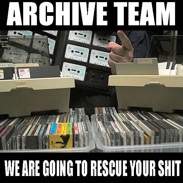 Formed in 2009, the Archive Team (not to be confused with the archive.org Archive-It Team) is a rogue archivist collective dedicated to saving copies of rapidly dying or deleted websites for the sake of history and digital heritage. The group is 100% composed of volunteers and interested parties, and has expanded into a large amount of related projects for saving online and digital history.


大家好,从 WWDC 2019 我们知道了 Apple 对于 SwiftUI 的重视以及整合其生态链
⌚️ 📱 💻 的决心。对于我们开发者 🧑🏻💻 而言,SwiftUI 的直观,高效和便捷以及可修饰性的 Coding🚀 更是值得我们开心 👏🏻,国内包括一些像 BATJ 的大厂也在积极布局 💪🏻。但是,Xcode中关于SwiftUI的 Library 文件
📖 依然非常抽象且苍白,要记住所有的修饰效果对于开发者们是一件十分痛苦的事情。我决定将其所有的修饰效果进一步视觉化,实例化 🤹🏻。还包括其使用的扩展方法
💬 以及注意事项❗️ (HIG)。可能对于一些 Pro 选手
🎩 来说这个 Repo 相当基础,但是对于原生控件的熟练掌控一定能让�?事半功倍,而且更多的视觉化效果也许还能助�?激发新的灵感 🙌🏻。当然对于初阶开发者 👶🏻 来说就更重要了,我曾尝试过好�?门 tutorial,但是学完之后仅仅就会开发 tutorial-alike 的 app,nothing more!。我承认我现在还是beginner,但是我觉得这是走向进阶 🧗🏻 的必由之路 。
Hi, guys! We all know that SwiftUI is getting more and more powerful
🚀 , and one of its big features is Modifier. However, in Xcode, the library documents📖 are pretty plain, and sometimes confusing for an inexperienced developer like me🤯 .So I decide to put my best effort 💪🏻 to visualize these and share with you guys. I know it's going to be elementary for some pros 🧑🏻💻. But every cool stuff is built from these, and you may find some inspirations
👻 from this graphic library.Feel free to make some contributions and polishes.
💙 you Gitters 👍🏻.
- macOS 15+
- Xcode 11.0+
- iOS 13.0+
- I use Gifox (app) to record
⏺ GIFs
for detail

👩🏻💻👩🏼💻
Controls
Action Sheet
An action sheet is a specific style of alert that appears in response to a control or action, and presents a set of two or more choices (recommend up to
3️⃣ ) related to the current context.
Work like this:

for more details, go to modifier_ActionSheet.md
Alert
Alerts
🚨 convey important information related to the state of your app or the device, and often request feedback. An alert consists of a title, an optional message, one or more buttons, and optional text fields for gathering input. Aside from these configurable elements, the visual appearance of an alert is static and can’t be customized.
Work like this:

for more details, go to modifier_Alert.md
Context Menu (1/4)
A container for views that you present as a menu items in a contextual menu in response to the standard system gesture (long press).
Work like this:

for more details, go to modifier_ContextMenu.md (🙏🏻 need HELP here)
- Control Size
- Focusable
- Item Provider
Popover (2/4)
A popover is a transient view that appears above other content onscreen when you tap a control or in an area.
Work like this:

for more details, go to modifier_Popover
Sheet (2/3)
A sheet is a fullscreen "popover" which appears from bottom with beautiful native transition.
Work like this:

for more details, go to modifier_Sheet
- Status Bar Hidden
- Tab Item
- Touch Bar
- Touch Bar Customization Label
- Touch Bar Item Presence
- Touch Bar Item Principal
Effect
Accent Color
Accent Color is the theme color of your apps, it can be applied on
Button&TabItem.The default accent color is
Color(.systemBlue)
Work like this:

for more details, go to modifier_AccentColor.md
Blend Mode
Sets the blend mode for compositing the view with overlapping views.
Work like this:

for more details, go to modifier_BlendMode.md
Blur
.blur()Applies a Gaussian blur to the view.If you want to apply it to backgrounde, you have to add few more code. See
struct BlurBg
Work like this:

for more details, go to modifier_Blur.md
Border & Stroke & StrokeBorder
.border()is always a rectangle, and draws border inside its frame.
.stroke()can be shaped, and draws border right in its frame.
.strokeBorder()can be shaped, and draws border inside its frame.
Work like this:

for more details, go to modifier_Border.md
Brightness
.brightness()applies to the view. and its suggested range is from -1 to 1 (Double)
Work like this:

for more details, go to modifier_Brightness.md
Clip Shape & Clipped
.clipShape()applies to the shape.
.clipped()applies to the frame.
Work like this:

for more details, go to modifier_ClipShape.md
Invert
Inverts the colors in the view.
Work like this:

for more details, go to modifier_ColorInvert.md
Color Multiply
Adds a color multiplication effect to the view.
Work like this:

for more details, go to modifier_ColorMultiply.md
Color Scheme
Sets the view’s color scheme. (Dark mode preview)
Work like this:

for more details, go to modifier_ColorScheme.md
-
Compositing Group
-
Content Shape
Contrast
.contrast()applies to the view. and its suggested range is from -5 to 5 (Double)
Work like this:

for more details, go to modifier_Contrast.md
Corner Radius
.cornerRadius()applies to the view.and when its amount is closer to its frame, it would be
.clipShape(Circle())
Work like this:

for more details, go to modifier_CornerRadius.md
- Drawing Group
Foreground Color
Sets the color that the view uses for foreground elements. (Text, SF Symbol, Shape)
Work like this:

for more details, go to modifier_ForegroundColor.md
Grayscale
Adds a grayscale effect to the view.
The intensity of grayscale to apply. Values closer to 0.0 are more colorful, and values closer to 1.0 are less colorful.
Set 0 or 1 will back to original.
Work like this:

for more details, go to modifier_Grayscale.md
Hue Rotation
Applies a hue rotation effect to the view.
Takes Angle(degrees:
Double)Sets 0 or 360 will back to original.
Work like this:

for more details, go to modifier_HueRotation.md
Luminance to Alpha
Adds a luminance to alpha effect to the view.
Work like this:

for more details, go to modifier_LuminanceToAlpha.md
Mask & Overlay & Opacity
Mask: works with View.
Overlay: works with View.
Opacity: A value between 0 (fully transparent) and 1 (fully opaque).
Double
Work like this:

for more details, go to modifier_Mask.md
- Preferred Color Scheme
particular
-
Projection
-
Rotation 3D
-
Rotation
-
Saturation
-
Scale
-
Shadow
-
Transform
Layout
-
Alignment Guide
-
Anchor Preference
-
Aspect Ratio
-
Background
-
Background preference Value
-
Coordinate Space
-
Default Wheel Picker Item Height
-
Edge Ignoring Safe Area
-
Fixed Size
-
Frame
-
Hidden
-
Horizontal Ratio Group Layout
-
Label Hidden
-
Layout Priority
-
Overlay Preference Value
-
Padding
-
Position
-
Scaled to Fill
-
Scaled to Fit
-
Transform Anchor Preference
-
Z index
Text
-
Allows Tightening
-
Autocapitalization
-
Baseline Offset
-
Bold
-
Disable Autocorrection
-
Flips for Right to Left
-
Font
-
Font Weight
-
Italic
-
Kerning
-
Keyboard Type
-
Line Limit
-
Line Spacing
-
Minimum Scale Factor
-
Multiline Text Alignment
-
Strikethrough
-
Text Content Type
-
Tracking
-
Truncation Mode
-
Underline
Image
-
Antialiased
-
Symbol Image Scale
-
Interpolation
-
Image Rendering Mode
-
Image Resizable
List
-
Delete Disabled
-
List Row Background
-
List Row Insets
-
List Row Platter Color
-
Move Disabled
-
On Delete
-
On Insert
-
On Move
Navigation Bar
-
Navigation Bar Back Button Hidden
-
Navigation Bar Hidden
-
Navigation Bar Items
-
Navigation Bar Title
Style
-
Button Style
-
Date Picker Style
-
List Style
-
Menu Button Style
-
Navigation View Style
-
Picker Style
-
Text Field Style
-
Toggle Style
Modifiers
-
Action
-
Adjustable Action
-
Element
-
Scroll Action
-
Activation Point
-
Add Traits
-
Hidden
-
Hint
-
Identifier
-
Label
-
Remove Traits
-
Sort Priority
-
Value
Events
-
Digital Crown Rotation
-
On Appear
-
On Command
-
On Copy Command
-
On Cut Command
-
On Delete Command
-
On Disappear
-
On Drag
-
On Drop
-
On Exit Command
-
On Hover
-
On Move Command
-
On Paste Command
-
On Play Pause Command
-
On Preference Change
-
On Receive
Gestures
-
Drag Gesture
-
Exclusive Gesture
-
Gesture
-
High Priority Gesture
-
Magnification Gesture
-
On Long Press Gesture
-
On Tap Gesture
-
Rotation Gesture
-
Sequence Gesture
-
Simultaneous Gesture
Shape
-
Fill
-
Offset
-
Rotation
-
Scale
-
Size
-
Transform
-
Trim
Other
-
Allows Hit Testing
-
Animation
-
Disabled
-
Environment
-
Environment Object
-
Equatable
-
Id
-
Preference
-
Tag
-
Transaction
-
Transform Environment
-
Transform Preference
-
Transition