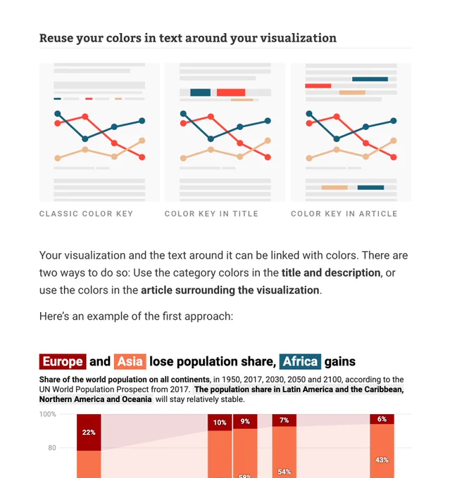
New blog post! Do you know the colors in your charts look bad, but don't know what to do? We wrote an article to help. Here are 13 ideas that will improve your #dataviz colour choices:
🎉 New blog post! And it’s the most in-depth one we ever published. Our writer @lisacmuth has spoken to dozens of people to learn how to best build a fixed color palette for data visualizations in an organization. Find what she learned here:
We updated one of our all-time favorites on our blog, "Your Friendly Guide to 🎨 Colors in Data Visualisation" with fresh new tools. If you don't know it yet, make sure to have a look (and bookmark it for later):
New blog post! When you want to visualize a lot of categories, your chart can quickly become too colorful and hard to decipher. This week, our blogger @lisacmuth gives you 10 tricks to reduce the number of colors in your visualizations. Find them here: blog.datawrapper.de/10-ways-to-use…
🎉🎉🎉 Big news: You can now create small multiple line charts with our new chart type “Multiple Lines”! Give each line its own panel, then sort, style, annotate, show lines on independent scales, and more.
See what’s possible in our announcement post:
New blog post! We provide 17 charts, maps and tables with up-to-date numbers about the coronavirus #COVIDー19.
Adapt them to your needs, change wording & colors, then embed them in your articles.
Find all the live visualizations here:
🎉 We are excited to introduce our new Youtube channel, where we will upload data visualization courses and Datawrapper how-tos. This is just the start – let us know what you think, and subscribe to learn about future videos 👉
youtube.com/channel/UCGRds…
🎉 We want to enable more people to create beautiful #dataviz. That's why you can now create, publish & embed Datawrapper charts, maps & tables without limits, export them as PNGs, use our API and collaborate in teams – all 🎉 for free 🎉! Learn more here:
New blog post! Text is often an afterthought when designing data visualizations. Our writer @lisacmuth explores in depth how text can make your visualizations easier to read and nicer to look at.
Read it here:
🎉🎉🎉 Big (big!) map update! Our choropleth and symbol maps are now simpler to create, quicker to load, and more beautiful.
Plus:
👉 finally: stepped maps!
👉 more flexible legends
👉 simpler tooltip editing
Learn about these and other new features:
blog.datawrapper.de/choropleth-sym…
New blog post! Sans-serif or serif typefaces? Lining or oldstyle figures? With many #dataviz examples, our writer @lisacmuth shows you which typefaces, fonts, and font customizations work best for your charts and tables. Read it here:
We just published a new Data Vis Dispatch! This week, you'll find a collection of some of the best #dataviz produced all around the world, with Ukraine, democratic institutions, and climate, as some of the biggest topics:
blog.datawrapper.de/data-vis-dispa…
New blog post! You designed a useful & fun color key? Great. Now you’ll want to make sure people don’t forget those associations between colors and categories. Our author @lisacmuth explores ways to do so, with >15 examples.
Read her article here: blog.datawrapper.de/remind-readers…