

Ellen Pompeo's Tutorial
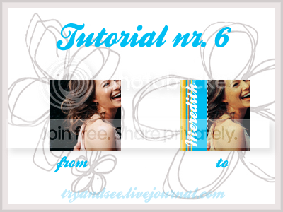
Hiatus continues, but I decided to make a little tutorial :) , just to keep this comm updated, easy steps as usual
- Using photoshop CS2 9
- THIS TUTORIAL IS A GUIDE!, I recommend you not to copy exactly because EVERY IMAGE IS DIFFERENT! Do not use the same base I did.
Rules:
Credit is a must
NO HOTLINKING
Comments feed my soul!, please comment if you try it!, and I'd looove to see your results!
Feel free to ask any questions!, and to join this comm for more updates! (stay tuned, some headers and friends only banners are comming up! :D)
Wanna make any request?
- Using photoshop CS2 9
- THIS TUTORIAL IS A GUIDE!, I recommend you not to copy exactly because EVERY IMAGE IS DIFFERENT! Do not use the same base I did.

It's very simple actually, but I thought It might help some people
Step 1: Open your baze, crop rezise or whatever, you will judge if it is too dark or not.. if it is, some screen layers will fix it [Duplicate your base, CTRL + J, set it to screen, then lower the opacity if you want, in case your subject looks too washed out, repeat the process if you're not comfotable with the result, you might want to add a soflight layer too]
I did not do anything to my base, my selective colour layers brightened it up.
Step 2: Selective Colouring
- First Selective Colour Layer:
Reds: -100, 0, +100, 0 (This brings my reds up, but the third value might vary, because it will make your image too yellowish)
Yellows: +100, -100, -100, 0
Neutrals: +12, 0, -10, 0

- Second Selective Colour Layer:
Reds: -11, 0, +19, 0
Yellows: -100, -21, -33, +100
Neutrals: +14, 0, -18, 0

*** PLAY WITH THE SETTINGS! they won't look good with some bases!
*** I also, just for this icon, added a Color Fill Layer with # ffd800, to make Mer's skin a little more yellow, but in the other examples I neglected that step. I also set that layer to Darken
Step 3: texturizing:
- Drag a dusty texture onto your icon and set it to Multiply, you may erase some of the parts that cover your subject.
 -->
--> 
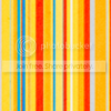
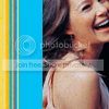
- Now for the light blue part, you just create a new layer (CTRL + SHIFT + N) and select with the Rectangular Marquee Tool the side of your icon you want to colour. After you selected your color, you fill your selection by pressing ALT + DEL (delete) or by using the Paint Bucket Tool. After that, you place a stripped texture by dignityy and move it around until you get the result you want (yes, one of the same textures I used for the bird textures ;)

 -->
--> 
- For the Dashed Line, it is quite simple actually, you create a new type layer, as if you were going to write something, then with Century Gothic or any other font, (that is the one I used), you start making this: ------------------ you can use the space bar to increase the space between lines, or go to: Window (on the menu above) > Character and there underneath a box that should say '(Auto)' (which is below Regular) you will find an 'AV' with an arrow below it, that's the space between letters, and enter whichever value you want. I used 200.
[It might sound complicated, it's just that I wanted to explain it as detailed as possible.]
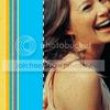
Step 4: Add some text, I typed Meredith with Ballpark
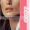
Other Examples using THE SAME technique:
 -->
--> 
 -->
--> 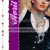
If anybody would like to have the psd file, let me know.
Step 1: Open your baze, crop rezise or whatever, you will judge if it is too dark or not.. if it is, some screen layers will fix it [Duplicate your base, CTRL + J, set it to screen, then lower the opacity if you want, in case your subject looks too washed out, repeat the process if you're not comfotable with the result, you might want to add a soflight layer too]
I did not do anything to my base, my selective colour layers brightened it up.
Step 2: Selective Colouring
- First Selective Colour Layer:
Reds: -100, 0, +100, 0 (This brings my reds up, but the third value might vary, because it will make your image too yellowish)
Yellows: +100, -100, -100, 0
Neutrals: +12, 0, -10, 0

- Second Selective Colour Layer:
Reds: -11, 0, +19, 0
Yellows: -100, -21, -33, +100
Neutrals: +14, 0, -18, 0

*** PLAY WITH THE SETTINGS! they won't look good with some bases!
*** I also, just for this icon, added a Color Fill Layer with # ffd800, to make Mer's skin a little more yellow, but in the other examples I neglected that step. I also set that layer to Darken
Step 3: texturizing:
- Drag a dusty texture onto your icon and set it to Multiply, you may erase some of the parts that cover your subject.
 -->
--> 
- Now for the light blue part, you just create a new layer (CTRL + SHIFT + N) and select with the Rectangular Marquee Tool the side of your icon you want to colour. After you selected your color, you fill your selection by pressing ALT + DEL (delete) or by using the Paint Bucket Tool. After that, you place a stripped texture by
dignityy and move it around until you get the result you want (yes, one of the same textures I used for the bird textures ;)
 -->
--> 
- For the Dashed Line, it is quite simple actually, you create a new type layer, as if you were going to write something, then with Century Gothic or any other font, (that is the one I used), you start making this: ------------------ you can use the space bar to increase the space between lines, or go to: Window (on the menu above) > Character and there underneath a box that should say '(Auto)' (which is below Regular) you will find an 'AV' with an arrow below it, that's the space between letters, and enter whichever value you want. I used 200.
[It might sound complicated, it's just that I wanted to explain it as detailed as possible.]

Step 4: Add some text, I typed Meredith with Ballpark
Other Examples using THE SAME technique:
 -->
--> 
 -->
--> 
If anybody would like to have the psd file, let me know.
Rules:
Credit is a must
NO HOTLINKING
Comments feed my soul!, please comment if you try it!, and I'd looove to see your results!
Feel free to ask any questions!, and to join this comm for more updates! (stay tuned, some headers and friends only banners are comming up! :D)
Wanna make any request?
Do not claim as your own.