This has been annoying me for years. The thin dotted line is not good enough to notice which one is the selected one in the IntelliSense pop-up. Below is the screen recording in which I keep pressing up/down arrows to move the selection in the pop-up; you tell me which one is the selected one!
https://imgur.com/a/ETdUpkD (I wanted to uploaded the screen recording MP4, but GitHub refused to host it, so I had to upload it to another site. Please add support for short MP4 files too...)
Also, if the mouse cursor is happened to be on the IntelliSense pop-up, it looks even more confusing. In the screenshot below, the selected item is "getAnimations", and the mouse cursor is happened to be on "getElementsByTagNameNS", and it looks as if thee of them are selected.
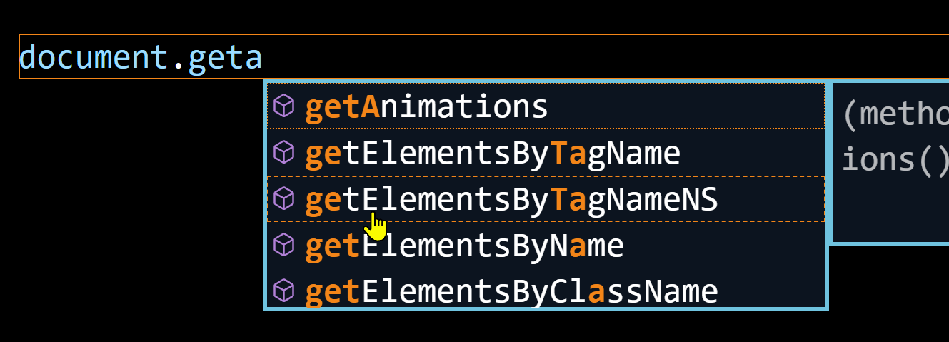
I do not have eyesight disabilities and I use the High Contrast theme because it looks good in a dark room. I am not sure if High Contrast theme is for people with disabilities and the current look of selected item is designed for such people, but in case it is not, please change the look of selected item to something more noticeable, something like inverted colours (background <-> text).


This has been annoying me for years. The thin dotted line is not good enough to notice which one is the selected one in the IntelliSense pop-up. Below is the screen recording in which I keep pressing up/down arrows to move the selection in the pop-up; you tell me which one is the selected one!
https://imgur.com/a/ETdUpkD (I wanted to uploaded the screen recording MP4, but GitHub refused to host it, so I had to upload it to another site. Please add support for short MP4 files too...)
Also, if the mouse cursor is happened to be on the IntelliSense pop-up, it looks even more confusing. In the screenshot below, the selected item is "getAnimations", and the mouse cursor is happened to be on "getElementsByTagNameNS", and it looks as if thee of them are selected.

I do not have eyesight disabilities and I use the High Contrast theme because it looks good in a dark room. I am not sure if High Contrast theme is for people with disabilities and the current look of selected item is designed for such people, but in case it is not, please change the look of selected item to something more noticeable, something like inverted colours (background <-> text).