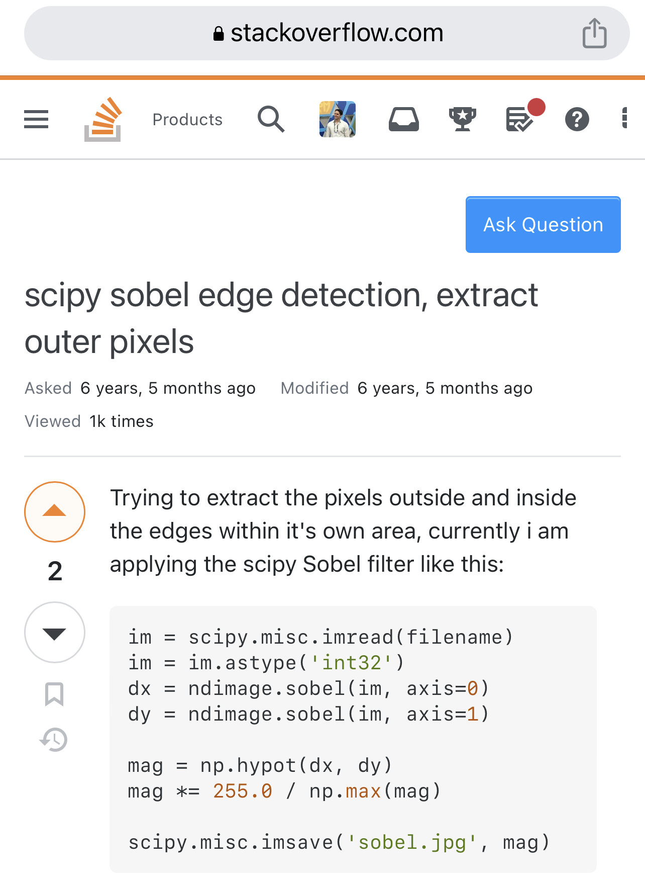
I suppose this isn’t such a big deal, but it seems to have become difficult to see visually if I’ve upvoted a post on math.stackexchange:
Compare this with the clear coloring on stackoverflow:
Has this been discussed? Though it’s not a big deal, it seems to be a change which has made the user interface slightly worse.
Maybe I’m just part of an A/B test and I don’t realize it.


