Published and written on
Jul 09 2024 by Michael Andreuzza
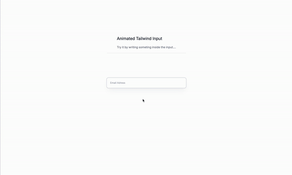
Today we are going to create an animated input field with Tailwind CSS.
Why animated input fields?
Well, you might be wondering why we would want to create an animated input field. There are a few reasons why you might want to do this:
- To add a touch of interactivity to your website.
- To make your input fields stand out and grab the user’s attention.
- To create a more engaging user experience.
- To add a touch of personality to your website. and many other reasons.
Let’s get started!
The wrapper
Let’s start by crating the wrapper div that will contain the input field and the label.
flexis used to create a flex container.flex-col-reverseis used to create a column layout with the items reversed.
<div class="flex flex-col-reverse ">
  <!--- Content goes here --->
</div>
The input field
peeris used to designate this element as a reference point for conditional styling of its siblings or children using the peer-* variants.outline-noneis used to remove the default browser outline.ringis used to add a focus ring to the input field. This adds a subtle visual indicator that the input field is currently focused.px-4is used to add padding to the left and right of the input field.py-1is used to add padding to the top and bottom of the input field.h-12is used to set the height of the input field to 12 pixels.border-0is used to remove the default border from the input field.rounded-lgis used to add rounded corners to the input field.ring-base-200is used to set the color of the focus ring to gray.duration-500is used to set the duration of the animation to 500 milliseconds.focus:ring-2is used to set the width of the focus ring to 2 pixels.focus:border-base-100is used to set the color of the border when the input field is focused to gray.relativeis used to position the input field relative to the parent element.placeholder:duration-500is used to set the duration of the placeholder animation to 500 milliseconds.placeholder:absoluteis used to make the placeholder positioned absolutely.focus:placeholder:pt-10is used to position the placeholder 10 pixels from the top of the input field when the input field is focused.text-xsis used to set the font size of the input field to 10 pixels.shadow-xlis used to add a shadow to the input field.shadow-base-400/10is used to set the opacity of the shadow to 10% and the color to gray.focus:shadow-noneis used to remove the shadow when the input field is focused.focus:rounded-mdis used to add rounded corners to the input field when the input field is focused.focus:ring-blue-600is used to set the color of the focus ring to blue.placeholder:text-base-500is used to set the color of the placeholder to gray.
<input
  type="text"
  placeholder="Email Adress"
  class="relative h-12 px-4 py-1 text-xs border-0 rounded-lg shadow-xl peer ring ring-base-200 duration-500 focus:ring-2 focus:border-base-100 placeholder:duration-500 placeholder:absolute focus:placeholder:pt-10 shadow-base-400/10 focus:shadow-none focus:rounded-md focus:ring-blue-600 placeholder:text-base-500"
/>
The label
duration-500is used to set the duration of the animation to 500 milliseconds.opacity-0is used to set the opacity of the label to 0%.mb-2is used to add margin-bottom to the label.peer-focus:opacity-100is used to set the opacity of the label to 100% when the input field is focused.text-base-500is used to set the color of the label to gray.text-xsis used to set the font size of the label to 10 pixels.-translate-y-12is used to translate the label 12 pixels from the top of the input field.peer-focus:translate-y-0is used to translate the label back to its original position when the input field is focused.
<span
  class="mb-2 text-xs opacity-0 duration-500 peer-focus:opacity-100 text-base-500 -translate-y-12 peer-focus:translate-y-0"
  >Email Adress</span
>
The whole code for the animated input field
<div class="flex flex-col-reverse ">
  <input
    placeholder="Email Adress"
    class="relative h-12 px-4 py-1 text-xs border-0 rounded-lg shadow-xl outline-none peer ring ring-base-200 duration-500 focus:ring-2 focus:border-base-100 placeholder:duration-500 placeholder:absolute focus:placeholder:pt-10 shadow-base-400/10 focus:shadow-none focus:rounded-md focus:ring-blue-600 placeholder:text-base-500"
    type="text"
  />
  <span
    class="mb-2 text-xs opacity-0 duration-500 peer-focus:opacity-100 text-base-500 -translate-y-12 peer-focus:translate-y-0"
    >Email Adress</span
  >
</div>
Conclusion
This is just a small example of an animated input field with Tailwind CSS. You can customize it to fit your needs and add more features like other hover effects, styles and so on. Do not forget to make it fully responsive and accessible.
Hope you enjoyed this tutorial and have a god day!
/Michael Andreuzza
Astro v5
/ Tailwind CSS v4
One Price.
Lifetime Access.
-
32 Premium Astro Templates
-
All Future Templates Included
-
Unlimited Projects · Lifetime License
Fastest product ever paid. Keep up the great work — Raf, RafWorks
The value in this is incredible. Every single one of the themes is a piece of art — Dan Mindru, Clobbr
Big fan of your themes. They're well-organized, look clean, and are fast — Keving Focke, Developer
Michael has been dropping some amazing premium themes for Astro lately — Fred Schott, Astro