
ICON TUTORIAL!
Wow! Two posts in under a minute!!
I created a hopefully easy "step-by-step" tutorial on how to make icons like the one below. No need to credit, but comments are always appreciated. :D
Created using: Photoshop 7.0
Tutorial by: coffee_day
How to get from this.....to this.
 to
to 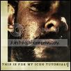
START: Create a 100x100 pixel file.
1) IMAGE: I choose this image of Charlie from Lost. Open the image in photoshop and go to Filter > Sharpen > Sharpen. The image should pixelize a little. Sharpen the image 3 more times.
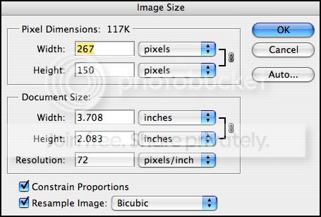
2) RESIZING: Now the image should look really crappy/pixelated. To make it look perfect for your icon, go to Image > Image Size. Change the image size so the box says something like this:
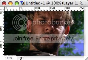
3) COPY, PASTE, ALINE: Now to get the image into your 100x100 pixel file, just go to Select All, then Copy, then Paste it into the box. Should look something like this:

Move the image around to the position you think it looks best. Word of advice, DO NOT CENTER. Center=boring. So, here's mine!
I left a bit of the green in the back so then his face isn't just "splat!" right there.
4) AFFECTS OF THE EFFECTS: I already chose pre-made textures and such. Some of them I blurred to make more interesting and some I created myself. You can create your own by searching randomly on google and/or taking photographs. Anyways, here's the textures (and colors) that I used for this icon:


(texture 1 is on the bottom, texture 3 is at the top)
Texture 1: Set to Multiply (100%)
Texture 2: Set to Screen (70%-100%) Byteh_indy
Texture 3: Set to Multiply (100%)
ALL textures are in this color: #E0D9AD
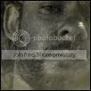
The icon should now look like this:
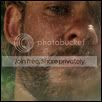
5) COPYING EFFECTS: Select the image layer and duplicate it. Set the new layer to Desaturate and increase the Contrast to 65. Set that layer to overlay (100%). Copy that same layer and paste it above the texture layers, and set that to Multiply (52%).
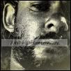
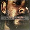
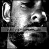
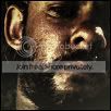
6) ADDITIONALS: If you want to add a matching border, all you have to do is create another layer in between the original and the overlayed images and the textures. Then, using the Rectangular Marquee Tool, select the areas that you want your border. Use the Paint Bucket Tool to fill in the selected area. I used the color white. Looks really crappy now, doesn't it? All you have to do is erase the parts of the image above the textures where your border is! And POOF! YAY!
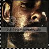
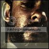
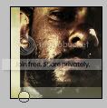
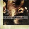
7) TEXT: I find that small text looks really pretty on icons. Readable or not, small text/fonts are IN YO!!1 For this icon I chose Georgia at 4.3 pt....and the color #0D0C0B. You can space out your lettering by setting the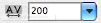 to any number you prefer.
Here is the layer order if any of you were confused about what went where..
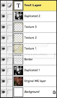
I guess that this is helpful to people. This is dedicated particularly to the people who have asked me for tutorials over the past 6 months. Thanks you guys!
I created a hopefully easy "step-by-step" tutorial on how to make icons like the one below. No need to credit, but comments are always appreciated. :D
Created using: Photoshop 7.0
Tutorial by:
coffee_dayHow to get from this.....to this.
to START: Create a 100x100 pixel file.
1) IMAGE: I choose this image of Charlie from Lost. Open the image in photoshop and go to Filter > Sharpen > Sharpen. The image should pixelize a little. Sharpen the image 3 more times.
2) RESIZING: Now the image should look really crappy/pixelated. To make it look perfect for your icon, go to Image > Image Size. Change the image size so the box says something like this:
3) COPY, PASTE, ALINE: Now to get the image into your 100x100 pixel file, just go to Select All, then Copy, then Paste it into the box. Should look something like this:
Move the image around to the position you think it looks best. Word of advice, DO NOT CENTER. Center=boring. So, here's mine!
I left a bit of the green in the back so then his face isn't just "splat!" right there.
4) AFFECTS OF THE EFFECTS: I already chose pre-made textures and such. Some of them I blurred to make more interesting and some I created myself. You can create your own by searching randomly on google and/or taking photographs. Anyways, here's the textures (and colors) that I used for this icon:
(texture 1 is on the bottom, texture 3 is at the top)
Texture 1: Set to Multiply (100%)
Texture 2: Set to Screen (70%-100%) By
teh_indyTexture 3: Set to Multiply (100%)
ALL textures are in this color: #E0D9AD
The icon should now look like this:
5) COPYING EFFECTS: Select the image layer and duplicate it. Set the new layer to Desaturate and increase the Contrast to 65. Set that layer to overlay (100%). Copy that same layer and paste it above the texture layers, and set that to Multiply (52%).
6) ADDITIONALS: If you want to add a matching border, all you have to do is create another layer in between the original and the overlayed images and the textures. Then, using the Rectangular Marquee Tool, select the areas that you want your border. Use the Paint Bucket Tool to fill in the selected area. I used the color white. Looks really crappy now, doesn't it? All you have to do is erase the parts of the image above the textures where your border is! And POOF! YAY!
7) TEXT: I find that small text looks really pretty on icons. Readable or not, small text/fonts are IN YO!!1 For this icon I chose Georgia at 4.3 pt....and the color #0D0C0B. You can space out your lettering by setting the
to any number you prefer.Here is the layer order if any of you were confused about what went where..
I guess that this is helpful to people. This is dedicated particularly to the people who have asked me for tutorials over the past 6 months. Thanks you guys!