Overlay bookmarklet
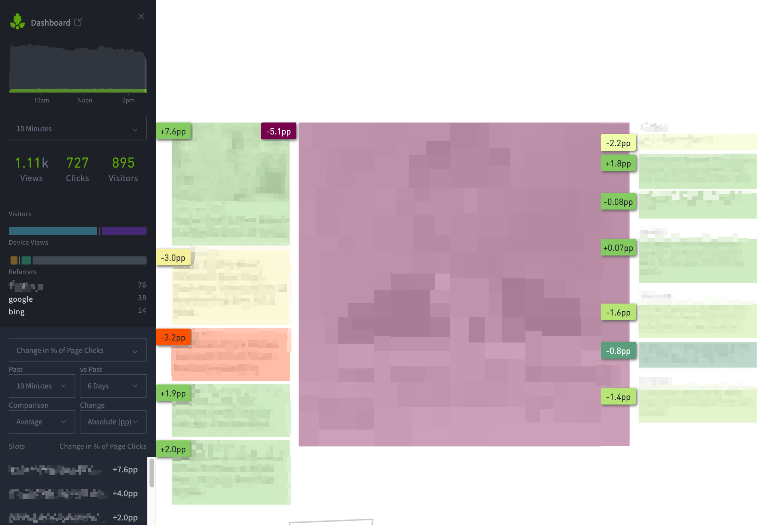
The Overlay bookmarklet layers real-time content analytics on top of your site. This enables tracking of the performance of posts on your homepage or section pages. It also displays historical performance for particular page positions (“slots”), so you can see if an article is doing better or worse than the slot’s average.
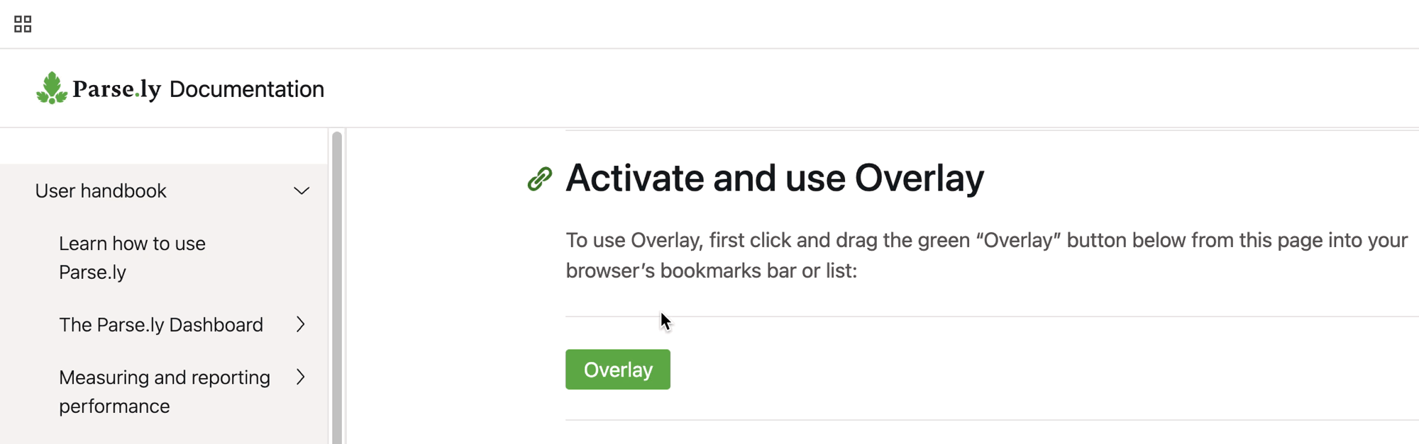
Activate Overlay
To use Overlay, first click and drag the green “Overlay” button below from this page into your browser’s bookmarks bar or list:
Overlay
Then, after logging into the Parse.ly Dashboard in your browser, visit a page on your site that:
- Is structured for custom content placement, such as your homepage or a section page.
- Contains links to content on the same site domain.
- Logged at least one page view within the last 10 minutes.
- Is a non-post per the metadata supplied to Parse.ly.
- Is not a Google AMP page.
While viewing this page, click your browser’s new bookmark to load Overlay.
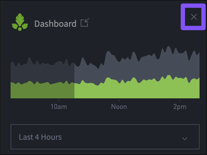
Close Overlay using the “X” icon in the upper-right corner of the panel.
Overlay controls
Timeline selector
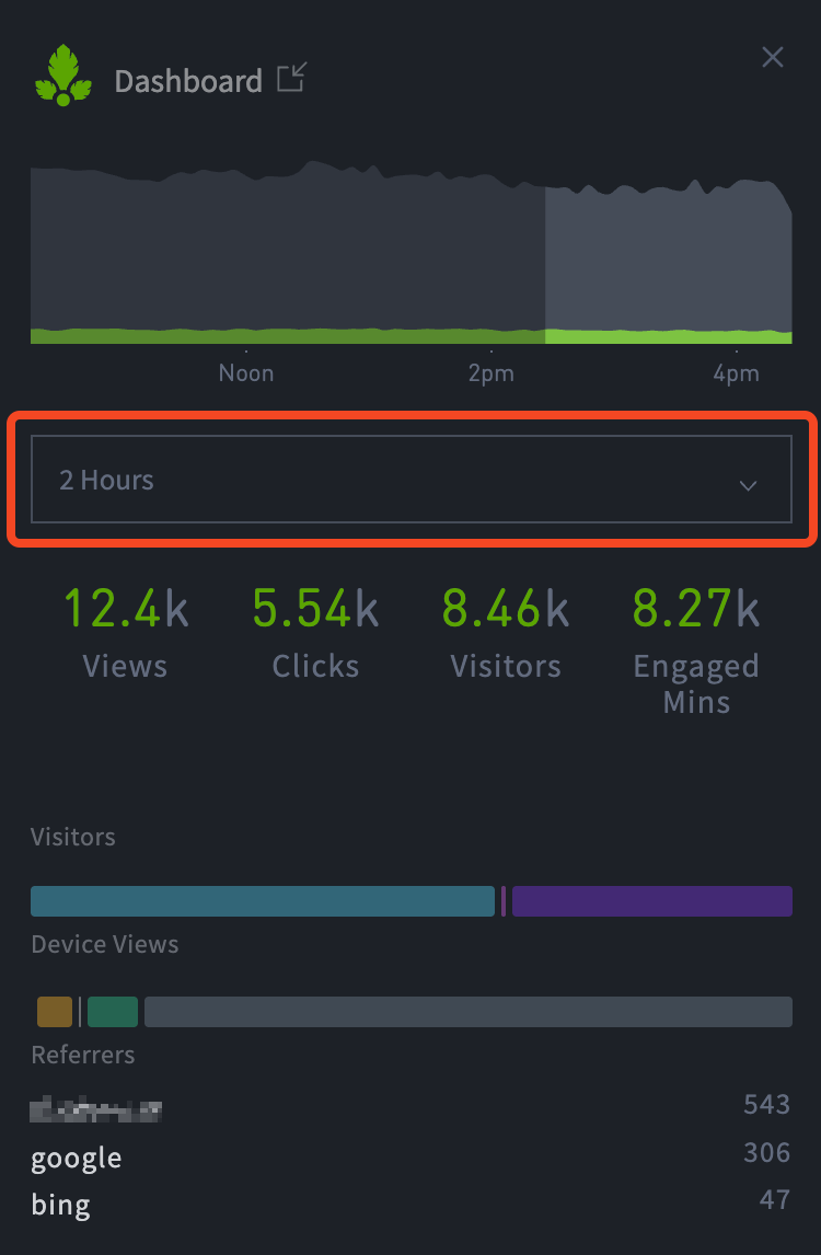
The timeline chart at the top of the overlay displays six hours of data. The timeline selector below the chart enables analysis of: 5m, 10m, 30m, 1h, 2h, 4h, or 6 hours of data.
The selected amount of time will display as a light gray color in the timeline chart. Any unselected time will remain dark gray.
The timeline selector will also modify the factoids (views, clicks, visitors, engaged minutes), visitor device distribution (desktop, tablet, mobile), referrer distribution, and top three referrer sources.
Metric menu

The metric menu offers the following options:
- Clicks per minute,
- % of Page Clicks,
- Change in % of Page Clicks,
- Historical % of Page Clicks,
- Click-through Rate,
- Change in Click-through rate, and
- Historical Click-through Rate
Non-comparison metrics
When viewing non-comparison metrics (Clicks per minute, % of Page Clicks, Historical % of Page Clicks, Click-through Rate, Historical Click-through Rate), you may see the following color scale after you’ve enabled the Overlay:
#EEFDA9
#B7E576 (good)
#5A9E7C
#84CC61
Non-comparison metrics time range
When viewing non-comparison metrics, you may select: 5m, 10m, 30m, 1h, 2h, 4h, or 6 hours of data from the time range menu. This time range will affect the Slots data that is located beneath this menu and it will affect the values that you see in the badges of the Overlay display.
Comparison metrics
When viewing comparison metrics (Change in % of Page Clicks, Change in Click-through Rate), you may see this broader color scale after you’ve enabled the Overlay:
#C31308
#FF5201
#F7F09B (okay)
#EEFDA9
#B7E576 (good)
#5A9E7C
#84CC61
Comparison metrics options
When selecting a comparison metric, you will have additional menus.
Time ranges: there are two dropdown menus.
- “Past” this menu on the left allows you to select a time period within the last six hours.
- “vs Past” this menu on the right enables you to select a time period within the last month.
Comparison mode:
- “Same Period” enables you to compare the same unit of time on two different days. For example, “I want to compare the last two hours with a two hour window from six days ago.”
- “Average” allows you to compare data over the recent period to the average performance of a span of time. For example, “I want to compare the past two hours to the average performance of the last six days.”
Absolute/Relative selector:
- Absolute: displays as “pp” (percentage points) to reflect absolute change, rather than suggesting relative change. For example, an increase from 2% to 10% click-through rate will display as +8pp.
- Relative: displays as a percentage change.
Display options
At the bottom of the Overlay panel, there are three toggles for changing how Overlay displays on your site.
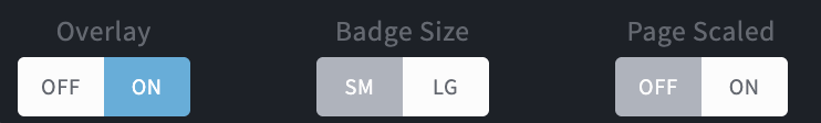
Overlay
Toggling on the Overlay will display a heat map over the site page for easy identification of how slots, or locations, on the page are performing.
Badge size
Badge size contains two badge sizes. The default size is small (SM). The large (LG) badges are displayed in the following screenshot (compare with the screenshot at the top of the page).

Page scaled
Page scaled reduces the page size for easier viewing alongside the Overlay panel on smaller screens.
Last updated: October 03, 2025