PIVOT TABLES IN EXCEL
These are powerful tools that allow you to summarize, analyze and present your data in a flexible and interactive way.
Pivot tables enable an easier transformation of large datasets into meaningful insights.
They aid in extracting significant data from a larger dataset without altering the data source.
Creating a pivot table
Select your data: Choose the data range you want to use for instance (A1:P540)
Insert a pivot table: Go to Insert tab, then click pivot table, choose where you want the pivot table either a new worksheet or an existing worksheet then click ok.
Setting up your pivot table
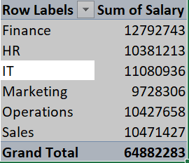
- Rows: Drag the field from the pivot Table fields section you want to group data by to the rows area. E.g: Department name
- Values: Drag the field you want to summarize to the values area E.g: Salary
- Filters (Optional): Drag a field into the filters area to filter the analysis. E.g: Gender
Advanced pivot table manipulations
Grouping Data: One can group data into specific intervals or time periods such as group Hire Date by Month or Year.

Calculated Fields: new fields can be created based on existing ones such as calculating Total Income from Salary and commission.

The Sum of Total Income is a calculated field.
Slicers and Filters: Generally used for interactive filtering whereby a slicer creates buttons that allow users to easily filter the data by specific criteria.

Refreshing a pivot table: Whenever new data is added to your dataset, one can refresh the Pivot Table to include the new data by right-clicking inside the Pivot Table and selecting Refresh.
PIVOT CHARTS IN EXCEL
A pivot chart and a pivot table are directly linked in excel.
A Pivot Chart allows you to create a graphical representation of the data in a Pivot Table.
As changes are made in the Pivot Table, the Pivot Chart updates automatically, rendering it an excellent tool for data exploration.
Types of Pivot Charts
Column chart, Line Chart, Bar Chart, Pie Chart, Scatter Plot.
Customizations in pivot charts
Grouping the data
Changing the chart type
Adding slicers
Applying conditional formatting

Changing data labels and titles
Adding a secondary axis: crucial when comparing two different data sets with different scales
Final Thoughts
Mastering Pivot Charts for data analysis enables you to make your data presentations more interactive and informative, helping you communicate trends, relationships, and comparisons more effectively.

Top comments (0)
Some comments may only be visible to logged-in visitors. Sign in to view all comments.