After the announcement of RubyUI and the idea of writing views 100% in Ruby, I decided to put my (still limited) knowledge of view componentization into practice.
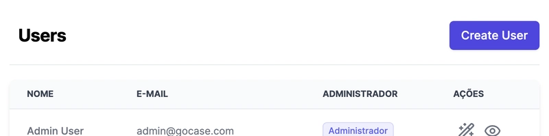
My goal was to create a simple and reusable Section Header component to use in my app, like in the example below:
Below, I’ll walk you through the step-by-step process, using ready-made components from RubyUI and a bit of TailwindCSS for styling.
1. Building the Component Skeleton
The RubyUI component structure already existed in my project, so I created a new file called section_header.rb inside the components folder. The component inherits from a Base class, which itself inherits from Phlex::HTML—so everything here is pure Ruby, no HTML templates!
The skeleton of the component follows the Phlex rendering pattern:
# app/components/ruby_ui/section_header/section_header.rb

module RubyUI
  class SectionHeader < Base
    def initialize()
      # put the params here
    end

    def view_template
      # build your page here
    end
  end
end
2. Displaying the Title
The first step was to allow the component to receive a title as a parameter and display it using the Heading component from RubyUI (which is part of the Typography group).
rails g ruby_ui:component Typography
rails g ruby_ui:component Typography
# app/components/ruby_ui/section_header/section_header.rb

module RubyUI
  class SectionHeader < Base
    def initialize(title: ")"
      @title = title
    end

    def view_template
      Heading(level: 2) { @title }
    end
  end
end
Now, I can call the component like this:
SectionHeader.new(title: "\"Users\")"
3. Adding Tailwind Styling
To make the title stand out, I wrapped the Heading in a div with some TailwindCSS classes, adding a bottom border and spacing:
# app/components/ruby_ui/section_header/section_header.rb

module RubyUI
  class SectionHeader < Base
    def initialize(title: ")"
      @title = title
    end

    def view_template
      div(class: "border-b border-gray-200 pb-5 mb-5") do
        Heading(level: 2) { @title }
      end
    end
  end
end
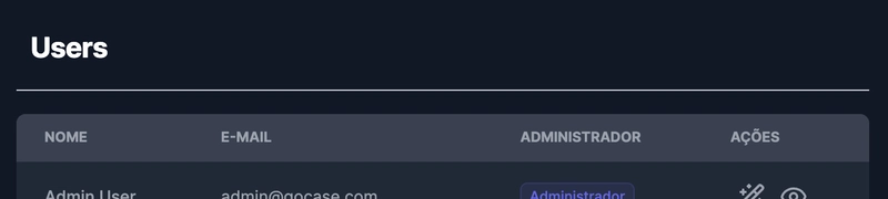
The result already works for both dark and light mode:
4. Making the Component More Flexible
Then I thought: what if I want to add an action button, like “Create New”? For that, I added two more optional parameters: href (the button link) and label (the button text). I used the RubyUI Link component to create the button, but you could swap it for a Button if you prefer.
rails g ruby_ui:component Link
rails g ruby_ui:component Button
# app/components/ruby_ui/section_header/section_header.rb

module RubyUI
  class SectionHeader < Base
    def initialize(title: ", href: nil, label: nil)"
      @title = title
      @href = href
      @label = label
    end

    def view_template
      div(class: "border-b border-gray-200 pb-5 mb-5") do
        div(class: "sm:flex sm:items-center sm:justify-between ml-3") do
          Heading(level: 2) { @title }
          if @href
            div(class: "mt-3 sm:mt-0 sm:ml-4") do
              Link(href: @href, variant: :primary, size: :lg) { @label }
            end
          end
        end
      end
    end
  end
end
Agora, para exibir o título com um botão de ação, basta chamar assim:
SectionHeader.new(
  title: "'Usuários',"
  href: new_admin_user_path,
  label: 'Criar Usuário'
)
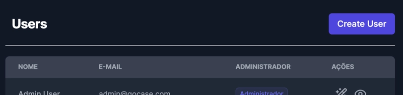
The final result looks like this:
Extra Tips
- You can improve the component to accept an I18n translation key instead of a plain string for the title, making internationalization easier.
- You can use the same pattern for other types of headers, just by changing the internal components.
With this, it’s super easy to create beautiful, standardized section headers using only Ruby and RubyUI components. If you want to see more examples, I recommend checking out the official RubyUI documentation.
If you have any questions or want to chat, just leave a comment!

Top comments (0)