I couldn't find a live, text-only CPU chart either. So, I made one.
Here's a link to my github repo: https://github.com/rigel314/ttysys
Try it out if you like, and please report any errors on my repo's issues page.
EDIT:
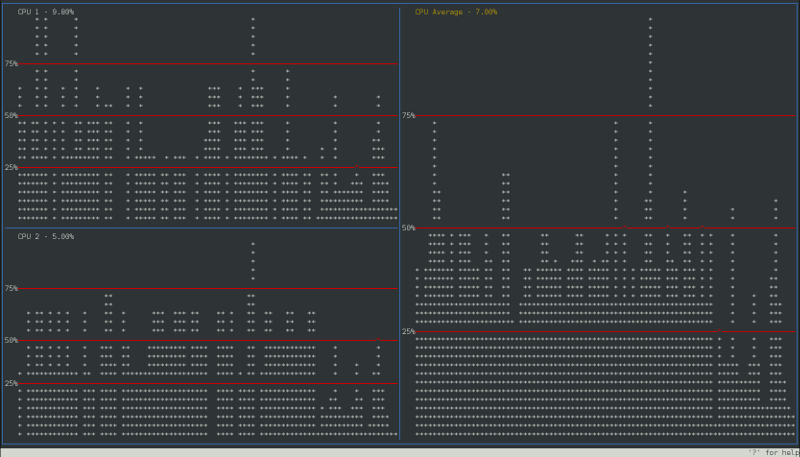
Screenshot:
Install:
You will have to compile it from source. I provided a simple makefile that calls gcc.
You can run the program using make then ./build/target/ttysys
Alternatively, you can run make install followed by ttysys since it is in your path now.
Usage:
$ ttysys [<sequence>]
sequence can consist of any number of the following characters:
? - Displays a help window.h - Split current window horizontally.v - Split current window vertically.c - Close current window.- Tab - Move to next window in order of creation.
- Arrow Keys - Move to next window on screen in direction pressed.
- Numbers
0 - 9 - Select a data source for a window.
0 will set the data source to an overview, and 1 - 9 set it to a specific core.
g - Toggle grid for selected window.e - Toggle value display in current window's title.t - Toggle display of current window's title bar.l - Toggle display of current window's label sidebar.q - Quit this program.u - Same as pressing up arrow key. Move to window above current one.d - Same as pressing down arrow key. Move to window below current one.l - Same as pressing left arrow key. Move to window left of current one.r - Same as pressing right arrow key. Move to window right of current one.
These same buttons will control the program while it is running.
How it works:
It works by reading the first few lines in /proc/stat that begin with cpu.
man 5 proc explained the meaning of contents of /proc/stat.
These lines tell you how much time each CPU spent in different states. The sum of each line is the total time spent for each CPU. I read this file twice with a second in between. Then, I subtract the two totals to have the total CPU time spent during my sleep(). Now, I add the user and system numbers together and divide by my difference. Finally, it's just a matter of displaying it nicely.


htop? Though it's not as pretty/big as slurm's chart, see the second PNG from bottom at htop.sourceforge.net/index.php?page=screenshots